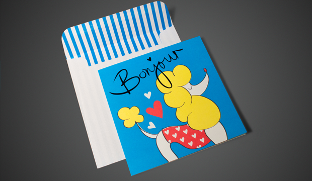
A new era for paper and print, digital style

The uptake in the use of image recognition (IR) and augmented reality (AR) is increasing. Not to forget quick response (QR) codes and even Documobi’s Intelligent Print Recognition™ (iPR). What all of these tools are doing is bridging the gap between the paper, print and digital worlds via tablets and smart phones, providing the reader with a complete communication experience. This article is partly our thoughts, research we’ve gathered and a lengthy chat we had with Deborah Corn from Print Media Centr (PMC) in the USA – thanks Deb! We love paper but we love the digital world too and now, they can both play nice.

Tell me more…
All of these buzz words can be a bit much. In a nutshell, in the case of AR/IR, software and apps have been designed for smart phones and tablets. They can recognise images via the camera (or webcam in the case of computers), scan them and then provide an interactive digital experience. QR codes (the black and white squares used on print ads or outdoor displays) can be easily generated with free software and hundreds of different apps can read them. You can see there are various options available. The one you choose all depends on what your client wants and the end result needed because all the technologies have their own benefits and limitations, whether its cost, aesthetic etc.

We encourage you to look more into this space to understand which options best suit your project. You can research the popular AR technologies like Aurasma, Blippar™ (used by Franklin Web) and Documobi’s iPR  (Digital Press uses it). This one is something quite revolutionary because you can create a digital experience with a piece that has already been printed. So it doesn’t need to be included in the design stages like with AR/IR. Here’s some real life examples from the retailers and companies that have developed/utilised these technologies:

Coles – has a Christmas edition of their free in-store magazine with QR codes throughout. They link to videos featuring Curtis Stone, their brand ambassador, doing everything from showing you how to speed up your crab picking or prepare deliciously light savoury puffs. On last visit, the savoury puffs had a whopping 7326 views!

Gram – is a popular food culture publication that uses tags (much like QR codes) to link their stories to further online content and imagery by the blogger featured in the newspaper. You’re also invited to comment on the story by scanning the code.

Tesco the UK supermarket giant, has done a great job of delivering AR to the masses. Scanning their print ads brings the page to life. You can download daily recipes, discounts, find your nearest store, access to articles and more.

Blippar™ and ShortList magazine – This magazine is amazing (watch video above). You hold your device up to the cover in blippar mode and you can blipp to play classic computer game Chuckie Egg from the front cover, find pages where you can blipp to watch videos, buy, vote as well as many other pages where you can find extra content.

ASOS the hugely popular online retailer, used AR with their print mag which is sent to over 450,000 readers. They know their readers love fashion, their mobiles and the mag, so they created a ‘Scan to shop’ experience like digital treasure hunts, exclusive offers and the chance to instantly buy pieces.

IKEA – their 2013 catalogue is going to be an AR experience. They’ve created their own app you can download. By scanning selected pages, you unveil films, photo galleries and interactive experiences.

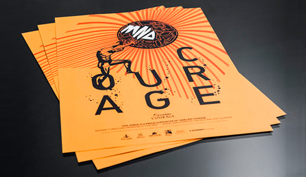
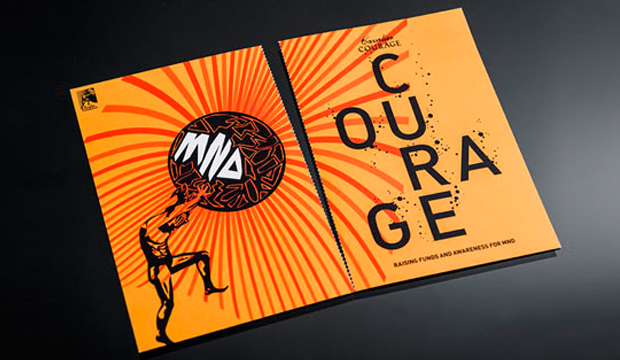
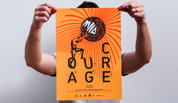
BMW Australia – created a unique book for new BMW owners, using AR and IR (the thumbnail pic for the Fetch Newsletter story was taken from the book). You can scan for video content, a 3D car and one page even starts with the rumble of an engine which then makes the device tremble at the same time. Search our website for ‘BMW’ to read more about this amazing project.

GRAPH EXPO 2012 – is held in America and is one of the largest displays of ‘live’ running print equipment. Deborah Corn hosted a booth – ‘The Printerverse™’which included the first interactive message board called GRAPHitti™ using iPR technology. Participants had their photo taken in the Kodak booth, then a video was made about them. The photo was pinned up on the wall and using iPR, it linked to the video content. Deb tells us that the students who visited the booth pretty much went insane over iPR and many mentioned how they were excited about print again.

Banana Republic a fashion label, released a QR code campaign that links the code, printed on a wine bottle, to music, style tips and food/wine recommendations.

That’s great but why would I use it?
We’ve only scratched the surface here but it’s clear these new technologies offer the best of both worlds – the tangibility of print and the possibilities the online world brings. As a printer or designer, there are plenty of reasons why you could get involved (other than the fact it’s inevitable the world is moving to a more digitised format). One of the main reasons is that it provides more value for customers like access to more content, good for times when space doesn’t allow, like on packages. Imagine being able to send the user to their travel destination with a digital experience as they’re reading a brochure! Point is, AR, IR, QR, iPR all add another level to the relevancy of the printed medium. Increasingly, the full, rich experiences and interactions a brand and/or company can deliver is going to set them apart. Just remember (it’s something we have read many times), provide credible, valuable content and not just feel good experiences (even though there is a place for that too).

If we had to rate our excitement right now, it’s about an 11 out of 10! We’ll keep adding to this discussion as time goes on so stay tuned for more content and interviews with people utilising these new technologies. We’ll also cover Near Field Communications in our next post.

Project 21 – a unique project by Lighthouse Foundation

Title: Project 21 greeting cards
Agency: 3 Deep, Tin & Ed, Paper Stone Scissors, Ortolan
Client: Lighthouse Foundation
Stocks: Barry Bleach Board / Conqueror Laid 100% Recycled / Impact
Printed by: Finsbury Green (VIC)

We’re proud to be a major sponsor of Project 21. A design collaboration between the Lighthouse Foundation and four generous Melbourne studios: Ortolan, Tin & Ed, 3 Deep and Paper Stone Scissors.

The project consists of 21 images all created around 21 positive messages such as ‘Laugh often, long and loud’ and ‘The secret to living is loving’. The images celebrate 21 years of operation for the Lighthouse Foundation, a not for profit organisation that seeks to eradicate youth homelessness. One Lighthouse statement that really resonated with us is ‘protecting young people is everyone’s business’. We like that. We’re pretty passionate about business giving back to the community. The Lighthouse Foundation says homelessness is not about a lack of a house, but rather the absence of a home. Buying one of these card packs means all of the money will go into funding one of their homes. Places where young people can develop a sense of belonging, feel connected to people and their environment. A base to start again.

Project_22

But it would be remiss of us not to mention that these cards aren’t just about doing good. They look pretty awesome too. Who wouldn’t love a limited edition print of a pineapple with googly eyes? Or a beautiful water coloured sun? Plus the 21st card is a donated image from the estate of the late David Band. The cards are printed on a mix of coated and uncoated paper and feature the super duper print from the guys at Finsbury Green.

Our reps will be out showcasing the work in the new year but in the meantime, if you’d like to see a pack for yourself then jump on to the Lighthouse Foundation’s site and lock a set down. For $35 you’ll receive 21 cards (the calculator says that’s a bargain). We hope they sell the lot! Thanks in advance for your support.

Project_21

Project_23

Project_24

Mabe Hair collateral

Title: Mabe Hair collateral
Agency: Band (SA)
Client: Mabe Hair (SA)
Stocks: Rives Design
Printed by: Terry Howe Printing (SA) and finishing by Hunter Brothers (SA)

Mabe Hair is not just any hairdresser in Adelaide. With a collective 20+ years of experience, safe to say this is a very special salon. Rightly so, they deserved an identity that reflects this. Introducing Band – a brand, communication and digital agency led by George Randle and Chris Cooper. It was those gold foiled scissors that first caught our attention. Nothing like a bit of foil to make us swoon!  Combined with uncoated stock Rives Design Pale Cream, it makes for very swish collateral.

Band created an identity that reflects the unique service Mabe provide as well as the history behind their craft. Hand illustrated scissors combined with bespoke typography has resulted in a clean and elegant identity. Rives Design Pale Cream 250gsm was chosen for the business cards and 120gsm for the stationery, providing an elevated feel. Printed 1 colour, the foil delivers the premium look and is a perfect balance to the creaminess of the stock.

‘No agenda, no pomp and ceremony, no clones’ states the Mabe website. Elements we think are perfectly reflected in the collateral Band has created.

Mabe_4

Mabe_2

Mabe_3

Mabe_1

A colourful Christmas at Doggett’s

Our 2012 Christmas cards are printed on our new WILD and Strathmore Enhance papers. Why two papers? Well, we couldn’t choose between the soft cotton finish of WILD and the geometric fine texture of Enhance. So why choose when you can have both. There have to be some perks to having warehouses full of paper! We threw in some seriously bright fluoro to bring our ‘colourful Christmas’ message to life. Here’s the specification low down:

Card 1:
WILD cotton paper 300gsm. Arriving mid January (weights 150, 300, 450, 850gsm)
Designed and letterpress printed by The Hungry Workshop.

Card 2:
Strathmore Premium Enhance 271gsm. Sound familiar? This is not a new paper but a new name. Previously know as Beckett Enhance. This Mohawk made paper is now branded as Strathmore. In fact, all our Mohawk grades: Expression, Concept, Cambric and Enhance are all now branded as part of the Strathmore family. Swatch out in early 2013. Card designed by The Hungry Workshop. Printed offset on a Heidelberg Speedmaster press.

xmas-2012_2

xmas-2012_3

xmas-2012_1


Delightful orange business cards by Poco People

Title: Tangerine business cards
Agency: Poco People
Stocks: Keaykolour Original
Printed by: Avon Graphics

Poco People is made-up of Kelly Eijdenberg and Travis Tiddy – two passionate, creative designers from Tasmania. We love to be inspired by design and it’s a pleasant surprise to find out a customer has been inspired by us! A recent visit from Peter Hansen, our Corporate Business Development Manager with our new Keaykolour ‘colourful life’ promo in hand, sparked their excitement and sent their love of orange into overdrive.

Kelly recalls Peter walking into their studio and saying: ‘I’ve got something you’re really going to love’ and boy, was he right. The duplex cover with our new, toothy, Tangerine (a delicious shade of orange) and old favourite Guardsman Red, combined with silver foil had the pair mesmerised. By the way, their love of orange extends to high vis work wear (we’re not kidding) and also to a one metre square tangerine coloured vinyl sticker on their office window.

Poco_2

Initially, they grappled with whether they should print on one side and foil on the other. They were rapt with the result and how Keaykolour held the foil on both sides as well as the thin type. The business cards are a miniature 55 x 70mm size but they sure do pack a punch. Avon Graphics in Victoria seriously impressed Kelly and Travis with their support and fast turnaround time (the cards arrived just in time for their office launch). Don’t you just love it when everything falls into place like that?

We asked Kelly what she loves most about the new Keaykolour shade: “This particular Tangerine is so strong and rich – a touch deeper and darker than your typical bright orange. We think it’s really a special colour that and we knew it would help our business cards stand out. They certainly can’t get lost on a client’s desk!” The Poco People also plan to produce letterheads and already have a paper stock in mind, Kaskad Fantail Orange, which would complement the Tangerine cards perfectly. You can find Poco People on FB, Twitter or Linked In.

Poco_1

Curious Metallics greeting cards

Title: Curious Dogs
Agency: Jacky Winter GroupFleur Harris
Client: K.W.Doggett Fine Paper
Stocks: Curious Metallics / Curious Metallics Iridescent
Printed by: Docklands Press (VIC)

Why is it that dogs are always speaking French? We’re not sure, but these little Curious pooches are no exception. Illustrated by Fleur Harris (Jacky Winter Group), these vintage style cards feature three pups. A French poodle, a sausage dog and a bulldog. Printed on Curious Metallics paper they pop with colour and make a cute little gift set. The cards are printed offset on Ice Silver, Ice Gold and Cryogen White.

Blank on the inside, they are designed for any occasion, open to your imagination really. They are a gift from us to you to use at any time of the year. We are always searching the office for a thank you card or a last minute birthday card. So keep this little pack in your desk for just such an occasion. They are also designed to show that Curious Metallics paper looks great with full colour and can be used in a variety of ways. Metallics aren’t just for wedding invites! Coming to your studio soon. If we don’t call on you but you’d like a set anyway, drop us a line and we’ll post a pack out to you. Email Catherine Doggett cdoggett@kwdoggett.com.au

Curious-greet_2

Curious-greet_3

Curious-greet_6

Curious-greet_4

Curious-greet_5

Curious-greet_7

Sukin organic skin care

Title: Sukin organic skin care
Stocks: Buffalo Board
Printed by: Press Print Digital (VIC)

You may recall the article we featured in the last issue of Fetch about white ink (search for HP ElectroInk). Well, check out this cool print sample we’ve just seen! The packaging was created by Jayden Zernich, Senior Graphic Designer at Sukin and printed digitally on Buffalo Board 272gsm.


Sukin is an organic, wholesome, Australian made skincare range. To complement this message, Jayden chose to work with Buffalo Board. He also knew that its unrefined nature would contrast perfectly with white ink. By using custom water colours, Jayden felt that this would maintain the organic look and feel on the outside of the box and also match the product within. The range includes three separate packs, so he played with colour to differentiate the various face care products. To distinguish between the curves created from the water colour treatment and still achieve a strong impact, he incorporated a structured, almost geometric typeface. The result is a unique, softened colour dynamic between ink and paper.

The packaging suite was printed on an HP Indigo press at Press Print Digital (VIC). Jayden mentioned to us that he chose to do this job digitally eliminating the need for plates which are required for offset printing or white foiling. We seriously love the result. It was such an ‘Ooooooo’ moment in the office when the sample came in. The colours are really vibrant in the flesh and we love to see Buffalo Board wrapped around such a primo product. Christmas shopping at Sukin, anyone?

Sukn_2

Sukn_3

Sukn_1

Ashleigh Abbott stationery and prints

Title: The Story, Love Birds Part 001
Agency: Ashleigh Abbott, The Creative Collective (SA)
Stocks: Envirocare 100% Recycled
Printed by: TK Print (SA)

We’re completely taken aback by the enthusiasm Ashleigh Abbott from the The Creative Collective, shows for her craft. The young lass, even over email, is bursting with creativity, excitement and love – a word she uses liberally and who can blame her? Spread the love we say! Ashleigh’s latest range of gift cards and prints is a wonderfully colourful, crisp, modern and geometric interpretatiosn of birds titled: ‘The Story, Love Birds Part 001’ which are all printed on Envirocare 100% Recycled.

Ashleigh_2

To sum it up, Ashleigh’s first series takes cues from messages of L-O-V-E. Whether it’s everyday love, emotions, friendships, good old fashioned romance (she’s even picked up love poems in vintage stores that have inspired her work), past love and what she dreams love to be in her future and the promise and spark of new relationships even. Her wish?  For today’s society to express love with pride and clarity. For people to be kinder, to celebrate love and make sure their lives are full of care and sweet times every day. “Why not!” She says. “It’s amazing!”

Ashleigh was tipped off by Brenton, one of our fabulous paper specialists, to the qualities of Envirocare 100% Recycled and she’s completely in love with it – the quality, feel, texture and print result. Having used offset printing for the gift card packs/packaging and digital for the single cards and prints, she was excited by the result. Ashleigh made a smart move by considering how the paper would complement her designs. “I use a lot of solid colour, straight lines and bold geometric shapes and the warm, neutral white of Envirocare 100% Recycled softened the overall feel.”

Ashleigh describes her work as embodying the quintessence of joy and elation. And with her unabashed love of all things colour, nature, life and love, it’s no surprise her first series is a distinct reflection of this. An insight into Ashleigh’s actual world better explains the use of so much colour in her work: “I look at the world as if through a kaleidoscope and reassemble the colourful pieces I see and feel into creations that celebrate happiness, connection and new possibilities.” Not bad hey?!

Ashleigh uses other styles that involve using pencils, paints, found objects and other mediums, which means one thing – we can’t wait to see your second series! Check out Ashleigh’s official Facebook page for all the latest goss and to get your mitts on this delightful series.

Ashleigh_1

Ashleigh_3

Ashleigh_4

Cavalier Courage – a beer with a cause

Title: Cavalier Courage print collateral
Agency: Bird Design (VIC)
Client: Cavalier Courage (VIC)
Stocks: Knight Digital – Indigo
Printed by: Bambra Press (VIC)

Bird Design from Melbourne have created a campaign for Cavalier Courage, a boutique beer developed to raise awareness and funds for Motor Neurone Disease (MND). Their job was to bring the myth of Sisyphus to life. They used Knight Digital – Indigo for the campaign and we have to say, the collateral sure is striking and inspiring and the story behind its creation even more so.

Cavalier_5

During an epiphany, Ian Davis, a doctor who suffers from MND, was inspired to make a difference. He contacted the team at Cavalier Brewing for their expertise and chose the name Cavalier Courage. It was Albert Camus’ essay on the king that touched Ian. He felt the story reflects the struggle MND patients go through. Sisyphus is about a king condemed to the underworld. His punishment was to push a boulder up a hill, only to have it roll down again when he reached the top.

Bird Design built on this powerful message, creating a bright and hopeful design printed digitally across a perforated brochure (270gsm) so the message can be shared as a postcard, A3 poster (160gsm) and beer coasters (325gsm). If you take a closer look at the design, there’s a play on the words ‘courage’ and ‘cure’.  Bubbles represent the beer and you can see the stress and weight of the boulder Sisyphus is holding through the slanted ‘U’. The dramatic rays of sunshine that don’t quite cover the entire page show us there’s much more to do in finding a cure.

Tight production and budget deadlines and the aim to produce quality work led the boys to use Knight Digital – Indigo. Luke Carson from Bird Design: “The quality of finish achieved was fantastic. The paper is a nice sharp white, feels good, but most importantly the print result is sharp and the colours bright. Matching PMS colours with the Indigo press on Knight Digital – Indigo was very accurate too.”

What started out as an exciting and rewarding project for for Bird Design turned into a passion which they hope will contribute to the beer’s success. To find out how you can help make the beer a success too, visit the website for the low down.

Cavalier_1

Cavalier_2

Cavalier_3

Cavalier_6

Lovebird candles

Title: Lovebird Candle boxes
Agency: The Design Den (VIC)
Client: Lovebird Candles
Stocks: Buffalo Board / Knight – Smooth
Printed by: Taylor’d Press (VIC)

The Design Den have a strong background in fashion and luxury packaging design as well as brand development. The brief was a tall order – Lovebird Candles wanted their packaging to stand out in small designer homeware stores but equally shine when shelved in larger, boutique stores. The box needed to appeal to gift buyers and be a reasonable unit price. The Design Den definitely had their work cut out for them!

Each candle is made from 100% soy wax so in order to convey the luxury, handmade natural product, the design needed to allow this natural aspect to shine through. Buffalo Board was chosen for the boxes because of  the contrast between the warm stock and the copper metallic foil. The business cards are printed on Knight Smooth – White 400gsm, 4 colour on one side and copper foiled on the other also. The Design Den had their concerns about how the foiled dot screen would hold up and which side to print on (Buffalo Board does have slightly different textures from one side to the other). Diana Taranto from The Design Den explained how it all went: “Despite these initial concerns, the boxes came up a treat and both us and Lovebird Candles were really happy. And they already have stockists interstate now. Happy client means The Design Den is happy!”

Lovebird_1

Lovebird_3

Lovebird_2