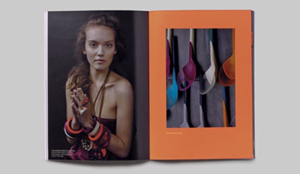
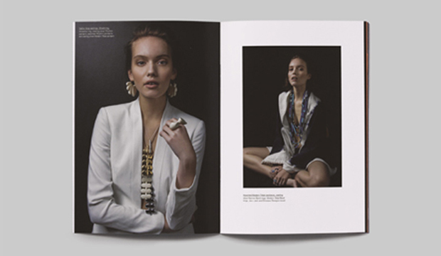
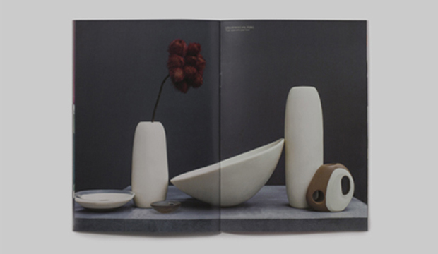
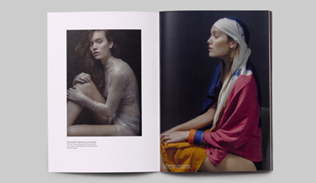
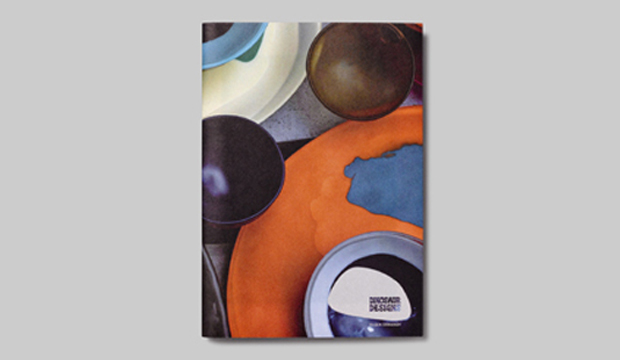
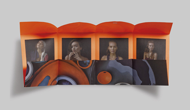
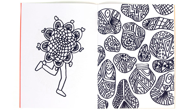
Dinosaur Designs is one of the Australia’s most celebrated brands in jewellery, homewares and objet d’art. To showcase their stunning new range, Dinosaur Designs aka Louise Olsen and Stephen Ormandy, partnered with Hoyne Design and photographer Nicholas Samartis to produce a highly collectible annual publication. Its graphic and textural imagery had us at page one. The theme is modern tribal, as Louise Olsen said: “With this collection, we played with the rhythmic sensibility of colour and pattern. Strong earthy tones are balanced with earthy neutral tones.
The 32pp A5 booklet is printed offset CMYK with fluoro orange ink on HannoArt Satin 170gsm and cover Impact 100% recycled 300gsm. The dust jacket is designed as a treatment which unfolds to reveal a double sided poster, printed offset CMYK with fluoro orange on Impact 100% recycled 100gsm. The publication is a work of art in itself – a real little beauty that does the brand justice. To view Dinosaur Design’s beautiful new range see www.dinosaurdesigns.com.au/collections
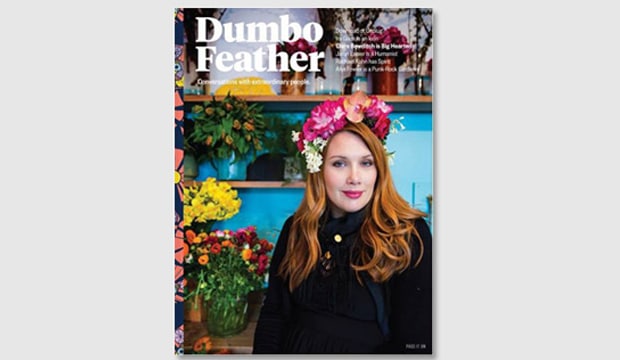
We get a real kick out of seeing commercial print projects that use our stock. We’ve long been lovers of Dumbo Feather, a magazine that profiles some of the more interesting people on the planet like editor of Monocle Tyler Brûlé, Alain de Botton and more recently Clare Bowditch. We’re talking conversations with artisans, activists, composers, choreographers, chefs, humanitarians, ethical fashion designers a media mogul even.
The latest issue is gorgeous with its burst of colour on the front care of Clare’s flower head piece. The mag is printed on two of our uncoated stocks Sovereign Offset 250gsm (cover) and Sun Offset 120gsm (text). Another example of people making our paper look daaaamn good.
For your local Dumbo Feather stockist email the team admin@dumbofeather.com or have them delivered straight to your door.
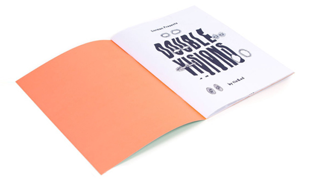
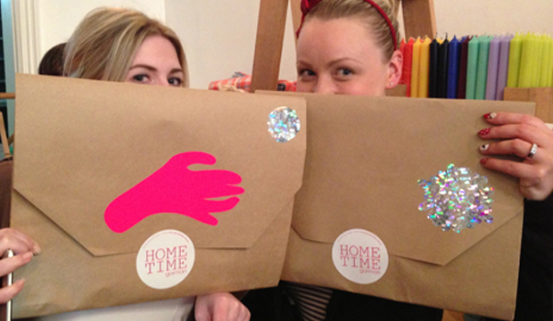
Tin&Ed from downtown Fitzroy have created a colouring book (for big kids just like us), especially for the release of Lisa Gorman’s new home wares range – Gorman Home Time. The ‘Double Visions’ colouring book features hand drawn illustrations by the talented duo and at a neat $39.95, could be just the gift for your favourite person this Christmas.
The limited edition 16pp book is printed 5 colours including an orange and red fluoro ink on Sovereign Offset 135gsm and cover Sovereign Offset 300gsm with a colossal holographic foil on the front and back for some extra bling!
For all of you chomping at the bit to feast your eyes on Gorman Home Time, the range is available in two special pop-up shop locations in Melbourne – Shop g08 at the GPO, and 336 Brunswick Street, Fitzroy AND of course it’s all available online too!
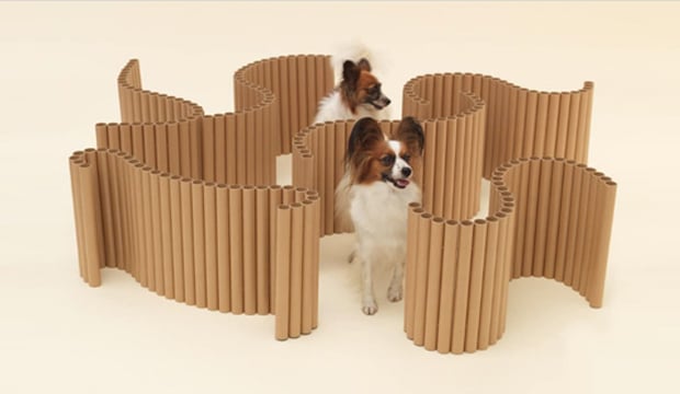
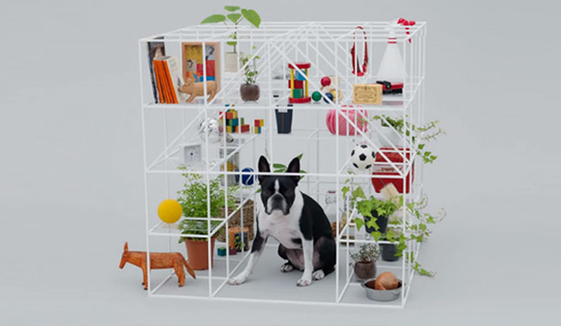
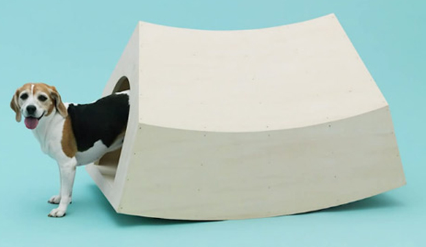
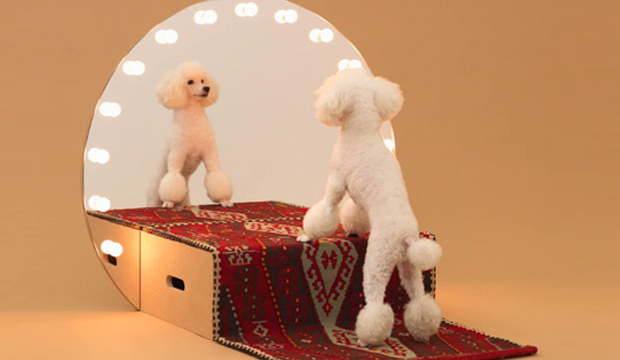
We found this hilarious website the other day ‘Architecture for dogs‘. Well, it might be funny to us and quite serious to others but either way it’s totally cool. Invented by a group of clever architects and designers, people all over the globe can watch the videos, download any of the 13 blueprints or pictures and make the constructions themselves. Sort of like a poochy IKEA yet much more elaborate. Ingenous really.
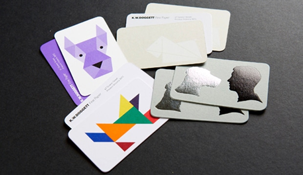
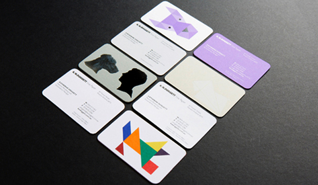
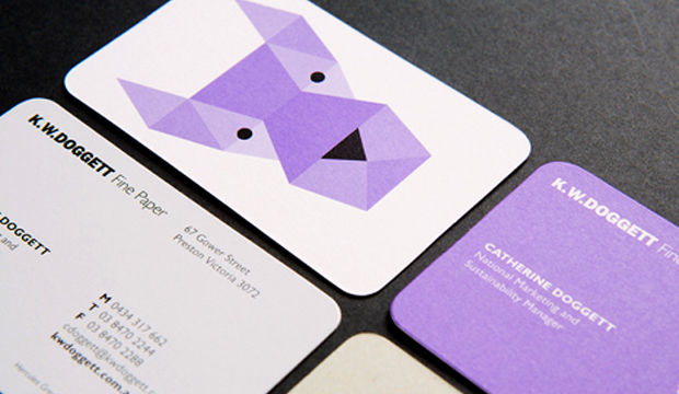
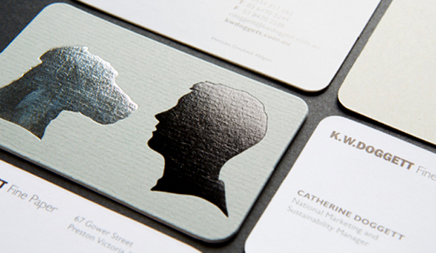
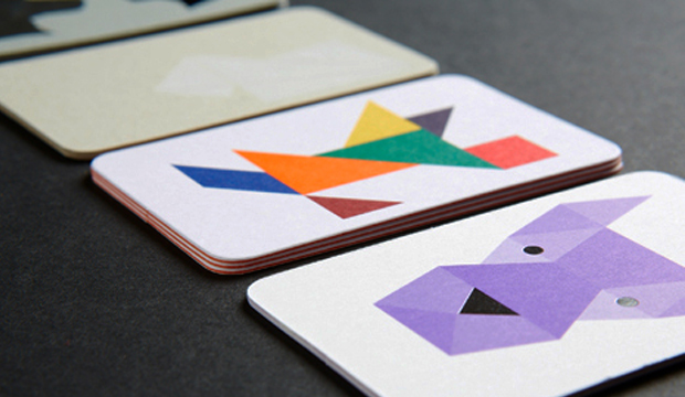
Our new look business cards have arrived and look smashing, bringing us from the 90’s to the noughties, oh yeah!! There has been a suite of four cards designed by David Lancashire Design (VIC), the same peeps that designed the Doggett branding many years ago. We used a variety of stocks and printing processes as part of the overall rebrand.
Here is a description of the four cards:
1. Purple geometric dog – printed 1 PMS 266 (Doggett purple) and black on Strathmore Premium Super Smooth Ultimate White 432gsm.
2. Origami dog – printed matt white pigment foil stamp on Hercules Greyback 450gsm.
3. Silhouette dog – printed gun metal grey foil + matt black foil stamp on Conqueror Laid Concrete 300gsm duplexed to Conqueror CX22 Diamond White 320gsm.
4. Tangram dog – printed 4 colour process (high gamut*) plus 1 PMS on Knight Smooth White 200gsm and triplexed to Kaskad Fantail Orange 270gsm.
Print specs:
• All the shells were printed at Southern Colour (VIC).
• Foiling was done at Lorimier (VIC).
• All overprints done at Taylor’d Press (VIC).
• Cards designed by David Lancashire Design (VIC).
*Southern Colour have an offset process called high gamut that makes certain colours like blue, orange, green really pop. It’s a special process where two or three inks are added in addition to CMYK, to extend the colour gamut and enable the press to print a wider range of colours. This in turn makes images look more vibrant, or ‘pop’ with colour.
Ask your local paper specialist or account manager to show you the cards if you’re keen to have a look at the re-design. Enjoy!
Stocks: Conqueror CX22 / Conqueror Laid / Hercules Greyback / Kaskad / Knight – Smooth / Strathmore Premium Super Smooth.
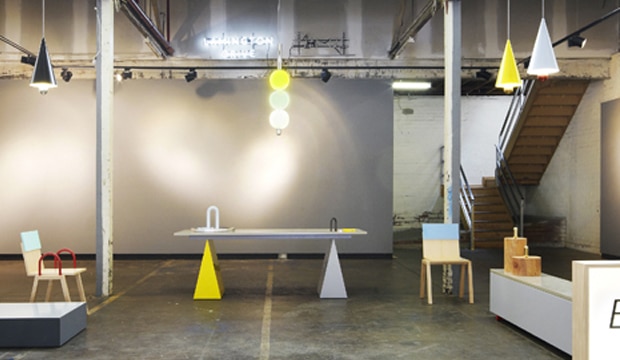
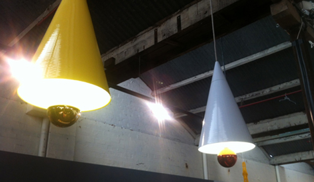
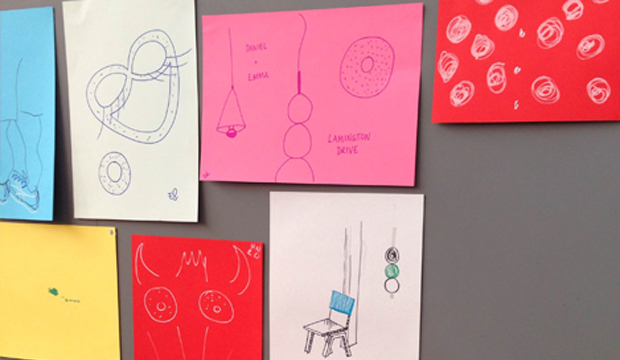
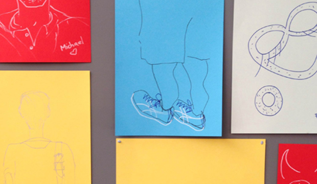
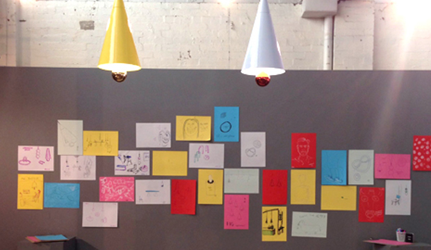
Adelaide based design duo Daniel Emma (Emma Aiston and Daniel To) recently launched their striking new range of design pieces. Think furniture, light fittings and table top paraphernalia, in a ‘still life’ themed exhibition called BIG! at Jacky Winter’sLamington Drive in Melbourne. We went along and we liked it A LOT.
Lamington Drive ran two workshops inspired by the exhibit. The first encouraged visitors, both adults and kids, to illustrate Daniel and Emma’s still life scenes using a mix of our uncoated stocks including some crazy colours from the Kaskad range and then pinning their work to the gallery walls. The second workshop was a demonstration featuring the ever-so-talented Melbourne illustrators Beci Orpin and Madeleine Stamer, who created their own in-situ still life illustrations. The exhibition space is now filled with colourful wallpaper featuring the artistic endeavours of Melbourne’s young and old, what a fantastic community project!
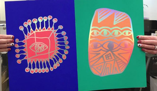
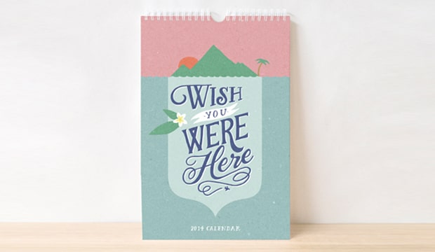
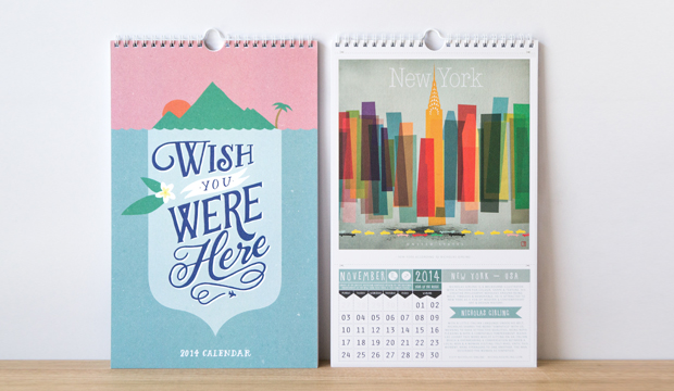
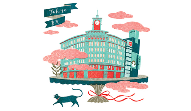
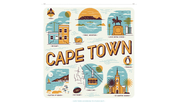
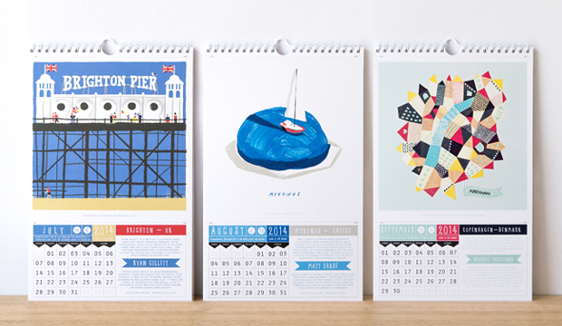
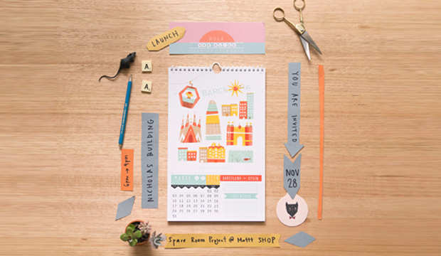
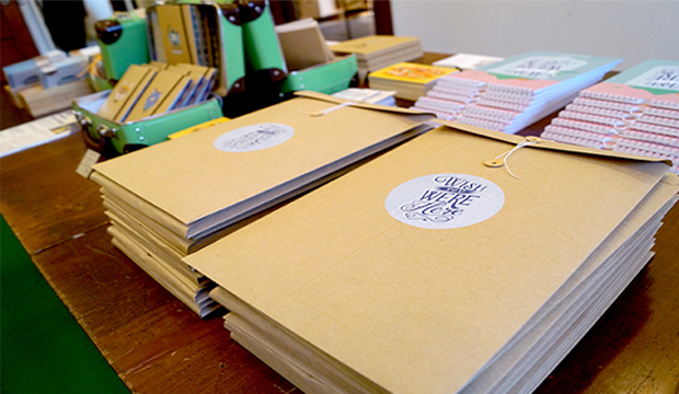
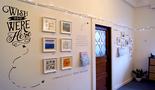
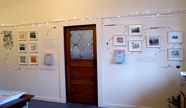
Each year Melbourne based stationery label, Ask Alice aka Sass Cocker, releases a charity calendar to raise funds for a not-for-profit organisation. ‘Wish You Were Here’ is the 2014 calendar, featuring a hand-picked selection of artists from all over the world, sharing their favourite city.
The 2014 project is raising funds for the Asylum Seeker Resource Centre (ASRC) with 100% of the proceeds going to the ASRC. This is truly a love project for Sass, who we’re proud to support in her pursuit of creativity and charity. Printed on Sovereign Offset Digital – Indigo 300gsm, this has to be our favourite calendar to-date (not that we didn’t like the others, there’s no favourite children here). The colourful print and imagery sure do make our paper look good!
To celebrate, a calendar launch was held in Melbourne last week with an exhibition of limited edition artworks. You can see the exhibition with your own peepers up until 22 December, click here: https://www.facebook.com/events/543445615742336/
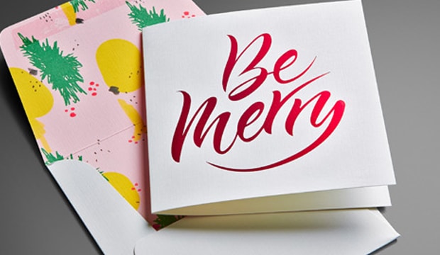
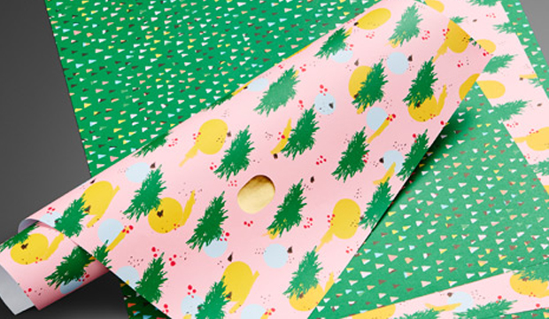
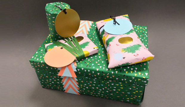
We had a very merry time creating our Christmas cards this year. For something extra special, we also created matching wrapping paper and some gift tags. It was an international affair this time around. The ‘Be Merry’ was crafted by the very talented calligrapher Henric Sjösten (Sweden). It was an LA based artist, Ashley Goldberg, who created the cheerful pattern on the inside of the envelope and two kinds of wrapping paper (a pink pattern and a green triangle pattern).
In keeping with the festive spirit, we wanted to have a bit of fun and showcase a variety of stocks and finishes:
Card – printed 1 colour black + red foil stamp on Strathmore Premium Cambric – Ultimate White 270gsm.
Envelope – custom made, printed 4 colour process +1PMS348 U (dark green) on Strathmore Premium Cambric – Ultimate White 216gsm.
Wrapping paper pattern 1 – printed 4 colour process +1PMS348 U (dark green) with gold foil highlights on Sun Offset 120gsm.
Wrapping paper pattern 2 – printed 4 colour process +1PMS348 U (dark green) on Sun Offset 120gsm.
Three coloured circle gift tags diecut – Kaskad Salmon 270gsm, Kaskad Puffin Blue 270gsm and Lustralux Metallic Gold 250gsm.
Phew! We love spreading Christmas cheer, did we mention we also moonlight as carollers?! Just kidding. Enjoy!
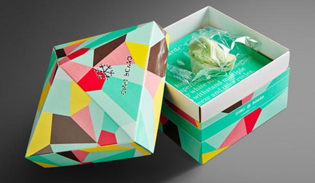
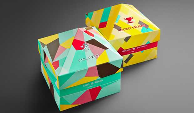
Title:2013 packaging promotions
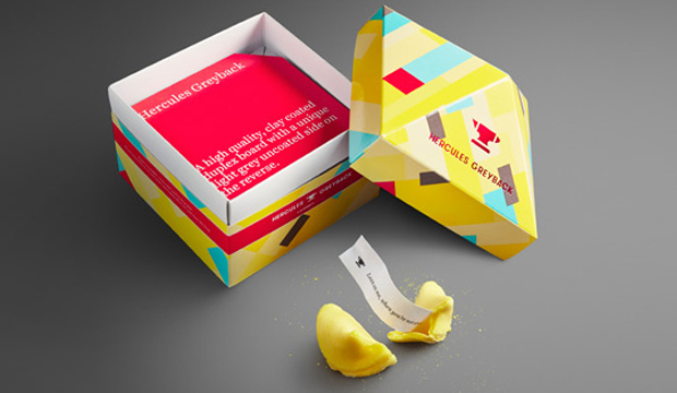
Agency: Seesaw (VIC) Client: K.W.Doggett Fine Paper Stocks: Chill Board / Hercules Greyback Printed by: Colna (boxes and coloured pad squares), Avon (foiling), Pala’s Print (pad squares with one colour print). All suppliers in VIC.
Thinking outside the box (gotta love a pun!), was the premise for the creation of these clever little stackable boxes. We thought it was about time to put some attention on our portfolio of packaging products so Chill Board and Hercules Greyback are the first to feature in this new look, developed by our friends at Seesaw.
The aim was to create promotions that were functional, fun and memorable. Something that wouldn’t be thrown into the (shock horror) bin when the rep leaves the building. It was important to create something unique yet complementary so we could add other packaging products to the suite down the track.
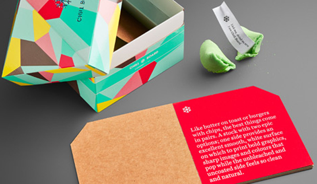
We like to have a bit of fun here at Doggett’s and Seesaw does too. The bold, colourful graphic patterns are a real stand-out. When Seesaw suggested a pad of samples to make the piece memorable and functional we thought: ‘Yeah for sure’ and they really had us at: ‘Let’s put a fortune cookie in the box’. They developed an icon for each so a snowflake for Chill Board, pointing to its freezer qualities and an anvil for Hercules Greyback, reflecting the strength of this particular product.
The first few pages of the pad, which acts as a mini swatch of sorts, talks about the features and benefits of the product and the remainder is a sample sheet from each grammage in the range. The idea is for our customer to be able to tear them off when visiting their client. Once again, clever.
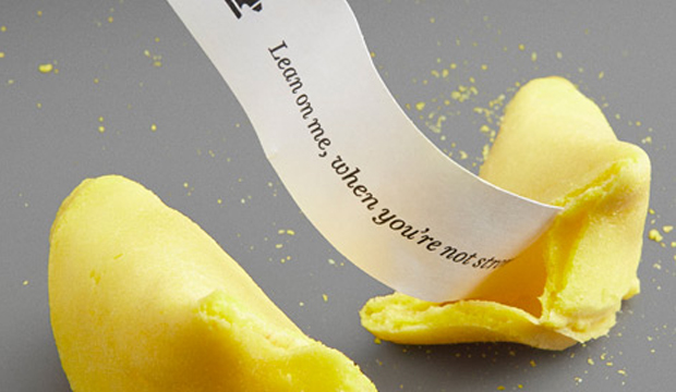
The cookies include an assortment of five fortunes that are related to the benefits of each product. Chosen to fit in with the respective colour palettes and the products, we chose mint (green) for Chill Board and a banana (yellow) for Hercules Greyback. The sayings are the best like the ‘Freeze me baby one more time’ and ‘I want to pop your colour’ for Chill Board and ‘I give good stiffness’ and ‘Lean on me when you’re not strong’ for Hercules Greyback. It may just be us and our need for a holiday but we think they’re a crack up!
Speak to your paper specialist or account manager for a copy of the promotion if you haven’t already seen it. And if you ever have any specific packaging related questions, contact our business development manager John Alipan. He’s like a guru of packaging and even wears kaftans and burns incense in the office. Ok, so maybe not the last part but it would be great to see a kaftan around the office.
Applications (Hercules Greyback): All the necessities in your life, the ones you can’t do without – biscuits, nails, toiletries, tissues, soup, cereal, washing detergent and pharmacy products. Oh and popcorn too.
Applications (Chill Board): Only the most delicious things in life like ice cream, pizza, beer, frozen berries and pies. Oh, and pretty cosmetics too.
Stock specs: Boxes and coloured pad squares – Hercules Greyback 350gsm and Chill Board 361gsm. Rest of the pads represent each grammage in the range.
Print specs: Boxes are offset printed with four PMS colours (PMS 333, PMS 102, PMS 1788, Warm Grey 11) plus some stipples. UV gloss varnish on boxes only. Grey squares warm grey 11 printed with a rubber stereo. Foils – silver confetti (Chill Board) and 098 red (Hercules Greyback).
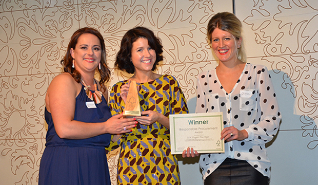
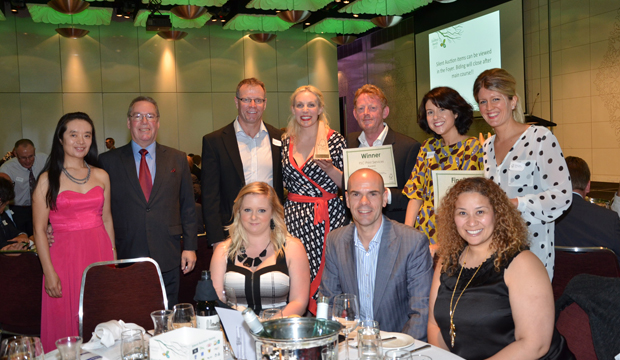
On Thursday 7 November we won something fabulous! The award for ‘Responsible Procurement’ at the Forest Stewardship Council 7th Annual Excellence Awards. The Responsible Procurement Award is for companies who demonstrate commitment to acquiring FSC products such as office papers, print services and furniture throughout their organisation as part of a Corporate Social Responsibility strategy. We were also a finalist for the ‘Print Services’ award.
The ceremony was attended by printers, corporates, government, retail brands, timber and forestry companies among others. It was lovely to be acknowledged for our FSC efforts as we continue to help promote environmentally appropriate, socially beneficial and economically viable management of the world’s forests. Did you know that we were one of the first companies in Australia to be certified and over 85% of our stocks are now FSC certified? Ideally we are working towards stocking 100% FSC certified stocks. If you are interested in taking care of the forest too, you can visit the FSC website or our website.
FSC is an international, non-profit organisation founded in 1993 by environmentalists, social interest groups, responsible retailers and leading forest companies to develop standards to manage and protect the health of our forests. And as we are in the paper business, it is absolutely imperative our paper comes from responsibly managed forests and that we do our bit for the environment.
 Footy Tips