Footy Tips
Title: Woolwich Pier Hotel direct mail piece
Agency: Matter Design (QLD)
Client: Woolwich Pier Hotel
Stocks: Knight – Vellum
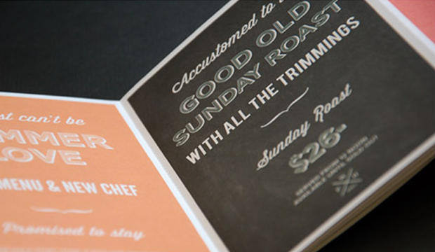
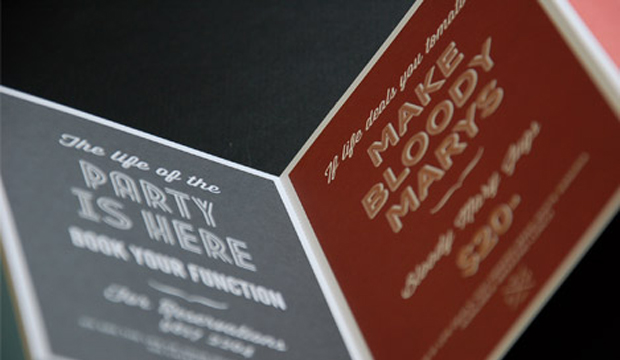
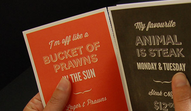
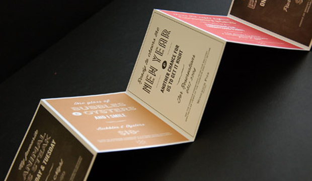
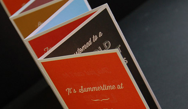
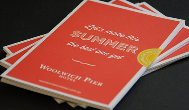
Here’s a direct mail piece that must have had thousands of people in the Lower North Shore and Ryde areas wanting a beer and hearty pub meal! Printed on Knight – Vellum 200gsm, the piece is a 7pp concertina fold with perf, created for one of Sydney’s most iconic pubs, the Woolwich Pier Hotel. The studio behind it is Matter Design (who also designed the hotel’s website and promotional posters).

Matter Design was asked to develop a new style to attract an audience over the Christmas and New Year period. The brief was to take a typographical approach and still have that traditional English feel but with a modern twist. Mission accomplished! You may recognise some of the free Conqueror typefaces that were used – Carved and Inline. Other fonts include Wisdom Script and League Gothic.
The Knight range is known for its tactility and elegant nature, factors that Matter Design took into account. They wanted people to pick up the piece and interact with it so Knight – Vellum was a good choice for them. The client provided creative freedom in all respects which made for a very happy design studio. It’s clear in the outcome – such a fun colour palette and lovely typography, quite different to regular pub branding.
Given the large print run (14,000), the job was offset printed by Lindsay Yates Group. Alyce Biggs from Matter Design explains: “The colours were practically spot on with the Pantone breakdowns on the 7 spot Heidelberg Speedmaster. The printer has great attention to detail and a great technical system so our CMYK was as close to the Pantone as it could be.”
We hope Matter Design keep producing such beautiful printed pieces. We like them a lot.