Cleveland & Co property brochure by Hoyne

Title: Cleveland & Co residential and commercial precinct
Stocks: Doggett Boxboard and Impact
Printing specs: Offset printed
Printed by: Green and Gold (NSW)

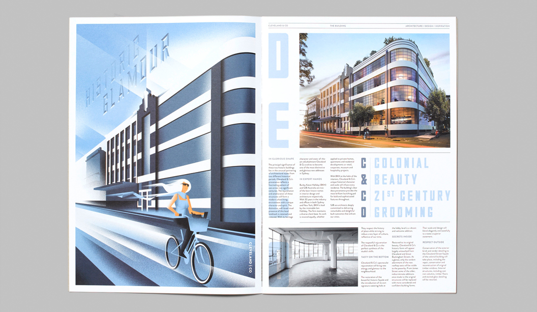
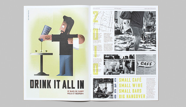
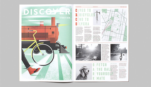
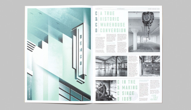
Hoyne recently designed the property campaign for ‘Cleveland & Co’, a restoration of two historic warehouses in Sydney’s Redfern, into one flagship residential and commercial precinct. The campaign heroes the art deco aspects of the building, combining it with some 21st century styling that takes the modern industrial look to a whole new level.

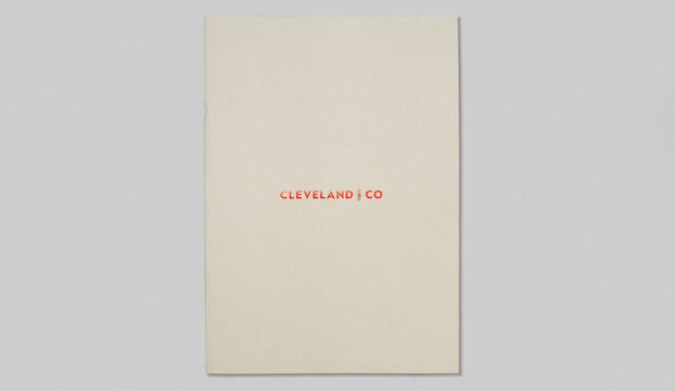
The brochure features a Doggett Boxboard 310gsm cover to reflect the buildings historical roots as a manufacturing and warehouse space, with red foil as a nod towards its recent premium renovation. The text pages are printed on Impact 100% Recycled 150gsm. The natural, uncoated surface of the stock really highlights the simple, clean shapes and stylised imagery of the incredible Art Deco illustrations created by commissioned artist, Matt Johnson.

Hoyne shares: “The old buildings had a fascinating pattern of use across two significant centuries, their structures have got real character and a unique spirit. What they needed was a confident, progressive campaign with panache.” And that’s exactly what Hoyne delivered.

Cleve&Co-1

Cleve&Co-2

Cleve&Co-3

Cleve&Co-4

Cleve&Co-6

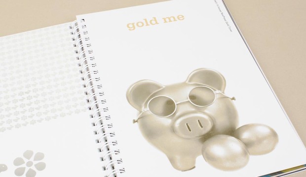
NexPress Gold Dry Ink is the bling without the price tag

Looking for a bit of sparkle without the cost? Need a job turned around quickly and want to add an embellishment? Well, if you didn’t already know, you’re about to find out how. A Kodak NexPress is a dry toner machine (powder toner as opposed to wet ink). The NexPress Gold Dry Ink offers a shimmery, metallic print effect.

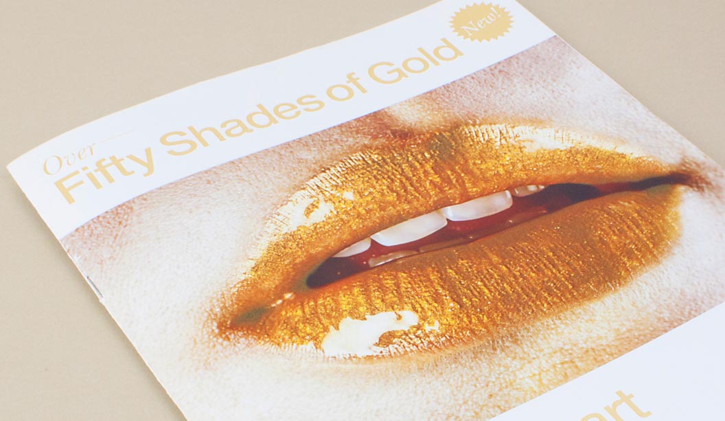
To find out more, we interviewed two printers that are currently using this technique. Tony Parker, General Manager from Impact Digital in Melbourne and Theo Pettaras, Founder and Digital Print Innovator of Digitalpress in Sydney (the main image you see is from their promo piece). These lovely chaps are doing some fun things with this sparkly bit of goodness.

What is the gold ink technique and what does it look like?
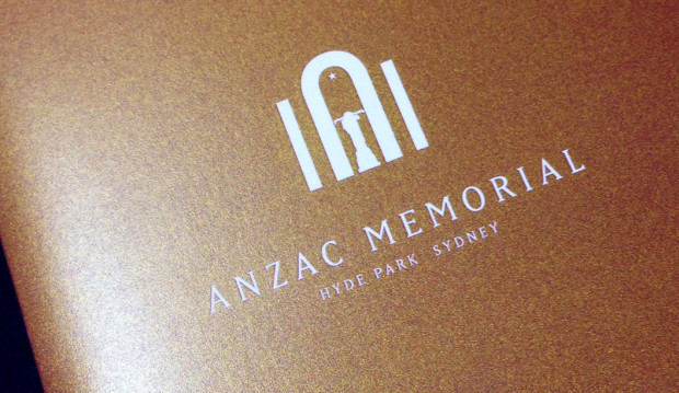
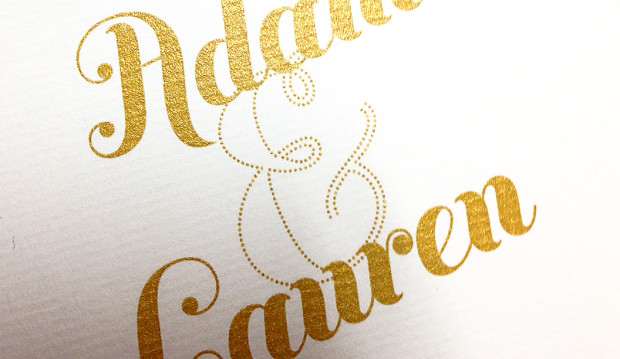
The NexPress Gold Dry Ink produces a true metallic gold pigment, similar to traditional PMS metallic gold. It’s the first toner to provide a metallic look with sparkle effects. It’s applied on the fifth imaging station of the press and works inline with CMYK print. The effect can be used to enhance both raster and vector art, text and images. Laminating or UV coating jobs printed with Gold Dry Ink produce really sparkly results.

Gold_3

(Image above courtesy of Digitalpress)

Is it cost effective in relation to regular metallic ink?
This technique replicates traditional PMS gold but is good for short runs which is a big advantage. It’s cost effective but like with anything, it will depend on the quantity and product being printed. As a general guide, it increases the cost of digital CMYK printing by around 30%.

What applications can you use it for?
We wanted to quote the guys directly here because we love what they said. Theo said: “The applications are only limited to your imagination.” Tony said: “You can use this application on any product where a sparkle may be required!” And now the serious answers…use it for direct marketing to stand out from the regular kind of DM pieces, short run magazine and book covers, postcards, business cards, certificates, invitational work eg birthday’s or weddings, stationery items and wine labels to add a touch of sophistication.

What stocks work best eg colours, coated v uncoated?
Use this technique on all sorts of stocks. Gloss coated ones will make the gold stand out a bit more. White works well too for this reason. You do need to know that if you want to use coloured stocks it can affect the colour of the gold as it is transparent. Usually when you print a metallic ink on an uncoated paper the sheet will naturally absorb the ink which can lose the shiny metallic effect. So best to print CMYK underneath the Gold Dry Ink first.

Can you print different shades of the gold?
Yes. You can actually integrate tints and 4 colour process colours with the Gold Dry Ink to get loads of different ‘gold-ish’ (Theo’s word!) colours. Digitalpress has created an awesome book called ‘Fifty Shades of Gold’ where they had some fun with expanding the metallic colours.  When printed on top of another color, Gold Dry Ink can be used to simulate a variety of metallic effects including copper, bronze
and a wide range of metallic colors (quoted directly from the Kodak website).

2

(Image above courtesy of Digitalpress)

Tony mentioned they printed gold over the top of a red Christmas bauble once to produce a red metallic colour. The gold is not opaque so the other colour underneath it could be seen. They’ve got an awesome book called: ‘The digital print manifesto’ that is a wealth of info on digital printing in general.

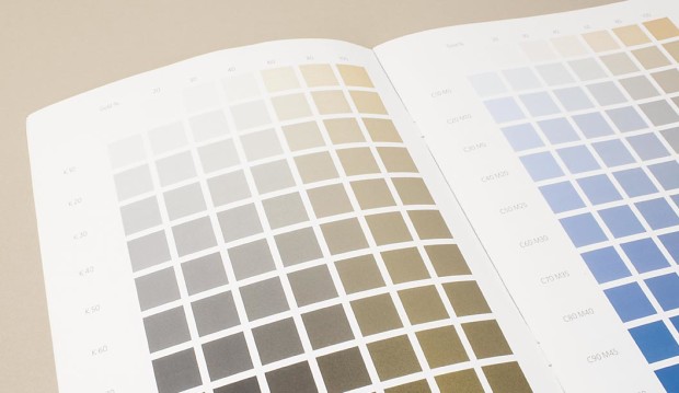
And this nugget of gold (sorry, we couldn’t help it!) came from PaperSepcs, it’s a great explanation. The press first puts down CMYK then gold, which is treated like a spot colour. So you can add 10%, 20% etc on top. Or, if you want to highlight a specific tone in the image, you can use the gold like a bump plate.

5

(Image from the Impact Digital ‘The digital print manifesto’ book).

Hints for preparing files so they’re set-up to take gold ink.

Digitalpress in NSW has file set-up specifications on their website. If you’re working with Impact Digital in VIC, Tony suggests setting up your file with a PMS colour in the area you want the gold to appear, then rename the files to NexPress DryInk gold (case sensitive).

gold_1

(Image above courtesy of Digitalpress)

Camilla look book by Heather Hawk

Title: Camilla look book ‘In the name of the tribe’
Stocks: Skin Curious Collection, Grange Offset
Printing specs: Offset printed with some Spot UV highlights
Printed by: Platypus Graphics, QLD
Finishing by: Craftsman Bookbinding, QLD and Vivid FX, QLD

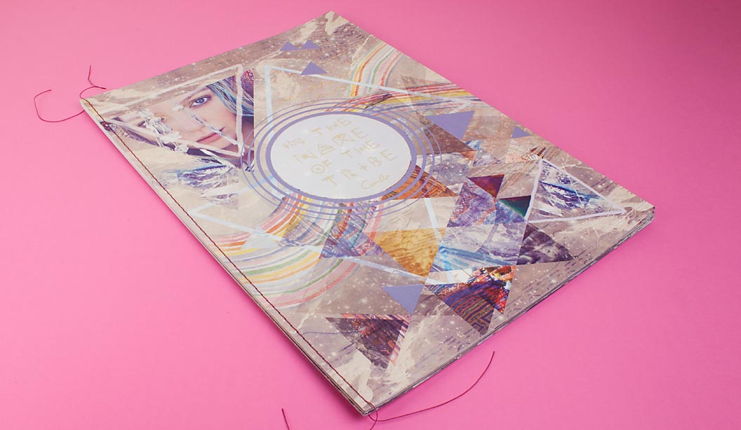
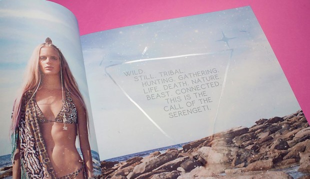
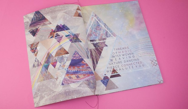
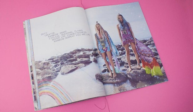
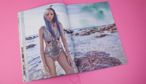
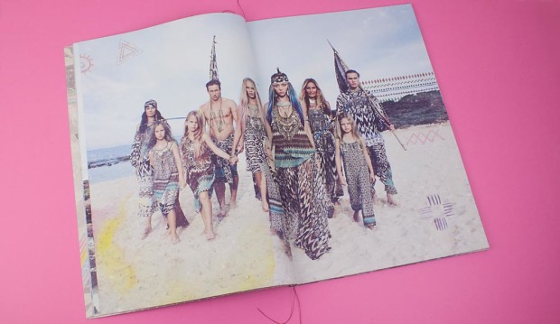
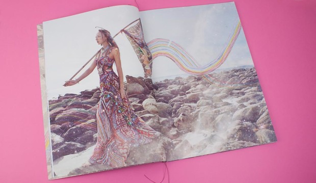
Heather Hawk is a very lucky designer in our eyes. She gets the fun job of branding each season for Camilla and translating the creative direction and styling of the shoot into a printed piece.

The latest look book reflects a 10 year celebration and Camilla wanted to make it super special. A lover of travel, Camilla’s latest adventures were spending some time with the tribes in the hills of Vietnam. Heather gets her inspiration for design elements and patterns from immersing herself in details like this. She then presents logo and design direction options to Camilla and the team and they choose their favourite.

12

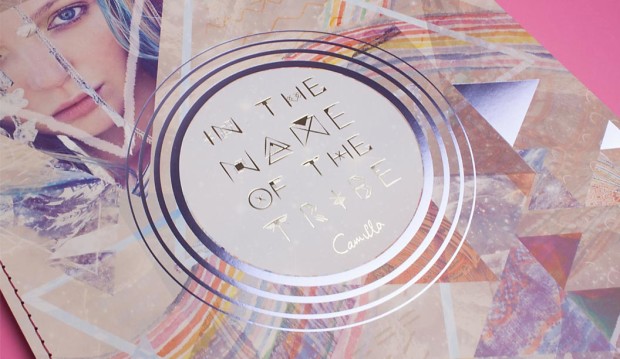
Part of what really makes this look book is the large format, singer sewn binding, not to forget the silver foil on the cover and illustrations throughout. Those rad hand painted rainbows and tribal symbols Heather draws with her own hand. Her own hand!! Amazing.

“There’s also something important I should mention about the whole experience of a Camilla look book,” says Heather. “It’s not only visual but textural. Camilla’s brand is all about the customer experience. So on the inside pages there are spot UV tribal symbols that are not necessarily clear to the eye but they pick up the light, and when you run your hand over them you feel the raised texture.”

11

This spot UV process is something Platypus Graphics do really well. What it does is makes a particular area of the page come to life (like in the above picture), adding a special touch to the piece. Heather wanted to use Skin as she finds it holds the colour really well. “I wanted the colour to pop and it also feels amazing. Grange – the uncoated text stock, is amazing too.”

As we say, it’s not just about our paper, it’s what you do with it! And you, Heather Hawk (and Platypus Graphics of course), have made it look totally rad.

10

7

6

3

2

Meet Peter Hansen, our corporate business development manager

We want to start introducing you to the people behind the paper.  Many of you may not know Peter Hansen aka the rockstar.  He’s a lovable, hard working guy who is well known for wearing extremely bright socks!  He likes his rice white, he’s a mad boxer and our business development manager servicing the corporate sector.  We took some time to sit down with Pete and find out what happens in a ‘day in the life of a rockstar’? We didn’t edit anything he said. Enjoy.

How many years have you worked in the paper industry?
Eighteen. I started working at Spicers, calling on the printers then ended up back selling and calling on the designers and ad agencies.

How many years have you worked at Doggett’s?
Nine. I’m based in the Victorian office but I work around Australia.

What does a day in the life of Pete Hansen look like?
I get in very early, like 7:30am and make appointments for the following week, so I’m always working a week ahead. I go out and discuss new products with my customers, go over their jobs. I discuss applications of our current papers that might suit what they’re doing and generally become part of their decision making when it comes to stock selection. My motto is I don’t have to win every order, but I want to get every phone call to have the opportunity to win every order. This makes me focus not just on sales, but education. Whether it be paper, printing or the environment.

I work mainly with the print managers who service big clients in the telecommunications, FMCG, property and retail sectors as well as advertising agencies.

I might get some rice for lunch.  I always have three apples in the car.

My main tool is my mobile phone which I am on the whole time in between visits.  I don’t listen to the radio. Instead I spend time speaking to my clients as this gives me a good opportunity to discuss upcoming jobs.

I take my iPad into client visits and show them certain jobs we have on our blog or pages on our website they may need to know about. The iPad is great.  Easy for us older blokes.

I also have clients I see in Melbourne who I go and visit in the other states such as  the Herald and Weekly Times. I also travel interstate and go out on the road with my colleagues. I go see the corporates, ad agencies and print management companies in other states. Quite a few of these have a national focus so it makes sense for these clients to have a national contact who can discuss their needs in each state.

How has the industry changed since you’ve been working in it?
The print management companies can play a critical role in the decision making process of a print job. In our case they look to us to provide advice on appropriate paper stocks for print jobs. Along with corporates, print managers are who I predominately spend my time servicing, showcasing and educating our broad product range.

What has also changed is the turnaround time for delivering stock. Customers require outcomes quicker than they did 10 years ago. For example, a phone call comes in at 9am and the printer needs it delivered tomorrow. Used to be about a week turnaround.

And new stocks and applications – there are so many more now. What I am talking about today is not what I was talking about 10 years ago.  It used to be all about offset papers. Now we’re talking digital, synthetics or wide format as well as everything else.

What do you love most about your job?
I love it because of where I work and the relationships I have built over the years. I make sure I grow them. When all things are equal, the relationship will win the order so for me it’s crucial I spend time making sure my customers receive what they need and want. I am their problem solver and also provide the solutions.

What do people at Doggett’s know you for?
They know me for being in their faces. What I mean is, if I need something, I’ll go out and get the answer and hopefully come up with the appropriate solution. I don’t just sit back. I find what I need. And that I am great with my clients. I do what I am paid for.

What are some things you do outside of work that you love?
Boxing, weights (as you can see). I also play in a 60s/70s cover band and I like to go see other bands in my spare time. I’m going to see one tonight at the Cherry Tree.

If you want to contact Peter yourself email him here phansen@kwdoggett.com.au He’d love to talk paper, boxing or rice with you.
Limited edition prints by Liesbeth Thie from Two Tone Design

Title: Limited edition prints by Liesbeth Thie from Two Tone Design
Stocks: Knight Vellum 
Printing specs: Screen printed
Printed by: Cosmic Screenprinting QLD

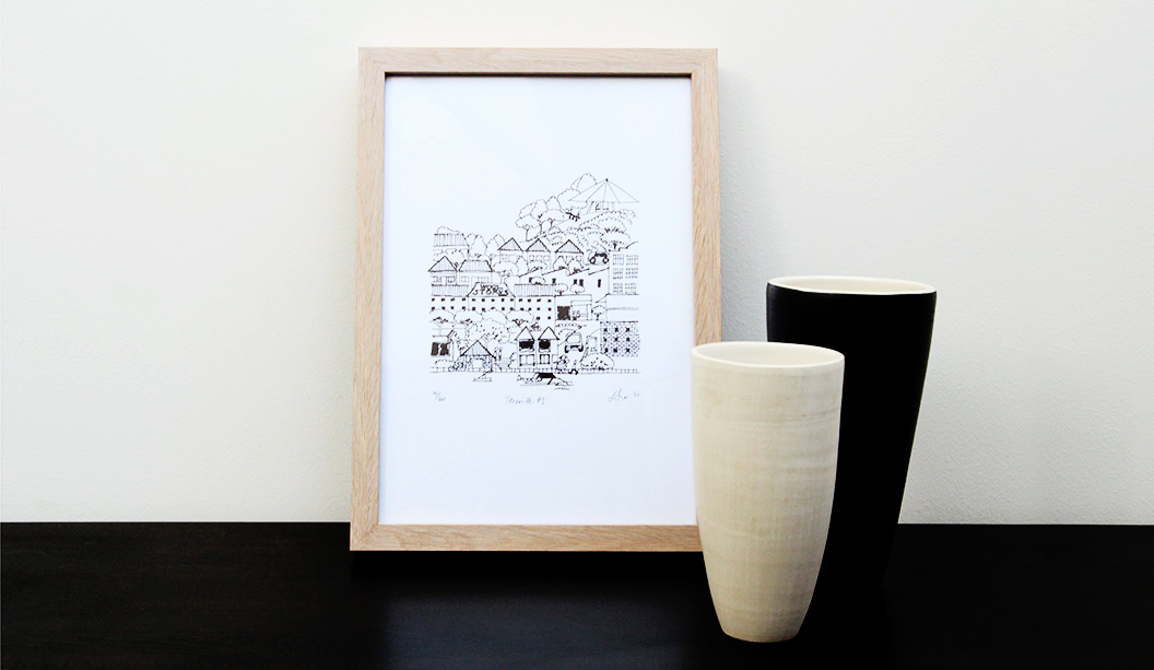
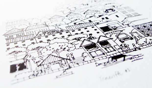
Everyone digs something limited edition. It makes the item all the more special. This lovely range of prints are just that. Graphic designer Liesbeth Thie from Two Tone Design has created some limited edition prints that capture the cosmopolitan Brisbane suburb of Teneriffe, showcasing her love of architecture, history and design with a modern Brisbane flavour.

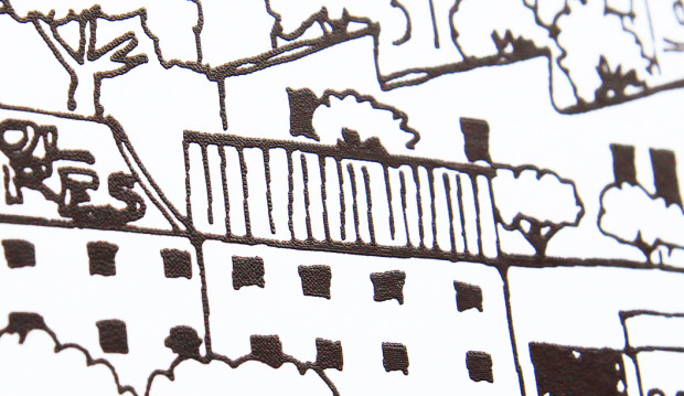
Her original line drawing has been screen printed in a range of colours on Knight Vellum White 280gsm. Liesbeth shares: “The bright white paper has a crisp finish which was important for positioning the prints as a premium product. I chose to screen print the artwork as it creates a great raised effect in the line work and adds a hand-made touch to the range.”

The prints are the first in what Liesbeth hopes will become a series of beautifully designed and printed keepsakes promoting the city she grew up in and still calls home. You can get your paws on some via https://www.etsy.com/au/shop/TwoToneDesign or New Farm Editions in Brisbane, as well as the Museum of Brisbane shop in City Hall.

Two-tone_2

Two-tone_1

We need to start the ‘stride of pride’. Print is king.

Hooray for Kellie Northwood, Executive Director of TSA Limited which runs Two Sides Australia (environmental campaigns) and VoPP (effectiveness campaigns) for the paper and print industry. Kellie has loads of experience and her writing is backed by research. She’s fed up with the pervasive lack of confidence in the industry about the future of print. Instead, she encourages people to stick to their guns, do the research and talk up the benefits with customers. We dig her attitude!

By Kellie Northwood.

Whether an industry event, a training session or a meeting, as I journey throughout the print industry, I find myself twitching when I hear some people talk in a way that concerns me. A voice that can become more powerful and more concerning than declining industry metrics, government cut-backs and site closures – I twitch when I hear a lack of confidence. Nervous comments over whether there will be a print industry in ten years, five years or three years. Fear over whether people will have the skills to work in the industry. A lack of confidence that print has no value and more.

Some fears have merit – with print companies folding we can be concerned as to our future employment prospects. With a communications revolution we can also be guaranteed that our industry has and will continue to change over the years ahead. However fears concerning print’s value, relevance and future prospects carry no weight with me. As an industry we must stop focussing on each other and start focussing on print as an effective, cost-efficient and powerful media channel.

A media channel that offers greater return on investment (ROI) than Online, TV and Radio. Is reported by the largest research companies across Australia – Roy Morgan Research, Neilsen, and GfK to name a few – as the strongest performer in effectiveness and influence surveys. Surveys that deliver consistent high-performance results across all socio-economic and age demographics and reveal print is the most trusted, credible and reliable. Print is also the most sustainable media channel from carbon footprint, renewable raw materials and industry initiatives over TV, Radio, Digital and Email.

No need to gain confidence from me, the research and data supports everything I am saying – Roy Morgan reports ‘Heavy print media users are more likely to be above average income earners, better educated and big spenders’. Music to marketer’s ears. Roy Morgan continue, ‘Print media continues to be the dominant media channel among those who are asked for advice on a range of product and service categories’.

Psychology reports continue to reinforce the strength of print when retaining messaging – brand awareness is stronger when communicated via print and commercial communication is most effective via paper and print. Your customer’s need to have these conversations not ones forecasting the industry’s doom and gloom. If we as an industry believe our industry has no merit then how can we expect our customers to invest valuable marketing budgets in print?

When asked are printers doing enough? My advice is to stick to your guns, declare proudly that print is still king, gather the research, collate the case studies and take them out to every sales call, every cross-media event, tag them to your websites, brochures and other marketing initiatives. When your real competitors – TV, Radio, Digital, Outdoor – talk to their customers they do not focus on who has the best camera equipment, microphones or ADSL line. They talk about one thing – results. They talk to their prospects about the effectiveness of TV, the ROI of Digital and so on. It’s time we do the same and start reclaiming some of the precious marketing dollars our industry may have lost in recent years. Trust me, the research and data will back you up.

vopp

New products

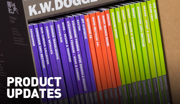
The following is a snapshot of the changes and updates we’ve made. Some exciting new product lines, sheet sizes, weights and reels are now available. Please speak to your account manager for any of the finer details.

Coated:

Uncoated:

  • Kaskad – Bullfinch Pink 270gsm is now discontinued

Packaging:

Doggett Digital:
The new Doggett Digital price book includes the digital sheets you already know about, but some old favourites as well as some newbies are also now available in digital sizes:

Synthetic
•  JPP Synthetic – C Grade now available in 566gsm/500ums and 905gsm/800ums in 760×1020 sheet size

Doggett Labels
• Envirocare 100% Recycled material is now discontinued

Plus, over the next couple of months we’ll be rolling out these changes so stay tuned for more on these:
• Sovereign Offset is becoming carbon neutral.
• Tacky 760×1000 white and clear electrostatic for UV offset
• New shade coming for Grange Offset and Grange Board

Social is so the new black, like

With the never ending treasure trove of visual inspiration on Pinterest, to the cool paper projects our customers have posted on Instagram, there’s hours of fun to be had. So this is really just a super quick reminder we’re on the social airwaves and we’d love you to be part of our online family.

Pinterest: We want our Pinterest page to bring into reality your wildest paper dreams. You’ll find loads of inspiring boards like embellishments, binding and packaging. For a bit of fun, there’s a board dedicated to our four legged friends too. Well, it’s not going to be cats is it?!  Our search for the latest and greatest pins means means we invite a guest pinner to contribute to our page every now and again. Recently it was graphic designer Masaki from Three60 in Melbourne. You can check out one of Masaki’s very cool boards here. We’re always adding new pins so be sure to check in often.

Instagram: We’re so amazed at the creativity out there. It’s not about our paper, it’s what you do with it and Instagram is the perfect platform to showcase this. Keep on posting those paper projects, we love them.

Facebook: Find out about design and print events, videos about paper and sustainability, design projects showing cool print techniques, the odd competition and more.

LinkedIn: We post industry news, insights and company updates on our company page. We’d love you to connect with the Doggett’s team on LinkedIn and we can all share in the paper and print news together.

Twitter: We usually tweet about industry related information and fact based news on paper and sustainability.

YouTube: Visit this platform to be entertained whether it’s a video about iPads v toilet paper or the more serious ones like the video about paper created with citronella to keep people from dying of dengue fever,

Utopia Goods catalogue by Deuce Design

Title: Utopia Goods catalogue
Stocks: Booklet – Keaykolour Original Navy Blue, Conqueror Wove. Postcard – Conqueror Laid 400gsm
Printing specs: Offset printed. Cover: foil on front, PMS 877 Silver inside. Text: 4 colour process plus 1 PMS throughout.
Printed by: Special T Print, Sydney

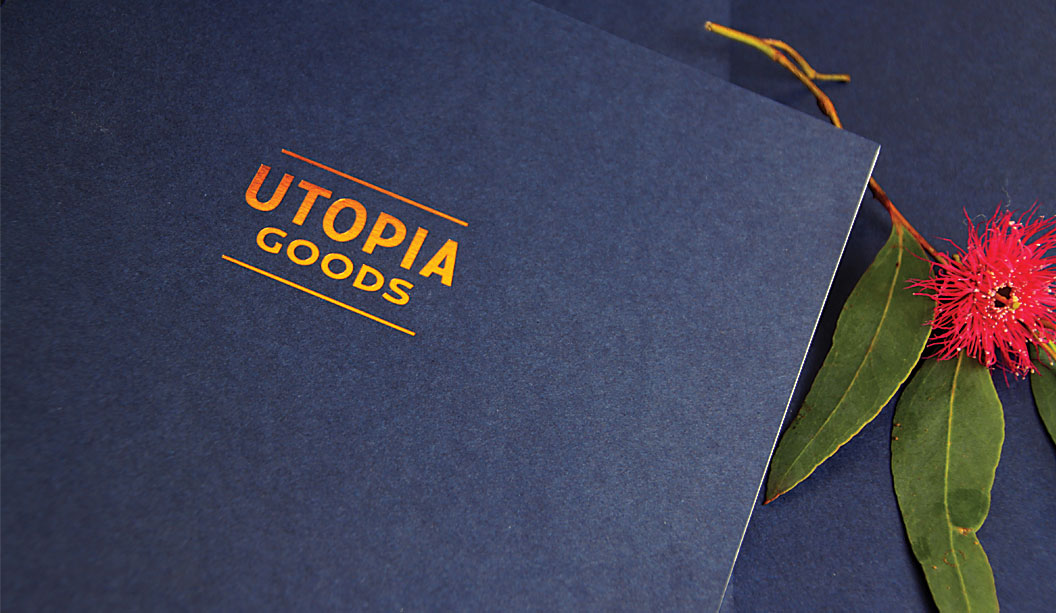
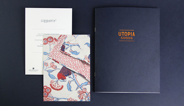
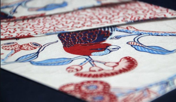
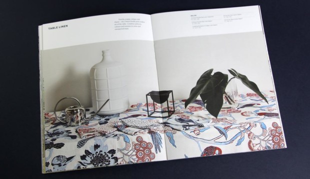
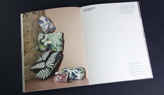
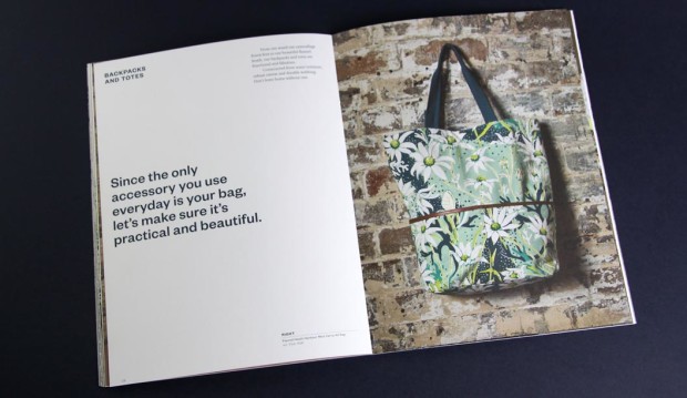
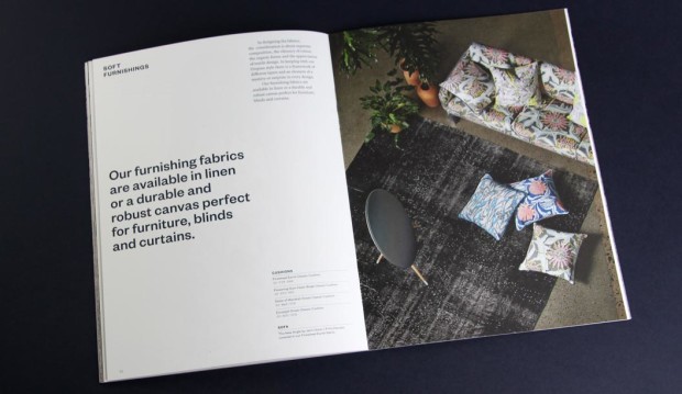
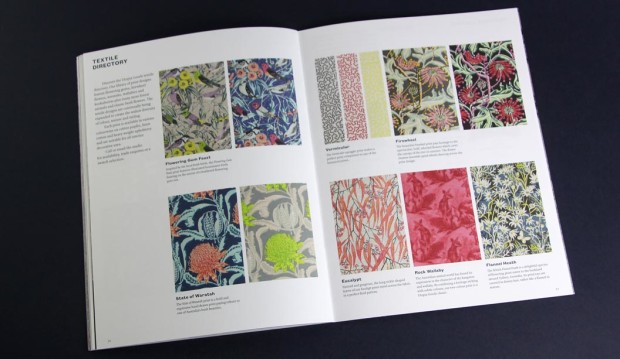
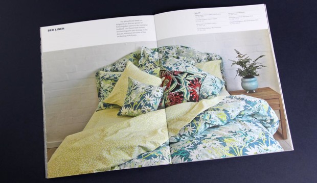
By day Bruce Slorach and Sophie Tatlow run the highly regarded Deuce Design. By night these two crafty cats dream up beautiful modern Australian homewares. Utopia Goods is a range of soft furnishings that centre around Bruce’s illustrative work. It features hand drawn native flora and fauna and is, in their words: “Part maximalist and part sumptuous fabric feast.” We love the colour, the chaos and the maximalist nature of it all. The perfect contrast to all that Danish minimalism of recent times.

UG8

For their printed catalogue, Duece were looking for a paper that would reproduce the beautiful bold colours of the collection and still offer the handler a natural finish. We chose Conqueror Wove Diamond White 120gsm, paired back with a Keaykolour Original Navy Blue cover in 250gsm. The Wove paper is soft to touch, not smooth but certainly not rough. The perfect softer style sheet for a brand such as Utopia Goods. Kudos to Special T Print in Sydney, a superb print job.

Utopia_goods_1

Utopia_goods_2

Utopia_goods_3

Utopia_goods_4

Utopia_goods_5

Utopia_goods_6

Utopia_goods_7