Footy Tips
Artist: Matlok Griffiths
Designers: Shane Loorham from Liquorice/Silent Partner (VIC)
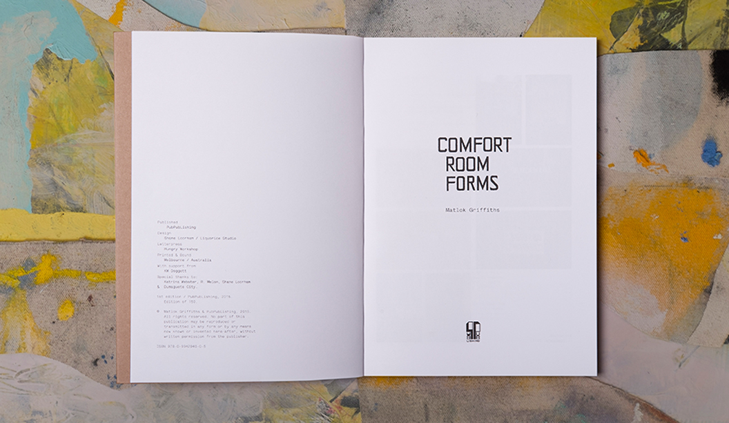
Publisher: PubPubLishing
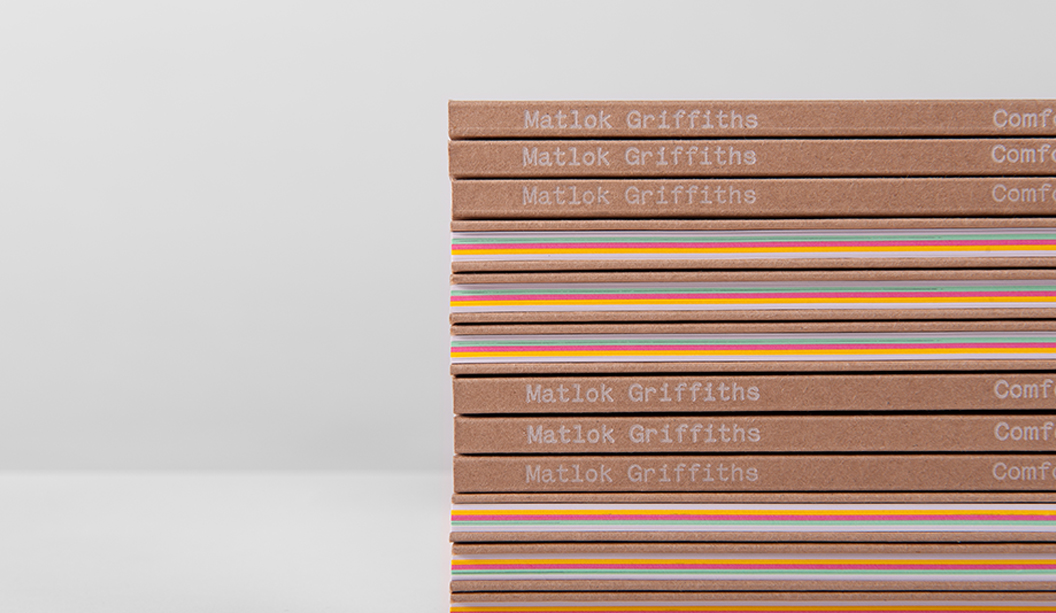
Stocks: Kaskad Oriole Gold 100gsm, Kaskad Leafbird Green 100gsm, Kaskad Bullfinch Pink 100gsm, Knight Smooth 120gsm, Buffalo Board and Knight Digital Indigo 120gsm.
Printing specs: Offset, Digital and Letterpress + Opaque White ink.
Printed by: The Hungry Workshop, On Demand and SS Printing (part of Documents on Call). All in VIC.
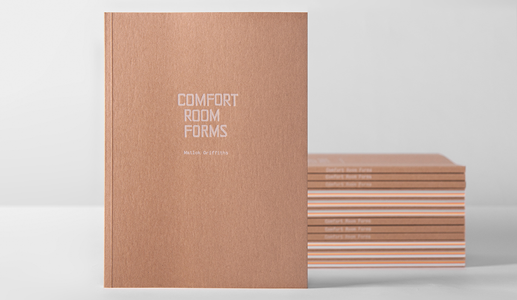
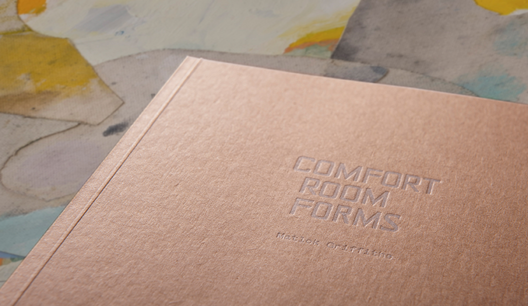
We love a good page-turner and Matlok Griffith’s book ‘Comfort Room Forms’ is no exception! Combining an exotic blend of drawings, vibrant papers and print techniques, it is the complete creative package.
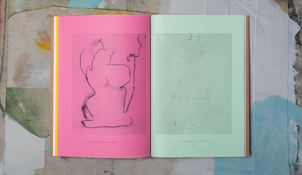
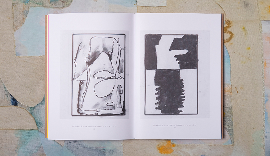
Designed in collaboration with Shane Loorham from Liquorice/Silent Partner (VIC), the 80 page book is a mix of full colour and one colour reproductions of Matlok’s drawings, made while he lived in the tropical island city of Dumaguete in the Philippines, surrounded by the smell of fried chicken and gasoline.
We picked Shane’s brain about the creative: “The book was designed in very close collaboration with the artist. We had been collaborating for a few years, designing and in some cases, hand-printing exhibition catalogues for him with a heavy degree of DIY coming through in the production. We were excited when this opportunity to create something a bit larger and more involved came up.”
Matlok’s original drawings were completed on a varied mixture of Filipino commodity papers, many of which were pretty bright and cheerful. In an effort to best reproduce them in printed form, the book was primarily printed offset in one colour on a variety of vibrant coloured stocks including Kaskad Oriole Gold 100gsm, Leafbird Green 100gsm and Bullfinch Pink 100gsm and Knight Smooth 120gsm. The credits and title pages were printed digitally on Knight Digital Indigo 120gsm. But wait, there’s more production goodness…
Shane explains: “We chose Buffalo Board for the front and back covers and had them letter pressed using Opaque white ink by our friends at The Hungry Workshop. Printing the covers this way was a bit of a gamble as no one was quite sure how the white ink would reproduce on the board. We were ready to change the colour at the last minute if need be, but the guys at The Hungry Workshop worked their magic and did a wonderful job for us!”
To see more of Matlok’s beautiful work, you can visit his website here http://matlokgriffiths.com/ or you can ask your friendly paper specialist to show you a printed sample the next time they pop by your studio.