Footy Tips
Agency: Studio Hi Ho (VIC).
Stocks: Sovereign Offset with custom “vellum’ emboss (cover) + Knight Vellum (text).
Printed by: Adams Print (VIC).
Printing specs: CMYK plus fluoro green.
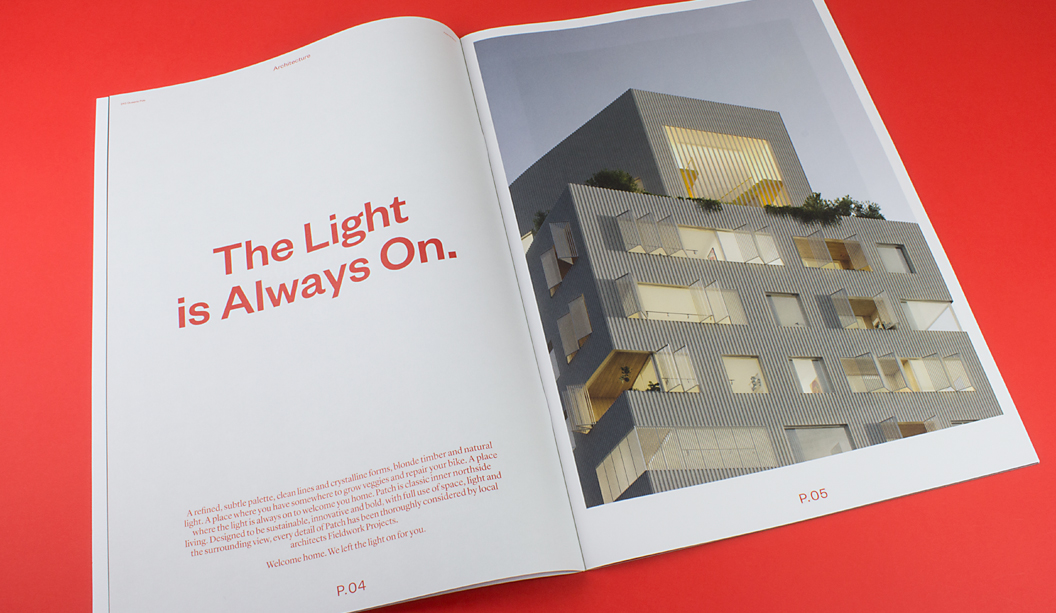
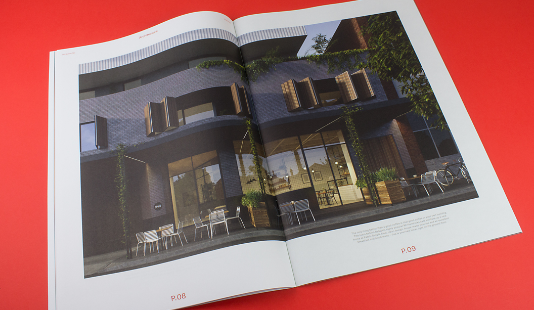
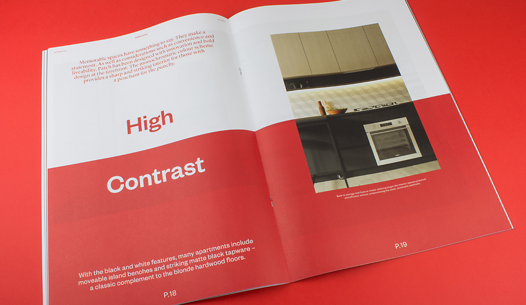
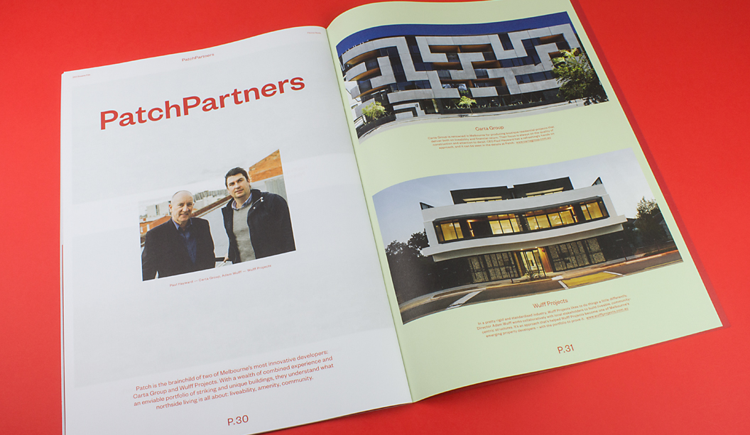
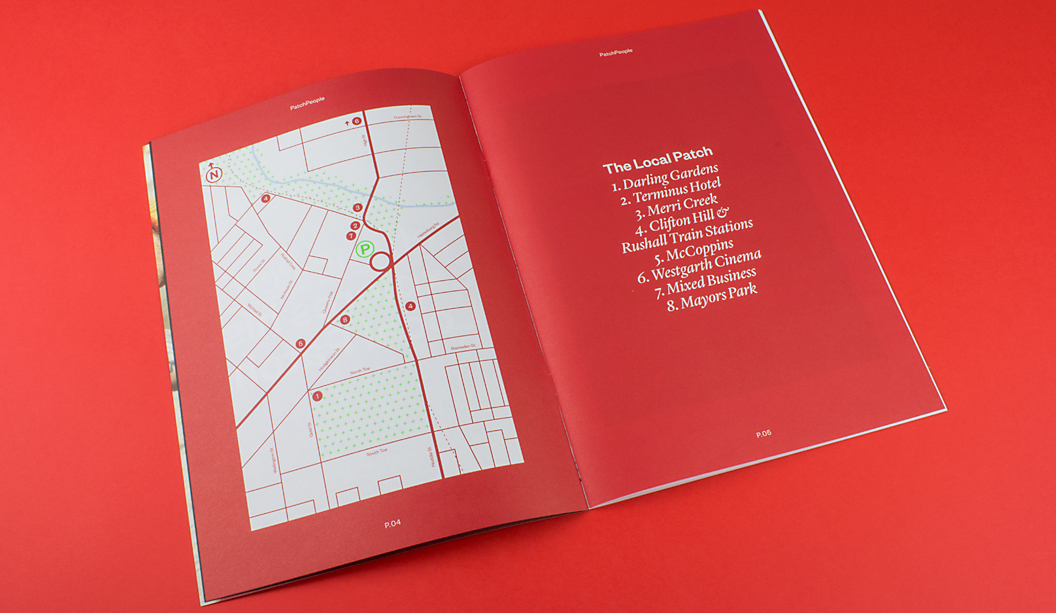
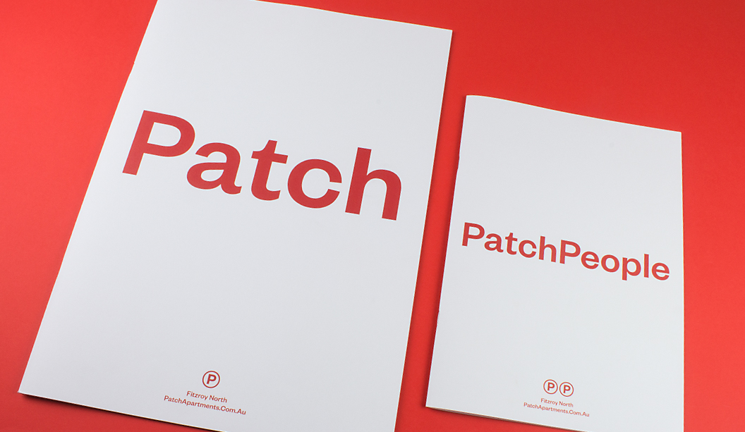
Take a look at ‘Patch’ designed by Studio Hi Ho in Melbourne. It’s a job that really stood out as one of the simplest but coolest property brochures of 2015. There’s a quote inside the brochure that states: “Patch provides a sharp and striking interior for those with a penchant for punchy.” What a great quote. And we think the brochure more than lives up to the rhetoric.
The print piece starts off with a Sovereign Offset 100gsm cover that features a killer 4 colour red logo on a custom ‘vellum’ emboss pattern from Tafeda. The inside pages showcase full bleed blacks, bold reds and knock out 4 colour images on the Knight Vellum 100gsm text. The reproduction by Adams Print is truly outstanding. We were amazed it wasn’t a special red PMS.
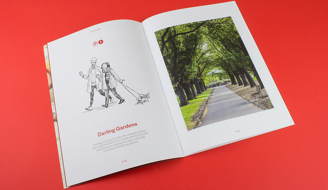
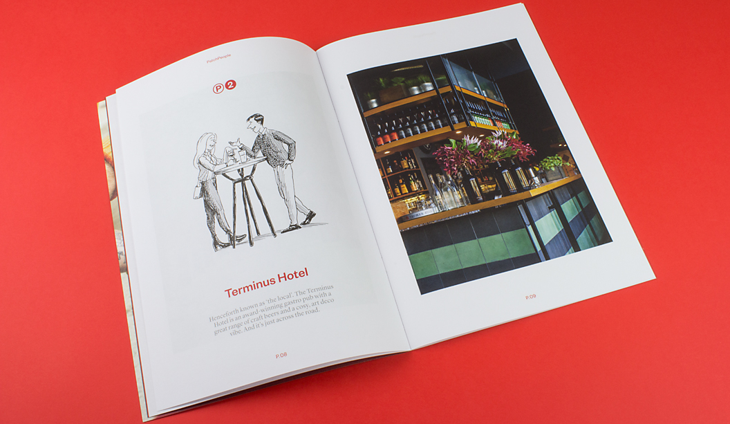
Our favourite bit though is ‘Patch People’ with the quirky and truly spot on illustrations of locals by Jeff the Peff. One of our marketing team staff lives right near the development (ok it’s Catherine), and she is sure Jeff has drawn one of her neighbours. A spot on interpretation of ‘Tim’ (you know who you are). Tim, you’re famous!
Jokes aside, it’s a job that really made us want to pick it up and have a good look. That’s a big deal among the masses of excellent property brochures we’ve seen this year. We did a property week feature on Facebook and Instagram back in August and that was just a snap shot of the great pieces we’ve seen in 2015. Check it out for some more property work inspiration.