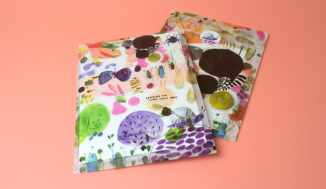
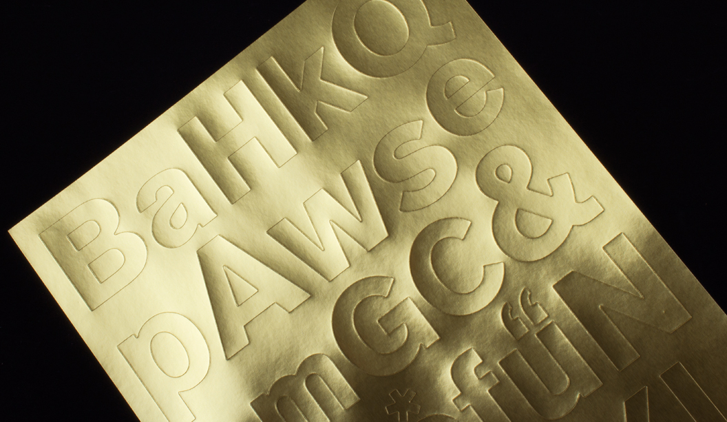
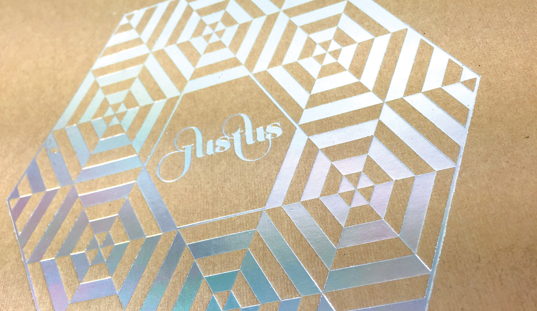
Latest Rives promo ‘snail mail’, by Ortolan

Title: Sail mail
Agency: 
Ortolan (VIC)
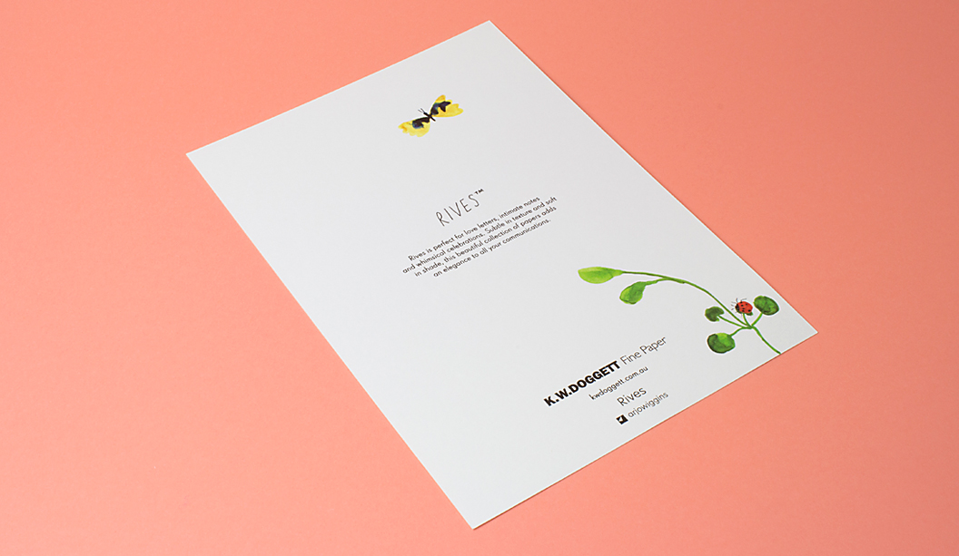
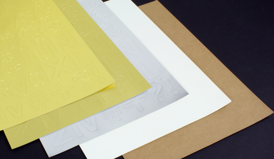
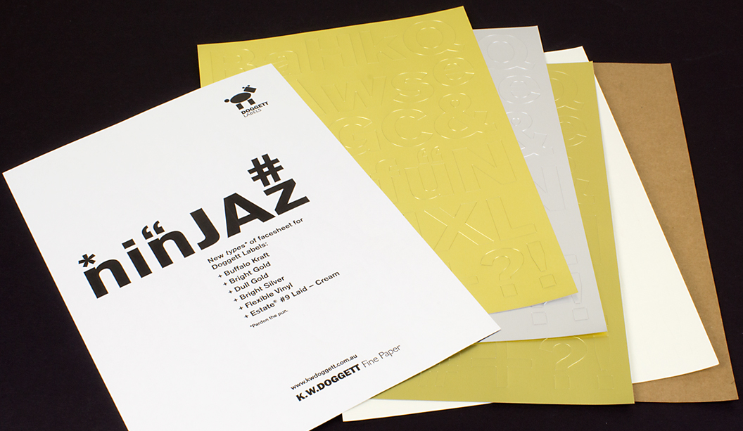
Stocks: 
Rives Design Bright White 120gsm, Rives Tradition Bright White 120gsm, Rives Tradition Digital Bright White 250gsm, Rives Design Bright White 350gsm, Rives Tradition Pale Cream 320gsm, Rives Design Natural White 350gsm, Curious Translucents 92gsm and JAC Brilliant Gloss White.
Printing specs: Offset and Digitally printed.
Printed by: Mercedes Waratah (offset), Press Print (digital) and JBS Printers (stickers). All in VIC.

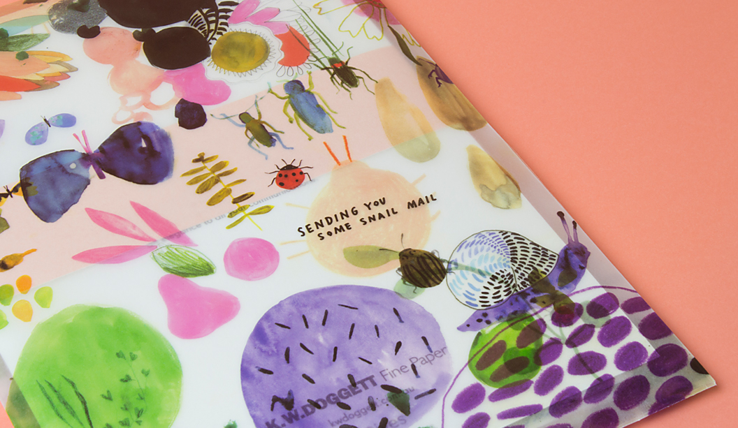
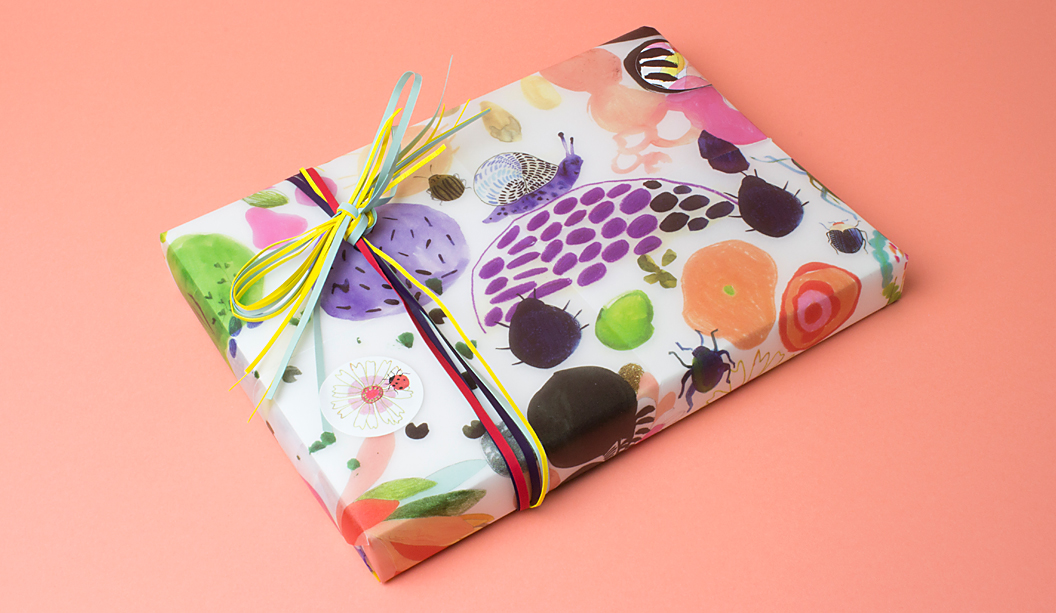
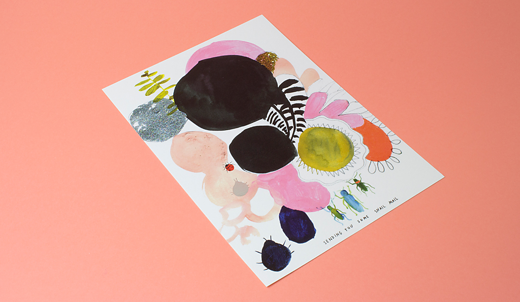
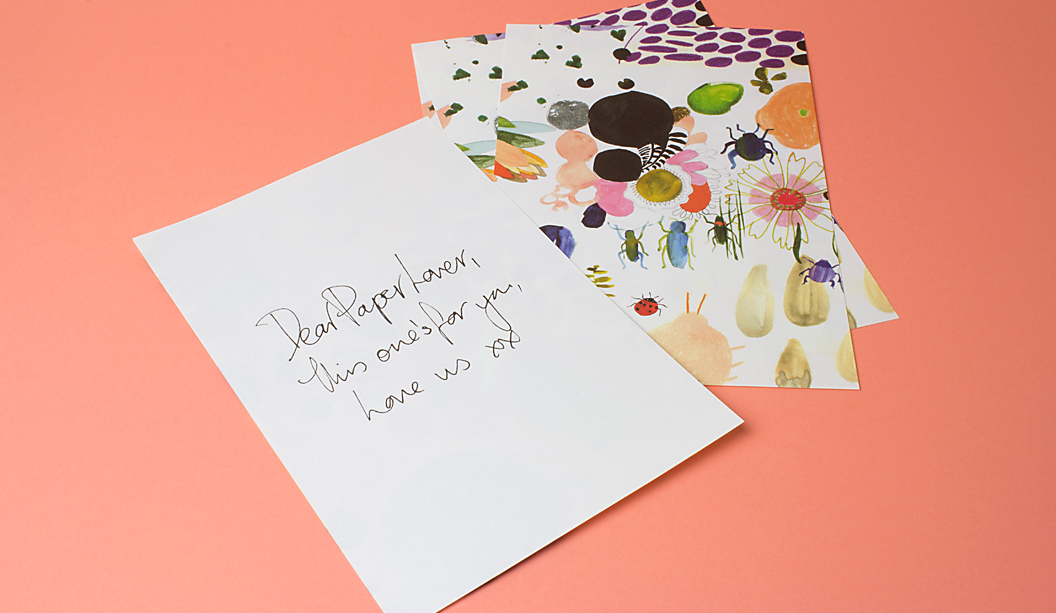
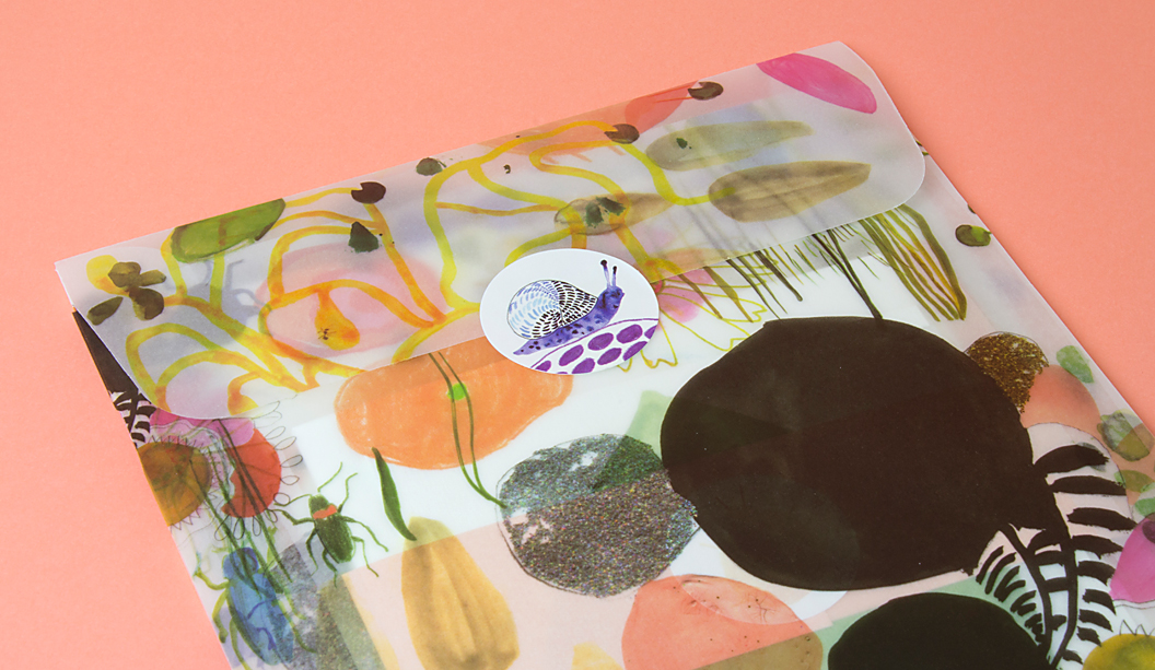
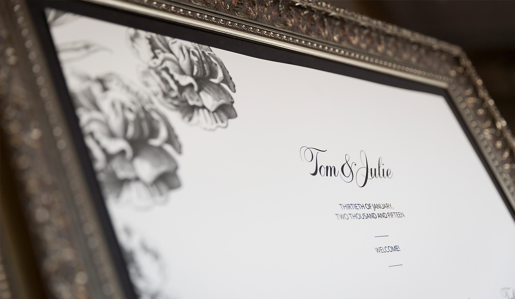
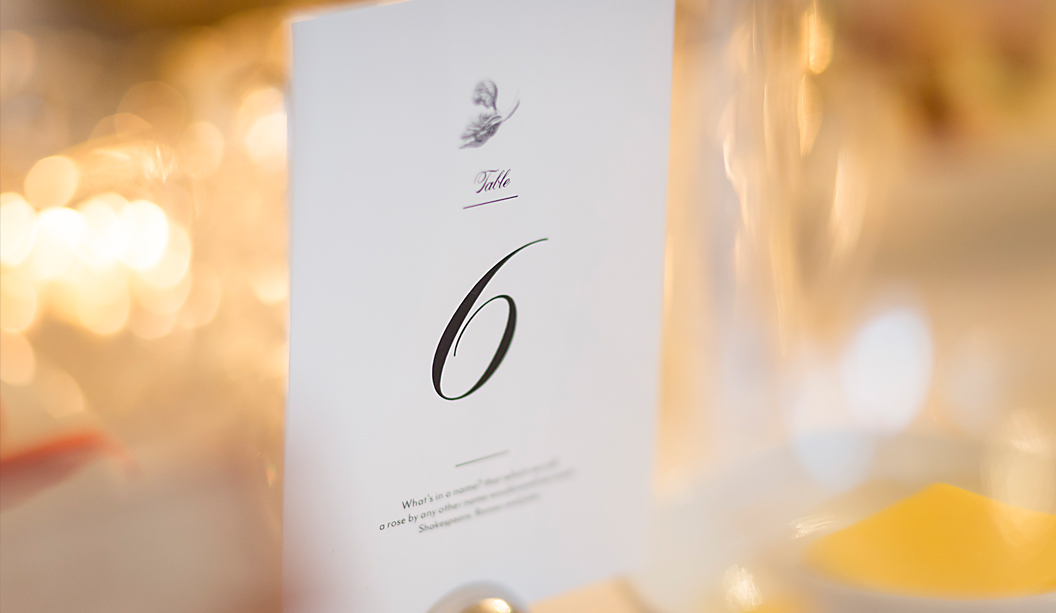
‘Snail Mail’, celebrates the idea of love letters, intimate notes and whimsical celebrations. It’s no surprise we are lovers of paper in all varieties so it’s been a real treat to work on this promo that showcases the Rives range. It’s sure to inspire the inner romantic in you all, it certainly has with us!

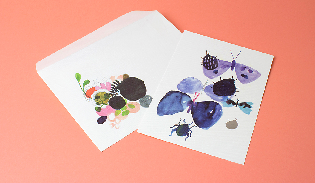
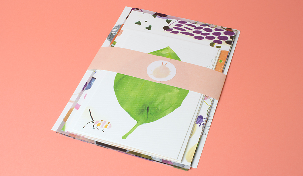
Created by the super talented team at Ortolan, in particular Kat Macleod and Holly Canham, the Rives stationery set showcases the versatility of the range. There’s a mix of Design and Tradition, printed both offset and digital, with wrapping paper and A5 envelope printed on Curious Translucents for something a little different. We couldn’t go past adding some stickers to the set, printed on JAC Brilliant Gloss White

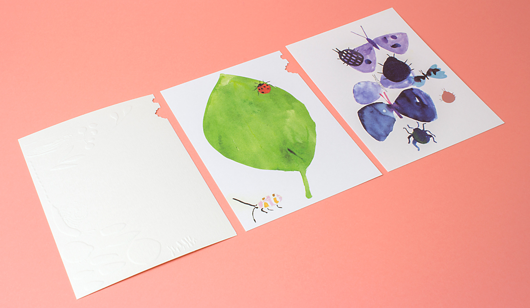
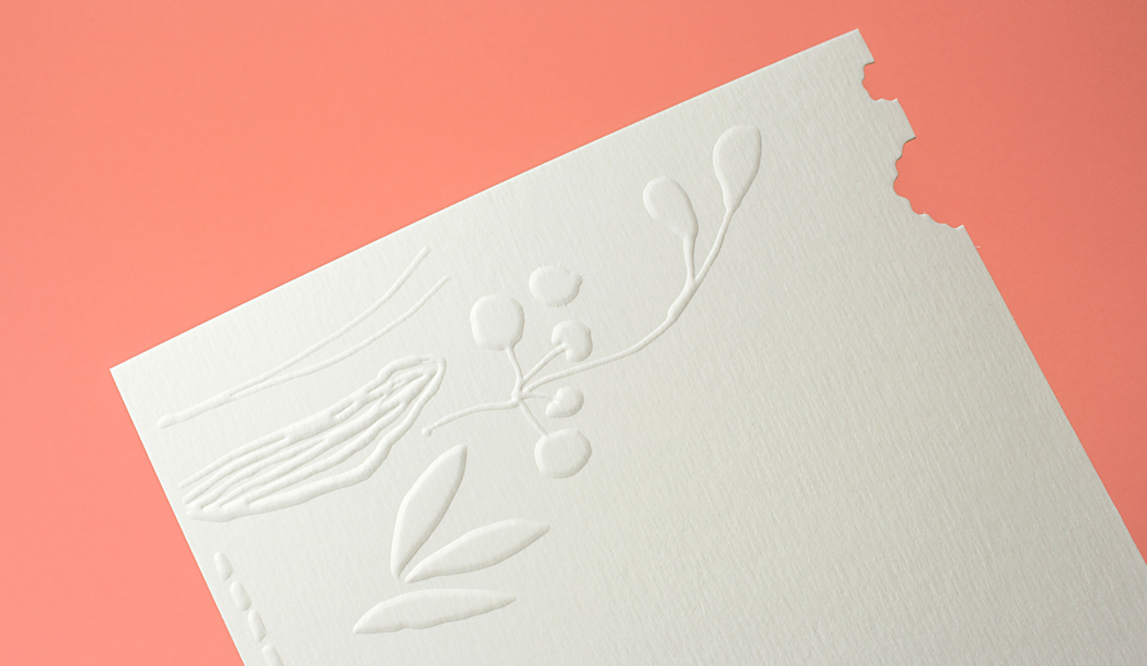
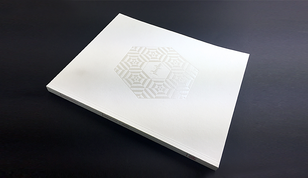
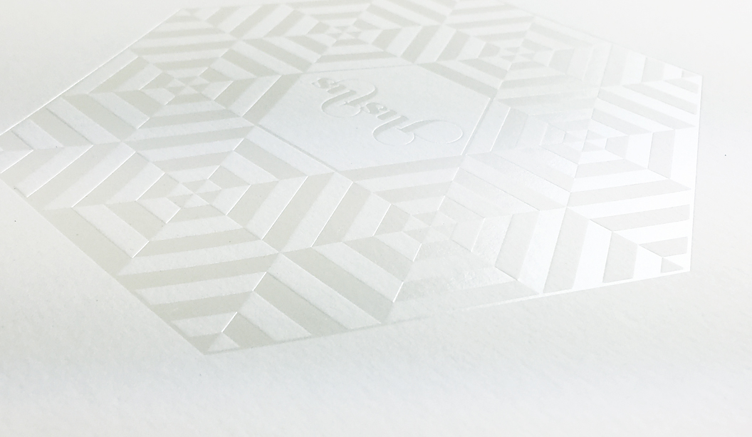
This beautiful piece features delicate hand painted scenes of flora and fauna dotted with silver foils, a blind emboss and little die cut bite marks that ties each of the applications together in a delightful combination. We can even imagine seeing this illustration printed as bespoke wallpaper or as a textile pattern for Gorman’s new spring range. 

Rives’ premium surface is engineered for beautiful colour reproduction and because we were working with watercolour and illustration, without the complexities of skin colours and hi-end photography, the print experience was a dream. Rives is ideal for all kinds of contemporary communications including stationery, annual reports, cards, direct mail,  envelopes, menus, packaging, swing tags plus much more.

Rives_3

 Printing specs:

  • Transparent envelope: Curious Translucents 92gsm, printed CMYK offset by Mercedes Waratah.

  • Belly band: Rives Design Bright White 120gsm, printed offset PMS489 (peach) by Mercedes Waratah.

  • Wrapping paper: Curious Translucents 92gsm, printed CMYK offset by Mercedes Waratah.

  • Writing paper: Rives Tradition Bright White 120gsm, printed CMYK offset by Mercedes Waratah.

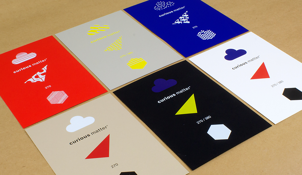
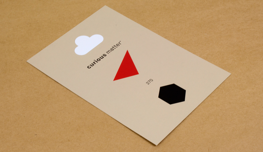
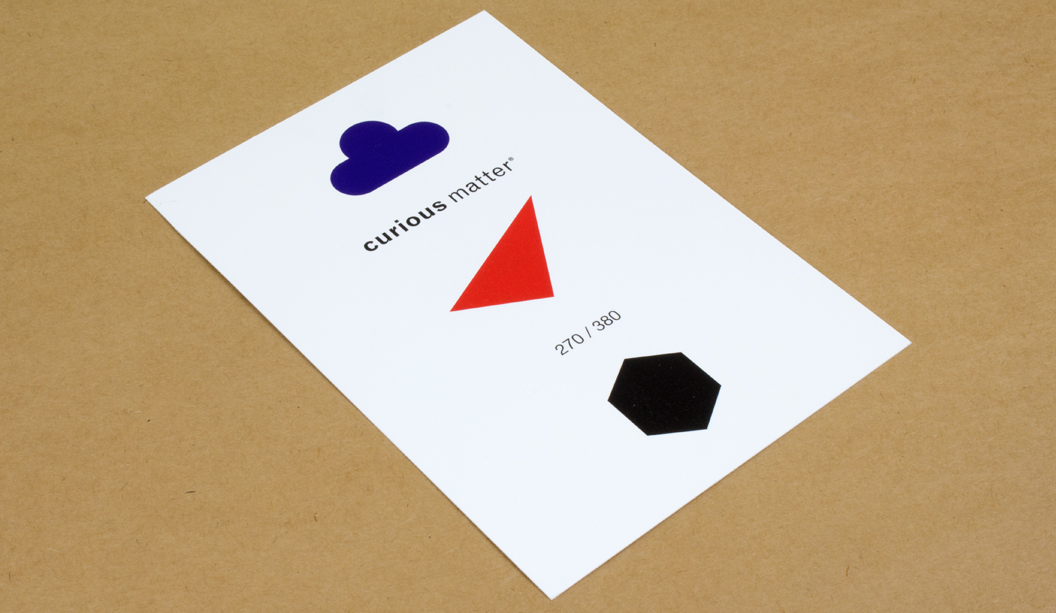
  • A5 tech spec card: Rives Tradition Digital Bright White 250gsm, printed CMYK plus silver foil on a HP Indigo by Press Print.

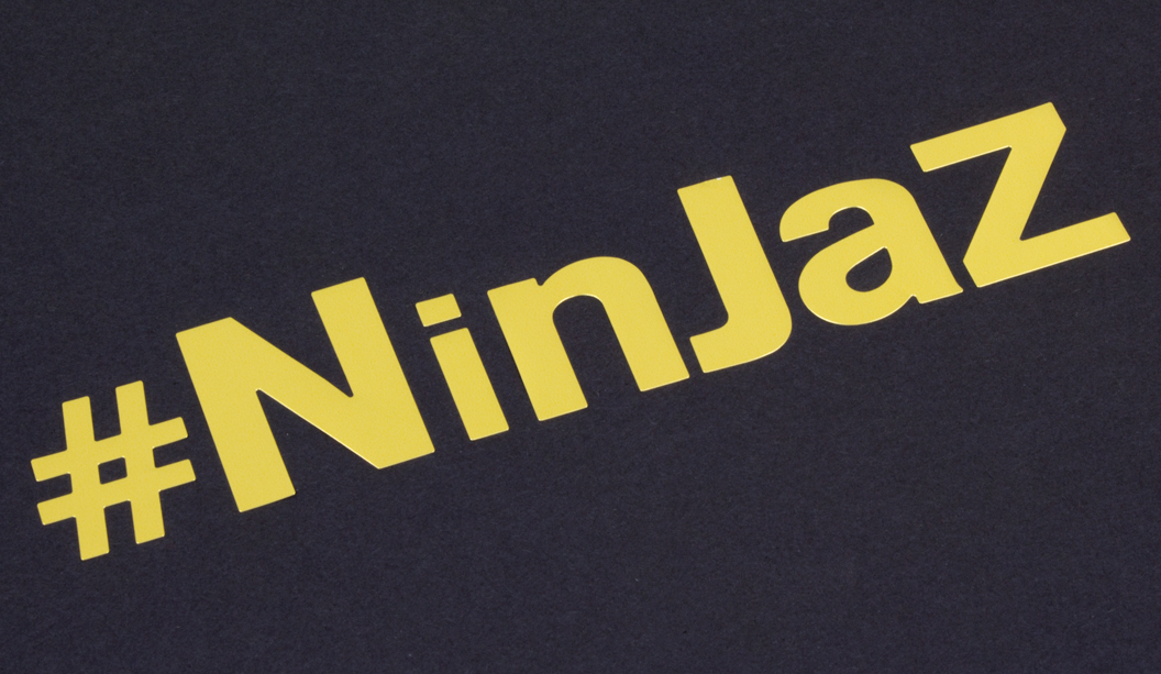
  • Stickers: JAC Brilliant Gloss White, printed offset by JBS Printers.

  • A6 cards:

    – Card 1 (leaf): Rives Design Bright White 350gsm, printed CMYK offset plus diecut by Mercedes Waratah.
    – Card 2 (blind emboss): Rives Tradition Pale Cream 320gsm, blind emboss plus diecut by Mercedes Waratah.
    – Card 3 (butterfly): Rives Design Natural White 350gsm, printed CMYK offset plus silver foil by Mercedes Waratah. 

  • C6 envelopes:

    – Envelope 1: Rives Design Natural White 350gsm, printed CMYK offset by Mercedes Waratah. 
    – Envelope 2: Rives Design Bright White 350gsm, printed CMYK offset by Mercedes Waratah. 
    – Envelope 3: Rives Tradition Pale Cream 320gsm, printed CMYK offset by Mercedes Waratah. 


A bit about Rives:

The Rives range made by Arjowiggins is all about the tactile experience of paper with textures inspired by the craftsman’s hand. The Tradition surface has a subtle and modern, refined felt-like finish. The Design features a fine mesh texture. This timeless and elegant range is also available in Design Digital and Tradition Digital – both Indigo compatible sheets in 120gsm. Rives Design and Tradition are available in 120-350gsm.

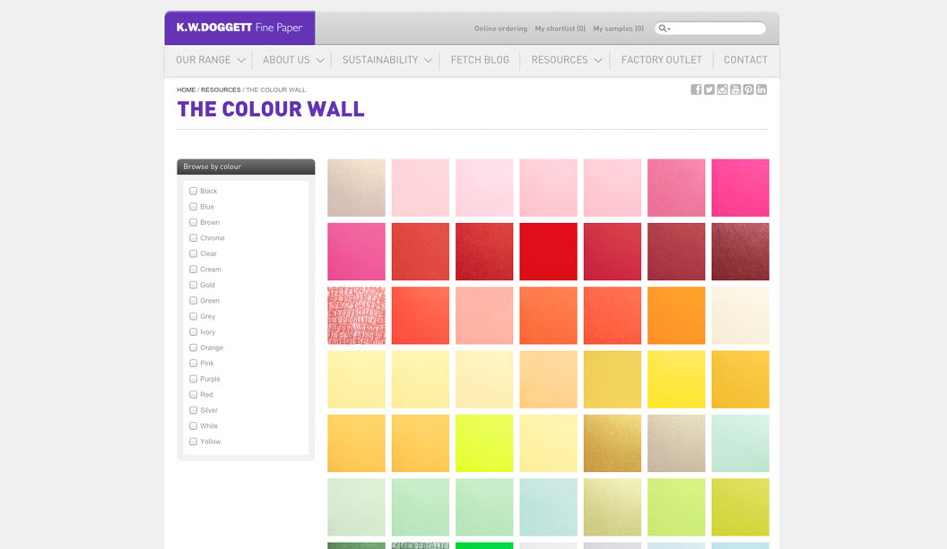
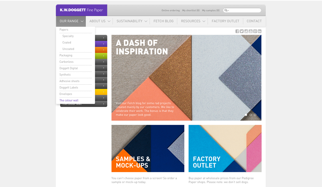
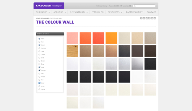
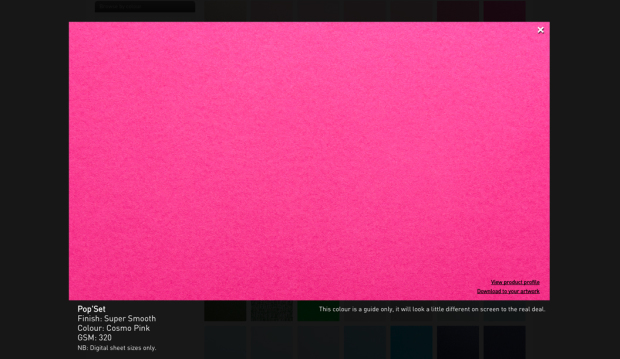
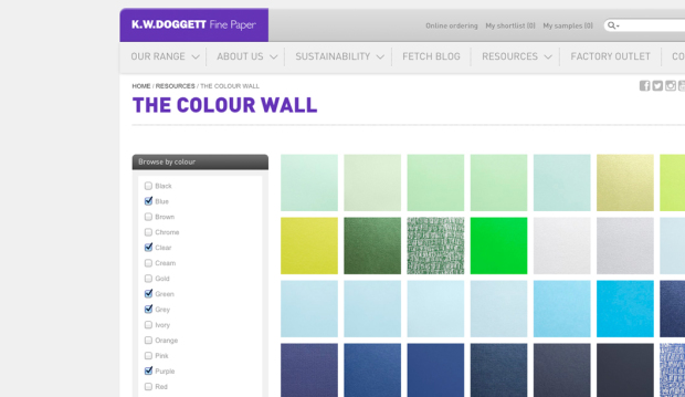
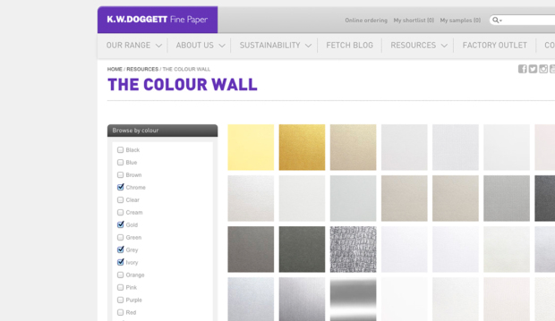
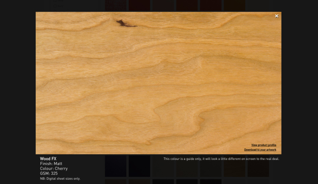
We suspect you’ll be itching to get your hands on these beauties but rest assured your friendly paper specialist will be by soon with a copy especially for you. Remember, you can always visit this part of our website for more information about this range or explore our new ‘Colour wall‘ to see the real deal. Enjoy!

Rives_1

Rives_4

Rives_10

Rives_5

Rives_6

Rives_7

Rives_8

Rives_9

Rives_2

Curious Matter HP Indigo print test

StocksCurious Matter Désirée Red 270gsm and Adiron Blue 270gsm, Goya White 380gsm, Andina Grey 380gsm, Ibizenca Sand 270gsm and Black Truffle 380gsm.
Printed by: Press Print Digital (VIC).

We are crushing all over the Curious Matter range. It has so many attractive qualities, like its flashy colour palette, sandy surface that is rough yet surprisingly smooth to touch AND the fact it’s also compatible with offset, embossing, screen and even dry toner printing. A complete package really, well almost…

We’ve fielded lots of questions lately about the stock’s suitability across the HP Indigo platform as it is not guaranteed for use on these machines. So we ran a print test using opaque white ink and CMYK. The stock was Sapphire coated first and we are pretty chuffed with the result. As you can see it does work, we just had to find someone willing to push the boundaries with us on this one!

CM-4

Printing specs:

  • Card 1: Goya White printed CMYK on a HP Indigo.

  • Card 2: Andina Grey printed two hits of CMYK on a HP Indigo, with four hits of opaque white ink.

  • Card 3: Désirée Red printed on a HP Indigo with six hits of opaque white ink.

  • Card 4: Adiron Blue printed on a HP Indigo with six hits of opaque white ink

  • Card 5: Ibizenca Sand printed CMYK on a HP Indigo, with four hits of opaque white ink.

  • Card 6: Black Truffle printed two hits of CMYK on a HP Indigo, with four hits of opaque white ink.

Speak to your printer about coating Curious Matter if you’re running a digital job as only certain printers have coating capabilities.

A bit about Curious Matter:

The Curious Matter range made by Arjowiggins, is all about the tactile experience of the paper. It’s sand-like yet silky feel (because of the potato starch it’s coated with) will see your paws all over it, rubbing it and exclaiming ‘wow, hmmm, what does that feel like?’. Available in rich bold colours in 270gsm and 380gsm, think invitations, annual reports, business cards, brochures, swing tags and much more. Enjoy!

CM-2

CM-3

CM-5

CM-6

CM-7

Gettin’ sticky with it!

Stocks: Estate #9 Laid – Cream, Dull Gold, Bright Gold, Bright Silver and Buffalo Kraft.
Printed by: Us.

We sell paper, of course, but we also specialise in other printing materials like our Doggett Labels range. Our motto is: “If you can print on it, we sell it.”

Introducing the newest kids on the labels block: Estate #9 Laid – Cream, Dull Gold, Bright Gold, Bright Silver, Buffalo Kraft and Flexible Vinyl.* Think lux labels for wine, wedding stationery, craft beer, awards invites, pharmaceutical and address labels, FMCG and cosmetic packaging, bumper stickers or price labels, plus much more!

DL_PROMO_1

Doggett Labels are manufactured on site by us meaning we can offer customised jobs quick as a flash, as well as standard templates. Our website allows you to search by size, shape, height/width, labels per sheet and sheet size. You can then download the print ready template in PDF or Word format. If you can’t find the template you want, we’ll make it for you.

For a bit of fun, we’ve created this alphabet using the new products to show you the sorts of things you can die-cut, not just standard label shapes (please note, ‘ninjaz’ doesn’t mean anything in particular, it’s just a cool word we made up using the letters in the promo – we were channeling our sticker craze days from the late 80s!).

DL_PROMO_3

We also thought it was high time to bring back the Doggett Labels guide, originally released in 2006. It’s an oldie but a goodie and now includes an updated list of materials, templates, stock availability and samples to help make choosing your labels easy. Remember, if you are unsure of what label material to use, please contact our friendly samples department to request a sample or speak to your paper representative. Get sticking!

*Flexible Vinyl is not available until end of June.

DL_PROMO_4

DL_Folder_1

DL_Folder_3

DL_Folder_4

DL_Folder_5

DL_Folder_6

Doggett x Justus Magazine

Title: Justus Magazine issue 4: ‘Wrapped in you’
Designer: Lindsay Smith from Eleven Eleven Design
Stocks: Strathmore Premium Wove, Super Smooth and Cambric, Skin Curious Collection,Rives Design,Buffalo Kraft, HannoArt Satin, Curious Metallics,Impact,Wild,Buffalo Board
Printing specs: Predominantly offset printed with foil, UV, spot colours, die cuts, reflectakote plus digital section printed on a HP Indigo
Printed by: Platypus Graphics (QLD)

Justus issue 4 is about to hit the streets and we’re super excited to say it features a knockout selection of our finest fine papers. It’s like our paper dreams have come true.

With unlimited access to print and embellishment techniques, the Justus story starts with a Tafeda embossed Buffalo Board slip case, followed by a pearl ‘snowflake’ like foil on Wild paper. Opening the first pages, it shows UV printing on Strathmore Super Smooth and then it rolls on from there. Spot colours, copper foils, a silver reflectakote, French folds, die cuts and more. There is definitely nothing minimalist about Justus issue 4. More is more.

Designed and edited by Lindsay Smith of Eleven Eleven design, Justus Magazine is created to celebrate (and show off), the talent within the Australian print, paper and design industry. It is made by us, for us. Just us. Issue 4 ‘Wrapped in you’ has a central theme of packaging and is printed by Platypus Graphics. Based in Brisbane these guys run a slick operation and their skill as printers, foilers and finishers is clear to see. I addition, there’s also a special HP Indigo section which highlights what these new machines can do and how our paper responds to the new digital techniques.

Your K.W.Doggett Fine Paper specialist has a copy to show you in their next studio visit but if you can’t wait til then, log on to Justus and subscribe for yourself. We look forward to bringing this beauty to market soon.


Justus-1

Justus-3

Justus-4

Justus-13

Justus-12

Justus-5

Justus-10

Justus-14

Justus-6

Justus-9

Justus-7

Justus-8

Justus-11

Justus-15

A rose gold wedding

Title: A rose gold wedding
Designer: Julie de Paoli
Stocks: Strathmore Premium Wove – Soft 352gsm and 270gsm
Printing specs: Offset printed
Printed by: Watermarx Graphics (NSW)

These invitations were a personal project for graphic designer and bride-to-be Julie De Paoli. She wanted to create a design reflecting the unique bond she shares with her husband and the sentiment of their special day. So romantic!

Julie-2

So the theme of the wedding suite was centred around the concept of growth. Intricate botanical drawings are featured throughout, including an olive branch and a rose which represent Julie’s Mediterranean roots and her husband’s English background. Ripper idea and great choice to use the rose gold foil. Elegant bling.

The suite of items was printed on Strathmore Premium Wove – Soft White 352gsm and 270gsm. The typography retains a modern edge with the use of both script and san serif typefaces. Julie explains: “The stock, with its subtle texture complemented the smooth metallic finish of the rose gold foil.  It was a difficult illustration to print, however the printers, Alan and Ange from Watermarx, did a fantastic job. The beautiful detail of the imagery and powerful bold foil was everything I had envisioned it to be.”

To see more of Julie’s work follow @juliedepaoli on Instagram and Twitter and keep your eyes peeled for her new website coming soon!

Julie-4

Julie-5

Julie-6

Julie-7


The 50NZ Dow Retrospective by StudioBrave

Title: The 50NZ Dow Retrospective by StudioBrave
Agency: StudioBrave
Stocks: Keaykolour Jet Black 300gsm, Conqueror Laid Calligraphy 300gsm and Knight Digital Indigo 120gsm
Printing specs: Digitally printed
Printed by: Press Print (VIC)

StudioBrave have designed a spectacular new printed piece – the Dow 50NZ Retrospective. We always say a great design makes the paper and StudioBrave have done just that. Printed by Melbourne’s Press Print, they have taken digital printing to a new level.

Dow is a global chemical organisation involved in the markets of agriculture, consumers, energy, infrastructure and transportation. The 50NZ Dow Retrospective was produced to commemorate 50 years of business in New Zealand. StudioBrave shares: “We were engaged to produce a book that harnessed the rich history of Dow in New Zealand and the culture that surrounds it. The company had become synonymous with New Plymouth, producing generations of employees and becoming part of the fabric that makes up the region. This book was for them, for every employee of the past 50 years.”

Dow-2

The piece combines beautiful artwork, a selection of monochromatic papers and print techniques that work together seamlessly. The paper includes Keaykolour Jet Black 300gsm for the cover, belly wrap on Conqueror Laid 300gsm with opaque white ink plus Knight Digital Indigo 120gsm for the text. Carlo Mussett from StudioBrave  explains: “It was important the book felt tactile, personal and natural, to reflect Dow’s passion for sustainability in agriculture and the environment. Conqueror Laid Calligraphy was used to complement this concept and every employee’s name has been foiled on the inside cover for an added personal touch.”

The pages of the retrospective are a treat to explore and the paper lends itself really well to image rich photography. StudioBrave engaged photographer Derek Swalwell to shoot New Zealand’s North Island, in particular New Plymouth. Carlo explains: “We wanted this to be a retrospective first and a company branded book second, by removing corporate colours and bringing in the iconic black of New Zealand, we found a balance and relationship grow between the book and its content.”

This is a great example of how you can design for digital print and really push the boundaries of creativity to achieve a outstanding result! To see more of StudioBrave’s work go to www.studiobrave.com.au

Dow-3

Dow-4

Dow-5

Dow-6

Dow-7

Dow-10

Dow-11

Dow-12

Armadillo&Co’s 2015 collection is out now!

Title: Armadillo&Co’s 2015 collection is out now!
Agency: Mike McMullen from Arms Studio (LA) in collaboration with Armadillo&Co.
Stocks: Knight Vellum 280gsm and Sun Offset 120gsm
Printing specs: Offset printed
Printed by: Bambra Press (VIC)

Armadillo&Co is dynamic duo Jodie Fried and Sally Pottharst, who share a love of honest and earthy rugs. This year, it was time to showcase their beautifully crafted pieces in a series of print catalogues.

Founded over five years ago, every piece embraces fair trade practices, is crafted from sustainable natural fibres including pure wool, hemp and PET recycled fibres, and all purchases benefit local schools in their weavers’ villages in India. We can’t help but gush at what a truly remarkable business this is, not to mention their beautiful rug collection. Armadillo&Co explains: “For us, it’s about combining aesthetics with ethics. Our artisans are our extended family – we treat them with love and respect that their weaving traditions have been generously passed down through generations.”

Armadillo-1

Armadillo&Co collaborated with designer Mike McMullen from Arms Studio in LA, to create the three gorgeous catalogues: ‘Collection’, ‘Bespoke’ and ‘Indoor Outdoor’ showcasing their 2015 range. Each piece is printed CMYK with a different PMS on Knight Vellum 280gsm for the cover and Sun Offset 120gsm for the text. The soft, uncoated surface of the paper pairs nicely with the stunning photography and earthy textures of the rugs.

There are just too many fabulous designs to choose from and we could spend hours pouring over their catalogues. Alas, it’s your turn! Visit http://armadillo-co.com/ we know you’ll love them as much as we do.

Armadillo-3 Armadillo-4 Armadillo-5 Armadillo-6 Armadillo-7 Armadillo-8 Armadillo-9 Armadillo-10  Armadillo-13 Armadillo-14

Inti Imports Wine & Spirits new branding by Moko Creative

Title: Inti Imports Wine & Spirits
Agency: Moko Creative
StocksKeaykolour Original Jet Black 450gsm
Printing specs: Copper foil and hand painted edges
Printer: Blueprint (VIC)

These striking business cards by Melbourne based studio Moko Creative were designed for Inti Imports, a boutique wine and spirits importing company who required a new identity to launch into the wholesale industry. Sounds like a good bunch of people to know! Inti imports source their highly curated product range from South America, in particular Peru and Chile, so it was important the brand reflected the essence of South American culture.

The business cards, printed on Keaykolour Original Jet Black 450gsm feature copper foiling and delicate hand painted copper edging. Moko Creative explains: “We selected this stock due to its thick weight yet elegant and textural qualities. Keaykolour Original Jet Black also contrasts well with the copper foil. These cards have so far made a great lasting impression, especially with local business people.”

Be sure to check out Inti Imports to add a little South American spice to your next culinary experience.

Inti_2

New! Wood FX is a printable wood product

We all know paper comes from wood. Well, now wood is the paper. Whaaaa? Introducing Wood FX, a wood veneer board in cherry and birch colours with a white coated reverse so you can print both sides. We like to think of it as 60s office wood panelling meets modern log cabin. Made by Masterpiece Graphix (USA), it’s also HP Indigo certified, works on dry toner machines and is made from wood sourced from certified responsibly managed forests. But wait, there’s more…

This distinctive paper can also be printed offset, letterpress, screen and UV ink presses (prior testing recommended) and is also water resistant. Working and printing on wood is essentially the same as printing digitally on paper and Wood FX’s reverse coated back allows you to create all sorts of unique print jobs. Think vintage style laser cut invitations, duplexed business cards or maybe add an organic look to a menu design, packaging project, sustainability report and more.

A big bonus is that the ink dosen’t feather, giving sharp, defined ink lay down so things like printed bar codes scan properly and text is readable. Wood FX comes in sheets and is available in 305gsm. What ‘wood’ you rather choose for your next project?

Remember, you can always visit our website for more information about this range or explore our new ‘Colour wall‘ to see the real deal. Enjoy!

Wood-FX_15

Above: Set of five A6 cards entitled ‘Wooden you like to be beside the seaside’ printed by Press Print Digital (VIC).

  • Card 1 (lobster) – Cherry Wood Veneer printed on a HP Indigo with three hits of opaque white ink base + CMYK.
  • Card 2 (whale) – Birch Wood Veneer printed on a HP Indigo CMYK.
  • Card 3 (umbrellas) – Birch Wood Veneer printed on a HP Indigo with two hits of opaque white ink base + CMYK.
  • Card 4 (lighthouse) – Cherry Wood Veneer printed on a HP Indigo with three hits of opaque white ink + CMYK.
  • Card 5 (seagull) – Side 1: Birch Wood Veneer printed on a HP Indigo with two hits of opaque white ink base + CMYK. Side 2: printed black only.


Wood-FX_2-new

Above: Cherry Wood Veneer card – printed on a HP Indigo with two hits of CMYK. The two outer sheets are Cherry Wood Veneer 305gsm with two sheets of Keaykolour Original – Guardsman Red 300gsm sandwiched in the middle. Birch Wood Veneer card – printed on a HP Indigo with three hits of white ink. The two outer sheets are Birch Wood Veneer 305gsm with two sheets of Knight Smooth – White 300gsm sandwiched in the middle. Printed by Bambra Press (VIC).


Wood-FX_14

Above: Business cards for Engine Group printed offset on Birch Wood Veneer 305gsm duplexed to Sovereign Silk 300gsm by Platypus Graphics and laser cut by Potato Press (both in QLD).


Wood-FX_12

Above: A3 posters for Mount Gay Rum printed HP Indigo on Cherry Wood Veneer 305gsm and Birch Wood Veneer 325gsm by Greenridge Press QLD.

Choosing paper by colour just got easy.

Paper and computer screens are not friends when it comes to choosing the right paper. There’s nothing like having the real deal in your hands. Soooo to help you out, we’ve created a colour wall which will give you a pretty accurate look and help you find the right shade.

There are over 200 hues to choose from and a high res photo for each paper. The textured papers have come up particularly well. Just click on the image and you can download the paper to your artwork to see how it will look when printed.

The colour wall in all its glory can be found in the ‘Our resources’ section of the website. And when you’re browsing for papers in the ‘Our range’ section, you can click on the ‘View’ button to see a photo of the stock. When you’re ready to order a sample, call your local samples team or send them a request via the world wide interweb. Enjoy!

Colour-wall-1

Colour-wall-2

Colour-wall-7

Colour-wall-9

Colour-wall-8

Colour-wall-5Colour-wall-6

Colour-wall-10