Our 2017 Calendar ‘A Cut Above’

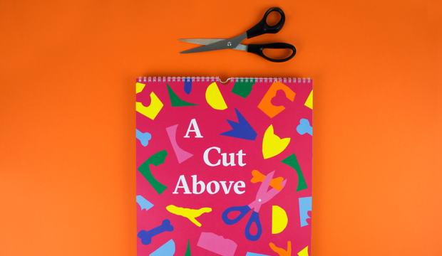
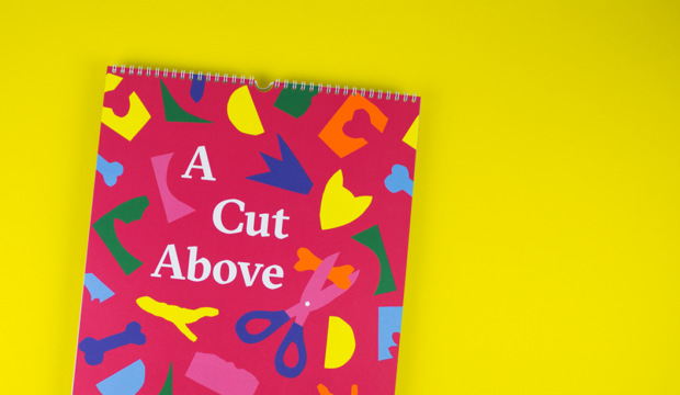
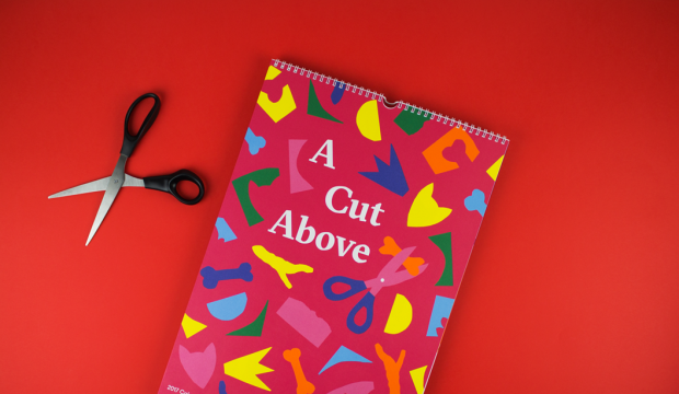
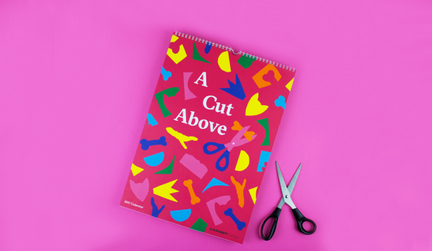
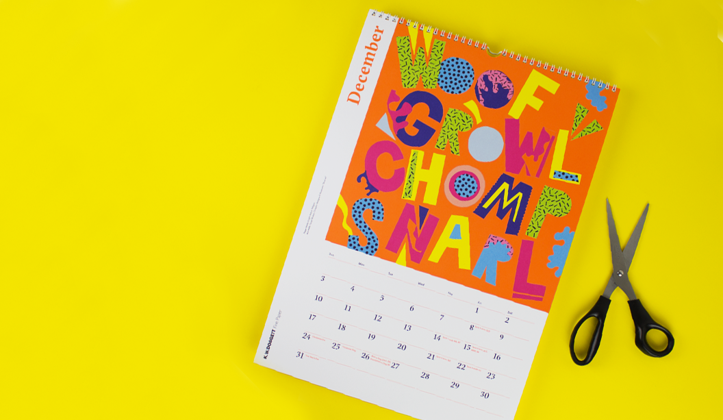
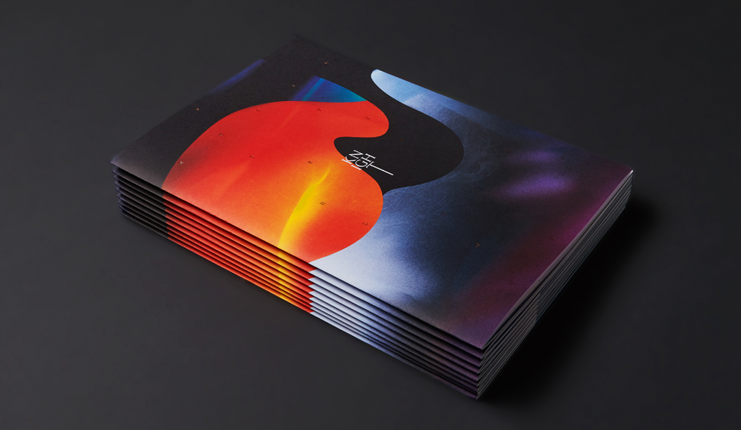
Our 2017 calendar ‘A Cut Above’ is a shout-out to Henry Matisse who, in his later years, created amazing artworks in his ‘cut-outs’ series using just scissors and paper. A collaboration with Spencer Harrison (who project managed and designed the calendar) and two workshops later and we have the super colourful 2017 K.W.Doggett Fine Paper calendar!

This is traditionally a student only project but this time, we opened it up to industry folk too. We put it out to ballot and chose the participants from there. Equipped with paper (including some awesome custom designed sheets by Spencer), heaps of glue and scissors, pizza and tunes, we ran two workshops in SA and VIC with Spencer at the helm sharing his expertise and guiding the participants through the creative process. Choosing the final 12 pieces was tough (so many fabulous pooches!) and the wonderful Mark Lobo shot the masterpieces.

Thanks to everyone that entered, those that attended the workshops, the artists who made it to the final 12 and the pizza guy. A big shout-out to UniSA and CATC/Billy Blue College of Design for giving us their digs to use. And of course the one and only Spencer Harrison. Wooooo hoo!

Check out our YouTube channel soon for behind the scenes videos!  bit.ly/2017calendarvideo

Printing specs:

The calendar was printed offset by Adams Print in VIC. Clear gloss foil on cover over the title by Avon Graphics in VIC.

  • Cover: CMYK plus PMS orange* and clear gloss over the title on Strathmore Super Smooth Ultimate white 176gsm. Artist: Spencer Harrison.
  • Credits: CMYK plus PMS orange* on Sovereign Offset 160gsm.
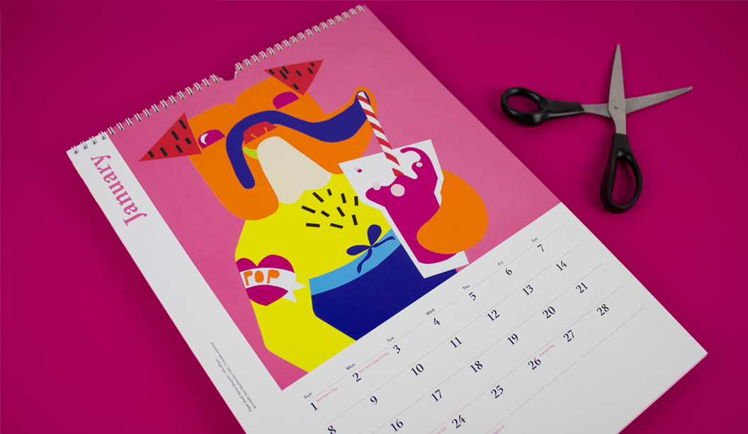
  • January ‘Grandpa soda pop’: CMYK plus PMS orange* on Maine Recycled – Silk 200gsm. Artist: Beth MacDonald.
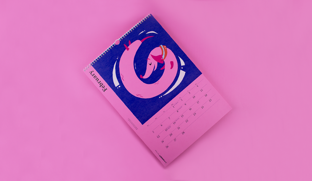
  • February ‘Sausage roll’: White ink (2 hits wet on 2 hits dry) plus CMYK on Kaskad – Bullfinch Pink 160gsm. Artist: Jack Stobart, UniSA.
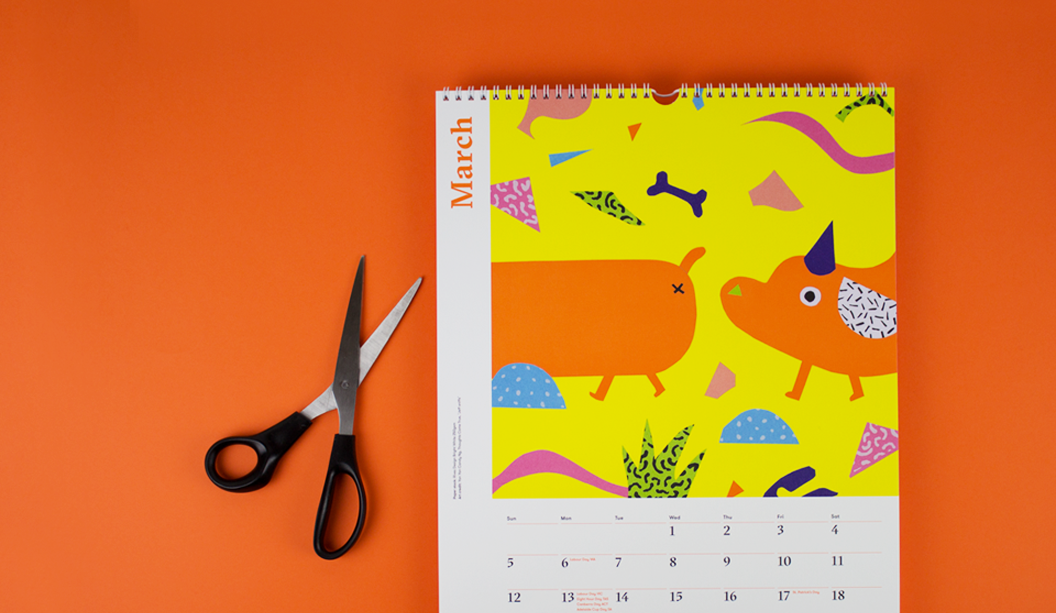
  • March ‘Jeff Sniffs’: CMYK plus PMS orange* on Rives Design Bright White 250gsm. Artist: Yan Yan Candy Ng from Thoughts Come True.
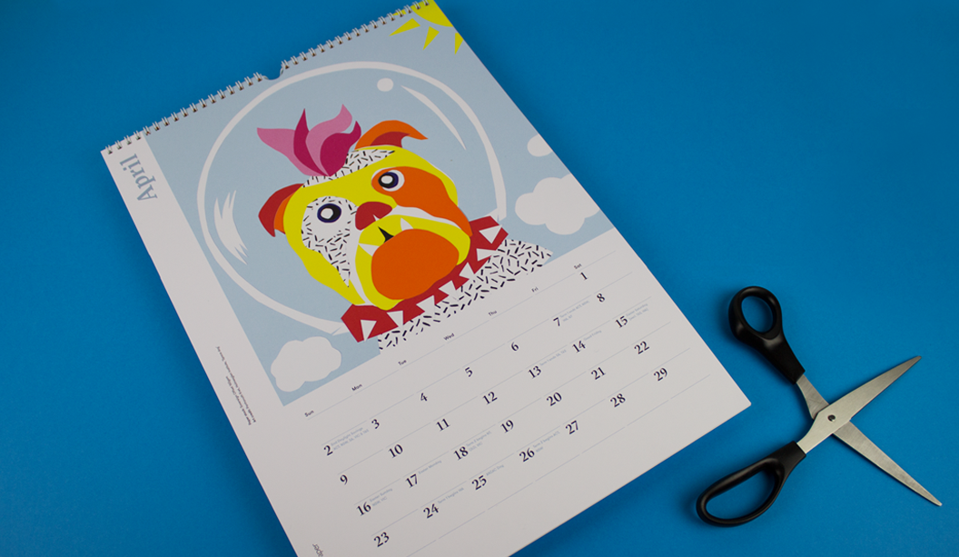
  • April ‘Space dog’: CMYK on Sovereign Offset 160gsm. Artist: Panhavuth Kret, Holmesglen Institute.
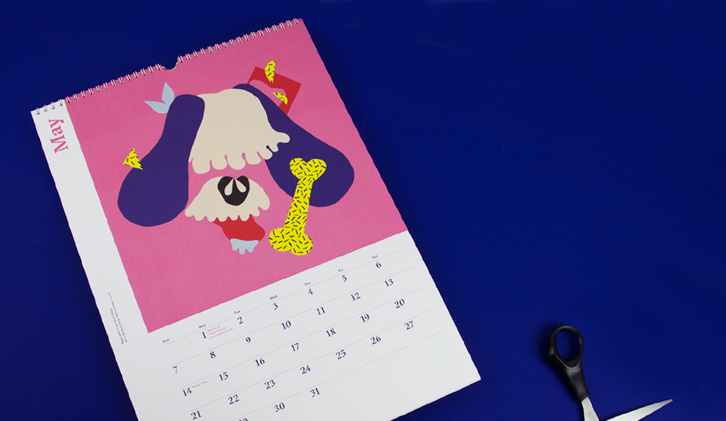
  • May ‘Get ’em’: CMYK on Knight Vellum 140gsm. Artist: Nana Utsugi, RMIT University.
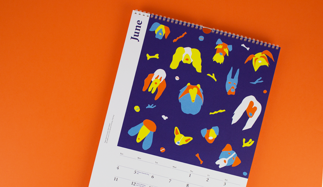
  • June ‘Field day’: CMYK plus PMS orange* on Sovereign Offset 160gsm. Artist: Lauren Conti, Monash University.
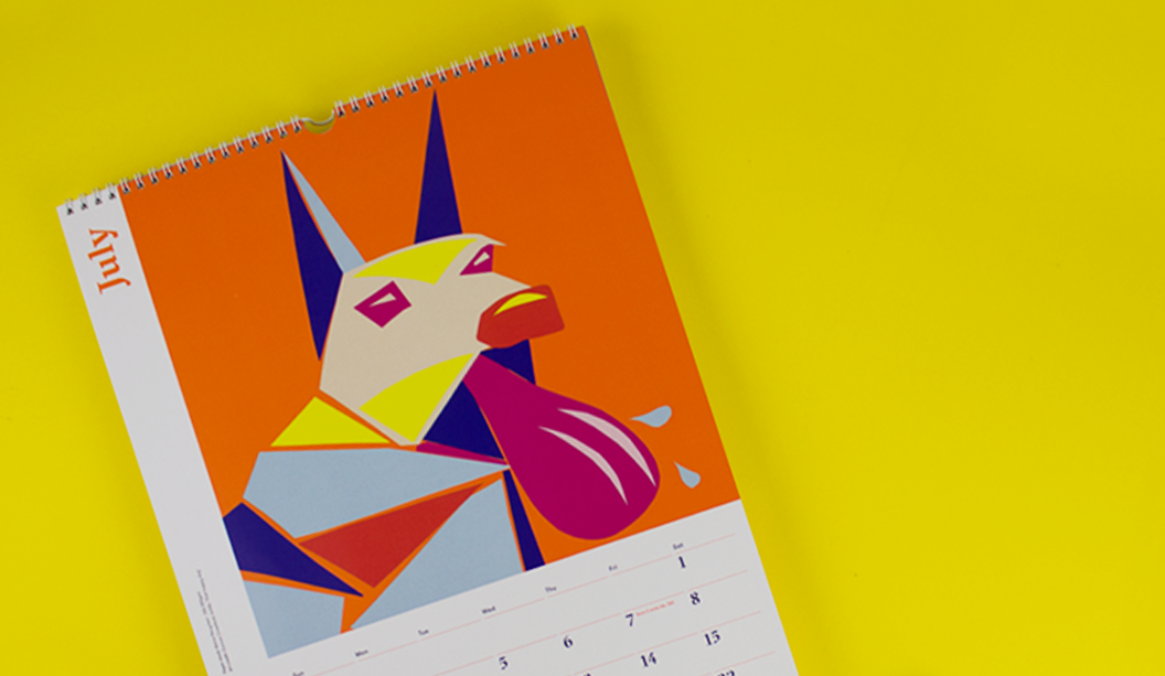
  • July ‘That happy dog’: CMYK plus PMS orange* on Maine Recycled – Silk 200gsm. Artist: Duncan Crawford, UniSA.
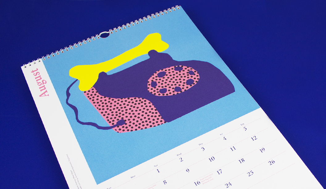
  • August ‘Dog & bone’: CMYK plus PMS orange* on Sovereign Offset 160gsm. Artist: Liam Kenny, Torrens University Australia.
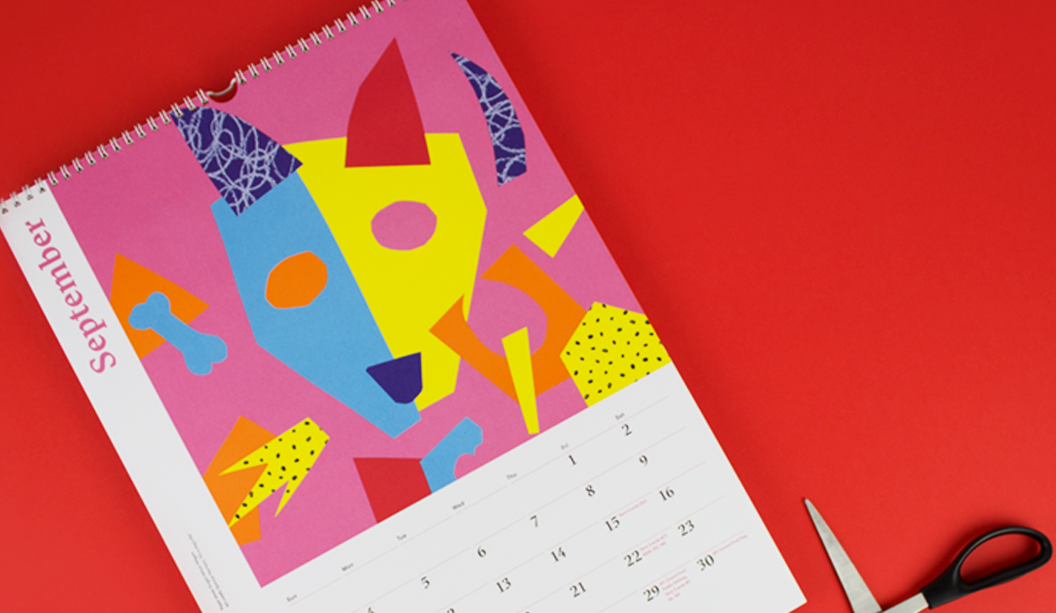
  • September ‘It’s a dog’s life’: CMYK plus PMS orange* on Knight Vellum 140gsm. Artist: Spencer Harrison.
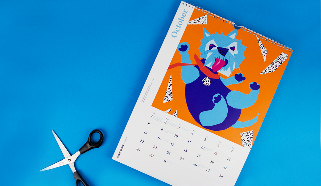
  • October ‘Walkies’: CMYK plus PMS orange* on Maine Recycled – Silk 200gsm. Artist: Alex Seret from Alex Seret Design and Illustration.
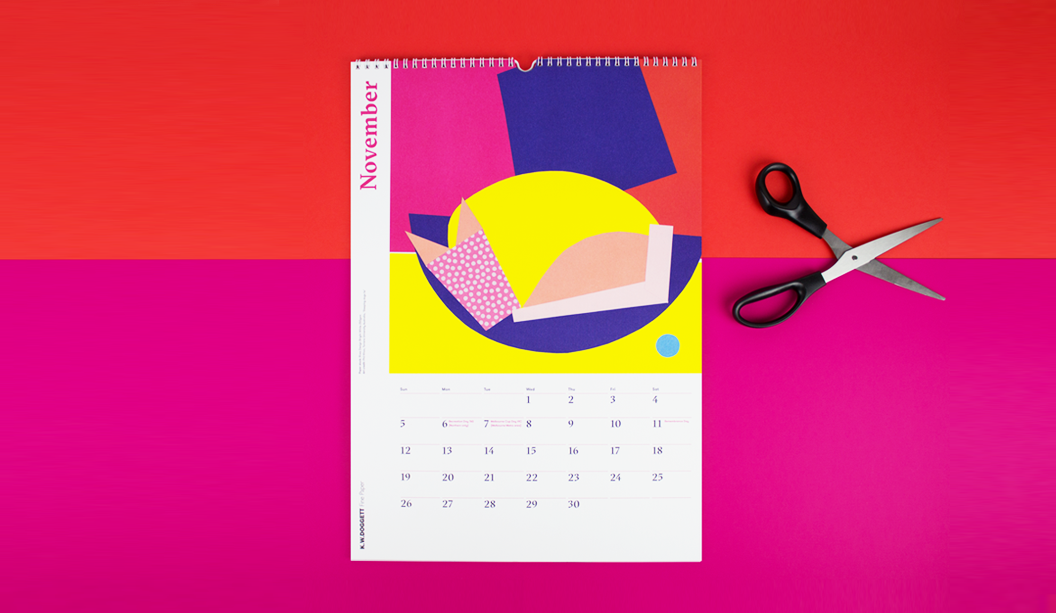
  • November ‘Sleeping dog’s lie’: CMYK on Rives Design Bright White 250gsm. Artist: Phil Koo, Torrens University Australia.
  • December ‘Shut up!’: CMYK plus PMS orange* on Knight Vellum 140gsm. Artist: Tanya Bickers, graphic designer and illustrator.
  • Backing: Doggett Boxboard 310gsm/520ums.

*Orange is PMS 1505 U. We altered the colour slightly to be 65% Orange 021 and 35% transluscent white (traditionally it would be 50/50). Adams have a special recipe for their CMYK and we boosted the Rhodamine and Yellow 012 too. Looks so good it could be UV.

1 - January

2 - february - 2

3 - march - 1

3 - march - closeup

0 - cover-orange

4 - april

5 - may

6 - june

0 - cover - yellow

7 - july-2

8 - august

0 - cover-red

9 - september - 2

10 - october - 2

0 - cover-pink-2

11 - november

12 - december

2016 Doggett Christmas Card

Designer: Studio Constantine (VIC).
Card Stock: Duplexed Curious Collection Metallics – Super Gold 250gsm and Virtual Pearl 120gsm.
Envelope Stock: Curious Collection Matter – Desiree Red 135gsm*.
Printed by:Blue Print (VIC).
Duplexed by: Cartonlux (VIC).
Envelopes by: Direct Envelopes (VIC).
Finished by:Blue Print (VIC). Scored, trimmed and folded.

Our 2016 Christmas card is so bright that we reckon it could probably give you a sunnies tan line. Which is why we love it.

We asked David of Studio Constantine to get creative so the card would bring merriment to our rather broad client base (graphic designers to corporates). When looking for inspiration, we like to imagine that after a few eggnogs staring up at the overcast summer sky, David had a lightbulb moment. He would create a card featuring the bright Aussie sun we’ve all been waiting for.

What we have is a duplexed card on Curious Collection Metallics – Super Gold 250gsm and Virtual Pearl 120gsm. It was printed HP Indigo black with white ink overprint (2 hits @ 50%) on the front ala the setting sun. We also had envelopes custom made in Curious Collection Matter – Desiree Red 135gsm* and printed Doggett Labels circular (C45 & C60) stickers in-house for postage and closure labels.

The combo of the red and the gold is very Christmas and a little bit Chinese New Year too. All in all – party time.

*Grammage not stocked by KWD – available on request from Arjowiggins.


2016-christmas-card-standing

2016-christmas-card-closeup

2016-christmas-card-and-envelope

2016-christmas-card-envelope-shadow

2016-christmas-card-envelope-back

2016-christmas-card-inside-envelope

2016-christmas-card-inside


Pop’Set bubble gum scented postcard

Design: In-house.
Stocks:
Pop’Set Cosmo Pink 320gsm.
Printed by: Intelligent Media, (VIC) on a HP Indigo 7800
Finishing:
tlc digital+ (VIC).
Printing specs: Six hits of white ink + CMYK + screen printed bubble gum scent.

You lay six hits of white ink plus CMYK down on a paper like Pop’Set and you’ve got yourself a postcard that…well…pops! The colour is super vibrant and the best bit is that bubble area is a bubble gum good time waiting to happen. We screen printed a bubble gum scent over the image and ever since we’ve been reminiscing about primary school and those amazing scratch ‘n’ sniff stickers we all loved so much.

It’s an interesting process adding scents to paper. It’s done via micro-encapsulated scented capsules that are mixed into UV curable carrier varnish. The UV-curable slurry is then applied to the printed sheet (or substrate) using a screen printing application. As the capsules are broken (like an egg shell) the scent is then released. Flick over to Instagram to see some pics showing the process.

Key selling points:

  • Highly pigmented colours in the range: Cosmo Pink, Lime Tonic, Black.
  • 30% recycled, ultra smooth board.
  • HP Indigo certified and suitable for dry toner printing too.
  • Available in SRA3 sheet size in 320gsm.

We have a list of scents available if you need. We’ve done banana in the past and know there is everything from fruity scents like grapefruit and pear all the way through to flowers like Yellow Rose and then Green Lawn, Horse Stable and Camp Fire. Sunscreen smell would have to be the most random though. Ha!

In all seriousness, this kind of thing is sensory branding at its best. Smells can trigger emotions so this is not only an easy but a fun and valuable way to make a marketing promotion stand out and increase brand recall.

And even more seriously, stay away from the horse stable scent.

popset1

pop'set-for-blog-2

VoPP Pantone Queen case study

BACKGROUND:

To celebrate Queen Elizabeth II’s Diamond Jubilee, Pantone created a Queen shaped colour guide. To ensure maximum exposure and engagement, they used direct mail.

Rather than targeting creative directors or design agencies with a mass direct mail campaign, Pantone targeted media publications and bloggers in order to attract a huge amount of PR. This strategy also ensured the resulting social media hype, which grew the campaign’s awareness exponentially. In doing so, Pantone extended the reach of the campaign far beyond that of an ordinary direct mailer.


OBJECTIVE:

Pantone worked with design agency Leo Burnett London in order to create a unique piece of memorabilia that celebrated the Diamond Jubilee as well as grab the attention of new and existing customers in a way that was both original and surprising. Pantone has been the definitive authority on colour within the printing industry for decades, and the omnipresence of their iconic swatch books in design studios worldwide has been a source of inspiration for generations. To remind their target audience of the capabilities of their colour matching system, Pantone decided to colour match a variety of the Queen’s most famous monochromatic outfits worn throughout the 60 years of her reign.

Pantone-Queen-1


“Building true brand engagement is about creating dialogue. Don’t consider direct mail or email or web in isolation, but consider the right combination to achieve the best response” 

Kevin Slatter, Director of Data & Analytics at Geometry Global

METHOD: 

A limited edition queen-shaped swatch book was created with each outfit painstakingly matched by Pantone’s colour expert technicians to the exact Pantone reference, date and location where each was worn. Each of the 60 cards in the spiral guide shows Queen Elizabeth II in the same formal suit with only the colour changing.

Leo Burnett approached Buckingham Palace with the concept which was so well received it was made an official piece of Diamond Jubilee memorabilia and became royally endorsed. An ultra-short run of 60 copies were produced and sent out to a highly targeted mailing list consisting of media publications including magazines and newspapers, influential design bloggers and prominent designers.


Pantone-Queen-2


“Our 7 colour HP Indichrome Pantone emulation process was capable of matching all 60 colours, exactly. From Primrose yellow to Lilac Snow, the palette subtly evolves yet always regal” 

Precision Printing

RESULTS: 

Within 24 hours the campaign had been written about in over 1.2 million website and blogs with #pantonequeen trending on Twitter. Numerous design publications also covered the innovative direct mailer which ensured it had maximum publicity with a targeted audience of existing and potential Pantone customers. Since Pantone only produced a small run for the Direct Mail campaign, printing and shipping fees were kept to an absolute minimum, translating into an incredible return on investment.


CONCLUSION: 

The Pantone Queen is a great example of how brands can combine the power of print and direct mail with the mass reach of online media. By targeting media publications and bloggers instead of customers, Pantone were able to extend the reach of its campaign far beyond what they could have expected to achieve with an ordinary direct mailer.

Direct mail continues to play a significant role in the marketing mix, offering more personally relevant content to customers and converting brand awareness into action. Creative Direct Mail, such as the Pantone Queen, has the ability to create a lot of online buzz and pushes the message out to a far greater audience.

Direct mail and online media, particularly social media, should be considered complimentary mediums as they greatly improve the effectiveness and reach of campaigns when used in conjunction. Direct mail is personal and more engaging whilst social media such as Facebook, Twitter and blogs offer a better platform for discussion and mass reach. Integrating the two mediums is a logical step for any brand to strive for as it reflects the multi-channel world in which we all consume content in.


VoPP_3

Thanks to Kellie Northwood, Executive Director of VoPP/Two Sides Australia for allowing us to republish this case study, made available to us as Foundation Sponsors of TSA Limited, the publishers of the VoPP (Value of Paper and Print) report. Find out more via www.valueofpaperandprint.com.au.


Pentagram’s Abbott Miller designs Dance Ink magazine (again!)

Not sure when the last time was that we (ok maybe just some of us), got THIS excited about a magazine being launched, or in this case, relaunched. So just imagine the excitement of all the lovers of dance, photography and design out there when niche publication Dance Ink was brought back from the publishing graveyard!

The magazine acts as an alternative performance space for dance. Originally published from 1989-1996, the quarterly performing arts journal is pretty unique. The dance works you see beautifully photographed on the pages are, we kid you not, specifically commissioned just for the magazine. What a concept! The cover of the first issue of the new Dance Ink features Silas Riener performing Merce Cunningham’s ‘Changeling’ which is a bit of a homage to the amazing performer.

Published by Patsy Tarr and designed and edited by Abbott Miller from Pentagram, both taking up their original roles (ah-mazing), Dance Ink has literally picked up where the last one left off. What could be a more perfect quote for the relaunched mag which appears in the first few pages from Merce Cunningham himself: “We begin again.” From what we’ve read on Pentagram’s blog, this time in history is shaping up to be: “…something of a renaissance in independent magazine publishing.” And it’s given them a primo opportunity to experiment with print.

dance1dance4

dance7

As noted on the Pentagram blog: “The new issue returns to the original premise of creating a unique and enduring stage for dance, using great photography, powerful design and the beauty of high-quality printing.” Printed offset, the mag is housed in a clear sleeve and throughout the pages, the design plays with the effect of transparency of ink on the page.


dance5


dance3

The other super cool thing is the mag has totally moved with the times. Yes it’s available in print form, but the publishers have also experimented with different formats eg you can also purchase large scale posters with every issue, a custom mural for a wall and videos were created as well. So print and wide format too. Raddy McRad. The new issue of Dance Ink has a print run of only 500 copies and can be purchased online at 2wice.org.


dance10


dance9

Thank you to Pentagram for allowing us to repost this story. We love your work! Get yourself over to their blog for a more in depth look at this issue of Dance Ink. It’s well worth it.

dance2

dance6

dance8

Five hacks when printing photographic images on uncoated paper

1. Perform ‘Under Colour Removal’ (UCR) on your files.
Under Colour removal (UCR) is a process whereby you eliminate overlapping yellow, magenta and cyan that would normally add to a dark neutral (black) and replace it with black ink only ie a ‘Full Black’. This is done during the colour separation process. Replace the coloured inks with black in shadowy or neutral areas to reduce the risk of mottling or a muddy look which can happen with excessive ink coverage.

2. Use the right colour profile.
Start with your images in RGB then convert to CMYK uncoated profile. Domestic printers work with CMYK and are therefore able to create a narrower range of colours.

3. Choose the right paper to match your imagery.
We know, we know, it seems so obvious but sometimes it’s still not considered. When reviewing your proofs, keep the shade of paper you’re actually printing on in mind eg if using a creamy white paper you may want to reduce the yellow (especially with skin tones). With a blue white paper you might want to take out some cyan. Proofs are often on a coated paper so consider this too. Best papers to use if printing lots of photography with skin tones is all papers really, but these kinds of images really lend themselves to blue-white uncoated papers.

4. Ask to see samples.
We have loads of samples on-hand. Some with specials, embellishments, specialty covers etc and if we don’t have it, we’ll find it! Let your paper specialist know the desired result you want and they’ll work backwards with you to find the best paper and print method. They really know their stuff when it comes to matching paper with imagery.

5. Print production is key.
This involves preparing the files as mentioned, checking the proof and also making sure that when on press, you consider some things eg you can make minor adjustments to colour and density but mostly this should be done in the pre press stage. And most importantly, allow for dry back. When on press, approve the sheet that comes off and then ensure you allow for dry back, so increase the ink pressure by about 10%.

Knight-4

Photograph-Knight-1

Knight-3

Photograph-Knight-2

VoPP Community Bonding Case Study


CASE STUDY 1:
Ogilvy Brazil & Life Support Group: ‘This Poster is HIV Positive’

Agency Ogilvy Brazil partnered with organisation Life Support Group to deliver a consumer education and awareness campaign in São Paulo, Brazil.

OBJECTIVE:
The campaign set out to break down the stigma and confusion surrounding HIV/AIDS and how the virus is transmitted.

METHODOLOGY:
Posters were created that contained 1 drop of blood from an HIV positive individual and distributed throughout São Paulo. The text on the posters read, “My measurements are 40 by 60 centimetres. I was printed on high brightness paper. And my weight is 250 grams. I’m just like any other poster. Except for one thing: I’m HIV positive.. I’m living with the virus. At this point you may be taking a step back, wondering if I offer any danger.”

RESULTS:
The campaign was effective at educating readers that HIV can’t survive for more than an hour outside the human body, so like the poster, HIV positive individuals are completely harmless. The campaign provided highly emotional responses from the public, with some touching and even kissing the poster after reading it, proving that the message was received and the misinformation was corrected.

“The poster humanizes the problem and brings people together for the cause, showing that it’s possible to live in a prejudice-free society.”

Aricio Fortes, Ogilvy Brazil’s Chief Creative Officer

VOPP-Image-Community-Spirit-1

CASE STUDY 2:
New Zealand Rugby Union & Adidas: ‘Bonded by Blood’

The New Zealand Rugby Union partnered with Adidas New Zealand to produce a campaign that exemplified how supporting the All Black players is in New Zealand’s DNA.

OBJECTIVE:
To create a poster that reflects the unwavering depth of support from All Blacks fans, as part of Adidas New Zealand’s annual limited-edition posters.

METHODOLOGY:
All Blacks players each donated a sample of blood that was combined with ink to produce 8000 special edition posters. The digitally imposed posters featured the All Blacks team performing the haka in Fiordland National Park. Slogans such as “Stand in black. It’s in our blood” and “Rugby. It runs through your veins” were used in the campaign. These ‘Bonded by Blood’ edition posters came with a certificate of authentication and given to those fans who purchased an All Blacks jersey.

RESULTS:
The posters were very well received within the community, achieving the goal of enhancing national pride and connection with the All Blacks team. This campaign allowed the All Blacks to acknowledge the depth of support received by fans over the years, and cultivate a strong sense of community.

“Adidas believes rugby is an essential part of New Zealand’s DNA and we wanted to show how the players and their supporters are inextricably linked – how supporting the All Blacks is in our blood.”
Craig Waugh, Adidas New Zealand’s Marketing Manager

VOPP-Image-Community-Spirit-2-wide

CONCLUSION:
Both of these campaigns are excellent examples of how companies are pushing the limits with print, yielding results. Incorporating blood into the posters ink created a strong tangible and sensory experience, forging a deeper emotional response to the campaigns. Thus generating both a memorable and impactful experience. Using print media to appeal and relate to consumer’s senses proves much more effective than just using images and text to get the message across. Print allows brands to communicate their values and message in a highly engaging and emotional manner.

VoPP_3

Thanks to Kellie Northwood, Executive Director of VoPP/Two Sides Australia for allowing us to republish this case study, made available to us as Foundation Sponsors of TSA Limited, the publishers of the VoPP (Value of Paper and Print) report. Find out more via www.valueofpaperandprint.com.au.

A raised or ‘multi-level’ emboss is next level

In our latest Knight campaign, we used a variety of print techniques. One of the most simple is the multi level or ‘raised’ emboss. A slightly different take on your standard emboss technique.
What is a raised emboss?

A raised or multi level emboss means the image or type area is raised to multiple levels to create a 3D type effect and in this case, with different depths.

What other kinds of embossing are there?
There is also blind embossing where you emboss the paper and leave it ‘as is’. The other option is to fill the indentation with ink or foil. You can also sculpt the die to have a bevelled edge which looks really good.

So it’s not a deboss?
That’s right, it’s not. A deboss means the surface is depressed instead of a raised impression which is what happens with embossing. So you inprint the image or type by pushing it into the paper (with embossing the impression is made from underneath).

Is it an expensive embellishment technique?
It can be pricey, depending on the area you want to embellish. The money is in the block that is made. So sometimes, if it suits the project, you’d get one block made and use it across different stationery items.

Is there anything I should avoid?
Make sure you allow for space in your design and also type, particularly with type because when your design is pressed into the paper, it will naturally appear closer together. For multi-level embossing use colour codes in your artwork to indicate various levels. Always best to speak to your printer before you deliver the files and find out how best to set them up. Also let them know what paper you are using.

Does it work better on some papers compared to others?
Long fibred papers don’t lend themselves too well to embossing but really, you can do it on both coated and uncoated paper with different results depending on the gsm, whether it’s textured etc. For example, an emboss may not turn out as deep on an coated paper due to a few things like the coating, but it still looks good. We used Knight Smooth Cream 250gsm in our promo and it worked a treat.

Do most printers do this type of work?
Some printers offer this service and usually, it’s the services of an embellisher you would seek. We used Avon in VIC in the case of the Knight promo. Call your paper specialist for the heads up on embellishers in your area.

Knight-11

Knight-7

Knight Smooth Cream 250gsm
• Foil produced by Avon
• Multilevel emboss with foil. 2 passes.
• Matt Gold 25

Our Digital Synthetics range

Did you know we stock synthetic products engineered for digital printing? Well, we sure do. In fact, we’ve got three absolute winners – PicoFilm, EnDURO and Tacky Dry Super Tuff Poly. They’re all high temperature resistant (meaning they won’t melt), durable, tear proof and weather resistant.
 
PicoFilm
A coated polyester (PET) that offers excellent colour reproduction, stiffness and trouble free feeding. This product is suitable for both Dry Toner and HP Indigo presses.
 
EnDURO
A high white paper laminate reinforced with a polypropylene (PP) or polyester (PET) film. Comes in ICE (PET – transparent) or Classic (PP – paper face). The ideal combination of paper feel, with the strength and printability of a synthetic. It’s easy to convert, has great printability and is easy to fold. Suitable for Dry Toner and HP Indigo presses.
 
Tacky Dry Super Tuff Poly
A polyester based, non adhesive paper with a white satin finish. Tacky Dry Super Tuff Poly has a soft tactile quality and comes in adhesive options too. Suitable for Dry Toner printing only.
 
Applications
There are so many uses for these products including point-of-sale, overlays, envelopes and protective jackets, maps, golf/membership cards, tags, entrance tickets, numbered bibs for sporting events, use-by dates for food, menus, personalised certificates, training manuals, blue prints, parking tickets, horticulture tags, boating maps and hotel door handle tags. Those and many more.
 
Follow the links above for more specifications, or call you trusty rep for more information.
 
 
Synthetics-Blog-image1
 
Synthetics-Blog-image3

‘Strength and Beauty’ Knight Promotion 2016.

Title: Knight campaign 2016 ‘Strength and Beauty’.

Agency: Three60 (VIC).
Client: K.W.Doggett Fine Paper.
Stocks: Knight Vellum / Knight Textures – Hammer / Knight Smooth White / Knight Smooth – Cream
Print specs: Dust jacket, cover, text, x4 postcards.

Dust jacket: Knight Vellum 100gsm.
• 6 colour printed Dust Jacket in one pass on Heidelberg A1 press
• Conventional offset
• 2 spot colours are Pantone Purple and PMS 375
• The rest of the channels in the artwork are process CMYK.
• We swapped out the standard process colours for more vibrant options of:

– Swapped process cyan for ‘Process Blue’
– Swapped process magenta for ‘Rubine red
– Swapped process yellow for ‘PMS 012’

Cover: Knight Hammer 280gsm with Knight 140gsm ‘gold inlay’.
• No print
• Copper Staples done by Bambra
• Gold inlay in two foils over the top of each other
• Base foil is Matt Gold 429
• lmage foil Is Dark Mirror Gold 425
• Hammer cover has been debossed to fit gold inlay

Text: Knight Smooth, Cream 140gsm, Knight Smooth, White 140gsm, Knight Vellum, 140gsm.
• CMYK print throughout
• Pages 22/23 have bump plate 021U
• Page 18/19 we 3D printed that piece of futuristic armor. Designed by RMIT student Amelia Agosta and printed in Melbourne by 3D objective
• Text is printed with a 400 Hybrid Screen. Part line screen and part stochastic

Postcards:

#1 Knight Smooth Cream 250gsm
• Black print only.
• Foil produced by Avon
• Multilevel emboss with foil. 2 passes.
• Matt Gold 25

#2 Knight Smooth White 400gsm
• CMYK conventional offset GTO Anicolor

#3 Knight Indigo, Vellum 325gsm
• CMYK Indigo 7500

#4 Knight Linen 350gsm
• CMYK conventional offset GTO Anicolor

Belly band and sticker:
• Curious Translucent 90gsm
• Jac Serilux black vinyl 30mm


Knight-2

Knight-1

Knight-6

Knight-5

Knight-4
Knight-3

Knight-12

Knight-7

Knight-11Knight-8

Knight-9

Knight-10

Knight-Belly-band1