Footy Tips
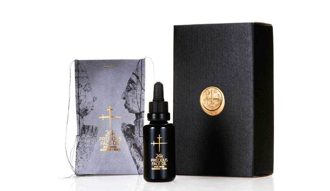
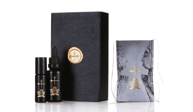
Title: 24k Precious Face Oil For Wise Women + Men.
Agency: Lepaar (NSW) – Johanna + Christo Everingham.
Stocks: Knight Textures – Linen 2-sided 280gsm
Printing specs: Offset, CMYK + PMS + Pantone Blue 072U and Pantone 7579U.
Printed by: Lindwall + Ward, Marrickvile NSW (1c black offset + sealing varnish). Gold detailing + embossing: Goldcraft, Marrickville NSW.
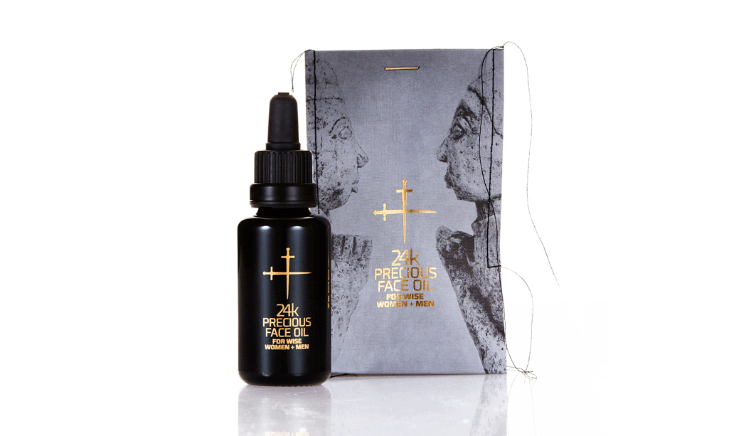
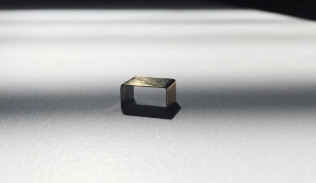
Embellishments: Stitching: Christo Everingham. The 14k gold plated staple from: OOOMS design studio, Netherlands.
Talented much are the first two words that spring to mind when speaking to Johanna, one half of Lepaar (the other half is…her other half Christo!). Drawing inspiration from the Knight promotion we released many years ago, the Lepaar design duo set about creating the packaging for their 24k Precious Face Oil.
Good design comes from lots of places but without a doubt, a brand’s philosophy will shape how good the outcome is. Lepaar are out to design exquisite products and objects of quality, beauty and function. They work with the best manufacturers, craftsmen and materials. They’re also staunch supporters of Australian companies and goods, plus they’re opposed to today’s throwaway kinda culture. The ingredients for the face oil are organic, biodynamic and from ethical growers and producers. We picking up what you’re putting down Lepaar.
Time for us to hand it over to Johanna, who has shared some great insights into the process…
“Because of our focus on local business, Doggett’s has been our first point of call throughout our years as brand designers. It’s a family run paper house, based in Australia and I’ve had brilliant personal service all the way through from Nathan Doggett. Living in the same suburb and bumping into each other over coffee or at house parties helps!
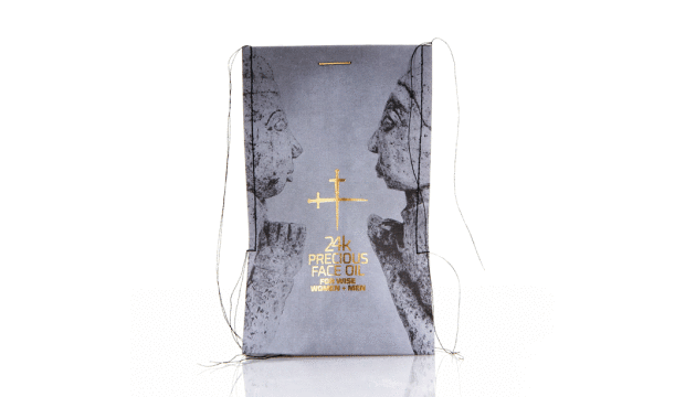
The Knight range has always been my personal favourite. The stock is one of the nicest to print deep blacks on without actually using rich blacks. For this particular job, we picked Knight Linen because it’s got a fabric-like stretchy quality to it which we needed to squeeze the bottle into the sleeve after stitching. The texture allows for stretch and handling without crinkling.
We know the stock, so did expect it to look and feel expensive and luxurious. Yet we were amazed by the richness of the black, given that we only printed 1c black, without extra screens. We did print offset rather than digital, which I believe made a difference.
We wanted the sleeves to be very avant-garde, expensive and luxurious looking, showing off the hand-made character of the stitching without making it look ‘crafty’. Our objective was beautiful, luxurious packaging that is not wasteful, has a collectors-item quality to it, is different and communicates the precious nature of the product.
We spend a long time sourcing packaging and found it tough trying to find someone who would produce small quantities in luxury materials and finishes in Australia, without much luck. Because we stitch all our products into paper packaging we ended up trying different versions of sleeves on the sewing machine one day, reluctantly cutting up my well-loved Knight promo which I consider a collectors item. It worked and looked stunning. Different and modern and rock ’n roll all at once.
The closure was a headache, until lateral thinking kicked in. We had stapled it just to see what it looks like closed, got the gold ink marker out and painted the staple. Bit of night time googling produced OOOMS, a dutch design co who had released 14k gold plated staples a few years back and Guido the owner was only too happy to send some our way. We love them and suggest to customers to reuse them as lapel pins or make earnings out of them.
We believe we have created packaging that conveys language – one interacting string of things that mix and match and talk to each other. In this case all the ingredients, inside and out, sing.”
Thanks Lepaar, our fellow paper obsessed customers. You’ve created truly beautiful and unique home grown packaging that we love, love, love.