Kevin Lincoln’s book: ‘The eye’s mind’.

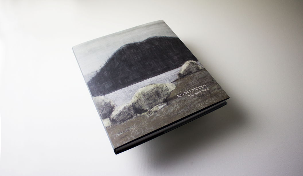
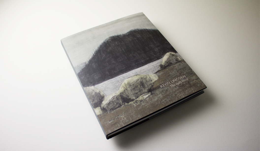
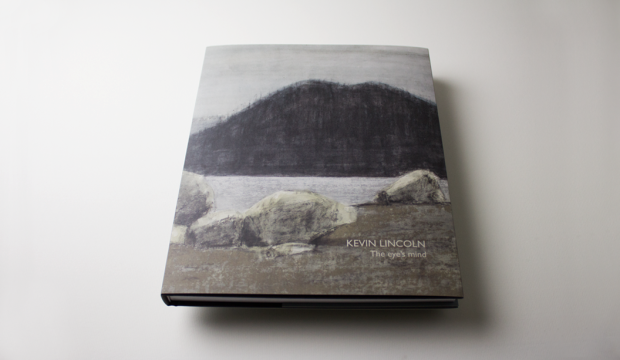
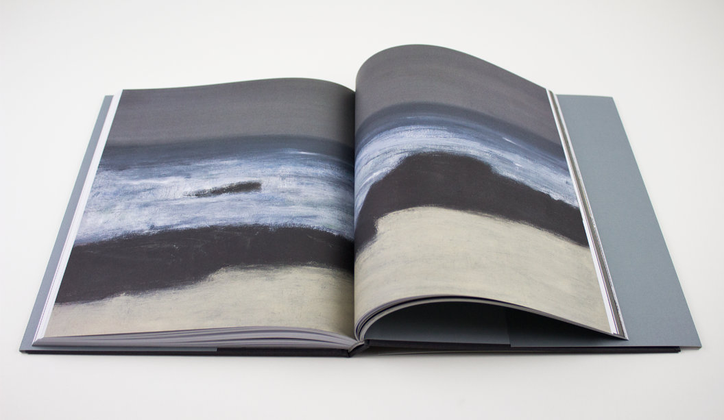
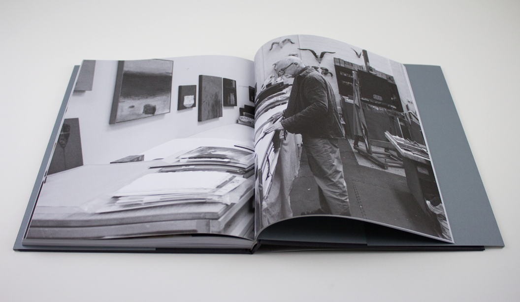
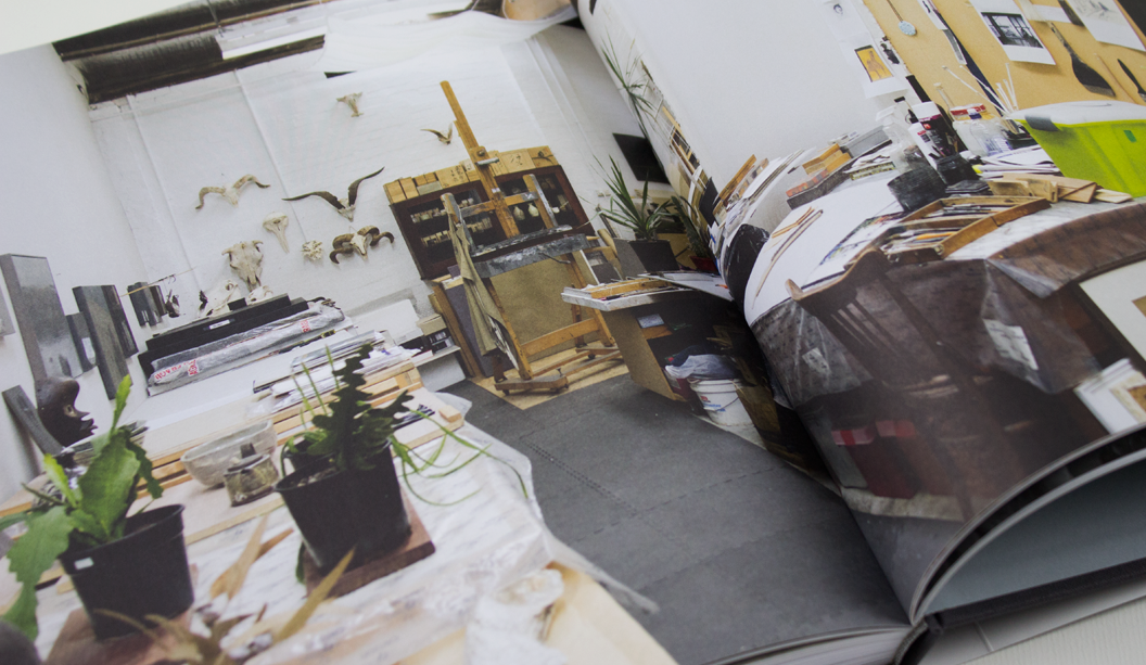
Artist: Kevin Lincoln.
Title:
The eye’s mind.  
Designer:
 Ben Cox.
Publisher: Art Gallery of Ballarat.
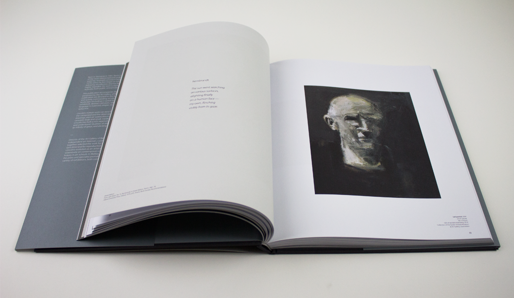
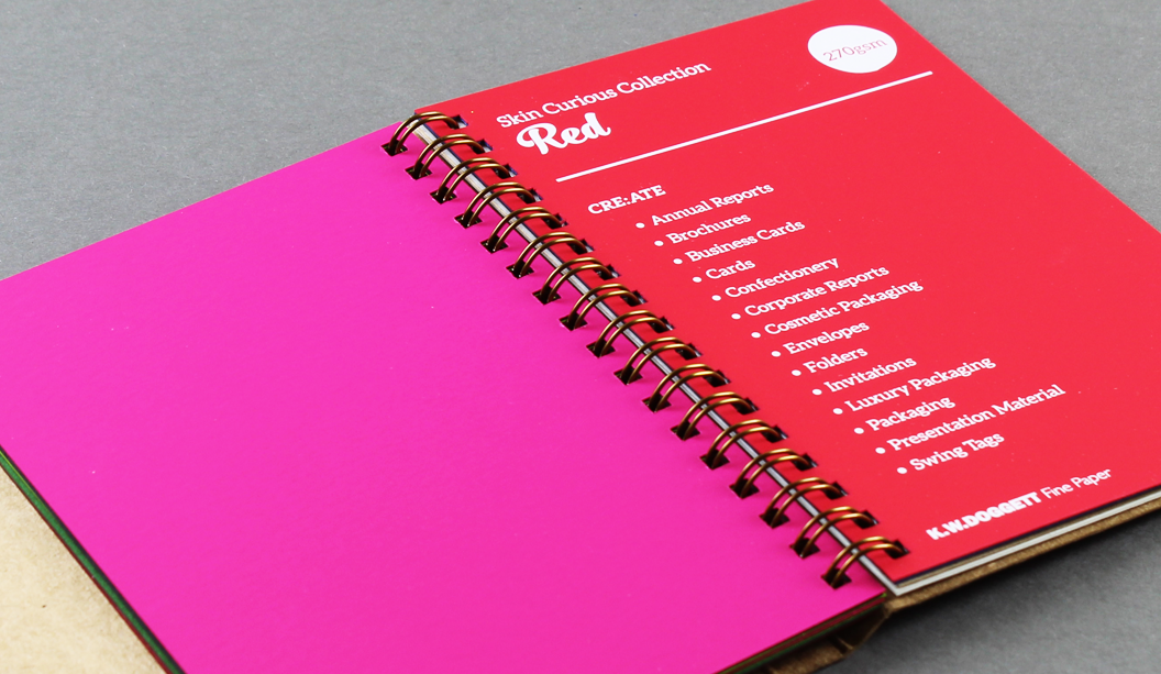
Stocks: Curious Matter Goya White 270gsm (cover), Grange Offset 135gsm (text).
Printing specs: 4 colour offset + PMS grey on the back and spine of the dust jacket.

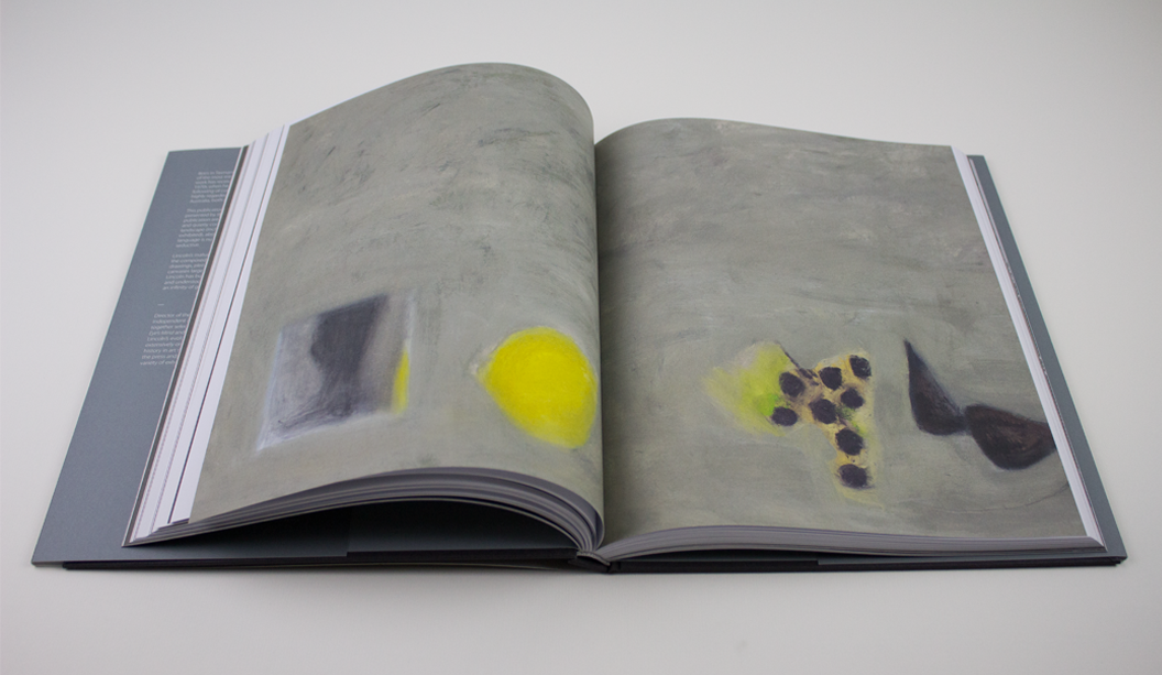
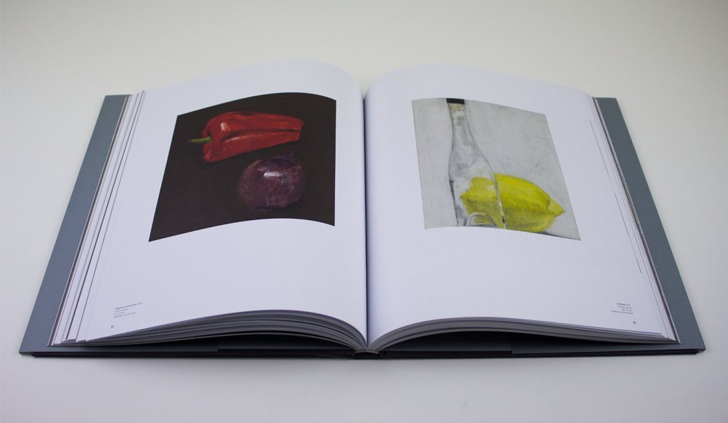
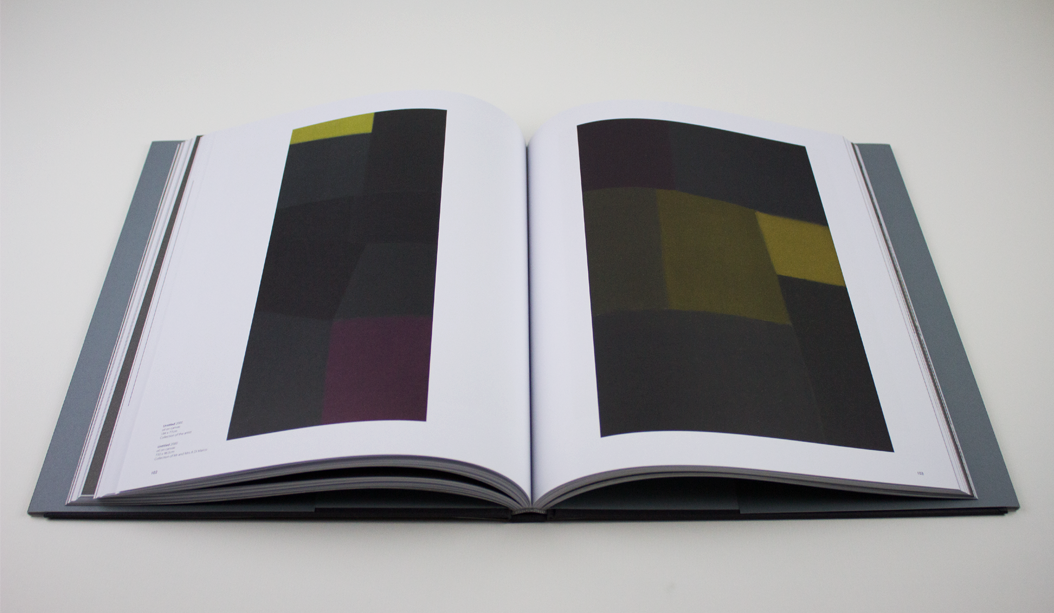
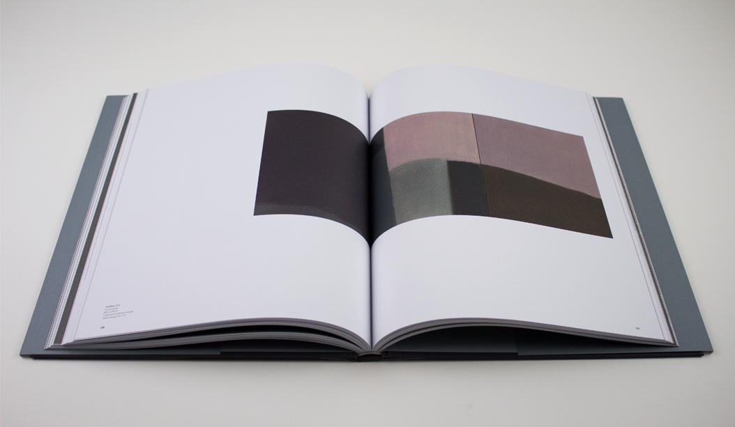
Feast your peepers on this collection of works by Australian artist Kevin Lincoln. With an impressive career spanning the decades, Kevin’s career although impressive isn’t widely known and yet has had a massive impact on the Australian art scene. So this 180 page publication not only accompanies his exhibition at the Art Gallery of Ballarat – the largest solo exhibition they’ve ever presented – but it’s also a highlight of the last 25 years of Kevin’s career which is described by The Art Almanac as poised, balanced and reflective.

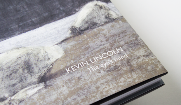
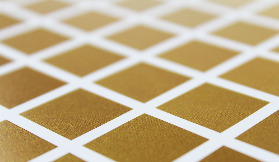
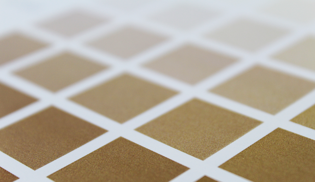
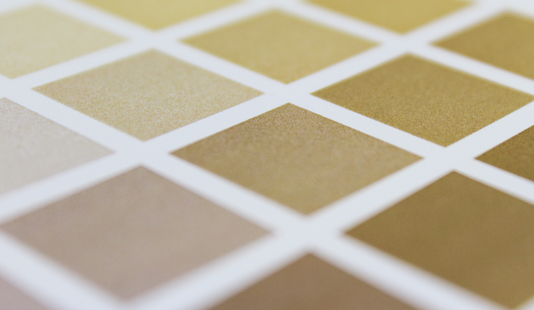
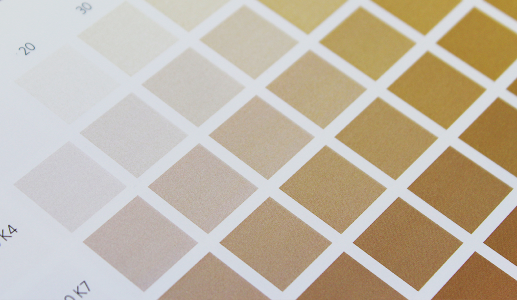
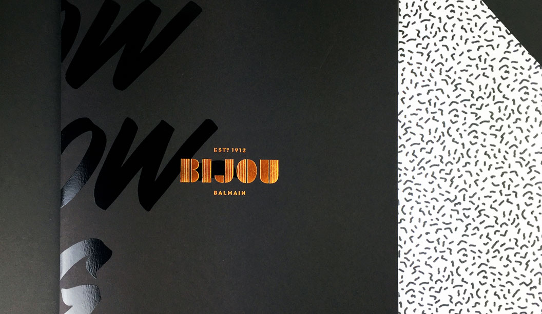
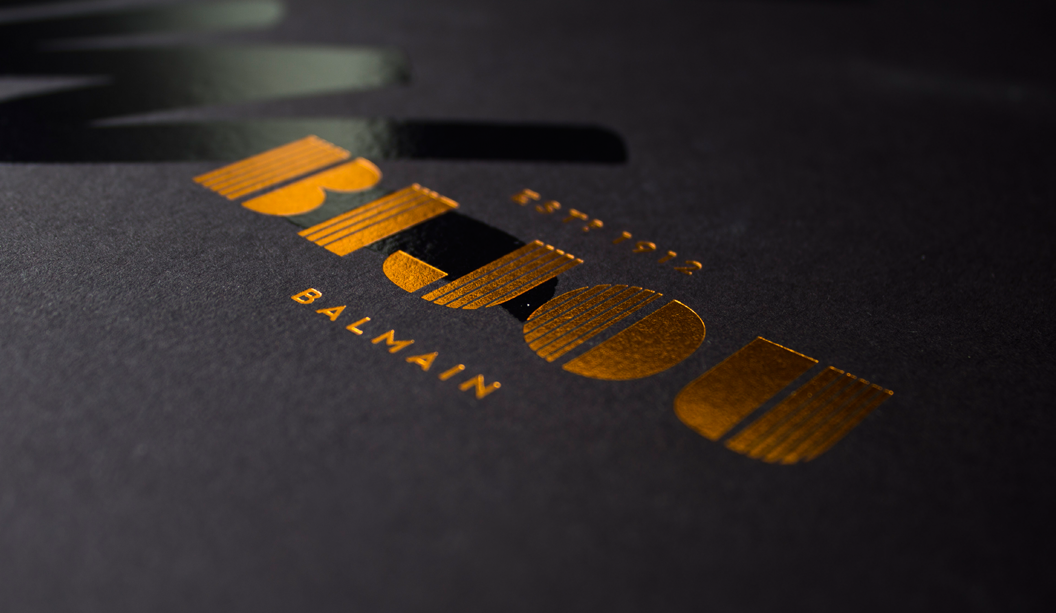
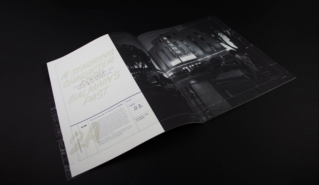
The dust jacket is printed on textured Curious Matter Goya White 270gsm and the text pages are Grange Offset 135gsm. Production insight: the dust jacket is printed 4 colour offset with PMS grey on the back and spine. You have to feel this book to appreciate just how perfectly the paper complements the design. It couldn’t have been paired any better.

With an interesting foreword offering some perspective on Lincoln’s ‘impoverished and bruising childhood’, it becomes clear to see how his style has developed into a sea of greys and rural scenes. Exhibition Officer/Book Designer Ben Cox shares how he conveyed the tone of the works in the design of the book.

“The design of the catalogue aims to reflect the subtle, nuanced and understated surfaces that are key to Lincoln’s work. The use of tonal greys throughout, the weight and balance of pages, font selection and stock all come together and attempts to give a sense of Lincoln’s work. Particularly, we selected Curious Matter for the dust jacket stock as it matched perfectly the feel of Lincoln’s tactile, raw and beautifully elegant paint surfaces.” We think they’re a match made in heaven, too.

The exhibition ‘The eye’s mind’ runs at the Art Gallery of Ballarat from 23 April – 19 June 2016. You can get your mits on a copy of the book by calling the Gallery Shop on 03 5320 5790. They even have some signed limited edition copies. Hazah!

About the Gallery:
The Art Gallery of Ballarat is the oldest and one of the largest regional galleries in Australia. Founded in 1884 the gallery has expanded through numerous renovations and extensions, most recently in 2001, bringing 19th, 20th and 21st century architecture together. AGB houses one of the most significant collections of Australian art in the country, from early colonial to contemporary work. A vibrant temporary exhibition schedule complements the permanent collection and sees a large number of exhibitions in its four temporary galleries annually. They also have public programs, workshops, talks, concerts and many other events on the go.

Kevin-Lincoln-Spine

Kevin-Lincoln-Cover-1

Kevin-Lincoln-Corner-Blog

Kevin-Lincoln-Cover-3

Kevin-Lincoln-Spread-8

Kevin-Lincoln-Spread-7

Kevin-Lincoln-Spread-6

Kevin-Lincoln-Spread-5

Kevin-Lincoln-Spread-4

Kevin-Lincoln-Spread-3

Kevin-Lincoln-Spread-2

Kevin-Lincoln-Spread-1

A label fit for an ice bucket

Did you know we sell all sorts of sticky labels? Address, beer, wine, invite, closure and loads more. We’ve pretty much got labels for all types. One of our self adhesive ranges that’s exclusive to us is Wausau. It has loads of colours and finishes. Everything from metalised silver, gloss or matt, natural kraft, black vellum, eggshell, white or even fine mesh like texture finishes.

Wausau Estate #8 Vellum – Ever Opaque is our latest fave. An elegant, white face stock with a toothy, vellum finish used for prestigious wine, beer and spirits labelling. It’s a strong, durable, ‘wet strength’ label that maintains its opacity and adhesion (the fibres are less likely to separate so the integrity of the label is not compromised), even hours after immersion in an ice bucket. Say whaaaat?! The under laminate film stops the general creasing and bubbling you get with other uncoated labels. It also reduces the wet-out (transparent) look you can sometimes get. Winning!

If you find yourself working on a brief to create a boutique brew, wine or spirit label, Wausau Estate #8 Vellum – Ever Opaque now comes in SRA3 sheets for use on HP Indigo and Dry Toner presses (traditionally it’s a roll label product). Some pros of now being able to digitally print this label on a HP Indigo or Dry Toner press are:

– No minimum orders required so now you can do short runs.
– Cheaper in sheets than buying it as a roll.
– Come in both solid and split backs (if you need a special die cut, call us and we can sort out a manufacturing order).

If you’re one of our customers and have an ‘Adhesive Rolls’ swatch, check it out for some samples of the Wausau range. Or call you trusty rep for more information.


Wausau-Estate-8-Central-Park-1

Wausau-Estate-8-Central-Park-2

Wausau-Estate-8-Capo-Dei-Fiori-2

Wausau-Estate-8-Capo-Dei-Fiori-3

Wausau-Estate-8-Chill-1

Wausau-Estate-8-Chill-2

Wine-label

Wausau-Estate-8-Chill-3-Close-Foil

Wausau-Estate-8-Fizz-2-Left


Five ways to achieve bling on a tight budget

Not that long ago, adding bling like foil or opaque white ink to a print job was either too expensive or only available if you went to a particular printer. BUT! Now we’re going to give you the very good news. Adding embellishments on a minimal budget is more accessible. Embellishments may seem out of reach when you’re on a small budget, but we’re here to tell you the TOTAL opposite. Shock, horror, gasp. Here are five digital printing machines that can give you bling for minimal cost.

1. Opaque white ink is now available on HP Indigo presses 5500 and above ie the 5500/5600, 7600/7800. Please note that the B2 Indigo ie the HP Indigo 10000 press, doesn’t offer a white ink station. So you can do white ink on its own (see first and second pics below) or add CMYK over the top (refer to the Pop’Set Pink card below).

2. The OKI C711WT does white ink and can handle a large range of printing papers. We’ve seen it used on everything from Buffalo Board to Skin Curious Collection and even Tacky Dry Crystal Cling Clear Gloss (an electrostatic product you can use for window applications among other things). See pics in post.

3. Ricoh C7100X does white or clear ink and you can do multiple hits of the white in one pass without any concern for mis-registration.

4. Kodak NexPress does Gold Dry Ink or Clear. The NexPress colour charts have hundreds of shades of gold through to copper and many other colours too (see images at the end of this post).

5. Fuji Xerox Colour 1000i does Clear Dry Ink, Metallic Gold or Metallic Silver. Use this machine to replicate foil stamp, metallic, spot or flood effects.

Remember to contact your paper specialist for a heads up on printer(s) in your area. They may also have a print sample of the techniques mentioned above which they can show you.


Ricoh Curious Skin Black

HP-Indigo-Poset-1

HP-Indigo-Poset-2

HP-Indigo-Popset-3

PS-Creative-Paper-Guide-OKI-Print-1

PS-Creative-Paper-Guide-OKI-Print-2

PS-Creative-Paper-Guide-OKI-Print-3

Kodak-Gold-Full

Kodak-Gold-5

Kodak-Gold-4

Kodak-Gold-3

Kodak-Gold-2

Kodak-Gold-1

The Mohawk Maker Quarterly gives us the feels

This is issue #8 of the Mohawk Maker Quarterly, designed by Hybrid Design and brought to you by one of our eminent mill partners – Mohawk. This issue is particularly special because it combines the Strathmore range and also Curious Collection which is from the Arjowiggins mill (Mohawk are now the North American suppliers of the Curious Collection range which makes us rather happy because we’re the Australian ones!). Maker is always a gift to the senses, a showcase of high quality printed matter in what is an increasingly digital era. It’s a real print treasure and celebration of creative, hands-on makers of this world.

Mohawk stands by the fact that embracing the medium is just as important as the message in creating an experience and building an emotional connection and with this issue, themed ‘Feel’, this premise is taken to a whole new level. This quote from the publication says it all: “Customers don’t necessarily remember what you do for them as much as they remember how you made them feel.”

We love the eight distinctive papers combined with a killer print job (offset printed using conventional and UV inks). They’ve boldly and cleverly combined half sheets, textured papers with photography, metallic papers with artworks and a deckled edge. The print medium, in our eyes at least, creates ‘feeling’ like not many other mediums can. Colour, texture, visuals. Print has the power to create a lasting memory and give anyone who loves design, print and paper all the feels.

Cover – What’s firstly most striking is Olimpia Zagnoli’s beautifully bold pattern illustration that blends so seamlessly with the Strathmore Wove Riveria Rose (one of four Strathmore Heritage Collection colours introduced in 2015). We don’t sell it but can look to order it for you, just keep in mind there would be a minimum order amount. Read this blog post by Parse and Parcel for an excellent read and print production tip when printing on dark coloured papers. Mohawk hit the sheet with opaque white ink, twice, then used UV inks which dry instantly and don’t soak into the sheet so are much more punchy.

Maker-1

Medium Rare – Music fans online go-to is pitchfork.com and they’ve just release a quarterly magazine – because there are some stories that just have to be told on paper. An online presence going offline. The travesty! Flies in the face of convention it does. The Pitchfork Review showcases the striking beauty of Curious Collection Metallics – Ice Gold, against vibrant images printed on Strathmore Premium Wove and Smooth – Platinum White. This is a fun spread. The half page looks rad.

Maker-pics-3

Maker-pics-4

Nature’s Calling – We stand by the choice to use uncoated papers for photography, as long as you prepare the files the right way and work with a printer that is willing to push it with you. A great example of how to make this combo work is the section on Kennett Mohrman which looks amazing on uncoated Strathmore Pastelle that has a felt finish. The mossy covered terrain appears as a double page spread printed partly on Strathmore Cambric that has a linen finish and the Strathmore Pastelle. Same photo across two different papers, one Platinum White the other Bright White. And geez it looks a-ma-zing! The photo is a beauty. So much depth and richness. The half sheet on Skin Curious Collection – Black printed with white ink even comes with augmented reality components.

Maker-pics-6

Maker-pics-7

Maker-pics8

Strathmore Archive – We absolutely love this double page spread called The Strathmore Archive. The team at Mohawk found all these swatches and print samples, boxed-up in their warehouse. Literally over 100 years of print design in America, discovered in some dusty boxes! The deckled edge. Swooooon.


Maker-pics-9

Maker-pics-10

Maker-pics-14

Why Design Matters Another half sheet and mixed paper goodness combo that gives us the design feels. Strathmore Premium Cambric (a linen finish) with Skin Curious Collection – Black and a half sheet thrown in for good measure. A perfect backdrop for Alain de Botton’s article on how objects make us feel – how good design can assist us with becoming even better versions of ourselves. As one blog mentions, the mid century illustrations look awesome printed on the linen sheet, as does the cathedral printed with red ink on the black. Clever.

See more pics and another write-up here, via the Mohawk blog Felt & Wire.


Maker-pics-11

Maker-Pics-15

The Movement – This is what the Maker does really well – covers some really talented champions of craft – small manufacturers, artisans, printers, designers and artists from around the world still using their skills in this so called age of the digital revolution. Our very own Australian brandDinosaur Designs even get a mention in this one! Other makers include Shelter Social Club, Penland School, Brothers & Craft, Sebastian Cox, Object and Totem and Adam Silverman. Plus there’s some more augmented reality to enjoy.

It is impossible to tell from this picture but the smart cookies at Hybrid and Mohawk have paired the photograph of this wooden sculpture with Curious Metallics – Ice Gold which literally has a gold shimmer finish. We’ve said it before and we’ll say it again. Clever.

And if this wasn’t enough for your senses, see more pics and another write-up here, via the Mohawk blog Felt & Wire.

Maker-Pics-16

Maker-Pics-17

Maker-pics-12

Maker-pics-13

VoPP Nutella Case Study

BACKGROUND:

Nutella wanted to build a lasting relationship with its customers and attach a sense of community to its iconic brand. To achieve this, they needed to make each customer feel special and trigger an emotive response that encouraged deeper connections with the brand.

VOPP-Nutella-Case-Study-2

The solution was to build a campaign that focused on personalisation with customers being given the opportunity to receive printed labels, or purchase personalised jars, that displayed their name in the trademark Nutella typography. The campaign has been a great success in Australia with hundreds of thousands of customers engaging with the novel idea and sharing images of their jars on social media.

OBJECTIVE: 

To tap into the lucrative millennial market segment whilst also appealing to their core target market of families required Nutella to engage with their customers on a truly personal level. Nutella realised that a product offering which appealed to individuals was key to the campaign’s mass appeal and success. To do so, Nutella adopted a one-to-one marketing strategy which focused entirely on the concept of ‘Make Me Yours’ with customers invited to personalise their Nutella label.

Given that millennials are all about mobility and digitisation, the ability to integrate innovative labelling and packaging with social media is paramount.” 

Gareth Pearson, CEO at BMi Research

METHODOLOGY: 

Nutella announced through multiple social media platforms that, for a period of time, customers who purchased a special jar of Nutella could request a personalised label which could be wrapped around the jar, replacing the standard Nutella label.

The customer had to use an in-built Facebook app to scan the barcode on the Nutella jar and then type the name they wished to be used for their personalised label. The label would then be posted to the customer for them to stick onto their jar of Nutella. The accompanying letter encouraged people to upload photos of themselves with their personalised jars onto Nutella’s Facebook page and share the experience with friends through the #mynutella hashtag.

VOPP-Case-Study-Nutella-4

Originally, the campaign was due to last for a six week period creating a sense of urgency with Nutella fans who wanted to take advantage of the special offer. However, major retailer Myer saw the potential in offering the service in store as part of their ‘Giftorium’ Christmas campaign. Partnering with Ferrero (Nutella’s manufacturer) Myer offered shoppers the opportunity to instantly purchase personalised jars, with special printers being deployed to all stores in order to print the personalised labels.

RESULTS: 

The initial campaign launch was very successful with hundreds of thousands of customers accessing the online app to receive personalised labels for their Nutella jars. Millennials quickly became Nutella’s greatest and most vocal advocates with thousands of customers using social media to propagate their recommendations to friends and family and upload images of their personalised Nutella jars.

For many, the concept was perfect to give to a friend or family member as a thoughtful and unique Christmas present. However, many would not have taken the steps required to receive the personalised labels via post, regardless of how perfect the gift may have been for its recipient.

This apparent shortfall in the deployment of the campaign was perfectly filled by retailer Myer’s ‘Giftorium’ Christmas campaign. Myer was the only retailer in Australia who offered the service and it featured heavily in all of their stores nationwide. The success of the in-store personalised Nutella jars was astounding and became the top-selling item for their Christmas period. Myer sold more than 400,000 personalised jars in Victoria alone with 50,000 being sold in their flagship store.

The personalisation of interactions fosters greater customer loyalty which ultimately results in the holy grail of marketing – namely improved ROI.” 

Gareth Pearson, CEO at BMi Research

CONCLUSION: 

Over the past couple of years, the concept of mass personalisation has emerged as a powerful differentiator for brands who are eager to give their products a USP in increasingly competitive markets. Especially among millennials, who demand more from the brands they choose to engage with, offering a personalised experience is essential for developing customer loyalty. Combining the power of customised printed packaging with social media is a highly effective tactic for forging strong customer engagement.

Today’s consumers want to feel unique and by offering something personalised and affordable, brands can achieve this and reap the rewards. The trend towards personalised packaging and printed marketing material will no doubt continue to rise with marketers capturing and utilising more customer data than ever before. The ability of printers to adapt to these changes and offer personalised components to a brand’s product or service offering will become essential as marketers continue to seek evermore effective ways to engage with their customers.

VoPP_3

Thanks to Kellie Northwood, Executive Director of VoPP/Two Sides Australia for allowing us to republish this case study, made available to us as Foundation Sponsors of TSA Limited, the publishers of the VoPP (Value of Paper and Print) report. Find out more via www.valueofpaperandprint.com.au.

Bijou property book by Hoyne (NSW)

Title: Bijou.
Agency:
 Hoyne (NSW). 
Stocks:
 Keaykolour Black 300gsm (cover) Keaykolour Ultra White 170gsm (text).
Printing specs: High Build Spot UV on the entire outer and inner cover + copper foil logo on front/back
Print managed by: Green & Gold.

With the boom in property development seeing no sign of slowing down just yet, we bring you yet another stunning piece by Hoyne in NSW for the Bijou development. Led by developer MADE and SJB interiors, the former Bijou Theatre in Balmain is being adapted to create 29 apartments that will exude style and panache.

The whole of Balmain exudes a feeling of nostalgia and charm with its colonial sandstone buildings, Victorian institutions and small workers cottages set among leafy streets. The Bijou itself is a robust art deco building well recognised by locals.

The entire brand identity developed by Hoyne references the art deco heritage of the building in a contemporary style. And the campaign features a script reminiscent of retro movie credits and theatre posters that points to the building’s past life as a theatre and cinema. What’s old is new again.

Hoyne chose Keaykolour Original mainly for its texture. As Leesa from Hoyne adds: “This project was all about the art deco influences, so we wanted a paper that felt vintage but lush.” It’s a great pairing and another fabulous example of how the right paper complements the design.

We really do see a lot of property pieces come across our desk and it’s great to see considered pieces like this one. Some simple embellishments, great design, print and paper choices has set this piece apart from others we’ve had come across our desk. Kudos.

Bijou-1

BIJOU-PROPERTY-MAG-3

BIJOU-PROPERTY-MAG-2

BIJOU-PROPERTY-MAG-SPREAD-4

BIJOU-PROPERTY-MAG-SPREAD-3

BIJOU-PROPERTY-MAG-SPREAD-2

BIJOU-PROPERTY-MAG-SPREAD-1

Bijou-3

Beautiful product packaging by Lepaar

Title: 24k Precious Face Oil For Wise Women + Men.
Agency:
 Lepaar (NSW) – Johanna + Christo Everingham. 
Stocks: 
Knight Textures – Linen 2-sided 280gsm
Printing specs: Offset, CMYK + PMS + Pantone Blue 072U and Pantone 7579U.
Printed by: Lindwall + Ward, Marrickvile NSW (1c black offset + sealing varnish). Gold detailing + embossing: Goldcraft, Marrickville NSW.
Embellishments: Stitching: Christo Everingham. The 14k gold plated staple from: OOOMS design studio, Netherlands.

Talented much are the first two words that spring to mind when speaking to Johanna, one half of Lepaar (the other half is…her other half Christo!). Drawing inspiration from the Knight promotion we released many years ago, the Lepaar design duo set about creating the packaging for their 24k Precious Face Oil.

24K-Image-3

Good design comes from lots of places but without a doubt, a brand’s philosophy will shape how good the outcome is. Lepaar are out to design exquisite products and objects of quality, beauty and function. They work with the best manufacturers, craftsmen and materials. They’re also staunch supporters of Australian companies and goods, plus they’re opposed to today’s throwaway kinda culture. The ingredients for the face oil are organic, biodynamic and from ethical growers and producers. We picking up what you’re putting down Lepaar.

Time for us to hand it over to Johanna, who has shared some great insights into the process…

“Because of our focus on local business, Doggett’s has been our first point of call throughout our years as brand designers. It’s a family run paper house, based in Australia and I’ve had brilliant personal service all the way through from Nathan Doggett. Living in the same suburb and bumping into each other over coffee or at house parties helps!

The Knight range has always been my personal favourite. The stock is one of the nicest to print deep blacks on without actually using rich blacks. For this particular job, we picked Knight Linen  because it’s got a fabric-like stretchy quality to it which we needed to squeeze the bottle into the sleeve after stitching. The texture allows for stretch and handling without crinkling.

24K-Image-2

We know the stock, so did expect it to look and feel expensive and luxurious. Yet we were amazed by the richness of the black, given that we only printed 1c black, without extra screens. We did print offset rather than digital, which I believe made a difference.

We wanted the sleeves to be very avant-garde, expensive and luxurious looking, showing off the hand-made character of the stitching without making it look ‘crafty’. Our objective was beautiful, luxurious packaging that is not wasteful, has a collectors-item quality to it, is different and communicates the precious nature of the product.

We spend a long time sourcing packaging and found it tough trying to find someone who would produce small quantities in luxury materials and finishes in Australia, without much luck. Because we stitch all our products into paper packaging we ended up trying different versions of sleeves on the sewing machine one day, reluctantly cutting up my well-loved Knight promo which I consider a collectors item. It worked and looked stunning. Different and modern and rock ’n roll all at once.

The closure was a headache, until lateral thinking kicked in. We had stapled it just to see what it looks like closed, got the gold ink marker out and painted the staple. Bit of night time googling produced OOOMS, a dutch design co who had released 14k gold plated staples a few years back and Guido the owner was only too happy to send some our way. We love them and suggest to customers to reuse them as lapel pins or make earnings out of them.

We believe we have created packaging that conveys language – one interacting string of things that mix and match and talk to each other. In this case all the ingredients, inside and out, sing.”

knight2


Thanks Lepaar, our fellow paper obsessed customers. You’ve created truly beautiful and unique home grown packaging that we love, love, love.

24K-Image-6

Ligature Journal by Tiliqua Press and Billy Blue students

Agency: Tiliqua Press with students from Billy Blue.
Publisher: Felix Oppen.
Stocks: 
Grange Offset 300gsm/110gsm.
Printed by: Seed Print Group in NSW.
Printing specs: CMYK Offset printed.

Every once in a while, someone dreams a little dream, yanks it out of the matrix, thrusts it into reality and watches it take shape. It’s a beautiful thing. This is the case with Felix Oppen, who recently launched the inaugural Ligature Journal, a publication made in collaboration with a bunch of hard working and enthusiastic students at Billy Blue College of Design.

If you’re looking for a fresh compilation of ripper content featuring local artists and student work that spans graphic design, illustration and photography, call off the search party. One of the many cool things about Ligature Journal is that every aspect is student managed from content to press checks to building the digital version. While some may be dismissive of a student magazine, it totally stands up on its own as a top shelf, relevant publication. This is exactly the vision Felix had for Ligature Journal – that it would add to the design and creativity discourse in Australia, New Zealand and beyond.

The team chose to release print and digital versions of Ligature Journal. Felix believes the future of publishing is to let each medium play to its strengths but work together. Smart. It is intended to be a tri-annual publication and you can already buy Issue Zero here.

The stock chosen for this work is Grange Offset 300gsm/110gsm, an economical, bright white uncoated paper which Felix says punches way above its weight and is regularly mistaken for a specialty paper. We agree that the print job looks bang-on, and we look forward to watching the development of the concept across future issues.

Ligature-Journal-Print-Grange-Offset-Uncoated-K.W.Doggett-3

Ligature-Journal-Print-Grange-Offset-Uncoated-KwDoggett

Ligature-journal-offset-print-uncoated-australia-spread

Ligature-Journal-Print-Australia-Grange-Offset-Uncoated-K.W.Doggett-6

Pictured: Students reviewing layouts and the running order of articles, with Kuen Kam – the Billy Blue lecturer/mentor.

Ligature-journal-uncoated-offset-print-australia-k.w.doggett

Ligature-Journal-Australia-Print-Grange-Offset-Uncoated-K.W.Doggett-7

Pictured: At the launch, a very happy contributor, Neil Barnett (centre) and is partner, Vicki (left), with Neil’s article on raw food. Kuen Kam (right) is the Billy Blue lecturer/mentor for the students.