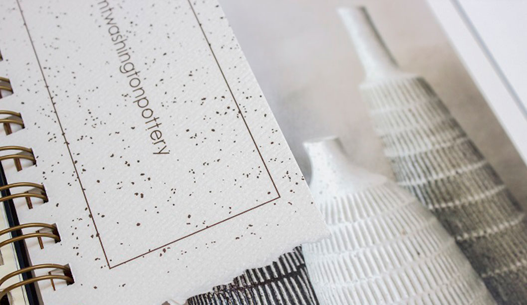
MultiLoft™ Encore is made using Convertible Solutions cohesive glue technology and Mohawk’s Superfine range of papers, certified to run on the HP Indigo press.
Looking for a pimped-up business card, with comps, wedding invite or greeting card that takes thickness to the max? MultiLoft™ Encore is where it’s at. Colour is built into the sheet of paper. So it’s ultra white on one side and coloured on the other side. And we also sell insert colours so the options are endless.
To achieve double the thickness of what is an already pretty thick card, print on the white side of two different sheets of MultiLoft™ Encore and then stick them together. Each double thick finished piece is approximately 634gsm.
The MultiLoft™ Encore inserts have cohesives (sticky stuff) on both sides and can be placed between the sheets to create colourful, eye-catching projects. As an example, adding x1 insert sheet, the thickness goes up to approximately 904gsm. Keep adding inserts to achieve your desired thickness.
After your project is printed and constructed, you can then diecut your job into the desired shape.
The range MultiLoft™ Encore sheet colours: Ultra white/Kraft (brown), Ultra white/Black Licorice, Ultra white/Wild Cherry, Ultra white/Pacific Breeze, Ultra white/Orange Fizz, Ultra white/Blue Raspberry. Click here for the full sheets stock chart.
MultiLoft™ Encore insert colours: Kraft (brown), Black Licorice, Wild Cherry, Pacific Breeze, Orange Fizz, Blue Raspberry.
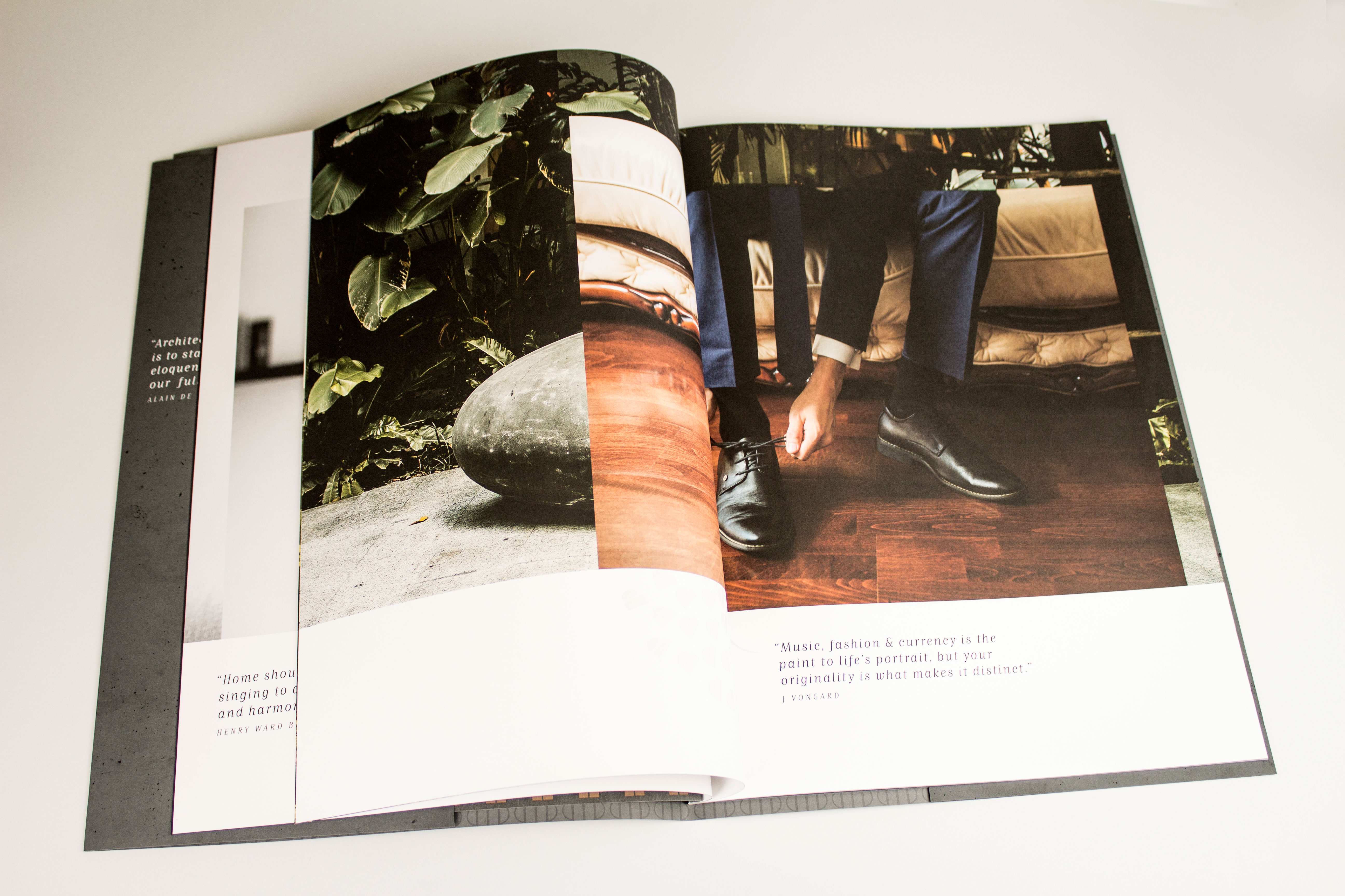
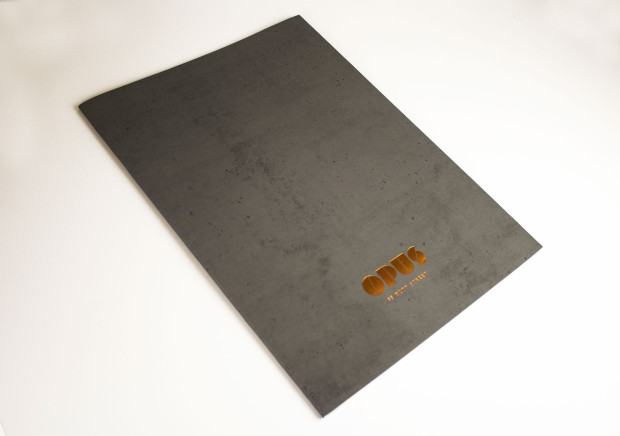
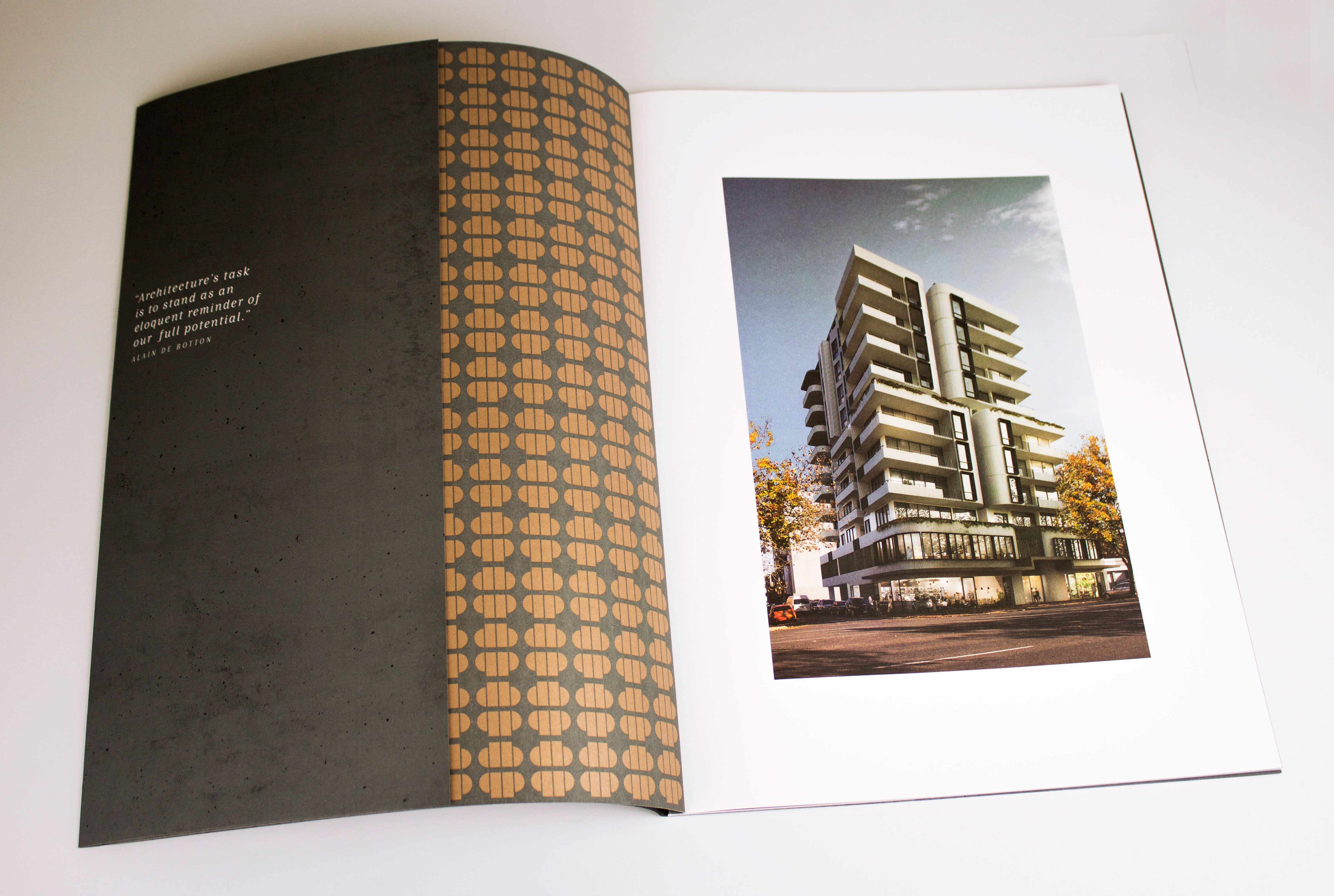
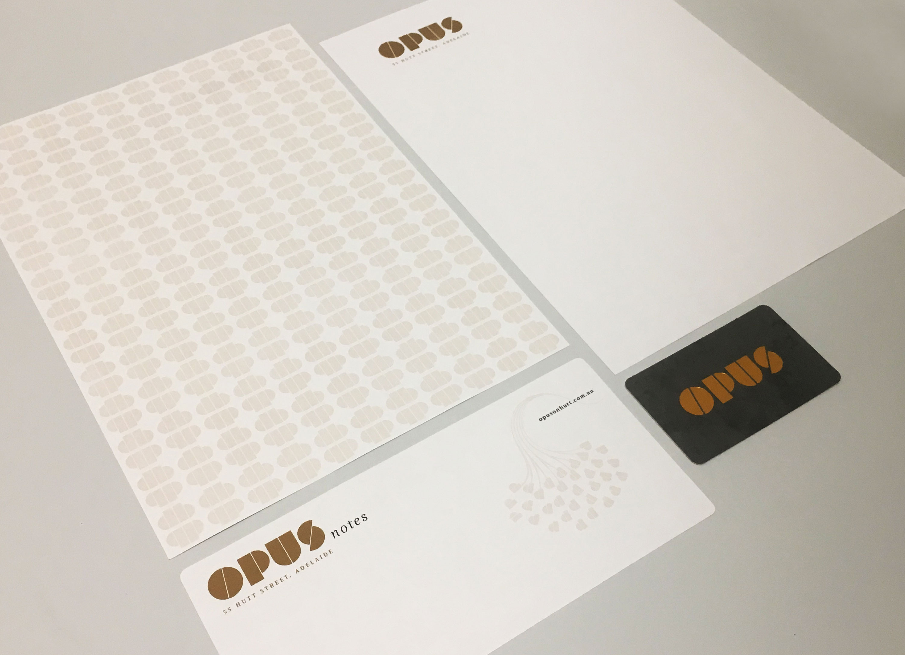
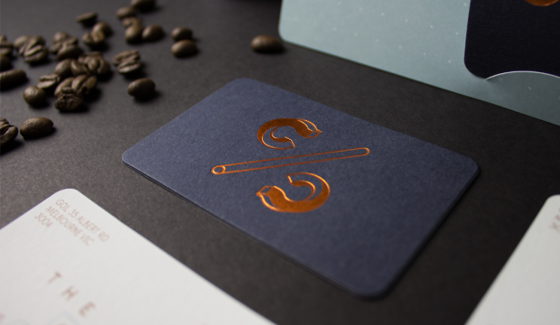
We love this marketing suite for OPUS on Hutt Apartments. Designed by Black Sheep Advertising in Adelaide for their client Proton Developments, the brochure emanates quality attention to detail and the business cards are just class.
OPUS (which means masterpiece), is a premium apartment development in the Adelaide CBD offering larger than usual apartments. Most places currently on the property market are substantially smaller in comparison. Plus, OPUS boasts all the dreamy bells and whistles like innovative integrated technology, premium finishings and fittings and a modern layout. Yes, we want to move in too. Get in line!
Creating a printed piece that stands out from the crowd is no mean feat. It practically has to yell your name and buy you a coffee to get your attention. Black Sheep Advertising have designed a clever marketing suite that is next level and reflects OPUS’s unique inner city living offering.
The burst bound brochure, printed on Knight Smooth, is over-sized and has a deliberate coffee table book feel. Black Sheep Advertising shares: “It was important to have print as part of our execution. Firstly, a functional reason – when people are looking to buy into a development it is important to be able to provide them with something to take home and return to multiple times.” The brochure’s dust jacket is treated with an all over soft touch Plasticoate laminate (it literally feels like it sounds) and a swish copper foil for the logo to add extra wow. The textures and colours throughout the brochure pick up on the architectural colour palette of the build.
The stationery and business cards are also printed on Knight Smooth. Again, the soft touch Plasticoate laminate and copper foil feature on the business card. Black Sheep mentioned to us: “When you hold the business card or the brochure in your hand, you can tell the project is one of quality and that sense is left with you after you put it down again.”
Find out more about the project which seeks to provide a quality of apartment living never seen in Adelaide before at www.opusonhutt.com.au.
Brochure: 24pp + 4pp cover
Finished size: 416 x 306mm
Cover: PMS 425 (Grey) + Black + o/all matt sealer varnish (outer) + PMS 425 (Grey) + PMS 876 (metallic) + Black + o/all matt sealer varnish (inner)
Text: CMYK + o/all matt sealer varnish t/out
Dust jacket: PMS 425 Grey + Black + soft touch cello + copper foil / matt sealer varnish to inner
Stock: Cover: Knight Smooth 350gsm, Text: Knight Smooth 170gsm, Dust Jacket: 140gsm Knight Smooth
Business cards: Finished size: 90 x 55mm
Front: Black + PMS 425 (Grey) + PMS 876 + metallic copper foil + soft touch cello
Back: Black + o/all matt sealer varnish
All four corners forme-cut round
Stock: Knight Smooth White 400gsm
Letterhead and with comps: Letterhead finished size: 210 x 297mm
With comps finished size: 100 x 210mm
Front: Black + PMS 876 + o/all matt sealer varnish
Back: PMS 876
All four corners forme-cut round
Stock: Knight Smooth White 120gsm
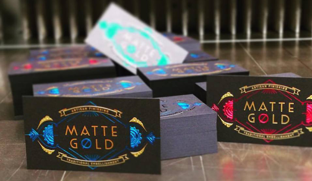
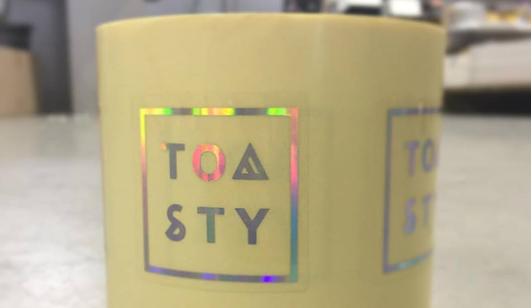
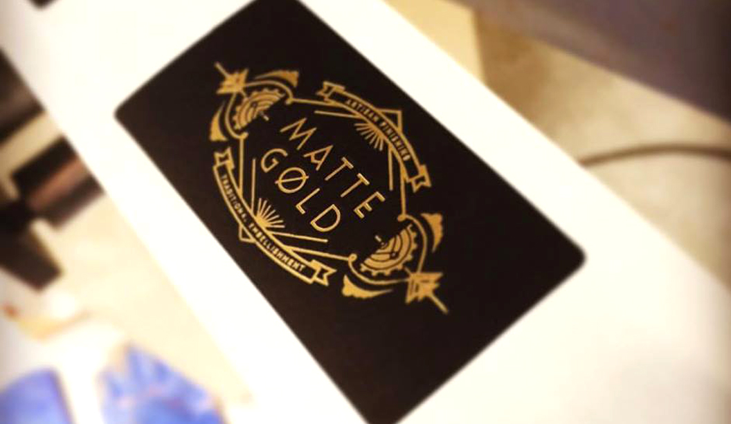
We all love a bit of bling on paper, especially the gold variety, or silver, or bronze…we’re not fussy! Matt Murcott, Director at Matte Gold sure knows how to make paper sparkle. Being in the business of embellishments, they specialise in foil stamping, embossing, forme cutting, holographics and even highly secure hologram foils.
Family owned and operated, Matt first sighted a foil-stamping machine as a child in the Moorabbin factory where his father worked. After countless school holidays cutting his printing teeth on the Milford Astor hand foil stamping press, at 17 years of age, Matt began his foilstamping apprenticeship. The rest is history. Matt shares: “Matte Gold was always going to be realised – it was just a matter of when…”
Now a Foilmaster in his own right, Matt and his team work on some seriously cool projects from shimmering candle labels to stickers for tattooists, specialised business cards with coloured foils and specialty applications like Perspex and leather. For the last five years Murcott has worked closely with the RMIT Design Management and students, sharing his knowledge of the trade and is also on their Program Advisory Committee.
The embellishment industry has come a long way in recent years and business is constant for Matte Gold. The biggest challenge has always been about education, for designers and consumers. Matt says: “Offshore options for consumers are slowly being reigned in thanks to poor quality and slow turnarounds but what remains is the ‘I want it now and I want it cheap’ issue… Designers are more inclined to ask questions before pushing the boundaries.”
When asked what the ultimate job would be, Matt said: “We do a bit of work with musicians and tried to get a spot producing some items for Midnight Oil’s tour this year, this would have been my personal dream project if we had pulled it off. Other than this, a lot of our work is so much fun and some days what we are doing right now, is dreamy enough.”
You can check out more of Matte Gold’s flashy creations here.
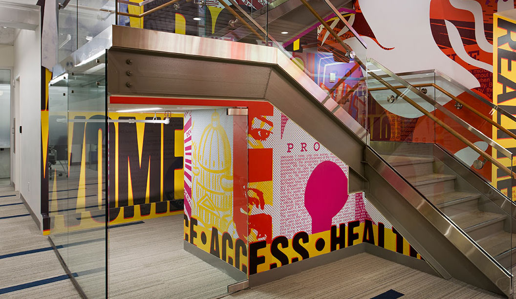
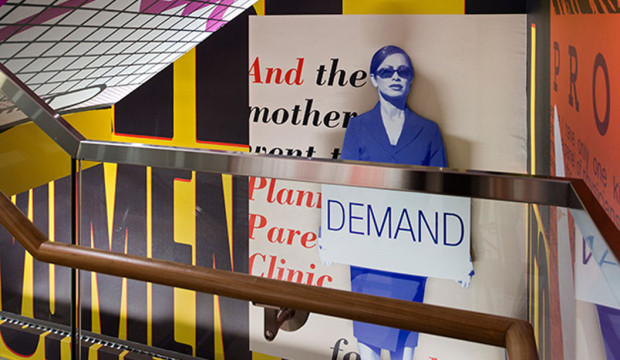
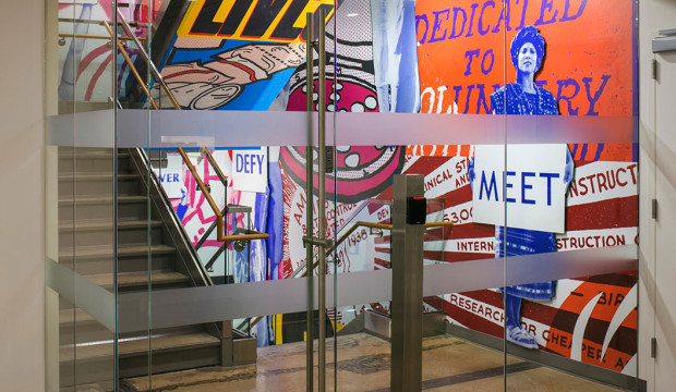
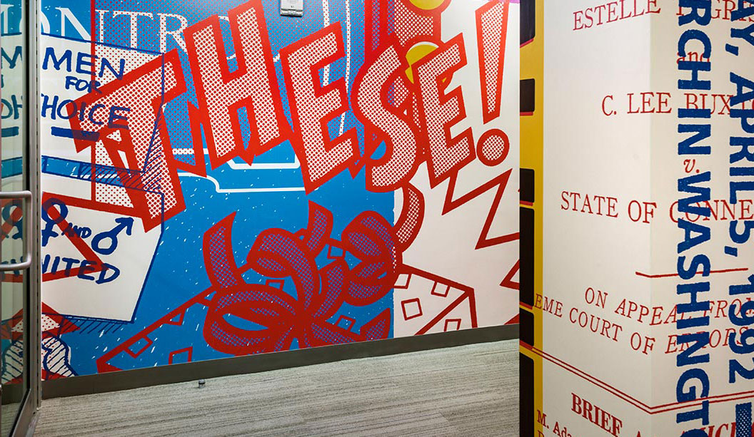
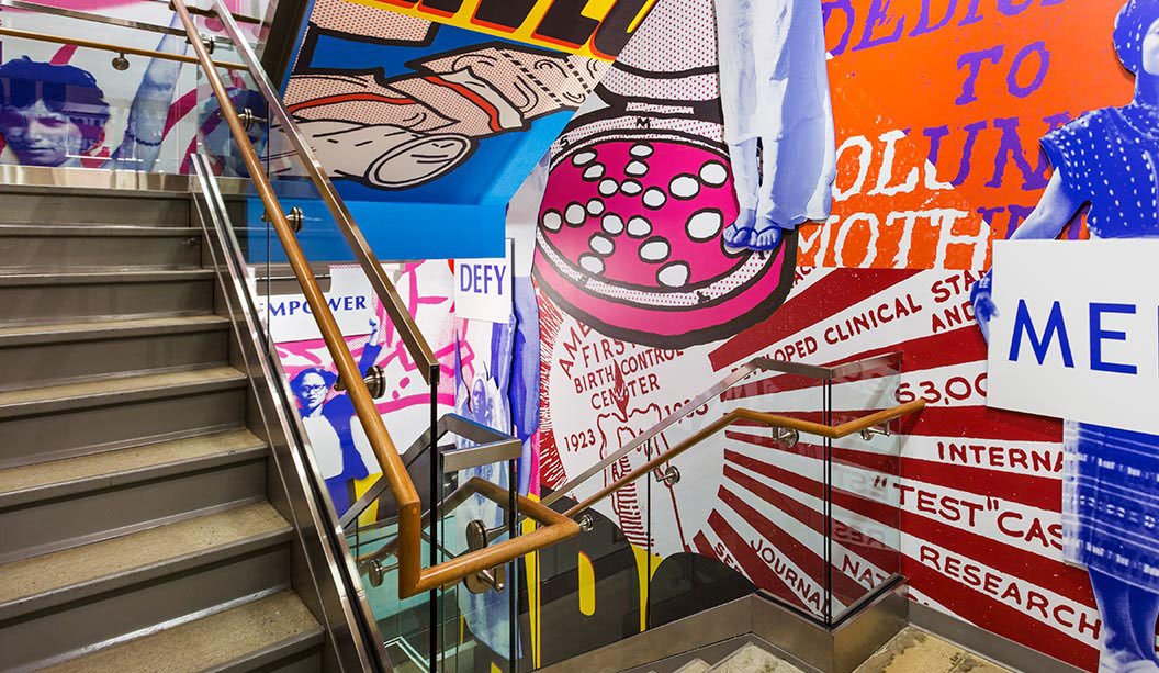
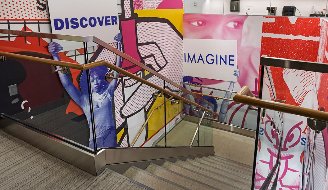
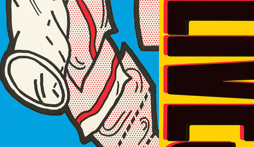
Project name: Planned Parenthood mural Partner-in-Charge/Designer: Paula Scher Associate Designer: Courtney Gooch Project Manager: Sarah McKeen Photos: Peter Mauss/Esto
We spotted this excellent example of wide format (commonly known as outdoor media), on the Pentagram blog. What we love about this project is the use of a not often spoken about product that we stock – wide format media eg billboards, point of sale, window and floor graphics, banner vinyls, light boxes and indoor/outdoor advertising. A big thanks to the Pentagram team for allowing us to post their story, a snapshot of which appears in the ‘Snippets’ section of our first edition of Spot. Speak to your paper specialist for a copy.
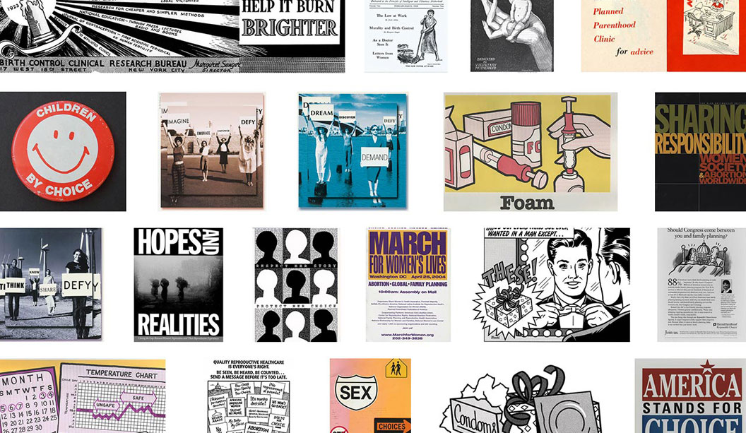
Planned Parenthood is America’s most trusted non profit provider of reproductive healthcare (an estimated one in five American women have chosen Planned Parenthood for healthcare at least once in her life and the organisation is currently powered b 9.5 million activists, supporters and donors nationwide). Paula Scher and her team designed a large-scale installation for the company’s new national headquarters in Lower Manhattan. The main mural goes up three staircases and was timed to coincide with the company’s centennial in October 2016.
Paula Scher and the team researched historic images, settling on about 30 in the end. They used a century of ephemera – a mix of newspaper ads, instructional posters from clinics, protest posters, pins, photos of protests, and other historical material (created by Planned Parenthood) for the mural.
To enhance image quality, they digitised them, then applied the Planned Parenthood colour palette (with the addition of bright yellow to tie in the environmental graphics into the existing brand identity). The design team worked closely with the architect and leadership team at Planned Parenthood to develop the installation. And other than the main installation, smaller murals appear on walls throughout large conference rooms and other meeting spaces.
As it states on the Pentagram blog: “The installation acknowledges the important role that activism and posters, placards, symbols and other graphics have played in garnering support. Many of the designs were originally created by grassroots activists, and the mural is a tribute to their impact in the movement for reproductive rights.”
To bring the mural to life, vinyl wall-covering built in layers for a dimensional effect, was installed. Acrylic forms were cut-out and mounted over the surface. The murals were a hit and now other Planned Parenthood offices want in on the action to. So do we Paula and the team, so do we. Fancy a trip to Australia??
If you’re one of our customers, visit the wide format section of our website for the products we carry that are similar to what Pentagram have used for the Planned Parenthood installation. If it all gets a bit much, call your paper specialist or account manager and they’ll be able to guide you in the right direction.
We tell our reps time and time again if you’re going to bring in samples of food packaging, INCLUDE the food. Sheesh.
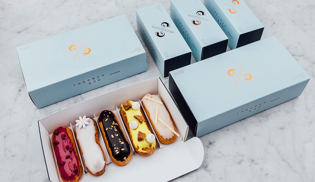
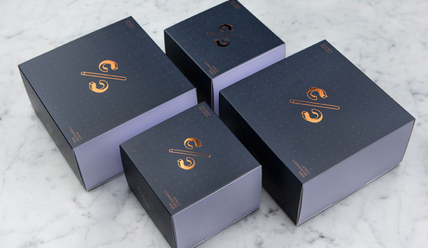
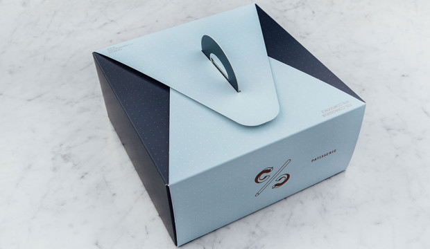
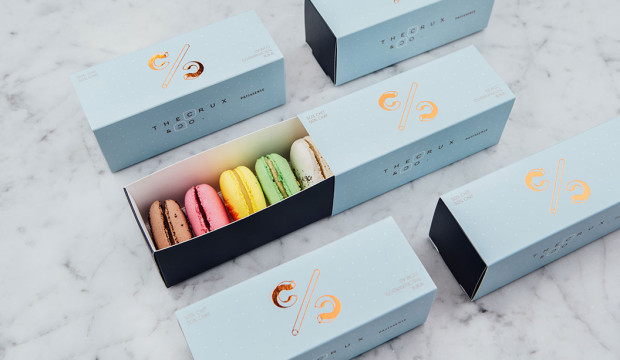
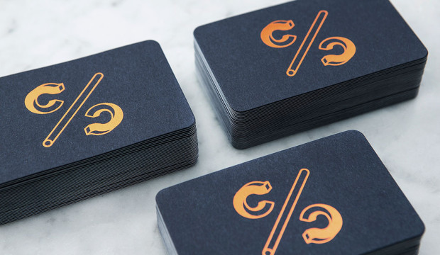
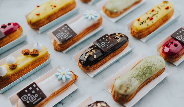
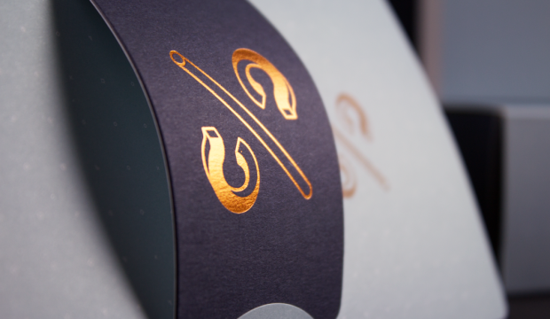
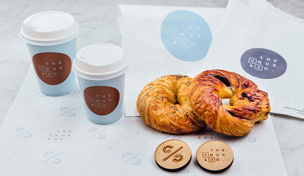
We love this branding job by Hue Studio for The Crux & Co. in Melbourne. We liked it so much we featured it as a case study in Spot, a recently released print publication that includes lots of rad design projects from local and international studios. Ask your paper specialist for a copy and in the meantime, check out more of Hue Studio’s work on their Instagram page @huestudio.
The Crux & Co. is a 110-seat café and patisserie in South Melbourne. The interior colour palette is baby blue and navy and the tables and cabinets have beautiful rounded edges that reference 1960s styling. The ethos behind The Crux & Co.’s menu is what we all strive for in life – balance. It boasts a delicious selection of macarons, eclairs, pastries and buttery house-made croissants, along with Korean influenced savoury dishes. Perfecto.
We interviewed Vian about his experience working on this rad project.
How did you articulate the brand identity of balance in a visual sense?
To bring the concept of balance to life we created all elements of The Crux & Co.’s branding with this concept in mind – everything from the monogram logo, which resembles a percentage symbol, to a series of cheeky C/C taglines like (50% Chit 50% Chat and 30% Cheese 70% Cheers). The taglines appear along with the custom pattern and typeface.
Did you work closely with the client to create the branding?
Yes, very close, but not intimately, because the one thing we know about the food industry is that sometimes people can’t respond to our queries until after business hours! And we totally understand that. The clients input and involvement is always paramount for the project’s success. It’s their business and their passion we’re bringing to life and at the same time, we want to create a space where we can be creative too. Approaching the project in this way creates a healthy designer-client relationship. It’s also good for us because the project doesn’t stop, even after the shop opens.
The marketing collateral, packaging and interior design complement each other perfectly. Did you also work closely with the architects?
We did work closely with Architects EAT (in particular Eid Goh), before and during the design process. We’ve collaborated on other projects together so the process was very smooth. It’s satisfying when you establish a good relationship with collaborators because, more often than not, they’ll give their honest opinion and this allows us to push ourselves even harder. I also don’t want to undermine the importance of the architect’s perspective on branding, which I think is crucial.
What’s involved in your process when designing a packaging job?
Firstly, we always do a lot of research. We ask the client a lot of questions and most importantly, determine who the competitors are and what’s already out there. For this project, we came up with a lot of concepts, made a lot of Barry Bleach Board mock-ups and used heaps of scalpels and cutting boards! With The Crux & Co. packaging we had to make size and design adjustments to the pastry boxes to make them more versatile. Working closely with the printers is really important too – for example for one box, we worked out how to get two-up on the printing press. This resulted in the box being smaller and now it takes up less space in the shop.
How crucial do you think packaging and branding is to eateries like The Crux & Co.?
I think the packaging design is just as important as the product itself because it allows the customer to revel in its beauty. They can appreciate the time and effort put into the design of the packaging as much as they can appreciate what’s inside. Also, good packaging can make you smile, even before you open it. The fact there are similar establishments opening up in practically every corner of Melbourne, means cafes like The Crux & Co. face stiff competition. So we have to be creative and come up with fresh ideas.
Why did you use the uncoated side of Barry Bleach Board for the pastry boxes?
To match the stationery set finish. The collateral is printed on uncoated Keaykolour Original, so we decided early on that the packaging needed to be uncoated too. Because it’s flipped, which means the coated side is in contact with the cakes and macarons. Barry Bleach Board is food safe and FDA approved – the biggest selling point for us – and is designed for high quality packaging materials. Along with the copper foil logo on each box, the overall design is ‘Chic and Classy’.
How important is branding to the overall customer experience?
Very. It’s about the whole experience, which starts before the customer walks in the front door and ends when they leave the shop with a beautifully designed cake or macaron box in a nice paper bag. Creating a brand identity is more than just abut a logo – it’s about the colour, typography, all the printed materials and how everything relates to the interior and in this case the food, which has to be amazing otherwise the customer won’t come back! Good branding and a complementary interior helps you get noticed and recognised faster and really completes the whole experience.
Now you be the judge…is the crogle balance or madness? A croissant pastry baked in the shape of a bagel with traditional bagel flavours like poppy seed and blueberry. Is it enough to get you down to The Crux & Co.? We think YES!
Boxes: Barry Bleach Board
Business cards:
– Print: Front: copper foil logo (35 mm x 35 mm) on Keaykolour Original Navy Blue 250gsm, (back) + 250gsm Keaykolour Pure White
– Back: 2 spot colours on Keaykolour Original Pure White
– Finishing: Mount back-to-back, Formecut round corners
– Size: 55 mm x 90 mm
Menu:
– Print: 2 spot colours one side only.
– Size: 414 mm x 297 mm.
– Stock: 225 gsm Kaskad Skylark Violet
Gift card holder:
– Print: 2 spot colours one side only.
– Size: 198 mm x 207 mm.
– Stock: 250 gsm Grange Offset
– Quantity: 500
Sticker:
– Print: 2 spot colours one side.
– Size: 60 mm diameter
– Stock: Cast Gloss White Permanent
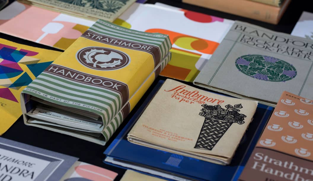
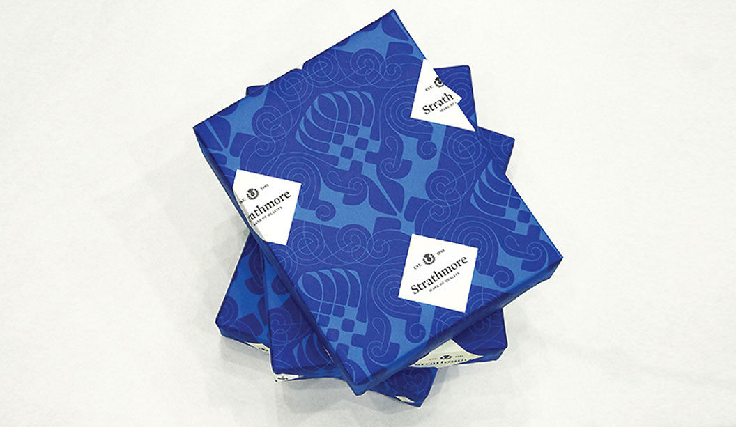
Many of you may not know this but in 2005, the Mohawk Paper Mills in Cohoes, New York, acquired the Strathmore brand. At the time they had no idea they had acquired an incredible documentary of American graphic design – now referred to as the Strathmore Archive. You should see it!! The collection of illustrates Strathmore’s sustained commitment to design, spanning more than 100 years. And up until 2013 it was virtually hidden in a Mohawk warehouse. The Archive was brought back to life by Mohawk creative director Chris Harrold. It’s hard to believe that up until then, this hugely rich resource remained largely unseen and unknown.
The Archive
The carefully preserved collection contains extremely rare and historic printed materials which beautifully communicate a century of graphic design, type, print production and paper making. The collection celebrates and showcases the collaboration between the paper maker and many of the 20th centuries most influential graphic designers. It literally reads like a who’s who of American graphic design including including William Dwiggins, Will Bradley, Helen Dryden, Oz Cooper, Lester Beall, Adolf Treidler, Walter Dorwin Teague, Pushpin Studios to name just a few of the many design greats. Not bad hey? Over that time, the Strathmore brand was able to engage with design luminaries, who created a series of inspirational campaigns that showcased the power of paper as a critical element in the design process, on par with illustration, colour and typography. So the collection includes rarely seen work from the graphic design leaders.
Heritage and legacy
Founded in 1892, the Strathmore name has been synonymous with quality, beauty and design. Inspired by the flora of Scotland’s Strathmore glen, company founder Horace Moses adopted both the glen’s name and the icon flower – the thistles – growing there as the symbols to convey the beauty and quality for his paper.
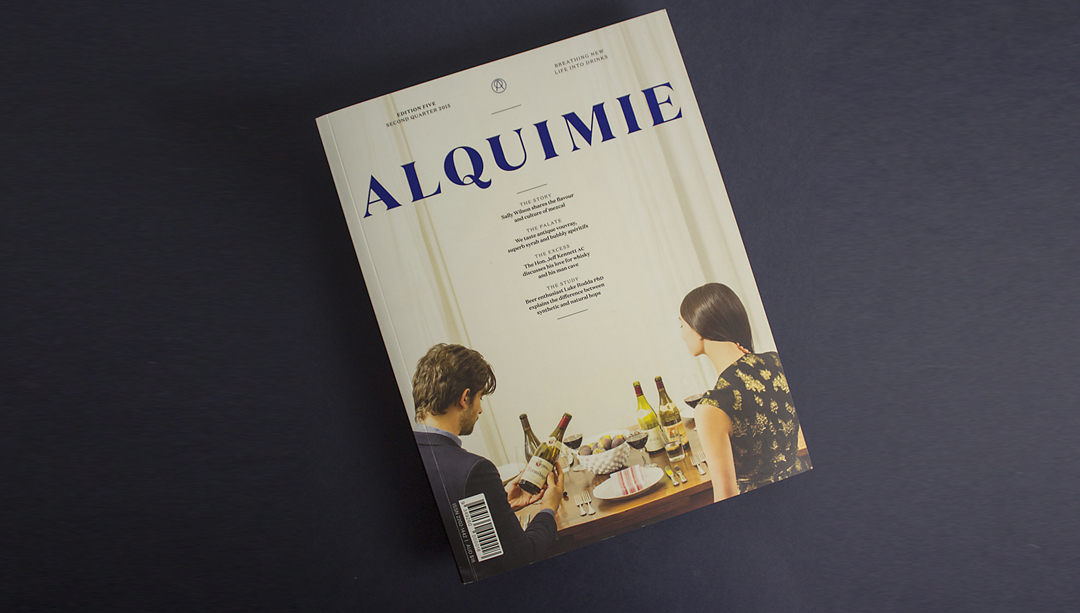
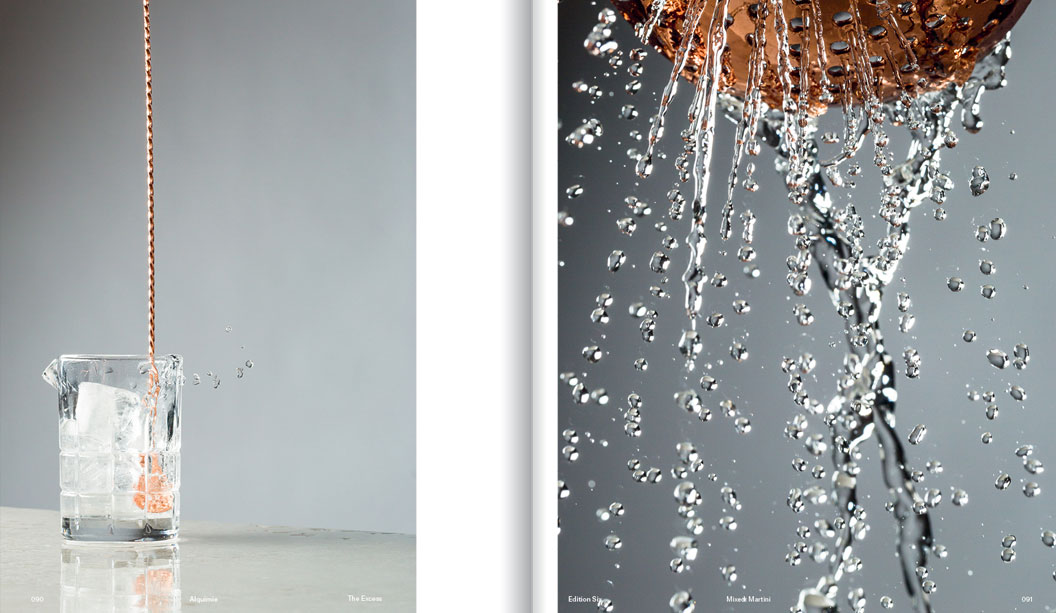
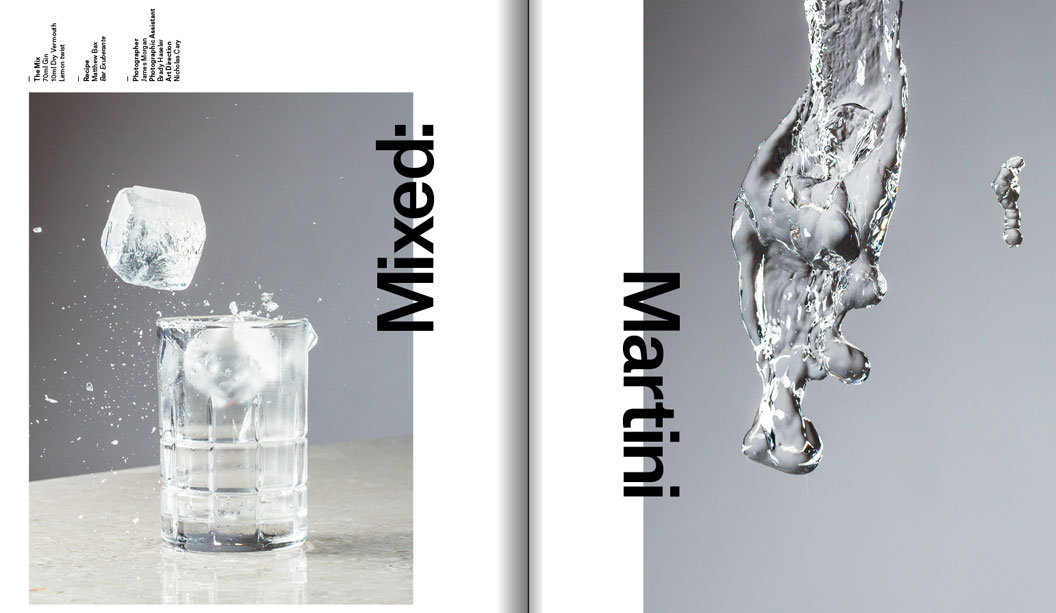
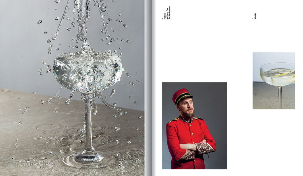
Breathing new life into drinks’ is what Alquimie is all about. Part magazine, part collector’s item, this publication shares the culture and stories behind drinks, from whisky to craft beers. We sat down with one of Alquimie’s owners and designers Nicholas Cary, who was putting the finishing touches on issue eight.*
Can you tell us a little bit about your background and how you became a magazine publisher?
After graduating from a degree in Visual Communication and Design from Monash University, I worked in a couple of smaller boutique design studios before branching out on my own. I landed a couple of big projects and slugged away with freelance stuff for a number of years, while also being the co-owner and creative director of Process Journal. After working on that title for eight editions it was time for a change and I decided to focus on my studio work for a year or so before the publishing itch struck again.
Luckily, this itch coincided with meeting Josh Elias, who’s the editor of Alquimie and James Morgan, the magazine’s photographer, through work. We started sharing glasses of wine after hours and it struck us that while there’s a number of great food titles around, there’s nothing about the world of drinks. Considering our skills killed all of the overheads (apart from printing and paper) we figured there was a gap in the market and so Alquimie was born.
Any favourite drinks you’ve profiled?
It would have to be a very special Japanese Single Malt Whisky by Suntory called the ‘Yamazaki’ Single Cask, which was distilled in 1998 and bottled in 2013 after being in a single sherry cask. As far as I know, Julian from Whisky and Alement in Melbourne had the only bottle in Australia. When I tried it I was blown away. Apart from that, I’m a big fan of lighter reds and we’ve featured a lot of great Pinot and Beaujolais in past editions.
How important is the relationship between branding and packaging in the beverage sector?
It is incredibly important! The majority of people are often overwhelmed and intimidated by the number of drinks on offer, whether it be wine, whisky or craft beer. It’s a very flooded market. It’s a mess! So considering we digest bottles with our eyes first, branding and packaging is very important.
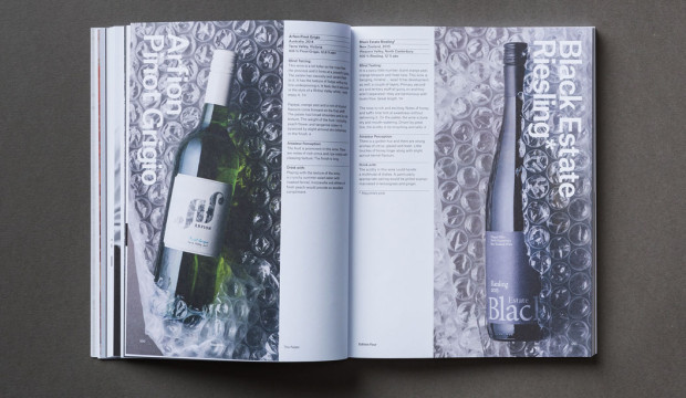
Are there any wine labels you love and why do you dig them so much?
There are a plethora of amazingly intelligent and aesthetically pleasing labels out there – too many to name and choose. I think among the smaller Australian labels in particular there are some really well considered and executed designs. Outside of wine, I think The Company You Keep did a great job with The Everleigh pre-mixed cocktail packaging. On a side note, the bottles Alt Group previously sent out as Christmas presents were brilliant. Do they count?
Have you experimented with the design and paper?
The design has been a constant evolution in regards to both layout and typography. One of my issues with Process was how constricting the design felt after a number of editions. While the brief was to let the design do the talking, I really wanted Alquimie to be more flexible. There are certain elements that have stayed the same, like grids, body copy and the general flow of the design, but I’ve made sure each edition is a definite evolution from the previous one, while being relevant to the content.
Likewise with the paper, this has been a subtle evolution which has included editions with gloss sections for photographic essays and experimenting with different production techniques for the cover. All of these changes shouldn’t be jarring to the reader and it keeps it even more enjoyable for us.
Why a printed magazine and not a digital one?
You can’t taste or smell drinks from a screen. For Josh, James and myself a digital magazine seems like a backward step for our readership. And it’s a self-indulgence – I love print.
What’s the most challenging aspect of designing a magazine like Alquimie?
Getting content from drinks journalists! That’s only a half-joke. As any small business owner knows, you have to put on different hats and do things outside of your comfort zone and for me personally, selling advertising is just that. In saying that, we’ve developed fantastic relationships with our advertisers and look forward to our catch-ups. Possibly because they always involve good wine too.
Designing a magazine must keep you pretty busy and we know you have other projects on the cook too. What else are you up to these days?
I’ve recently stepped into a new role as Creative Director for an appliance company, Residentia Group, a relatively new business dealing in appliances from Italy, Spain and China. After some very exciting growth, they made me an offer to come on board full-time and oversee the strategy and direction of the business and the five brands they own and/or distribute. Apart from this, I’m still undertaking freelance design commissions, including work for Bureaux coffee roasting collective, as well as a new Armadale wine bar called Wine 1160 and a new bistro pub in Fitzroy called The Recreation.
Do you have a dream project you’d love to work on?
Can it include moving to Switzerland? If so, watch design. From the mechanics through to the face, typography and packaging. One can dream.
Out of interest, what is your favourite watch design?
From a design perspective, my favourite watch company would be A. Lange & Söhne or vintage chronographs from any of the main Swiss houses.
*Interview first appeared in Spot, our first print publication about all things paper, people, design and dogs. Ask your paper specialist for a copy today
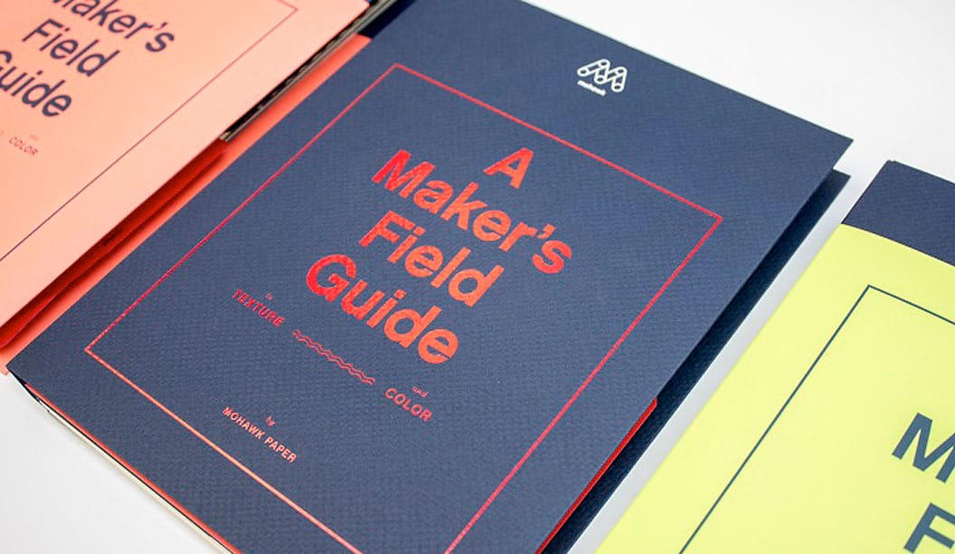
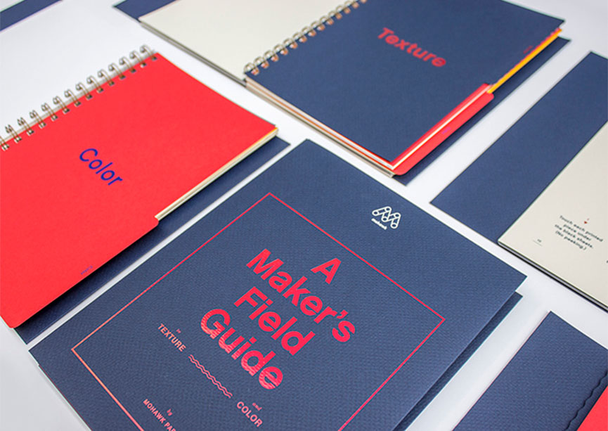
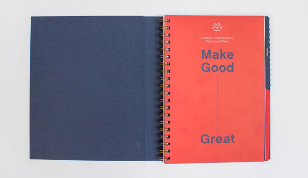
>Thanks to Mohawk for contributing this blog post! And if you don’t feel like reading, watch this video about the The Mohawk Maker’s Field Guide.<
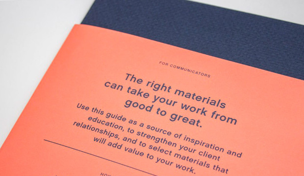
Audiences today are simply overwhelmed by the volume of communication they receive. A direct consequence of this ‘noise’ is that many communications fail to land their message and deliver with minimal impact. To be effective we need to create communication devices which slow people down, command attention, stimulate the senses and promote interaction.
The Mohawk Maker’s Field Guide seeks to achieve these physical and emotional outcomes through highlighting the values and benefits of using uncoated textured and coloured paper to inform, inspire and engage.
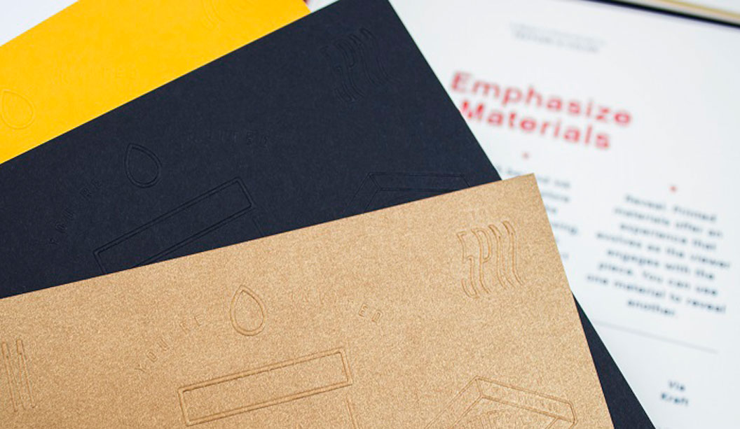
Materials matter
Evidence has indicated that the combination of visual and tactile stimuli creates a deeper and more lasting impression on the brain. Paper and print is the perfect vehicle for creating this visual and tactile experience – it can help to establish a physical interaction and relationship between you and your customer. Paper and print stir the emotions and engage the senses while textured and tinted papers can further enhance the physical and emotional experience
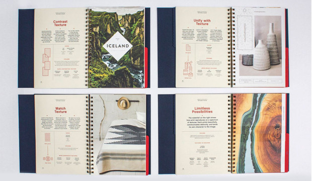
Textured paper
Touch supports the communication process – we read with our fingers and our eyes – evoking emotion and challenging expectation. The choice of material can directly impact on communication effectiveness. The correct materials can amplify the message while the wrong material can seriously compromise the message.
Marry texture with content to reinforce physical characteristics. Contrast textures to create interest, engage the senses and stimulate interaction and unify texture across the brand palette and experience to establish and reinforce brand consistency, personality and understanding.
Coloured paper
Colour adds interest. Consider coloured paper to increase the impact – and change the perception – of the printed piece. Integrate paper fully into the design process – adopt paper as the fifth colour – and make paper part of the picture. Or use coloured paper to change the meaning and influence the reading of a photograph. Or dial down the ink and emphasise the personality of the paper, the product or organisation, through a simple and classic emboss, de-boss or foil treatment…or go to town and manage the mood, pace and energy of a design and document by combining a variety of tinted and coloured papers.
The MAKERS FIELD GUIDE provides a wonderfully engaging and questioning insight into the power of paper, colour and texture to ensure your good communications are great communications!
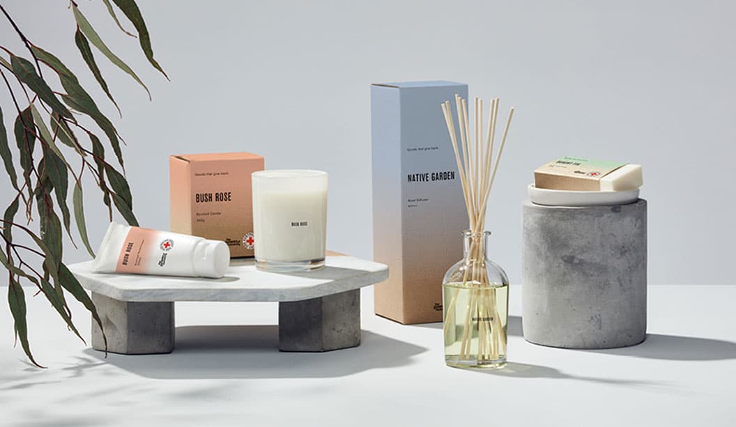
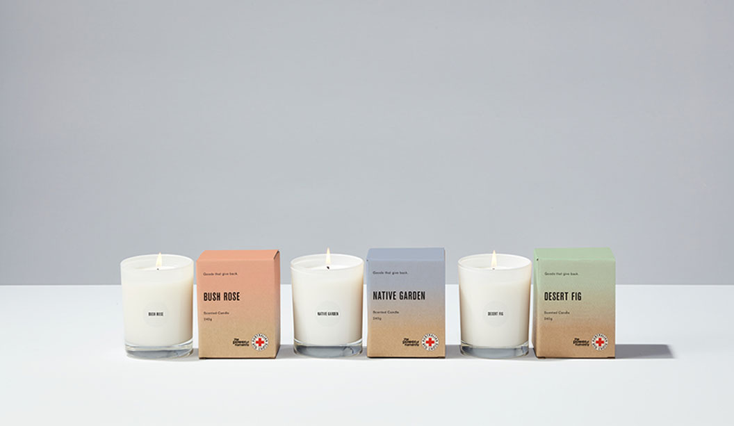
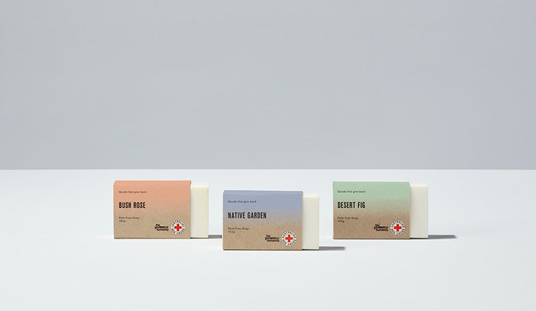
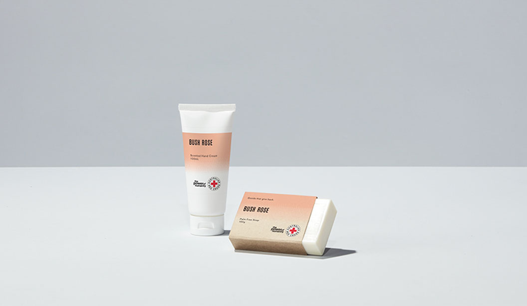
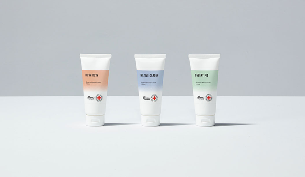
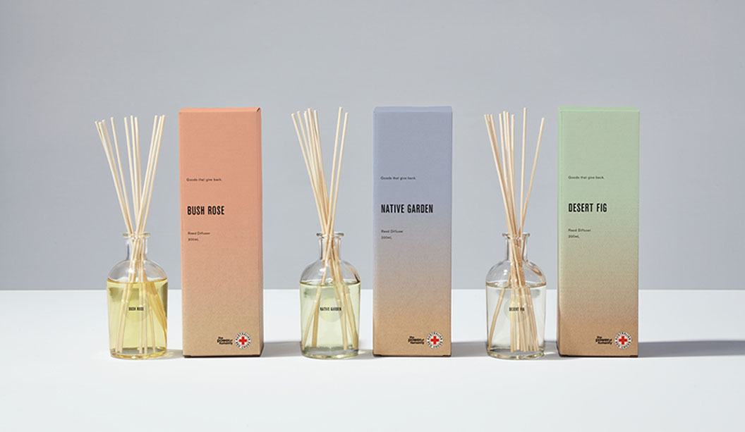
We are suckers for scented products, especially ones that are beautiful and best of all for a good cause!
The makers are Grosz Co.Lab, an inter-disciplinary creative studio in Melbourne run by Ben and Laura. Working closely with long-time client Red Cross, they have developed a bespoke range of packaging for diffusers, candles, soaps and creams. The first project of this kind that Red Cross have embarked upon.
Printed on Buffalo Board 332gsm and 225gsm, each product is inspired by the Australian Landscape. “It was actually established very early on from the Red Cross team that they’d like to explore the use of a natural brown stock for the range as a reference to their heritage,” says Ben. And who can resist delish scents like Bush Rose, Native Garden and Desert Fig?
The super cool print effect (designed to mimic the scent materialising and dissipating) is a bitmap gradient allowing the colour of the stock to come through each of the three PMS colours. Working with Scott Henry at Colna Print & Pak, white ink was then mixed in with each colour and the level of opacity was adjusted on press to get just the right effect. Nice!
Available at Red Cross shops (they just sold out online but will be back soon), the funds raised helps to support the vital work of the organisation locally and abroad. “We feel fortunate they entrusted it to us – especially as it was not only the packaging design that we created, but also establishing the vision for the product range, naming and also consulting on the curation of the scents. We’re thrilled it’s been a success for them,” says Ben. See more of the project on www.groszcolab.com.au.
When asked what they’re dreams were for the future, Ben shares “…something that combines design across a range of disciplines, along with music, dance, fashion and/or scent would be a dream. Or perhaps a design museum! We have many ideas – we just need the funds.” No doubt we’ll be seeing more from Grosz Co.Lab very soon.
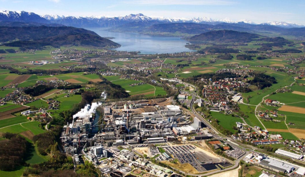
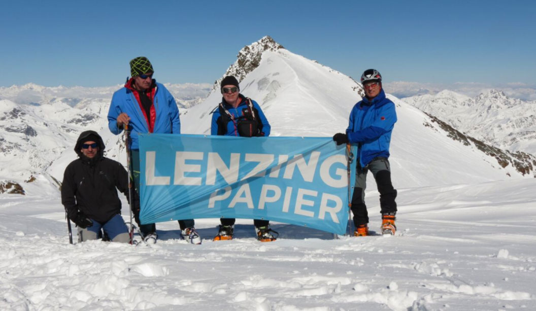
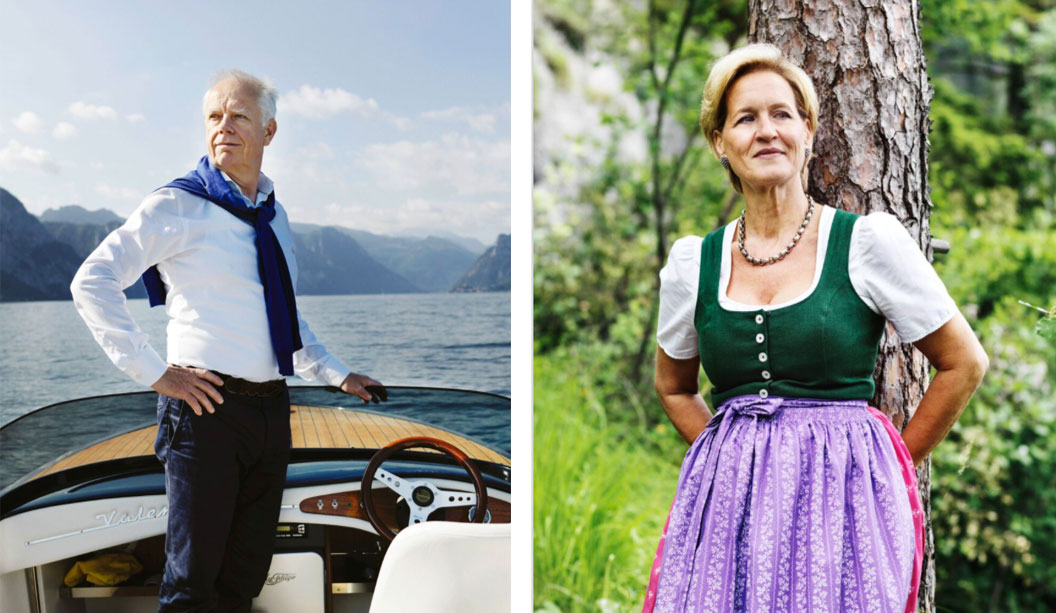
Lenzing Papier, manufacturers of Envirocare 100% Recycled and Impact, is not your average paper mill. Their tagline ‘Simply sustainable’ is in reality, what they live by. As a fully integrated paper mill with a minimal carbon footprint, they’re all about making the world a little greener, driven by the need to preserve the unspoilt natural environment of their Austrian mill’s site for current and future generations. We spoke to General Manager Ernst Brunbauer about the positive outcomes of a green approach.*
What does the Lenzing Papier mill do differently to other mills with regards to manufacturing paper?
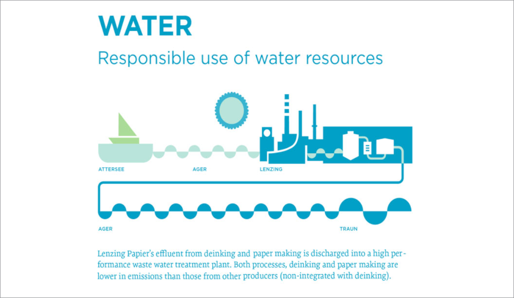
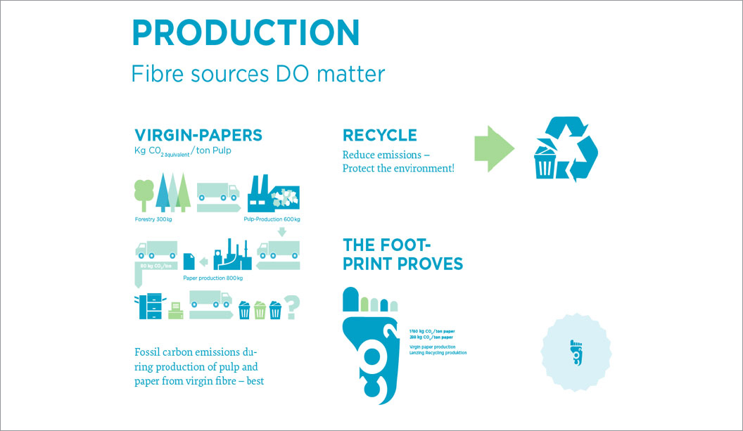
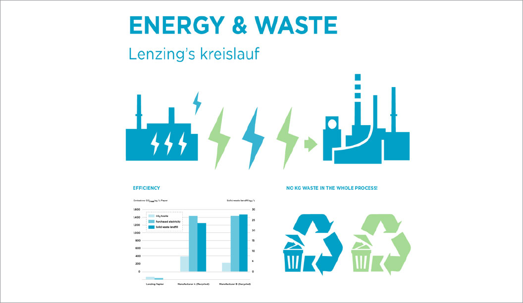
Paper mills making recycled products are usually not integrated with a pulp mill. Lenzing Papier is in a unique position as our mill is integrated with a de-inking plant and a pulp mill. There are two categories of recycled paper producers: the ones like Lenzing Papier, who operate their own waste paper facility and de-inking plant, and the ones who buy de-inked pulp on the market. Making the de-inked pulp in-house gives us a significant advantage in terms of avoided carbon emissions, because there’s no need to dry the de-inked fibres for transportation and shelf-life, as it’s made and used simultaneously. The fibres are made-to-measure for the paper machine and the respective product, giving a consistent output.
How can the mill’s carbon footprint be so small?
Predominantly because Lenzing Papier’s paper mill is integrated with the pulp mill (which is fairly uncommon), so we’re only using the carbon neutral energy from the pulping process. The pulp itself is a dissolving pulp grade used to make textile fibres and we use this energy, which is a side product of making dissolving pulp. The carbon footprint is very low because the energy is from renewable sources.
How many people work at the mill?
There are 160 people working in Lenzing Papier and most of them live in the area. The company was founded in 1892 and we have fourth and fifth generation employees.
What does the company primarily stand for and believe in when it comes to the environment?
The staff of Lenzing Papier loves nature. Most of our employees enjoy the outdoors and so their attitude towards protecting the environment is natural. They have a lot of pride in their work and want to be the best in environmental performance. Continually improving processes is an ongoing task for us and we believe in gentle chemical technologies, where nature is our guide, such as using enzymes instead of conventional chemistry.
Is this how you de-ink your pulp?
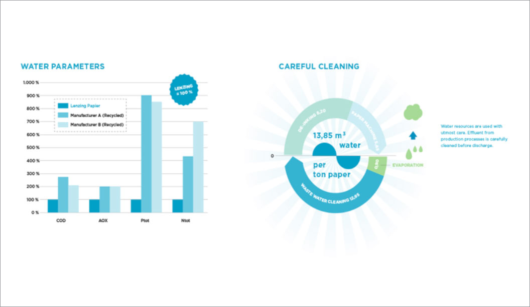
The de-inking process is usually done by using a flotation system in combination with air and de-inking chemicals to flotate the printing. At Lenzing we have developed a process using enzymes instead of the standard chemistry with very good success.
How much paper do you produce each year?
With a production of 85.000 metric tons per year, Lenzing Papier is a small paper mill compared to commodity producers, but it’s among the market leaders in the field of uncoated recycled papers.
Is it true you swim in the same lake the water from the mill is pumped into?
Yes, that’s true. We take all our fabrication water out of the lake’s outflow and use it with only mechanical cleaning for production. After responsible use and careful cleaning of the water, we put it back into the river. People swim and fish after the outlet from the waste water treatment plant.
How much waste does the mill actually produce?
We’re very proud of the fact that we do not produce any waste that has to go to landfill. The raw materials are re-used as much as possible and at the end of their lifecycle those substances are incinerated in a very efficient incinerator. The generated energy is then put back into the milling process.
*Interview first appeared in the April 2017 issue of Spot, our print publication about paper, people, dogs and design.
 Footy Tips