Alastair Swayn book by Swell Design

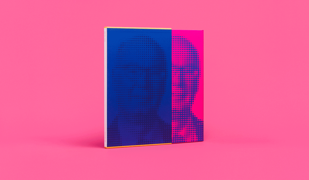
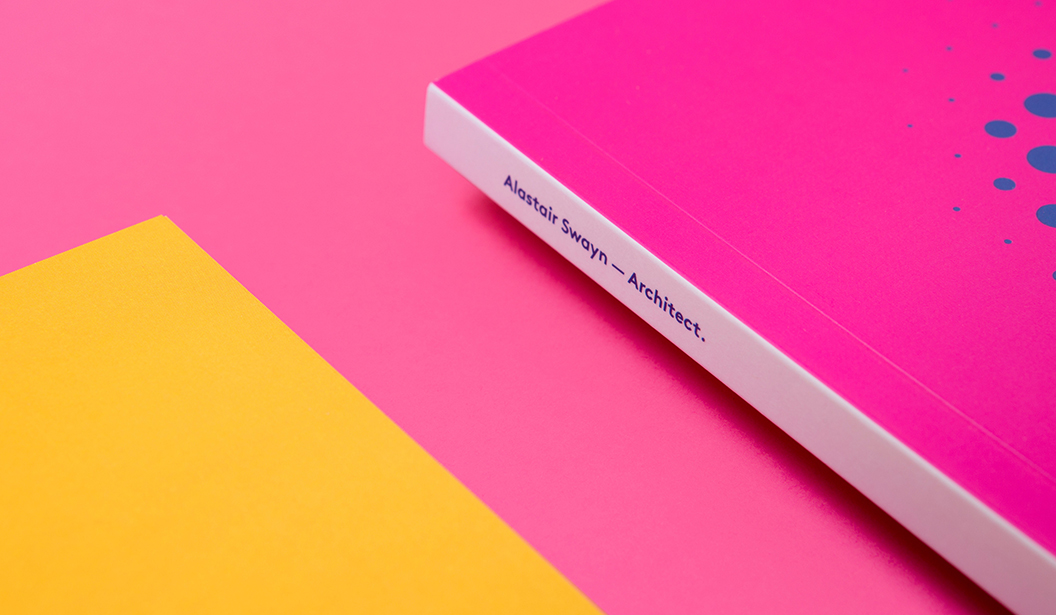
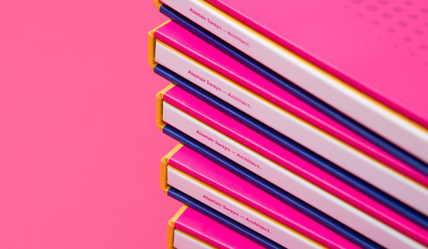
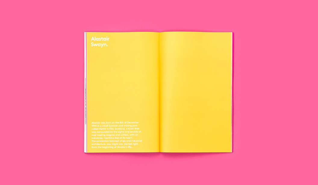
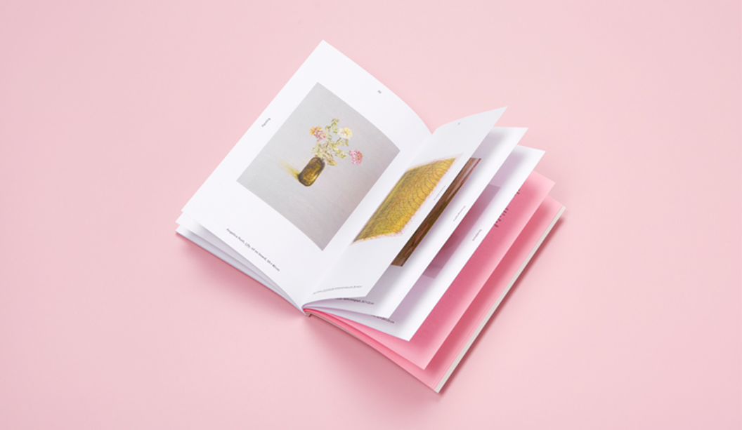
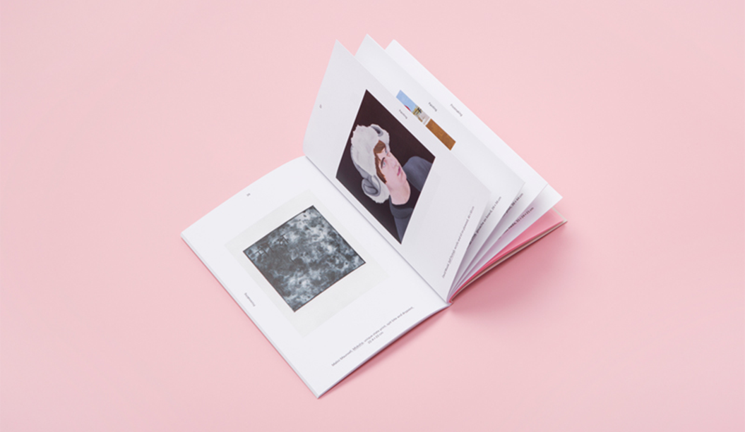
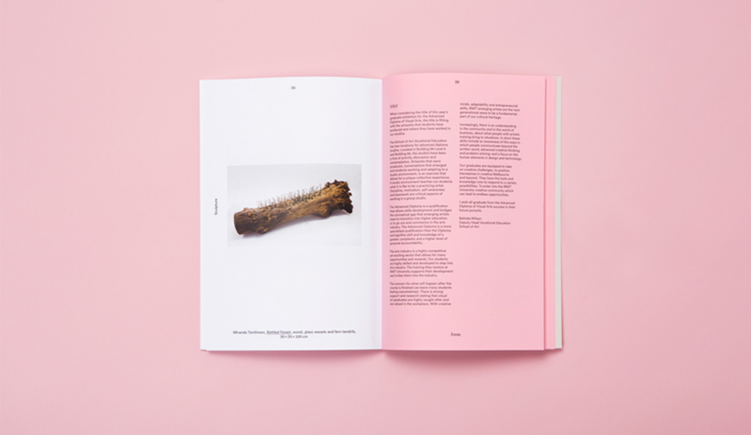
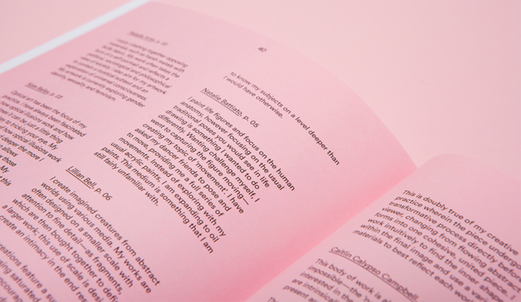
We talk a lot about paper as a powerful platform for communication so we couldn’t go past this bright publication, the Alastair Swayn book* by Swell Design with its bold coloured pages and strong message.

The inspiration for the eye-popping publication was two-fold; to celebrate a much loved architect and friend of Swell and to promote the Alastair Swayn Foundation. A charity that supports young Australian architects.

We spoke to Swell Design about their experience working on the project, the creative process and their new Groundswell website, a charity to raise money for brain cancer.

Can you elaborate a little more on the creative direction for the book?

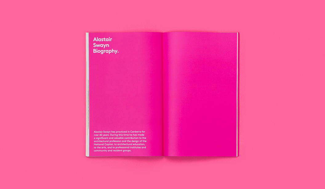
Alastair Swayn was an amazing architect, friend, mentor and supporter of Swell for close to two decades. He passed away on the 4th of August 2016 after a long battle with brain cancer. As part of his final project (planning his own memorial and party), Alastair engaged Swell to create a legacy book that would help to promote the Alastair Swayn Foundation. 

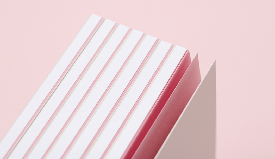
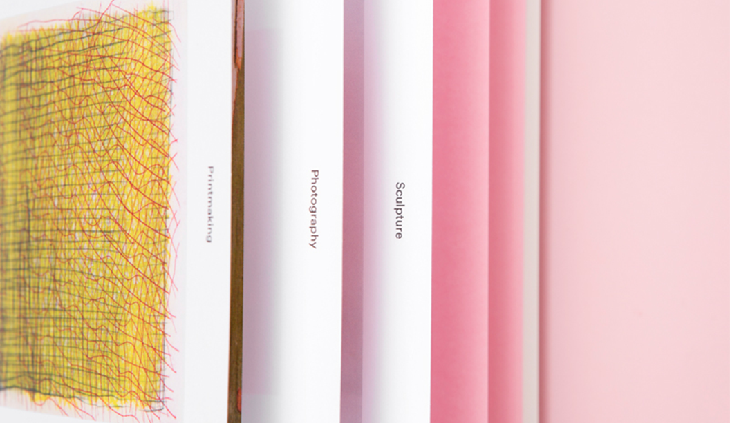
Out of respect for Alastair, we undertook this 100pp challenge as a pro bono exercise and created an oversized publication with a case bound hard cover option and two different soft cover variations. Partly due to our exposure to Alastair’s illness, Swell has started a charity to raise $20,000 to help combat brain cancer — the Groundswell website will be available very soon.

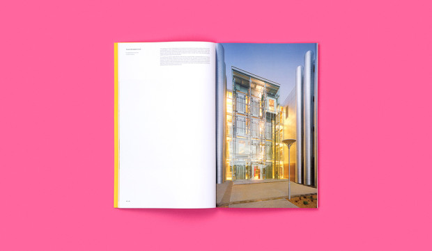
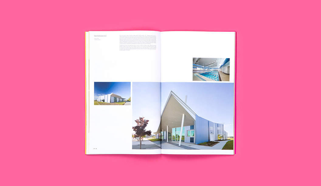
Why did you choose to use Knight Smooth Digital – Indigo and what as the print result like? 

We chose Knight Smooth Digital – Indigo 140gsm because of its smooth surface and crisp white colour which help the bold layouts and Alastair’s architecture to pop. Knight Smooth and the Indigo where a great combination — the colours jump from the page (as planned).

How is the Groundswell website going?

The groundswell for Groundswell has started. We’ve now had a couple of close encounters with this terrible disease. Back in 2010, Col’s (Swell Director) son had a (fortunately benign), brain tumour removed. We then sponsored Brainstorm for a Cure, a local charity event created by Sarah Mamalai, a stage 5 brain cancer survivor (one of few). Lastly, in 2016, Swell lost a strong friend and advocate in Alastair Swayn, one of Canberra’s most successful architects.

We’ve started slowly by producing water bottles and cycling jerseys and selling these for $5 and $50 respectively (bargain). Basically, we fund the production and all proceeds so 100% goes straight into our fund managed pro bono by Grant Alleyn, Director of Allegra Wealth. Further fund raising will centre around events (cycling and running), sales of GroundSwell branded coffee and corporate donations. A website is coming, so stay tuned and let’s help beat this thing! In the mean time check out Swell’s new site.

*Thanks to Swell Design for taking their time to answer our questions and allowing us to feature their work in the ‘Snippets’ section of Spot, our very first print publication about all things design, paper, people and dogs.

AlastairSwayn_01-1056x615

AlastairSwayn_03b-1056x615

AlastairSwayn_06-1056x615

AlastairSwayn_04-1056x615

AlastairSwayn_08-1056x615

AlastairSwayn_09-1056x615

AlastairSwayn_05-1056x615

AlastairSwayn_10-1056x615

AlastairSwayn_11-1056x615

Two rad jobs from Mildred & Duck

Two person design studio in Melbourne, Mildred & Duck, punch way above their small team weight. The team being Daniel Smith and Sigiriya Brown. Their branding job for Delores Butterball posted below, we recently featured in the ‘Snippets’ section of Spot, our first ever print publication. Speak to your paper specialist for a copy. And in the meantime, check out more of their awesome work on Instagram.

Title: Unfurl
Stocks: Curious Collection Skin Stone 270gsm, Knight Smooth Digital – Indigo White 160gsm, and Grange Tinted Bond Pink 80gsm
Print specs: Black metallic foil + CMYK
Printed by: Ellikon
Photography: Mark Lobo of Foliolio

The ‘Unfurl’ publication showcases the work of RMIT’s Visual Arts graduates. The publication was designed to unify the diverse range of works created across different disciplines. Mildred & Duck used a consistent grid structure to create a cohesive experience, and allowing for easy navigation. Housed within an understated black-foil exterior, the publication reveals a playful pink section containing the text pages.

Unknown-1

Unknown-2

Unknown-3

Unknown-5

Unknown-6

Unknown-7

Unknown

Stocks: Knight Smooth White 350gsm
Print specs: Raised verko + black
Printed by: Moule Print
Photography: Mark Lobo of Foliolio

Delores Butterball is a small batch baked goods stall serving cakes and cookies across Melbourne. Mildred & Duck created a visual identity for Delores Butterball that is bold and confident and can be easily applied to boxes and bags as needed without losing legibility. The oversized business card doubles as a with comps slip, with raised verko printing that looks like the texture of icing. Yum!


Blog-Delores Butterball-1

Blog-Delores Butterball-2

Blog-Delores Butterball-3


VoPP Outback Brewery case study

BACKGROUND:

An independent microbrewery in Sydney wanted to grow direct-to-consumer sales through their website as well as increase brand awareness of their boutique beers. To achieve this, a multi-channel campaign utilising personalised URLs and direct mail was created.

OBJECTIVE:

Outback brewery aimed to tap into direct mail’s ability to drive traffic both online and in stores by coupling relevant messaging with measurable response mechanisms.

METHOD: 

Outback Brewery created 5,000 personalised postcards that were sent to select consumers that had a specific lifestyle, age, income and propensity to spend. Postcard recipients were asked to “name the lizard” on the beer’s logo and submit their answer to a personalised URL. Recipients were incentivised to participate by a chance to win free beer for a year, $10 off a mixed case of beer via their new online shop and a free bottle opener. Participants were brought to a personalised landing page that was an extension of the branding found on the postcard, maintaining the continuity and connection with the brand both offline and online.

RESULTS:

The campaign proved to be a huge success for the company, increasing consumer engagement and driving sales. Outback Brewery received over 120 online orders and more than 2,300 unique web visitors. A 10% response rate was achieved within 72 hours, growing to 20% within two weeks and eventually reaching 33%.

CONCLUSION:  

Outback brewery was able to reinforce their brand identity and stand out from the competition by adopting a personalised and colourful direct mail campaign. The personalised mail was able to capture attention and drive traffic to Outback Brewery’s online platform where recipients could enter the competition and make purchases. Direct mail was vital in this campaign, and exemplifies how it can be used as part of a multi-channel campaign to engage consumers and drive sales.


Brewery_2


Thanks goes to Kellie Northwood, Executive Director of VoPP/Two Sides Australia for allowing us to republish this case study, made available to us as Foundation Sponsors of TSA Limited, the publishers of the VoPP (Value of Paper and Print) report. Find out more via www.valueofpaperandprint.com.au.

VoPP_3