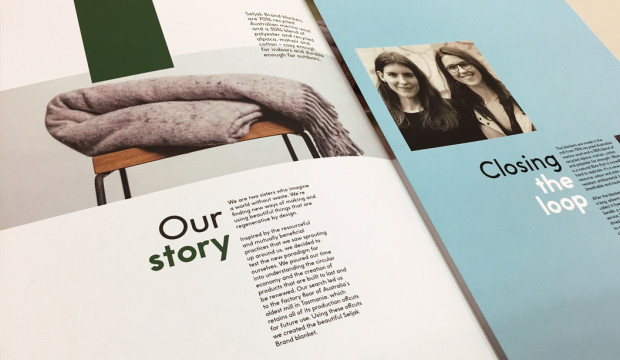
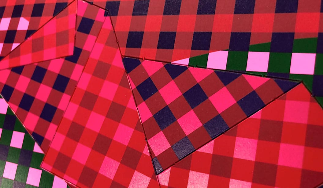
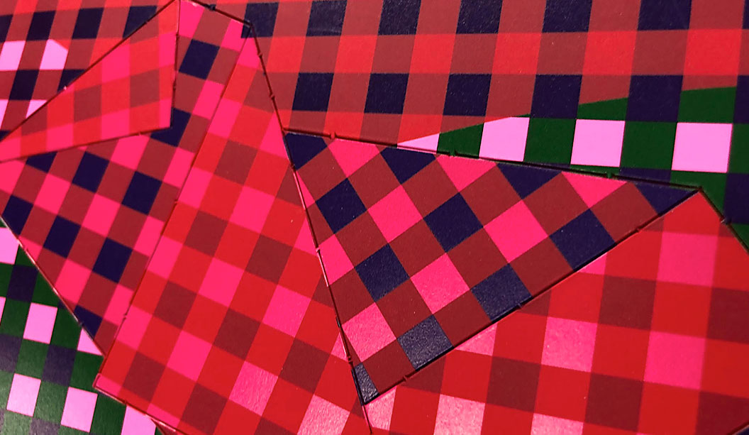
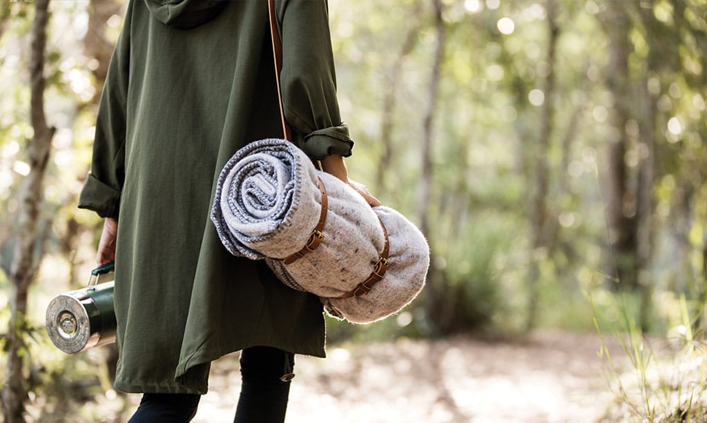
We recently collaborated with Seljak Brand to bring their story to life in print. Featuring Maine Recycled and ecoStar+ 100% Recycled, the large format print piece captures the story of their beautiful recycled wool blankets. We sat down with Sam, one half of the amazing sister duo (the other half is Karina), to discover more about what had them start their inspiring brand, the concept of the circular economy and some very interesting insights into the world of waste. Download the interview here.A little about the brand…
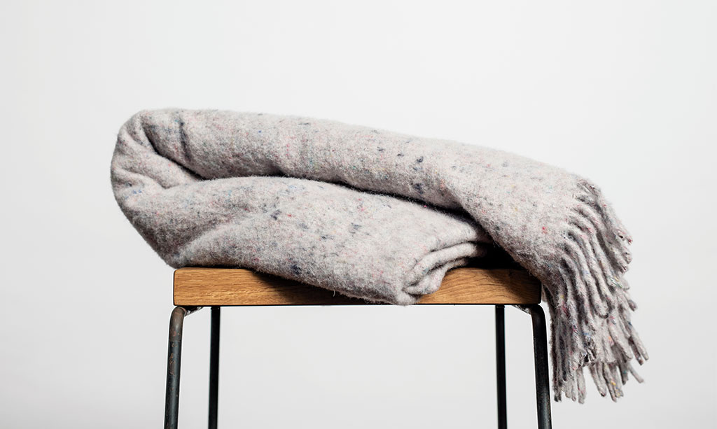
Sam and Karina Seljak imagine a world without waste, continuously finding new ways to make beautiful things that are regenerative by design. They launched their brand in March 2016 and have since worked towards accelerating the transition towards a more circular economy and closed loop methodologies. Their closed loop blankets (which we’re running a comp around at the moment! Refer to the end of this article), are made from 70% recycled Australian merino wool and a 30% blend of polyester and recycled alpaca, mohair and cotton – cosy enough for indoors and durable enough for outdoors. The blankets are made with offcuts from the factory floor of the oldest weaving mill in Australia, which happens to be a wool mill in Tasmania.
B&D: What did you discover researching the circular economy? And for those that don’t know, what is it?
Sam Seljak: The circular economy is a movement that rejects the current linear take/make/waste model that the world is using today to make and build things. Instead, it focuses on a closed loop circular model that cycles resources again and again. This avoids discarding resources in landfill and the mining of virgin resources for making products. So in the circular economy, existing resources like recycled materials are used to create and make products. Then there is an end of life solution so that the product doesn’t get discarded but instead gets held to its highest value at all times and used in a closed loop.
B&D: Did you find there are a lot of products that use this system?Sam Seljak: It is a pretty tricky system to achieve when it comes to making products and things like clothes, buildings, in fact most of the things that our society uses. There are lots of people and businesses that are trying to implement the circular economy but having a truly closed loop model is quite rare. We’ve found that there are lots of small start-ups managing to create a fully circular program or production cycle, but when it comes to larger scale it can become quite difficult. There are circular economy thought leaders, for example William McDonough and Michael Braungart who created ‘cradle-to-cradle’, who’ve implemented certifications for use in the building industry and for larger impact products as well as smaller ones. So there is an uptake in many industries around the world but true circularity is still very hard to achieve and many are still working towards it.
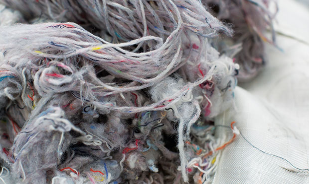
B&D: Why is recycling textile waste so important to you both?Sam Seljak: Textiles waste is something that the world has in abundance. People’s behaviour today is very consumeristic and statistics show that people are buying more clothes than ever before. And of course this means they can’t all be worn so the old clothes and production waste of these new clothes needs to go somewhere. When this textiles waste is in landfill it releases harmful methane gases into the atmosphere and ultimately degrades ecosystems and perpetuates climate change. So it’s not only a waste resource that is in abundance, it’s also something that is incredibly damaging to the environment. So from both of these perspectives we felt there is a need to use this as the precious resource that it is rather than let it be discarded as waste.
B&D: Do you think the attitude to recycling is different in Australia to other countries?Sam Seljak: I think Australia as a population is pretty aware of recycling. Recently, shows like ‘War on Waste’ has been monumental in helping that. We’ve also seen companies like Keep Cup now become a household name. Of course there are still statistics that show that Australians throw away millions of single-use coffee cups every day. But then in comparison – I’ve been based in Scandinavia for the last two years – in other countries, the government takes a huge responsibility for recycling. In my apartment block in Sweden there are around 10 different recycling bins…one for batteries, clear glass, coloured glass, paper, for cardboard, soft plastics, hard plastics, aluminium, the list goes on. And thus exists a mindset in Scandinavia that the government will take care of it so it becomes less of a people’s problem. You don’t see a wide-spread uptake of KeepCups, for example. Whereas in Australia I feel like it’s the opposite. The people are recognising it needs to change and therefore are acting. And these movements, and shows like ‘War on Waste’, will hopefully impact legislation.
B&D: We see on your website that for every 10 blankets sold, Seljak Brand donates one to the Asylum Seeker Resource Centre in Victoria. Why did you choose this organisation?Sam Seljak: Seljak, our surname, is a Slovenian name. Our grandparents where refugees to Canada in World War II (we have a Canadian father and Australian mother) from Slovenia. We saw our grandparents had flourished in a country where they arrived without speaking the language or understanding the culture and yet contributed so much to the society over the decades. So we’ve both felt quite strongly about Australia enabling opportunities for people in less fortunate situations. And ultimately it’s about accessing basic human rights; a safe place to live. If you can’t live safely or you can’t secure your safety where you are, then we think you should be able to seek that somewhere else. We think the ASRC is an organisation that does a wonderful job of supporting and welcoming asylum seekers to Australia. They rely on the generosity of people around Australia. It’s the least we can do to support their cause and we’d love to do more in the long run.
B&D: Your latest project with Citizen Wolf, tell us a little more about that.Sam Seljak: Last year we crowdfunded some research and development money to find a solution for businesses that were coming to us with their textiles waste. We had already set-up Seljak Brand and had already used offcuts from the Tasmanian mill to create the blankets, which is an age old technique used by mills. As word spread, other companies were coming to us with their textiles waste and we needed some time and resources to put into testing solutions for other companies’ waste. Citizen Wolf was one of the companies and we’re working with the offcuts of their custom t-shirt production. They have a very sustainable business model already – made-to-order and custom fit so they have minimal waste anyway. The scraps they do have we shredded and spun into a light weight yarn that we’ll then weave into a lighter weight summer time blanket. Of course, our beautiful cosy blankets are great for the Australian winter, but come summer, people might want something less warm! We’re hoping to launch that in October.
B&D: Any other innovative projects in the pipeline for Seljak brand?Sam Seljak: We just got accepted into the Kick Starter program which is funded by Macquarie Group and run by SEFA partnerships. Basically, it’s an accelerator for social enterprises to grow their impact. So we’ll have access to mentors and support to become investor ready if we want to go down that path. We’d love to be able to introduce another waste-to-resource product in 2019, whether that’s something that focuses on recycled textiles in the way we have been using them now or in a completely different way.
Some facts about Seljak Brand…
• Diverted 2,000kg of textiles waste from landfill.
• Donated 114 blankets to the Asylum Seeker Resource Centre in Melbourne.
• Exposed over 500,000 Australians to closed loop business practices thanks to the press they’ve received.
• They’ve crowdfunded $32,000 to help fund the research and development of using other businesses’ textile waste to make more blankets (check out their progress here with local Sydney label Citizen Wolf’s offcuts).
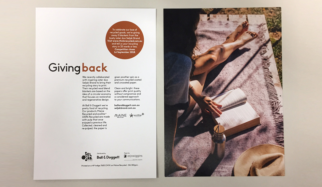
It’s a great time to be a Seljak sister that’s for sure! If you’re one of our customers, your rep will be around soon with a copy of the Seljak Brand print piece, featuring Maine Recycled and ecoStar+ Recycled. We’re pretty fond of recycled products around here which is why we love the Seljak Brand ethos, their products and why the recent collaboration was a no brainer for us.
To share our love of recycled goods, you can win one of their cosy blankets! We have five to giveaway. Visit www.thinkrecycled.com.au and in 25 words or less, tell us your recycled story.
Handy hint!
If you’re into recycled things like we are, visit thinkrecycled.com.au and use the environmental calculator. Enter the details into the eco calculator and display results on your next print job or client meeting. The calculator makes it easy for you to illustrate the contribution you can make to the environment when using some of the recycled papers in the Ball & Doggett range.
The final issue of BJ Ball New Zealand’s GSM covers a great story about the making of our brand. Designed by Sydney agency For The People, the task was not an easy one! Merging two prominent companies in the same industry and creating a new story, was a big task.
———————-
Mid-2017, two of the largest commercial print supply merchants in Australia merged; K.W. Doggett and BJ Ball—became Ball & Doggett. The merging of these two industry heavyweights was always going to present significant opportunities. One such opportunity was brand.
Historically, both entities have had their own stories to tell and legacies on which to draw. K.W. Doggett takes its name from the Doggett family who founded the company in the late 1960s. BJ Ball has been supplying paper in New Zealand for nearly 100 years, before moving into the Australian market in recent decades. But as the saying goes, ‘the past is the past, the future belongs to now’. And that future is Ball & Doggett.
GSM caught up with Jason Little, Creative Director and co-founder of Sydney-based For The People, AGDA Studio of the Year (2016)—to talk about paper, brand and everyone being on the same page.
GSM: How did you come to work with Ball & Doggett on the project? JL: Getting to work on a project like this was quite fortuitous, but it’s equally an outcome of good relationships over time. Working in Australia since 2002, I’ve had my fair share
of print projects, and over those years developed some good working relationships with some lovely and helpful people at BJ Ball. During my stint as AGDA NSW Chairman a few years back, I began working even more closely with BJ Ball to support their needs as a sponsor. When I began For The People, Tony Bertrand at BJ Ball was very supportive, and gave us one of our first projects—The Mohawk Show.The relationship has been stronger ever since. After a proposal submission, discussions with representatives from both companies—Catherine Doggett & Tony Bertrand, we received the job.
GSM: Run us through the thought process behind the project. JL: Working in print has changed. The traditional paper industry has had to shift its thinking, and start looking at new avenues for growth. BJ Ball & KW Doggett know this, and have been working hard to adapt to the ever-changing needs of customers, staff, and the industry itself. In mid 2017 they joined forces as part of a merger to form the largest commercial print supply company in the Australian market, Ball & Doggett. This was big news and a big change for the Australian industry, which was essentially bringing two of the three largest players together. When the brief for this project arrived, there was an obvious enthusiasm from the studio. We assembled the team: Amanda, James, Liv, Damian, Sunil, Ed and myself. We worked through a rapid immersion in the businesses, research and intensive engagement with the people of both companies, the products, and a diverse array of clients and customers. A vast amount of interviews, site visits with impromptu conversations and desk research allowed us to really observe the strengths, cultures and ambitions of both businesses. From here we were able to formulate some hypotheses about the newly merged company and where it could potentially position itself.The final objective of this project was to build a brand for the newly named Ball & Doggett (the name was also part of the process), that was not only true to the two businesses and the people, but also one that sets a bold vision for its future. We needed to present back a strong point of view on what that vision could be; how the new direction could consolidate their ambitions and help them drive the business forward, whilst connecting with its highly diversified clients.
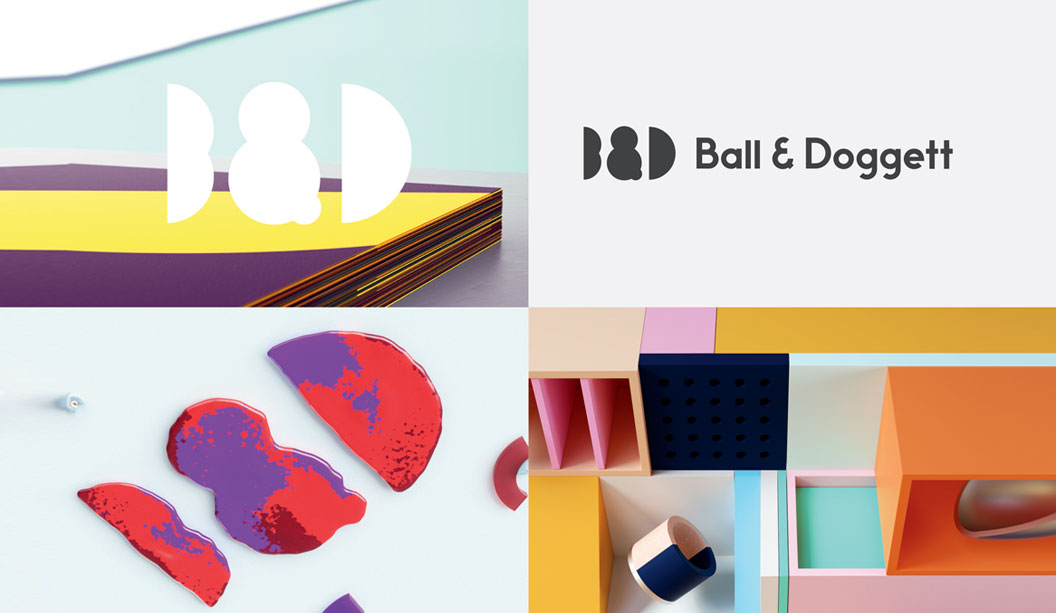
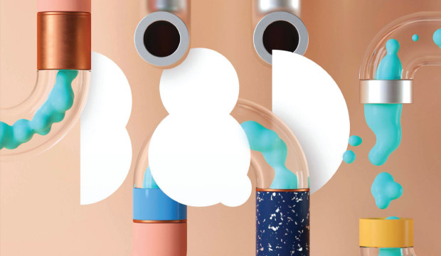
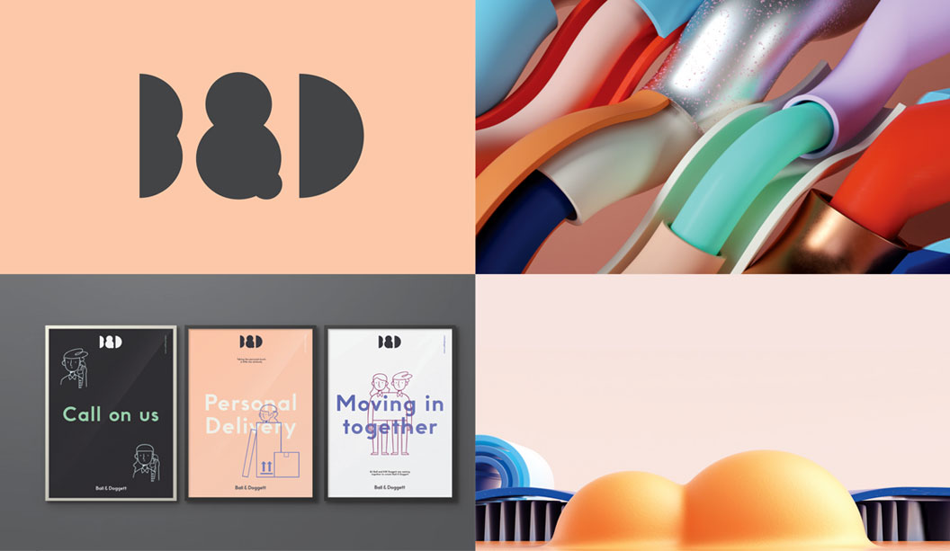
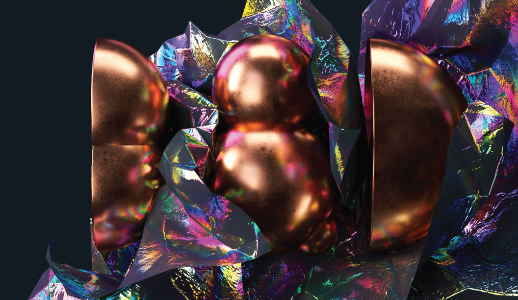
GSM: How did you come up with the new Ball & Doggett identity? What is it about? JL: The merger was as an opportunity to build a new identity that better reflected the true nature of the business—that of a highlydiversified, innovative company that supplies every material associated with the print and production supply chain. It needed to move beyond the perception of a paper merchant stuck in the past, and really start to show how the company fits into the digital ecosystem of today. The diverse set of customers meant that the identity needed to flex in tone whist maintaining a coherent story.We were very conscious of trying to show the company’s knowledge, passion and enthusiasm for their products and the relationships they’ve built with clients.
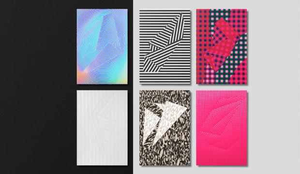
Testing paper weight, mixing ink and polishing foil were some we put through the lens of Willy Wonka and the materials factory, where thingsare never ordinary. And so the brand began to take shape from there.
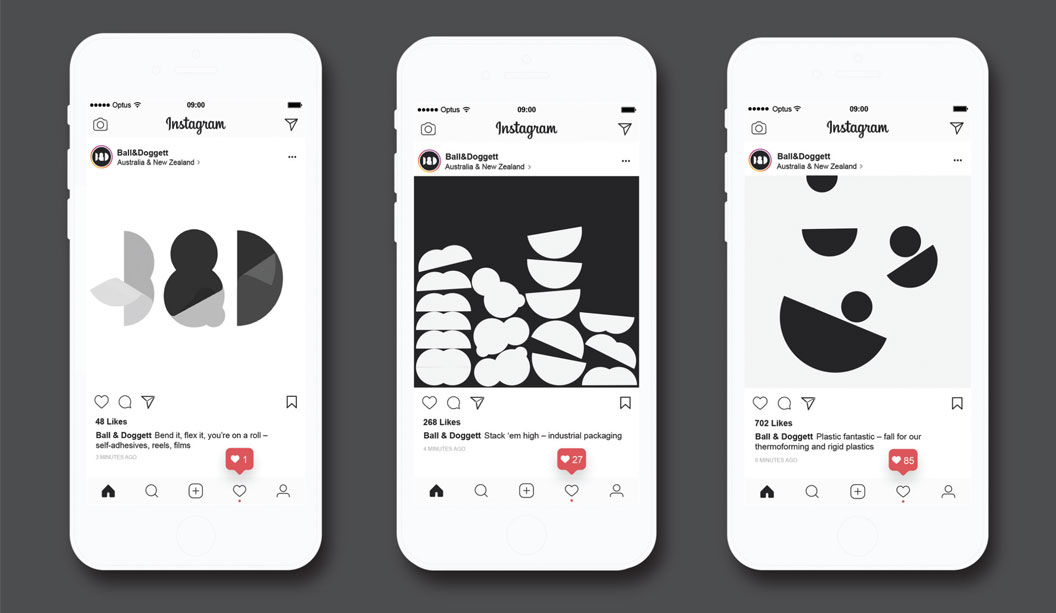
The simplified letterforms of the brandmark enable it to demonstrate various behaviours and material properties. This was coupled with the imagined weird and wonderful manufacturing processes to show the joy in all materials. When it came to anything printed, materials are pushed to the front in applications. This meant toning down or straight up avoiding excessive graphics, and instead leaning more towards utility of information, simplified typography and a focus on making the materials do all the talking. The material is the central piece—its colour, texture, smell, weight, and so on, and every piece of design is there to support it, not distract from it.Understanding the need to tell a human story, we also worked with illustrator Deborah Ho to create a series of character illustrations to reflect the people of Ball & Doggett. These are then used for navigation and informative elements online, and across internal communications to facilitate the merger transition.
GSM: You worked in a highly collaborative and transparent way with Ball & Doggett—can you elaborate on this approach? JL: We’ve been working in a completely open and transparent partnership with clients since we began the studio three years ago. It has meant that there are little, or no, secrets. From the start, we really try to immerse ourselves in the project, and the client’s business, whilst intensively engaging with the client team. From there, everything is shared and communicated almost daily. We really throw ourselves head first, and look to work through a shared commitment and authorship.
There is a constant conversation: thoughts and progress are shared through Slack, lo-fi videos of internal discussion and developments are recorded and uploaded, there are regular phone and Skype chats, there are face-to-face meetings
to share the larger milestones of the project with a wider group. Essentially, the evolving process of our thinking is seen, shared and discussed throughout the process.
One particular instance of this was for a critical meeting to share our creative concept. It involved the team standing around a wall in our studio, iPhone in hand, with Catherine Doggett on Skype, at the other end. The video discussion bounced around from talking to the screen, to pointing the phone at stuff on the walls, moving in closer to show specific details or information, and then back to me or a member of the team. It was presenting the main creative idea in its early and imperfect iteration. However, it was building on prior ad-hoc conversations we’d been having, so was less of a ta-da moment and more of a thought share. This kind of loose chat is typical. It’s not for everybody, but for most of our clients it works. There is no pretence or formality once the project gets going. We’re all in it together trying to find the best outcome, and it makes the process far more enjoyable.
GSM: What challenges did you face while working on the project? JL: This is an enviable project to work on—ensuring it delivers on the needs of the organisation and its people, whilst delivering a good creative result, is probably the main one.There were obvious concerns about a potential convoluted decision-making process, but this never materialised—it was a very straightforward process, we were working closely with the decision makers, and consensus was easily achieved on the work. We hit a brick wall for a period during the design sprint, where we had some issues in crafting the identity so that it could showcase the material properties. We finally cracked it once we brought a level of simplicity to the logo. This allowed us to go further in execution through the 2D and 3D work.
GSM: Where is the identity at and what’s next? JL: The brand is still very new to the market. We’ve developed the core parts of the identity and developed the design intent for a number of areas. We’ve created 3D illustrations and animations with some cracking animators, Dominik Grejc and Georgiy Kuznetsov, for use online and in marketing publications. Various pieces of print and digital communications are being worked on by the B&D team, The Company You Keep, and ourselves. We’ll be looking to build out and shoot some of the material testing experiments when the opportunity presents itself further down the track.As Ball & Doggett look to the future, this new brand gives them the flexibility to adapt and develop in untapped markets, create new tools for their customers, and stay relevant as the market changes. I’d anticipate further collaborations, with great designers and studios, to interpret the branding and help it live up to the ambitions I have for it.
GSM would just like to clarify for our Kiwi readers that Ball & Doggett is the Australian entity for BJ Ball. In New Zealand the company remains known as BJ Ball. Thanks.
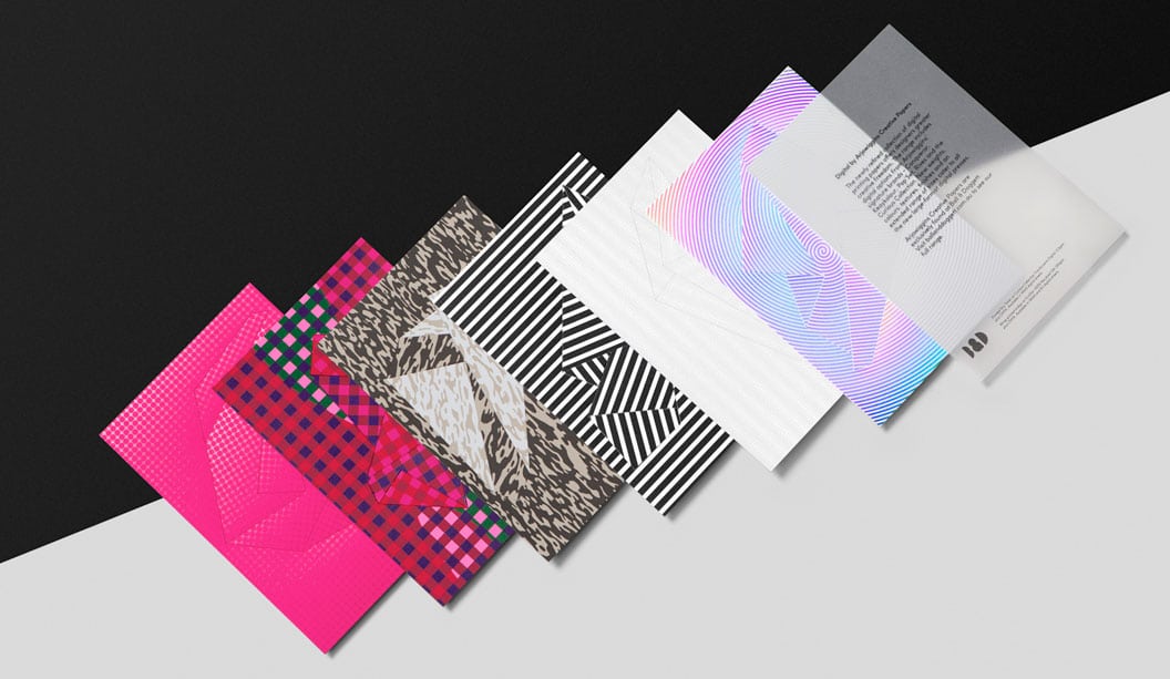
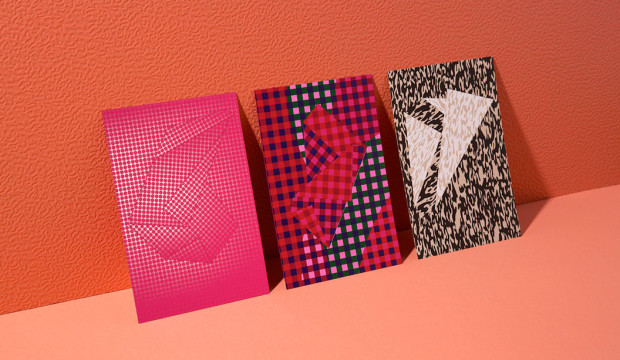
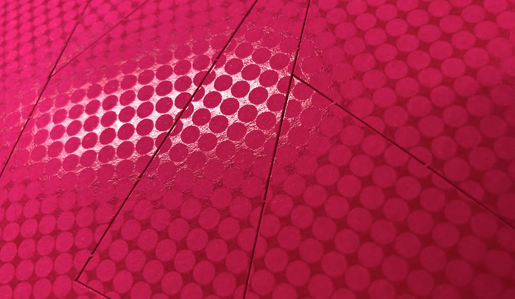
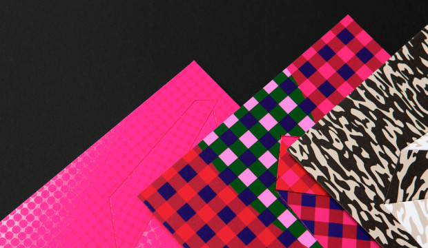
We recently released an A5 sampler created by A Friend of Mine design studio in Melbourne, consists of a set of seven cards (read more about it in the previous post). One of the cards, printed on a Dry Toner machine, is what we’re going to share our knowledge about today.
In print land, there are many ways you can print an image. Dry Toner print means laser printer and is a great choice for short run work. Dry toner machines are the most common print machines out there so you can often get work done quickly and at a competitive price. Like all digital printing there is very little set up (no plates) meaning each impression can be different to the next, think personalisation and the ability to mix up the colours on the same job.
Dry Toner printing has made leaps and bounds in terms of print quality and enhancement too, now offering a broader gamut of colour via CMYK but also clear, silver and gold toner options too. Dry toner is really up there for quality now and we actually think dry toner silver gives the best metallic print result you can find but shhh don’t tell the offset guys!
Economical embellishment with clear toner
The idea of this piece was to show you can mimic spot varnish with the use of clear toner. It’s a really economical trick and great for when you only need a small amount of business cards or an invite. On first glance of the printer’s proof we immediately saw the clear ink was too subtle on the bright pink. We wanted more impact so decide to put 30% magenta down first and then print the clear toner over the top. This gave greater contrast between paper and print. And by putting the clear toner on last it gave a nice shiny finish, mimicking the look of an expensive varnish.
TIP: the more matt and rough the paper is the greater contrast with the shiny clear toner. This trick works beautifully on dark papers and can be mistaken for a clear foil. Much cheaper and quicker than getting a foil block made and ideal for those times when you need some quick impact.
Looking for some additional inspo? Here’s some dry toner tricks just for you:
1. Clear ink on black stock to create a shiny, rich black effect.
2. Clear ink on white stock can achieve a subtle, modern white foil effect
3. Print a clear ink pattern over black text for a textured print effect
4. Dry Toner Silver and Golds come in all shades from yellow gold through to cooper, pewter and flat silver. It’s a mix of silver and yellow and the shades are endless.
5. Want a thick card? We sell cardboard that can be printed and stuck together under pressure. Mulitloft and Mohawk layers are the two products. It’s a cheap way to get super lux thick business cards on a short run, quick turnaround basis.
If you ever have any production questions, speak to your business development executive or call our marketing department on either 02 8863 1266 or 03 8794 3407.
Spec:
Dry Toner on Pop’Set Cosmo Pink 320gsm.
Printed: 30% Magenta plus clear toner on front. Silver toner on reverse.
A5 cut short grain.
We recently released an A5 sampler created by A Friend of Mine (AFOM) design studio in Melbourne, consisting of a set of seven cards wrapped in an origami folded B2 sheet. And we folded them all in-house. We owe a lot of people a big thanks for their help! Inspired by the shape formations found in paper, each card in the sampler showcases a variety of digital print techniques and a custom perforated shape. It’s been a doozy of a production project but worth it.
We wanted to share some important printing hints and tips around the Curious Collection Skin Red 270gsm card. The red card was printed on a HP Indigo press using CMYK, white AND fluoro pink ink. The checked pattern looks simple enough but delve deeper and there’s quite and few tricks we implemented to really make it pop. We did the hard yards so you don’t have to.
The artwork file is made up of seven layers. Getting the order of ink lay down is imperative. To get the tonal effect between the opaque and translucent areas of ink, the white gets laid down first, 3 hits to be exact. Then we follow up straight away (electro ink dries instantly) with the CMYK. On this piece CMYK shows up as the green, navy blue, magenta and maroon layers. To ensure they sit over the white, all CMYK areas need to be set to OVERPRINT. For a further explanation of what overprinting is click here. The ink that hits the white becomes opaque and has a bolded look. Ink printed directly onto the paper looks more transparent and subtly shows the stock colour underneath. Finally, the fluoro pink ink is laid down. Fluoro ink has a translucency so when it hits the white ink it pops as pink but when it hits the red stock it makes a slightly darker red shade.
Important to also mention that printer’s proofs are essential, especially when working with white ink. We went a few rounds with these before getting it right and consulted the printer regularly to achieve the desired result. Look out for registration too, with so many layers it’s important the edges of the pattern all line up. Finally there is a lot of ink coverage on this card, however AFOM has been mindful to keep some areas of the paper ink-free for all the paper lovers out there who want to feel Curious Collection Skin’s silky tactile goodness.
If you ever have any production questions, speak to your business development executive or call our marketing department on either 02 8863 1266 or 03 8794 3407.
Spec:
• Curious Collection Skin i-Tone Red 270gsm
• Printed HP Indigo
• Duplexed (1 sheet short grain, 1 sheet long grain- this minimises the curling that can happen with duplexing)
• CMYK, white ink (3 hits) and fluoro pink ink
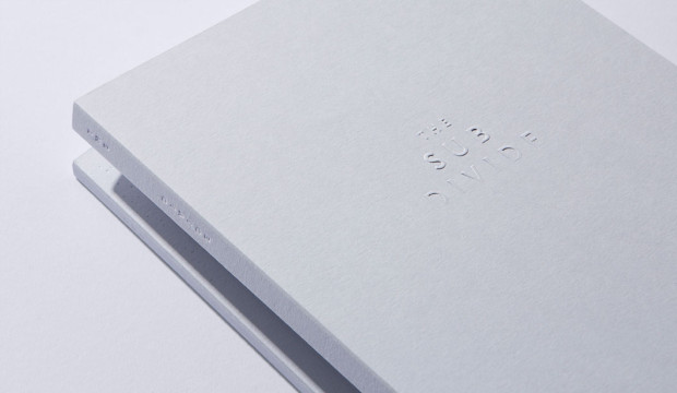
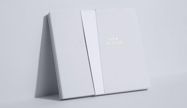
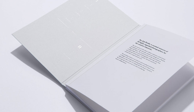
In 2016, we got to be a part of something pretty spesh when it comes to the world of paper and print. The culmination was the limited edition book The Sub Divide. It’s part print, part art and a whole lot of beauty. A curated resource celebrating a selection of 30 highly regarded photographers – recommended by and for, the creative industry. The publication has been developed by a collective of specialists dedicated to their craft.
(Most of the content from this blog post first appeared in Issue 11 of GSM Magazine).
The Sub Divide is an exquisite printed resource developed through the pillars of inspiration, experimentation, collaboration and celebration. It also celebrates craftsmanship. With a unique collaborative approach to production, this resource came to life through the dedication and expertise of some very committed individuals. The project started with a simple conversation between John Wanless Director at Bambra Press and one of staff after they saw printed test sheets of photographic material lying on Bambra’s press room floor. Grosz Co. Lab’s Creative Directors, Ben Grosz and Laura Camilleri then became involved by developing the concept and curating the collection of photographic works which the book showcases. Their efforts were none other than extraordinary!
The collective behind this project comprised includes:
> Bambra Press for Initial concept and delivering exceptional print.
> Grosz Co. Lab for the development and curation of the publication through intelligent, articulated design.
> Huber Inks for the supply of the Pacifica Inks and also specialist guidance on technical advice during the process, supplied by Ball & Doggett.
> The Bindery for the development and production of the unique featured binding techniques.
> Avon Graphics for the production and expertise in embellishments and foiling.
> Foldercorp for the production of the sleeve.
> Cartonlux for laminating the stock for the sleeve.
> Nordale Graphics/Wibelin for the binding techniques.
And yours truly for the supply of paper (visit our existing websites until the Ball & Doggett one is live).
The technical challenges
Such a complex print project presents many technical challenges. A key driver to the success of the publication was the extensive research and development phase. This included a series of mock-ups created by our Designline team in VIC that enabled dialogue with everyone involved. Creating a mock-up although it doesn’t have any print is a key step in any major print project and can save a lot of time and ensure the end product is exactly what you want.
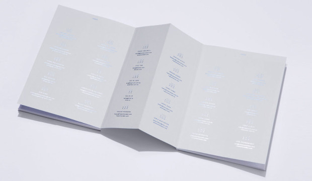
One of the specific technical challenges presented, was the unique bind which creates both an interesting aesthetic experience and is also unusual in placing the index containing the details of the featured photographers in the middle of the book. The bind solution was developed by Ian Leckie, operations manager at The Bindery.
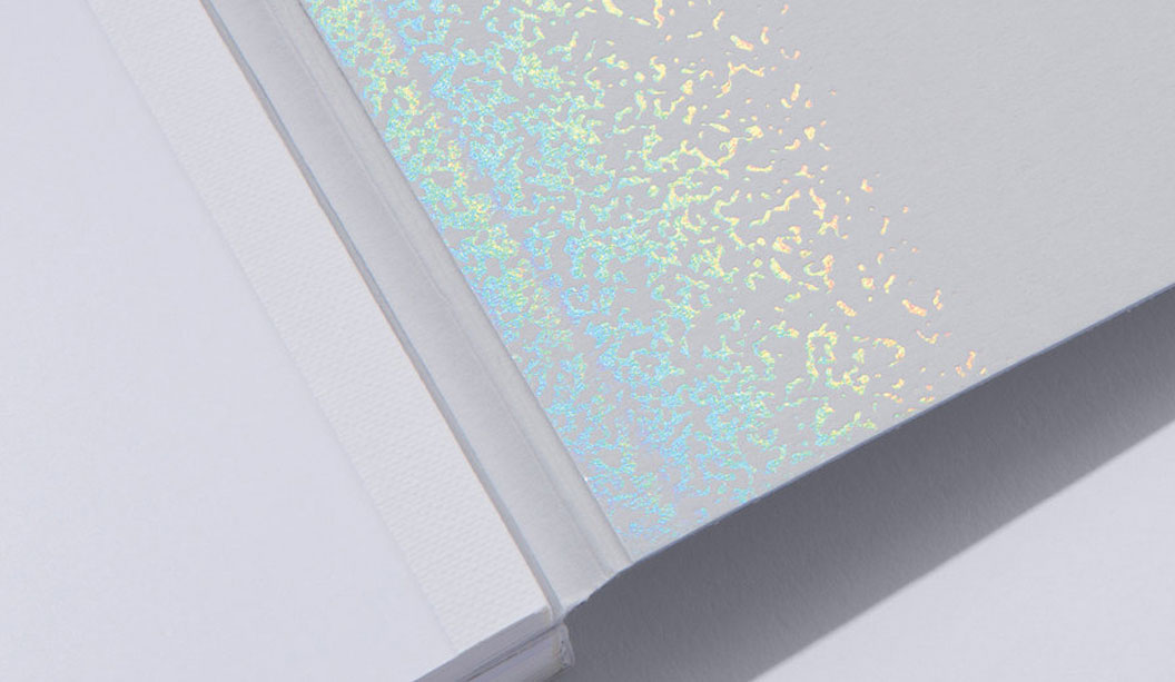
The slipcase (1) uses Colorplan Cool Grey 270gsm stock which has been custom diecut, folded and hand-glued, then duplex laminated to Colorplan Pristine White 270gsm. The embellishment across the slipcase features foiling by Avon Graphics with an API Foil (2004 / CL Clear Rainbow).
The bind design (2 + 3) uses a unique concertina fold to connect the two sections of the book together. The cover uses 350gsm Colorplan Cool Grey stock, on which a range of tactile embellishments have been employed including a multi-level emboss using a hand-carved sculpted die on the front cover (3), and on the back cover (4) a blind press using a foil stamping die without the counter die.
The inside front and back cover (5 & 6) use an API Foil (2004 / CL Clear Rainbow), and the spines and concertina fold (7) employ a blind deboss and foil. The index (8) is cleverly positioned at the centre of the book to make maximum use of the extra real-estate allowed by the open concertina fold, and was foiled using a blue metallic foil.
> The internal text pages of The Sub Divide were printed by the team at Bambra Press in CMYK, using Pacifica Inks throughout, on a Heidelberg XL75 12P
+ Aqueous Coater using Fuji Film CTP Processless Plates. Various screen rulings (specifically developed by Bambra Press) were selected to ensure the best possible result across each section of the book.
After 15 months of development from concept to production, The Sub Divide was officially launched in October 2016. A testament to the quality of the finished product, Grosz Co. Lab were recipients of a gold medal in the Print/Design Category at the recent 34th Annual National Print Awards.
The Sub Divide features the work of 30 highly regarded Australian photographers. Published together for the first time, the photographers responded to catergorisations divided into two groupings. The first, a commercial response to ‘people’, ‘place’ and ‘pieces’. And the second category was a response to ‘passion’, exploring the photographer’s personal connection, depicted through their lens.
 Footy Tips
 B&D: Any other innovative projects in the pipeline for Seljak brand?
Sam Seljak: We just got accepted into the Kick Starter program which is funded by Macquarie Group and run by SEFA partnerships. Basically, it’s an accelerator for social enterprises to grow their impact. So we’ll have access to mentors and support to become investor ready if we want to go down that path. We’d love to be able to introduce another waste-to-resource product in 2019, whether that’s something that focuses on recycled textiles in the way we have been using them now or in a completely different way.
B&D: Any other innovative projects in the pipeline for Seljak brand?
Sam Seljak: We just got accepted into the Kick Starter program which is funded by Macquarie Group and run by SEFA partnerships. Basically, it’s an accelerator for social enterprises to grow their impact. So we’ll have access to mentors and support to become investor ready if we want to go down that path. We’d love to be able to introduce another waste-to-resource product in 2019, whether that’s something that focuses on recycled textiles in the way we have been using them now or in a completely different way.