Footy Tips
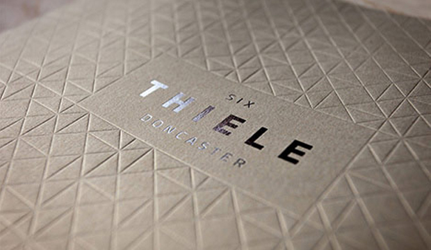
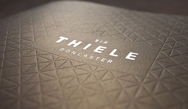
Title: Six Thiele Doncaster residential apartment project
Agency: Scharp
Client: Six Thiele Doncaster
Stocks: Curious Metallics
Printed by: Ellikon (VIC) Offset
Six Thiele Doncaster is the latest residential apartment project by Accord Property Group. The masterminds behind this impressive brochure design is Scharp, a multi-disciplinary creative studio specialising in property and development. Scharp came up with a full marketing campaign to promote the new development which included an animated movie, website, lifestyle photography, print and online advertising collateral, and much, much more. A very talented bunch indeed!
The cover is printed offset on Curious Metallics in Gold Leaf 300gsm. No ink was used on the cover. Instead, a full blanket blind deboss of the brand’s geometric motif (inspired by the architecture designed by award-winning architect Clarke Hopkins Clarke), has been impressed across the entire surface to create a stunning tactile experience. As a final touch of opulence, Six Thiele Doncaster’s bold logotype was centrally embellished using Milford Astor silver foil for a striking and eye-catching contrast.