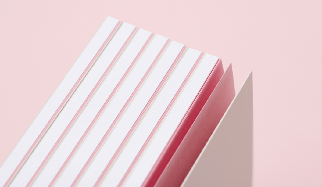
MultiLoft™ Encore is made using Convertible Solutions cohesive glue technology and Mohawk’s Superfine range of papers, certified to run on the HP Indigo press.
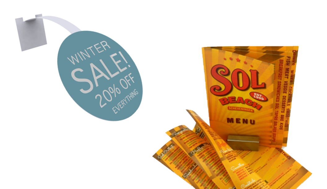
Looking for a pimped-up business card, with comps, wedding invite or greeting card that takes thickness to the max? MultiLoft™ Encore is where it’s at. Colour is built into the sheet of paper. So it’s ultra white on one side and coloured on the other side. And we also sell insert colours so the options are endless.
To achieve double the thickness of what is an already pretty thick card, print on the white side of two different sheets of MultiLoft™ Encore and then stick them together. Each double thick finished piece is approximately 634gsm.
The MultiLoft™ Encore inserts have cohesives (sticky stuff) on both sides and can be placed between the sheets to create colourful, eye-catching projects. As an example, adding x1 insert sheet, the thickness goes up to approximately 904gsm. Keep adding inserts to achieve your desired thickness.
After your project is printed and constructed, you can then diecut your job into the desired shape.
The range MultiLoft™ Encore sheet colours: Ultra white/Kraft (brown), Ultra white/Black Licorice, Ultra white/Wild Cherry, Ultra white/Pacific Breeze, Ultra white/Orange Fizz, Ultra white/Blue Raspberry. Click here for the full sheets stock chart.
MultiLoft™ Encore insert colours: Kraft (brown), Black Licorice, Wild Cherry, Pacific Breeze, Orange Fizz, Blue Raspberry.
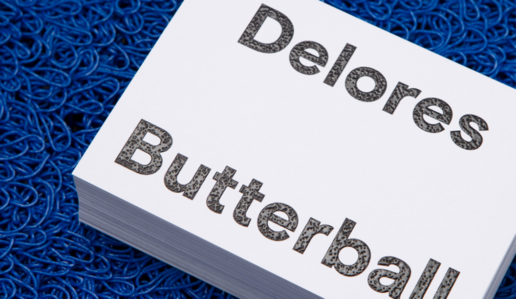
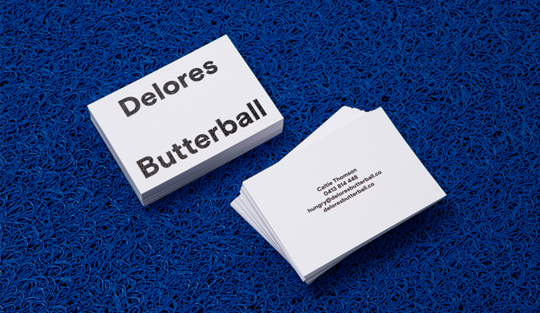
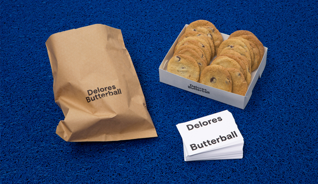
Two person design studio in Melbourne, Mildred & Duck, punch way above their small team weight. The team being Daniel Smith and Sigiriya Brown. Their branding job for Delores Butterball posted below, we recently featured in the ‘Snippets’ section of Spot, our first ever print publication. Speak to your paper specialist for a copy. And in the meantime, check out more of their awesome work on Instagram.
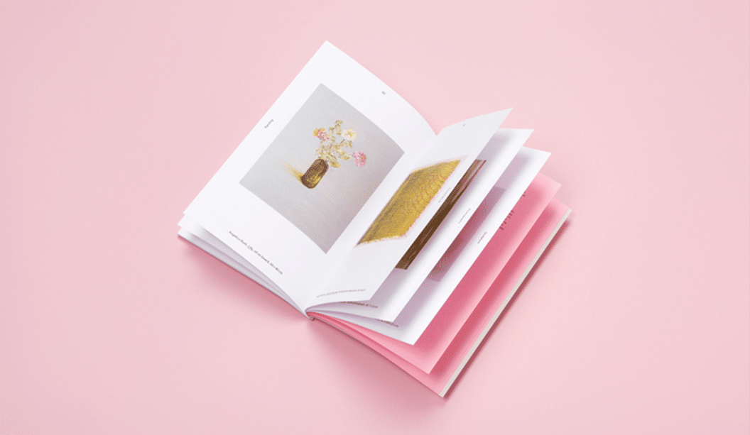
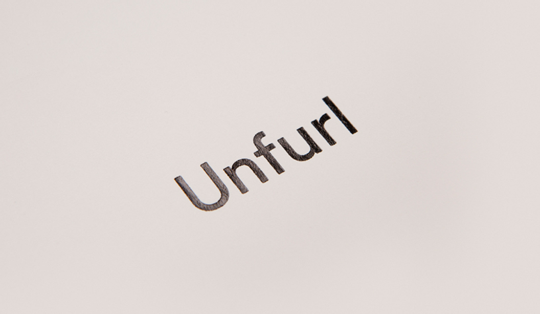
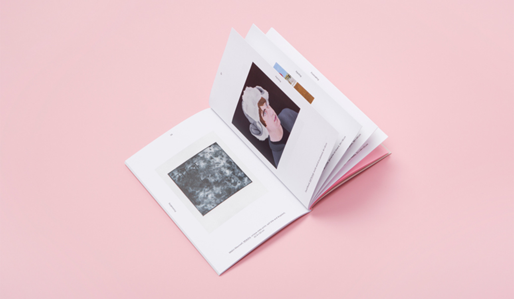
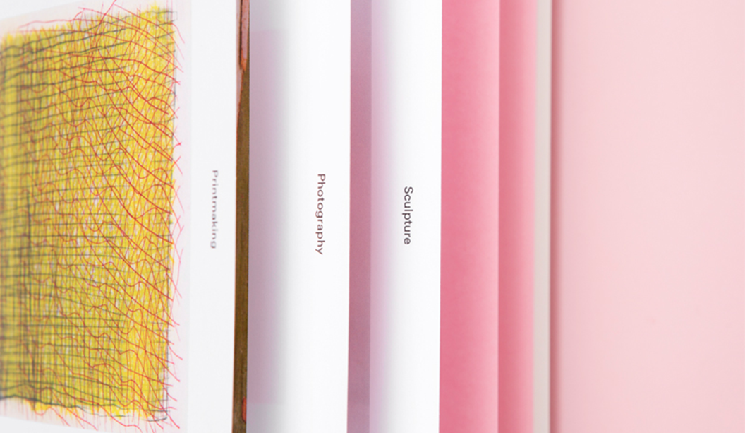
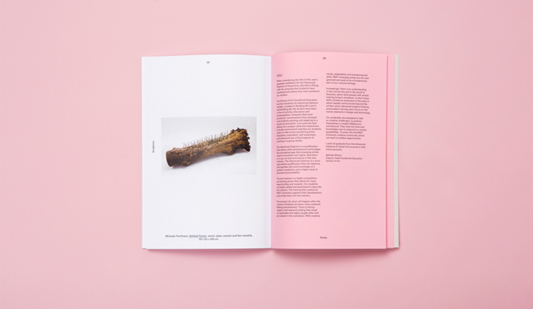
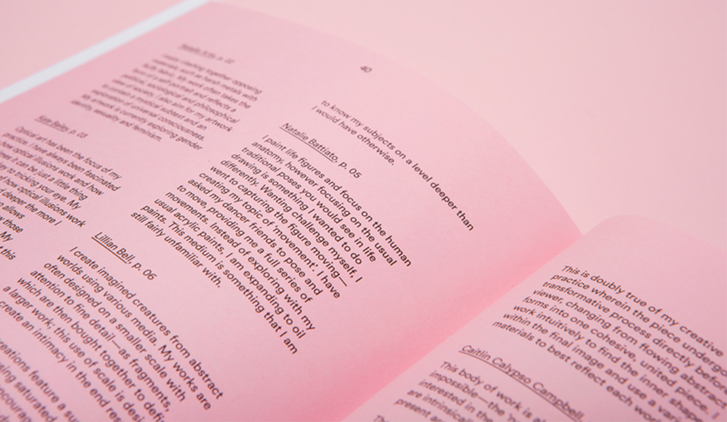
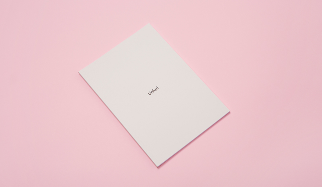
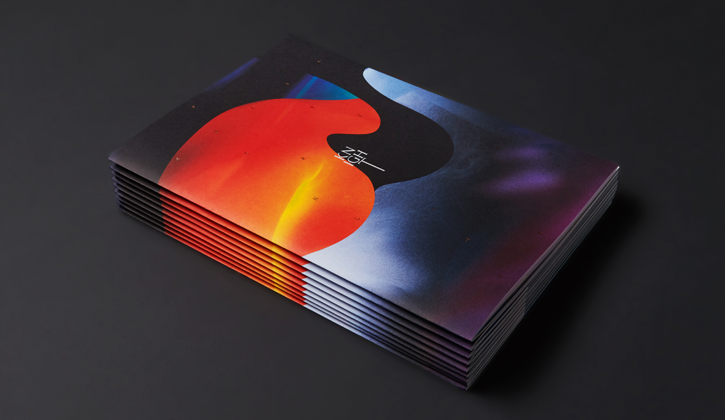
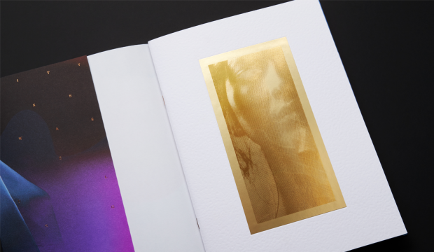
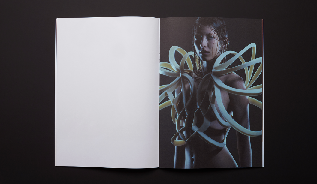
The ‘Unfurl’ publication showcases the work of RMIT’s Visual Arts graduates. The publication was designed to unify the diverse range of works created across different disciplines. Mildred & Duck used a consistent grid structure to create a cohesive experience, and allowing for easy navigation. Housed within an understated black-foil exterior, the publication reveals a playful pink section containing the text pages.
Delores Butterball is a small batch baked goods stall serving cakes and cookies across Melbourne. Mildred & Duck created a visual identity for Delores Butterball that is bold and confident and can be easily applied to boxes and bags as needed without losing legibility. The oversized business card doubles as a with comps slip, with raised verko printing that looks like the texture of icing. Yum!
Design: In-house.
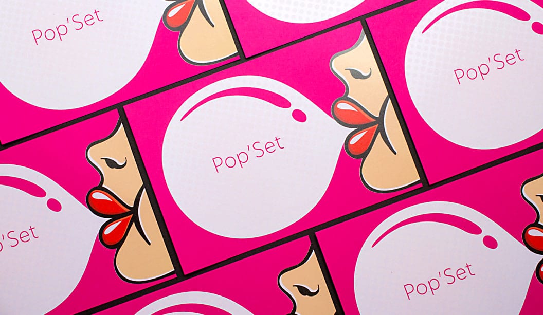
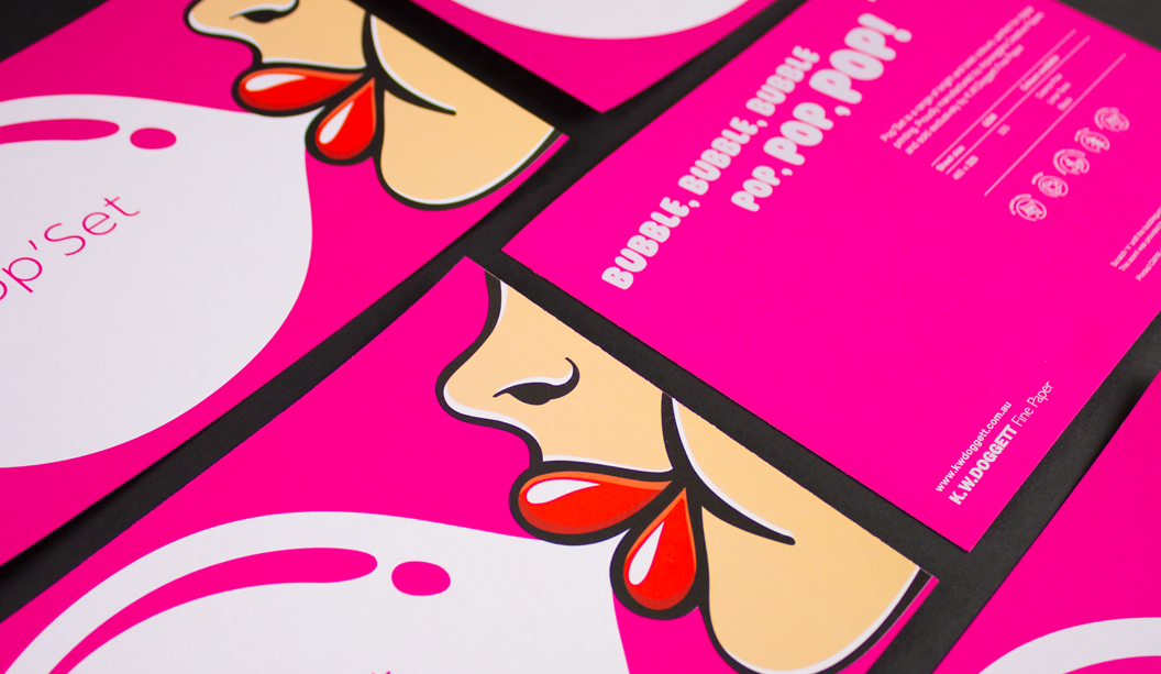
Stocks: Pop’Set Cosmo Pink 320gsm. Printed by: Intelligent Media, (VIC) on a HP Indigo 7800
Finishing: tlc digital+ (VIC). Printing specs: Six hits of white ink + CMYK + screen printed bubble gum scent.
You lay six hits of white ink plus CMYK down on a paper like Pop’Set and you’ve got yourself a postcard that…well…pops! The colour is super vibrant and the best bit is that bubble area is a bubble gum good time waiting to happen. We screen printed a bubble gum scent over the image and ever since we’ve been reminiscing about primary school and those amazing scratch ‘n’ sniff stickers we all loved so much.
It’s an interesting process adding scents to paper. It’s done via micro-encapsulated scented capsules that are mixed into UV curable carrier varnish. The UV-curable slurry is then applied to the printed sheet (or substrate) using a screen printing application. As the capsules are broken (like an egg shell) the scent is then released. Flick over to Instagram to see some pics showing the process.
Key selling points:
Highly pigmented colours in the range: Cosmo Pink, Lime Tonic, Black.
30% recycled, ultra smooth board.
HP Indigo certified and suitable for dry toner printing too.
Available in SRA3 sheet size in 320gsm.
We have a list of scents available if you need. We’ve done banana in the past and know there is everything from fruity scents like grapefruit and pear all the way through to flowers like Yellow Rose and then Green Lawn, Horse Stable and Camp Fire. Sunscreen smell would have to be the most random though. Ha!
In all seriousness, this kind of thing is sensory branding at its best. Smells can trigger emotions so this is not only an easy but a fun and valuable way to make a marketing promotion stand out and increase brand recall.
And even more seriously, stay away from the horse stable scent.
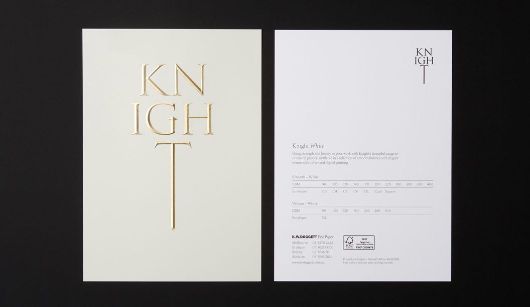
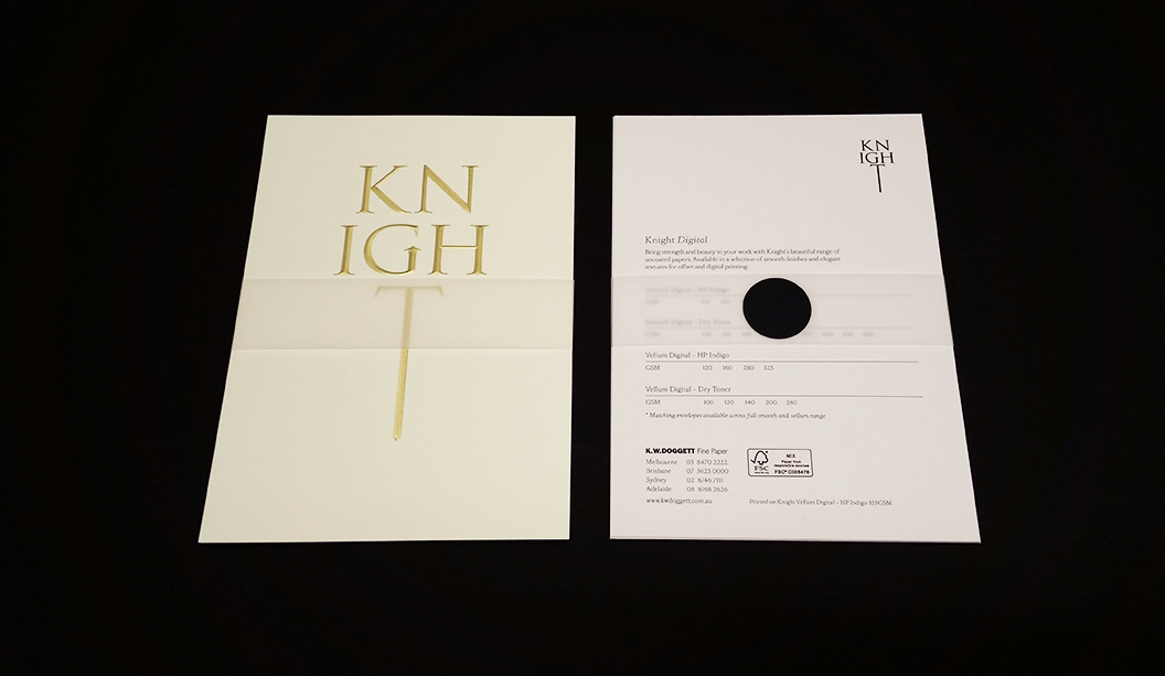
In our latest Knight campaign, we used a variety of print techniques. One of the most simple is the multi level or ‘raised’ emboss. A slightly different take on your standard emboss technique.
What is a raised emboss?
A raised or multi level emboss means the image or type area is raised to multiple levels to create a 3D type effect and in this case, with different depths.
What other kinds of embossing are there?
There is also blind embossing where you emboss the paper and leave it ‘as is’. The other option is to fill the indentation with ink or foil. You can also sculpt the die to have a bevelled edge which looks really good.
So it’s not a deboss?
That’s right, it’s not. A deboss means the surface is depressed instead of a raised impression which is what happens with embossing. So you inprint the image or type by pushing it into the paper (with embossing the impression is made from underneath).
Is it an expensive embellishment technique?
It can be pricey, depending on the area you want to embellish. The money is in the block that is made. So sometimes, if it suits the project, you’d get one block made and use it across different stationery items.
Is there anything I should avoid?
Make sure you allow for space in your design and also type, particularly with type because when your design is pressed into the paper, it will naturally appear closer together. For multi-level embossing use colour codes in your artwork to indicate various levels. Always best to speak to your printer before you deliver the files and find out how best to set them up. Also let them know what paper you are using.
Does it work better on some papers compared to others?
Long fibred papers don’t lend themselves too well to embossing but really, you can do it on both coated and uncoated paper with different results depending on the gsm, whether it’s textured etc. For example, an emboss may not turn out as deep on an coated paper due to a few things like the coating, but it still looks good. We used Knight Smooth Cream 250gsm in our promo and it worked a treat.
Do most printers do this type of work?
Some printers offer this service and usually, it’s the services of an embellisher you would seek. We used Avon in VIC in the case of the Knight promo. Call your paper specialist for the heads up on embellishers in your area.
Knight Smooth Cream 250gsm
• Foil produced by Avon
• Multilevel emboss with foil. 2 passes.
• Matt Gold 25
Did you know we stock synthetic products engineered for digital printing? Well, we sure do. In fact, we’ve got three absolute winners – PicoFilm, EnDURO and Tacky Dry Super Tuff Poly. They’re all high temperature resistant (meaning they won’t melt), durable, tear proof and weather resistant.
PicoFilm
A coated polyester (PET) that offers excellent colour reproduction, stiffness and trouble free feeding. This product is suitable for both Dry Toner and HP Indigo presses.
EnDURO
A high white paper laminate reinforced with a polypropylene (PP) or polyester (PET) film. Comes in ICE (PET – transparent) or Classic (PP – paper face). The ideal combination of paper feel, with the strength and printability of a synthetic. It’s easy to convert, has great printability and is easy to fold. Suitable for Dry Toner and HP Indigo presses.
Tacky Dry Super Tuff Poly
A polyester based, non adhesive paper with a white satin finish. Tacky Dry Super Tuff Poly has a soft tactile quality and comes in adhesive options too. Suitable for Dry Toner printing only.
Applications
There are so many uses for these products including point-of-sale, overlays, envelopes and protective jackets, maps, golf/membership cards, tags, entrance tickets, numbered bibs for sporting events, use-by dates for food, menus, personalised certificates, training manuals, blue prints, parking tickets, horticulture tags, boating maps and hotel door handle tags. Those and many more.
Follow the links above for more specifications, or call you trusty rep for more information.
Dust jacket: Knight Vellum 100gsm.
• 6 colour printed Dust Jacket in one pass on Heidelberg A1 press
• Conventional offset
• 2 spot colours are Pantone Purple and PMS 375
• The rest of the channels in the artwork are process CMYK.
• We swapped out the standard process colours for more vibrant options of:
– Swapped process cyan for ‘Process Blue’
– Swapped process magenta for ‘Rubine red
– Swapped process yellow for ‘PMS 012’
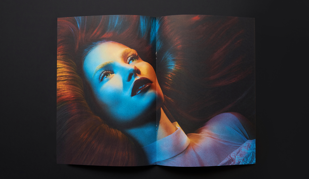
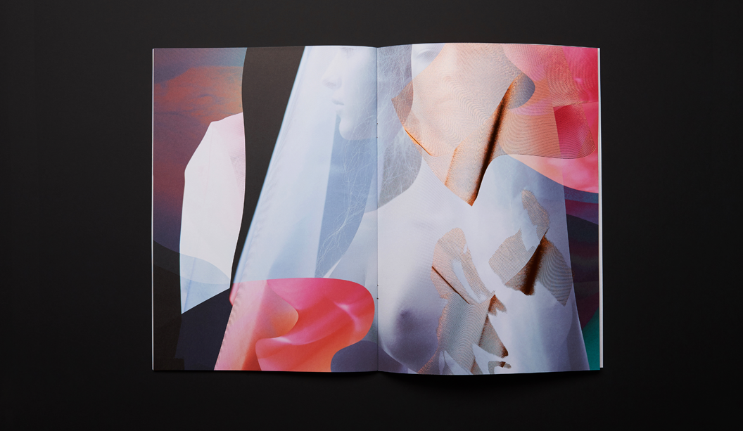
Cover: Knight Hammer 280gsm with Knight 140gsm ‘gold inlay’.
• No print
• Copper Staples done by Bambra
• Gold inlay in two foils over the top of each other
• Base foil is Matt Gold 429
• lmage foil Is Dark Mirror Gold 425
• Hammer cover has been debossed to fit gold inlay
Text: Knight Smooth, Cream 140gsm, Knight Smooth, White 140gsm, Knight Vellum, 140gsm.
• CMYK print throughout
• Pages 22/23 have bump plate 021U
• Page 18/19 we 3D printed that piece of futuristic armor. Designed by RMIT student Amelia Agosta and printed in Melbourne by 3D objective
• Text is printed with a 400 Hybrid Screen. Part line screen and part stochastic
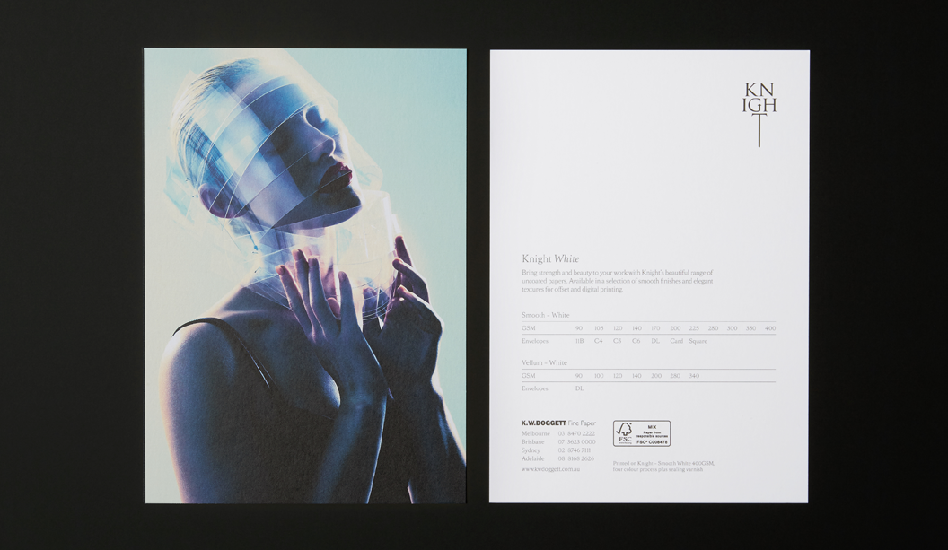
Postcards:
#1 Knight Smooth Cream 250gsm
• Black print only.
• Foil produced by Avon
• Multilevel emboss with foil. 2 passes.
• Matt Gold 25
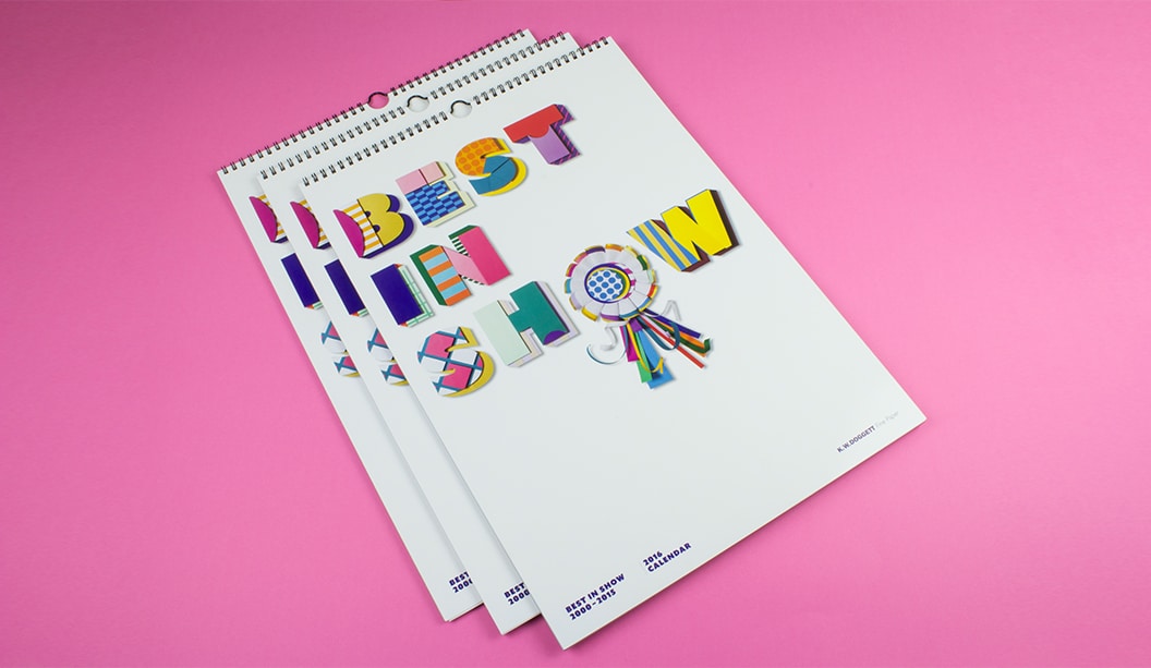
Bring on the 2016 Doggett calendar, as voted by YOU! Featuring many of our favourite papers and a few bells and whistles, ‘Best in Show’ is a celebration, a paper and poochie bonanza showcasing the most popular images dating back to 2000. The fate of the calendar was put in the hands of our customers, paper lovers and social family and over 1000 people submitted a vote. So a huge thank you, to everyone, who participated.
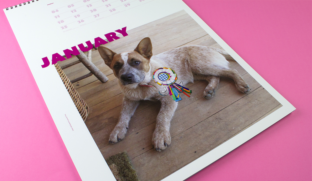
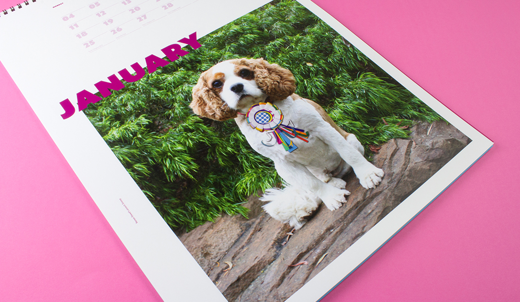
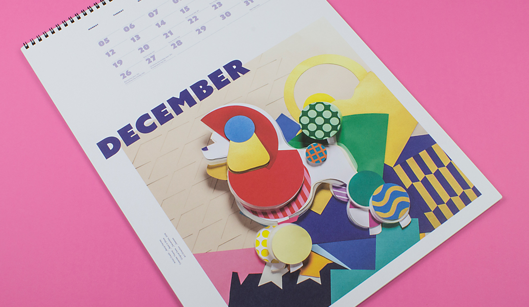
The cover and December artwork is by paper genius and friend Benja Harney. That man can fold paper like nobody’s business and also happens to be the loveliest guy. Benja also made the paper rosette worn by 100 pooches from around Australia that took part in the ‘Pimp my Pooch’ campaign.
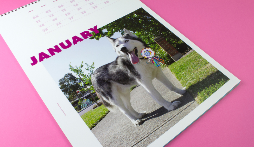
What is this you speak of?! Pimped pooches?! We offered all our customers the opportunity to have their pooch feature as the January star in a custom Indigo printed calendar. Some of the stars are shown below and you can check out others on our Insta page.
To all of our lucky customers that receive a calendar, your rep is coming around in the weeks before Christmas with your copy. Enjoy!
Printing specs:
Cover: CMYK plus emboss on Finesse Cast Coated 250gsm.
Credits page: CMYK on Wild 150gsm.
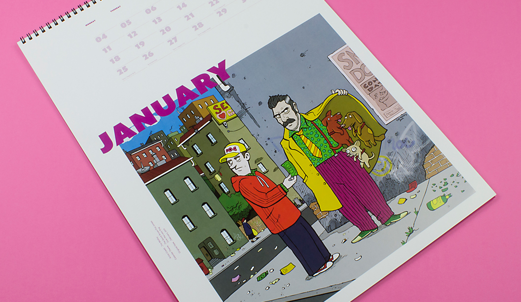
January: CMYK on HannoArt Plus Gloss 200gsm.
February: CMYK on Knight – Smooth 140gsm.
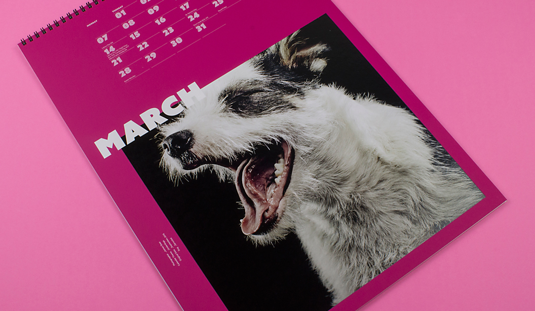
March: CMYK plus 4 hits white ink (title of month) and 2 hits white ink (dates and image) on SKIN Curious Collection – Pink 270gsm.
April: CMYK on Curious Metallics – Virtual Pearl 240gsm.
May: CMYK on Envirocare 100% Recycled 250gsm.
June: CMYK on Cambric – Colonial White 270gsm.
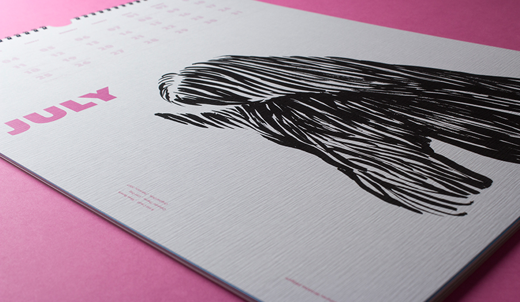
July: CMYK on Tablex – Textures Wrinkles 280gsm.
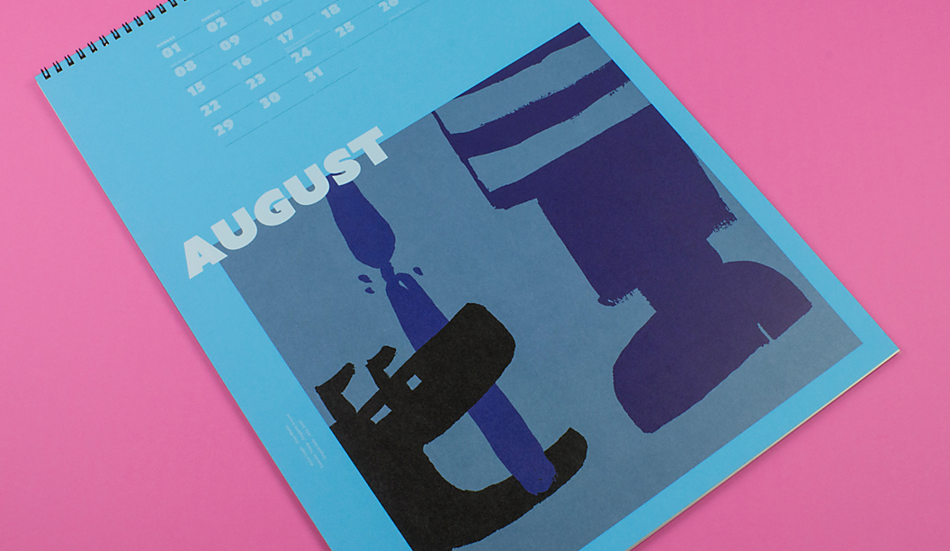
August: CMYK on plus 4 hits white ink (title of month) and 2 hits white ink (dates and image) on Kaskad – Peacock Blue 160gsm.
September: CMYK on Sovereign A2 – Silk 250gsm.
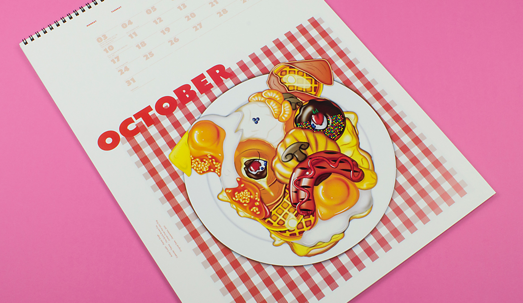
October: CMYK plus Spot Gloss UV on Barry Bleach Board 170gsm.
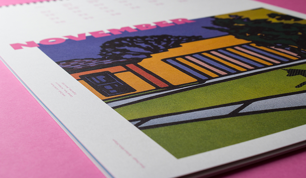
November: CMYK on Rives Design – Brilliant White 250gsm.
December: CMYK on Sovereign Offset 160gsm. ‘Pimp my pooch’
Custom January month: Indigo CMYK on Sovereign A2 – Digital Gloss 200gsm. Please read the contents page and blurb of calendar.
Check out some of the ‘Pimp my Pooch’ entries. Woof!
Dot Georgoulas’ pooch Diego
Helen McGeachin’s pooch Finn
Renee Stead’s pooch Snoop
A little about us, a little about the calendar: Dogs for Doggett seems a logical connection. But it wasn’t always the case. In the early 90s (hello purple, green and orange corporate colours!), David Lancashire suggested we should incorporate dogs into our marketing material. It took a fair bit of persuading to get Ken and John across the line. Who would have thought a funny name like Doggett would turn out to be such an asset! Fast forward to 2016 and ‘Best in Show’ is a celebration of doggie themed calendars from the last 15 years. It’s worth mentioning that over the years, the calendar has been just as much about the students/emerging talent that create it, as it is about dogs. Each year we brief in the doggie theme and are blown away by the creative ideas we get back. We’d like to say thanks to the students, lecturers and creatives that have helped us make the Doggett calendar such a success.
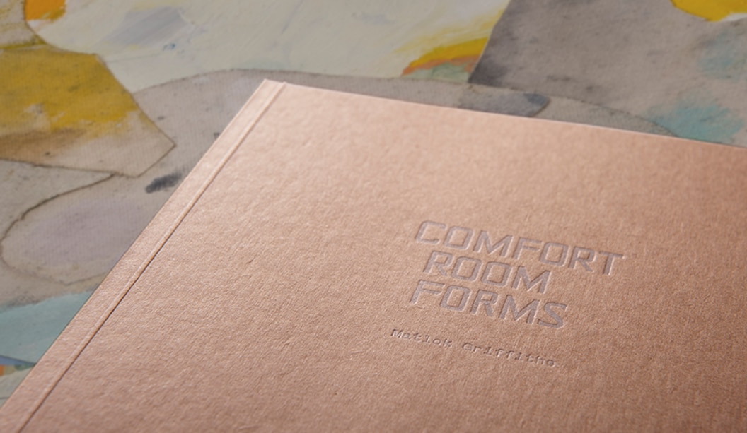
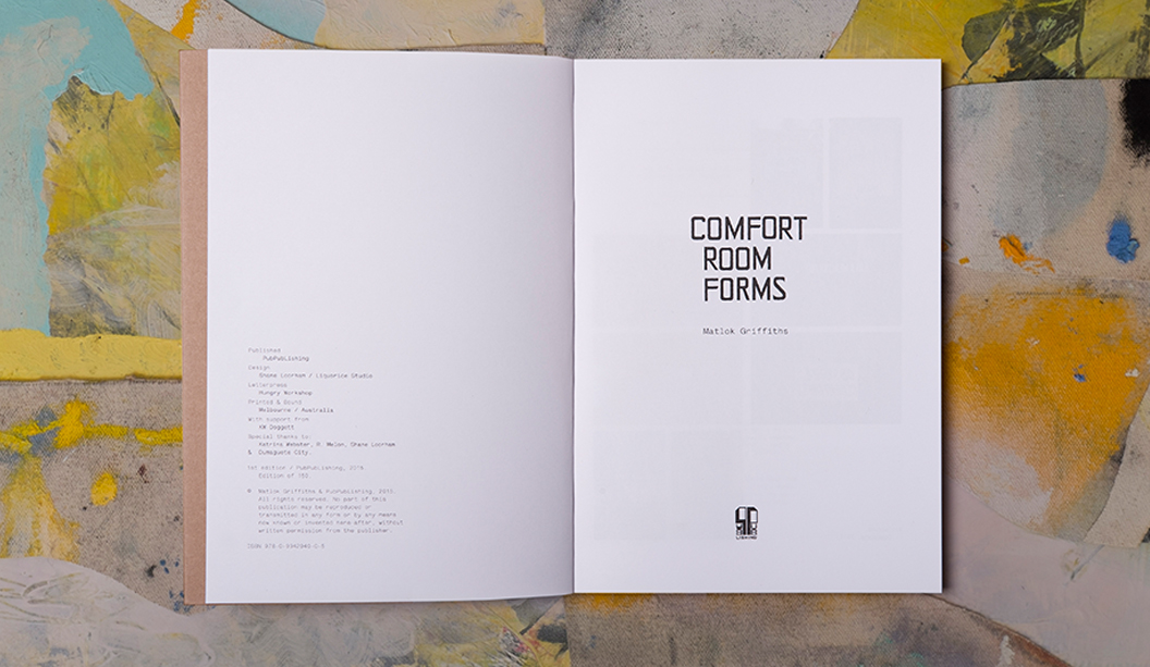
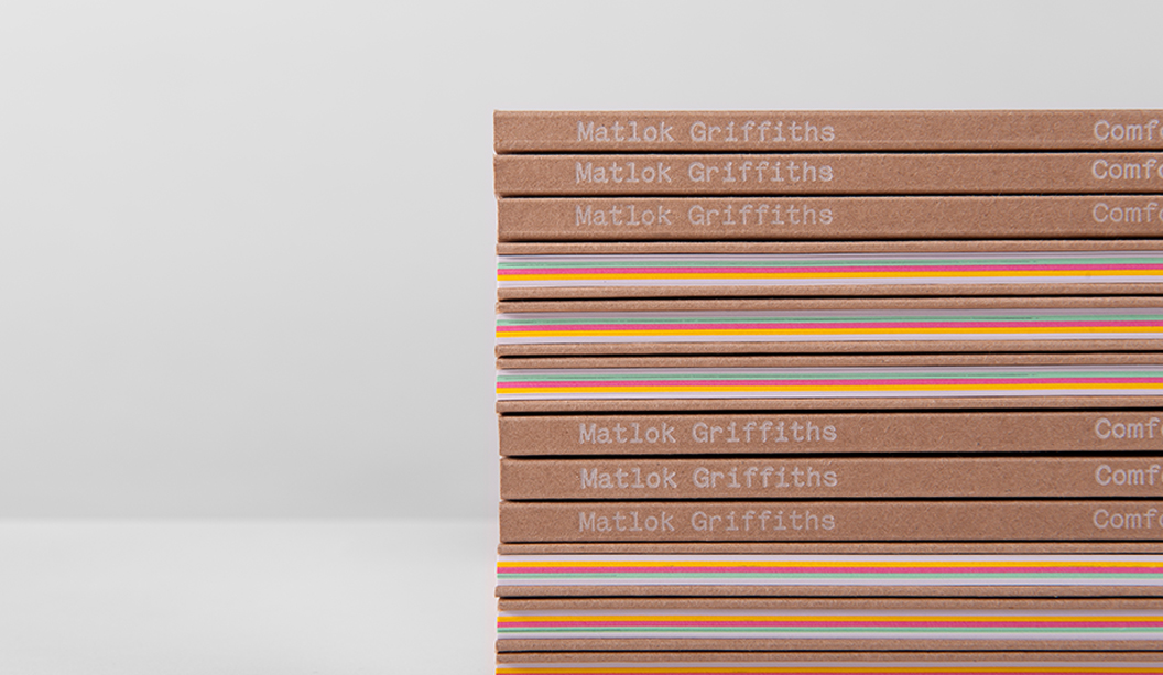
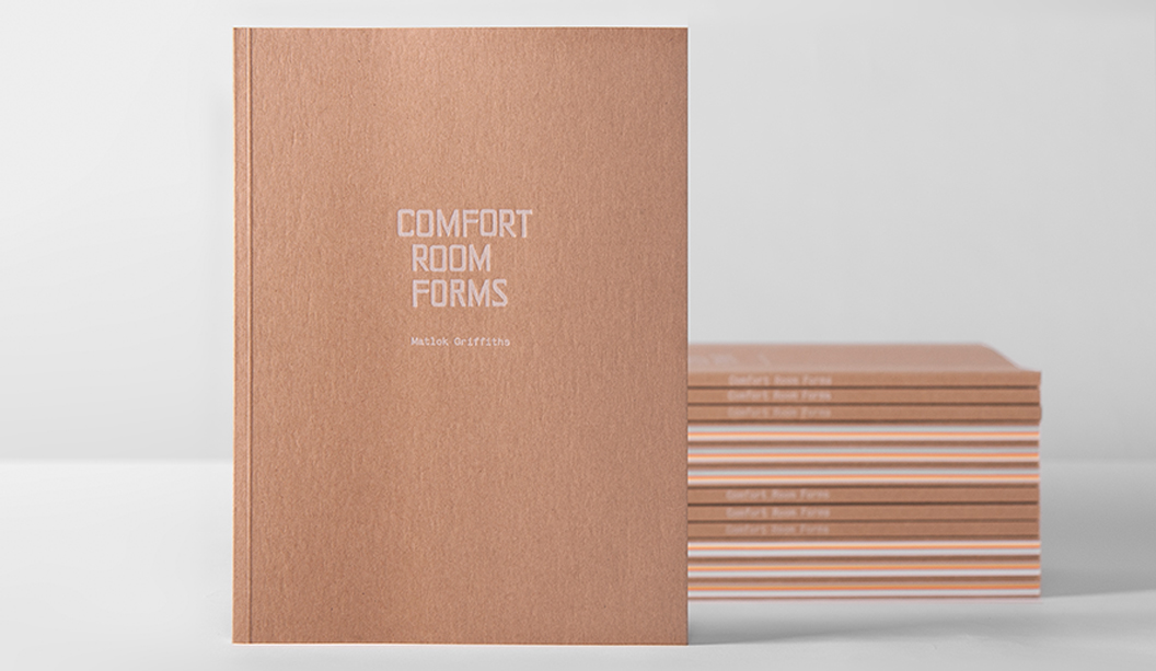
We love a good page-turner and Matlok Griffith’s book‘Comfort Room Forms’ is no exception! Combining an exotic blend of drawings, vibrant papers and print techniques, it is the complete creative package.
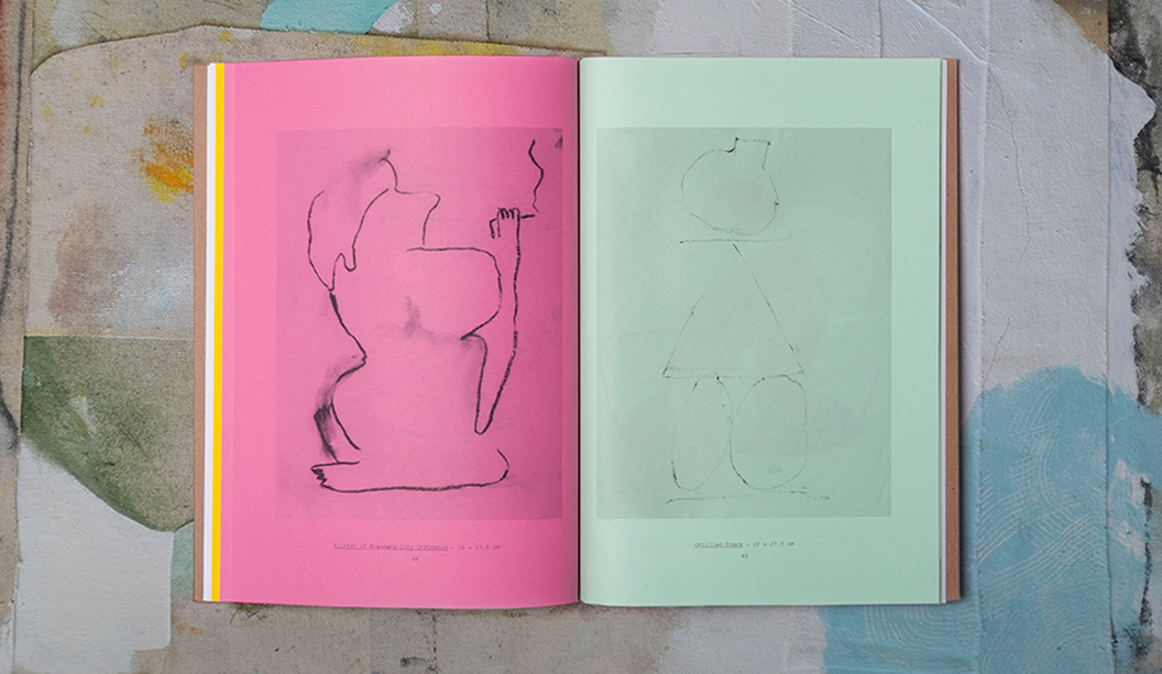
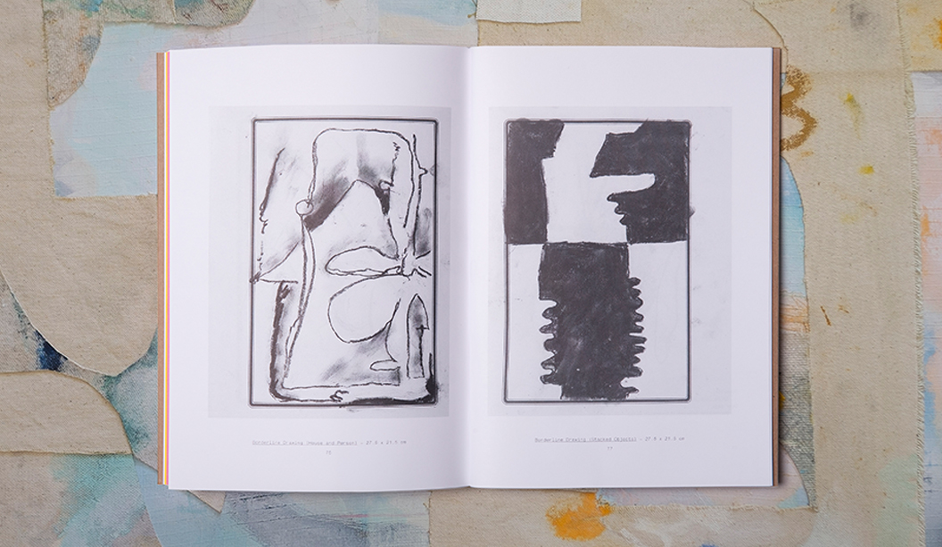
Designed in collaboration with Shane Loorham from Liquorice/Silent Partner (VIC), the 80 page book is a mix of full colour and one colour reproductions of Matlok’s drawings, made while he lived in the tropical island city of Dumaguete in the Philippines, surrounded by the smell of fried chicken and gasoline.
We picked Shane’s brain about the creative: “The book was designed in very close collaboration with the artist. We had been collaborating for a few years, designing and in some cases, hand-printing exhibition catalogues for him with a heavy degree of DIY coming through in the production. We were excited when this opportunity to create something a bit larger and more involved came up.”
Matlok’s original drawings were completed on a varied mixture of Filipino commodity papers, many of which were pretty bright and cheerful. In an effort to best reproduce them in printed form, the book was primarily printed offset in one colour on a variety of vibrant coloured stocks including Kaskad Oriole Gold 100gsm, Leafbird Green 100gsm and Bullfinch Pink 100gsm and Knight Smooth 120gsm. The credits and title pages were printed digitally on Knight Digital Indigo 120gsm. But wait, there’s more production goodness…
Shane explains: “We chose Buffalo Board for the front and back covers and had them letter pressed using Opaque white ink by our friends at The Hungry Workshop. Printing the covers this way was a bit of a gamble as no one was quite sure how the white ink would reproduce on the board. We were ready to change the colour at the last minute if need be, but the guys at The Hungry Workshop worked their magic and did a wonderful job for us!”
To see more of Matlok’s beautiful work, you can visit his website here http://matlokgriffiths.com/ or you can ask your friendly paper specialist to show you a printed sample the next time they pop by your studio.
 Footy Tips