Two rad jobs from Mildred & Duck

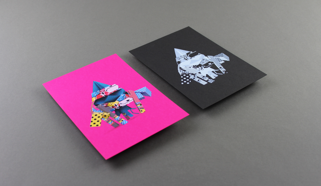
Two person design studio in Melbourne, Mildred & Duck, punch way above their small team weight. The team being Daniel Smith and Sigiriya Brown. Their branding job for Delores Butterball posted below, we recently featured in the ‘Snippets’ section of Spot, our first ever print publication. Speak to your paper specialist for a copy. And in the meantime, check out more of their awesome work on Instagram.
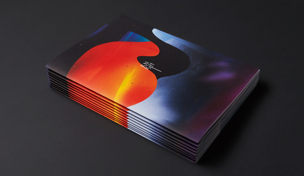
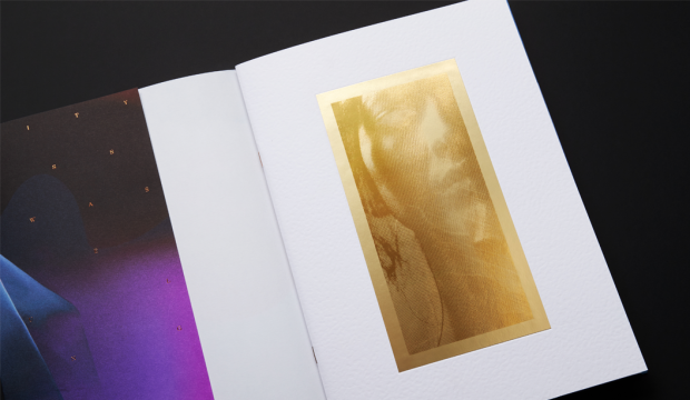
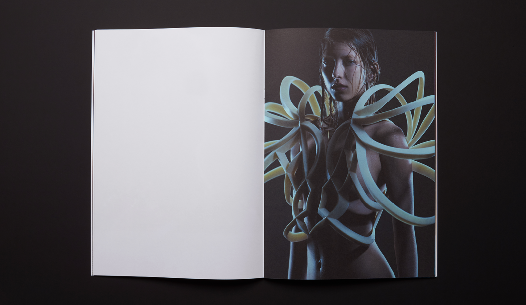
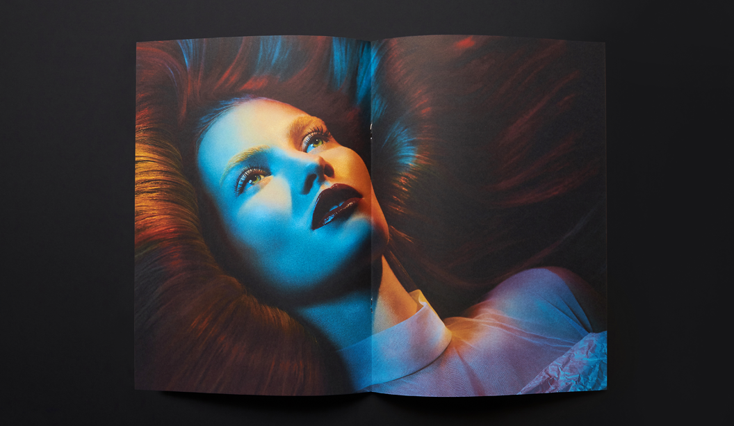
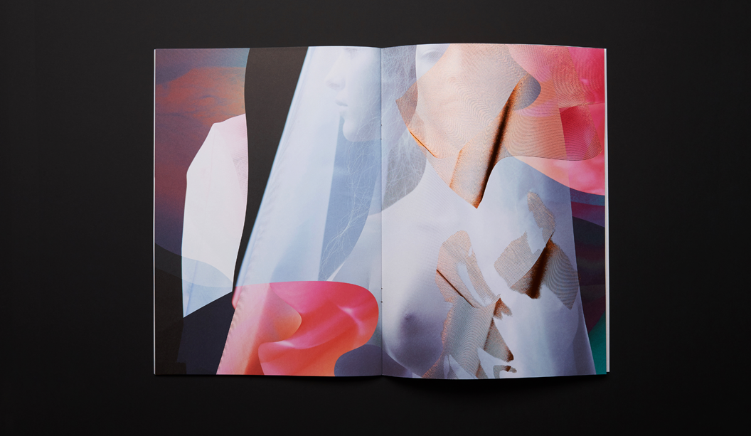
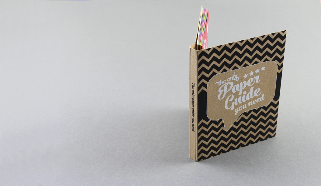
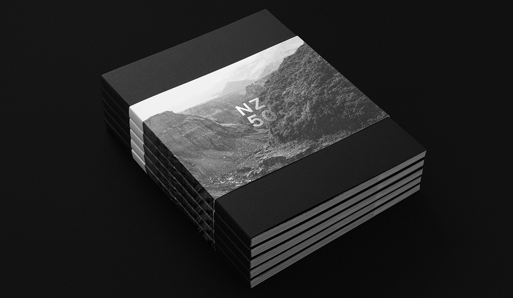
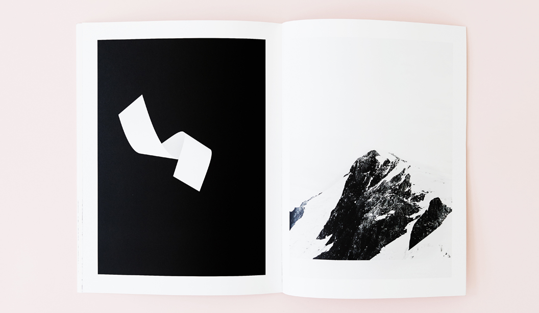
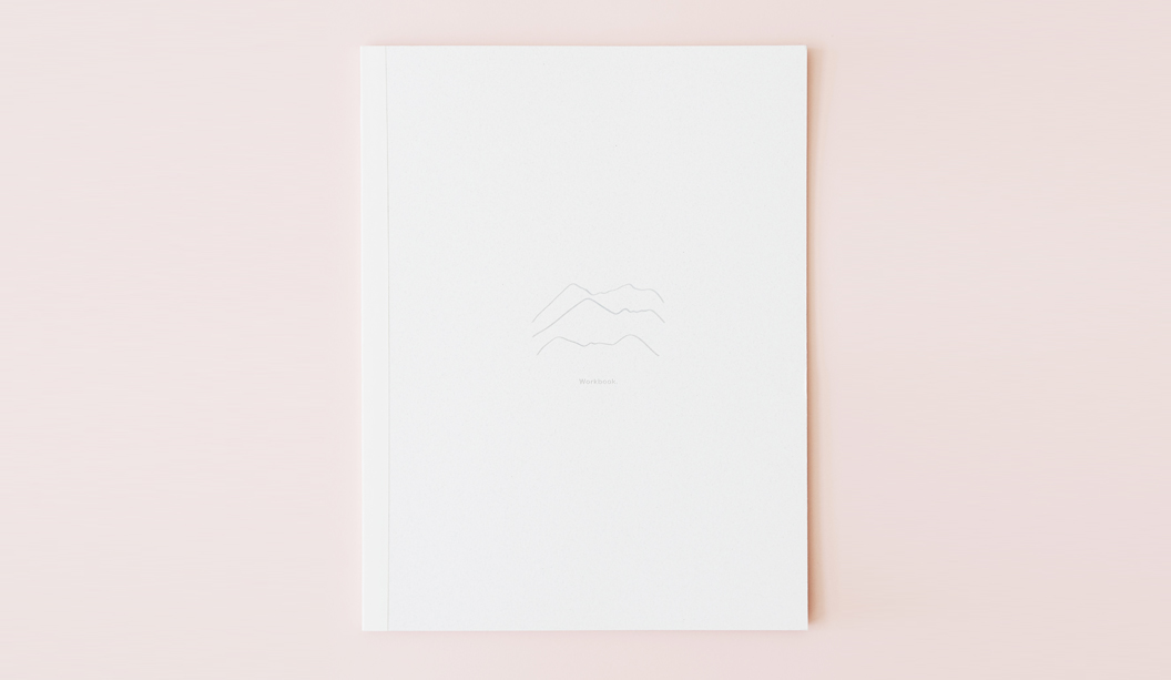
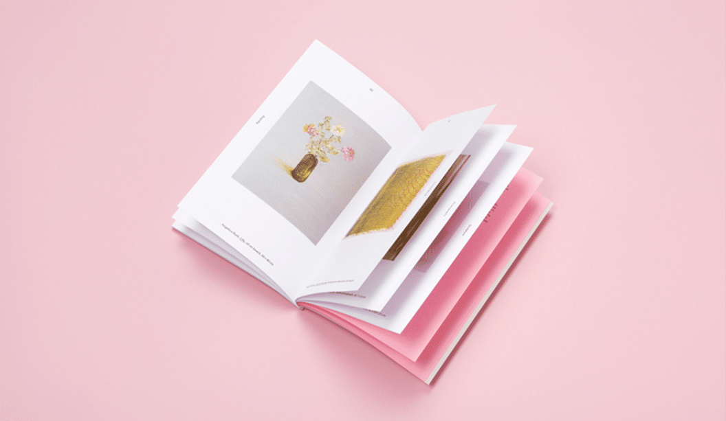
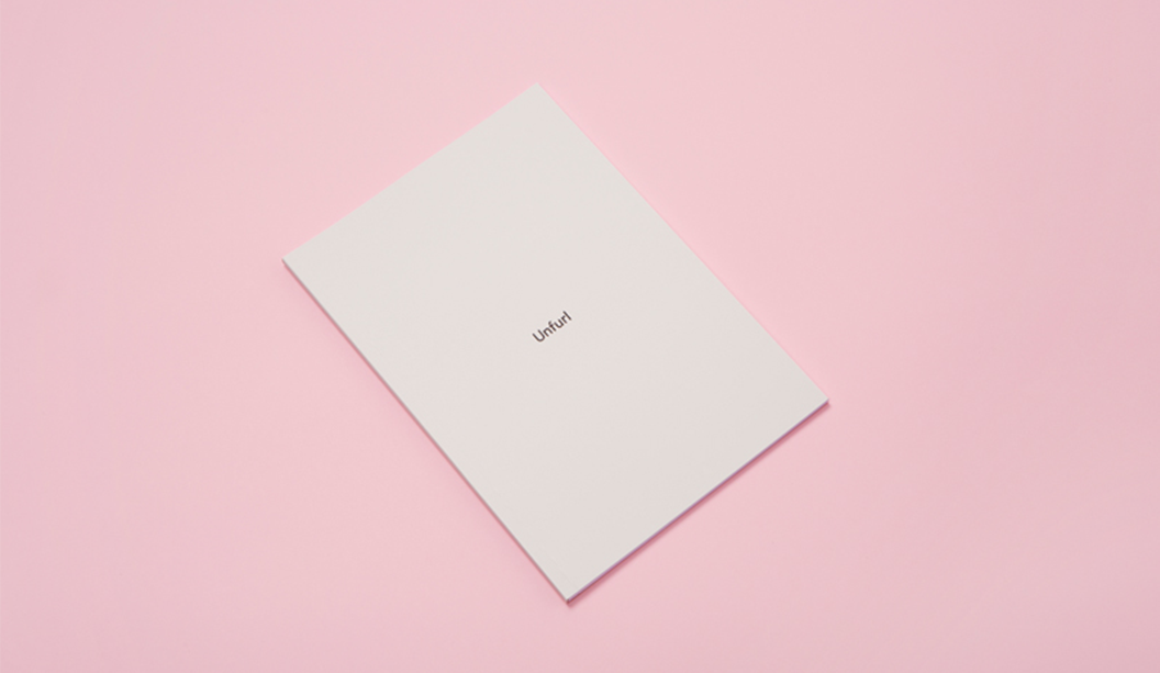
Title: Unfurl
Stocks: Curious Collection Skin Stone 270gsm, Knight Smooth Digital – Indigo White 160gsm, and Grange Tinted Bond Pink 80gsm
Print specs: Black metallic foil + CMYK
Printed by: Ellikon
Photography: Mark Lobo of Foliolio

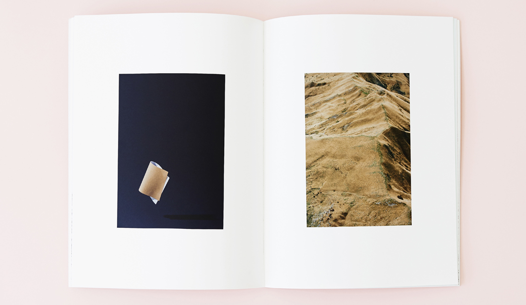
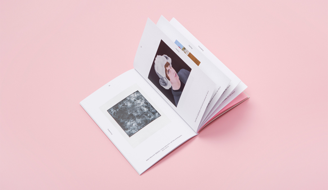
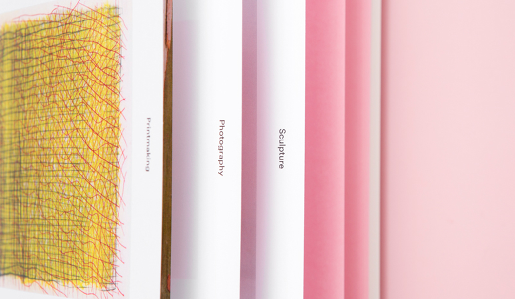
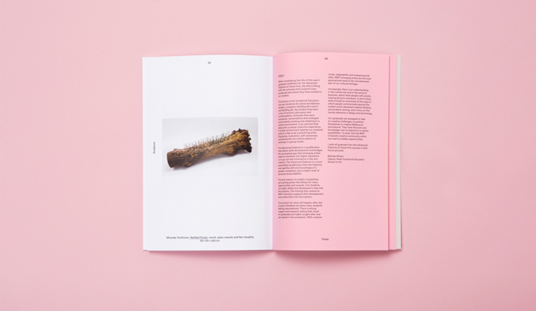
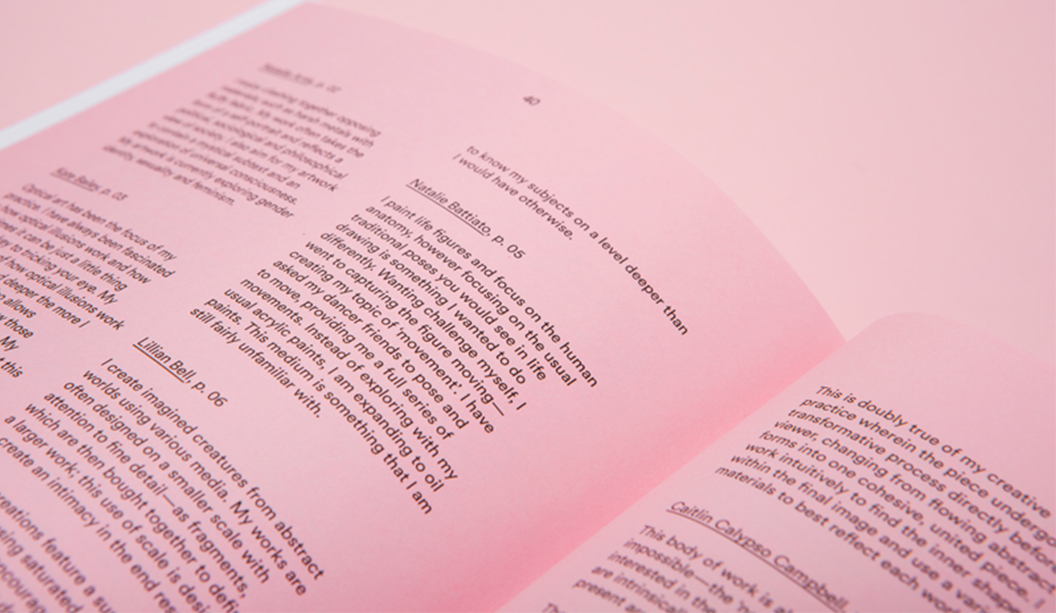
The ‘Unfurl’ publication showcases the work of RMIT’s Visual Arts graduates. The publication was designed to unify the diverse range of works created across different disciplines. Mildred & Duck used a consistent grid structure to create a cohesive experience, and allowing for easy navigation. Housed within an understated black-foil exterior, the publication reveals a playful pink section containing the text pages.

Unknown-1

Unknown-2

Unknown-3

Unknown-5

Unknown-6

Unknown-7

Unknown

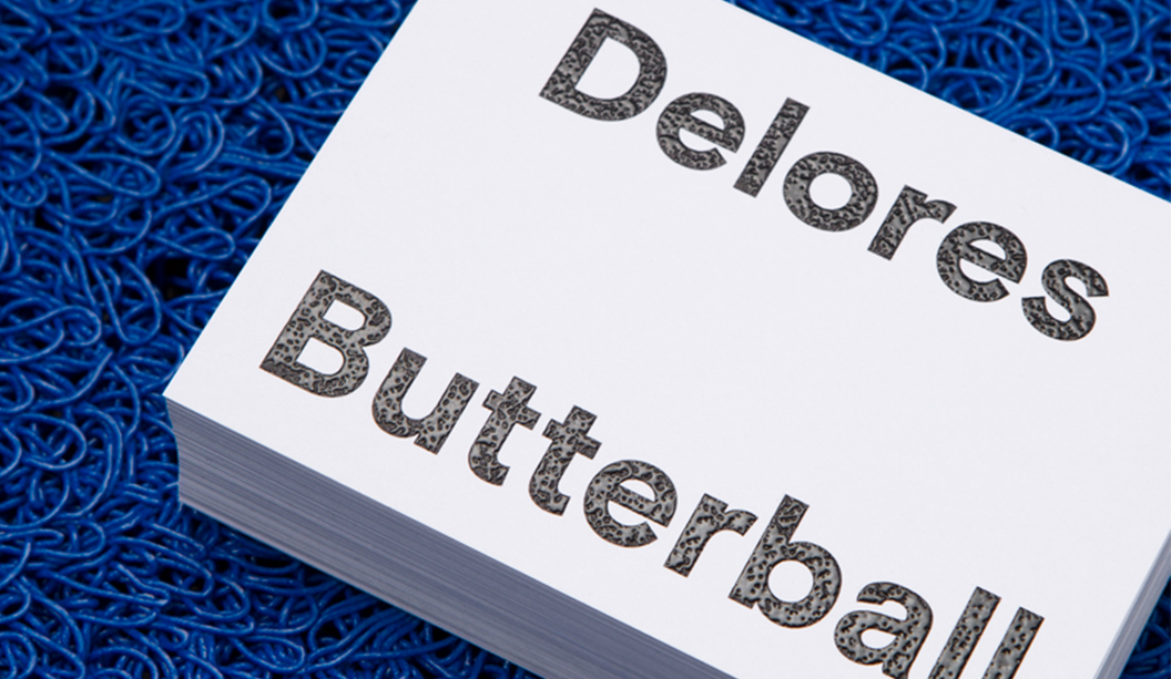
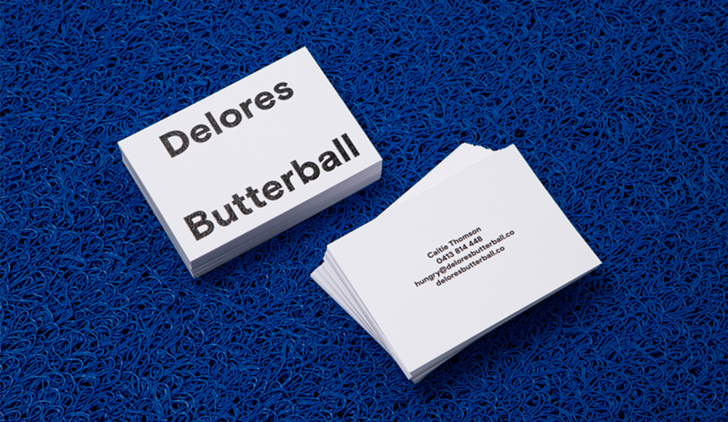
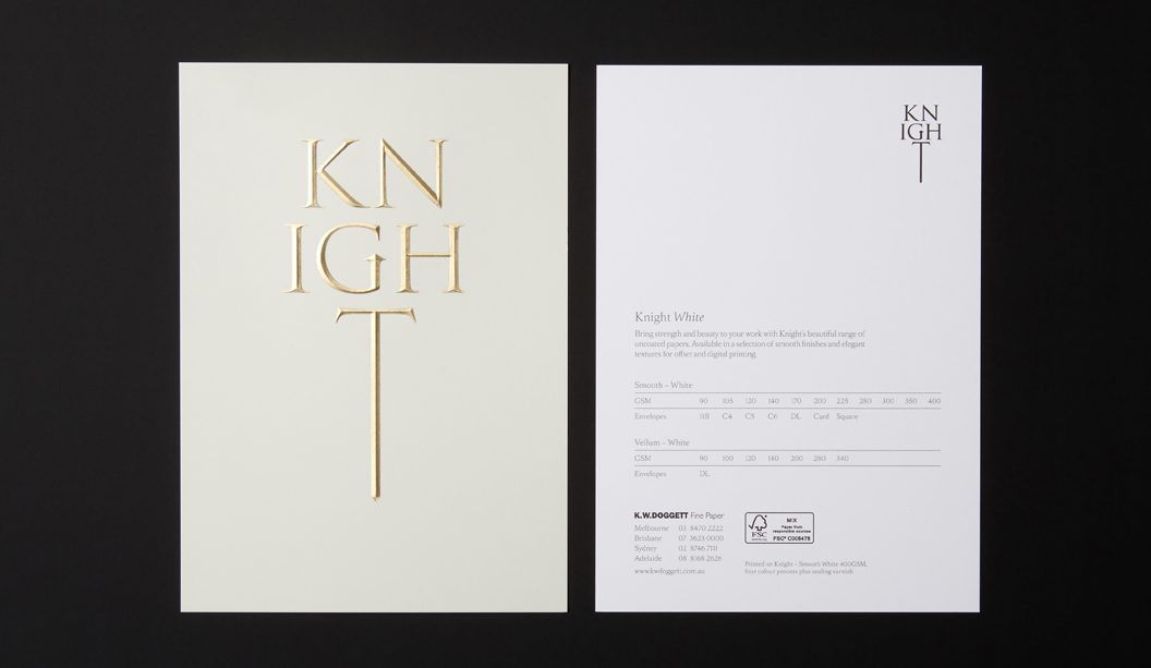
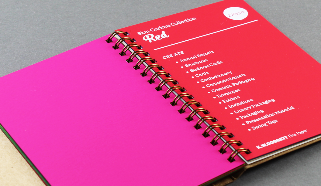
Stocks: Knight Smooth White 350gsm
Print specs: Raised verko + black
Printed by: Moule Print
Photography: Mark Lobo of Foliolio

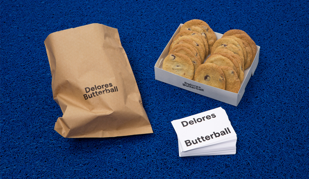
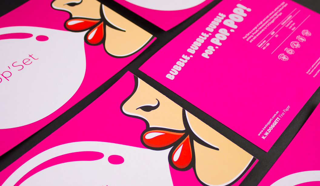
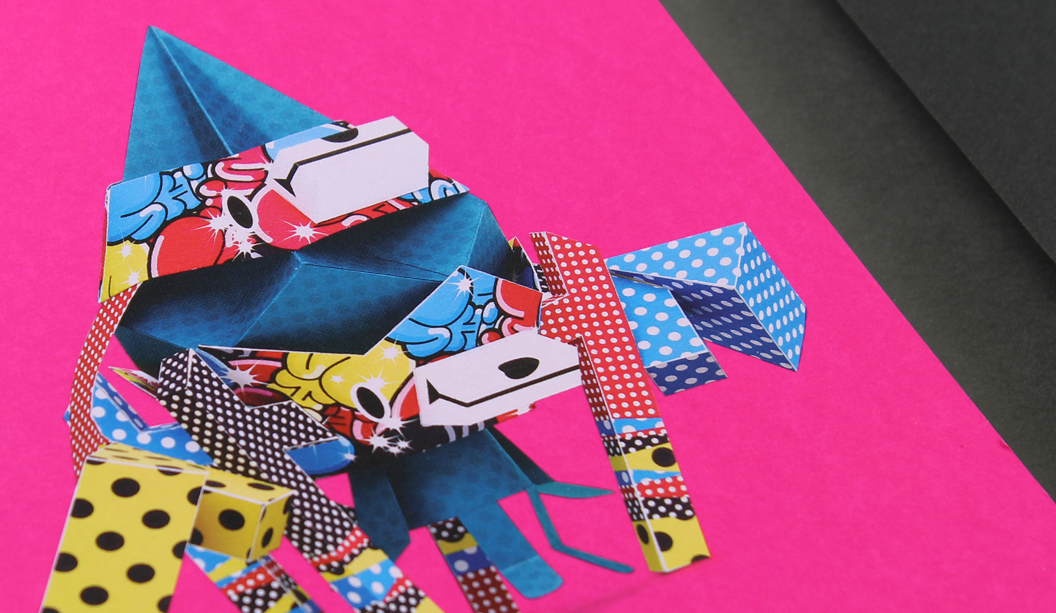
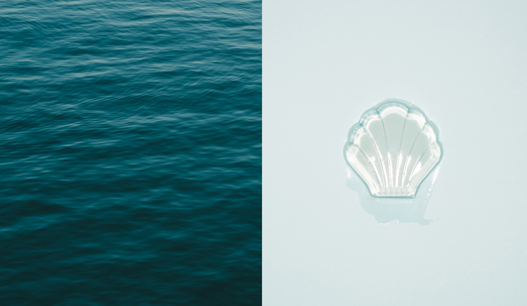
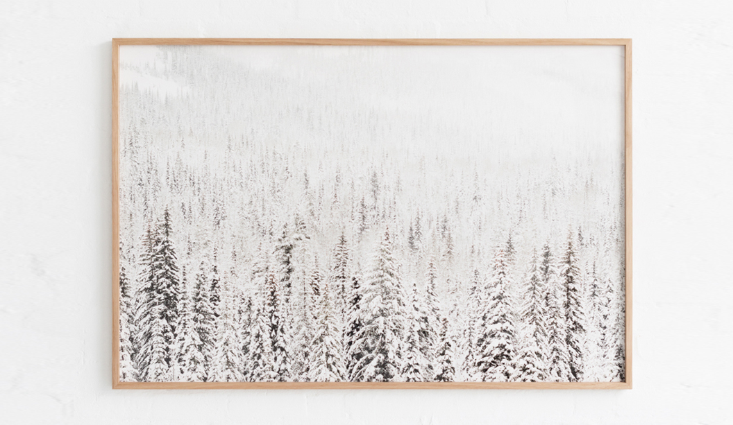
Delores Butterball is a small batch baked goods stall serving cakes and cookies across Melbourne. Mildred & Duck created a visual identity for Delores Butterball that is bold and confident and can be easily applied to boxes and bags as needed without losing legibility. The oversized business card doubles as a with comps slip, with raised verko printing that looks like the texture of icing. Yum!


Blog-Delores Butterball-1

Blog-Delores Butterball-2

Blog-Delores Butterball-3


Pop’Set bubble gum scented postcard

Design: In-house.
Stocks:
Pop’Set Cosmo Pink 320gsm.
Printed by: Intelligent Media, (VIC) on a HP Indigo 7800
Finishing:
tlc digital+ (VIC).
Printing specs: Six hits of white ink + CMYK + screen printed bubble gum scent.

You lay six hits of white ink plus CMYK down on a paper like Pop’Set and you’ve got yourself a postcard that…well…pops! The colour is super vibrant and the best bit is that bubble area is a bubble gum good time waiting to happen. We screen printed a bubble gum scent over the image and ever since we’ve been reminiscing about primary school and those amazing scratch ‘n’ sniff stickers we all loved so much.

It’s an interesting process adding scents to paper. It’s done via micro-encapsulated scented capsules that are mixed into UV curable carrier varnish. The UV-curable slurry is then applied to the printed sheet (or substrate) using a screen printing application. As the capsules are broken (like an egg shell) the scent is then released. Flick over to Instagram to see some pics showing the process.

Key selling points:

  • Highly pigmented colours in the range: Cosmo Pink, Lime Tonic, Black.
  • 30% recycled, ultra smooth board.
  • HP Indigo certified and suitable for dry toner printing too.
  • Available in SRA3 sheet size in 320gsm.

We have a list of scents available if you need. We’ve done banana in the past and know there is everything from fruity scents like grapefruit and pear all the way through to flowers like Yellow Rose and then Green Lawn, Horse Stable and Camp Fire. Sunscreen smell would have to be the most random though. Ha!

In all seriousness, this kind of thing is sensory branding at its best. Smells can trigger emotions so this is not only an easy but a fun and valuable way to make a marketing promotion stand out and increase brand recall.

And even more seriously, stay away from the horse stable scent.

popset1

pop'set-for-blog-2

A raised or ‘multi-level’ emboss is next level

In our latest Knight campaign, we used a variety of print techniques. One of the most simple is the multi level or ‘raised’ emboss. A slightly different take on your standard emboss technique.
What is a raised emboss?

A raised or multi level emboss means the image or type area is raised to multiple levels to create a 3D type effect and in this case, with different depths.

What other kinds of embossing are there?
There is also blind embossing where you emboss the paper and leave it ‘as is’. The other option is to fill the indentation with ink or foil. You can also sculpt the die to have a bevelled edge which looks really good.

So it’s not a deboss?
That’s right, it’s not. A deboss means the surface is depressed instead of a raised impression which is what happens with embossing. So you inprint the image or type by pushing it into the paper (with embossing the impression is made from underneath).

Is it an expensive embellishment technique?
It can be pricey, depending on the area you want to embellish. The money is in the block that is made. So sometimes, if it suits the project, you’d get one block made and use it across different stationery items.

Is there anything I should avoid?
Make sure you allow for space in your design and also type, particularly with type because when your design is pressed into the paper, it will naturally appear closer together. For multi-level embossing use colour codes in your artwork to indicate various levels. Always best to speak to your printer before you deliver the files and find out how best to set them up. Also let them know what paper you are using.

Does it work better on some papers compared to others?
Long fibred papers don’t lend themselves too well to embossing but really, you can do it on both coated and uncoated paper with different results depending on the gsm, whether it’s textured etc. For example, an emboss may not turn out as deep on an coated paper due to a few things like the coating, but it still looks good. We used Knight Smooth Cream 250gsm in our promo and it worked a treat.

Do most printers do this type of work?
Some printers offer this service and usually, it’s the services of an embellisher you would seek. We used Avon in VIC in the case of the Knight promo. Call your paper specialist for the heads up on embellishers in your area.

Knight-11

Knight-7

Knight Smooth Cream 250gsm
• Foil produced by Avon
• Multilevel emboss with foil. 2 passes.
• Matt Gold 25

Our Digital Synthetics range

Did you know we stock synthetic products engineered for digital printing? Well, we sure do. In fact, we’ve got three absolute winners – PicoFilm, EnDURO and Tacky Dry Super Tuff Poly. They’re all high temperature resistant (meaning they won’t melt), durable, tear proof and weather resistant.
 
PicoFilm
A coated polyester (PET) that offers excellent colour reproduction, stiffness and trouble free feeding. This product is suitable for both Dry Toner and HP Indigo presses.
 
EnDURO
A high white paper laminate reinforced with a polypropylene (PP) or polyester (PET) film. Comes in ICE (PET – transparent) or Classic (PP – paper face). The ideal combination of paper feel, with the strength and printability of a synthetic. It’s easy to convert, has great printability and is easy to fold. Suitable for Dry Toner and HP Indigo presses.
 
Tacky Dry Super Tuff Poly
A polyester based, non adhesive paper with a white satin finish. Tacky Dry Super Tuff Poly has a soft tactile quality and comes in adhesive options too. Suitable for Dry Toner printing only.
 
Applications
There are so many uses for these products including point-of-sale, overlays, envelopes and protective jackets, maps, golf/membership cards, tags, entrance tickets, numbered bibs for sporting events, use-by dates for food, menus, personalised certificates, training manuals, blue prints, parking tickets, horticulture tags, boating maps and hotel door handle tags. Those and many more.
 
Follow the links above for more specifications, or call you trusty rep for more information.
 
 
Synthetics-Blog-image1
 
Synthetics-Blog-image3

‘Strength and Beauty’ Knight Promotion 2016.

Title: Knight campaign 2016 ‘Strength and Beauty’.

Agency: Three60 (VIC).
Client: K.W.Doggett Fine Paper.
Stocks: Knight Vellum / Knight Textures – Hammer / Knight Smooth White / Knight Smooth – Cream
Print specs: Dust jacket, cover, text, x4 postcards.

Dust jacket: Knight Vellum 100gsm.
• 6 colour printed Dust Jacket in one pass on Heidelberg A1 press
• Conventional offset
• 2 spot colours are Pantone Purple and PMS 375
• The rest of the channels in the artwork are process CMYK.
• We swapped out the standard process colours for more vibrant options of:

– Swapped process cyan for ‘Process Blue’
– Swapped process magenta for ‘Rubine red
– Swapped process yellow for ‘PMS 012’

Cover: Knight Hammer 280gsm with Knight 140gsm ‘gold inlay’.
• No print
• Copper Staples done by Bambra
• Gold inlay in two foils over the top of each other
• Base foil is Matt Gold 429
• lmage foil Is Dark Mirror Gold 425
• Hammer cover has been debossed to fit gold inlay

Text: Knight Smooth, Cream 140gsm, Knight Smooth, White 140gsm, Knight Vellum, 140gsm.
• CMYK print throughout
• Pages 22/23 have bump plate 021U
• Page 18/19 we 3D printed that piece of futuristic armor. Designed by RMIT student Amelia Agosta and printed in Melbourne by 3D objective
• Text is printed with a 400 Hybrid Screen. Part line screen and part stochastic

Postcards:

#1 Knight Smooth Cream 250gsm
• Black print only.
• Foil produced by Avon
• Multilevel emboss with foil. 2 passes.
• Matt Gold 25

#2 Knight Smooth White 400gsm
• CMYK conventional offset GTO Anicolor

#3 Knight Indigo, Vellum 325gsm
• CMYK Indigo 7500

#4 Knight Linen 350gsm
• CMYK conventional offset GTO Anicolor

Belly band and sticker:
• Curious Translucent 90gsm
• Jac Serilux black vinyl 30mm


Knight-2

Knight-1

Knight-6

Knight-5

Knight-4
Knight-3

Knight-12

Knight-7

Knight-11Knight-8

Knight-9

Knight-10

Knight-Belly-band1

Five ways to achieve bling on a tight budget

Not that long ago, adding bling like foil or opaque white ink to a print job was either too expensive or only available if you went to a particular printer. BUT! Now we’re going to give you the very good news. Adding embellishments on a minimal budget is more accessible. Embellishments may seem out of reach when you’re on a small budget, but we’re here to tell you the TOTAL opposite. Shock, horror, gasp. Here are five digital printing machines that can give you bling for minimal cost.

1. Opaque white ink is now available on HP Indigo presses 5500 and above ie the 5500/5600, 7600/7800. Please note that the B2 Indigo ie the HP Indigo 10000 press, doesn’t offer a white ink station. So you can do white ink on its own (see first and second pics below) or add CMYK over the top (refer to the Pop’Set Pink card below).

2. The OKI C711WT does white ink and can handle a large range of printing papers. We’ve seen it used on everything from Buffalo Board to Skin Curious Collection and even Tacky Dry Crystal Cling Clear Gloss (an electrostatic product you can use for window applications among other things). See pics in post.

3. Ricoh C7100X does white or clear ink and you can do multiple hits of the white in one pass without any concern for mis-registration.

4. Kodak NexPress does Gold Dry Ink or Clear. The NexPress colour charts have hundreds of shades of gold through to copper and many other colours too (see images at the end of this post).

5. Fuji Xerox Colour 1000i does Clear Dry Ink, Metallic Gold or Metallic Silver. Use this machine to replicate foil stamp, metallic, spot or flood effects.

Remember to contact your paper specialist for a heads up on printer(s) in your area. They may also have a print sample of the techniques mentioned above which they can show you.


Ricoh Curious Skin Black

HP-Indigo-Poset-1

HP-Indigo-Poset-2

HP-Indigo-Popset-3

PS-Creative-Paper-Guide-OKI-Print-1

PS-Creative-Paper-Guide-OKI-Print-2

PS-Creative-Paper-Guide-OKI-Print-3

Kodak-Gold-Full

Kodak-Gold-5

Kodak-Gold-4

Kodak-Gold-3

Kodak-Gold-2

Kodak-Gold-1

The 50NZ Dow Retrospective by StudioBrave

Title: The 50NZ Dow Retrospective by StudioBrave
Agency: StudioBrave
Stocks: Keaykolour Jet Black 300gsm, Conqueror Laid Calligraphy 300gsm and Knight Digital Indigo 120gsm
Printing specs: Digitally printed
Printed by: Press Print (VIC)

StudioBrave have designed a spectacular new printed piece – the Dow 50NZ Retrospective. We always say a great design makes the paper and StudioBrave have done just that. Printed by Melbourne’s Press Print, they have taken digital printing to a new level.

Dow is a global chemical organisation involved in the markets of agriculture, consumers, energy, infrastructure and transportation. The 50NZ Dow Retrospective was produced to commemorate 50 years of business in New Zealand. StudioBrave shares: “We were engaged to produce a book that harnessed the rich history of Dow in New Zealand and the culture that surrounds it. The company had become synonymous with New Plymouth, producing generations of employees and becoming part of the fabric that makes up the region. This book was for them, for every employee of the past 50 years.”

Dow-2

The piece combines beautiful artwork, a selection of monochromatic papers and print techniques that work together seamlessly. The paper includes Keaykolour Jet Black 300gsm for the cover, belly wrap on Conqueror Laid 300gsm with opaque white ink plus Knight Digital Indigo 120gsm for the text. Carlo Mussett from StudioBrave  explains: “It was important the book felt tactile, personal and natural, to reflect Dow’s passion for sustainability in agriculture and the environment. Conqueror Laid Calligraphy was used to complement this concept and every employee’s name has been foiled on the inside cover for an added personal touch.”

The pages of the retrospective are a treat to explore and the paper lends itself really well to image rich photography. StudioBrave engaged photographer Derek Swalwell to shoot New Zealand’s North Island, in particular New Plymouth. Carlo explains: “We wanted this to be a retrospective first and a company branded book second, by removing corporate colours and bringing in the iconic black of New Zealand, we found a balance and relationship grow between the book and its content.”

This is a great example of how you can design for digital print and really push the boundaries of creativity to achieve a outstanding result! To see more of StudioBrave’s work go to www.studiobrave.com.au

Dow-3

Dow-4

Dow-5

Dow-6

Dow-7

Dow-10

Dow-11

Dow-12

New! Wood FX is a printable wood product

We all know paper comes from wood. Well, now wood is the paper. Whaaaa? Introducing Wood FX, a wood veneer board in cherry and birch colours with a white coated reverse so you can print both sides. We like to think of it as 60s office wood panelling meets modern log cabin. Made by Masterpiece Graphix (USA), it’s also HP Indigo certified, works on dry toner machines and is made from wood sourced from certified responsibly managed forests. But wait, there’s more…

This distinctive paper can also be printed offset, letterpress, screen and UV ink presses (prior testing recommended) and is also water resistant. Working and printing on wood is essentially the same as printing digitally on paper and Wood FX’s reverse coated back allows you to create all sorts of unique print jobs. Think vintage style laser cut invitations, duplexed business cards or maybe add an organic look to a menu design, packaging project, sustainability report and more.

A big bonus is that the ink dosen’t feather, giving sharp, defined ink lay down so things like printed bar codes scan properly and text is readable. Wood FX comes in sheets and is available in 305gsm. What ‘wood’ you rather choose for your next project?

Remember, you can always visit our website for more information about this range or explore our new ‘Colour wall‘ to see the real deal. Enjoy!

Wood-FX_15

Above: Set of five A6 cards entitled ‘Wooden you like to be beside the seaside’ printed by Press Print Digital (VIC).

  • Card 1 (lobster) – Cherry Wood Veneer printed on a HP Indigo with three hits of opaque white ink base + CMYK.
  • Card 2 (whale) – Birch Wood Veneer printed on a HP Indigo CMYK.
  • Card 3 (umbrellas) – Birch Wood Veneer printed on a HP Indigo with two hits of opaque white ink base + CMYK.
  • Card 4 (lighthouse) – Cherry Wood Veneer printed on a HP Indigo with three hits of opaque white ink + CMYK.
  • Card 5 (seagull) – Side 1: Birch Wood Veneer printed on a HP Indigo with two hits of opaque white ink base + CMYK. Side 2: printed black only.


Wood-FX_2-new

Above: Cherry Wood Veneer card – printed on a HP Indigo with two hits of CMYK. The two outer sheets are Cherry Wood Veneer 305gsm with two sheets of Keaykolour Original – Guardsman Red 300gsm sandwiched in the middle. Birch Wood Veneer card – printed on a HP Indigo with three hits of white ink. The two outer sheets are Birch Wood Veneer 305gsm with two sheets of Knight Smooth – White 300gsm sandwiched in the middle. Printed by Bambra Press (VIC).


Wood-FX_14

Above: Business cards for Engine Group printed offset on Birch Wood Veneer 305gsm duplexed to Sovereign Silk 300gsm by Platypus Graphics and laser cut by Potato Press (both in QLD).


Wood-FX_12

Above: A3 posters for Mount Gay Rum printed HP Indigo on Cherry Wood Veneer 305gsm and Birch Wood Veneer 325gsm by Greenridge Press QLD.

‘Workbook’ by Brooke Holm and Marsha Golemac

Title: Workbook
Creators: Brooke Holm and Marsha Golemac
Agency: Ortolan (VIC)
Stocks and printing specs: See specs at bottom of email
Printed by:  Offset component by Southern Colour (VIC), binding by Mercedes Waratah (VIC), embellishments by Enhance Print (VIC). Dry toner book printed and bound by McKellar Renown Press (VIC) on a Xerox Colour 800, digital postcard printed on this machine too.

Oooooo we like a wee bit of collaboration around here, especially when it comes in the form of an uber talented photographer and stylist aka Brooke Holm and Marsha Golemac. It’s the first time the pair (and good friends) have worked together on a project of their very own, just for them. Brooke’s photography from America and Canada paired with Marsha’s stylistic response has resulted in ‘Workbook’ and a damn fine piece of creative.

WB-6

This is how it started: Brooke speaks to Catherine Doggett about her trip to North America. After some earlier discussions about working together, printing the photos seems a good fit. Catherine then thinks about Marsha and her awesome styling work and hey presto, a collaboration is born. Ortolan then joins the picture to provide some graphic design prowess, paper is meticulously selected by internal, democratic voting, a few production meetings, loads of phone calls and emails and some more production chats, an exhibition at Modern Times takes place and in the end everyone’s a winner!

This commercial print piece has become not only a beautiful, inspirational project but a testament to collaborations that work. The right creative, people and paper (choosing Strathmore worked super well because the paper has even ink lay down, produced nice solids and sharp image production). An interview on the pair’s creative process appears on the Modern Times blog which is worth checking out.

WB-3

Other than the offset printed Workbook, we also ran out a dry toner version and some postcards (two offset and one digital on an Indigo machine) to show the results you can achieve using both printing methods. This is becoming more important with the need to include print components in a campaign and both long and short runs. You want the paper to match between presses and with a bit of craftiness when it comes to production, you can achieve an excellent result. Your paper specialist can run you through everything when they visit.

WB-13-new-2

WB-7

WB-8

Some tips on production:

  • A lot of work was done in the pre-press stages. It was crucial with the photographs particularly, to take out any shadows so we opened the mid tones. Not much had to be adjusted on press as a result.
  • We printed the offset book line screen not stochastic.
  • Strathmore is a true white ie not blue white. The Ultimate White adds a small amount of yellow into the mix, so be aware of this in the file preparation stage. You can compensate for it on press but you may as well do it before then.
  • For the offset job we ran the Smooth sheets on a coated profile and the Wove ones on an uncoated profile. The line screen was 225.
  • For the digital job we ran it on a coated profile as the colours were much more vibrant with this setting.

Print specs:

  • Workbook cover – Strathmore Premium Wove Glacier Mist 270gsm + holographic silver foil. Section sewn, drawn on cover + white buckram tape on spine.
  • Workbook text – section 1 (16pp): Strathmore Premium Wove Ultimate White 118gsm. CMYK + PMS9244 U (pink) and PMS9040 U (blue) with emboss on first page. Section 2 (8pp): Strathmore Premium Super Smooth Ultimate White 118gsm. CMYK + PMS9244 U (pink) and PMS9040 U (blue). Section 3 (16pp): Strathmore Premium Super Smooth Ultimate White 148gsm. CMYK + PMS9040 U (blue).
  • Postcards (offset and digital) are a mix of Strathmore Premium Wove Ultimate White 352gsm and 432gsm.

Dry toner book:

  • Printed on a Xerox Colour 800 with a spot gloss varnish done in line on the Xerox.
  • Cover: Concept Vellum Ocean Mist 352gsm + white gloss foil and singer sewn spine.
  • Text – Strathmore Premium Wove Ultimate White 148gsm and Strathmore Premium Super Smooth Ultimate White 148gsm. Clear Gloss Varnish on p1 and pp17-24.

WB-5

WB-2

WB-9

WB-10


AWE Cosmeceuticals

Title: AWE Cosmeceuticals
Agency: Liquidink Design
Stocks: Maine Recycled Silk
Printing specs: Digitally printed.
Printed by: Whirlwind Print (VIC).

AWE is an Australian ‘cosmeceutical’ range. That’s not a made up word! Cosmeceutical means products that are a blend of cosmetic and pharmaceutical active ingredients to create a unique biological effect. Sounds a little bit fancy really. The range is also natural, luxuriant and eco-friendly. AWE also offers Ayurveda skin care (pronounced eye-your-vay-da), a 5000 year old holistic medical system from India designed to rejuvenate the mind and the body. Due to popular demand, the range will soon be available nationally.

To celebrate their growth, a new product brochure was created. Printed digitally on Maine Recycled – Silk 150gsm, the natural sheen of the paper gives the brochure a luxurious, fresh look. Lindsay Spencer from AWE shares: “Using a recycled stock was particularly important as we wanted to remain true to the brand’s ethical ethos.”

To learn more about AWE’s products and indulge in some well earned pampering, go to http://www.awecosmeceuticals.com.au

AWE