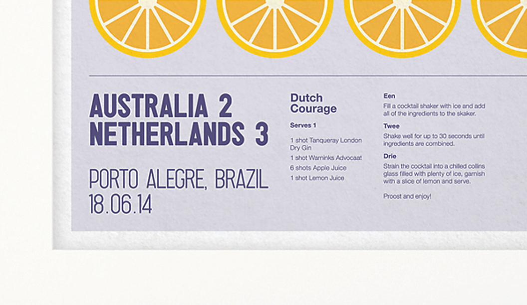
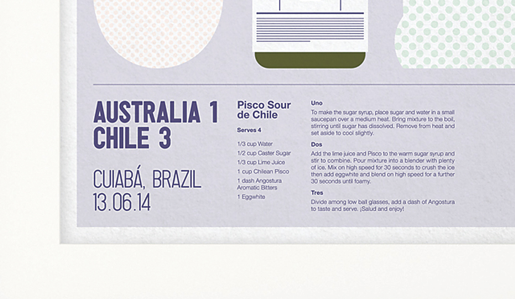
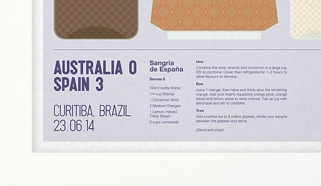
Presenting Jardan’s new retail brochure

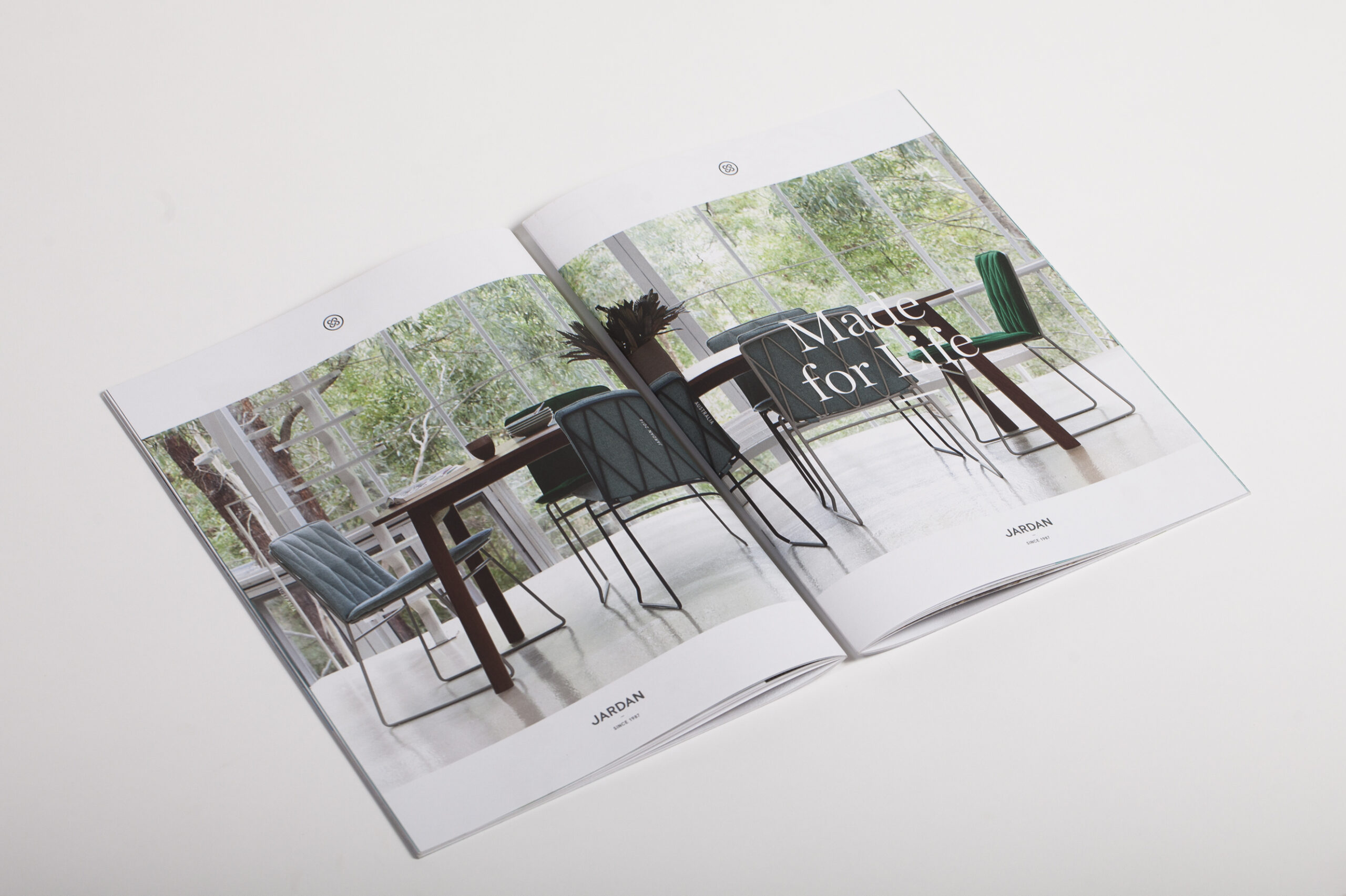
Title: Jardan. Made for life – retail brochure
Agency: Seesaw
Stocks: Grange Offset
Printing specs: Digitally printed.
Printed by: McKellar Renown Press (VIC).

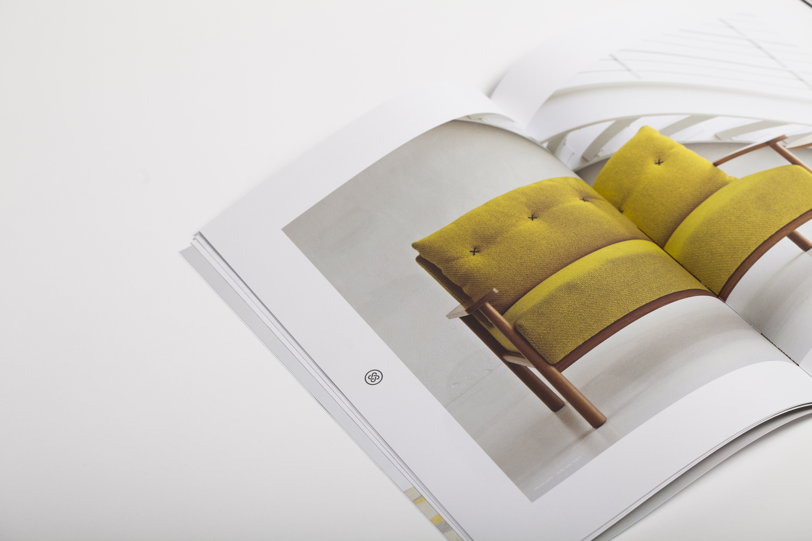
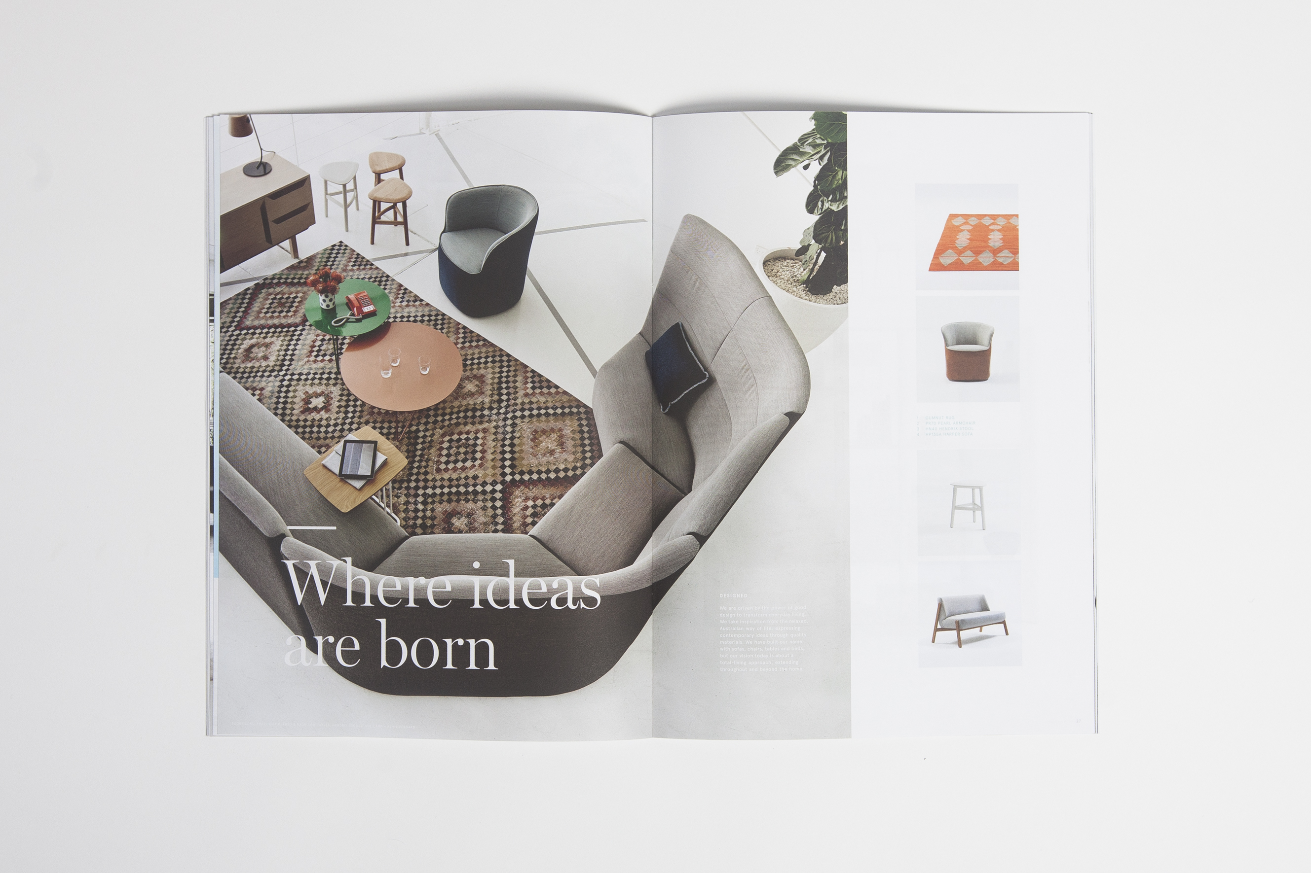
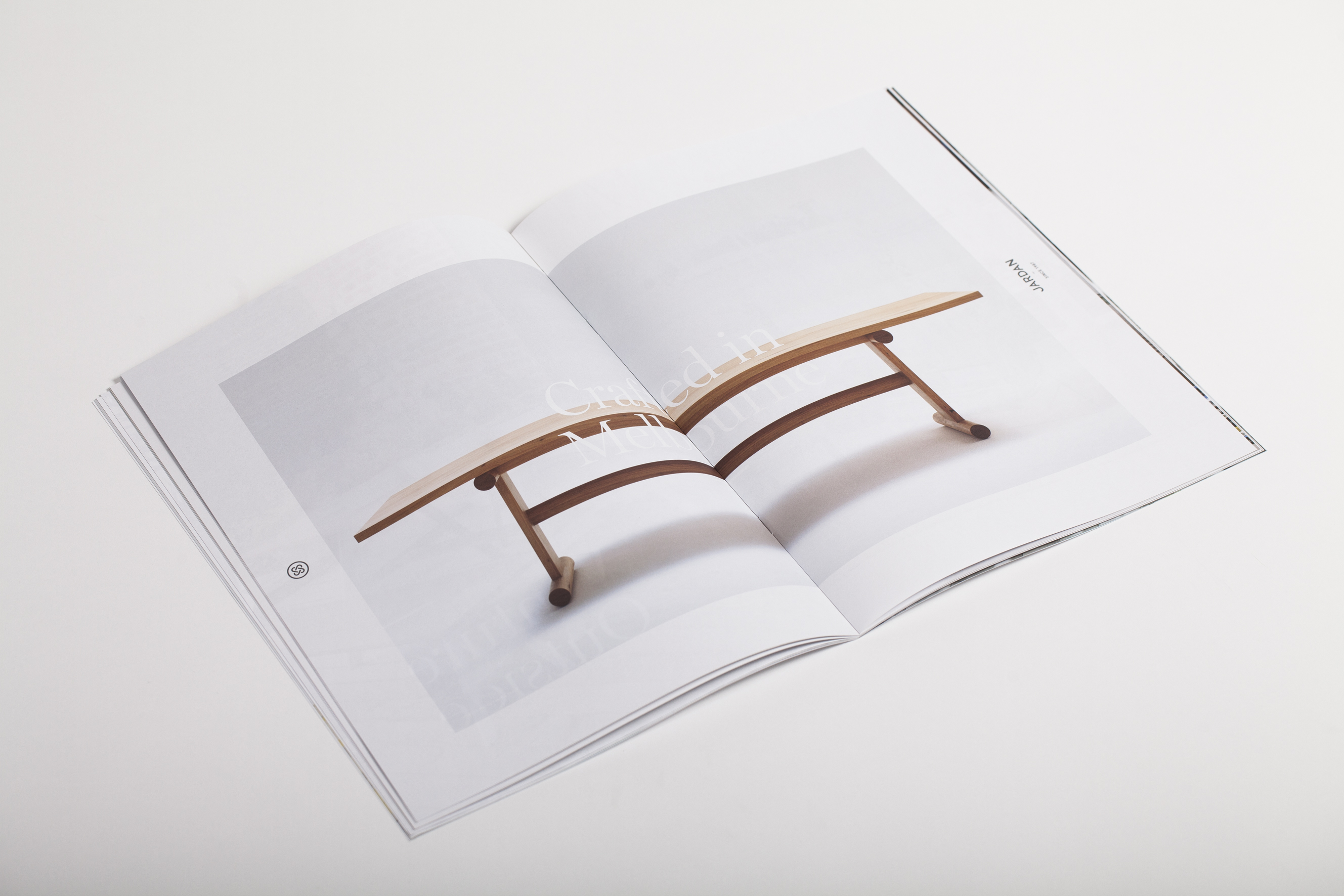
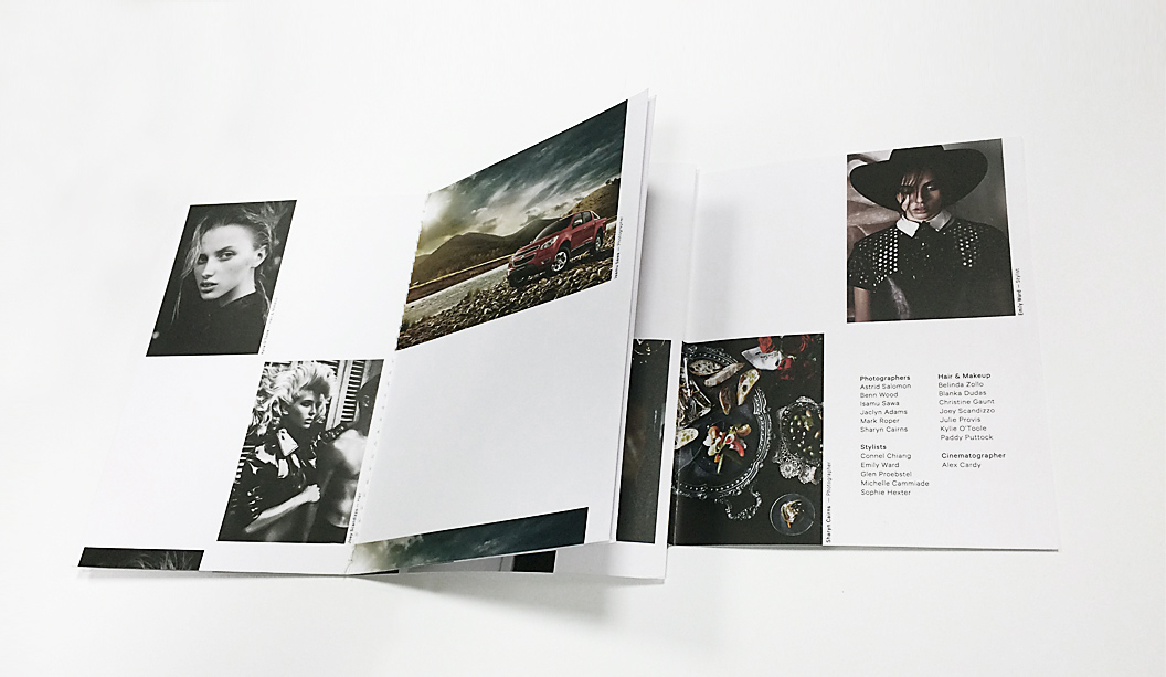
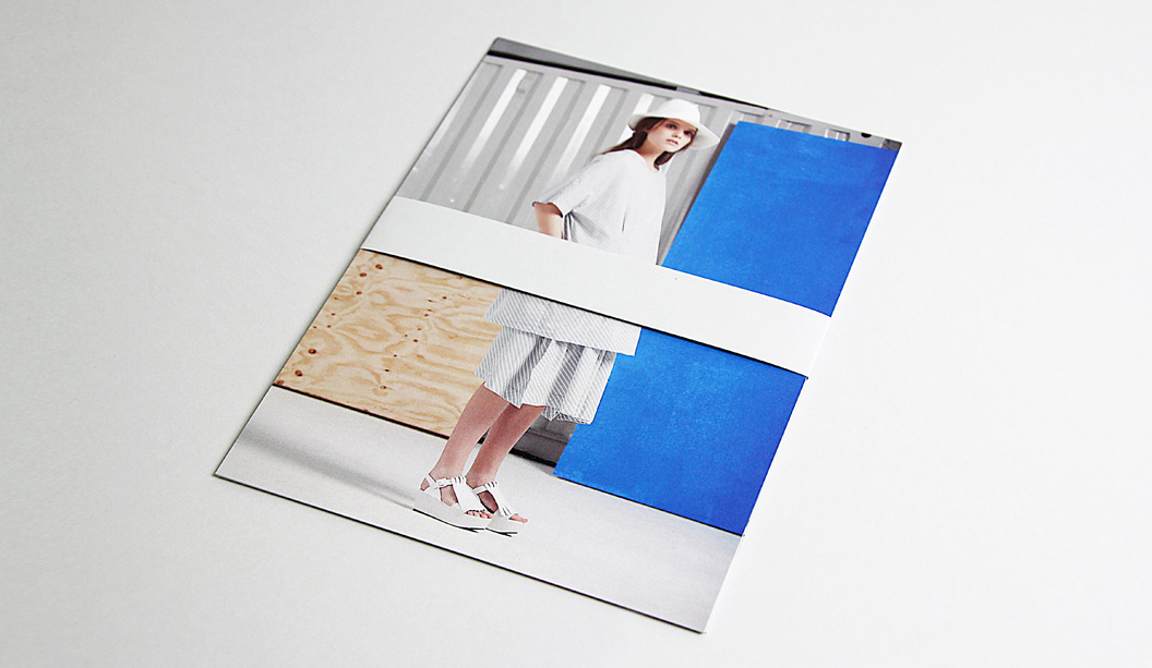
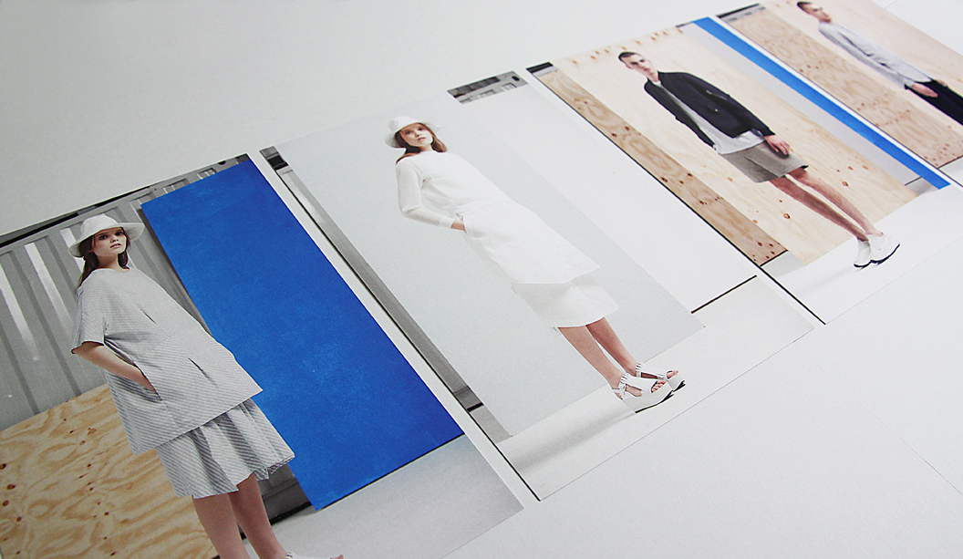
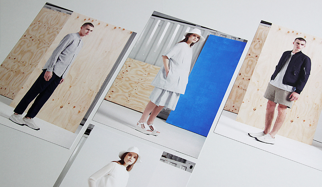
Seesaw recently designed Jardan’s new retail brochure and it’s a stunner. Featuring their latest range of gorgeous modern furniture and homewares, we know what we’ll be asking Santa for Christmas!

If you have been to one of Jardan’s showrooms, you want to touch and feel everything, it is definitely an experience for the senses. The retail brochure was designed as a tactile printed piece for Jardan’s customers and clients. Sort of like bringing the showroom straight into their hands. Featuring Grange Offset 135gsm cover and 110gsm for the text, the natural, uncoated paper ties in nicely with Jardan’s colour palette. Grange Offset also comes with a stack of environmental credentials that echo the strong sustainability values that are so integral to the Jardan brand.

IMG_4447

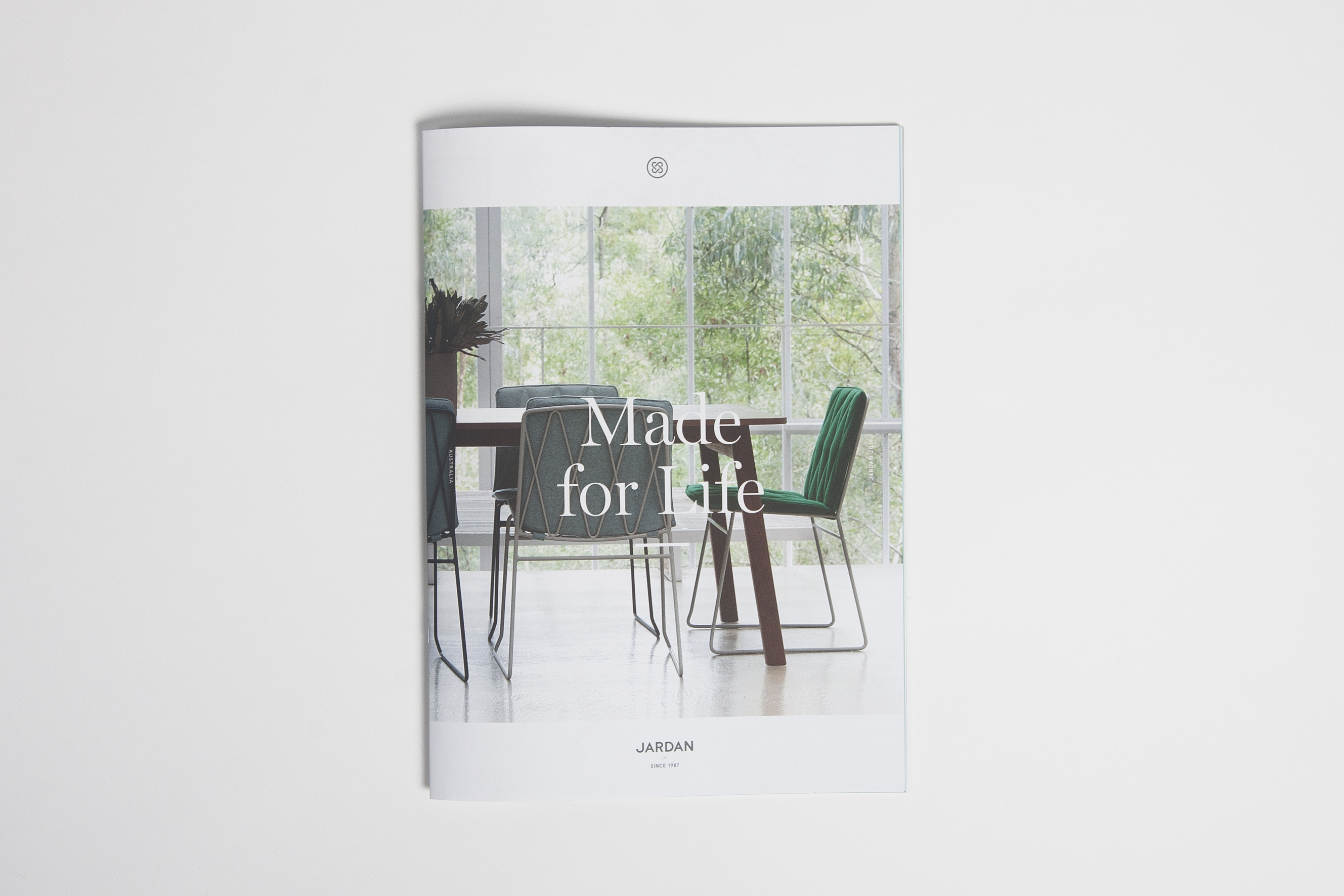
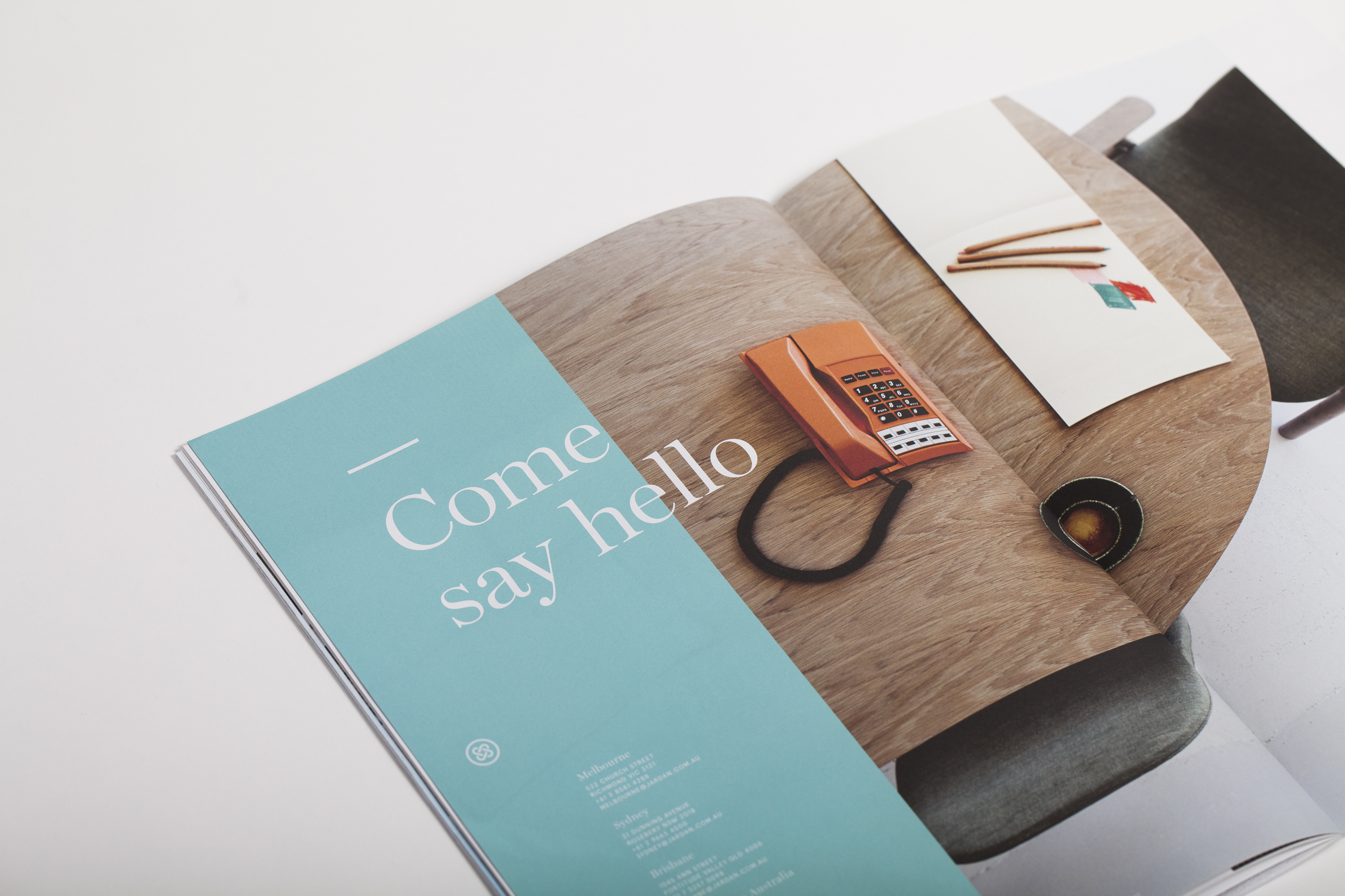
In collaboration with the Jardan team and extended creative family, the much loved Australian brand has a refreshed new identity that captures the heart and soul crafted into every irresistible Jardan piece. Seesaw explains: “The interlocking ‘J’ logo mark is reminiscent of an interlocking heart with the woven fabric inspired forms that create the ultimate Jardan seal of quality. It is a mark that encompasses the developed positioning statement – Jardan. Made for life. We are thrilled with the result, as are our clients.”

If you want to get your paws on a beautiful Jardan brochure, they’re now available in their showrooms across Australia.

IMG_4449

IMG_4457


IMG_4462

IMG_4450

IMG_4464

IMG_4469


Tacky is now ready for Dry Toner printing

Title: Tacky Dry A5 promotion
Agency: Andy Ashton, Work Art Life (VIC).
Stocks: Crystal Cling, White Repositionable, White Super Permanent, Super Tuff Poly (double sided, non adhesive product). Envelope printed on Sovereign A2 Digital – Gloss.
Printing specs: Digitally printed on a Kodak NexPress.
Printed by: The Tennyson Group (QLD).

The newest addition to our Doggett Digital range is Tacky Dry, a range of unique polyester products certified for use on all popular dry toner machines (only). Durable, tear, resistant and waterproof, the products run great, print great and have excellent toner adhesion. We don’t need to say too much more really.

Andy Ashton has produced another set of winning tacky images to continue the Tacky (for Indigo machines) story. The porcelain flamingo with the doilies is almost tacky chic. Did we just say that?

tackd4

White super permanent: A high quality decal solution for projects requiring a permanent fix. Available in white only.

Applications: appliance labels, warehouse external signage, construction dumpsters, freezer labels, water heater labels etc.

tackd5

Crystal Cling: Non adhesive cling used for interior and exterior applications. No solvents are needed for fixing or removal. It’s a true clear cling making it great for window applications.

Applications: shop specials, car window stickers, in store advertising, changeable window graphics eg stained glass look, fire safety signs, operating hours signs etc.

tackd1

White Repositionable: A great alternative to vinyl because it won’t stretch when removed from the surface and will keep its shape even when reapplied. The face stock is a woven polyester fabric material, which is water, tear and UV resistant. The removable adhesive will not only stick to virtually any surface, it’s also repositionable, so it can easily be moved again and again. It’s like a magnet, but better, because you’re not limited to just metal surfaces. Painted walls, wood cabinets, glass and metal are all approved surfaces.

Applications: counter mats, custom educational products, employee of the month wall posters, event door and wall signs, interior car labels, laptop skins, magnets, hallway decorations etc.

tackd6

Super Tuff Poly: This is a unique product because it’s tough but soft and is double sided. It has the positive characteristics of both polyester and paper. It is water and tear resistant and has the excellent durability plus its feeds, prints and handles print finishing processes like paper does. It even folds cleanly, which is really unique compared to other digital synthetic sheets.

Applications: Airline and hospital tray liners, boat manuals, book covers, bookmarks, maps, children books, coasters, construction plans, golf scorecards, heating and cooling tags, hiking luggage tags, maps, menus, place mats, racing bibs, tab dividers, tags, tape measures, tree tags, wristbands.

tackd3

Buffalo Board recipe cards promotion

Title: Buffalo Board recipe cards promotion
Agency: Recipe cards – Seesaw (VIC). Notepads – K.W.Doggett Fine Paper.
Stocks: Recipe cards – Buffalo BoardKaskad Kingfisher Blue and Kaskad Fantail Orange. Notepads – Buffalo Kraft, Buffalo BoardGrange Tints Old Gold and Tablex Tints Salmon.
Printing specs: Recipe cards – Offset and digitally printed. Notepads – Debossed.
Printed by: Recipe cards – Bambra (VIC). Notepads – E.H. Stationers (VIC).

We have a fun, new and exciting Buffalo Board recipe cards promotion for you to feast your eyes on. The cards are a follow up to our previous promo in 2011. You may remember five recipe cards featuring mouth watering buffalo mozzarella dishes? Visit the post here. This latest set of colourful cards were designed by Seesaw and feature simple illustrative graphics that highlight the recipe’s ingredients. To showcase just how versatile Buffalo can be, Seesaw went to town with embellishments and we printed one card offset and the other digital. The recipes were kindly supplied by chef Maurizio Terzini, owner of popular Italian Restaurant Da’Orazio and the famous Icebergs Restaurant in Bondi.

The offset card is printed CMYK on Buffalo Board 283gsm with three foils ie Clear, White and Milford Astor GFE123 Dark Green for some extra bling. The digital card was printed HP Indigo CMYK on Buffalo Board 283gsm plus Opaque White Ink and duplexed to Kaskad Kingfisher Blue 270gsm with Opaque White Ink (two hits) phew! To wrap them all up nice and neat we added a belly band in Kaskad Fantail Orange 100gsm.

BUFF3

Buffalo Board is a low density, high yield product. It’s an uncoated, moisture-resistant folding carton board that is cost effective, has a verifiably low bacteria content compared to many other paperboard products and outstanding strength and durability. Buffalo Board is also available in 386gsm/711ums and is also used for health, beauty, fashion and beverage applications. It’s made from natural kraft fibres that are responsibly sourced and fully recyclable and is carbon neutral (measured exit mill gate).

Printing tips
Buffalo Board is suitable for all kinds of jobs. Think offset, digital and letterpress printing as well as embellishments like foil and screen printing. The natural kraft paper looks great with some white ink (consider two-three hits for offset and two hits for digital). If you want your CMYK colours to really pop, apply a white ink base first then a layer of CMYK over the top. This provides a surface for which the colour can sit up on, resulting in a brighter finish. You might like to do a combination of both like we did for the recipe cards (colours with and without a white base) to achieve a variety of printed effects. It comes up a treat!

It’s no secret we have a thing for bling, but kraft could be a close second. So we’ve also produced a set of A5 notepads as a gift for our customers. They come with three different spine colours – natural ie Buffalo Board, as well as Grange Tints Old Gold 80gsm and Tablex Tints Salmon 150gsm. All have a subtle K.W.Doggett Fine Paper debossed logo on them. It’s also perforated along the spine for writing down quick and easy tear-away ideas.

BUFF1

If you have any specific packaging related questions, please call our John Alipan, Packaging Business Development Manager  (National) on 0434 692 446 or jalipan@kwdoggett.com.au and for all the Syndey-siders, contact Chris Churchward on 0488 440 131 or cchurchward@kwdoggett.com.au

Our paper specialists and account managers are coming around to see you soon with your own copy. Enjoy!

BUFF4

BUFF5

BUFF7

BUFF8


BUFF2

Curious Collection A5 promo

Title: Curious Collection A5 promo
Agency: Three60 (VIC). Photography by Justin Cooper. 
Stocks: Skin Curious Collection, Skin Curious Collection Digital, Curious Metallics
Printing specs: Digitally printed plus embellishments
Printed by: Foiled cards: Apex Goldstamping (VIC). NexPress Gold and belly band: Impact Digital (VIC). HP Indigo card: Clarke Murphy Print (NSW). Spot UV: Avon Graphics (VIC).

Our new promo showcases a stunning set of images on Skin Curious Collection and Curious Metallics. The images complement the Skin campaign from 2013. You may remember the original promotion with the haunting images of a man covered in a kaleidoscope of coloured paint. If not, visit the story here.

The shots are the hero, then there’s the paper and the awesome art direction from Three60 which means we got to collaborate on another exciting campaign. As Dellano shared with us: “Our concept explored the notion of regeneration. Our idea was to find a way to express shedding the old to make way for the new [imagery]. Like a snake putting on its new suit, we treated the image to look like the paper surface was the outer layer, slowly peeling and cracking away to reveal a shiny new surface that lies beneath.”

To give this year’s images just as much love, we used a mix of papers. After playing around with the stocks we discovered the suite of complementary colours in the Metallics and Skin ranges. We wanted something paired back, sophisticated and shades that worked well with the designs. Often, people use Curious Metallics for wedding invites but we had hoped that mixing up some of the stocks would show the kind of results you can get. So a bit more of a sophisticated colour palette with a dash of sparkle.

SKIN7

Check out the detail in those foiled images. Crazy. Critical to being able to achieve this result was the capacity to transform a full tonal range into a bitmap image which could be foiled. As Dellano further explains: “This was largely a process of knowing exactly what we wanted the end result to look like. We worked closely with our photographer to ensure our model would be lit appropriately to allow the tonal shift we needed in post production, without compromising the quality of light rendered once the image was converted to a bitmap format. However, no matter how much planning goes into creating these images, there is always a healthy amount of trial and error when it comes down to the final stages of tweaking in Photoshop.”

The Skin Stone and Curious Metallics Nude cards are a great example of having the embellishment really complement the stock while showcasing the design. We ran the cards through twice, same image, which resulted in a more solid look and a shinier finish. It was ok with one hit as well but we decided to go with two. The pressure was the same second run. The detail in the artwork also made a difference, as did the person making the plate. True craftsmen/women.

The dark blue card features a rad print technique called NexPress Gold. We recently wrote an article about it. If and when a silver version gets released we’re sure it will be just as popular. It only takes one hit of the Gold Dry Ink to get this effect. We did have to consider the FSC logo but and the very small font size but it all turned out aok.

Curious Collection papers are suitable for all kinds of jobs. Think offset, digital and letterpress printing as well as embellishments like foil and screen printing. The darker Skin colours look great with some white ink and the lighter colours in both ranges come up really well with CMYK printing. Applications include menus, luxury packaging, invitations, fashion labels, presentation folders, covers for publications and business cards. Both ranges are exclusive to us, the fine paper people and can be enjoyed by you, anytime you want some tactility in your life.

Stocks/specs:
Card one: Skin Dark Blue 270gsm, UV spot gloss varnish (front), Dry Toner NexPress Gold Dry Ink (back).
Card two: Skin Stone 270gsm, Milford Astor Gloss Black Foil.
Card three: Skin Digital Extra White 270gsm, HP Indigo CMYK.
Card four: Curious Metallics Nude 300gsm, Milford Astor Pink/Copper foil.
Belly band: Curious Metallics Cognac 120gsm, Dry Toner CMYK.

Our paper specialists and account managers are coming around to see you soon with your own copy. Enjoy!

SKIN3

SKIN5

SKIN6

SKIN1

SKIN4


NexPress Gold Dry Ink is the bling without the price tag

Looking for a bit of sparkle without the cost? Need a job turned around quickly and want to add an embellishment? Well, if you didn’t already know, you’re about to find out how. A Kodak NexPress is a dry toner machine (powder toner as opposed to wet ink). The NexPress Gold Dry Ink offers a shimmery, metallic print effect.

To find out more, we interviewed two printers that are currently using this technique. Tony Parker, General Manager from Impact Digital in Melbourne and Theo Pettaras, Founder and Digital Print Innovator of Digitalpress in Sydney (the main image you see is from their promo piece). These lovely chaps are doing some fun things with this sparkly bit of goodness.

What is the gold ink technique and what does it look like?
The NexPress Gold Dry Ink produces a true metallic gold pigment, similar to traditional PMS metallic gold. It’s the first toner to provide a metallic look with sparkle effects. It’s applied on the fifth imaging station of the press and works inline with CMYK print. The effect can be used to enhance both raster and vector art, text and images. Laminating or UV coating jobs printed with Gold Dry Ink produce really sparkly results.

Gold_3

(Image above courtesy of Digitalpress)

Is it cost effective in relation to regular metallic ink?
This technique replicates traditional PMS gold but is good for short runs which is a big advantage. It’s cost effective but like with anything, it will depend on the quantity and product being printed. As a general guide, it increases the cost of digital CMYK printing by around 30%.

What applications can you use it for?
We wanted to quote the guys directly here because we love what they said. Theo said: “The applications are only limited to your imagination.” Tony said: “You can use this application on any product where a sparkle may be required!” And now the serious answers…use it for direct marketing to stand out from the regular kind of DM pieces, short run magazine and book covers, postcards, business cards, certificates, invitational work eg birthday’s or weddings, stationery items and wine labels to add a touch of sophistication.

What stocks work best eg colours, coated v uncoated?
Use this technique on all sorts of stocks. Gloss coated ones will make the gold stand out a bit more. White works well too for this reason. You do need to know that if you want to use coloured stocks it can affect the colour of the gold as it is transparent. Usually when you print a metallic ink on an uncoated paper the sheet will naturally absorb the ink which can lose the shiny metallic effect. So best to print CMYK underneath the Gold Dry Ink first.

Can you print different shades of the gold?
Yes. You can actually integrate tints and 4 colour process colours with the Gold Dry Ink to get loads of different ‘gold-ish’ (Theo’s word!) colours. Digitalpress has created an awesome book called ‘Fifty Shades of Gold’ where they had some fun with expanding the metallic colours.  When printed on top of another color, Gold Dry Ink can be used to simulate a variety of metallic effects including copper, bronze
and a wide range of metallic colors (quoted directly from the Kodak website).

2

(Image above courtesy of Digitalpress)

Tony mentioned they printed gold over the top of a red Christmas bauble once to produce a red metallic colour. The gold is not opaque so the other colour underneath it could be seen. They’ve got an awesome book called: ‘The digital print manifesto’ that is a wealth of info on digital printing in general.

And this nugget of gold (sorry, we couldn’t help it!) came from PaperSepcs, it’s a great explanation. The press first puts down CMYK then gold, which is treated like a spot colour. So you can add 10%, 20% etc on top. Or, if you want to highlight a specific tone in the image, you can use the gold like a bump plate.

5

(Image from the Impact Digital ‘The digital print manifesto’ book).

Hints for preparing files so they’re set-up to take gold ink.

Digitalpress in NSW has file set-up specifications on their website. If you’re working with Impact Digital in VIC, Tony suggests setting up your file with a PMS colour in the area you want the gold to appear, then rename the files to NexPress DryInk gold (case sensitive).

gold_1

(Image above courtesy of Digitalpress)

Top 10 things you should know about digital printing

The world of printing is a wondrous but complex beast with all the proofs, colour correction, press checks, papers to choose from etc. Yet it’s very rewarding too. Seeing that printed piece come off press is a damn good feeling. But, it can also be tricky to know which print method to choose, particularly between offset v digital, so we’ve put together a list of important facts you should know when designing and printing digital jobs.

1. What is digital printing?  It is the term used to describe printing technology that links printing processes to computers. There are various technologies available but the two main types of machines fall under the HP Indigo or Dry Toner banners. Dry toner (powder toner) printers are the Kodak Nexpress, Fuji Xerox, Ricoh, Canon, Lanier, Konica Minolta. The HP Indigo (liquid electrostatic ink) presses include the 3550, 5600, 7600 and 10000 models.

2. Paper.  You need to use digitally certified papers, particularly important for the HP Indigo. Some printers will use non certified stocks and that’s ok, but it’s up to them. It’s also handy to advise them of the gsm and ums. Check our ‘Doggett Digital’ section for our range.

3. Print quality.  Improvements in digital printing means machines like the HP Indigo presses can produce similar print results to offset printing. Check out the astronauts below printed on Pop’Set Lime Tonic, Cosmo Pink and Black 320gsm with four hits of white ink and CMYK over the top.

Digital-tip-6

(Project above printed by Intelligent Media).

4. Speed.  Digital printing is a simpler process compared to offset. Without the need for plates, mixing inks etc the final print can be delivered faster.

5. Cost effective.  No set-up costs, no minimum print quantities and no plate costs. Some digital machines are also capable of doing inline finishing like binding eg saddle stitch, perfect bound or wire binding, so costs and turnaround times are reduced.

6. Short runs.  It’s ideal for printing small to medium quantities ie 1-1000 units.

7. Personalisation.  Also known as variable data. This allows you to tailor your message to your audience so you can personalise invites with the recipient’s names ie wedding invitations. We’ve heard of a national retail store using this method for posters given each store had different details, they printed the job digitally in one go.

8. Effects.  Some digital machines such as HP Indigo have the ability to print special effects like white ink, special Pantone PMS colours, UV red invisible ink that fluoresces under ultraviolet light, clear varnish and gloss effects and raised ink, like an emboss effect. Here are some examples of Buffalo Board 283gsm printed using CMYK and white ink.

Digital-tip-4

9. Green.  There are lots of positive environmental factors like no pre-press stages so no films, plates or photo chemicals which means less waste. Printing can use a lot of water but digital presses are now waterless saving thousands of litres of water per year.

10. Last minute jobs.  Lucky for you, digital printing can be done on demand and you have the ability to make last minute changes at the time of printing via the computer.

There are also many reasons why you would use offset printing too like the fact you can tweak the colours on press, do long runs etc. So just make sure you go for the right print method depending on your desired outcome. Stay tuned for more printing tips and production information in the next issue of Fetch. This final piece is printed CMYK on Knight Digital Indigo 270gsm.

Digital-tip-3


Kloke’s spring/summer collection 2014

Title: Kloke 2014 A5 postcards
Stocks: Conqueror Wove and Kaskad
Printing specs: Digitally printed
Printed by: Press Print VIC

With spring only a few short weeks away, Melbourne fashion label Kloke have released a set of four A5 promotional cards to celebrate the launch of their 2014 spring/summer range. We are loving their latest creations and true to form, Kloke continue to create fresh and simple designs that leave us wanting more, more more. If you do want more of their previous ranges, check out the other Fetch stories: Kloke’s autum/winter Collection 2013 and Kloke spring/summer catalogue 2013.

Kloke-3

The cards are digitally printed on a HP Indigo on Conqueror Wove Brilliant White 300gsm and packaged together with a Kaskad Sparrow Grey 160gsm belly band. Conqueror Wove is a great match for fashion photography, the images look sharp and the colours are really striking. Conqueror Wove isn’t digitally certified though. It was sapphire coated by the printer to make sure it would run through the digital machine. There are a small batch of printers that will treat the stock with this kind of coating (at a cost). Like the old adage states, where there’s a will, there is a way!

Be sure to check out Kloke’s beautiful new range online https://kloke.com.au/ or in store at 270 Brunswick Street, Fitzroy.

Kloke-2


Bondi Whiteback, our newest packaging grade

To announce the release of Bondi Whiteback, our newest packaging grade, we released two A5 postcards. One was printed offset and the other digital on a HP Indigo 7500. The image is a cracker and happens to be a custom illustration of a Doggett’s NSW staff member!

Bondi is an economical alternative and sits between our Simcote and Barry Bleach boards regarding price. A high white folding bleach board, it’s FSC certified, has a clay coating on one side and a lick coating on the other (this means the coating is not not as heavy on the back). It’s also food contact approved to ISEGA standards (the European version of FDA), which is excellent to know if you’re going wrap it around some chocolate. If you are, best send some to us.

Bondi Whiteback is ideal for cosmetic packaging, point of sale, postcards/greeting cards. Since releasing it, we’ve also seen it used for confectionery packets and pharmaceutical products.

Call John Alipan (National) 0434 692 446 or Chris Churchward (NSW) 0488 440 131 if you want to know more about any of our packaging stocks.

Bondi-1


The Tailor on Brunswick property brochure

Title: The Tailor on Brunswick property brochure
Agency: ERD
Stocks: Keaykolour and Knight Smooth
Printing specs: Digitally printed
Printed by: Bambra Press VIC

This story is about a property developer, textiles factory and astute design studio. ERD recently designed the property publication ‘The Tailor on Brunswick’, for a boutique development located in funky East Brunswick in Melbourne. To make it happen, they had to convince developer Gutch & Co to do it after their real estate agent said it wasn’t necessary. Boo!! ERD knew: “The printed piece would reflect the style and attention to detail that defined the development.” We concur.

The brochure features singer sewn (black thread) binding that cleverly ties in with the building’s historical roots (in its original life it was a textile factory). The publication is 28pp with a 4pp cover, printed on Keaykolour Sombre Grey 300gsm for the cover and Knight Smooth 160gsm for the text. The beautiful stock choices were made all the more special with photography by Joe Vittorio and Mattia Scarfo and digital rendering by Andrew Clarkson.

Tailor-3

Tailor-1

Tailor-2


The Cocktail Cup by The Bureau

Title: The Cocktail Cup
Agency: The Bureau
Stocks: Sovereign Offset
Printing specs: Digital printed
Printed by: Press Print Digital VIC

To celebrate the 2014 FIFA World Cup™, The Bureau in Melbourne created a series of illustrated posters complete with match details and recipe instructions so you can kick off your own ‘cocktail cup’ at home. Genius! It’s a special time of year, as the studio puts it: “We all suddenly become experts on match tactics and whether Tim Cahill is better in the air or with his feet!”

Inspired by host city, Brazil (the home of Samba, sandy beaches and sunshine), these one-of-a-kind designs are printed CMYK on an HP Indigo using Sovereign Offset 160gsm. The Bureau’s Creative Director, Jarrod Bransden, explains: “If you’re looking for a little consistency after an up and down Spanish campaign, you can’t go past the humble Sangria. Match the ingredients to the illustrations, follow the recipe and hold your glasses high to celebrate a brave Australian performance at the 2014 World Cup. If we can’t beat them, at least drink like them.” Ha!

So if you feel like a little opponent-inspired tipple from Chile, The Netherlands or Spain, go to henryandson.com and purchase your very own poster. A perfect wall adornment whether you’re drowning your sorrows or just feel like some general merriment.

Soccer-5

Soccer-6

Soccer-2

Soccer-1

Soccer-3