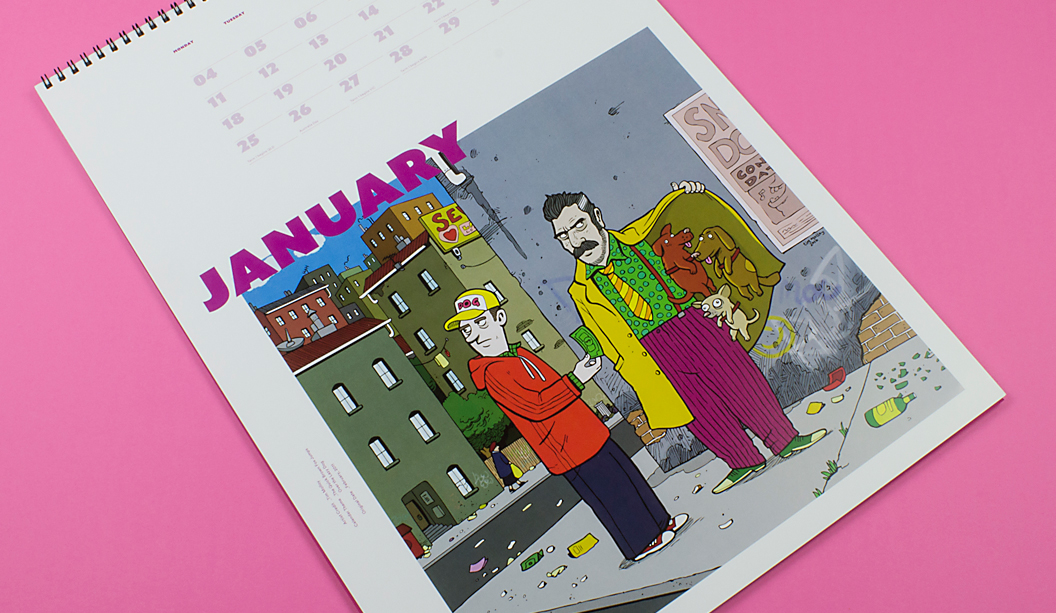
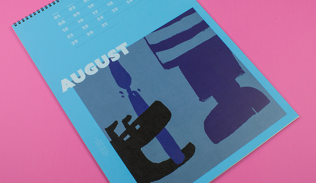
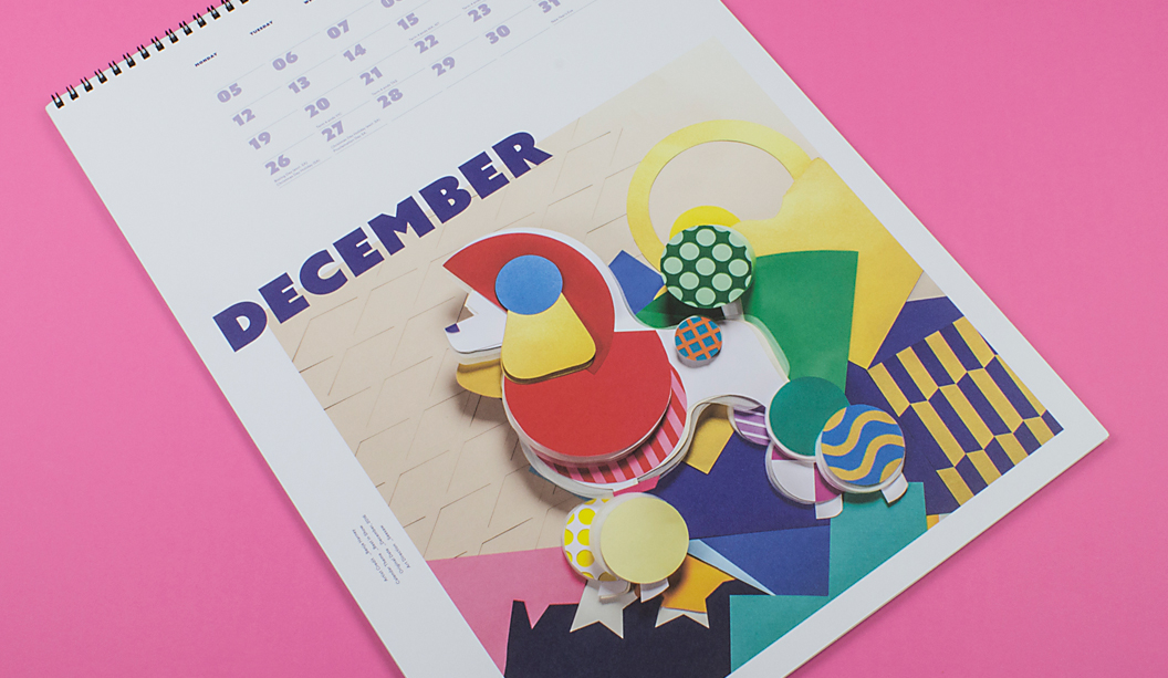
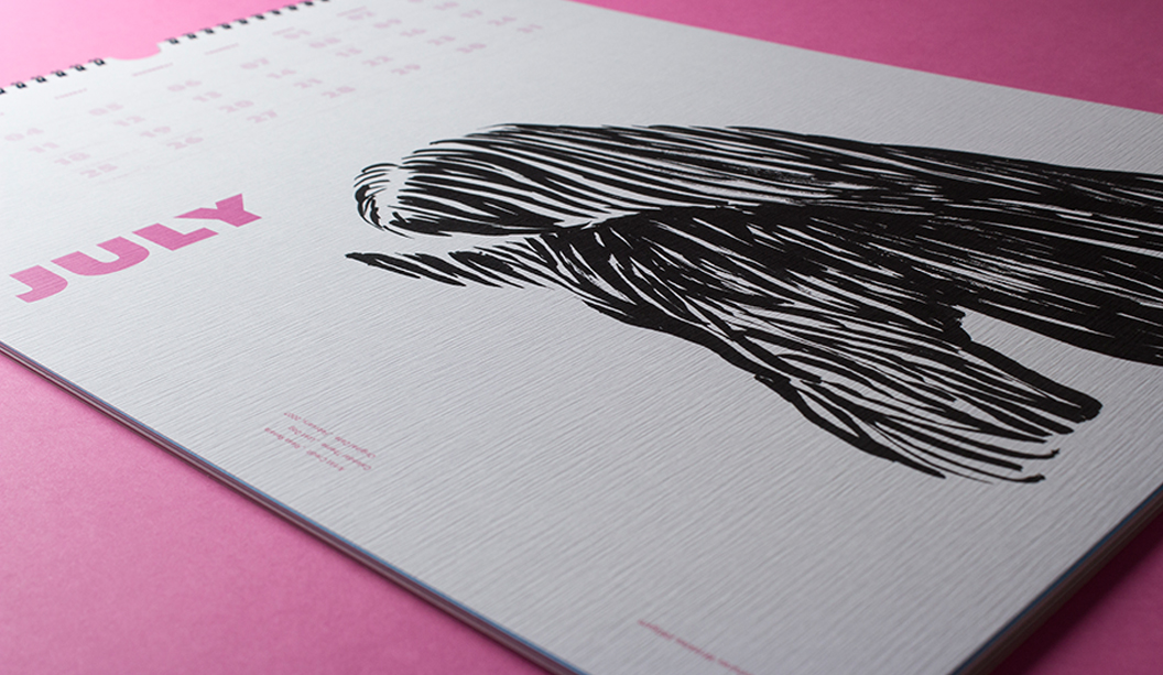
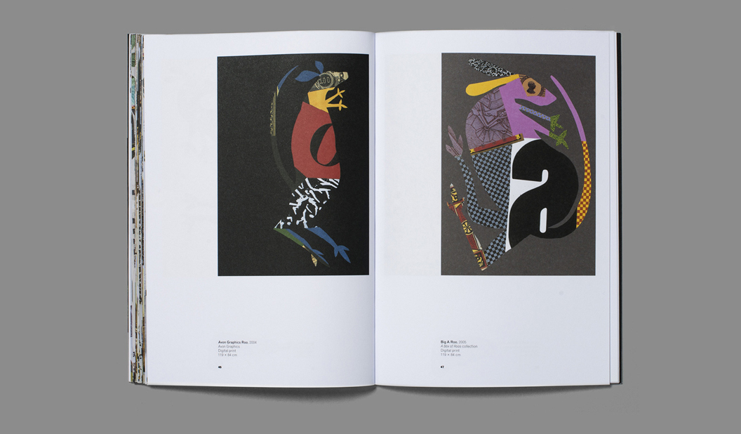
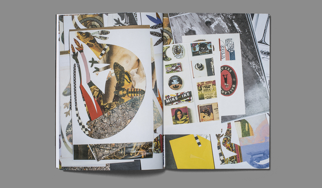
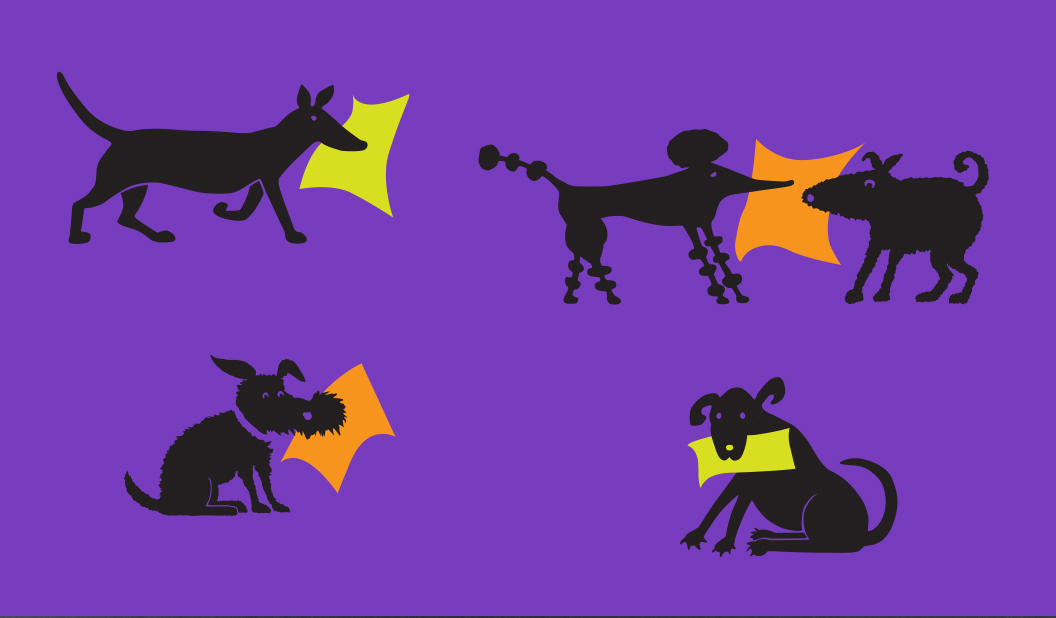
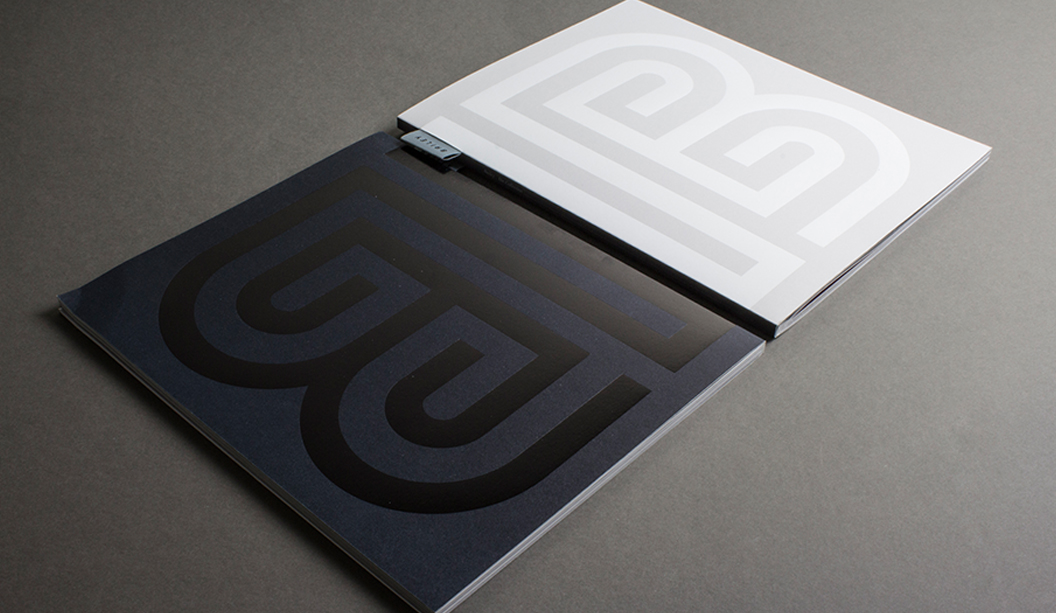
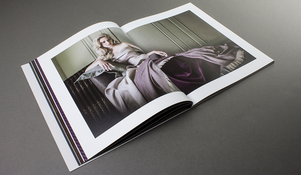
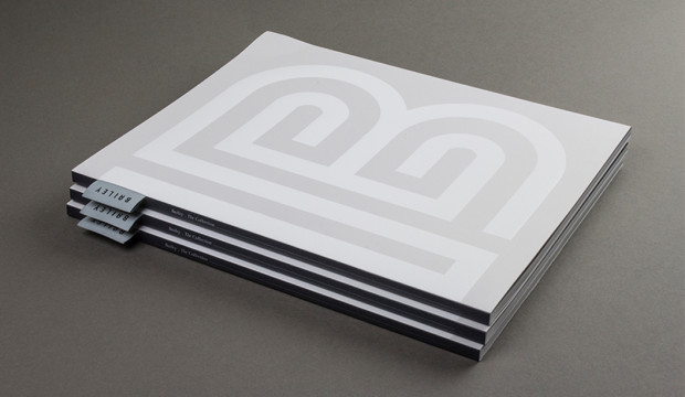
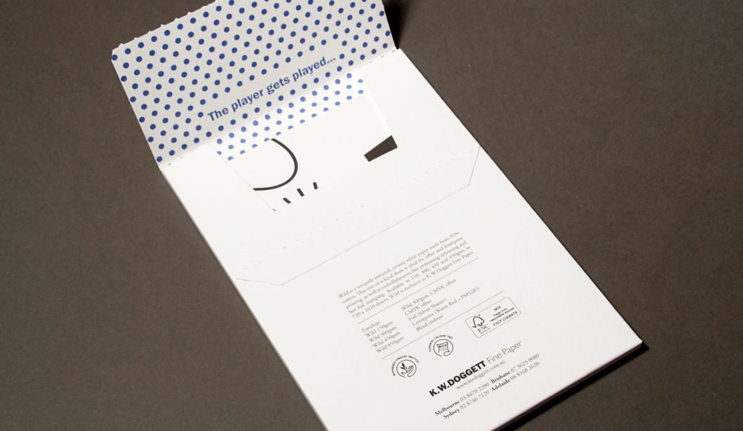
Footy Tips
Every paper stock has different inherent qualities based on the composition of the fibres in the pulp and how the paper is manufactured. Some papers are better suited to certain types of embellishment than others. We strongly recommend discussing what you want to achieve, along with your choice of paper, with your commercial print supplier before making a decision. Choosing the wrong stock for embellishment can be a disaster!
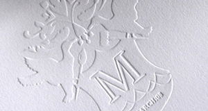
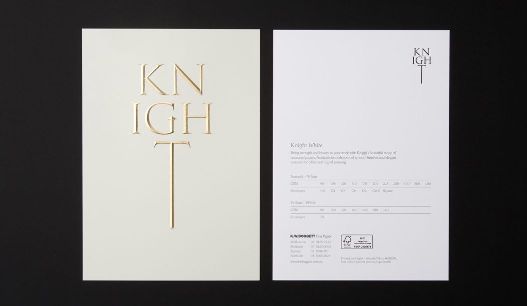
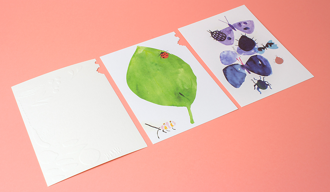
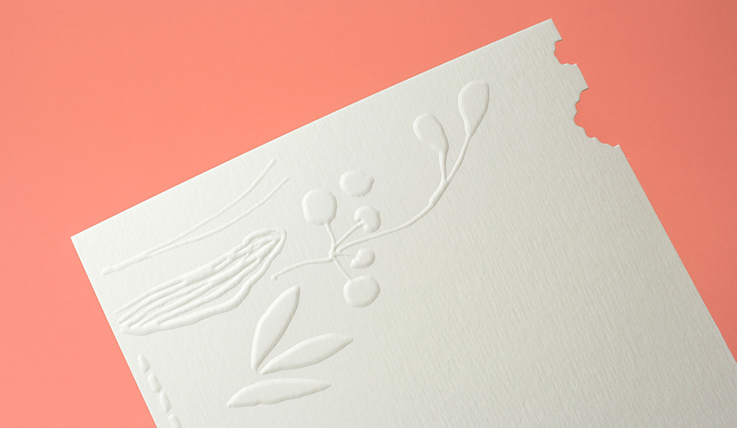
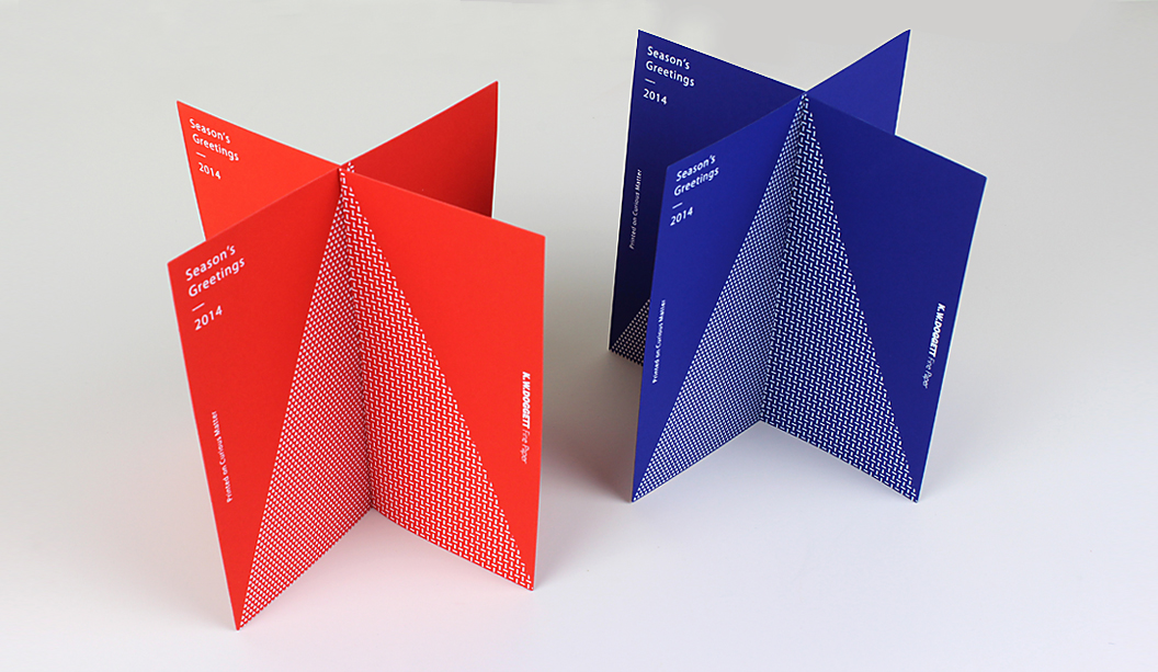
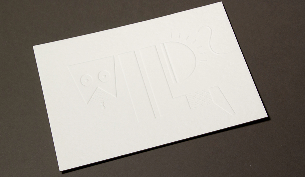
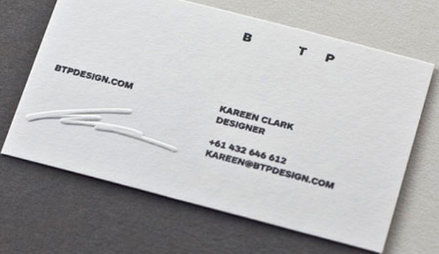
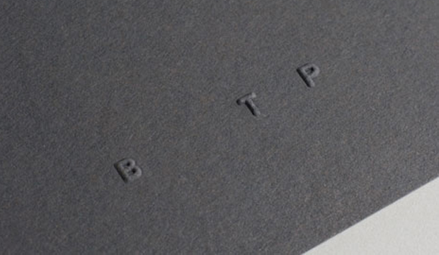
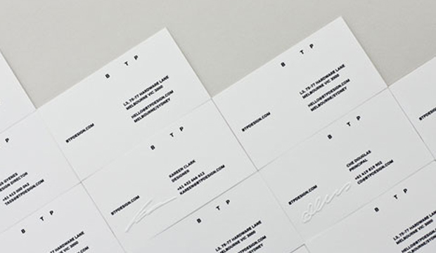
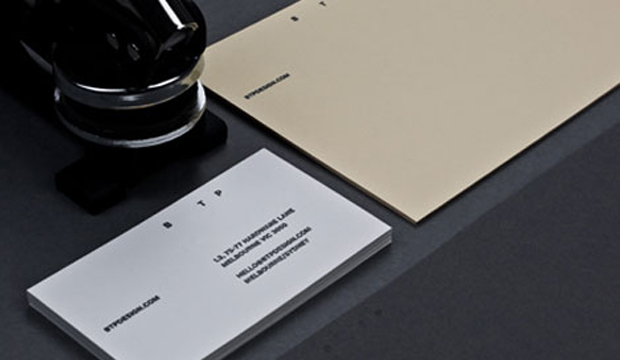
Embossing
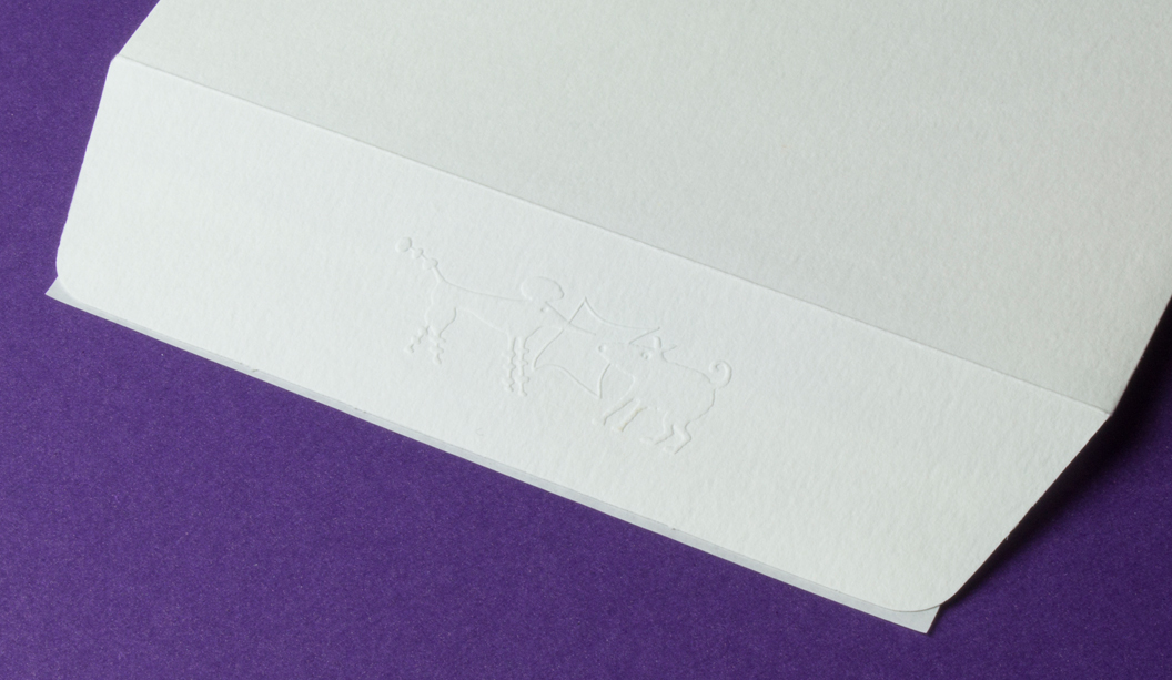
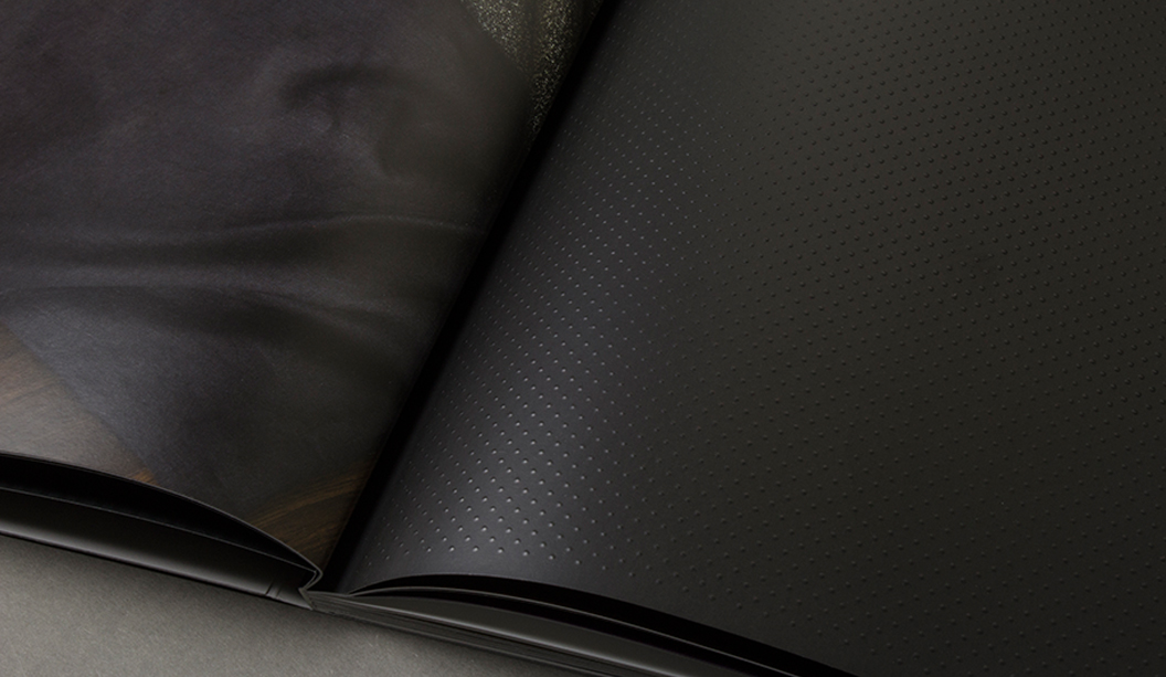
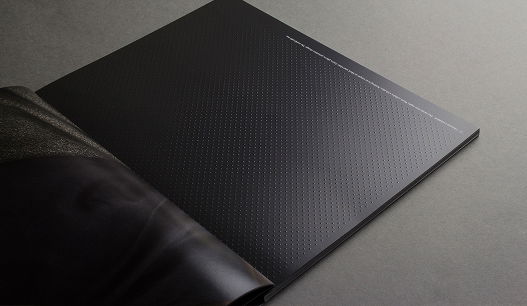
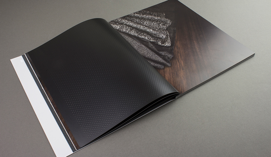
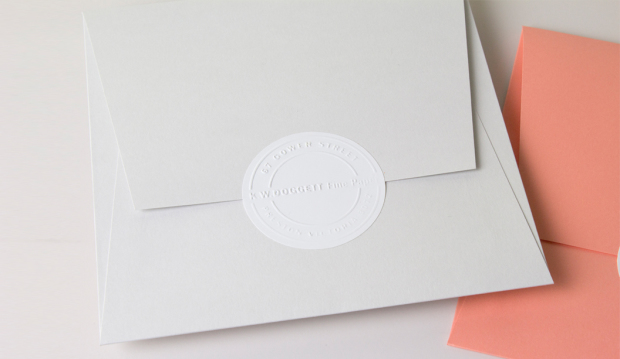
Embossing creates a striking tactile finish by leaving an image either indented or raised on the surface of the paper. Embossing can be done on many types of papers and boards. Blind embossing is embossing on a non-printed area (ie: there is no printed graphic to act as a guide — it is being done ‘blind’). Debossing, or negative embossing is embossing ‘into’ the paper instead of ‘out’ of the paper.Budget
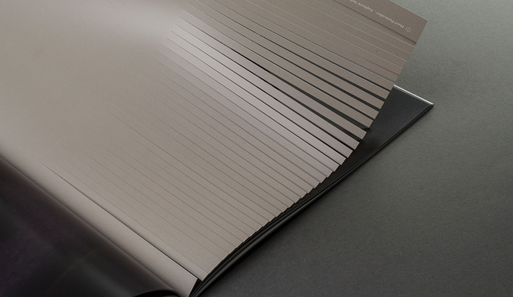
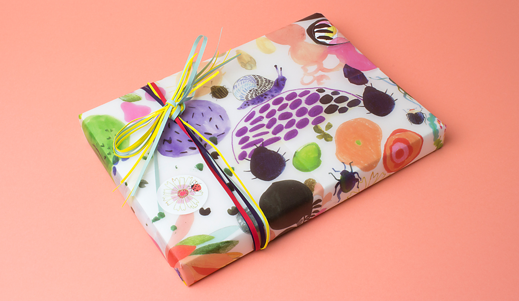
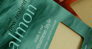
Form cutting
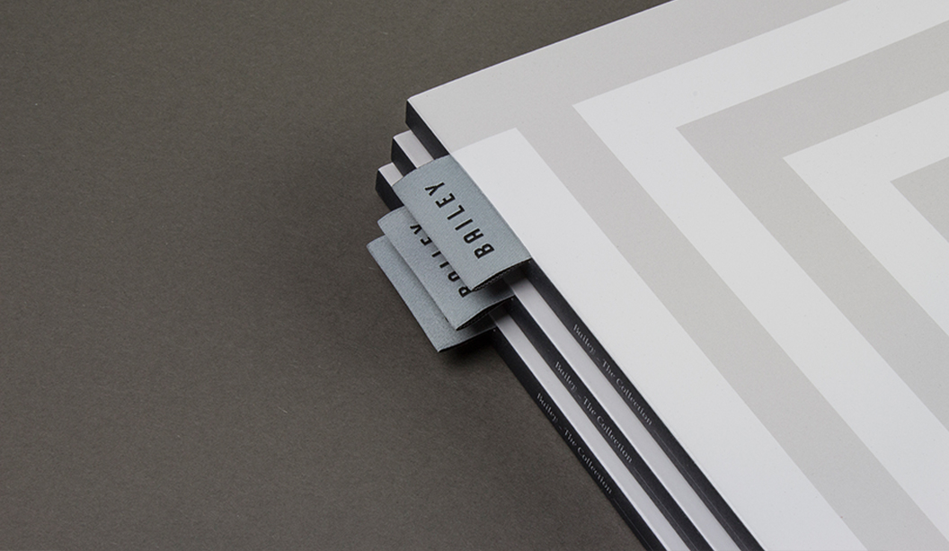
Form cutting, also referred to as stamping or knifing, involves making a die that is stamp pressed against the paper stock to cut a shape. Form cutting can be used to create a custom shaped outer contour or to cut a window or shape out from the finished piece. Kiss cutting is similar to form cutting, but does not cut all the way through the stock material. Kiss Cutting is often used in manufacturing peel and stick labels.Budget
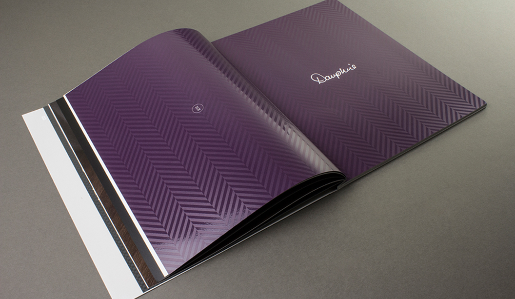
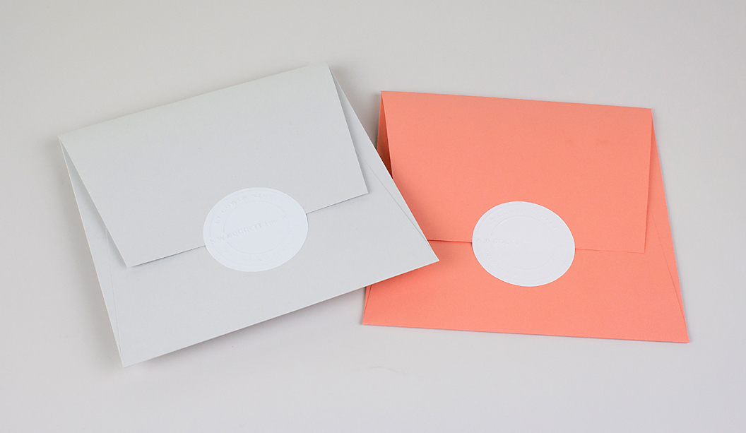
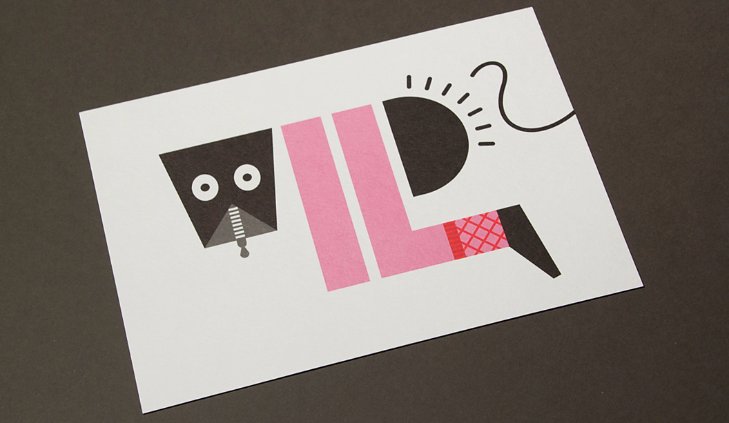
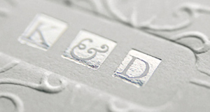
Spot UV
Spot UV is a gloss coating applied using ultra-violet radiation to cure the finish to the paper stock after the printing has been finished. Spot UV is often mistaken as a gloss Laminate finish as both have a similar appearance — but, a Spot UV has the advantage of being able to be applied in specific areas or as a image, not just as an all over finish.Budget
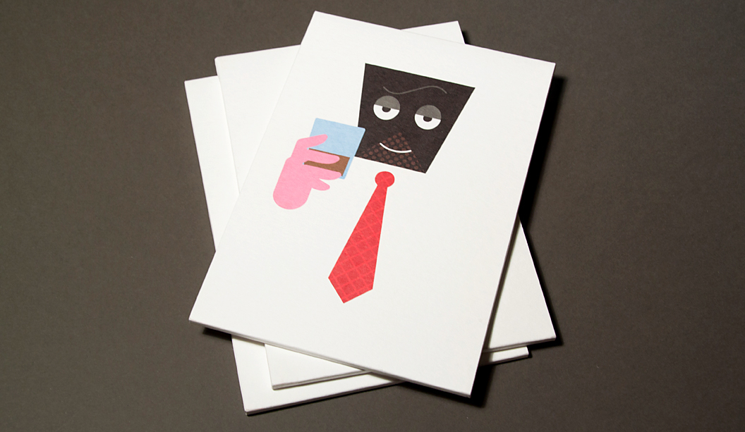
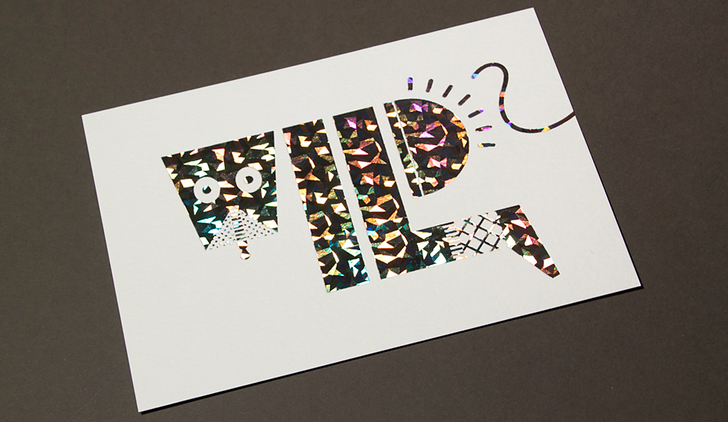
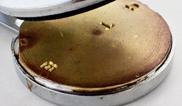
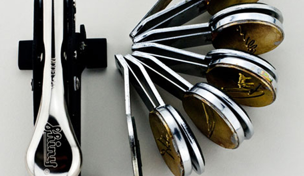
Foil stamping
Foil stamping, also referred to as foiling, uses heat to adhere a foil material directly onto the paper surface. Foils come in many different colours and finishes including metallic, reflective and even holographic. Foils are opaque and can be used on coloured or black paper stocks to create a crisp, unique look. Some paper stocks, particularly textured paper, are not suited to foil stamping finishes.Budget
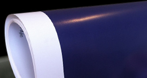
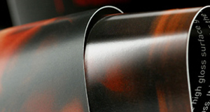
Laminates
Available in both a gloss and matt finish, a laminate is a protective film that is applied over the surface of a printed piece. Sometimes a laminate is applied to a single side only (such as on a cover), or to both sides. A laminate gives a superior level of protection, is more durable and has a more striking finish than a varnish.Budget