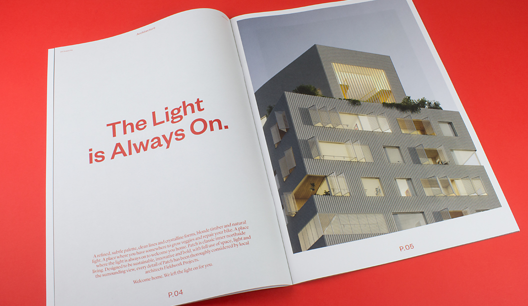
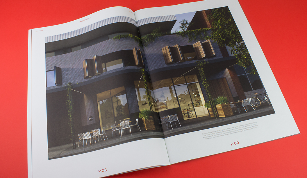
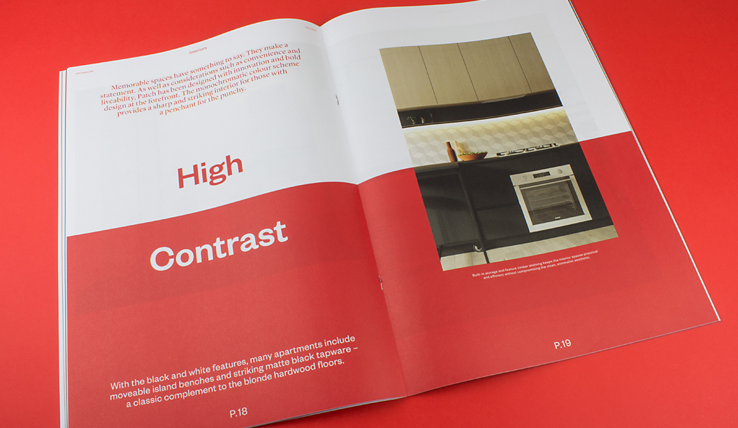
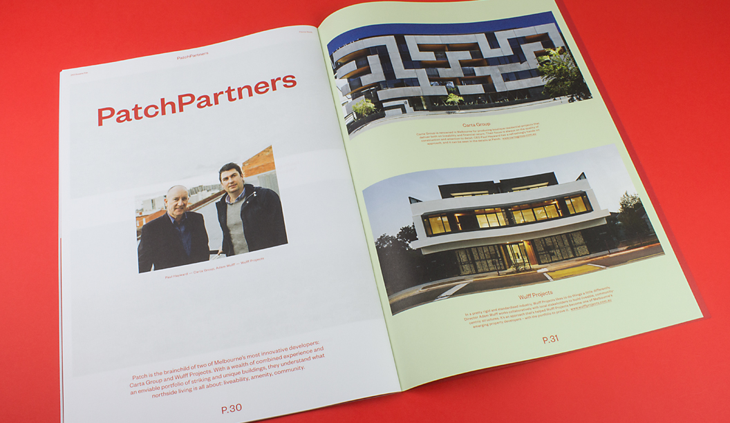
Take a look at ‘Patch’ designed by Studio Hi Ho in Melbourne. It’s a job that really stood out as one of the simplest but coolest property brochures of 2015. There’s a quote inside the brochure that states: “Patch provides a sharp and striking interior for those with a penchant for punchy.” What a great quote. And we think the brochure more than lives up to the rhetoric.
The print piece starts off with a Sovereign Offset 100gsm cover that features a killer 4 colour red logo on a custom ‘vellum’ emboss pattern from Tafeda. The inside pages showcase full bleed blacks, bold reds and knock out 4 colour images on the Knight Vellum 100gsm text. The reproduction by Adams Print is truly outstanding. We were amazed it wasn’t a special red PMS.
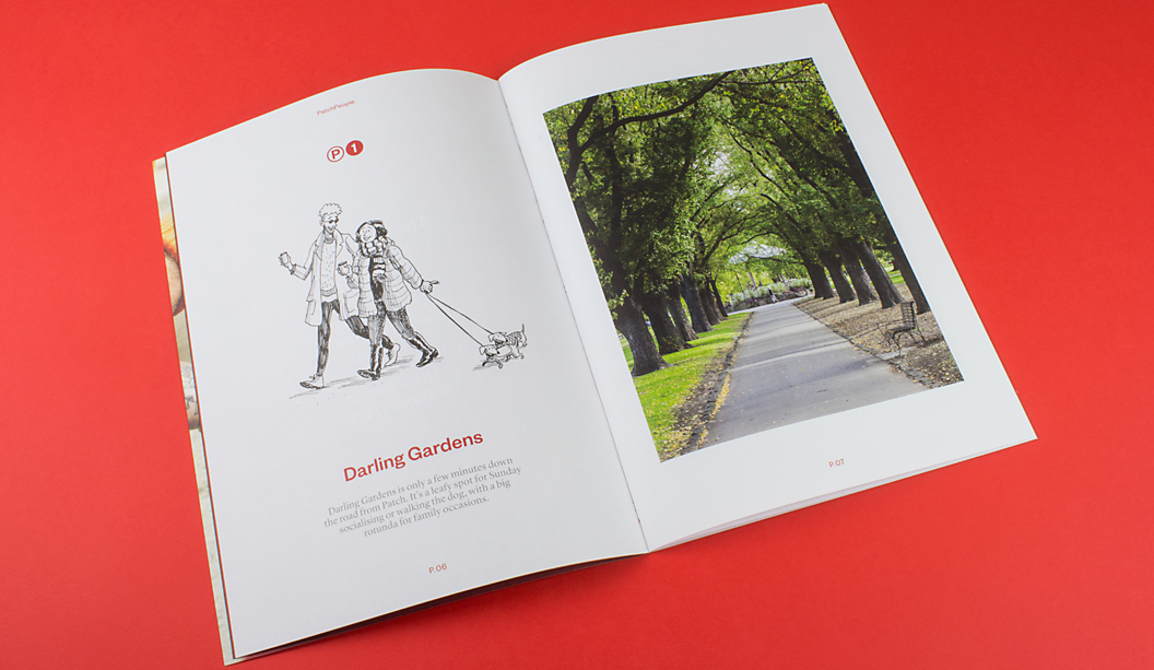
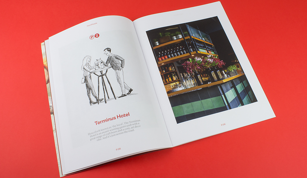
Our favourite bit though is ‘Patch People’ with the quirky and truly spot on illustrations of locals by Jeff the Peff. One of our marketing team staff lives right near the development (ok it’s Catherine), and she is sure Jeff has drawn one of her neighbours. A spot on interpretation of ‘Tim’ (you know who you are). Tim, you’re famous!
Jokes aside, it’s a job that really made us want to pick it up and have a good look. That’s a big deal among the masses of excellent property brochures we’ve seen this year. We did a property week feature on Facebook and Instagram back in August and that was just a snap shot of the great pieces we’ve seen in 2015. Check it out for some more property work inspiration.
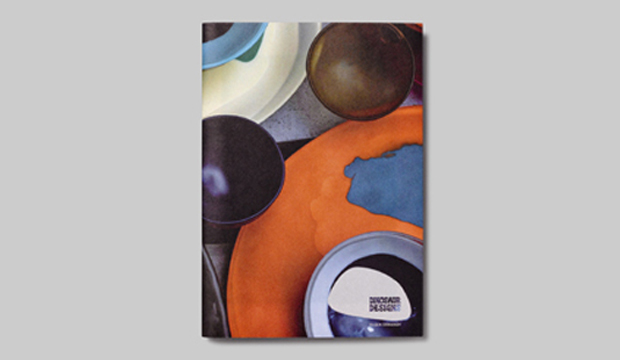
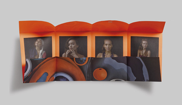
Dinosaur Designs is one of the Australia’s most celebrated brands in jewellery, homewares and objet d’art. To showcase their stunning new range, Dinosaur Designs aka Louise Olsen and Stephen Ormandy, partnered with Hoyne Design and photographer Nicholas Samartis to produce a highly collectible annual publication. Its graphic and textural imagery had us at page one. The theme is modern tribal, as Louise Olsen said: “With this collection, we played with the rhythmic sensibility of colour and pattern. Strong earthy tones are balanced with earthy neutral tones.
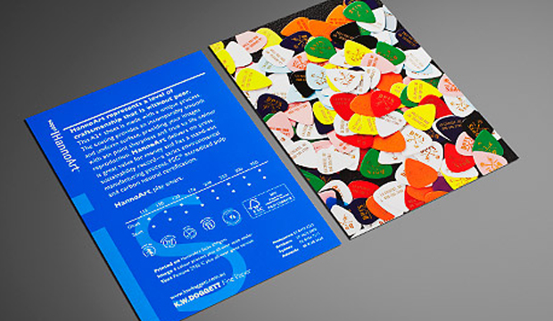
The 32pp A5 booklet is printed offset CMYK with fluoro orange ink on HannoArt Satin 170gsm and cover Impact 100% recycled 300gsm. The dust jacket is designed as a treatment which unfolds to reveal a double sided poster, printed offset CMYK with fluoro orange on Impact 100% recycled 100gsm. The publication is a work of art in itself – a real little beauty that does the brand justice. To view Dinosaur Design’s beautiful new range see www.dinosaurdesigns.com.au/collections
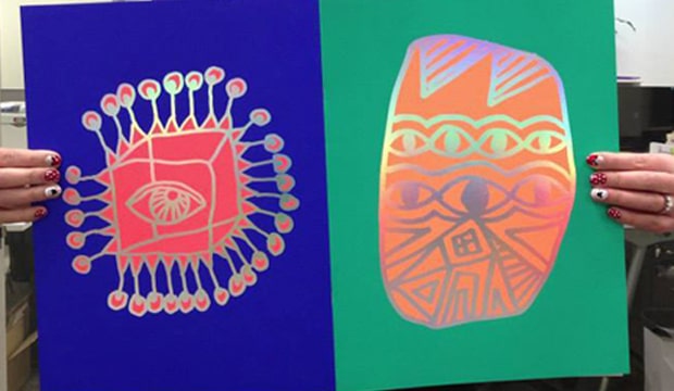
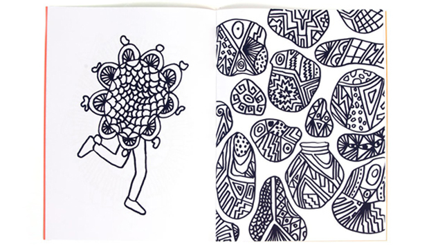
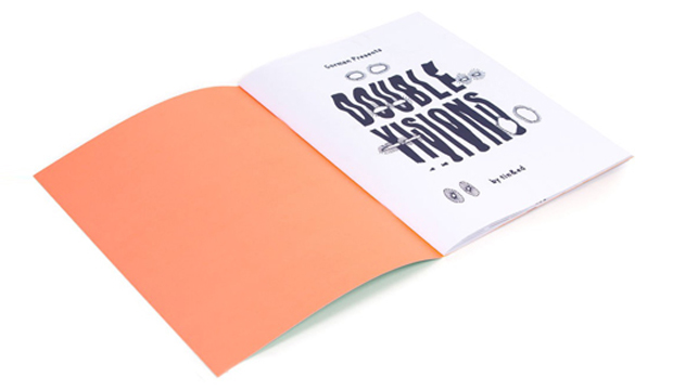
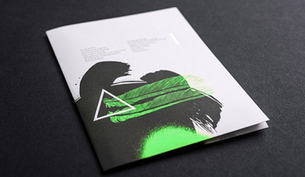
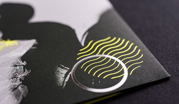
Tin&Ed from downtown Fitzroy have created a colouring book (for big kids just like us), especially for the release of Lisa Gorman’s new home wares range – Gorman Home Time. The ‘Double Visions’ colouring book features hand drawn illustrations by the talented duo and at a neat $39.95, could be just the gift for your favourite person this Christmas.
The limited edition 16pp book is printed 5 colours including an orange and red fluoro ink on Sovereign Offset 135gsm and cover Sovereign Offset 300gsm with a colossal holographic foil on the front and back for some extra bling!
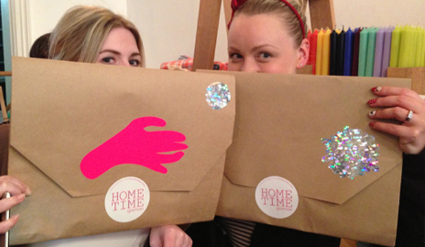
For all of you chomping at the bit to feast your eyes on Gorman Home Time, the range is available in two special pop-up shop locations in Melbourne – Shop g08 at the GPO, and 336 Brunswick Street, Fitzroy AND of course it’s all available online too!
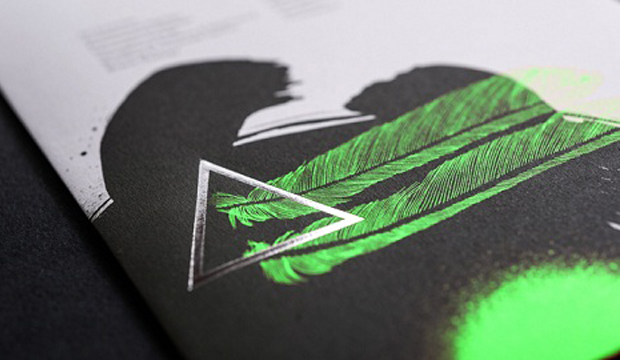
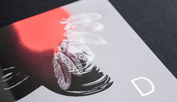
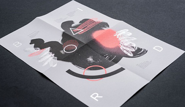
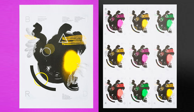
Let us share with you the excitement that filled the office when one of our much loved paper specialists came into work with the eye catching Bird A3 self-promotional posters. ‘I can choose from four colours?’ people exclaimed. ‘But I like all of them!’ was the common response. Each poster features hand drawn and vector illustrations and a unique fluorescent colour (pink, yellow, green, red) topped off with silver metallic foil. A true project of experimentation which had our paper sensibilities going c-r-a-z-y.
Printed on Keaykolour Original Pure White 120gsm, which for Bird was an economical choice and great feel for a 120gsm paper. Also handy as they sent some out in the post in A5 format so the piece needed to fold down well. Each illustration varies in method and combines individual design elements such as spray paint, brush and ink, pen illustration and computer generated shapes. Experimentation is evident with things like the beautiful abstract bird illustration and typographic elements that creates a piece with energy and beauty.
Bird offset printed the posters using two colours, black and also separate fluorescents for each poster. Luke Carson from Bird mentioned: “We hit the fluorescent colours twice and the black once. The result was an even flat black and really punchy fluorescent colour that lifted off the paper. Further enhancing this was a matte spot varnish on the black and a gloss spot vanish on the fluoros.” Safe to say, we likey.
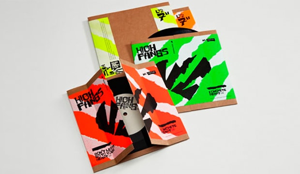
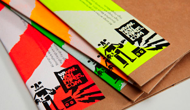
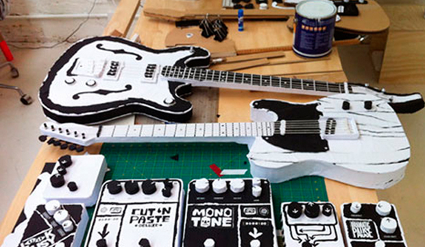
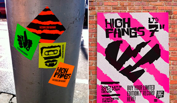
The marketing team has voted. If any of us leave Doggett’s, we’re joining a rock n roll band. In the meantime, we’ll take the use of our stock, uncoated JAC Fluorescent, as the closest link we have to a future in the music industry. Grosz Co.Lab, a Melbourne based design studio, have crafted a graphic language for High Fangs, a Melbourne three piece. A truly original visual aesthetic that encapsulates the band’s DIY rough and ready sound and live performance reputation has been created.
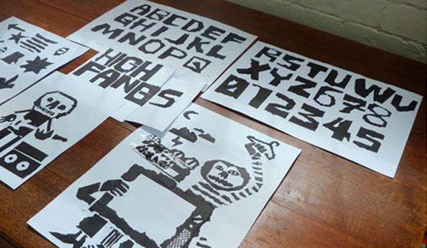
Just to put the band into context, they’re described as: ‘A fusion of 60s Garage, 70s Power Pop, Stiff Records New Wave, 00s Swedish Punk energy minus an Ikea™ Allen Key’ on their site. Somehow, this explains why JAC Fluoro is such a good choice! The visual language includes a typeface (High Fang irregular), gig posters, packaging and 3D props, logo, icons, illustrations, symbols and graphic patterns. The torn paper approach seen throughout the work provided a communication style totally reflective of the band’s music and work.
As Ben Grosz (designer by day, band member by night) mentioned to us: “We purposefully decided to do the printing ourselves in the Grosz Co.Lab studio. It’s been so enjoyable to get our hands dirty and create every piece of collateral from print to props by hand.” JAC meant Grosz Co.Lab could achieve maximum visual and economic impact, also deciding to use the stickers for guerrilla marketing, merchandise packaging or to giveaway at gigs.
Ben mentioned they had to do lots of tests before choosing to stencil white acrylic paint (using strips created by tearing, scanning, vectorising and printing a stencil to cut-out) directly onto the JAC adhesive. When the sheets were dry enough they manually fed them hrough a very cheap A4 black and white laser printer for overprinting. The fluoro colour ways of green, orange, red and yellow were rolled-out across 300 hand made, tear open record sleeves for the band’s 7″ double A side single ‘heart tearing’ themed release.
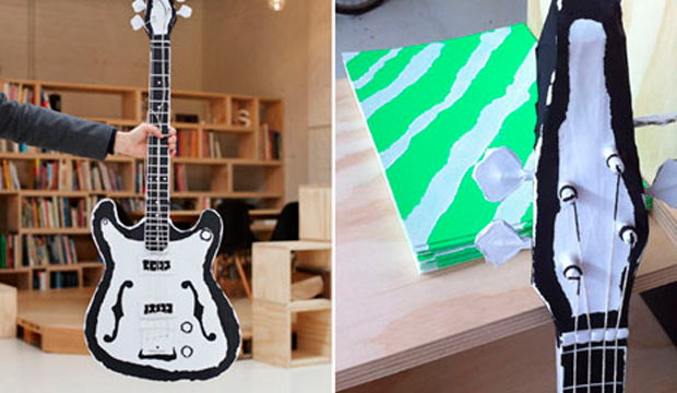
Not up for stopping there, Grosz Co.Lab recycled previously purchased and unused poster sized stock, tearing and transforming the Sovereign Offset 120gsm and Kaskad Raven Black 160gsm into electric guitars for the band’s video clip. The paper was stuck on cardboard and foam core frames.
It seems some lateral thinking, a cost effective, individual approach and a glue stick = maximum impact. Our JAC Fluoro never looked so cool. Long live rock n roll!
“The time I burned my guitar it was like a sacrifice. You sacrifice the things you love. I love my guitar,” Jimi Hendrix. Ok, so does that mean we need to burn paper to prove we love it? We figured a bonfire in the back of the warehouse would most likely breach an OH&S rule. A paper promotion seemed a much safer option!
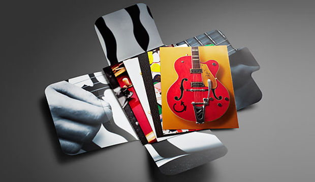
In our latest HannoArt promo, we pay homage to the worlds of music and paper. We added an educational twist by including tips about grain direction, colour, printing with blacks, stochastic/conventional line screen and also ink limits. Not to forget the awesome colour and visuals. We really wanted to showcase how well HannoArt handles solid colour and sharp detail. We pondered, we collaborated (with David Lancashire Design in Melbourne), we held production meetings (with Southern Colour in Melbourne) and fleshed out ideas over and over to come up with a promotion that uses achievable print techniques and includes technical information.
This post is going to provide you with some tips and insights into a few of the cards we printed. If you’re not keen on reading any of this, thanks for being here or call your rep and ask them for an in person demonstration. Soak up their technical knowledge!
The spot matt etch, which appears on the front cover is probably the only technique that isn’t offered by a majority of printers. We firstly printed the cover with the fluoro pink, then had it laminated. The spot matt etch was done in a second pass. It’s a matt varnish technique has been applied to the black leather grain area only, leaving the glossy laminate to shine on the plectrums and the ‘IS’.
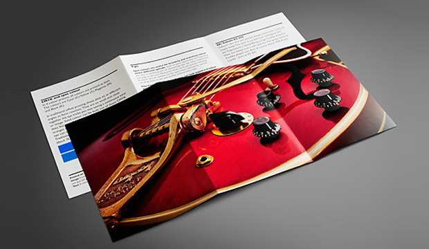
We purposefully designed some of the cards to be a comparator. The 4pp ’56 Gretsch Atkins card, is one of these. The left image is printed 4 colour process with all over gloss varnish. For the right image, we added a Pantone 877 Silver and spot OP matt and spot OP gloss varnish. We then perforated the card so our customers had the option to take one with them to a meeting and potentially leave one with their client. Now, there’s nothing wrong with the 4 colour image – it looks really good actually. But you can tell the difference with the contrasting card. The silver brightens up the bridge of the guitar, and the varnishes make the guitar pop off the page.
We used Pantone 2935 C for one card because it’s the HannoArt blue. This is such a tricky colour to print with and can be really challenging. The result shows how there is no mottling on the paper which is a really good result. No extra pressure was used for this card but we did use a stochastic screen to produce crisp, clean edges in the small logos and tiny type. Gloss varnish was used to seal in the colour better.
We’ve got an unofficial favourite – the 6pp red guitar. We tricked this one up on purpose. It was good for us to see what difference the Pantone Rubine Red C bump plate could make with this type of image. The body of the guitar just looks so much brighter and richer with it. And the Pantone Silver underlay boosts up the hardware. On the back, there are tips on colour, so we replicated a small square of the Pantone Blue with a CMYK blue to show the difference. It’s pretty obvious, the difference, and handy to know the compromise you’ll make if budget doesn’t allow for a PMS.
The final card in the pack shows three images – a 4 colour b&w stochastic, monotone stochastic and monotone conventional. On the reverse we have printed three blacks. The 4 colour b&w printed stochastic is a stand-out in this set, a much warmer black. On the reverse, we’ve show just how different stock looks with a varnish, we printed each card with a strip of satin sealer, gloss varnish and then no varnish. We perforated this card as well so you can compare the blacks next to each other.
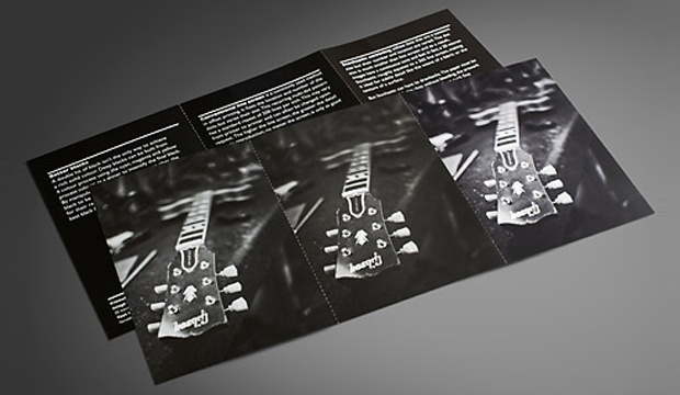
You may recognise the images we’ve used are from the 2010 promotion Sappi released called ‘Dave’s Guitar Shop’. In Wisconsin USA, Dave’s famed guitar shop houses a rare collection of guitars by legends like Gibson, Fender and Gretsch and other music legends. This place is apparently a mecca for guitar lovers from all over. As an extra bonus, we have a Dave’s Guitar Shop plectrum in the promos! Just like the iconic instruments at Dave’s, HannoArt bears the hallmarks of quality and craftsmanship.
Printing specs:
Folder (outside): Satin 250gsm, 4 colour + Pantone 806 C (plectrums). Spot matt etch. All over gloss laminate.
Folder (inside): 4 colour black and white image, matt laminate.
Card 1: 2pp, Satin 350gsm.
Text: 4 colour process plus all-over satin sealer.
Image (close-up of the Dave’s 25th anniversary guitar) : 4 colour process + all over gloss varnish.
Card 2: 2pp, Satin 350gsm.
Text: 4 colour process plus all over gloss machine varnish, Pantone 2935 C.
Image (branded plectrums from the front cover): 4 colour process. All-over satin sealer.
Card 3: ’56 Gretsch Atkins. 4pp, Gloss 300gsm.
Left image: 4 colour process. All-over gloss varnish. Perforation at 6 TPI (teeth per inch).
Right image: 4 colour process. Spot Pantone Silver (first pass). (Second pass) Spot OP gloss varnish over the guitar and spot OP matt varnish over background to create a contrast. Black plus all over gloss varnish.
Tip: Ink limits.
Card 4: Three Fender Telecasters from the 50s. Gloss 170gsm.
Image: 4 colour process. All-over gloss aqueous varnish. Scored and folded.
Text: Black plus 2 hits Pantone Silver 877 C. All-over gloss aqueous varnish.
Tip: Grain direction.
Card 5: 60s Gibson ES 355. Gloss 250gsm.
Image: Pantone Silver (separation). First pass. 4 colour process. Second pass. Pantone Rubine Red C (separation). Bump plate in second pass. Spot OP gloss varnish on timber areas.
Text: Black plus all-over gloss varnish. Left card has two squares: PMS 2935 (same as the blue on card 2) – CMYK (which shows the nearest match you can get using a CMYK breakdown).
Tip: CMYK and spot colour.
Card 6: Satin 250gsm. 6pp.
Image (left): Black monotone printed stochastic. FM screen, 20 microns. Satin sealer.
Image (middle): Black monotone printed conventional. AM screen, 200 lines per inch. Satin sealer.
Image (right):4 colour black and white, printed stochastic. FM screen, 20 microns. Satin sealer.
Text (left. Tip – Better blacks: 4 colour black. K100 with underprint of C40, M20, Y20.
Text (middle). Tip – Conventional line screen: Dense black.
Text (right). Tip – Stochastic screening: Standard process black.
Varnishes Each text card has three varnishes applied to it in columns. First column is gloss varnish, then satin sealer then no varnish.
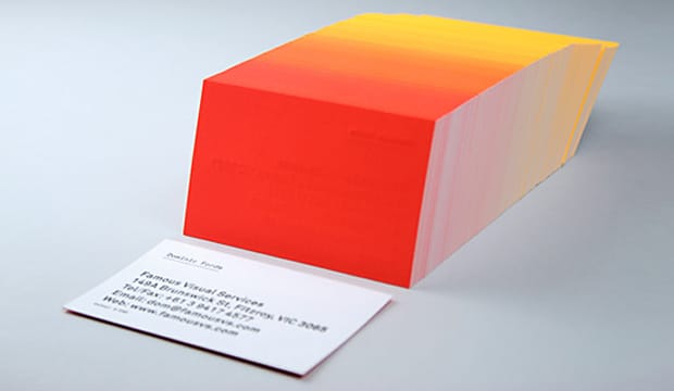
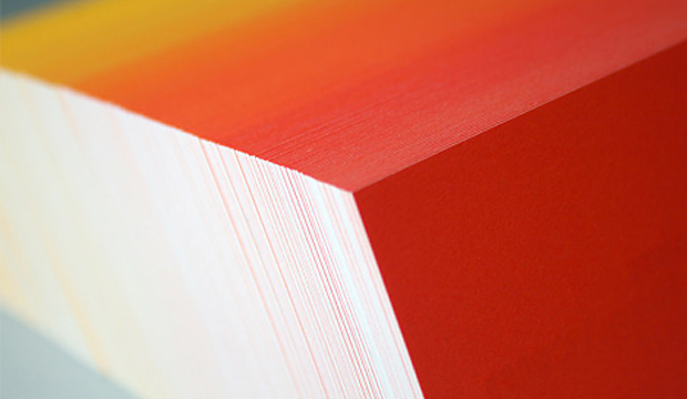
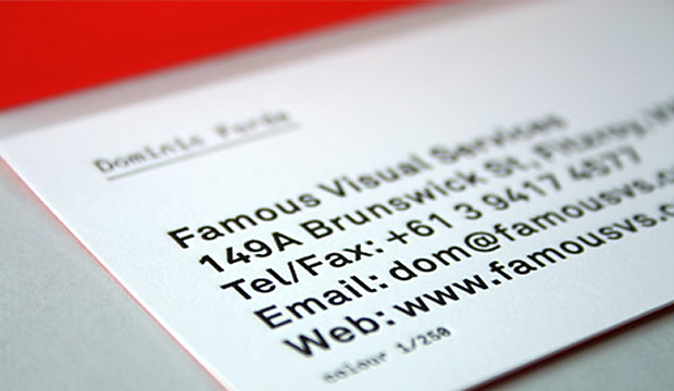
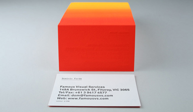
Title: Famous Visual Services business cards Agency: Self-promotion Stocks:Concept Vellum Printed by:Taylor’d Press (VIC)
We love a bit of colour around here. We have even been known to say certain colourful designs remind us of 80s icy poles. These business cards are definitely a reminder of 80s Summer time goodness. These knockout cards were produced by Dom Forde from Famous Visual Services. For Dom, new business cards present the opportunity to experiment with ideas and materials. And experiment he did!
Concept Vellum Radiance was chosen for its ability to handle fluoro ink well. Dom wanted to enhance the vibrancy of the colours and he also knew, on advice from James Taylor at Taylor’d Press, that the stock handles letter press well. Especially the heavy grammage – 352gsm, which can take a robust indentation from the machine. The outcome is a vibrant set of cards with luxurious tactile qualities.
The patience of James Taylor was really important in the process. As Dom explains: “Our idea was to print a slightly different colour shade across the back of each card in the print run. First we printed a solid fluoro yellow on all 250 cards, then we then ran the cards back through the press adding dollops of fluoro red to the press as the cards were running.” The result is a 250 step gradation from yellow to red across the print run. The name details were letterpress printed in black. Now that’s a nifty business card print job if ever we saw one. And yes, he did say 250 step gradation. Amazing!
 Footy Tips