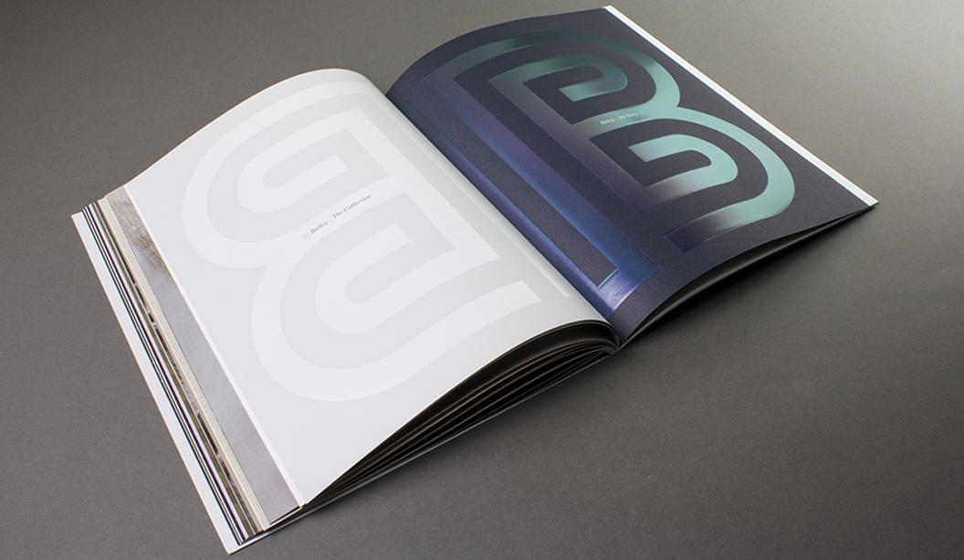
The Sub Divide, a collective of beautiful print

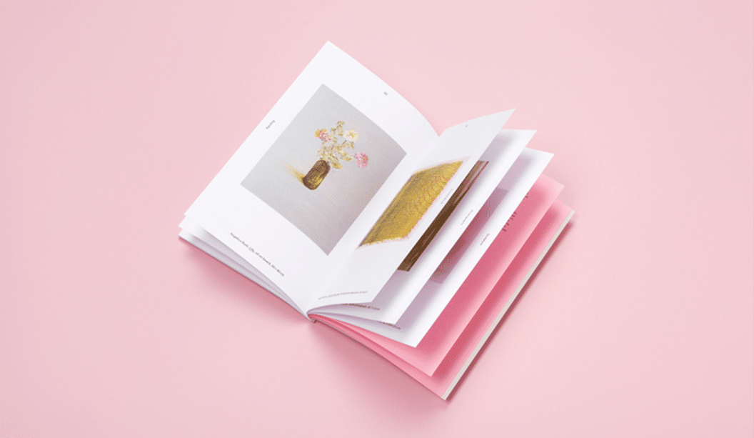
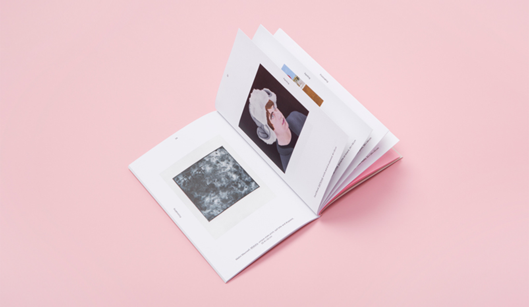
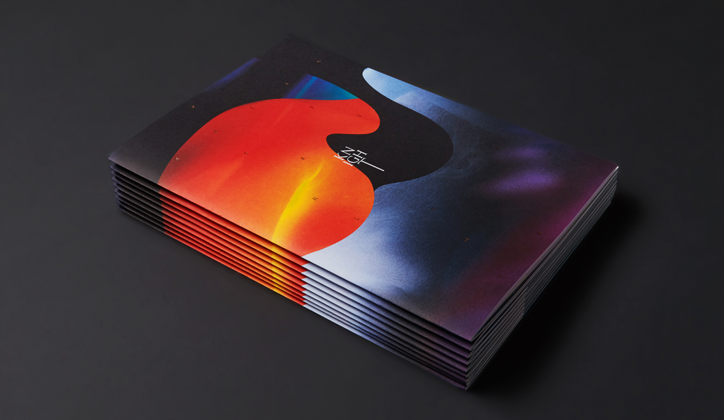
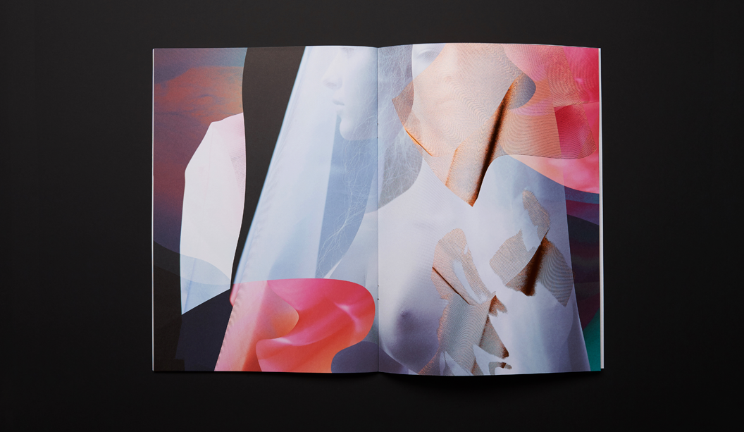
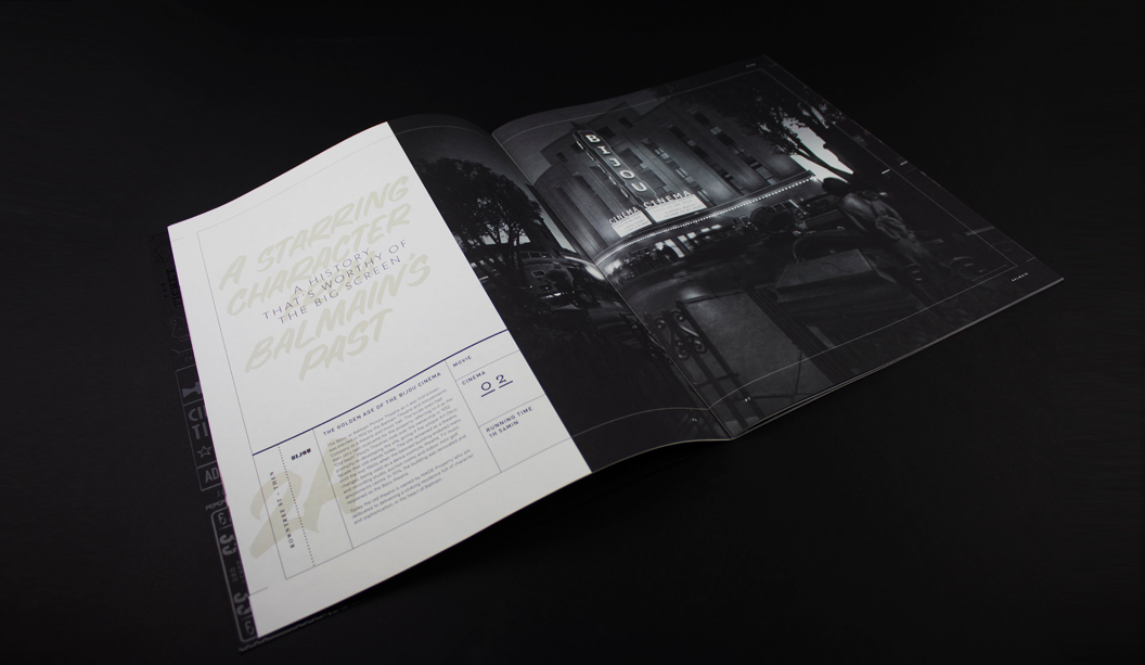
In 2016, we got to be a part of something pretty spesh when it comes to the world of paper and print. The culmination was the limited edition book The Sub Divide. It’s part print, part art and a whole lot of beauty. A curated resource celebrating a selection of 30 highly regarded photographers – recommended by and for, the creative industry. The publication has been developed by a collective of specialists dedicated to their craft.

(Most of the content from this blog post first appeared in Issue 11 of GSM Magazine).

The Sub Divide is an exquisite printed resource developed through the pillars of inspiration, experimentation, collaboration and celebration. It also celebrates craftsmanship. With a unique collaborative approach to production, this resource came to life through the dedication and expertise of some very committed individuals. The project started with a simple conversation between John Wanless Director at Bambra Press and one of staff after they saw printed test sheets of photographic material lying on Bambra’s press room floor. Grosz Co. Lab’s Creative Directors, Ben Grosz and Laura Camilleri then became involved by developing the concept and curating the collection of photographic works which the book showcases. Their efforts were none other than extraordinary!

SD_2

The collective behind this project comprised includes:

> Bambra Press for Initial concept and delivering exceptional print.
> Grosz Co. Lab for the development and curation of the publication through intelligent, articulated design.
> Huber Inks for the supply of the Pacifica Inks and also specialist guidance on technical advice during the process, supplied by Ball & Doggett.
> The Bindery for the development and production of the unique featured binding techniques.
> Avon Graphics for the production and expertise in embellishments and foiling.
> Foldercorp for the production of the sleeve.
> Cartonlux for laminating the stock for the sleeve.
> Nordale Graphics/Wibelin for the binding techniques.

And yours truly for the supply of paper (visit our existing websites until the Ball & Doggett one is live).

The technical challenges

Such a complex print project presents many technical challenges. A key driver to the success of the publication was the extensive research and development phase. This included a series of mock-ups created by our Designline team in VIC that enabled dialogue with everyone involved. Creating a mock-up although it doesn’t have any print is a key step in any major print project and can save a lot of time and ensure the end product is exactly what you want.

SD_5

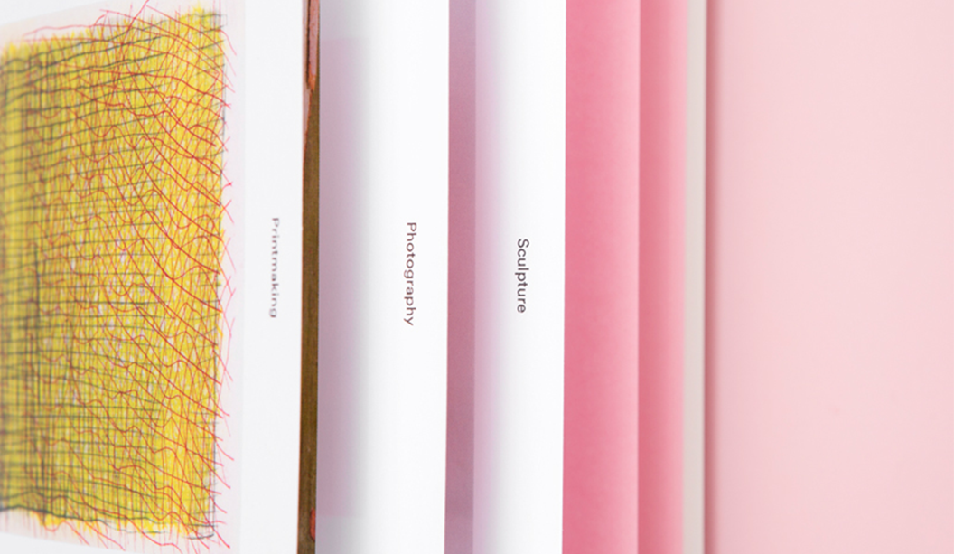
One of the specific technical challenges presented, was the unique bind which creates both an interesting aesthetic experience and is also unusual in placing the index containing the details of the featured photographers in the middle of the book. The bind solution was developed by Ian Leckie, operations manager at The Bindery.

SD_1

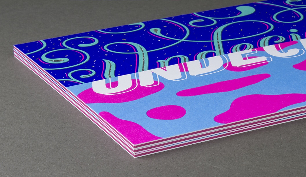
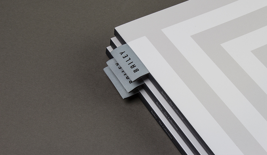
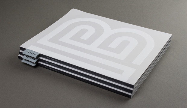
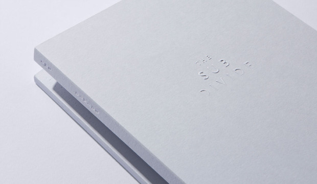
The slipcase (1) uses Colorplan Cool Grey 270gsm stock which has been custom diecut, folded and hand-glued, then duplex laminated to Colorplan Pristine White 270gsm. The embellishment across the slipcase features foiling by Avon Graphics with an API Foil (2004 / CL Clear Rainbow).

SD_4

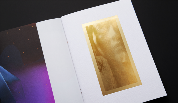
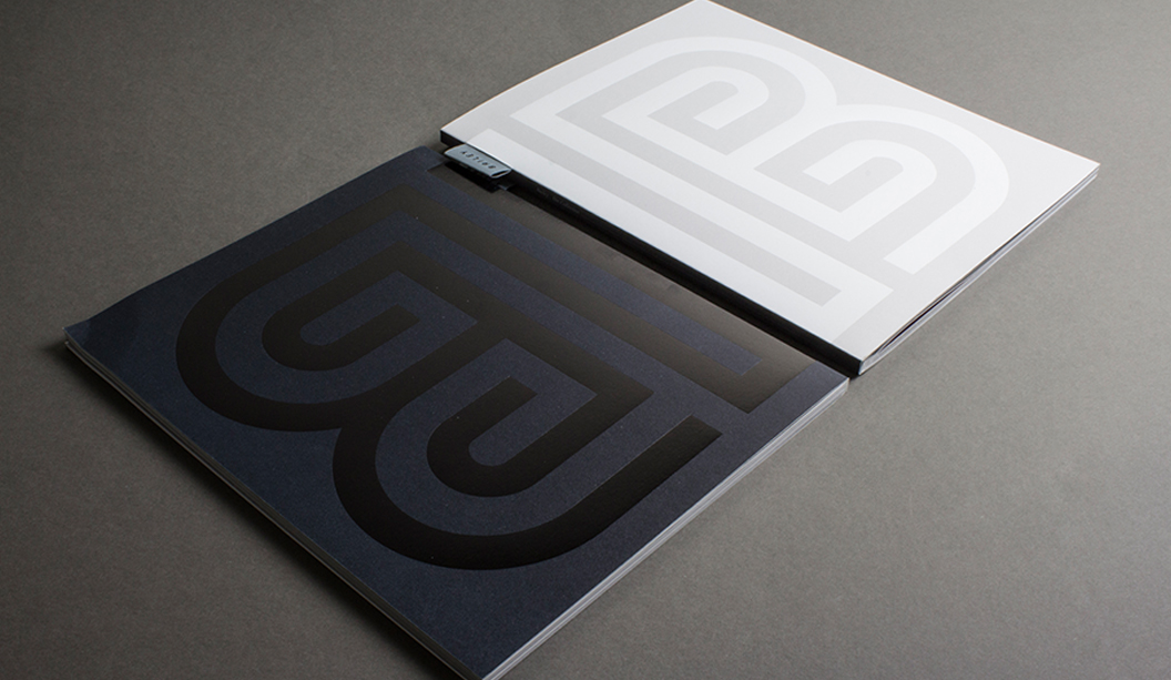
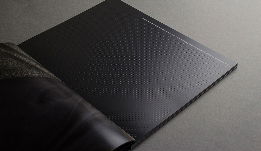
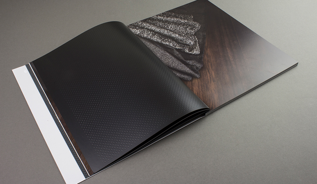
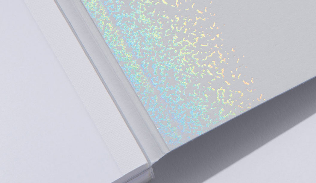
The bind design (2 + 3) uses a unique concertina fold to connect the two sections of the book together. The cover uses 350gsm Colorplan Cool Grey stock, on which a range of tactile embellishments have been employed including a multi-level emboss using a hand-carved sculpted die on the front cover (3), and on the back cover (4) a blind press using a foil stamping die without the counter die.

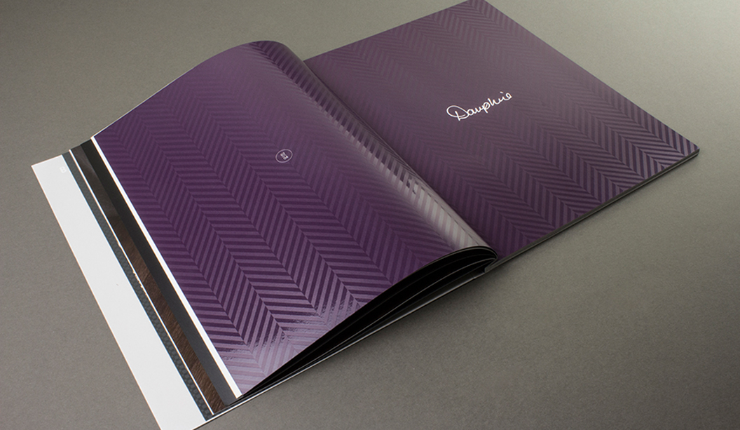
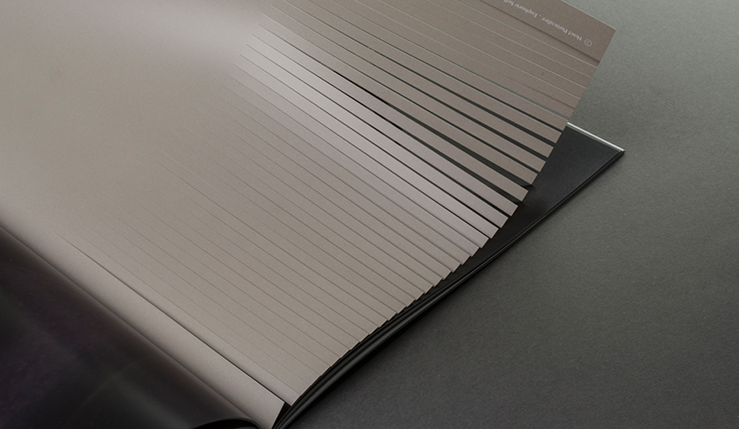
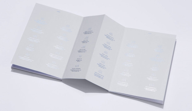
The inside front and back cover (5 & 6) use an API Foil (2004 / CL Clear Rainbow), and the spines and concertina fold (7) employ a blind deboss and foil. The index (8) is cleverly positioned at the centre of the book to make maximum use of the extra real-estate allowed by the open concertina fold, and was foiled using a blue metallic foil.

SD_3

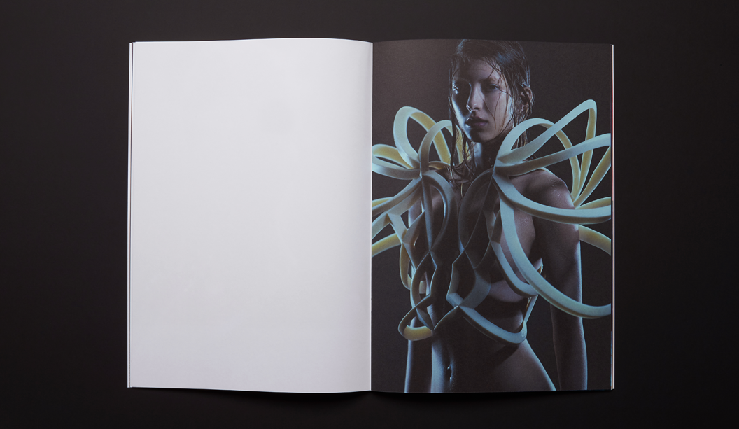
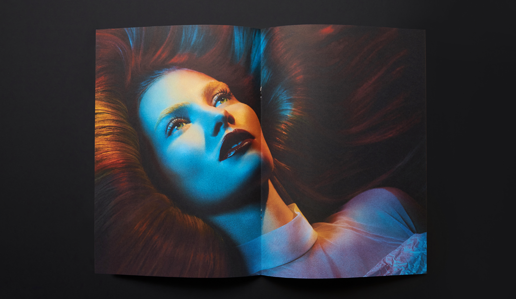
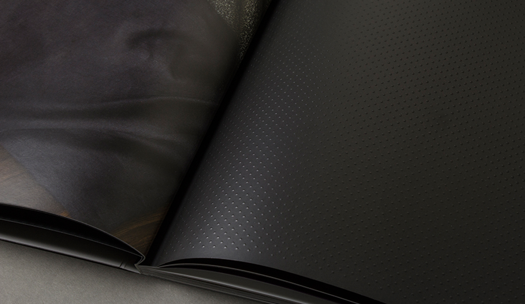
> The internal text pages of The Sub Divide were printed by the team at Bambra Press in CMYK, using Pacifica Inks throughout, on a Heidelberg XL75 12P
+ Aqueous Coater using Fuji Film CTP Processless Plates. Various screen rulings (specifically developed by Bambra Press) were selected to ensure the best possible result across each section of the book.

After 15 months of development from concept to production, The Sub Divide was officially launched in October 2016. A testament to the quality of the finished product, Grosz Co. Lab were recipients of a gold medal in the Print/Design Category at the recent 34th Annual National Print Awards.

For a more information on the production methods used in the project visit www.thesubdivide.bjball.com.au

Please direct any queries about The Sub Divide to Zaidee Jackson, Business Development Manager via zaidee.jackson@ballanddoggett.com.au

The Sub Divide featured photographers

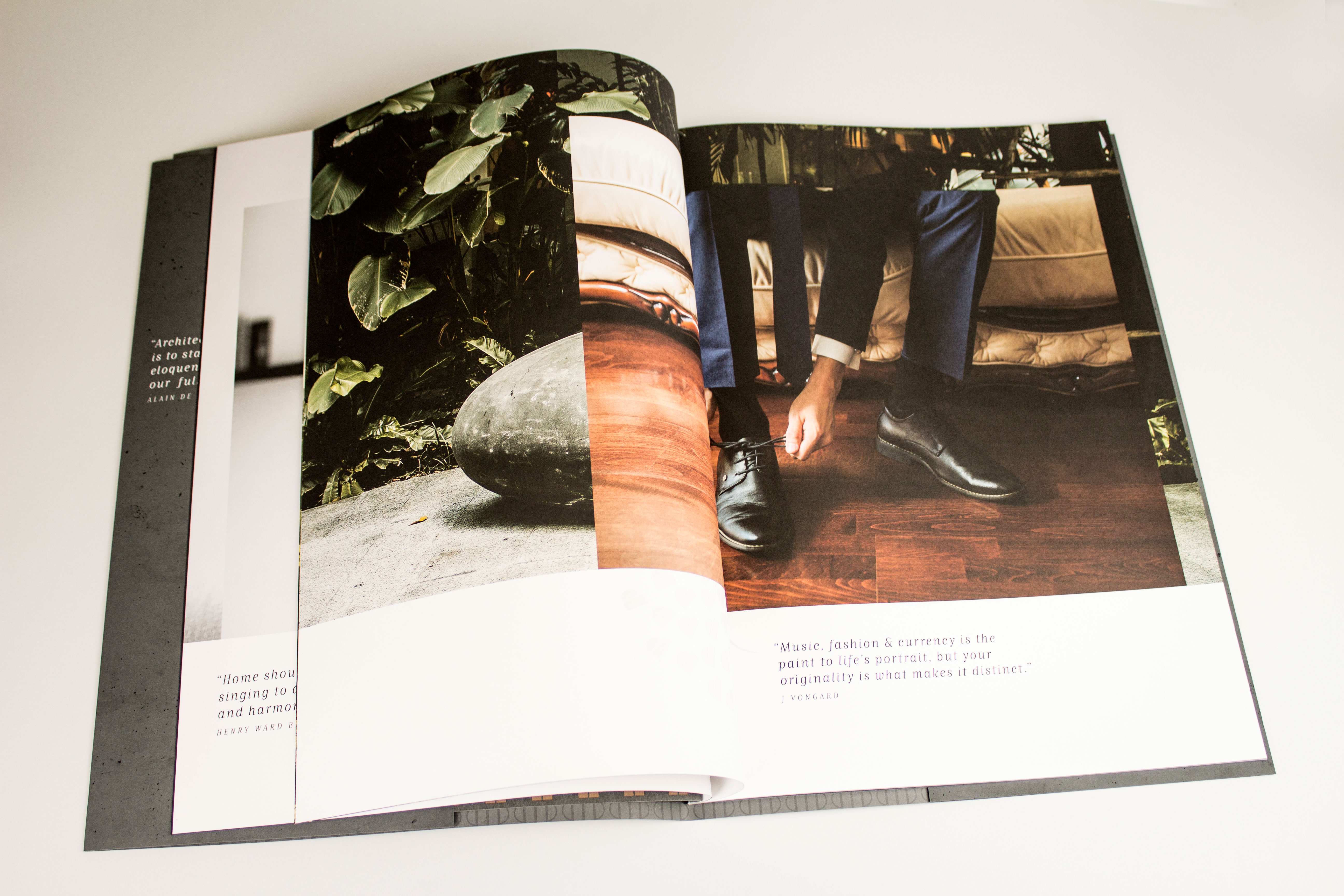
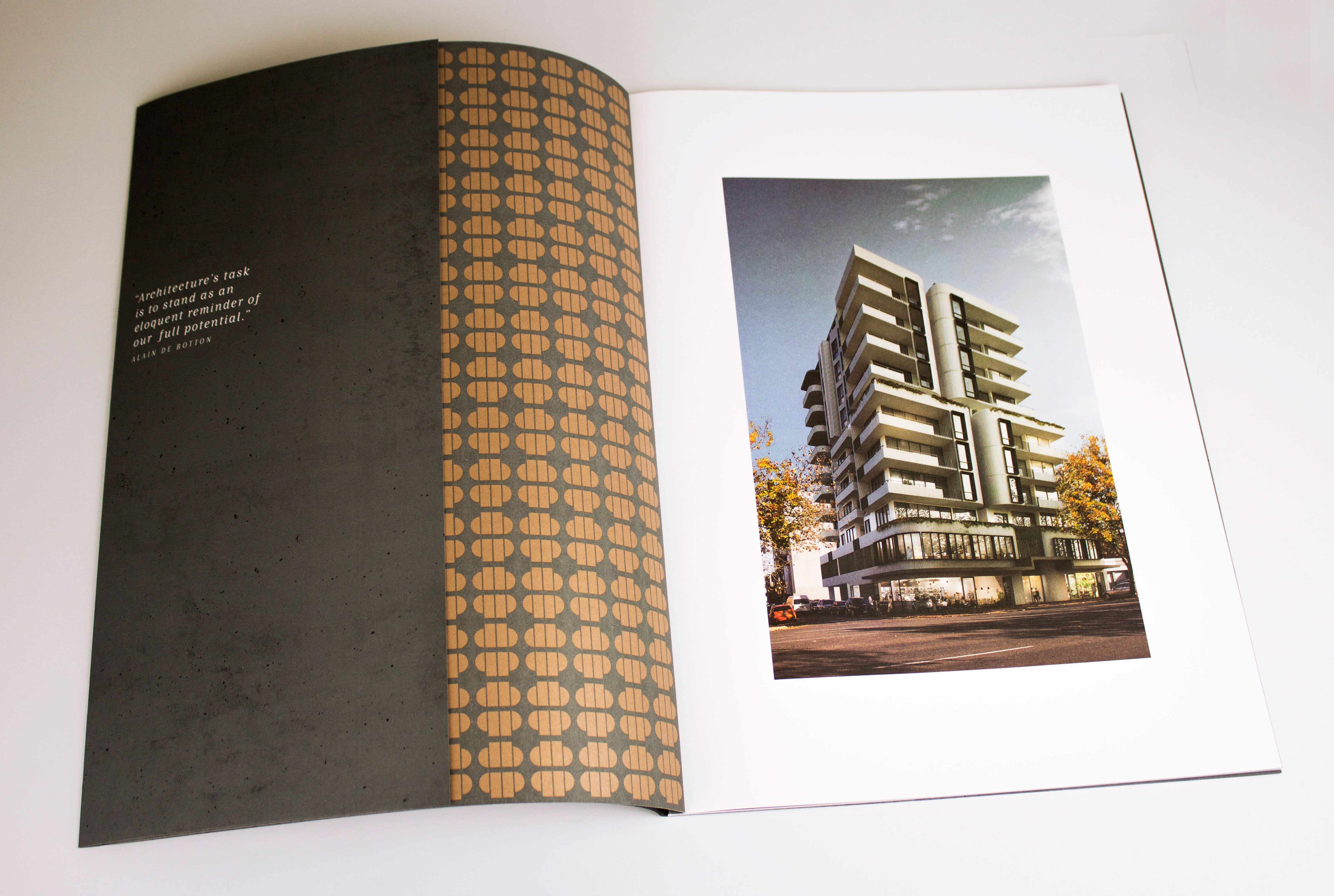
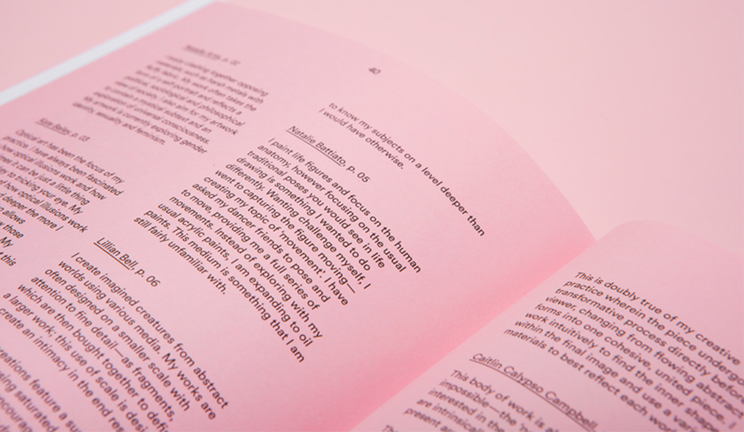
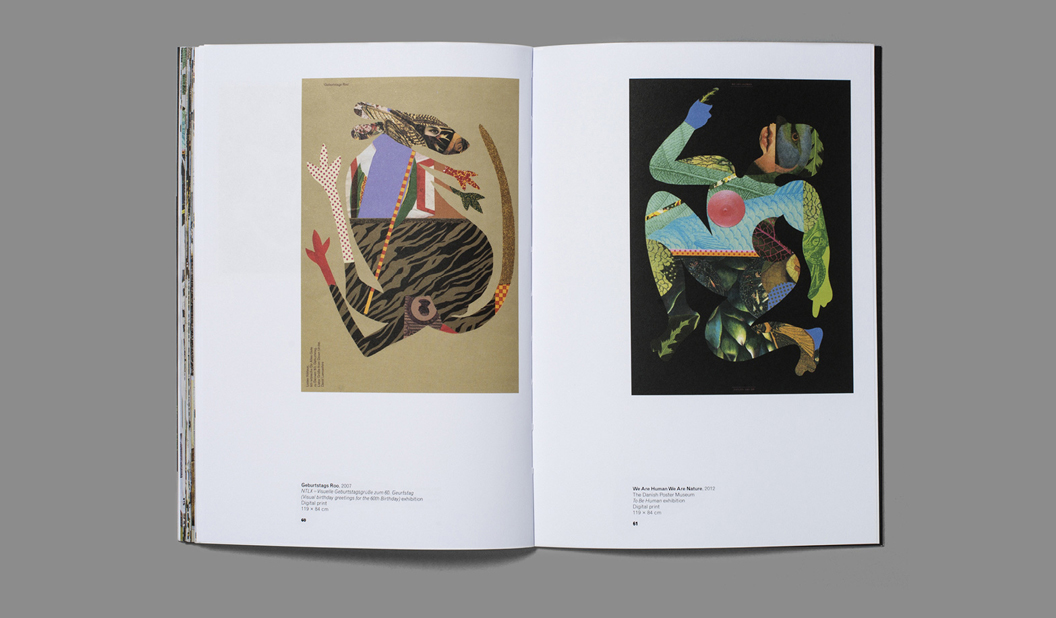
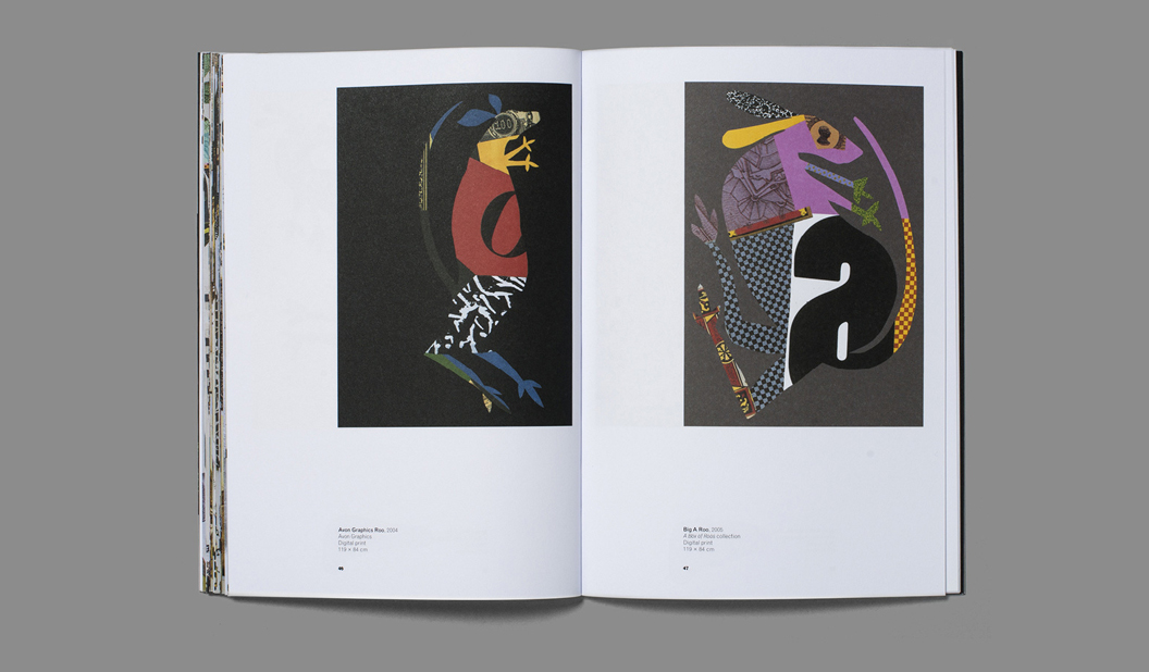
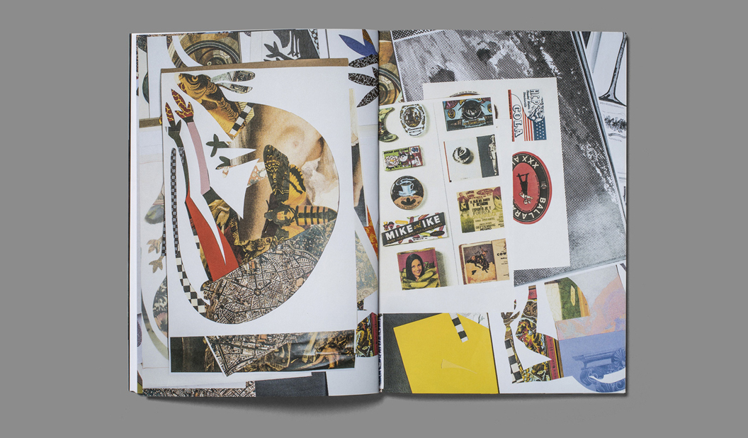
The Sub Divide features the work of 30 highly regarded Australian photographers. Published together for the first time, the photographers responded to catergorisations divided into two groupings. The first, a commercial response to ‘people’, ‘place’ and ‘pieces’. And the second category was a response to ‘passion’, exploring the photographer’s personal connection, depicted through their lens.

> Amanda Austin //amandaaustin.net
> Andrew Curtis //andrewcurtis.com.au
> Anna Pogossova //annapogossova.com
> Ben Glezer //beng.com.au
> Ben King //benkingphotographer.com
> Bonnie Savage //bonniesavage.com
> Brooke Holm //brookeholm.com.au
> Cecille David //cecilledavid.com
> Christian Blanchard //christianblanchard.com
> David Rosendale //davidrosendale.com
> Derek Swalwell //derekswalwell.com
> Dieu Tan //dieutan.com
> Eve Wilson //vevewilson.com.au
> Foliolio //foliol.io
> Fraser Marsden //frasermarsden.com
> Heather Dinas //heatherdinas.com
> Ingvar Kenne //ingvarkenne.com
> Isamu Sawa //isamusawa.com.au
> James Geer //jamesgeer.com
> Jamie Macfadyen //jamiemacfadyen.com
> Jeremy Blincoe //jeremyblincoe.com
> Justin Ridler //justinridler.net
> Lynton Crabb //crabb.com.au
> Mark Lobo //marklobo.com.au
> Peter Bennetts //peterbennetts.com
> Peter Greig //petergreig.com
> Shannon Mcgrath //shannonmcgrath.com
> Tim Jones //timjones.co
> Toby Scott //tobyscott.com.au
> Zoe Economides //zoeeconomides.com

This article was originally published in GSM Magazine, created by BJ Ball New Zealand.

Opus on Hutt St by Black Sheep Advertising

We love this marketing suite for OPUS on Hutt Apartments. Designed by Black Sheep Advertising in Adelaide for their client Proton Developments, the brochure emanates quality attention to detail and the business cards are just class.

OPUS (which means masterpiece), is a premium apartment development in the Adelaide CBD offering larger than usual apartments. Most places currently on the property market are substantially smaller in comparison. Plus, OPUS boasts all the dreamy bells and whistles like innovative integrated technology, premium finishings and fittings and a modern layout. Yes, we want to move in too. Get in line!

Creating a printed piece that stands out from the crowd is no mean feat. It practically has to yell your name and buy you a coffee to get your attention. Black Sheep Advertising have designed a clever marketing suite that is next level and reflects OPUS’s unique inner city living offering.

The burst bound brochure, printed on Knight Smooth, is over-sized and has a deliberate coffee table book feel. Black Sheep Advertising shares: “It was important to have print as part of our execution. Firstly, a functional reason – when people are looking to buy into a development it is important to be able to provide them with something to take home and return to multiple times.” The brochure’s dust jacket is treated with an all over soft touch Plasticoate laminate (it literally feels like it sounds) and a swish copper foil for the logo to add extra wow. The textures and colours throughout the brochure pick up on the architectural colour palette of the build.

The stationery and business cards are also printed on Knight Smooth. Again, the soft touch Plasticoate laminate and copper foil feature on the business card. Black Sheep mentioned to us: “When you hold the business card or the brochure in your hand, you can tell the project is one of quality and that sense is left with you after you put it down again.”

Find out more about the project which seeks to provide a quality of apartment living never seen in Adelaide before at www.opusonhutt.com.au

Brochure:
24pp + 4pp cover
Finished size: 416 x 306mm
Cover: PMS 425 (Grey) + Black + o/all matt sealer varnish (outer) + PMS 425 (Grey) + PMS 876 (metallic) + Black + o/all matt sealer varnish (inner)
Text: CMYK + o/all matt sealer varnish t/out
Dust jacket: PMS 425 Grey + Black + soft touch cello + copper foil / matt sealer varnish to inner
Stock: Cover: Knight Smooth 350gsm, Text: Knight Smooth 170gsm, Dust Jacket: 140gsm Knight Smooth

Business cards:
Finished size: 90 x 55mm
Front: Black + PMS 425 (Grey) + PMS 876 + metallic copper foil + soft touch cello
Back: Black + o/all matt sealer varnish
All four corners forme-cut round
Stock: Knight Smooth White 400gsm

Letterhead and with comps:
Letterhead finished size: 210 x 297mm
With comps finished size: 100 x 210mm
Front: Black + PMS 876 + o/all matt sealer varnish
Back: PMS 876
All four corners forme-cut round
Stock: Knight Smooth White 120gsm
Opus_3

Opus_5

Opus_2

Opus_6

Two rad jobs from Mildred & Duck

Two person design studio in Melbourne, Mildred & Duck, punch way above their small team weight. The team being Daniel Smith and Sigiriya Brown. Their branding job for Delores Butterball posted below, we recently featured in the ‘Snippets’ section of Spot, our first ever print publication. Speak to your paper specialist for a copy. And in the meantime, check out more of their awesome work on Instagram.

Title: Unfurl
Stocks: Curious Collection Skin Stone 270gsm, Knight Smooth Digital – Indigo White 160gsm, and Grange Tinted Bond Pink 80gsm
Print specs: Black metallic foil + CMYK
Printed by: Ellikon
Photography: Mark Lobo of Foliolio

The ‘Unfurl’ publication showcases the work of RMIT’s Visual Arts graduates. The publication was designed to unify the diverse range of works created across different disciplines. Mildred & Duck used a consistent grid structure to create a cohesive experience, and allowing for easy navigation. Housed within an understated black-foil exterior, the publication reveals a playful pink section containing the text pages.

Unknown-1

Unknown-2

Unknown-3

Unknown-5

Unknown-6

Unknown-7

Unknown

Stocks: Knight Smooth White 350gsm
Print specs: Raised verko + black
Printed by: Moule Print
Photography: Mark Lobo of Foliolio

Delores Butterball is a small batch baked goods stall serving cakes and cookies across Melbourne. Mildred & Duck created a visual identity for Delores Butterball that is bold and confident and can be easily applied to boxes and bags as needed without losing legibility. The oversized business card doubles as a with comps slip, with raised verko printing that looks like the texture of icing. Yum!


Blog-Delores Butterball-1

Blog-Delores Butterball-2

Blog-Delores Butterball-3


A raised or ‘multi-level’ emboss is next level

In our latest Knight campaign, we used a variety of print techniques. One of the most simple is the multi level or ‘raised’ emboss. A slightly different take on your standard emboss technique.
What is a raised emboss?

A raised or multi level emboss means the image or type area is raised to multiple levels to create a 3D type effect and in this case, with different depths.

What other kinds of embossing are there?
There is also blind embossing where you emboss the paper and leave it ‘as is’. The other option is to fill the indentation with ink or foil. You can also sculpt the die to have a bevelled edge which looks really good.

So it’s not a deboss?
That’s right, it’s not. A deboss means the surface is depressed instead of a raised impression which is what happens with embossing. So you inprint the image or type by pushing it into the paper (with embossing the impression is made from underneath).

Is it an expensive embellishment technique?
It can be pricey, depending on the area you want to embellish. The money is in the block that is made. So sometimes, if it suits the project, you’d get one block made and use it across different stationery items.

Is there anything I should avoid?
Make sure you allow for space in your design and also type, particularly with type because when your design is pressed into the paper, it will naturally appear closer together. For multi-level embossing use colour codes in your artwork to indicate various levels. Always best to speak to your printer before you deliver the files and find out how best to set them up. Also let them know what paper you are using.

Does it work better on some papers compared to others?
Long fibred papers don’t lend themselves too well to embossing but really, you can do it on both coated and uncoated paper with different results depending on the gsm, whether it’s textured etc. For example, an emboss may not turn out as deep on an coated paper due to a few things like the coating, but it still looks good. We used Knight Smooth Cream 250gsm in our promo and it worked a treat.

Do most printers do this type of work?
Some printers offer this service and usually, it’s the services of an embellisher you would seek. We used Avon in VIC in the case of the Knight promo. Call your paper specialist for the heads up on embellishers in your area.

Knight-11

Knight-7

Knight Smooth Cream 250gsm
• Foil produced by Avon
• Multilevel emboss with foil. 2 passes.
• Matt Gold 25

‘Strength and Beauty’ Knight Promotion 2016.

Title: Knight campaign 2016 ‘Strength and Beauty’.

Agency: Three60 (VIC).
Client: K.W.Doggett Fine Paper.
Stocks: Knight Vellum / Knight Textures – Hammer / Knight Smooth White / Knight Smooth – Cream
Print specs: Dust jacket, cover, text, x4 postcards.

Dust jacket: Knight Vellum 100gsm.
• 6 colour printed Dust Jacket in one pass on Heidelberg A1 press
• Conventional offset
• 2 spot colours are Pantone Purple and PMS 375
• The rest of the channels in the artwork are process CMYK.
• We swapped out the standard process colours for more vibrant options of:

– Swapped process cyan for ‘Process Blue’
– Swapped process magenta for ‘Rubine red
– Swapped process yellow for ‘PMS 012’

Cover: Knight Hammer 280gsm with Knight 140gsm ‘gold inlay’.
• No print
• Copper Staples done by Bambra
• Gold inlay in two foils over the top of each other
• Base foil is Matt Gold 429
• lmage foil Is Dark Mirror Gold 425
• Hammer cover has been debossed to fit gold inlay

Text: Knight Smooth, Cream 140gsm, Knight Smooth, White 140gsm, Knight Vellum, 140gsm.
• CMYK print throughout
• Pages 22/23 have bump plate 021U
• Page 18/19 we 3D printed that piece of futuristic armor. Designed by RMIT student Amelia Agosta and printed in Melbourne by 3D objective
• Text is printed with a 400 Hybrid Screen. Part line screen and part stochastic

Postcards:

#1 Knight Smooth Cream 250gsm
• Black print only.
• Foil produced by Avon
• Multilevel emboss with foil. 2 passes.
• Matt Gold 25

#2 Knight Smooth White 400gsm
• CMYK conventional offset GTO Anicolor

#3 Knight Indigo, Vellum 325gsm
• CMYK Indigo 7500

#4 Knight Linen 350gsm
• CMYK conventional offset GTO Anicolor

Belly band and sticker:
• Curious Translucent 90gsm
• Jac Serilux black vinyl 30mm


Knight-2

Knight-1

Knight-6

Knight-5

Knight-4
Knight-3

Knight-12

Knight-7

Knight-11Knight-8

Knight-9

Knight-10

Knight-Belly-band1

Bijou property book by Hoyne (NSW)

Title: Bijou.
Agency:
 Hoyne (NSW). 
Stocks:
 Keaykolour Black 300gsm (cover) Keaykolour Ultra White 170gsm (text).
Printing specs: High Build Spot UV on the entire outer and inner cover + copper foil logo on front/back
Print managed by: Green & Gold.

With the boom in property development seeing no sign of slowing down just yet, we bring you yet another stunning piece by Hoyne in NSW for the Bijou development. Led by developer MADE and SJB interiors, the former Bijou Theatre in Balmain is being adapted to create 29 apartments that will exude style and panache.

The whole of Balmain exudes a feeling of nostalgia and charm with its colonial sandstone buildings, Victorian institutions and small workers cottages set among leafy streets. The Bijou itself is a robust art deco building well recognised by locals.

The entire brand identity developed by Hoyne references the art deco heritage of the building in a contemporary style. And the campaign features a script reminiscent of retro movie credits and theatre posters that points to the building’s past life as a theatre and cinema. What’s old is new again.

Hoyne chose Keaykolour Original mainly for its texture. As Leesa from Hoyne adds: “This project was all about the art deco influences, so we wanted a paper that felt vintage but lush.” It’s a great pairing and another fabulous example of how the right paper complements the design.

We really do see a lot of property pieces come across our desk and it’s great to see considered pieces like this one. Some simple embellishments, great design, print and paper choices has set this piece apart from others we’ve had come across our desk. Kudos.

Bijou-1

BIJOU-PROPERTY-MAG-3

BIJOU-PROPERTY-MAG-2

BIJOU-PROPERTY-MAG-SPREAD-4

BIJOU-PROPERTY-MAG-SPREAD-3

BIJOU-PROPERTY-MAG-SPREAD-2

BIJOU-PROPERTY-MAG-SPREAD-1

Bijou-3

David Lancashire x Doggett

Designer: David Lancashire VIC. 
Stock: 
Wild 450gsm (invite) and Wild 150gsm (envelope).
Printing specs: Blind emboss, foil and letterpress.
Printed by: Watermarx Graphics (blind emboss, foil and letterpress). Envelope printed by Social Printing. Both in NSW.

This story comes in two parts and is really, mainly, about the great man himself David Lancashire. Not only can we thank David for the doggie branding he created in the 90s waaaay back when MC Hammer pants were cool and bum bags were an accessory of choice, he also custom illustrated our Christmas card this year. Being our 40th year in the paper biz, we thought it fitting David designed our Christmas card.

Each pooch represents one of the Doggett’s that work in the business today. Ken (Director), John (Director), Simon (Managing Director), Nathan (National Sales Manager), Heath (Sales Manager, Victoria) and Catherine (National Marketing and Sustainability Manager) holding the star.

We used Wild for the card, a 35% cotton paper combining softness with strength, a luxurious feel and very high bulk. The 450gsm card is printed with a blind emboss and foil on the front, letterpress on the inside. The 150gsm envelope features a blind emboss of ‘poodle and fatty’ (more of our doggie branding). Embellishments and Wild go together like brandy sauce and Christmas pudding (cue tummy grumbling).


Xmas-2015_1

Xmas-2015_3

A conversation with David:
We wanted to celebrate David’s history and career too, so we sat down and had a bit of a chin wag. Here’s how it all started…

A young David Lancashire came to Australia as an 18 year old 10£ pom in search of sun and adventure. At first he found work on the factory floor and production line of Weyland Motors. Hardly adventurous for him! David soon realised that he was not cut out for such a repetitive job and after two long weeks quit in search of something ‘creative and stimulating’. He found his way to Claret St Studio, in Vogue House in Sydney. He stayed there for a few years before a driving trip back from Adelaide saw him pass through Melbourne. He decided Melbourne was a pretty good place to try. He drove in his Land Rover straight from Sydney to the doors of Art Associates, brushed off his folio and walked in and asked for a job. He started that day.

DLD_1

DLD_2

DLD_3

DLD_4

DLD_5

Flash forward 10 years and David started his own studio and began working for lots of big names including Spicers and Daltons paper. Ken Doggett saw the great work David had been doing and approached him to revamp the Doggett branding. At first David said no due to a conflict of interest! But Ken persisted and David eventually came around to see the potential.

He pitched the idea that our funny name should be highlighted to create a memorable campaign. Ken and now John were NOT keen. Names like dogs body, dogs s**t were commonly thrown around at school and they didn’t plan to bring more attention to it. But David presented the concept of ‘Doggett’s take the lead’ and illustrated our first dog. It was a big hit with the staff and customers and from there the concept took off.

DLD_Dog

The purple, green and orange corporate colours came next. “The other merchants all had very traditional branding, Doggett’s were the new kid on the block and we needed to stand out. Purple certainly did that!” said David.

“The swatch kit came next, based around the theme of ‘the dog ate my shoe’ with each one representing the different papers. We sourced some great old shoes from the powerhouse museum and included even some of my families old shoe.”

And of course there’s the 266 PMS purple iconic doggie trucks. We thank our lucky stars that David pitched the idea to wrap our trucks and often when we tell people where we work they say: “Oh you work at that place with the purple trucks.” They’re hard to miss!

Doggett-truck

That’s a wrap. Thanks to everyone for your continued support in 2015 and we wish you a joyful and festive summer.

Ho, ho, ho and woof!
Love us.

McKellar X Doggett for #themakeproject

We always say it’s not about our paper, it’s what you do with it. And you’ve got to admit, this is a pretty rad example of taking paper and making it pop. The project concept itself is also pretty damn rad. McKellar Renown Press have been running The Make Project for a while now, each month releasing a new print piece that showcases design, print/embellishments and paper, direct to people’s mail box. Yes, that’s right. a DM piece. Who would have thunk it in this ‘digital age’.

MK-2

The offset printed combo is Knight Smooth White 400gsm on the outer with Pop’Set Cosmo Pink 320gsm in the middle. We love the Kate Pullen Draws illustration and the hint of gold foil bling. It doesn’t take a lot to just print something, but it does take the attention and skills of a printer who cares, to make a piece look this good. We’re loving the installments of #themakeproject so keep em coming McKellar Renown!

MK3

MK-4

Bailey catalogue by Hoyne Design

Title: Bailey
Agency: 
Hoyne Design (VIC)
Stocks: 
Curious Matter Goya White 270gsm, Sovereign A2 – Silk 150gsm and Strathmore Premium Enhance Ultimate White 118gsm.
Printing specs: Offset printed plus clear gloss foil, black gloss foil, spot gloss UV, embossing, die cutting and laser cutting.
Printed by: Bambra Press (VIC).
Design and photography@lyntoncrabb. 

The latest Bailey Luxury Bedding catalogue by Hoyne Design really is a work of art, showcasing the best of the best in layout, photography and print production. One flick through its pages and you’ll be wanting to deck-out your bedroom in their beautiful, sumptuous bed linen which includes throws, pillow cases, sheets and duvet covers.

Bailey-2

Hoyne Design did a stellar job of creating the catalogue using subtle, beautiful details like the satin material tag on the spine, embellishments and use of textured and glossy papers. It makes flicking throug the catalogue a really interesting, tactile experience and tunes into the right senses. The enviable list of embellishments include a clear gloss foil, black gloss foil, spot gloss UV, embossing, die cutting and laser cutting. It’s no wonder they were nominated as an AGDA Award finalist (Design Craft category) this year. The cover is printed on Curious Matter Goya White 270gsm plus Sovereign A2 – Silk 270gsm and Strathmore Premium Enhance Ultimate White 118gsm for the text. 

The Bailey brand has quite a story to tell too. A bespoke bedding manufacturer, they partner with top craftspeople from around the globe to create their collections. To produce Bailey’s Belgian linen for example, they worked with masters of linen – who move the flax into the factories, make the yarn and undertake the finishing. Italian weavers from the historic milling town of Biella are chosen for their reputation in producing high quality wools and yarns. Mills nestled in the north east of Scotland produce Bailey’s cashmere throws. If you like the sound of this, visit their site for more juice. It’s a pretty amazing story.

Interested in getting a look-see at the exceptional printed piece that is the Bailey catalogue? Please contact your friendly paper specialist.

Bailey-9

Bailey-8

Bailey-7

Bailey-6

Bailey-5

Bailey-4

Bailey-3

Bailey-10

Latest Rives promo ‘snail mail’, by Ortolan

Title: Sail mail
Agency: 
Ortolan (VIC)
Stocks: 
Rives Design Bright White 120gsm, Rives Tradition Bright White 120gsm, Rives Tradition Digital Bright White 250gsm, Rives Design Bright White 350gsm, Rives Tradition Pale Cream 320gsm, Rives Design Natural White 350gsm, Curious Translucents 92gsm and JAC Brilliant Gloss White.
Printing specs: Offset and Digitally printed.
Printed by: Mercedes Waratah (offset), Press Print (digital) and JBS Printers (stickers). All in VIC.

‘Snail Mail’, celebrates the idea of love letters, intimate notes and whimsical celebrations. It’s no surprise we are lovers of paper in all varieties so it’s been a real treat to work on this promo that showcases the Rives range. It’s sure to inspire the inner romantic in you all, it certainly has with us!

Created by the super talented team at Ortolan, in particular Kat Macleod and Holly Canham, the Rives stationery set showcases the versatility of the range. There’s a mix of Design and Tradition, printed both offset and digital, with wrapping paper and A5 envelope printed on Curious Translucents for something a little different. We couldn’t go past adding some stickers to the set, printed on JAC Brilliant Gloss White

This beautiful piece features delicate hand painted scenes of flora and fauna dotted with silver foils, a blind emboss and little die cut bite marks that ties each of the applications together in a delightful combination. We can even imagine seeing this illustration printed as bespoke wallpaper or as a textile pattern for Gorman’s new spring range. 

Rives’ premium surface is engineered for beautiful colour reproduction and because we were working with watercolour and illustration, without the complexities of skin colours and hi-end photography, the print experience was a dream. Rives is ideal for all kinds of contemporary communications including stationery, annual reports, cards, direct mail,  envelopes, menus, packaging, swing tags plus much more.

Rives_3

 Printing specs:

  • Transparent envelope: Curious Translucents 92gsm, printed CMYK offset by Mercedes Waratah.

  • Belly band: Rives Design Bright White 120gsm, printed offset PMS489 (peach) by Mercedes Waratah.

  • Wrapping paper: Curious Translucents 92gsm, printed CMYK offset by Mercedes Waratah.

  • Writing paper: Rives Tradition Bright White 120gsm, printed CMYK offset by Mercedes Waratah.

  • A5 tech spec card: Rives Tradition Digital Bright White 250gsm, printed CMYK plus silver foil on a HP Indigo by Press Print.

  • Stickers: JAC Brilliant Gloss White, printed offset by JBS Printers.

  • A6 cards:

    – Card 1 (leaf): Rives Design Bright White 350gsm, printed CMYK offset plus diecut by Mercedes Waratah.
    – Card 2 (blind emboss): Rives Tradition Pale Cream 320gsm, blind emboss plus diecut by Mercedes Waratah.
    – Card 3 (butterfly): Rives Design Natural White 350gsm, printed CMYK offset plus silver foil by Mercedes Waratah. 

  • C6 envelopes:

    – Envelope 1: Rives Design Natural White 350gsm, printed CMYK offset by Mercedes Waratah. 
    – Envelope 2: Rives Design Bright White 350gsm, printed CMYK offset by Mercedes Waratah. 
    – Envelope 3: Rives Tradition Pale Cream 320gsm, printed CMYK offset by Mercedes Waratah. 


A bit about Rives:

The Rives range made by Arjowiggins is all about the tactile experience of paper with textures inspired by the craftsman’s hand. The Tradition surface has a subtle and modern, refined felt-like finish. The Design features a fine mesh texture. This timeless and elegant range is also available in Design Digital and Tradition Digital – both Indigo compatible sheets in 120gsm. Rives Design and Tradition are available in 120-350gsm.

We suspect you’ll be itching to get your hands on these beauties but rest assured your friendly paper specialist will be by soon with a copy especially for you. Remember, you can always visit this part of our website for more information about this range or explore our new ‘Colour wall‘ to see the real deal. Enjoy!

Rives_1

Rives_4

Rives_10

Rives_5

Rives_6

Rives_7

Rives_8

Rives_9

Rives_2