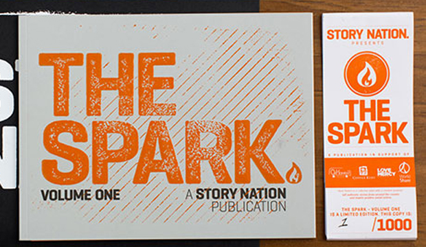
Title: 2012 HannoArt promotion – strum a chord for a legend
Agency: David Lancashire Design (VIC)
Client: K.W.Doggett Fine Paper
Stocks: HannoArt – Gloss / HannoArt – Satin
Printed by: Southern Colour (VIC); folder laminated by The Laminating Company (VIC).
“The time I burned my guitar it was like a sacrifice. You sacrifice the things you love. I love my guitar,” Jimi Hendrix. Ok, so does that mean we need to burn paper to prove we love it? We figured a bonfire in the back of the warehouse would most likely breach an OH&S rule. A paper promotion seemed a much safer option!
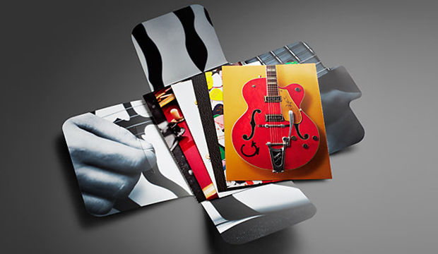
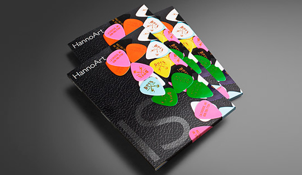
In our latest HannoArt promo, we pay homage to the worlds of music and paper. We added an educational twist by including tips about grain direction, colour, printing with blacks, stochastic/conventional line screen and also ink limits. Not to forget the awesome colour and visuals. We really wanted to showcase how well HannoArt handles solid colour and sharp detail. We pondered, we collaborated (with David Lancashire Design in Melbourne), we held production meetings (with Southern Colour in Melbourne) and fleshed out ideas over and over to come up with a promotion that uses achievable print techniques and includes technical information.
This post is going to provide you with some tips and insights into a few of the cards we printed. If you’re not keen on reading any of this, thanks for being here or call your rep and ask them for an in person demonstration. Soak up their technical knowledge!
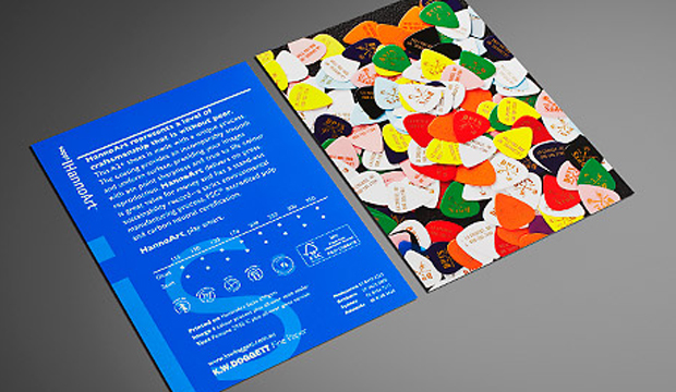
The spot matt etch, which appears on the front cover is probably the only technique that isn’t offered by a majority of printers. We firstly printed the cover with the fluoro pink, then had it laminated. The spot matt etch was done in a second pass. It’s a matt varnish technique has been applied to the black leather grain area only, leaving the glossy laminate to shine on the plectrums and the ‘IS’.
We purposefully designed some of the cards to be a comparator. The 4pp ’56 Gretsch Atkins card, is one of these. The left image is printed 4 colour process with all over gloss varnish. For the right image, we added a Pantone 877 Silver and spot OP matt and spot OP gloss varnish. We then perforated the card so our customers had the option to take one with them to a meeting and potentially leave one with their client. Now, there’s nothing wrong with the 4 colour image – it looks really good actually. But you can tell the difference with the contrasting card. The silver brightens up the bridge of the guitar, and the varnishes make the guitar pop off the page.
We used Pantone 2935 C for one card because it’s the HannoArt blue. This is such a tricky colour to print with and can be really challenging. The result shows how there is no mottling on the paper which is a really good result. No extra pressure was used for this card but we did use a stochastic screen to produce crisp, clean edges in the small logos and tiny type. Gloss varnish was used to seal in the colour better.
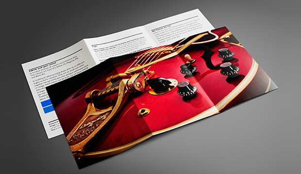
We’ve got an unofficial favourite – the 6pp red guitar. We tricked this one up on purpose. It was good for us to see what difference the Pantone Rubine Red C bump plate could make with this type of image. The body of the guitar just looks so much brighter and richer with it. And the Pantone Silver underlay boosts up the hardware. On the back, there are tips on colour, so we replicated a small square of the Pantone Blue with a CMYK blue to show the difference. It’s pretty obvious, the difference, and handy to know the compromise you’ll make if budget doesn’t allow for a PMS.
The final card in the pack shows three images – a 4 colour b&w stochastic, monotone stochastic and monotone conventional. On the reverse we have printed three blacks. The 4 colour b&w printed stochastic is a stand-out in this set, a much warmer black. On the reverse, we’ve show just how different stock looks with a varnish, we printed each card with a strip of satin sealer, gloss varnish and then no varnish. We perforated this card as well so you can compare the blacks next to each other.
You may recognise the images we’ve used are from the 2010 promotion Sappi released called ‘Dave’s Guitar Shop’. In Wisconsin USA, Dave’s famed guitar shop houses a rare collection of guitars by legends like Gibson, Fender and Gretsch and other music legends. This place is apparently a mecca for guitar lovers from all over. As an extra bonus, we have a Dave’s Guitar Shop plectrum in the promos! Just like the iconic instruments at Dave’s, HannoArt bears the hallmarks of quality and craftsmanship.
Printing specs:
Folder (outside): Satin 250gsm, 4 colour + Pantone 806 C (plectrums). Spot matt etch. All over gloss laminate.
Folder (inside): 4 colour black and white image, matt laminate.
Card 1: 2pp, Satin 350gsm.
Text: 4 colour process plus all-over satin sealer.
Image (close-up of the Dave’s 25th anniversary guitar) : 4 colour process + all over gloss varnish.
Card 2: 2pp, Satin 350gsm.
Text: 4 colour process plus all over gloss machine varnish, Pantone 2935 C.
Image (branded plectrums from the front cover): 4 colour process. All-over satin sealer.
Card 3: ’56 Gretsch Atkins. 4pp, Gloss 300gsm.
Left image: 4 colour process. All-over gloss varnish. Perforation at 6 TPI (teeth per inch).
Right image: 4 colour process. Spot Pantone Silver (first pass). (Second pass) Spot OP gloss varnish over the guitar and spot OP matt varnish over background to create a contrast. Black plus all over gloss varnish.
Tip: Ink limits.
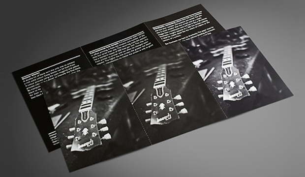
Card 4: Three Fender Telecasters from the 50s. Gloss 170gsm.
Image: 4 colour process. All-over gloss aqueous varnish. Scored and folded.
Text: Black plus 2 hits Pantone Silver 877 C. All-over gloss aqueous varnish.
Tip: Grain direction.
Card 5: 60s Gibson ES 355. Gloss 250gsm.
Image: Pantone Silver (separation). First pass. 4 colour process. Second pass. Pantone Rubine Red C (separation). Bump plate in second pass. Spot OP gloss varnish on timber areas.
Text: Black plus all-over gloss varnish. Left card has two squares: PMS 2935 (same as the blue on card 2) – CMYK (which shows the nearest match you can get using a CMYK breakdown).
Tip: CMYK and spot colour.
Card 6: Satin 250gsm. 6pp.
Image (left): Black monotone printed stochastic. FM screen, 20 microns. Satin sealer.
Image (middle): Black monotone printed conventional. AM screen, 200 lines per inch. Satin sealer.
Image (right):4 colour black and white, printed stochastic. FM screen, 20 microns. Satin sealer.
Text (left. Tip – Better blacks: 4 colour black. K100 with underprint of C40, M20, Y20.
Text (middle). Tip – Conventional line screen: Dense black.
Text (right). Tip – Stochastic screening: Standard process black.
Varnishes Each text card has three varnishes applied to it in columns. First column is gloss varnish, then satin sealer then no varnish.
 Footy Tips