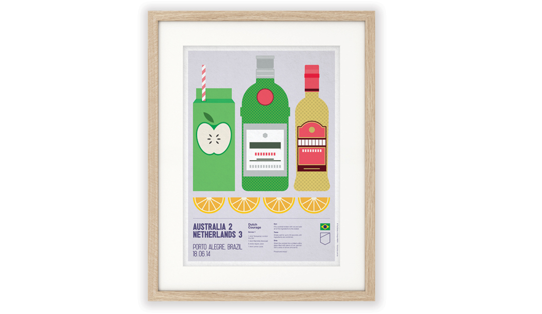
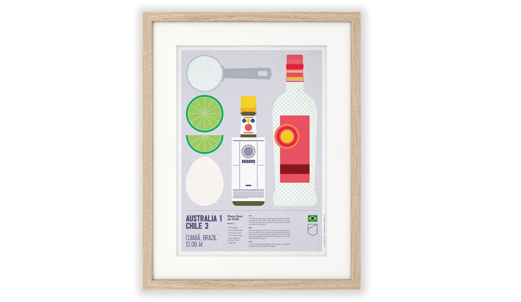
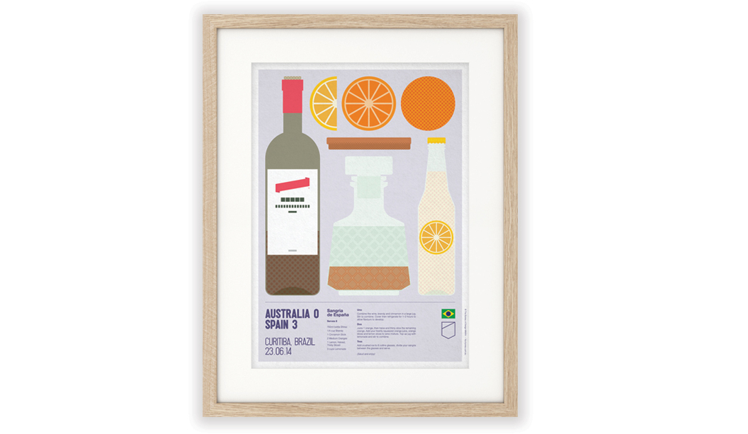
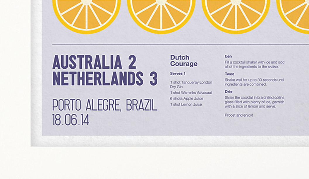
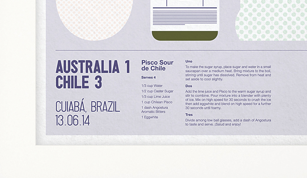
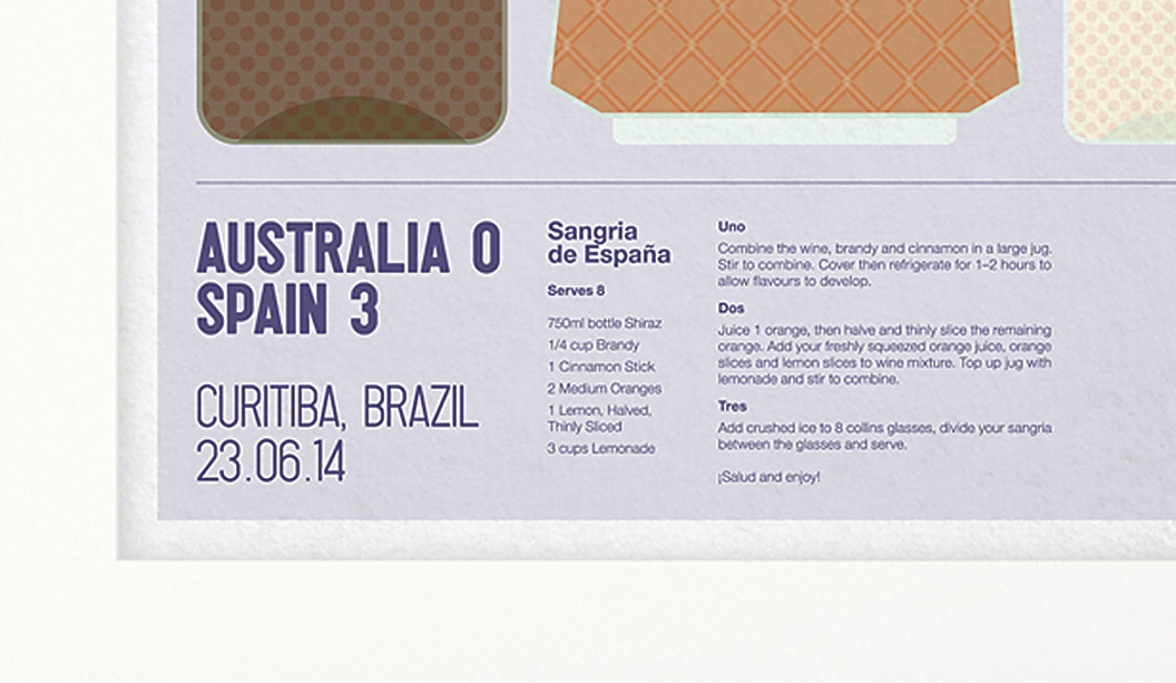
Maine Recycled 2015 campaign ‘capturing beauty’, by Thursday Design.

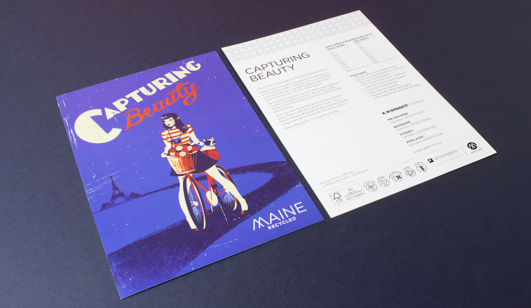
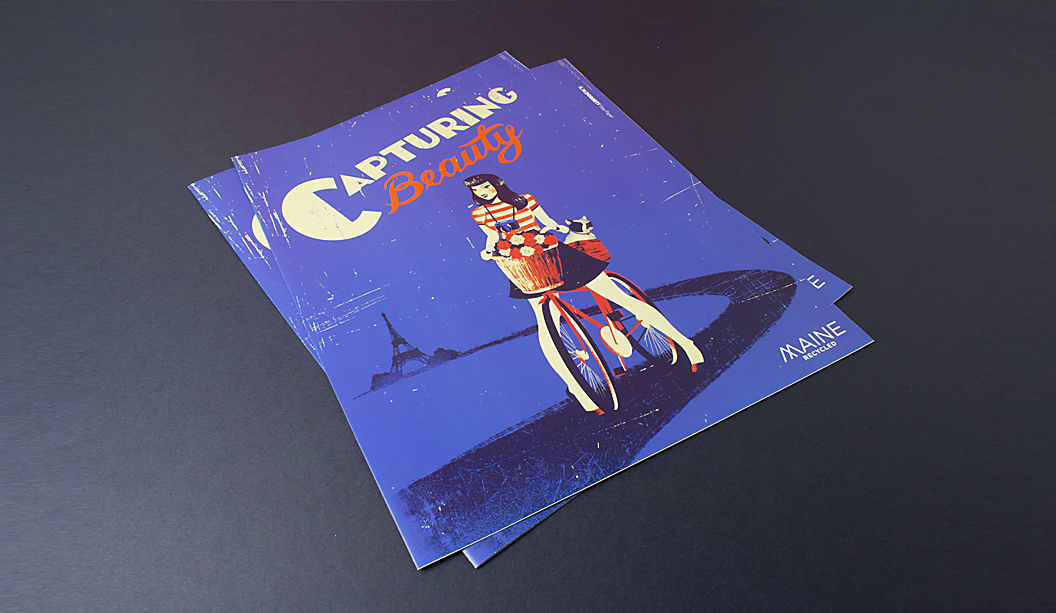
Title: Capturing beauty.
Agency: 
Thursday Design (NSW).
Stocks: 
Maine Recycled Silk 150gsm (brochure) and 350gsm postcard.
Printing specs: Offset, CMYK, drytrap gloss varnish, PMS877 and all over satin varnish.
Printed by: Oxygen (NSW).

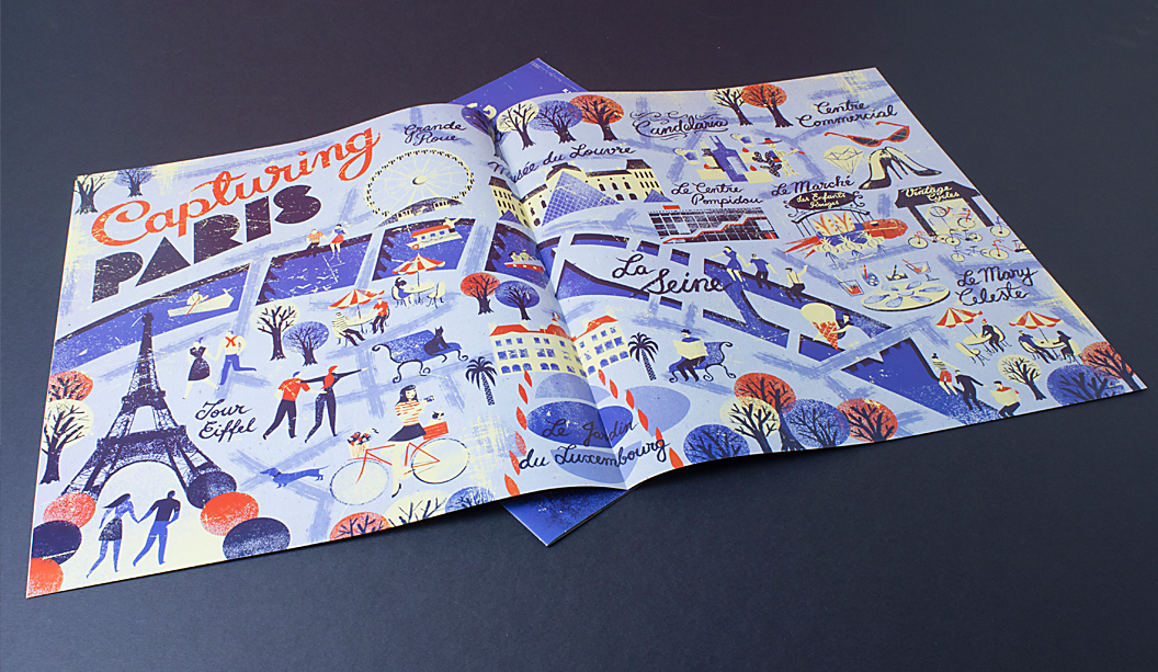
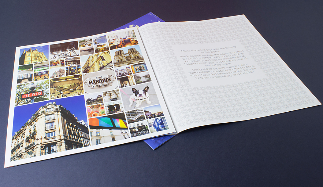
This is the third incarnation of the ‘Maine girl’ and quite possibly our favourite. We’ve worked with Thursday Design in NSW and Christopher Nielsen for many years on the Maine Recycled campaigns and we love the chance to collaborate with them. This year’s added bonus of a Paris map, showing some of the Maine girl’s stops in her daily travels, is an absolute, hands down winner.

‘Capturing beauty’ is the tagline for this year, following on from ‘A beautiful journey’ and ‘A natural beauty’. In 2015 our aim was to bring attention back to Maine Recycled’s fantastic environmental credentials.

The tagline ‘Capturing beauty’ stands for many things, whether it’s capturing beauty in the world, every day moments in Paris as the Maine girl cycles around with her trusty French bulldog in tow. It also represents the print qualities of Maine Recycled, a bright white sheet that captures colours beautifully.

Maine Recycled has a truly amazing environmental story to tell. It’s made with 60% FSC certified recycled fibre which is all post consumer waste and it’s also certified carbon neutral. The French mill that makes the sheet is conscious of its community, reducing its environmental footprint each year.

Rather than tricking up the promotion, we wanted to show how the paper prints with CMYK which is how most people are going to use it. To demonstrate how it handles embellishments we added a silver PMS 877 on the inside covers and a drytrap varnish on two pages. More on drytrap as a technique below.

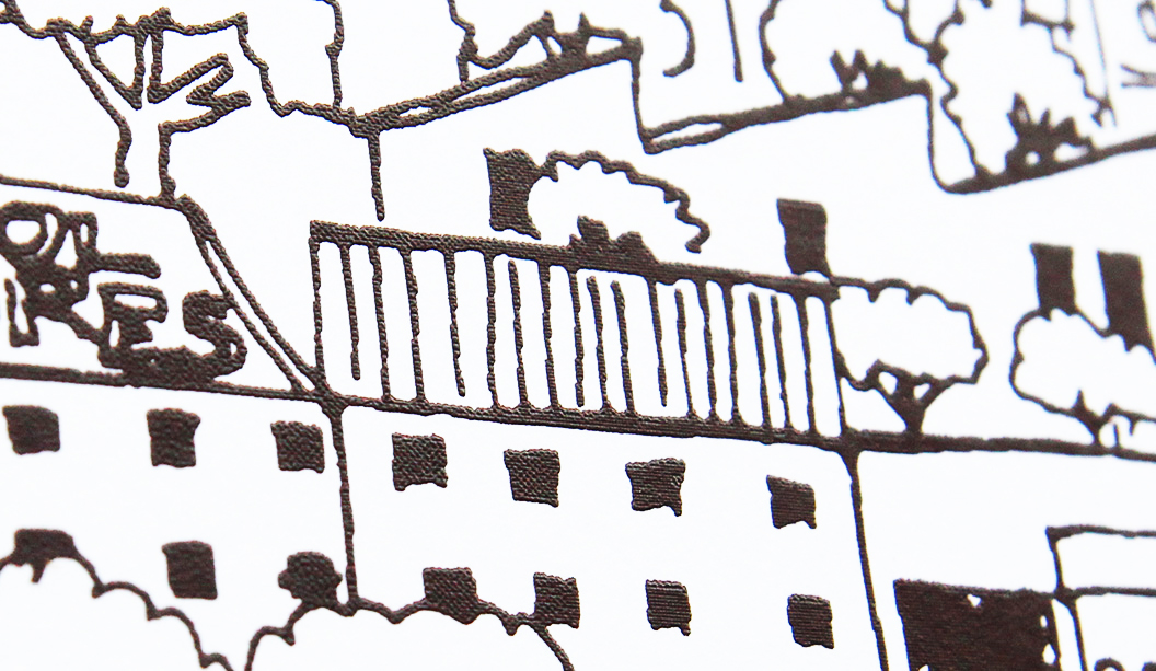
Drytrap varnish technique
This technique involves printing the coloured inks first then allowing the paper to dry before going back through the press to print the varnish. Doing this provides better hold out and less absorption of the varnish into the ink. It can be executed by any printer as it only requires a standard varnish plate. We used two hits of the varnish on the Silk stock for extra oomph. On a Gloss stock, you’d probably only need one hit. It’s a good technique to use for art catalogues, high end property jobs or appliance catalogues when you want to life an image off the page. And it’s not very expensive either.

Carbon offset program
Maine Recycled has a new carbon offset program, the Acre Amazonian REDD+ project in Brazil. You can watch the video on our YouTube channel.
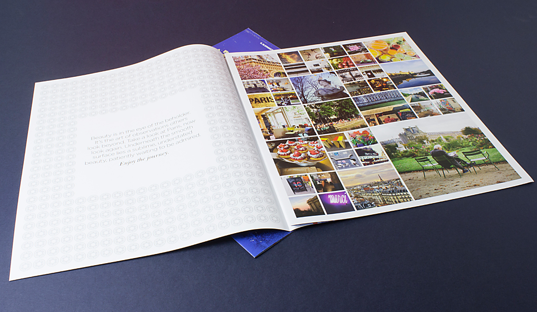
Photography
Thanks to the following people for their reportage style photographs! We loved seeing Paris through your eyes. In no particular order: Elisa Balaresque, Sean Conaty, Catherine Doggett, Georgia Hopkins.

For any further information on the promotion, speak to your trusty paper specialist.

Maine_1

Maine_2

Maine_3

Maine_4

Maine_6

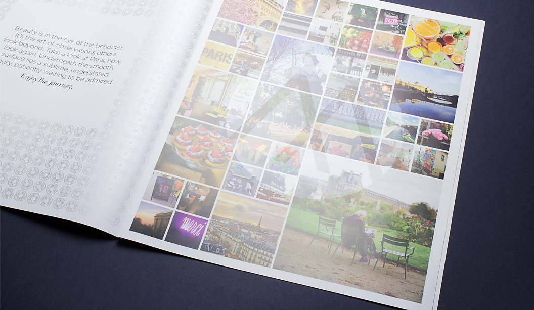
This is the drytrap technique.  It comes up as a subtle watermark effect here.


Cleveland & Co property brochure by Hoyne

Title: Cleveland & Co residential and commercial precinct
Stocks: Doggett Boxboard and Impact
Printing specs: Offset printed
Printed by: Green and Gold (NSW)

Hoyne recently designed the property campaign for ‘Cleveland & Co’, a restoration of two historic warehouses in Sydney’s Redfern, into one flagship residential and commercial precinct. The campaign heroes the art deco aspects of the building, combining it with some 21st century styling that takes the modern industrial look to a whole new level.

The brochure features a Doggett Boxboard 310gsm cover to reflect the buildings historical roots as a manufacturing and warehouse space, with red foil as a nod towards its recent premium renovation. The text pages are printed on Impact 100% Recycled 150gsm. The natural, uncoated surface of the stock really highlights the simple, clean shapes and stylised imagery of the incredible Art Deco illustrations created by commissioned artist, Matt Johnson.

Hoyne shares: “The old buildings had a fascinating pattern of use across two significant centuries, their structures have got real character and a unique spirit. What they needed was a confident, progressive campaign with panache.” And that’s exactly what Hoyne delivered.

Cleve&Co-1

Cleve&Co-2

Cleve&Co-3

Cleve&Co-4

Cleve&Co-6

Limited edition prints by Liesbeth Thie from Two Tone Design

Title: Limited edition prints by Liesbeth Thie from Two Tone Design
Stocks: Knight Vellum 
Printing specs: Screen printed
Printed by: Cosmic Screenprinting QLD

Everyone digs something limited edition. It makes the item all the more special. This lovely range of prints are just that. Graphic designer Liesbeth Thie from Two Tone Design has created some limited edition prints that capture the cosmopolitan Brisbane suburb of Teneriffe, showcasing her love of architecture, history and design with a modern Brisbane flavour.

Her original line drawing has been screen printed in a range of colours on Knight Vellum White 280gsm. Liesbeth shares: “The bright white paper has a crisp finish which was important for positioning the prints as a premium product. I chose to screen print the artwork as it creates a great raised effect in the line work and adds a hand-made touch to the range.”

The prints are the first in what Liesbeth hopes will become a series of beautifully designed and printed keepsakes promoting the city she grew up in and still calls home. You can get your paws on some via https://www.etsy.com/au/shop/TwoToneDesign or New Farm Editions in Brisbane, as well as the Museum of Brisbane shop in City Hall.

Two-tone_2

Two-tone_1

The Cocktail Cup by The Bureau

Title: The Cocktail Cup
Agency: The Bureau
Stocks: Sovereign Offset
Printing specs: Digital printed
Printed by: Press Print Digital VIC

To celebrate the 2014 FIFA World Cup™, The Bureau in Melbourne created a series of illustrated posters complete with match details and recipe instructions so you can kick off your own ‘cocktail cup’ at home. Genius! It’s a special time of year, as the studio puts it: “We all suddenly become experts on match tactics and whether Tim Cahill is better in the air or with his feet!”

Inspired by host city, Brazil (the home of Samba, sandy beaches and sunshine), these one-of-a-kind designs are printed CMYK on an HP Indigo using Sovereign Offset 160gsm. The Bureau’s Creative Director, Jarrod Bransden, explains: “If you’re looking for a little consistency after an up and down Spanish campaign, you can’t go past the humble Sangria. Match the ingredients to the illustrations, follow the recipe and hold your glasses high to celebrate a brave Australian performance at the 2014 World Cup. If we can’t beat them, at least drink like them.” Ha!

So if you feel like a little opponent-inspired tipple from Chile, The Netherlands or Spain, go to henryandson.com and purchase your very own poster. A perfect wall adornment whether you’re drowning your sorrows or just feel like some general merriment.

Soccer-5

Soccer-6

Soccer-2

Soccer-1

Soccer-3


Jasper Margaritis’ illustrations are mind blowing

Jasper Margaritis was born on 10 December 2001. His drawing skills are so impressive that we’re rather jealous. His series is called ‘Internals’, a set of intricate illustrations that are an imaginative and playful exploration of the inner life of objects, animals and creatures. We’re talking a cloud, turtle, castle bug, snake, jet plane, octopus, a muscle man and more. He has also turned some of his creations into greeting cards, printed on our very own specialty stock Wild.

Jasper6

Jasper3

Can you guess what he uses to create these inspiring images? It’s a humble Sharpie. A simple, black, Sharpie which he applies to the canvas with the skill of someone far beyond his years. Did we mention we’re jealous? Visit Jasper’s blog here.

Jasper’s dad is a dear customer of ours, George Margaritis from Peel Design. Thanks for the pics George!

Jasper2

Jasper1

Prostate Cancer Foundation Australia new collateral

Title: Prostate Cancer Foundation of Australia collateral
Agency: Thursday Design (NSW)
Client: Prostate Cancer Foundation of Australia
Stocks: Sovereign Offset 120gsm
Printing specs: Offset printed with three PMS colours plus a black.
Printed by: Oxygen (NSW)

Thursday Design have a knack for teaming up with great illustrators. This time it was Lew Keilar who did a super job of illustrating real people from the prostate cancer community for a series of three A5 brochures. Using PMS colours like the foundation’s blue, PMS 3005 and PMS 144, PMS 305, PMS 583 plus a black, Thursday Design have done a great job of making this collateral a real stand-out. The campaign launches nationally this month so keep a look out for it.

Thursday Design, prostate cancer 2

Thursday Design, prostate cancer 3


Daniel Emma BIG! exhibition

Title: Daniel Emma BIG! exhibition
Stocks: Expression Super Smooth / Kaskad

Adelaide based design duo Daniel Emma (Emma Aiston and Daniel To) recently launched their striking new range of design pieces. Think furniture, light fittings and table top paraphernalia, in a ‘still life’ themed exhibition called BIG! at Jacky Winter’s Lamington Drive in Melbourne. We went along and we liked it A LOT.

Daniel-Emma_5

Lamington Drive ran two workshops inspired by the exhibit. The first encouraged visitors, both adults and kids, to illustrate Daniel and Emma’s still life scenes using a mix of our uncoated stocks including some crazy colours from the Kaskad range and then pinning their work to the gallery walls. The second workshop was a demonstration featuring the ever-so-talented Melbourne illustrators Beci Orpin and Madeleine Stamer, who created their own in-situ still life illustrations. The exhibition space is now filled with colourful wallpaper featuring the artistic endeavours of Melbourne’s young and old, what a fantastic community project!

Daniel-Emma_1

Daniel-Emma_2

Daniel-Emma_4