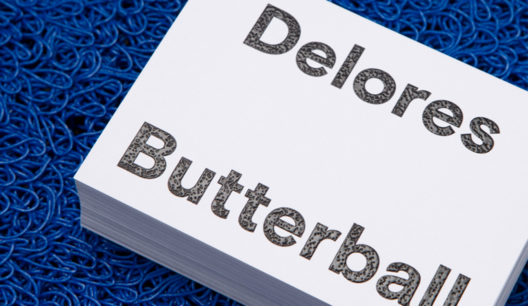
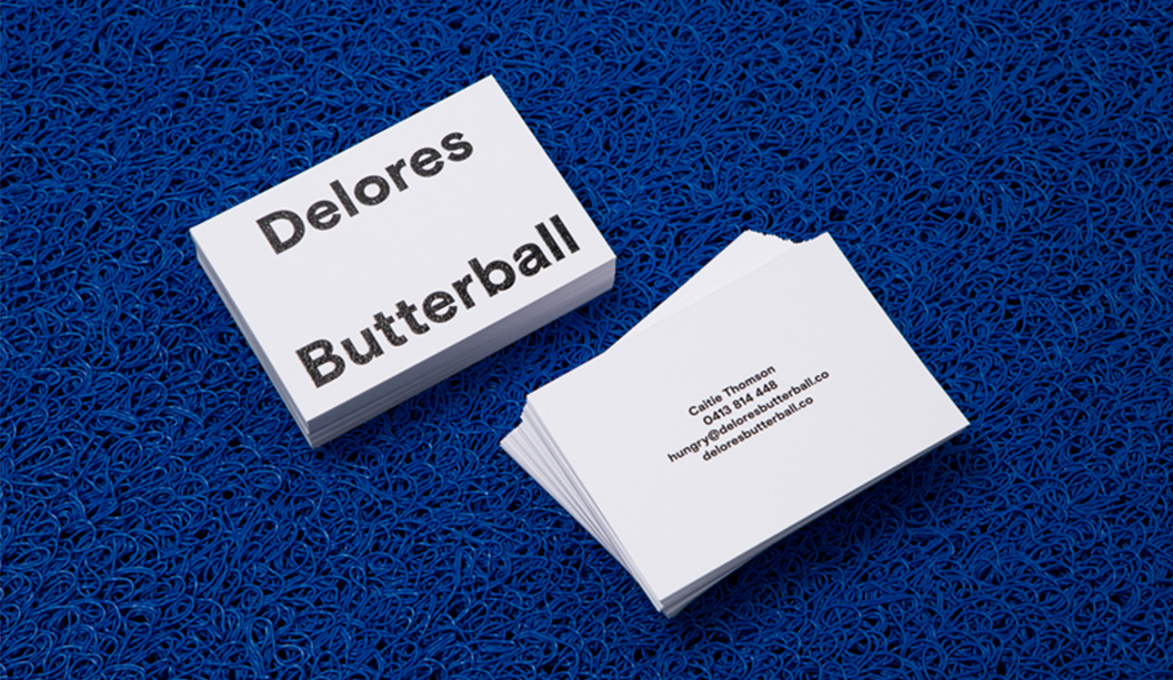
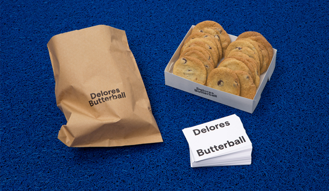
Two person design studio in Melbourne, Mildred & Duck, punch way above their small team weight. The team being Daniel Smith and Sigiriya Brown. Their branding job for Delores Butterball posted below, we recently featured in the ‘Snippets’ section of Spot, our first ever print publication. Speak to your paper specialist for a copy. And in the meantime, check out more of their awesome work on Instagram.
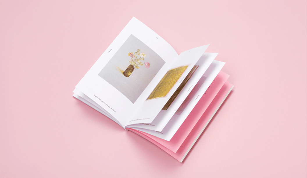
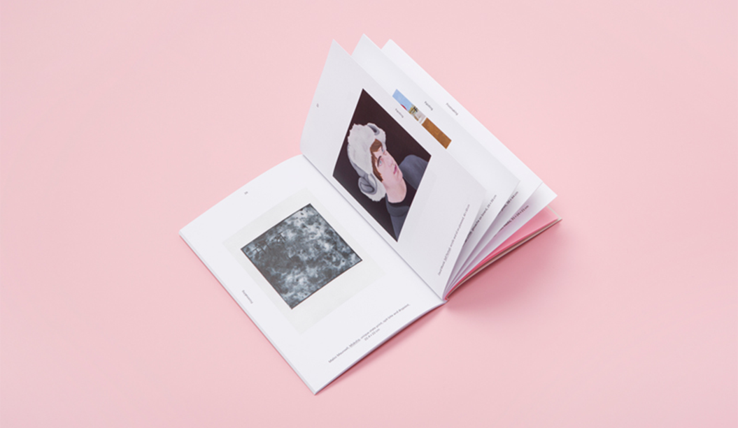
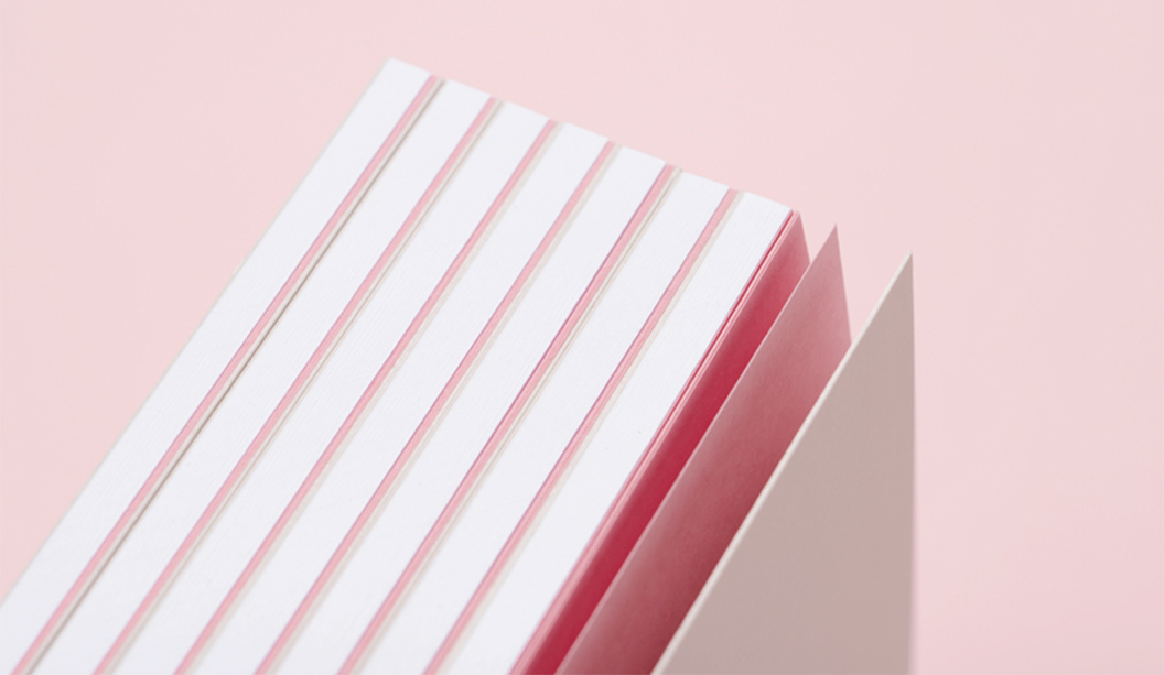
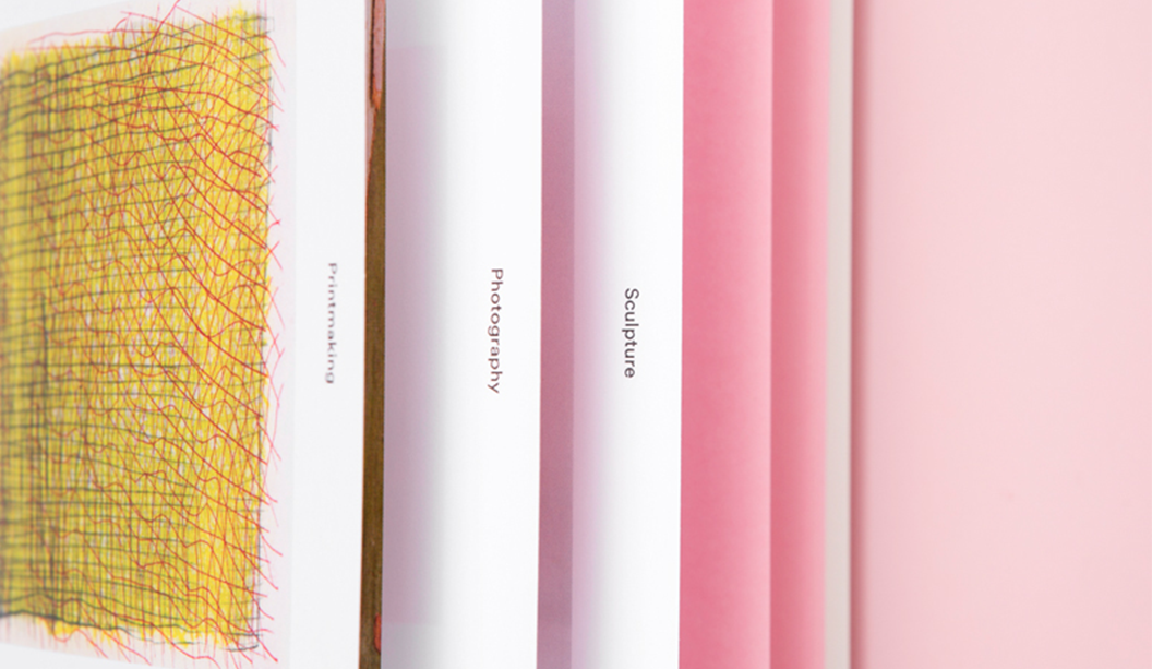
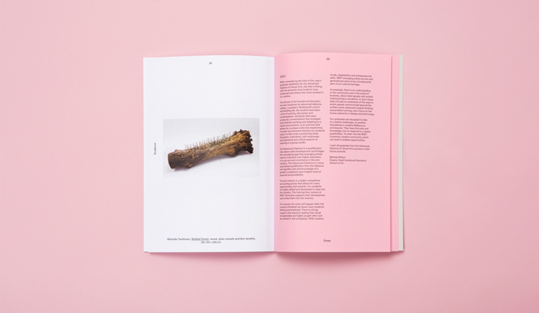
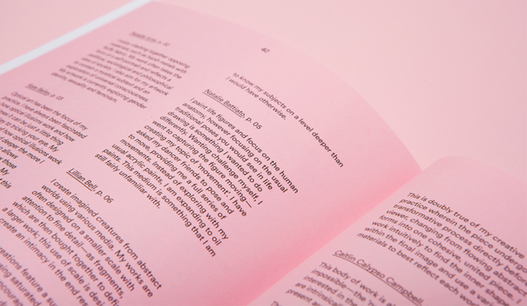
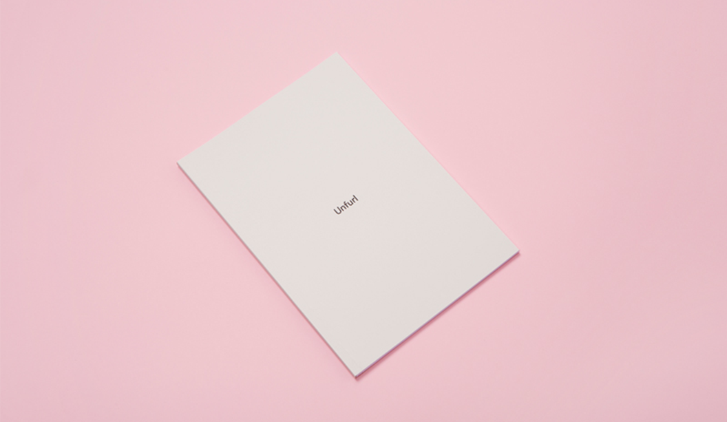
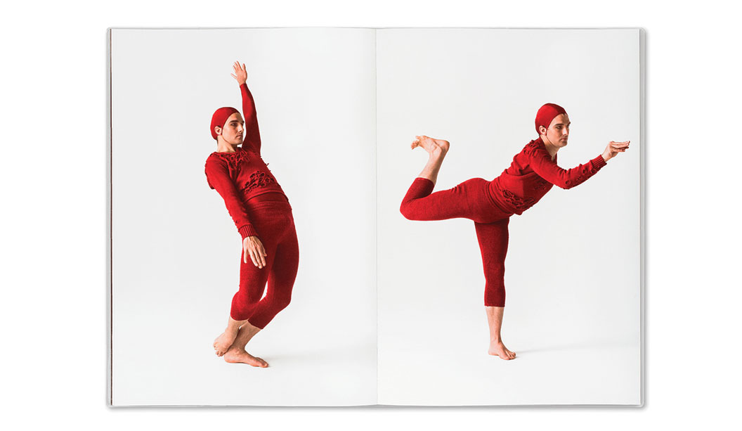
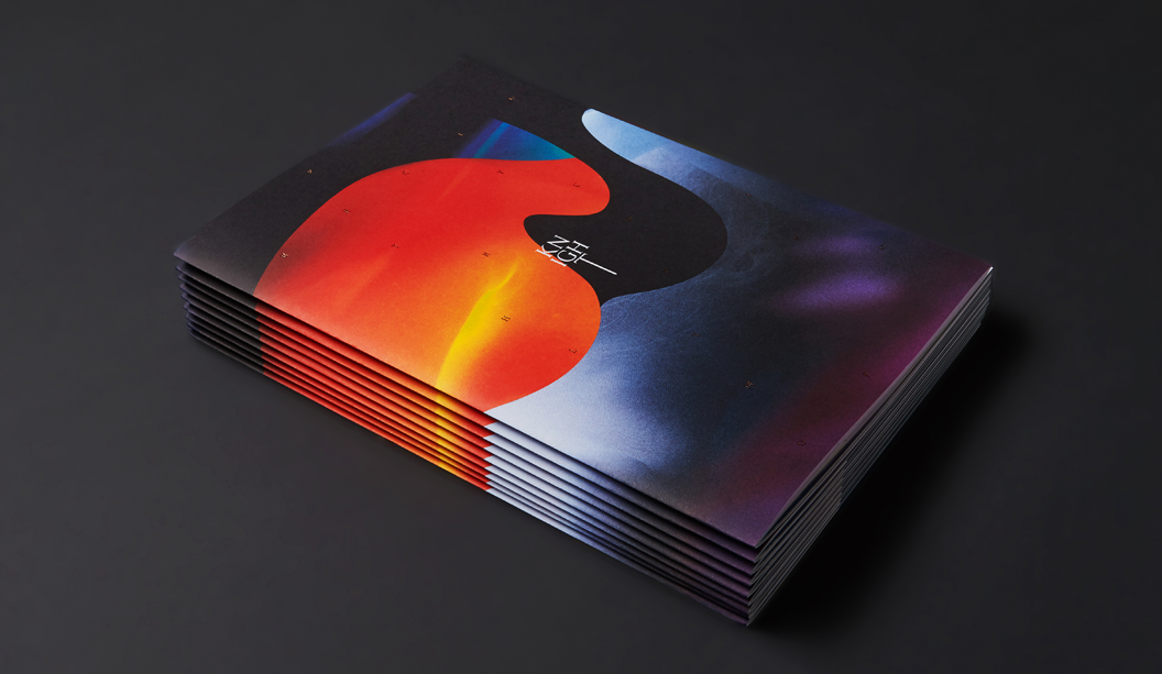
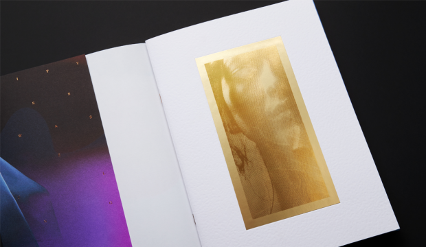
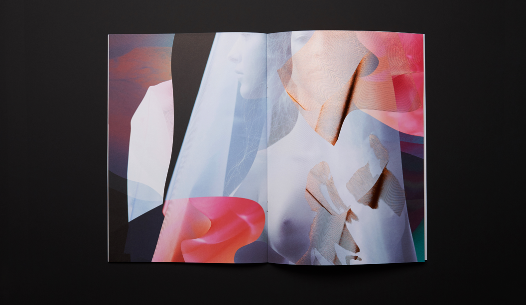
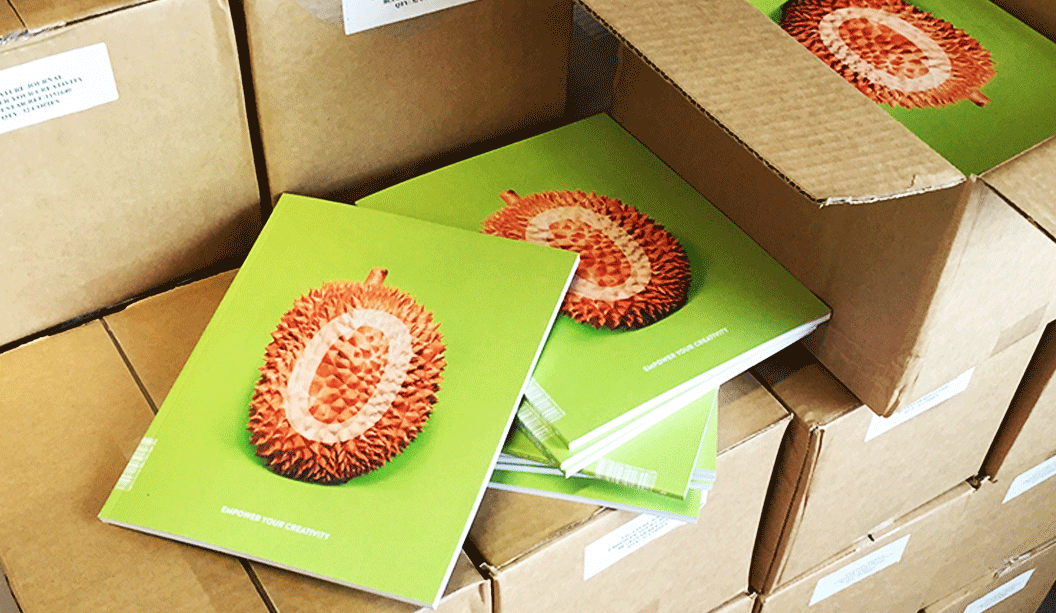
The ‘Unfurl’ publication showcases the work of RMIT’s Visual Arts graduates. The publication was designed to unify the diverse range of works created across different disciplines. Mildred & Duck used a consistent grid structure to create a cohesive experience, and allowing for easy navigation. Housed within an understated black-foil exterior, the publication reveals a playful pink section containing the text pages.
Delores Butterball is a small batch baked goods stall serving cakes and cookies across Melbourne. Mildred & Duck created a visual identity for Delores Butterball that is bold and confident and can be easily applied to boxes and bags as needed without losing legibility. The oversized business card doubles as a with comps slip, with raised verko printing that looks like the texture of icing. Yum!
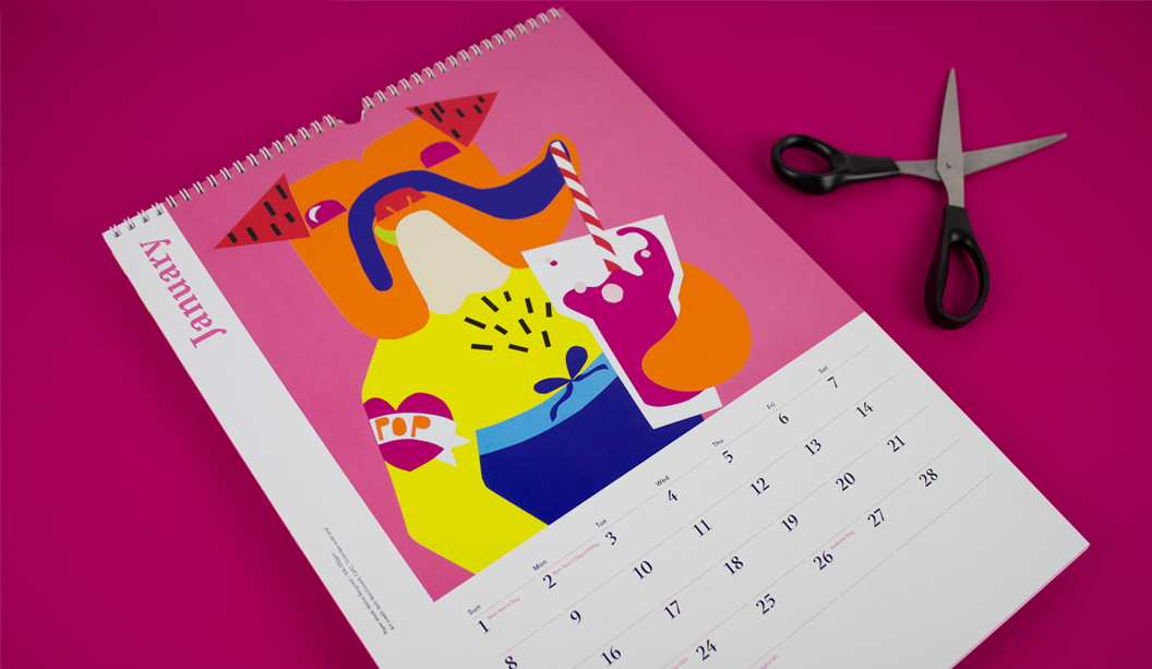
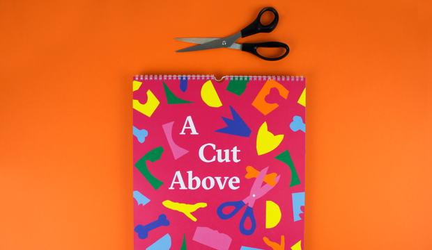
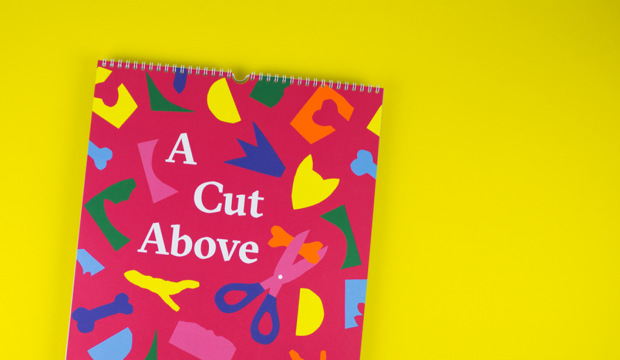
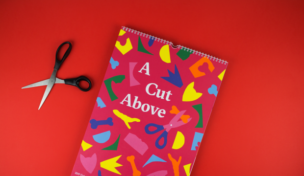
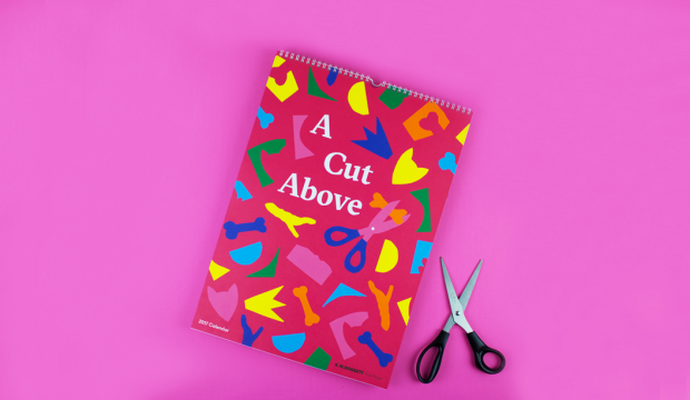
Our 2017 calendar ‘A Cut Above’ is a shout-out to Henry Matisse who, in his later years, created amazing artworks in his ‘cut-outs’ series using just scissors and paper. A collaboration with Spencer Harrison (who project managed and designed the calendar) and two workshops later and we have the super colourful 2017 K.W.Doggett Fine Paper calendar!
This is traditionally a student only project but this time, we opened it up to industry folk too. We put it out to ballot and chose the participants from there. Equipped with paper (including some awesome custom designed sheets by Spencer), heaps of glue and scissors, pizza and tunes, we ran two workshops in SA and VIC with Spencer at the helm sharing his expertise and guiding the participants through the creative process. Choosing the final 12 pieces was tough (so many fabulous pooches!) and the wonderful Mark Lobo shot the masterpieces.
Thanks to everyone that entered, those that attended the workshops, the artists who made it to the final 12 and the pizza guy. A big shout-out to UniSA and CATC/Billy Blue College of Design for giving us their digs to use. And of course the one and only Spencer Harrison. Wooooo hoo!
The calendar was printed offset by Adams Print in VIC. Clear gloss foil on cover over the title by Avon Graphics in VIC.
Cover: CMYK plus PMS orange* and clear gloss over the title on Strathmore Super Smooth Ultimate white 176gsm. Artist: Spencer Harrison.
Credits: CMYK plus PMS orange* on Sovereign Offset 160gsm.
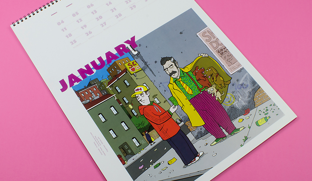
January ‘Grandpa soda pop’: CMYK plus PMS orange* on Maine Recycled – Silk 200gsm. Artist: Beth MacDonald.
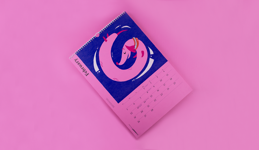
February ‘Sausage roll’: White ink (2 hits wet on 2 hits dry) plus CMYK on Kaskad – Bullfinch Pink 160gsm. Artist: Jack Stobart, UniSA.
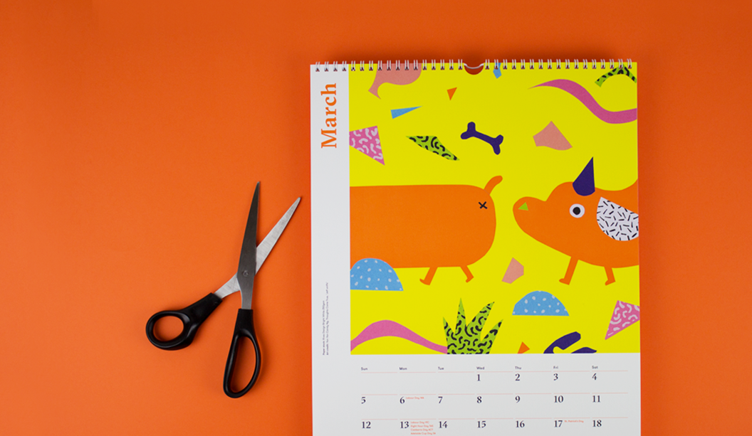
March ‘Jeff Sniffs’: CMYK plus PMS orange* on Rives Design Bright White 250gsm. Artist: Yan Yan Candy Ng from Thoughts Come True.
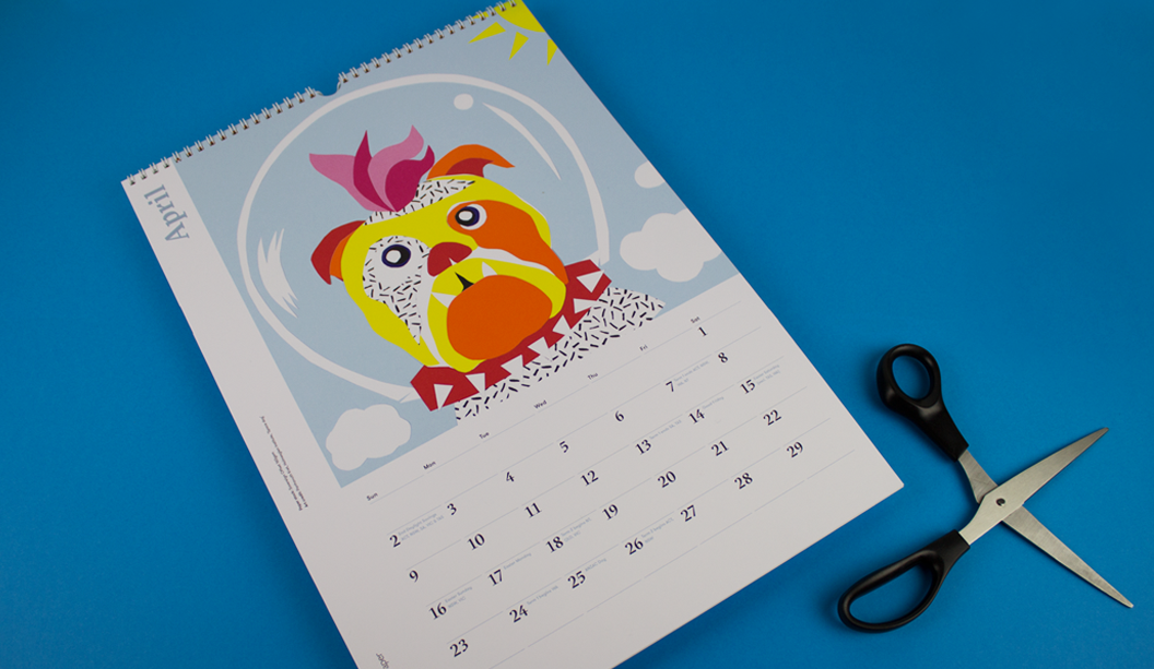
April ‘Space dog’: CMYK on Sovereign Offset 160gsm. Artist: Panhavuth Kret, Holmesglen Institute.
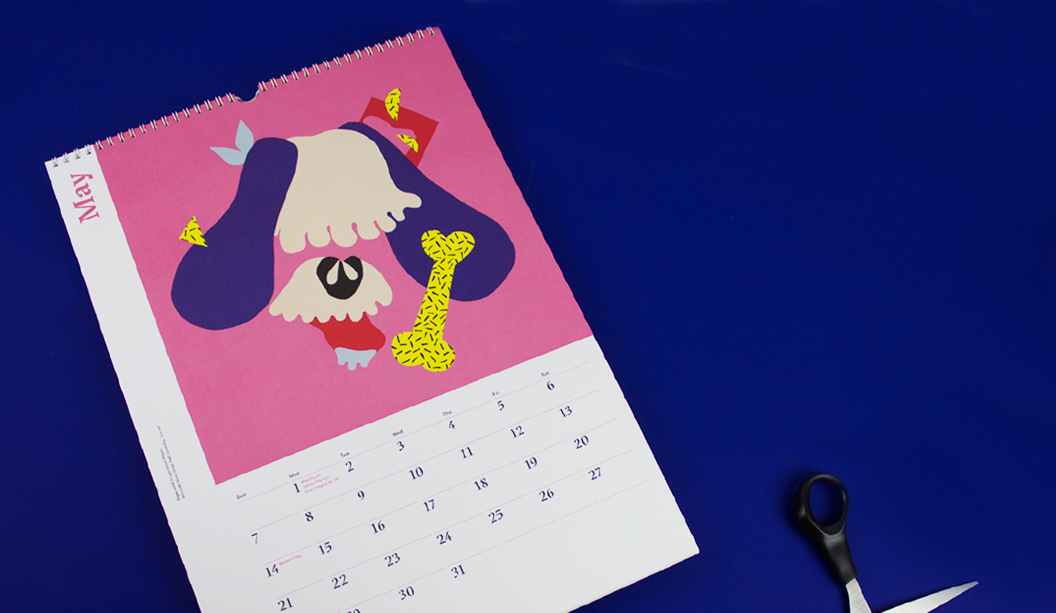
May ‘Get ’em’: CMYK on Knight Vellum 140gsm. Artist: Nana Utsugi, RMIT University.
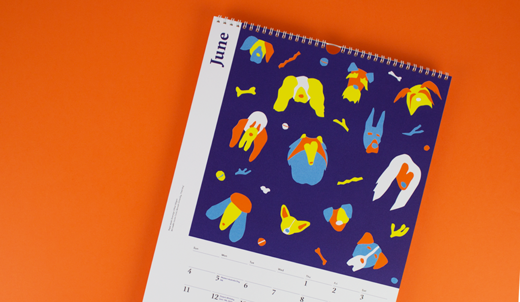
June ‘Field day’: CMYK plus PMS orange* on Sovereign Offset 160gsm. Artist: Lauren Conti, Monash University.
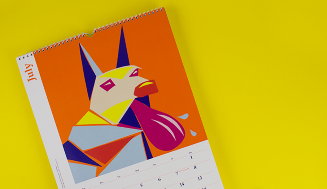
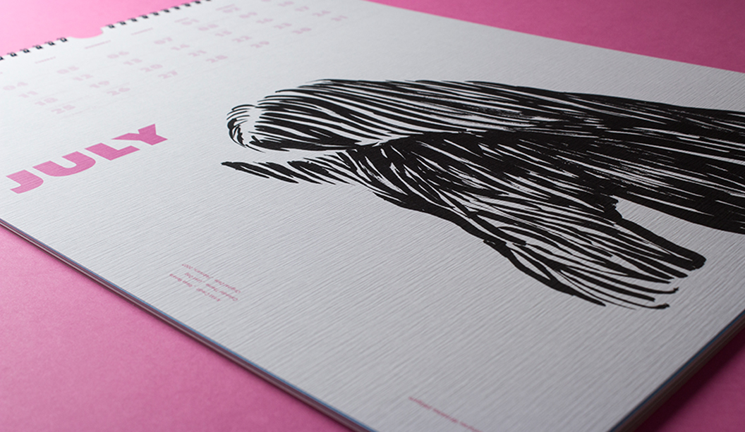
July ‘That happy dog’: CMYK plus PMS orange* on Maine Recycled – Silk 200gsm. Artist: Duncan Crawford, UniSA.
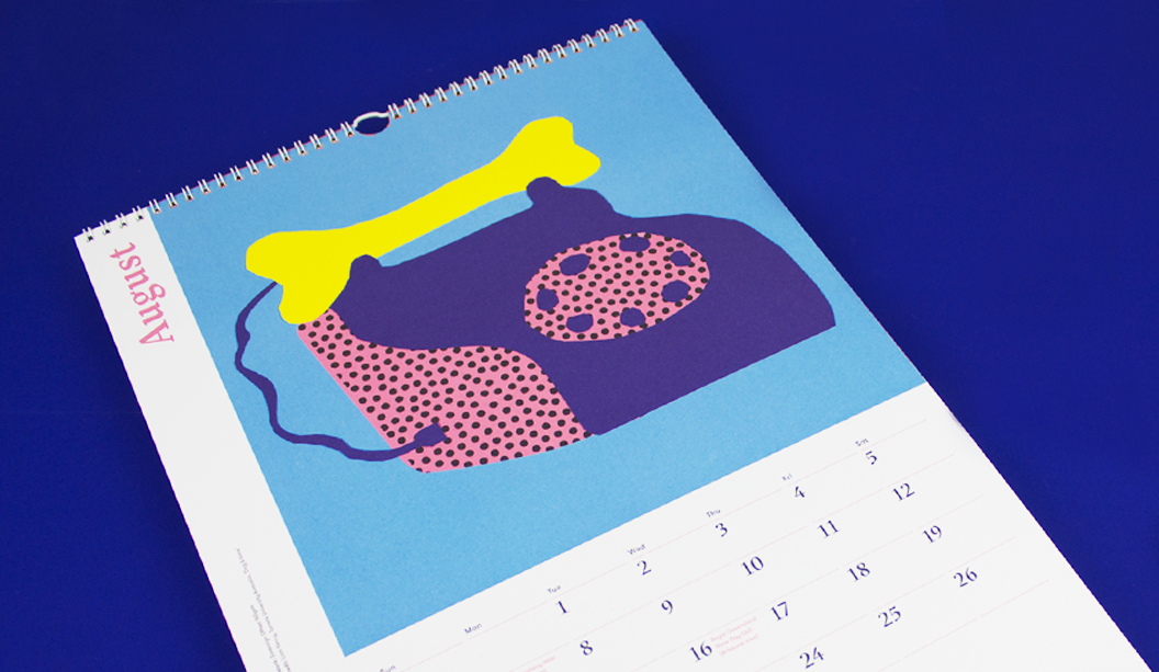
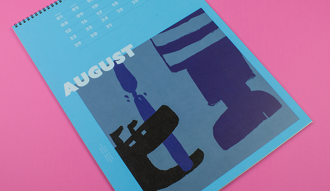
August ‘Dog & bone’: CMYK plus PMS orange* on Sovereign Offset 160gsm. Artist: Liam Kenny, Torrens University Australia.
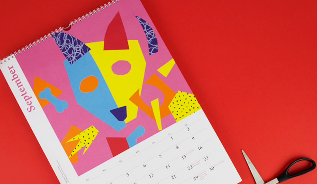
September ‘It’s a dog’s life’: CMYK plus PMS orange* on Knight Vellum 140gsm. Artist: Spencer Harrison.
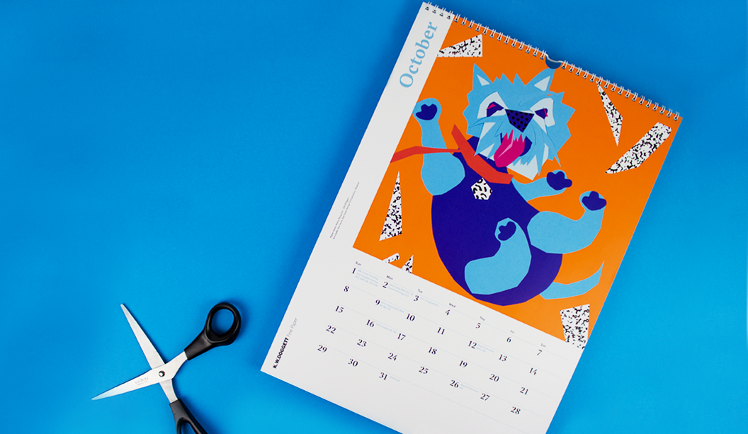
October ‘Walkies’: CMYK plus PMS orange* on Maine Recycled – Silk 200gsm. Artist: Alex Seret from Alex Seret Design and Illustration.
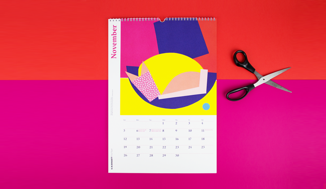
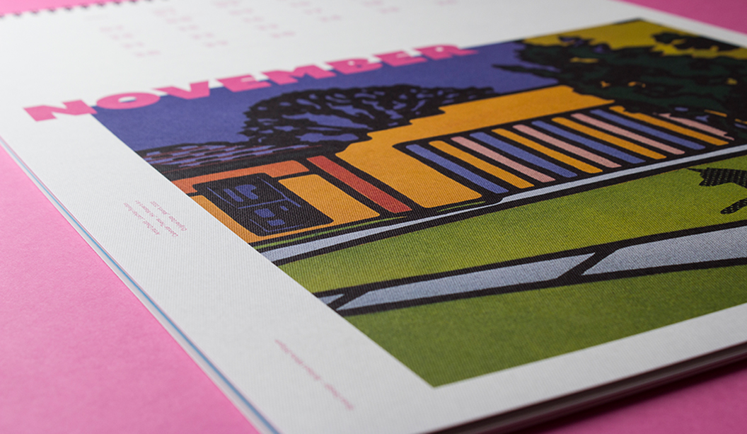
November ‘Sleeping dog’s lie’: CMYK on Rives Design Bright White 250gsm. Artist: Phil Koo, Torrens University Australia.
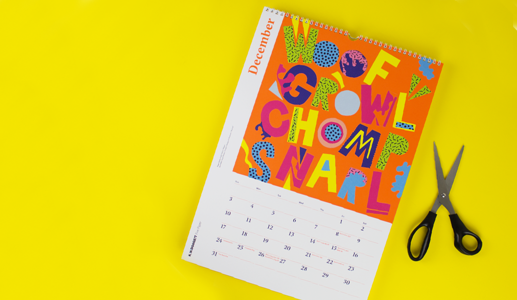
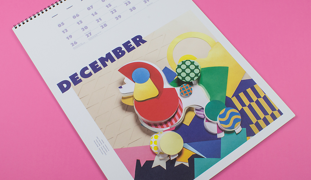
December ‘Shut up!’: CMYK plus PMS orange* on Knight Vellum 140gsm. Artist: Tanya Bickers, graphic designer and illustrator.
Backing: Doggett Boxboard 310gsm/520ums.
*Orange is PMS 1505 U. We altered the colour slightly to be 65% Orange 021 and 35% transluscent white (traditionally it would be 50/50). Adams have a special recipe for their CMYK and we boosted the Rhodamine and Yellow 012 too. Looks so good it could be UV.
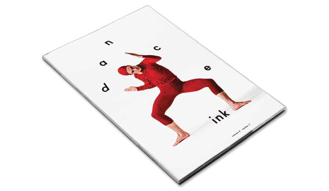
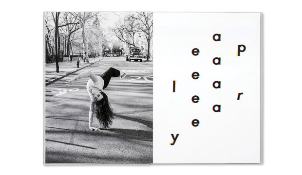
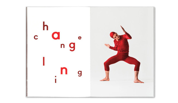
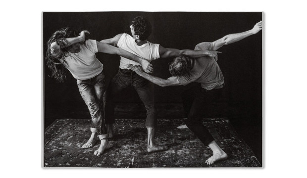
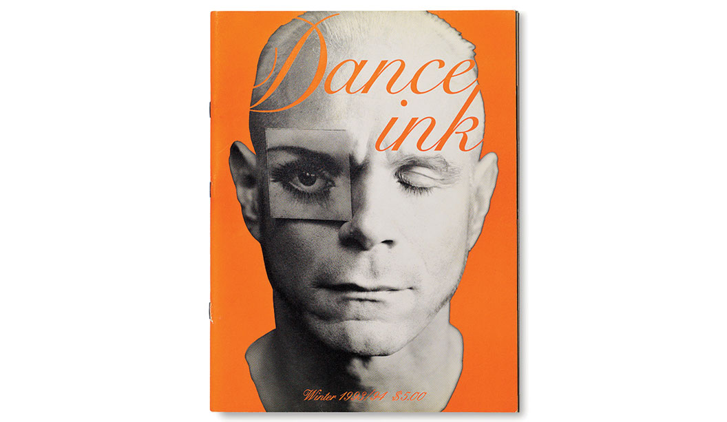
Not sure when the last time was that we (ok maybe just some of us), got THIS excited about a magazine being launched, or in this case, relaunched. So just imagine the excitement of all the lovers of dance, photography and design out there when niche publication Dance Ink was brought back from the publishing graveyard!
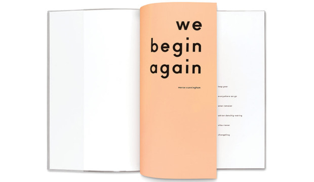
The magazine acts as an alternative performance space for dance. Originally published from 1989-1996, the quarterly performing arts journal is pretty unique. The dance works you see beautifully photographed on the pages are, we kid you not, specifically commissioned just for the magazine. What a concept! The cover of the first issue of the new Dance Ink features Silas Riener performing Merce Cunningham’s ‘Changeling’ which is a bit of a homage to the amazing performer.
Published by Patsy Tarr and designed and edited by Abbott Miller from Pentagram, both taking up their original roles (ah-mazing), Dance Ink has literally picked up where the last one left off. What could be a more perfect quote for the relaunched mag which appears in the first few pages from Merce Cunningham himself: “We begin again.” From what we’ve read on Pentagram’s blog, this time in history is shaping up to be: “…something of a renaissance in independent magazine publishing.” And it’s given them a primo opportunity to experiment with print.
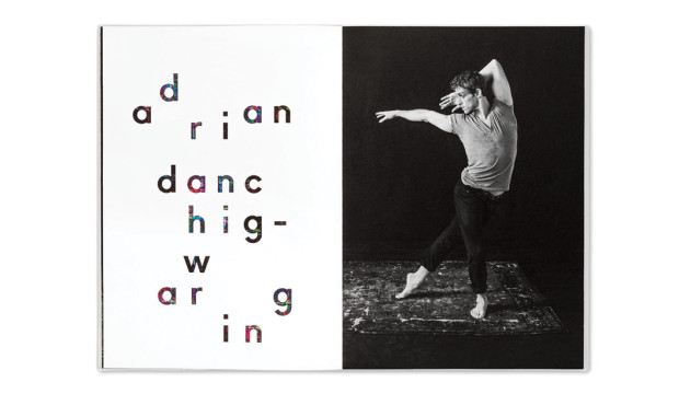
As noted on the Pentagram blog: “The new issue returns to the original premise of creating a unique and enduring stage for dance, using great photography, powerful design and the beauty of high-quality printing.” Printed offset, the mag is housed in a clear sleeve and throughout the pages, the design plays with the effect of transparency of ink on the page.
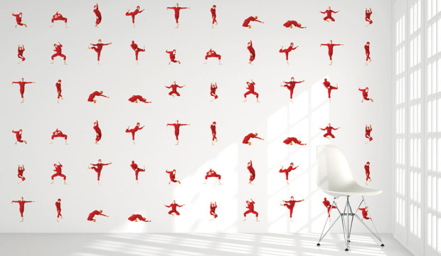
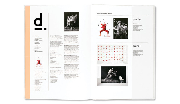
The other super cool thing is the mag has totally moved with the times. Yes it’s available in print form, but the publishers have also experimented with different formats eg you can also purchase large scale posters with every issue, a custom mural for a wall and videos were created as well. So print and wide format too. Raddy McRad. The new issue of Dance Ink has a print run of only 500 copies and can be purchased online at 2wice.org.
Thank you to Pentagram for allowing us to repost this story. We love your work! Get yourself over to their blog for a more in depth look at this issue of Dance Ink. It’s well worth it.
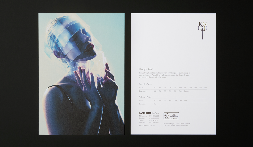
In our latest Knight campaign, we used a variety of print techniques. One of the most simple is the multi level or ‘raised’ emboss. A slightly different take on your standard emboss technique.
What is a raised emboss?
A raised or multi level emboss means the image or type area is raised to multiple levels to create a 3D type effect and in this case, with different depths.
What other kinds of embossing are there?
There is also blind embossing where you emboss the paper and leave it ‘as is’. The other option is to fill the indentation with ink or foil. You can also sculpt the die to have a bevelled edge which looks really good.
So it’s not a deboss?
That’s right, it’s not. A deboss means the surface is depressed instead of a raised impression which is what happens with embossing. So you inprint the image or type by pushing it into the paper (with embossing the impression is made from underneath).
Is it an expensive embellishment technique?
It can be pricey, depending on the area you want to embellish. The money is in the block that is made. So sometimes, if it suits the project, you’d get one block made and use it across different stationery items.
Is there anything I should avoid?
Make sure you allow for space in your design and also type, particularly with type because when your design is pressed into the paper, it will naturally appear closer together. For multi-level embossing use colour codes in your artwork to indicate various levels. Always best to speak to your printer before you deliver the files and find out how best to set them up. Also let them know what paper you are using.
Does it work better on some papers compared to others?
Long fibred papers don’t lend themselves too well to embossing but really, you can do it on both coated and uncoated paper with different results depending on the gsm, whether it’s textured etc. For example, an emboss may not turn out as deep on an coated paper due to a few things like the coating, but it still looks good. We used Knight Smooth Cream 250gsm in our promo and it worked a treat.
Do most printers do this type of work?
Some printers offer this service and usually, it’s the services of an embellisher you would seek. We used Avon in VIC in the case of the Knight promo. Call your paper specialist for the heads up on embellishers in your area.
Knight Smooth Cream 250gsm
• Foil produced by Avon
• Multilevel emboss with foil. 2 passes.
• Matt Gold 25
Dust jacket: Knight Vellum 100gsm.
• 6 colour printed Dust Jacket in one pass on Heidelberg A1 press
• Conventional offset
• 2 spot colours are Pantone Purple and PMS 375
• The rest of the channels in the artwork are process CMYK.
• We swapped out the standard process colours for more vibrant options of:
– Swapped process cyan for ‘Process Blue’
– Swapped process magenta for ‘Rubine red
– Swapped process yellow for ‘PMS 012’
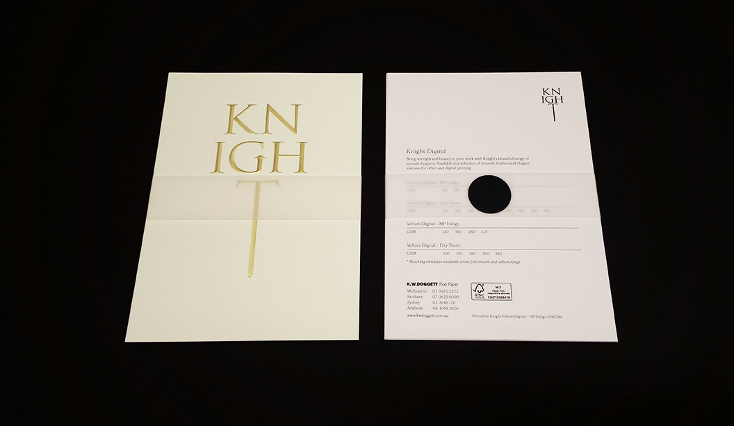
Cover: Knight Hammer 280gsm with Knight 140gsm ‘gold inlay’.
• No print
• Copper Staples done by Bambra
• Gold inlay in two foils over the top of each other
• Base foil is Matt Gold 429
• lmage foil Is Dark Mirror Gold 425
• Hammer cover has been debossed to fit gold inlay
Text: Knight Smooth, Cream 140gsm, Knight Smooth, White 140gsm, Knight Vellum, 140gsm.
• CMYK print throughout
• Pages 22/23 have bump plate 021U
• Page 18/19 we 3D printed that piece of futuristic armor. Designed by RMIT student Amelia Agosta and printed in Melbourne by 3D objective
• Text is printed with a 400 Hybrid Screen. Part line screen and part stochastic
Postcards:
#1 Knight Smooth Cream 250gsm
• Black print only.
• Foil produced by Avon
• Multilevel emboss with foil. 2 passes.
• Matt Gold 25
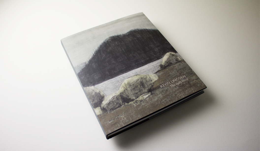
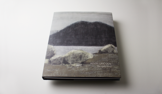
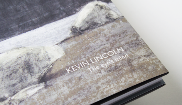
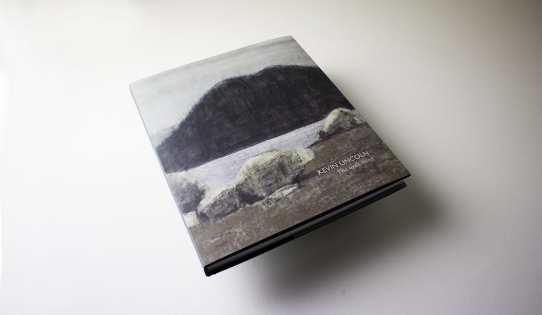
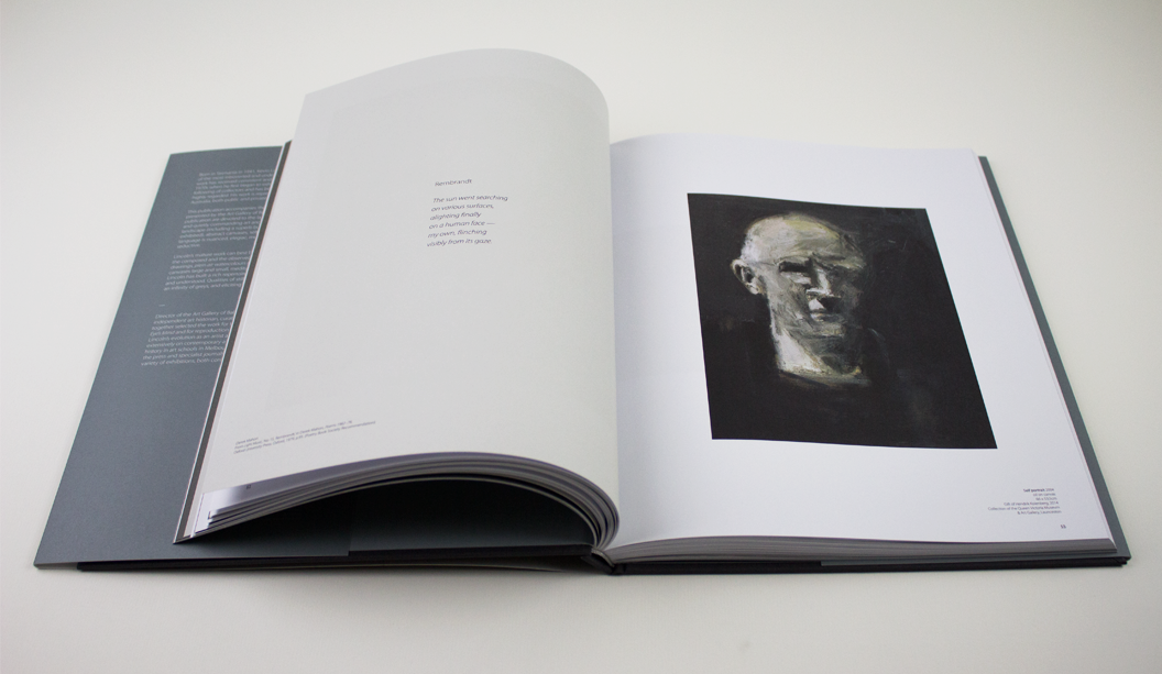
Artist: Kevin Lincoln. Title: The eye’s mind.
Designer: Ben Cox. Publisher: Art Gallery of Ballarat. Stocks: Curious Matter Goya White 270gsm (cover), Grange Offset 135gsm (text). Printing specs: 4 colour offset + PMS grey on the back and spine of the dust jacket.
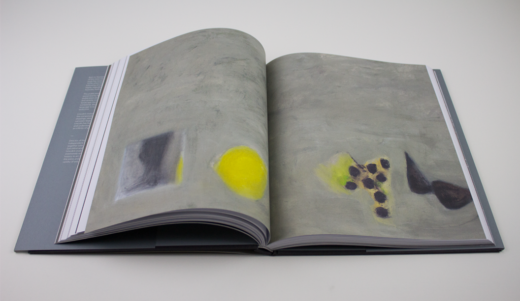
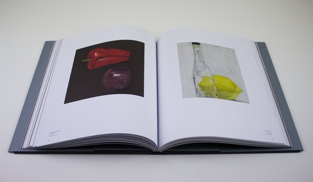
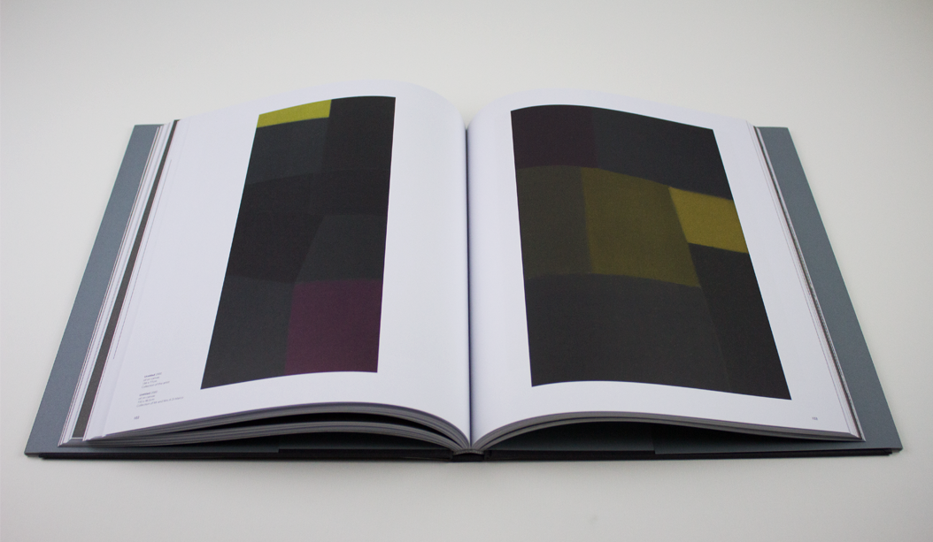
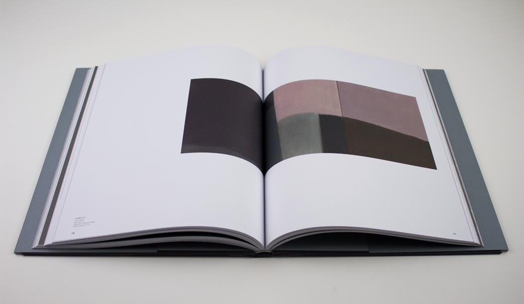
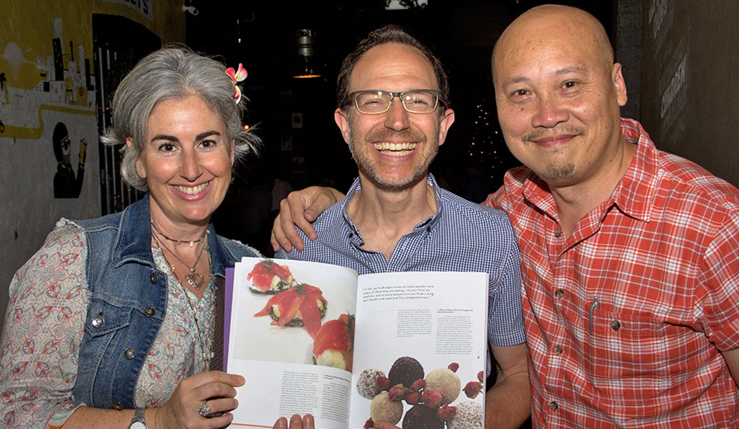
Feast your peepers on this collection of works by Australian artist Kevin Lincoln. With an impressive career spanning the decades, Kevin’s career although impressive isn’t widely known and yet has had a massive impact on the Australian art scene. So this 180 page publication not only accompanies his exhibition at the Art Gallery of Ballarat – the largest solo exhibition they’ve ever presented – but it’s also a highlight of the last 25 years of Kevin’s career which is described by The Art Almanac as poised, balanced and reflective.
The dust jacket is printed on textured Curious Matter Goya White 270gsm and the text pages are Grange Offset 135gsm. Production insight: the dust jacket is printed 4 colour offset with PMS grey on the back and spine. You have to feel this book to appreciate just how perfectly the paper complements the design. It couldn’t have been paired any better.
With an interesting foreword offering some perspective on Lincoln’s ‘impoverished and bruising childhood’, it becomes clear to see how his style has developed into a sea of greys and rural scenes. Exhibition Officer/Book Designer Ben Cox shares how he conveyed the tone of the works in the design of the book.
“The design of the catalogue aims to reflect the subtle, nuanced and understated surfaces that are key to Lincoln’s work. The use of tonal greys throughout, the weight and balance of pages, font selection and stock all come together and attempts to give a sense of Lincoln’s work. Particularly, we selected Curious Matter for the dust jacket stock as it matched perfectly the feel of Lincoln’s tactile, raw and beautifully elegant paint surfaces.” We think they’re a match made in heaven, too.
The exhibition ‘The eye’s mind’ runs at the Art Gallery of Ballarat from 23 April – 19 June 2016. You can get your mits on a copy of the book by calling the Gallery Shop on 03 5320 5790. They even have some signed limited edition copies. Hazah!
About the Gallery:
The Art Gallery of Ballarat is the oldest and one of the largest regional galleries in Australia. Founded in 1884 the gallery has expanded through numerous renovations and extensions, most recently in 2001, bringing 19th, 20th and 21st century architecture together. AGB houses one of the most significant collections of Australian art in the country, from early colonial to contemporary work. A vibrant temporary exhibition schedule complements the permanent collection and sees a large number of exhibitions in its four temporary galleries annually. They also have public programs, workshops, talks, concerts and many other events on the go.
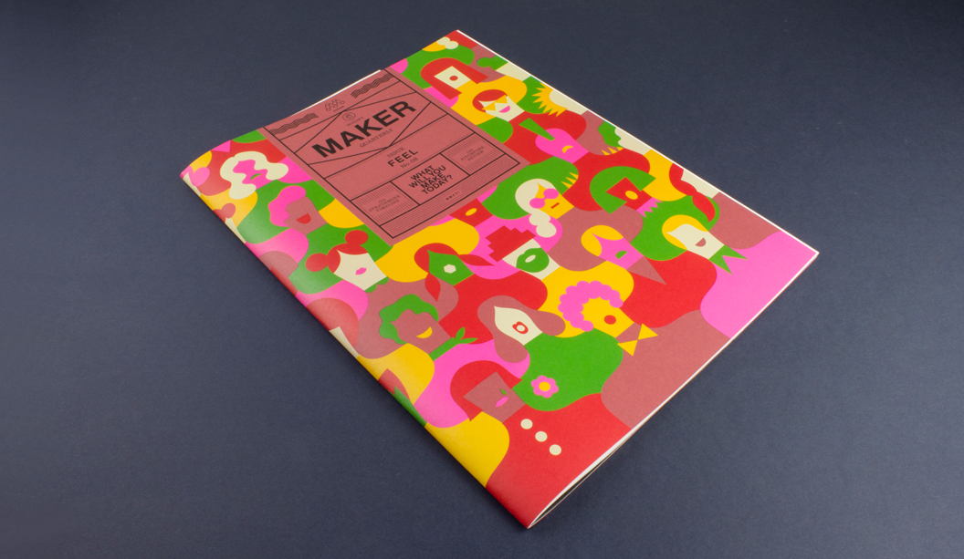
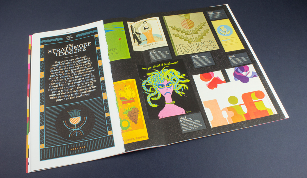
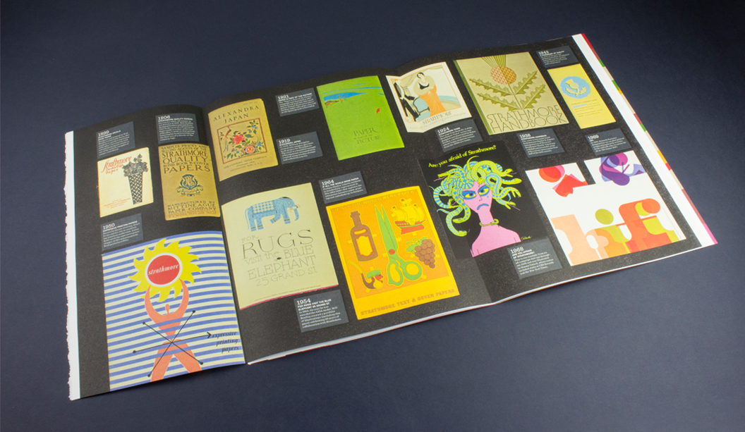
This is issue #8 of the Mohawk Maker Quarterly, designed by Hybrid Design and brought to you by one of our eminent mill partners – Mohawk. This issue is particularly special because it combines the Strathmore range and also Curious Collection which is from the Arjowiggins mill (Mohawk are now the North American suppliers of the Curious Collection range which makes us rather happy because we’re the Australian ones!). Maker is always a gift to the senses, a showcase of high quality printed matter in what is an increasingly digital era. It’s a real print treasure and celebration of creative, hands-on makers of this world.
Mohawk stands by the fact that embracing the medium is just as important as the message in creating an experience and building an emotional connection and with this issue, themed ‘Feel’, this premise is taken to a whole new level. This quote from the publication says it all: “Customers don’t necessarily remember what you do for them as much as they remember how you made them feel.”
We love the eight distinctive papers combined with a killer print job (offset printed using conventional and UV inks). They’ve boldly and cleverly combined half sheets, textured papers with photography, metallic papers with artworks and a deckled edge. The print medium, in our eyes at least, creates ‘feeling’ like not many other mediums can. Colour, texture, visuals. Print has the power to create a lasting memory and give anyone who loves design, print and paper all the feels.
Cover – What’s firstly most striking is Olimpia Zagnoli’s beautifully bold pattern illustration that blends so seamlessly with the Strathmore Wove Riveria Rose (one of four Strathmore Heritage Collection colours introduced in 2015). We don’t sell it but can look to order it for you, just keep in mind there would be a minimum order amount. Read this blog post by Parse and Parcel for an excellent read and print production tip when printing on dark coloured papers. Mohawk hit the sheet with opaque white ink, twice, then used UV inks which dry instantly and don’t soak into the sheet so are much more punchy.
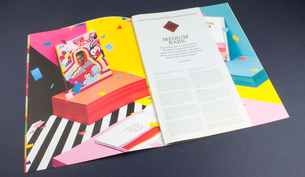
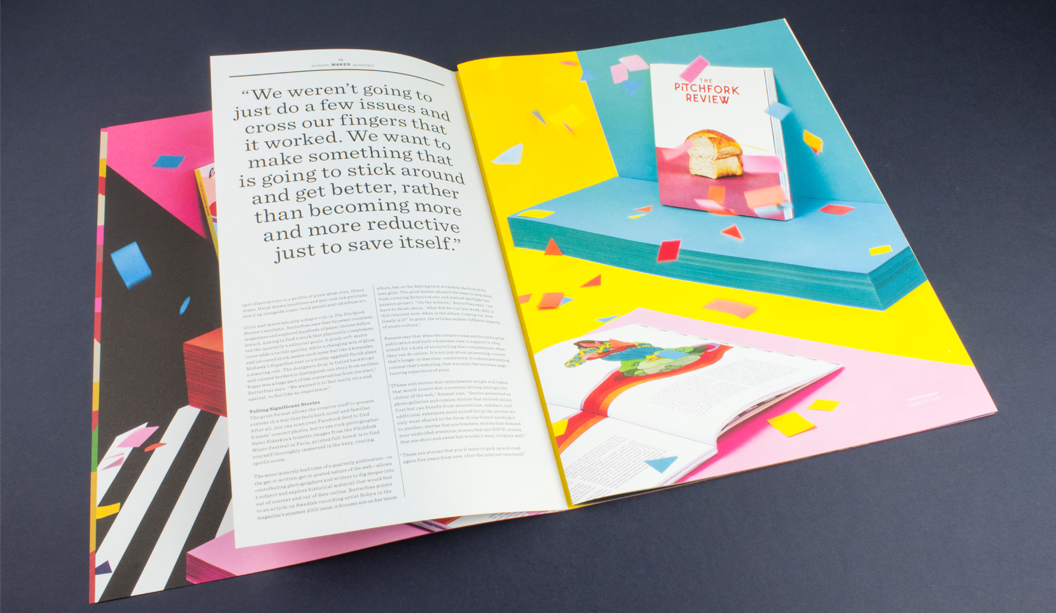
Medium Rare – Music fans online go-to is pitchfork.com and they’ve just release a quarterly magazine – because there are some stories that just have to be told on paper. An online presence going offline. The travesty! Flies in the face of convention it does. The Pitchfork Review showcases the striking beauty of Curious Collection Metallics – Ice Gold, against vibrant images printed on Strathmore Premium Wove and Smooth – Platinum White. This is a fun spread. The half page looks rad.
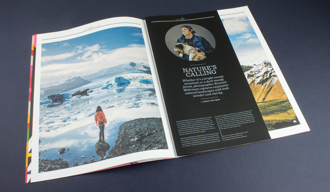
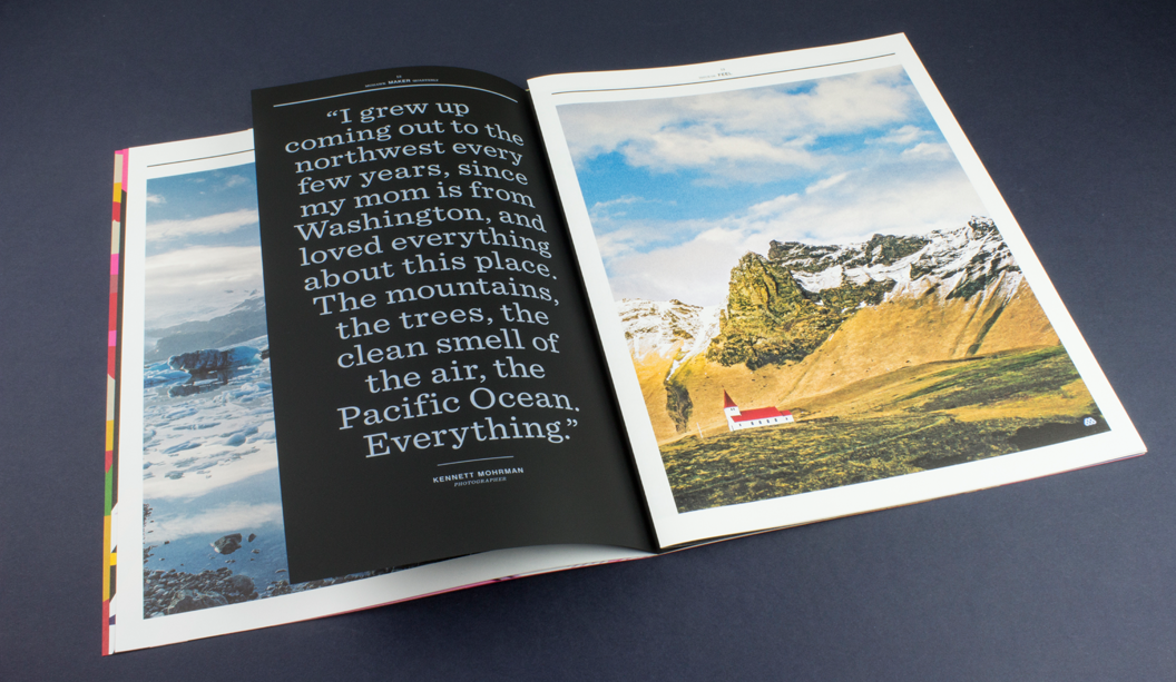
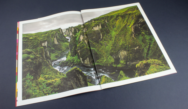
Nature’s Calling – We stand by the choice to use uncoated papers for photography, as long as you prepare the files the right way and work with a printer that is willing to push it with you. A great example of how to make this combo work is the section on Kennett Mohrman which looks amazing on uncoated Strathmore Pastelle that has a felt finish. The mossy covered terrain appears as a double page spread printed partly on Strathmore Cambric that has a linen finish and the Strathmore Pastelle. Same photo across two different papers, one Platinum White the other Bright White. And geez it looks a-ma-zing! The photo is a beauty. So much depth and richness. The half sheet on Skin Curious Collection – Black printed with white ink even comes with augmented reality components.
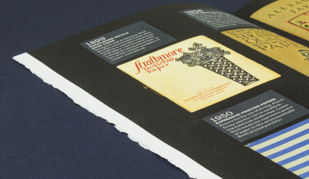
Strathmore Archive – We absolutely love this double page spread called The Strathmore Archive. The team at Mohawk found all these swatches and print samples, boxed-up in their warehouse. Literally over 100 years of print design in America, discovered in some dusty boxes! The deckled edge. Swooooon.
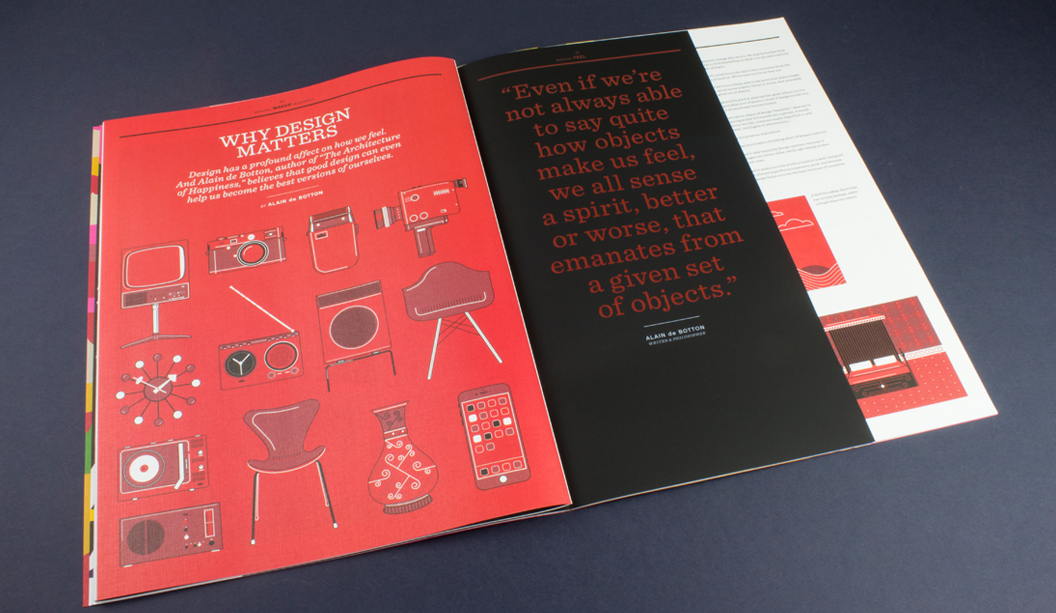
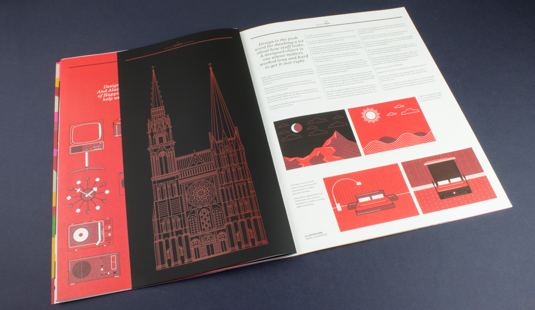
Why Design Matters– Another half sheet and mixed paper goodness combo that gives us the design feels. Strathmore Premium Cambric (a linen finish) with Skin Curious Collection – Black and a half sheet thrown in for good measure. A perfect backdrop for Alain de Botton’s article on how objects make us feel – how good design can assist us with becoming even better versions of ourselves. As one blog mentions, the mid century illustrations look awesome printed on the linen sheet, as does the cathedral printed with red ink on the black. Clever.
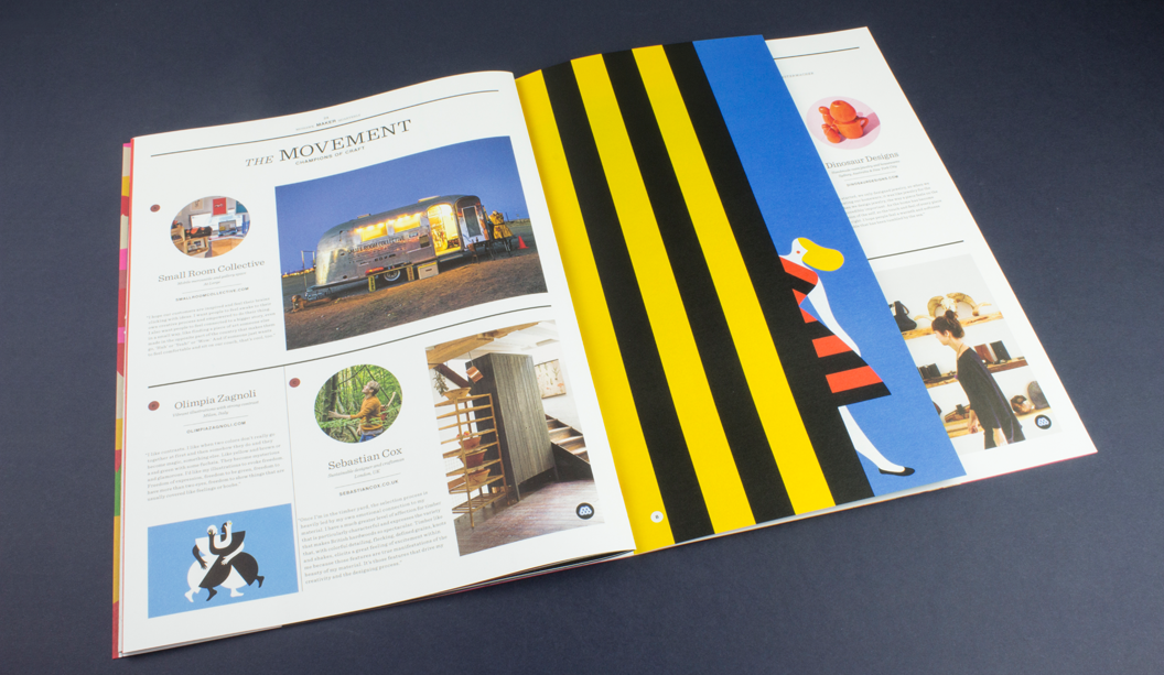
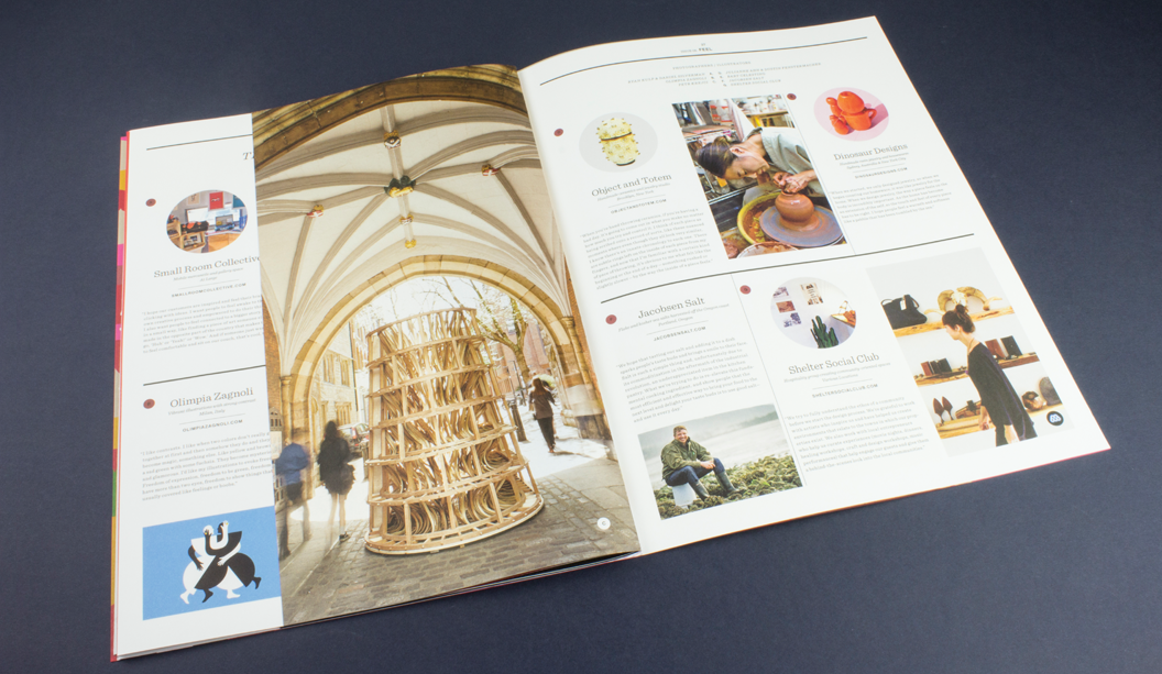
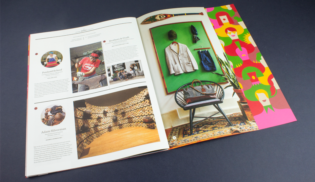
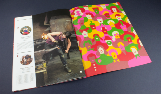
The Movement – This is what the Maker does really well – covers some really talented champions of craft – small manufacturers, artisans, printers, designers and artists from around the world still using their skills in this so called age of the digital revolution. Our very own Australian brandDinosaur Designs even get a mention in this one! Other makers include Shelter Social Club, Penland School, Brothers & Craft, Sebastian Cox, Object and Totem and Adam Silverman. Plus there’s some more augmented reality to enjoy.
It is impossible to tell from this picture but the smart cookies at Hybrid and Mohawk have paired the photograph of this wooden sculpture with Curious Metallics – Ice Gold which literally has a gold shimmer finish. We’ve said it before and we’ll say it again. Clever.
And if this wasn’t enough for your senses, see more pics and another write-up here, via the Mohawk blog Felt & Wire.
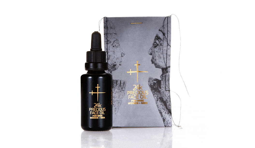
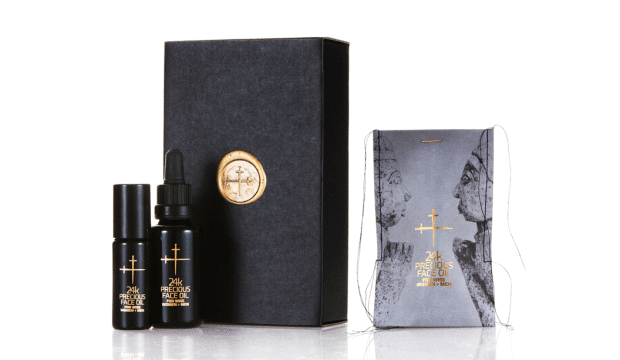
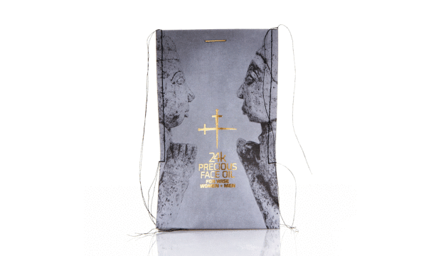
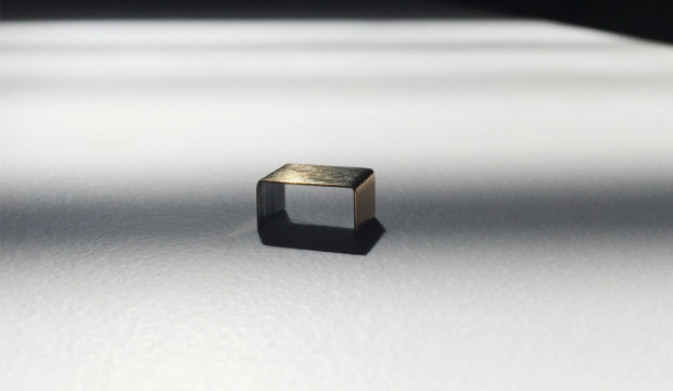
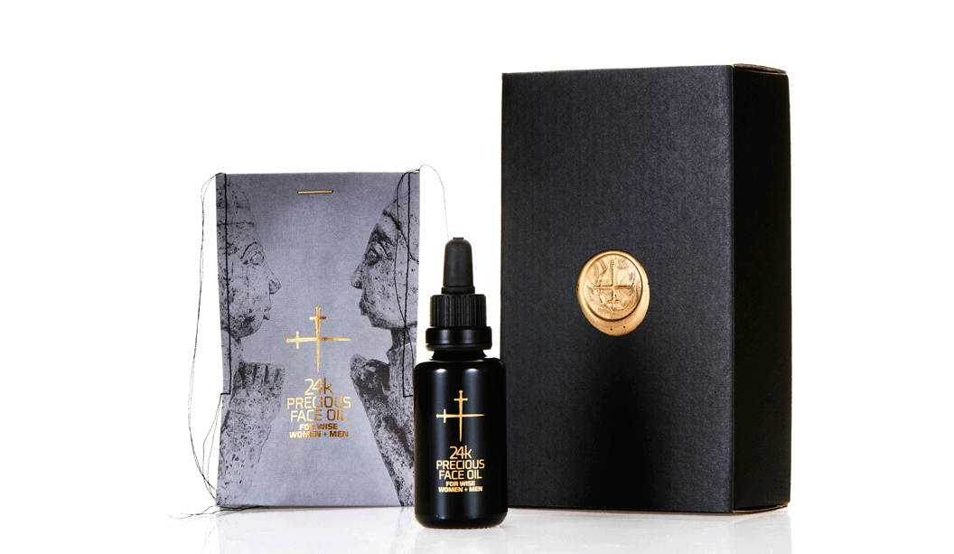
Title:24k Precious Face Oil For Wise Women + Men. Agency:Lepaar (NSW) – Johanna + Christo Everingham. Stocks: Knight Textures – Linen 2-sided 280gsm Printing specs: Offset, CMYK + PMS + Pantone Blue 072U and Pantone 7579U. Printed by: Lindwall + Ward, Marrickvile NSW (1c black offset + sealing varnish). Gold detailing + embossing: Goldcraft, Marrickville NSW. Embellishments: Stitching: Christo Everingham. The 14k gold plated staple from: OOOMS design studio, Netherlands.
Talented much are the first two words that spring to mind when speaking to Johanna, one half of Lepaar (the other half is…her other half Christo!). Drawing inspiration from the Knight promotion we released many years ago, the Lepaar design duo set about creating the packaging for their 24k Precious Face Oil.
Good design comes from lots of places but without a doubt, a brand’s philosophy will shape how good the outcome is. Lepaar are out to design exquisite products and objects of quality, beauty and function. They work with the best manufacturers, craftsmen and materials. They’re also staunch supporters of Australian companies and goods, plus they’re opposed to today’s throwaway kinda culture. The ingredients for the face oil are organic, biodynamic and from ethical growers and producers. We picking up what you’re putting down Lepaar.
Time for us to hand it over to Johanna, who has shared some great insights into the process…
“Because of our focus on local business, Doggett’s has been our first point of call throughout our years as brand designers. It’s a family run paper house, based in Australia and I’ve had brilliant personal service all the way through from Nathan Doggett. Living in the same suburb and bumping into each other over coffee or at house parties helps!
The Knight range has always been my personal favourite. The stock is one of the nicest to print deep blacks on without actually using rich blacks. For this particular job, we picked Knight Linen because it’s got a fabric-like stretchy quality to it which we needed to squeeze the bottle into the sleeve after stitching. The texture allows for stretch and handling without crinkling.
We know the stock, so did expect it to look and feel expensive and luxurious. Yet we were amazed by the richness of the black, given that we only printed 1c black, without extra screens. We did print offset rather than digital, which I believe made a difference.
We wanted the sleeves to be very avant-garde, expensive and luxurious looking, showing off the hand-made character of the stitching without making it look ‘crafty’. Our objective was beautiful, luxurious packaging that is not wasteful, has a collectors-item quality to it, is different and communicates the precious nature of the product.
We spend a long time sourcing packaging and found it tough trying to find someone who would produce small quantities in luxury materials and finishes in Australia, without much luck. Because we stitch all our products into paper packaging we ended up trying different versions of sleeves on the sewing machine one day, reluctantly cutting up my well-loved Knight promo which I consider a collectors item. It worked and looked stunning. Different and modern and rock ’n roll all at once.
The closure was a headache, until lateral thinking kicked in. We had stapled it just to see what it looks like closed, got the gold ink marker out and painted the staple. Bit of night time googling produced OOOMS, a dutch design co who had released 14k gold plated staples a few years back and Guido the owner was only too happy to send some our way. We love them and suggest to customers to reuse them as lapel pins or make earnings out of them.
We believe we have created packaging that conveys language – one interacting string of things that mix and match and talk to each other. In this case all the ingredients, inside and out, sing.”
Thanks Lepaar, our fellow paper obsessed customers. You’ve created truly beautiful and unique home grown packaging that we love, love, love.
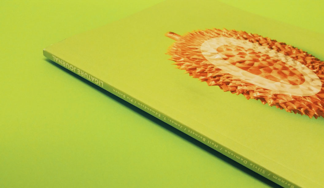
Agency: Tiliqua Press with students from Billy Blue. Publisher: Felix Oppen.
Stocks: Grange Offset 300gsm/110gsm. Printed by: Seed Print Group in NSW. Printing specs: CMYK Offset printed.
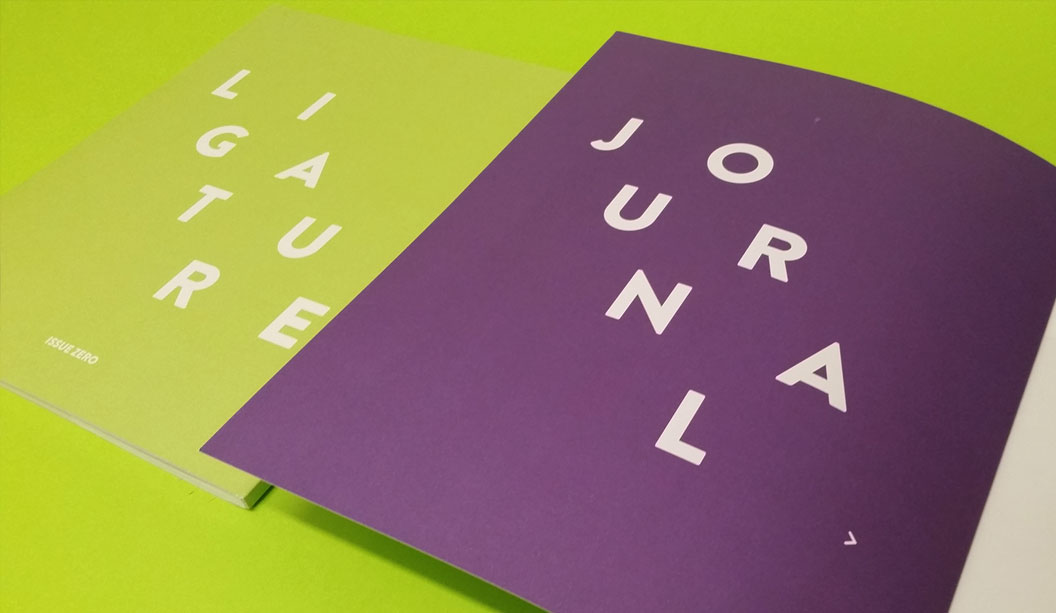
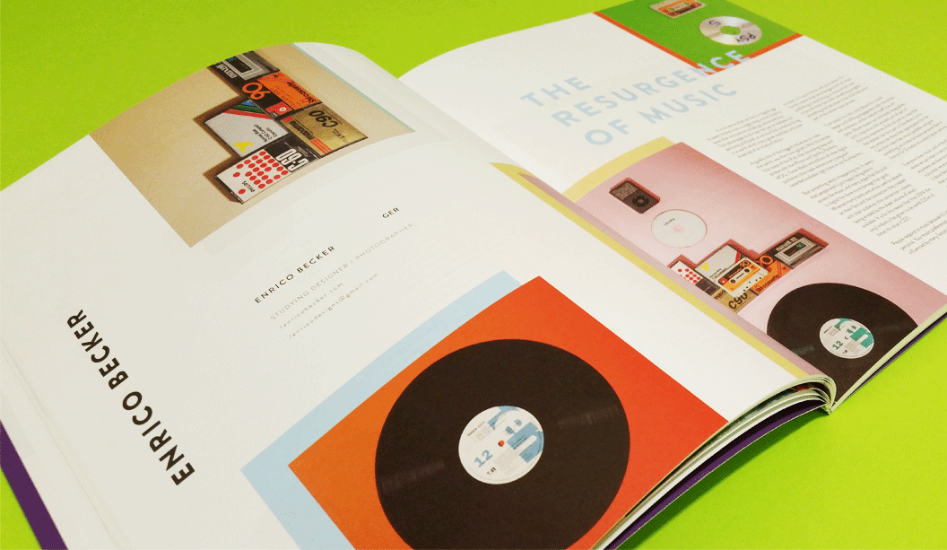
Every once in a while, someone dreams a little dream, yanks it out of the matrix, thrusts it into reality and watches it take shape. It’s a beautiful thing. This is the case with Felix Oppen, who recently launched the inaugural Ligature Journal, a publication made in collaboration with a bunch of hard working and enthusiastic students at Billy Blue College of Design.
If you’re looking for a fresh compilation of ripper content featuring local artists and student work that spans graphic design, illustration and photography, call off the search party. One of the many cool things about Ligature Journal is that every aspect is student managed from content to press checks to building the digital version. While some may be dismissive of a student magazine, it totally stands up on its own as a top shelf, relevant publication. This is exactly the vision Felix had for Ligature Journal – that it would add to the design and creativity discourse in Australia, New Zealand and beyond.
The team chose to release print and digital versions of Ligature Journal. Felix believes the future of publishing is to let each medium play to its strengths but work together. Smart. It is intended to be a tri-annual publication and you can already buy Issue Zero here.
The stock chosen for this work is Grange Offset 300gsm/110gsm, an economical, bright white uncoated paper which Felix says punches way above its weight and is regularly mistaken for a specialty paper. We agree that the print job looks bang-on, and we look forward to watching the development of the concept across future issues.
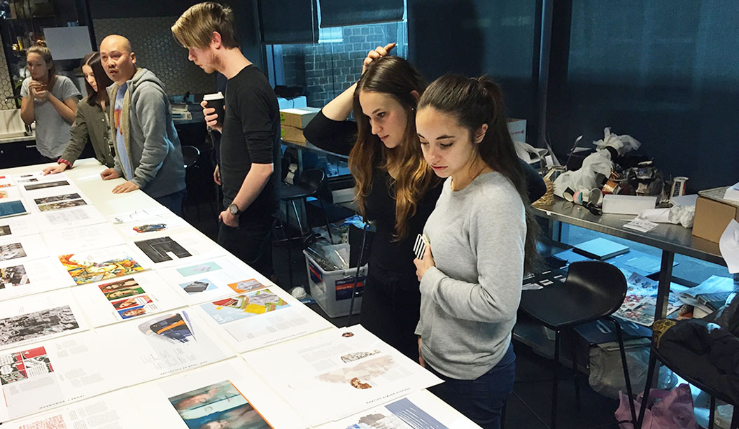
Pictured: Students reviewing layouts and the running order of articles, with Kuen Kam – the Billy Blue lecturer/mentor.
Pictured: At the launch, a very happy contributor, Neil Barnett (centre) and is partner, Vicki (left), with Neil’s article on raw food. Kuen Kam (right) is the Billy Blue lecturer/mentor for the students.
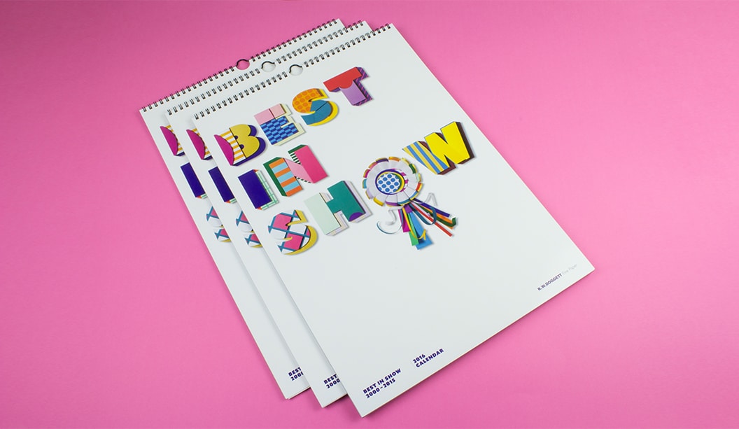
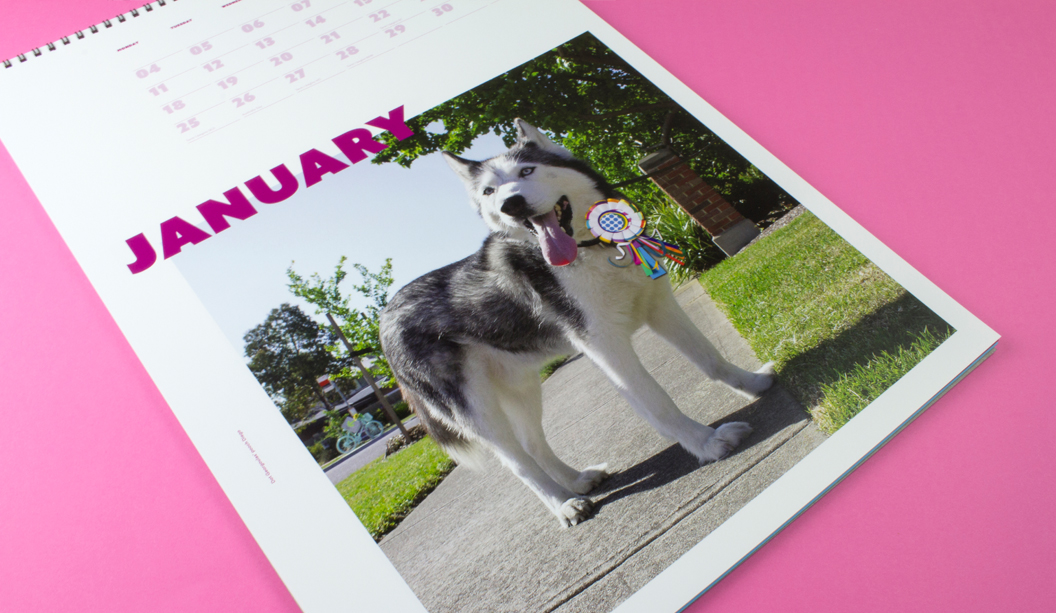
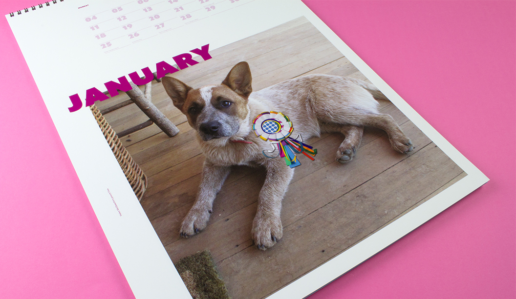
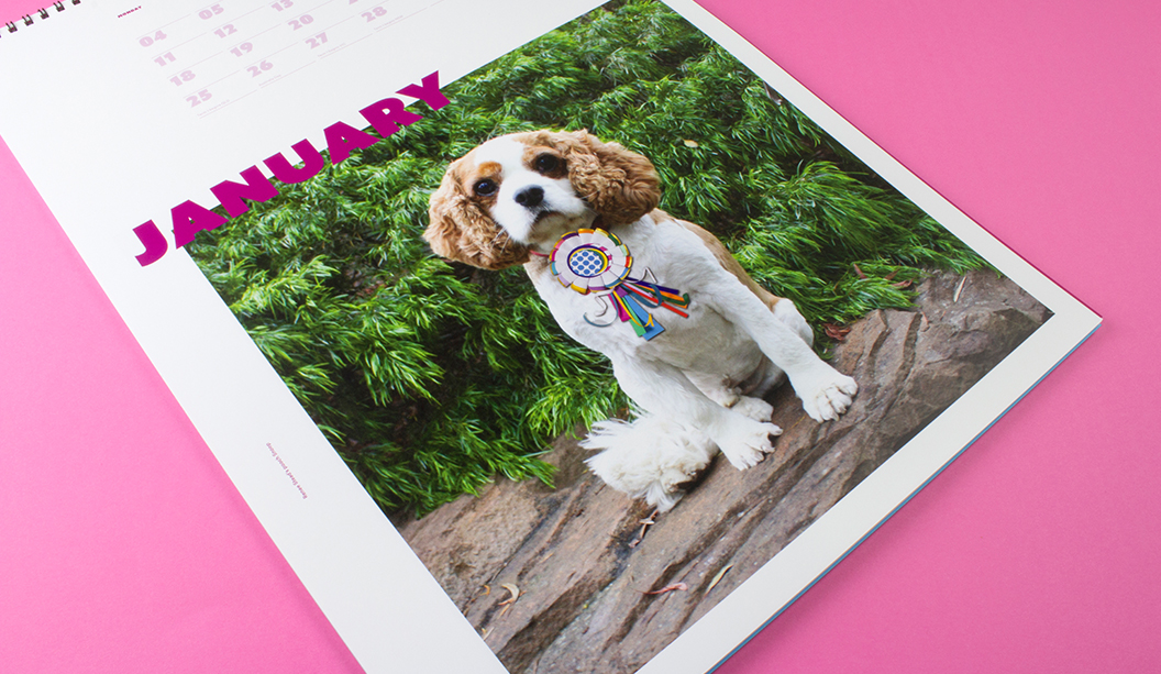
Bring on the 2016 Doggett calendar, as voted by YOU! Featuring many of our favourite papers and a few bells and whistles, ‘Best in Show’ is a celebration, a paper and poochie bonanza showcasing the most popular images dating back to 2000. The fate of the calendar was put in the hands of our customers, paper lovers and social family and over 1000 people submitted a vote. So a huge thank you, to everyone, who participated.
The cover and December artwork is by paper genius and friend Benja Harney. That man can fold paper like nobody’s business and also happens to be the loveliest guy. Benja also made the paper rosette worn by 100 pooches from around Australia that took part in the ‘Pimp my Pooch’ campaign.
What is this you speak of?! Pimped pooches?! We offered all our customers the opportunity to have their pooch feature as the January star in a custom Indigo printed calendar. Some of the stars are shown below and you can check out others on our Insta page.
To all of our lucky customers that receive a calendar, your rep is coming around in the weeks before Christmas with your copy. Enjoy!
Printing specs:
Cover: CMYK plus emboss on Finesse Cast Coated 250gsm.
Credits page: CMYK on Wild 150gsm.
January: CMYK on HannoArt Plus Gloss 200gsm.
February: CMYK on Knight – Smooth 140gsm.
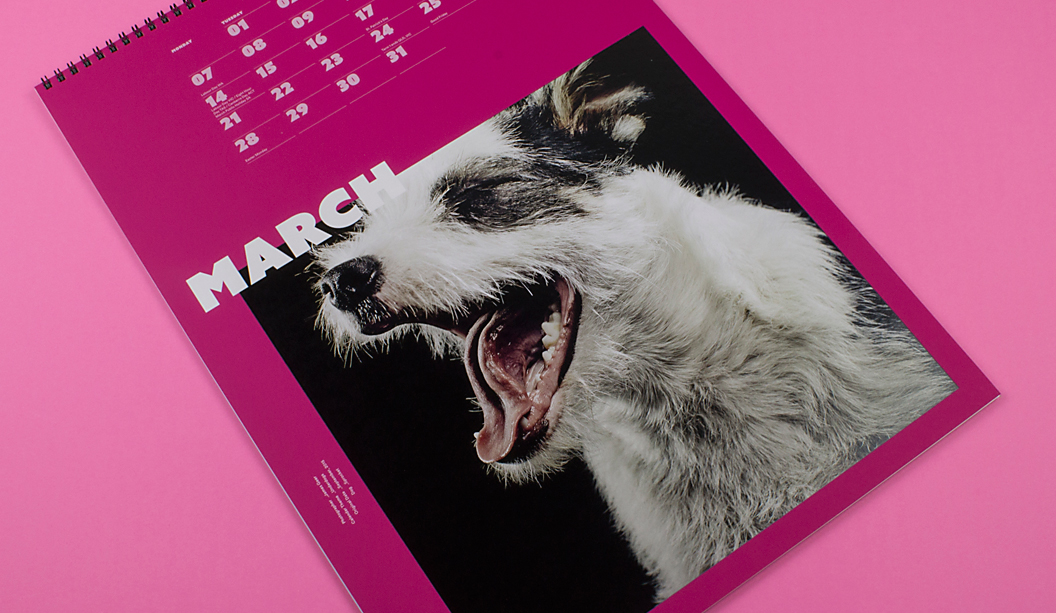
March: CMYK plus 4 hits white ink (title of month) and 2 hits white ink (dates and image) on SKIN Curious Collection – Pink 270gsm.
April: CMYK on Curious Metallics – Virtual Pearl 240gsm.
May: CMYK on Envirocare 100% Recycled 250gsm.
June: CMYK on Cambric – Colonial White 270gsm.
July: CMYK on Tablex – Textures Wrinkles 280gsm.
August: CMYK on plus 4 hits white ink (title of month) and 2 hits white ink (dates and image) on Kaskad – Peacock Blue 160gsm.
September: CMYK on Sovereign A2 – Silk 250gsm.
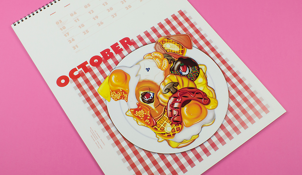
October: CMYK plus Spot Gloss UV on Barry Bleach Board 170gsm.
November: CMYK on Rives Design – Brilliant White 250gsm.
December: CMYK on Sovereign Offset 160gsm. ‘Pimp my pooch’
Custom January month: Indigo CMYK on Sovereign A2 – Digital Gloss 200gsm. Please read the contents page and blurb of calendar.
Check out some of the ‘Pimp my Pooch’ entries. Woof!
Dot Georgoulas’ pooch Diego
Helen McGeachin’s pooch Finn
Renee Stead’s pooch Snoop
A little about us, a little about the calendar: Dogs for Doggett seems a logical connection. But it wasn’t always the case. In the early 90s (hello purple, green and orange corporate colours!), David Lancashire suggested we should incorporate dogs into our marketing material. It took a fair bit of persuading to get Ken and John across the line. Who would have thought a funny name like Doggett would turn out to be such an asset! Fast forward to 2016 and ‘Best in Show’ is a celebration of doggie themed calendars from the last 15 years. It’s worth mentioning that over the years, the calendar has been just as much about the students/emerging talent that create it, as it is about dogs. Each year we brief in the doggie theme and are blown away by the creative ideas we get back. We’d like to say thanks to the students, lecturers and creatives that have helped us make the Doggett calendar such a success.
 Footy Tips