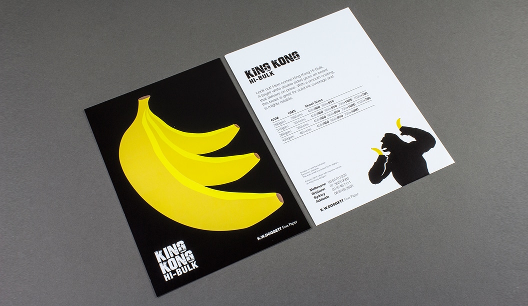
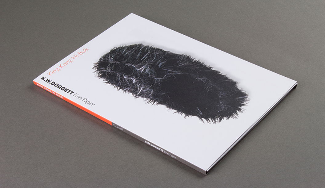
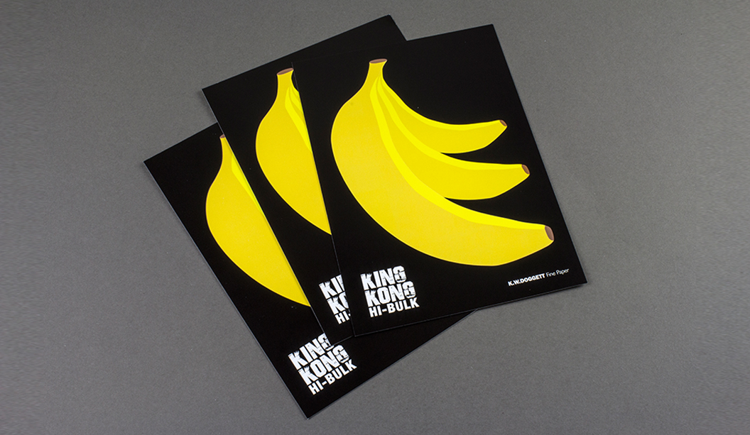
Go bananas for King Kong Hi-Bulk! Like its name, King Kong Hi-Bulk is a formidable new player in our coated product range. Boasting a bright white double-sided art board with gloss finish, it delivers on ink lay down, scoring, folding, laminating and spot varnishing.
For its price and class, you would think this beast of a sheet is off limits, au-contraire paper peeps. It’s surprisingly economical and highly reliable so you can feel confident about great press performance whilst keeping your budget in a happy place. Did we mention it also requires minimum drying time? Available in 260, 310, 360 and 420gsm, you can really go to town with applications including business cards, direct mail, folders, POS, stationery and swing tags to name a few. Coated is the new uncoated, remember that.
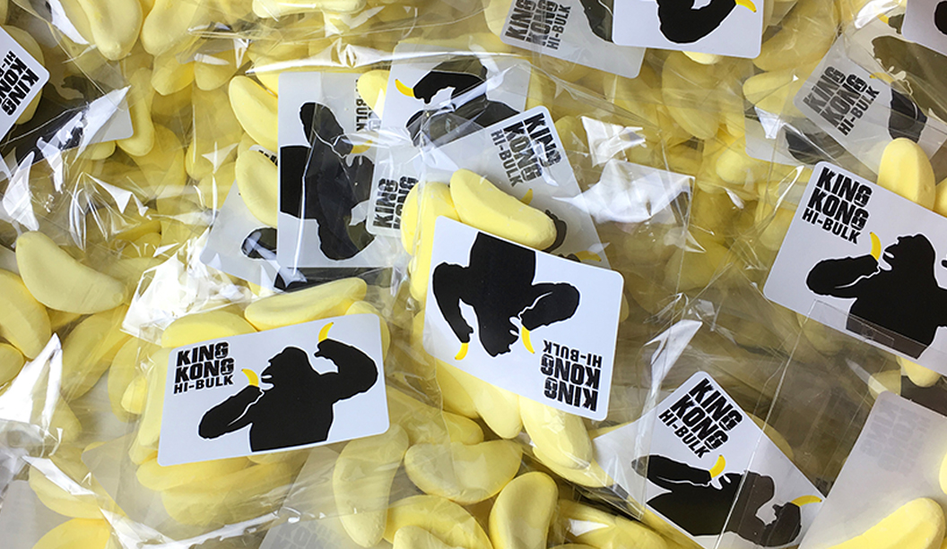
To really show off what this big boy can do, we’ve created ‘scratch n sniff’ A5 postcards with big bright yellow bananas that smell just like…a barn yard. Just making sure you’re paying attention. Smells like b-a-n-a-n-a-s. Pretty cool huh? Printed offset by Whirlwind, the scent was screen printed by TLC. The result came up a real treat, rich in colour with a lovely gloss sheen. And for some super lucky customers, we’re giving out banana lollies.
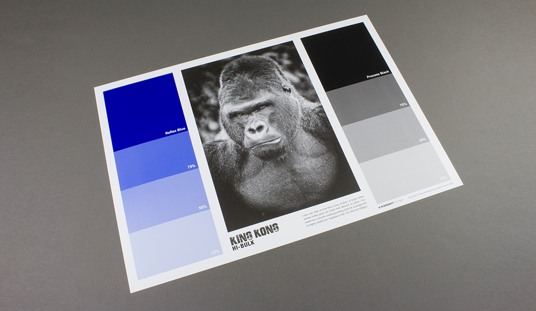
Finally, we have also created King Kong Hi-Bulk A3 print tests to further demonstrate its on-press performance. Printed offset by Print Graphics with Reflex blue, process black and an overall machine varnish, the blue dried well and the press operator was very happy with the sheet.
Be on the look out for your friendly rep who will be by soon to drop off some delicious smelling (and tasting) goodies. Remember, you can always visit our website for more information. Enjoy!
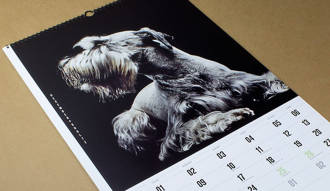
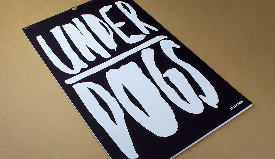
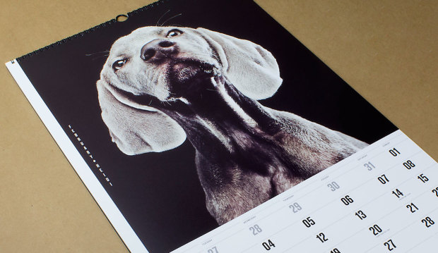
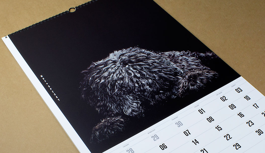
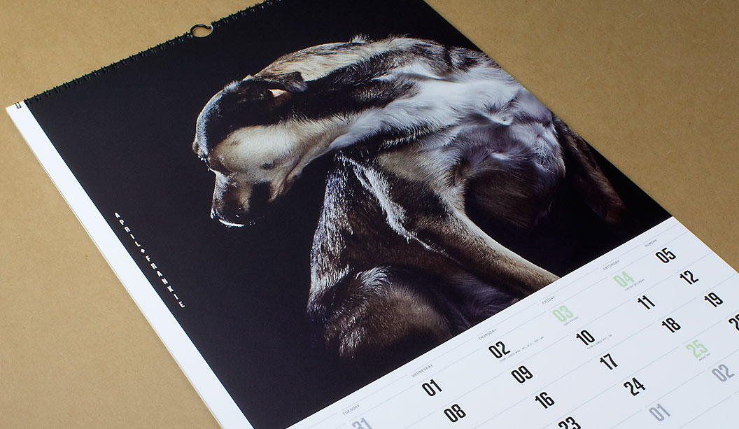
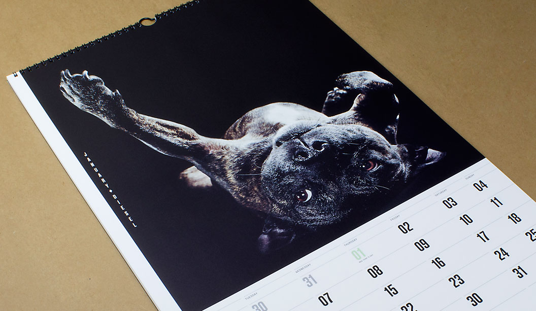
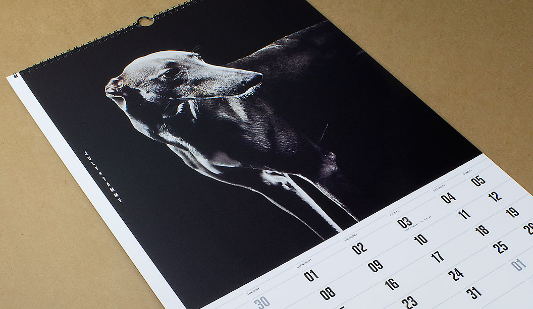
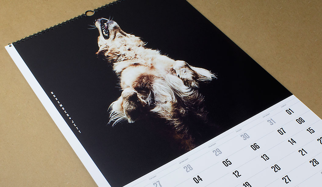
Next year marks our 40th year in the paper biz, so we called in the big guns to create our 2015 calendar which is given to key customers as a gift and a thank you. We assembled a team of poochie lovers that set-out on a collaboration that took nine months to complete. The result is a set of doggie portraits, fashion inspired images of 12 underdogs. The misfits and true Aussie battlers from the wrong side of the tracks.
The team of poochie aficondos was made-up of Marta Roca, Creative Director from online and print magazine Four&Sons along with some students which we found via a shout-out on desktop. The wonderful Caroline Beard and Anthony Stephens, two recently graduated RMIT students from VIC made the cut. They recently wrote to us saying how much they loved the experience, had loads of fun. That the project intensified their love of print and beautiful paper even more and they thanked us for the friendship and guidance provided. We think you guys rock! Ok, enough gushing.
When Catherine Doggett contacted Four&Sons to be a part of the calendar project, Marta says she: “Felt a sense of serendipity. From the KWD team, to the graduates Anthony and Caroline and James Geer, everyone got in sync with the underdog concept straight away. We all wanted to pay tribute to the unsung heroes and to give something back for all of those years of constant inspiration.”
To find the poochie models, we ran a doggy talent search among our VIC clients and customers. The criteria specifically asked for dogs that have been adopted or rescued. Each person submitted a photo and a bio of their dog. We received over 200 entries. A great response and so many great dogs! Marta, Anthony and Caroline chose the final 12 to appear in the calendar.
One camera shoot, one day and a lot of pooches coming and going from the studio in Melbourne’s leafy suburb of Elsternwick. We took the dogs for walks, helped them make friends and let them roam around in the hope we’d capture their true spirit which James did so brilliantly. We gave them lots of attention. It was a big love-in of our furry friends. “Maybe it was the treats, maybe we were just plain lucky. Or all of the above. Whatever the reason, magic just happened! We couldn’t have asked for better models,” said Marta to us recently. And internationally renowned photographer James Geer captured that magic.To say thanks for their hard work, we donated money to Pet Rescue Australia.
That’s it friends, we’re done for another year. We often joke that maybe, just maybe, one day, we will make the calendar about cats instead. Possibly even change our name to Cattett Paper. But we’re pretty keen on the dogs for now, so not just yet. Enjoy the 12 months of canine inspiration! Until next time…
Printing tips… Using the UV offset press (on an uncoated paper profile) means instant drying times and a slight sheen to the ink is created. The darker images were printed using a 225 line screen which gave us a richer black and even ink lay down. The lighter images were printed with a 175 line screen as there was more contrast between the lighter and darker areas. The cover is screen printed with two hits of white to give a bold ink lift.
The paper for the text pages is Strathmore Premium Super Smooth. Being a premium paper, it is ideal for high end photography with even ink lay down. Nice solids and sharp reproduction. It makes the images look great. The Ultimate White is slightly ivory in colour and does add a small amount of yellow to an image (you can compensate for this on press or when setting up artwork).
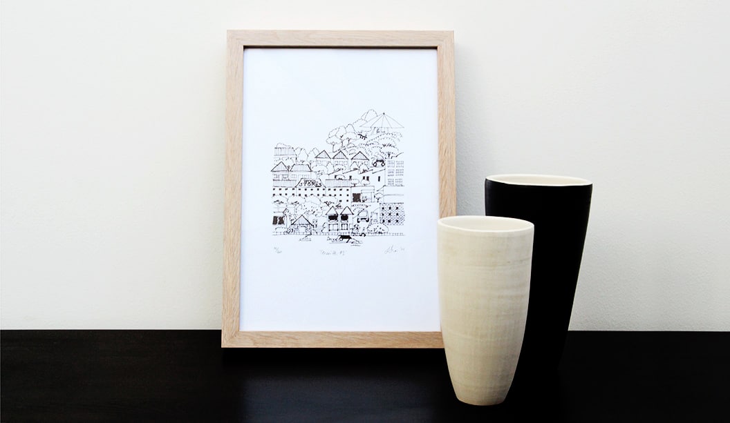
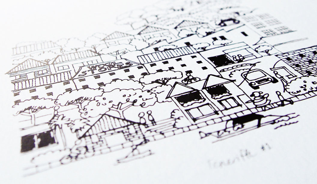
Title: Limited edition prints by Liesbeth Thie from Two Tone Design Stocks:Knight Vellum Printing specs: Screen printed Printed by:Cosmic Screenprinting QLD
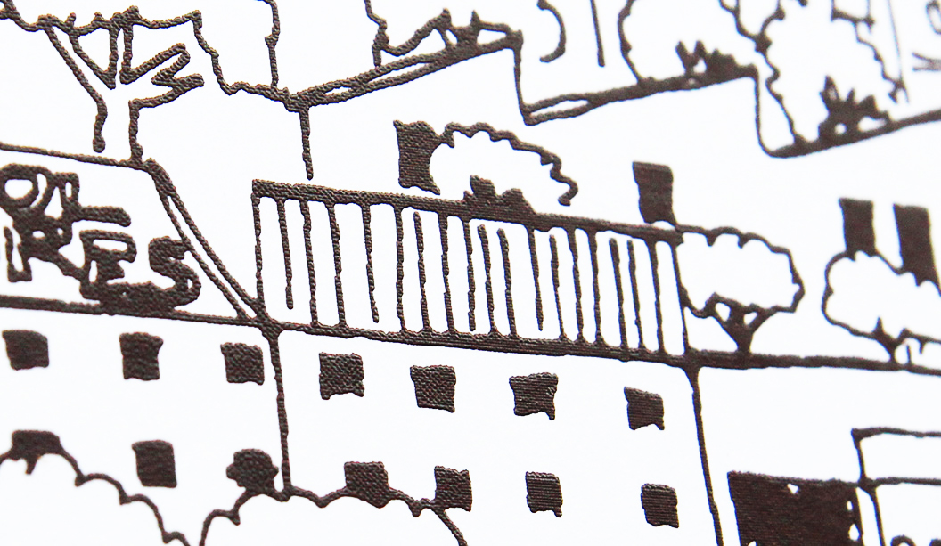
Everyone digs something limited edition. It makes the item all the more special. This lovely range of prints are just that. Graphic designer Liesbeth Thie from Two Tone Design has created some limited edition prints that capture the cosmopolitan Brisbane suburb of Teneriffe, showcasing her love of architecture, history and design with a modern Brisbane flavour.
Her original line drawing has been screen printed in a range of colours on Knight Vellum White 280gsm. Liesbeth shares: “The bright white paper has a crisp finish which was important for positioning the prints as a premium product. I chose to screen print the artwork as it creates a great raised effect in the line work and adds a hand-made touch to the range.”
The prints are the first in what Liesbeth hopes will become a series of beautifully designed and printed keepsakes promoting the city she grew up in and still calls home. You can get your paws on some via https://www.etsy.com/au/shop/TwoToneDesign or New Farm Editions in Brisbane, as well as the Museum of Brisbane shop in City Hall.
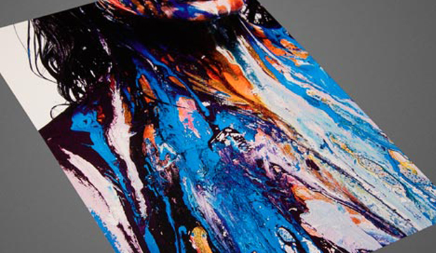
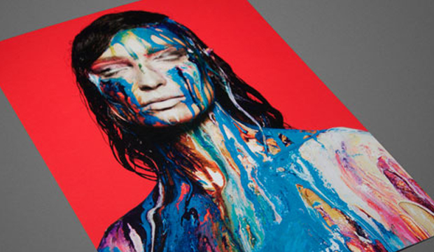
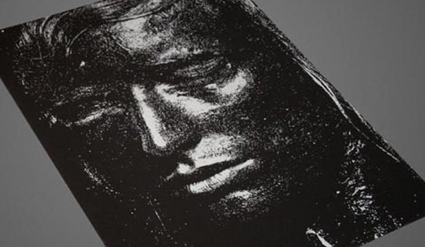
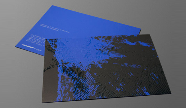
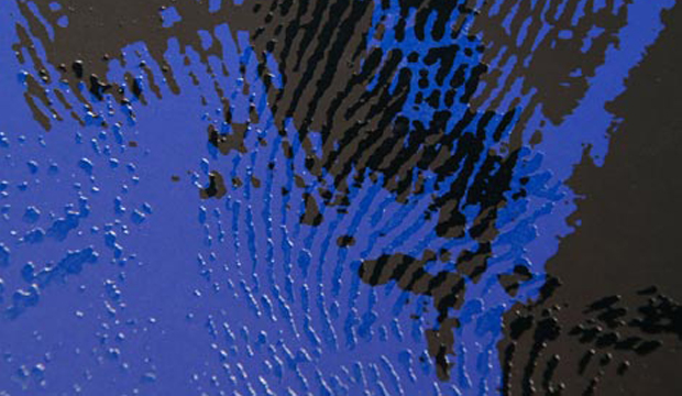
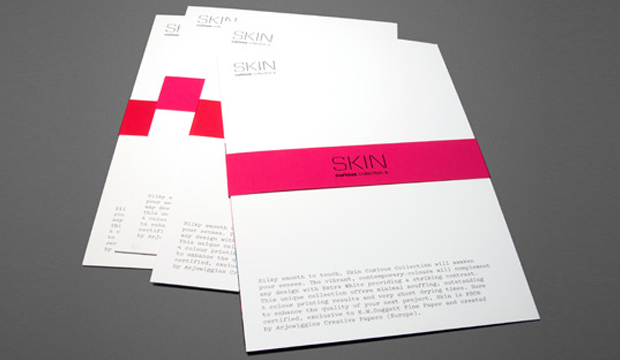
Did you hear? We recently revealed our Skin. A new unique collection of speciality papers that is. Skin Curious Collection is a smooth yet silky range with a distinct matt finish. To launch this exciting new product, we produced a small promo of four A5 cards to show the print quality of the stock as well as a brand spanking new swatch. Three60 created the promo, using the idea of a ‘second skin’ to develop the creative. Three60 often collaborate with some pretty cool cats. Enter photographer Pierre Toussaint and make-up artist Rae Morris. Next, organise a photo shoot of a striking male model with a set of lips most women would die for, add some glycerine and a mesmerising display of paint and you have some seriously stunning visuals that make up the mini promo.
Three60 wanted to create energy and tension with the paint, with the ‘second skin’ made-up of texture and rich colour. They did this by covering the subject in paint so that he was almost non-existent. Hours of experimentation with the glycerine added thickness and body to the paint which was then applied with consideration and yet elements of randomness. We can honestly say when the first round of images came through, there was a touch of shock and yet a massive amount of intrigue. We were like ‘What is this?!’ and yet we absolutely loved it!
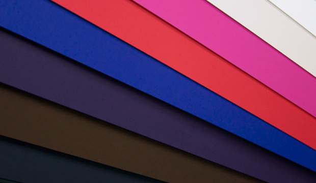
The postcards are printed on Skin Curious Collection Extra White 380gsm (offset printed), Extra White 380gsm (1 colour black offset) this is the spec card, Digital Extra White 270gsm (HP Indigo CMYK) and Black 270gsm (1 colour screen print – silver metallic ink). The range comes in a palette of contemporary colours, includes a digital sheet and is resistant to scuff and finger marks. The three pastel shades (Extra White, Ivory and Stone) handle 4 colour printing brilliantly. Alternating belly bands in either Red 270gsm or Pink 270gsm (1 colour black offset).
You can use Skin for offset printing, letterpress, digital (the certified sheet only) and some great embellishments (think navy foil on the Dark Blue stock or black foil on the black). FSC certified and exclusively sold in Australia by us, the range is created by Arjowiggins Creative Papers (Europe). It can be used for invitations, presentation folders, luxury packaging, business cards, fashion labels, prestigious brochures and books.
To launch the new range we held six intimate breakfast events in VIC, NSW, ACT, QLD and SA. The invite for the launch inadvertently became a second promo. It was a little beauty. A triplexed number with Skin Curious Indigo 270gsm on either side of some Keaykolour Jet Black 400gsm, one hit of silver on the back, see pictures above. There were lots of croissants and coffee, overseas paper samples to ogle at and general good times. Great to see those that did attend rise and shine so early. We loved hosting you!
Your paper specialist or account manager will be around with your Skin promo and swatch soon. Call your nearest samples department if you’d like some Skin samples.
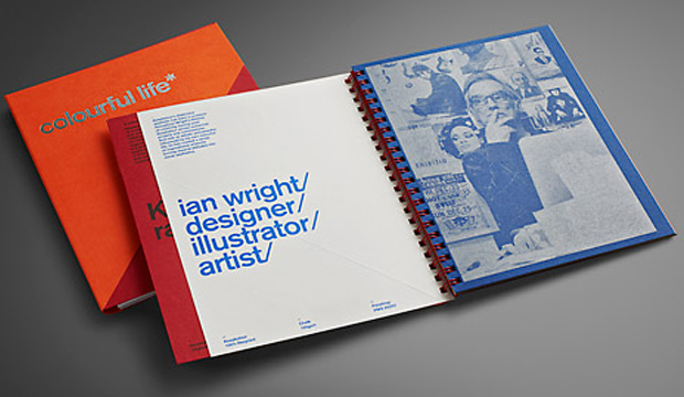
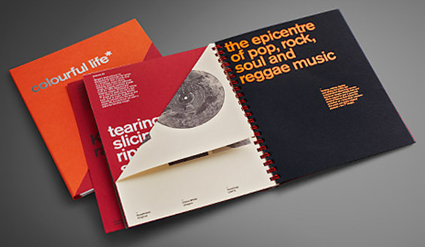
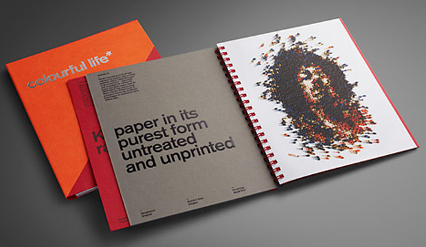
Keaykolour collaborated with Ian Wright, a contemporary artist, illustrator and designer based in the UK to come up with this musically inspired promotion. Ian has had a truly ‘colourful life’ at the forefront of contemporary design and illustration, creating iconic images for culturally hip clients. He has an original approach to image making, reflected in his three works of paper art.
The pieces include the replica of a JVC Boombox, portrait of Jimi Hendrix and a 7” disk of black vinyl. All of them have been created using paper from the Keaykolour range and by cutting, slicing, folding (and in the case of Jimi, rolling 2250 cones of paper, each 20cm high, into pre-drilled holes!), some original pieces of art have been created. Thank you Ian for reminding us how much fun paper can be. It’s like he has taken the primary school days of cutting and gluing and experimenting with paper to new heights!
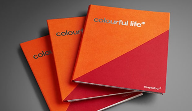
Not too many tricks with this little beauty designed in collaboration with There Design (NSW) and the wonderful company behind Keaykolour – Arjowiggins Creative Papers. There is a duplex cover showcasing the new Tangerine 300gsm and favourite – Guardsman Red. The promo also features the new deeper coloured Jet Black and new grammages. We’ve used some screen printing, PMS 877U, silver and black foil action. The book comes flat, with some pages scored so that people can interact with them. We had a recent range update so we’ve included the revised stock table in the promotion.
If YouTube floats your boat, please visit our channel showing where you’ll find some behind-the-scenes footage and interviews with Ian Wright and the creative process he followed to create the homage to music that is the ‘colourful life’ promotion.
 Footy Tips