Title: The Merchant Apartments.
Agency: Them Advertising (SA).
Stocks: Buffalo Board 283gsm (slip case), Sovereign Offset 250gsm cover and 160gsm text (brochure).
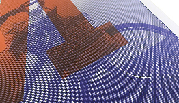
Printing specs: Offset, CMYK + PMS + Pantone Blue 072 U and Pantone 7579 U.
Printed by: Graphic Print Group (SA), binding by Chasdor (SA).
We’re featuring this brochure as part of #kwdpropertyweek this week. We were keen to find out a bit more about Them Advertising’s approach to the project so we spoke to Robert McHale from the agency.
The project involved creating the brand identity for Emmett Property’s latest development in Bowden. The agency’s strong reputation in the field of property development marketing has gotten even stronger with the release of this piece. We dig it.
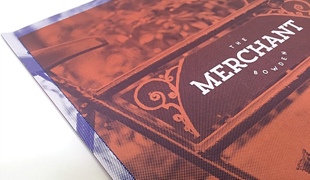
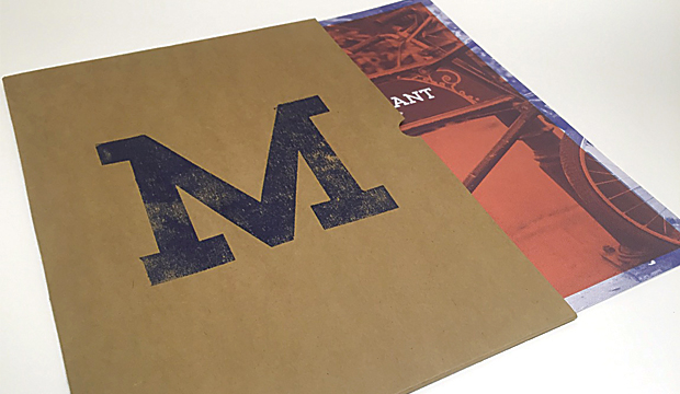
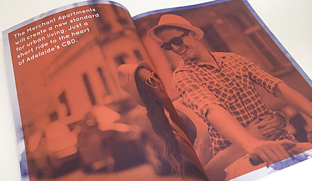
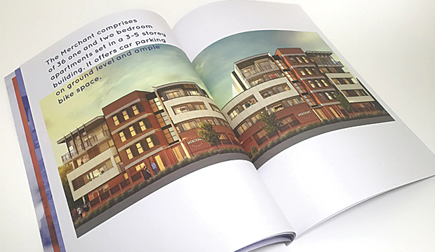
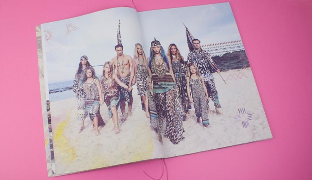
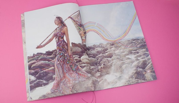
Short and sharp, the brochure is a real showstopper. After undertaking extensive background research, the print piece was designed to reflect the lives of the large number of merchants living in Bowden during the 1800s. Distinctive elements such as the unique, seamless sewn spine were incorporated to pay homage to Bowden’s rich culture. The paper was chosen to complement the history too. Robert explained: “Buffalo Board (the reverse side) was used for the sleeve as it gives a raw and earthy texture which ties in perfectly with Bowden’s history. Sovereign Offset was chosen for the text and cover as it’s an economical, top-of-the-range uncoated stock that provides rich colour and a smooth feel.”
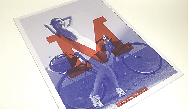
We also wondered, why add a print piece into the mix? In this digital age, does a printed piece really matter that much? Robert said: “Having a printed piece to complement the website added to the entire experience of buying a Merchant Apartment. The unique Buffalo Board sleeve allows prospective buyers to have a practical place to store floor plans and other information. It gives an indication of the quality, look and feel of The Merchant Apartments, helping to sell the overall lifestyle.” Seriously, what a killer idea. Giving the slip case a dual purpose is really clever. Every element of this piece is great: the hand stamped ‘M’ on the front, the use of a packaging grade and design/layout.
We also hear that the printers, being as good as they are, helped the team a lot. It meant there were no challenges when it came to printing the piece. Happy client, happy designer, happy printer (should that be a t-shirt slogan?). And, the development almost entirely sold out within just six months of its release. Nice.

 Footy Tips
