Title: The Merchant Apartments. Agency: Them Advertising (SA). Stocks: Buffalo Board 283gsm (slip case), Sovereign Offset 250gsm cover and 160gsm text (brochure). Printing specs: Offset, CMYK + PMS + Pantone Blue 072 U and Pantone 7579 U. Printed by:Graphic Print Group (SA), binding by Chasdor (SA).
We’re featuring this brochure as part of #kwdpropertyweek this week. We were keen to find out a bit more about Them Advertising’s approach to the project so we spoke to Robert McHale from the agency.
The project involved creating the brand identity for Emmett Property’s latest development in Bowden. The agency’s strong reputation in the field of property development marketing has gotten even stronger with the release of this piece. We dig it.
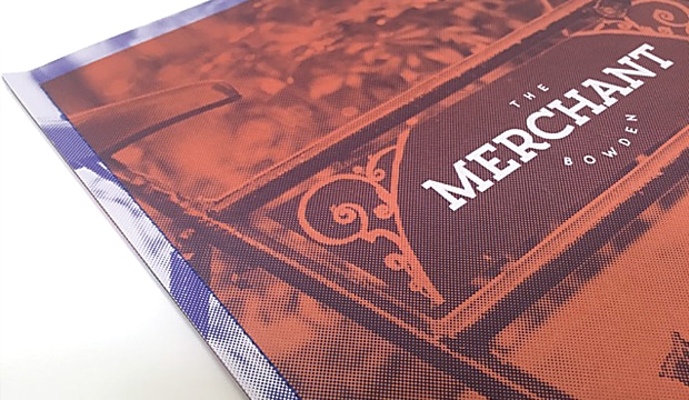
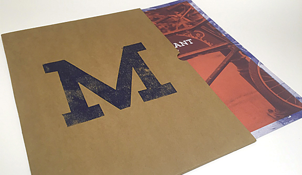
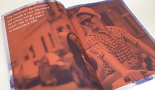
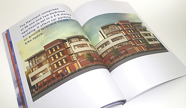
Short and sharp, the brochure is a real showstopper. After undertaking extensive background research, the print piece was designed to reflect the lives of the large number of merchants living in Bowden during the 1800s. Distinctive elements such as the unique, seamless sewn spine were incorporated to pay homage to Bowden’s rich culture. The paper was chosen to complement the history too. Robert explained: “Buffalo Board (the reverse side) was used for the sleeve as it gives a raw and earthy texture which ties in perfectly with Bowden’s history. Sovereign Offset was chosen for the text and cover as it’s an economical, top-of-the-range uncoated stock that provides rich colour and a smooth feel.”
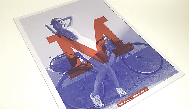
We also wondered, why add a print piece into the mix? In this digital age, does a printed piece really matter that much? Robert said: “Having a printed piece to complement the website added to the entire experience of buying a Merchant Apartment. The unique Buffalo Board sleeve allows prospective buyers to have a practical place to store floor plans and other information. It gives an indication of the quality, look and feel of The Merchant Apartments, helping to sell the overall lifestyle.” Seriously, what a killer idea. Giving the slip case a dual purpose is really clever. Every element of this piece is great: the hand stamped ‘M’ on the front, the use of a packaging grade and design/layout.
We also hear that the printers, being as good as they are, helped the team a lot. It meant there were no challenges when it came to printing the piece. Happy client, happy designer, happy printer (should that be a t-shirt slogan?). And, the development almost entirely sold out within just six months of its release. Nice.
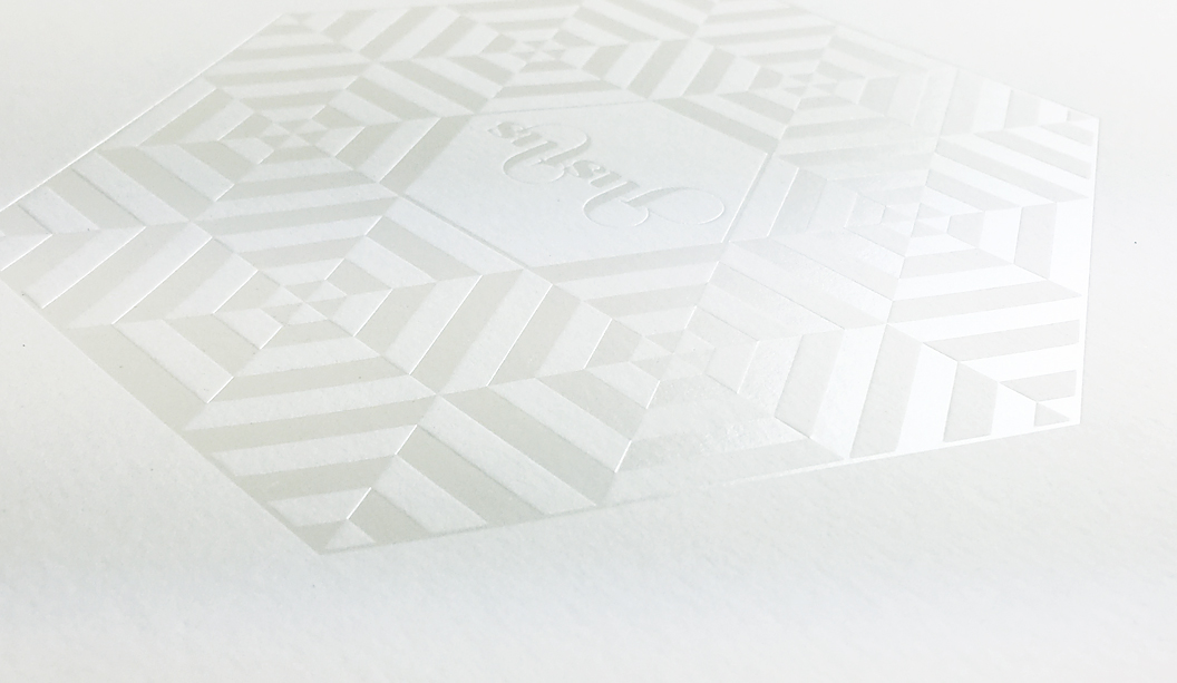
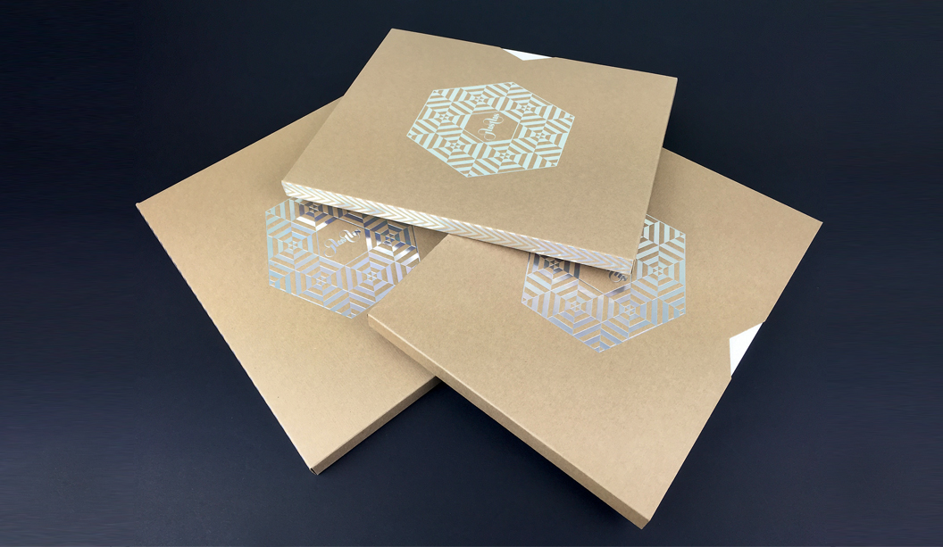
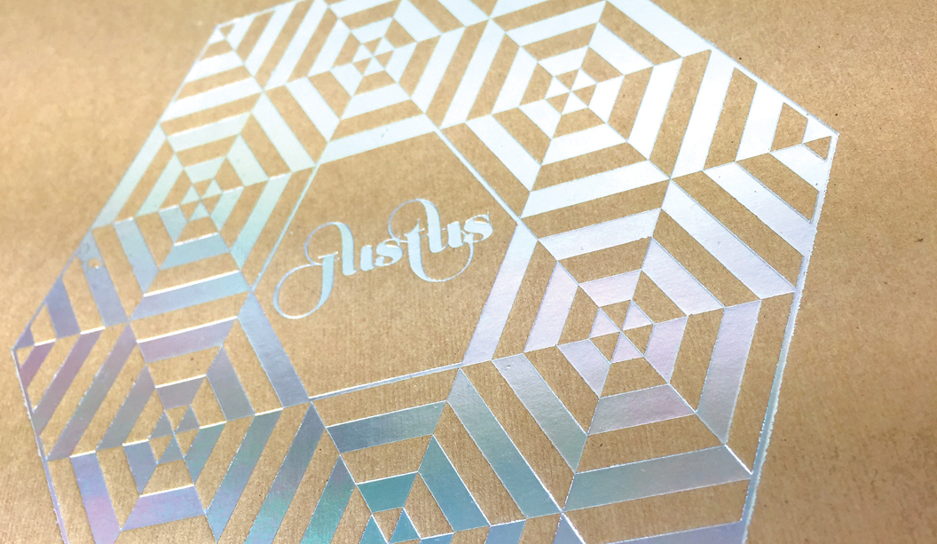
Justus issue 4 is about to hit the streets and we’re super excited to say it features a knockout selection of our finest fine papers. It’s like our paper dreams have come true.
With unlimited access to print and embellishment techniques, the Justus story starts with a Tafeda embossed Buffalo Board slip case, followed by a pearl ‘snowflake’ like foil on Wild paper. Opening the first pages, it shows UV printing on Strathmore Super Smooth and then it rolls on from there. Spot colours, copper foils, a silver reflectakote, French folds, die cuts and more. There is definitely nothing minimalist about Justus issue 4. More is more.
Designed and edited by Lindsay Smith of Eleven Eleven design, Justus Magazine is created to celebrate (and show off), the talent within the Australian print, paper and design industry. It is made by us, for us. Just us. Issue 4 ‘Wrapped in you’ has a central theme of packaging and is printed by Platypus Graphics. Based in Brisbane these guys run a slick operation and their skill as printers, foilers and finishers is clear to see. I addition, there’s also a special HP Indigo section which highlights what these new machines can do and how our paper responds to the new digital techniques.
Your K.W.Doggett Fine Paper specialist has a copy to show you in their next studio visit but if you can’t wait til then, log on to Justus and subscribe for yourself. We look forward to bringing this beauty to market soon.
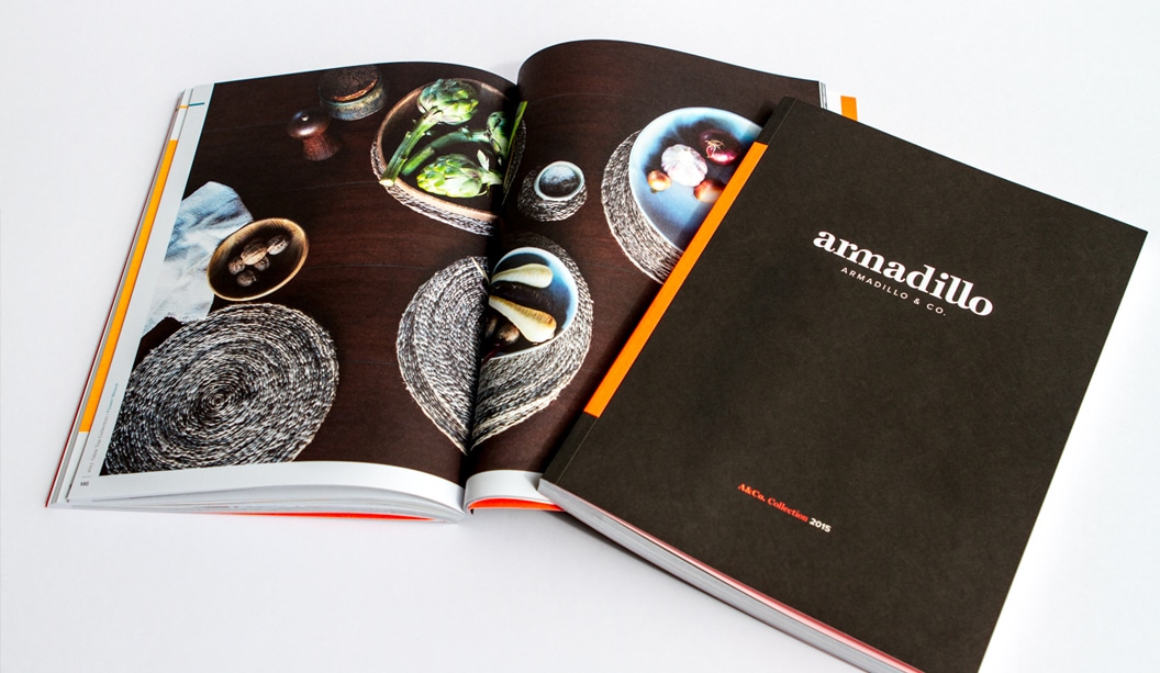
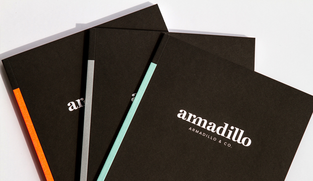
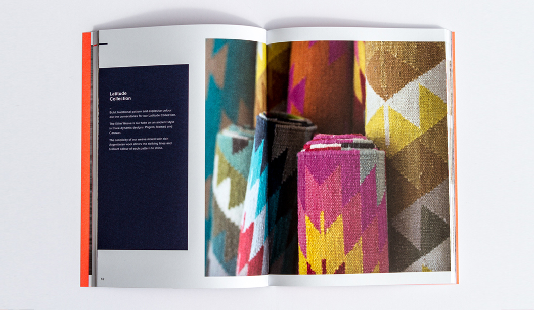
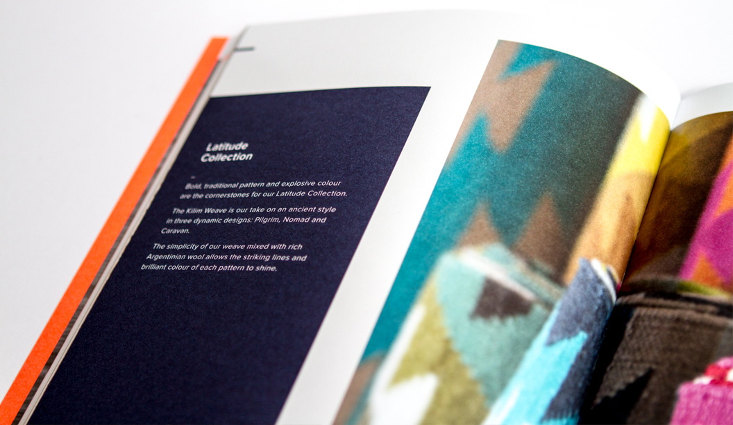
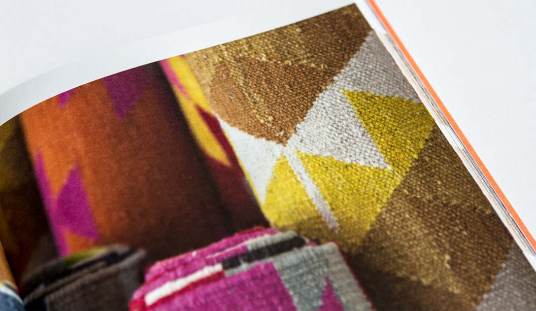
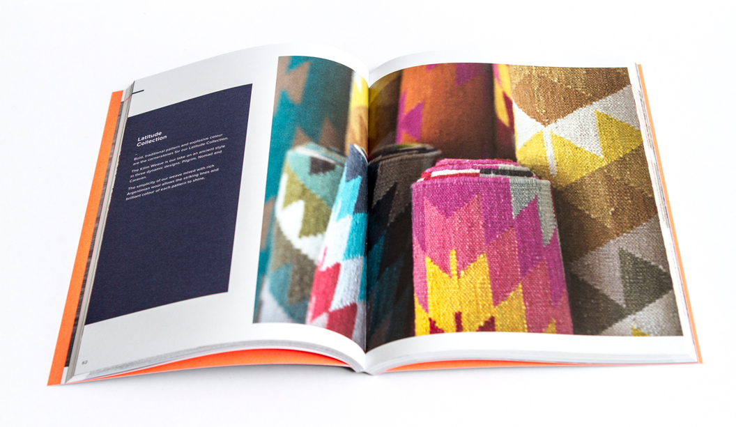
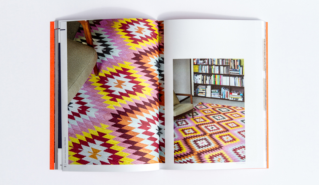
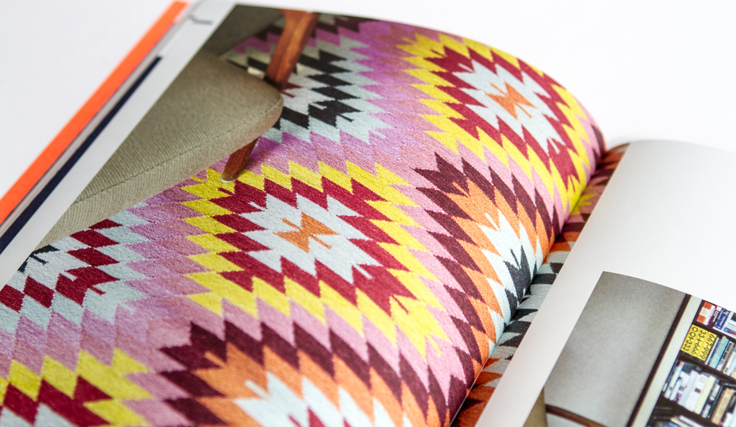
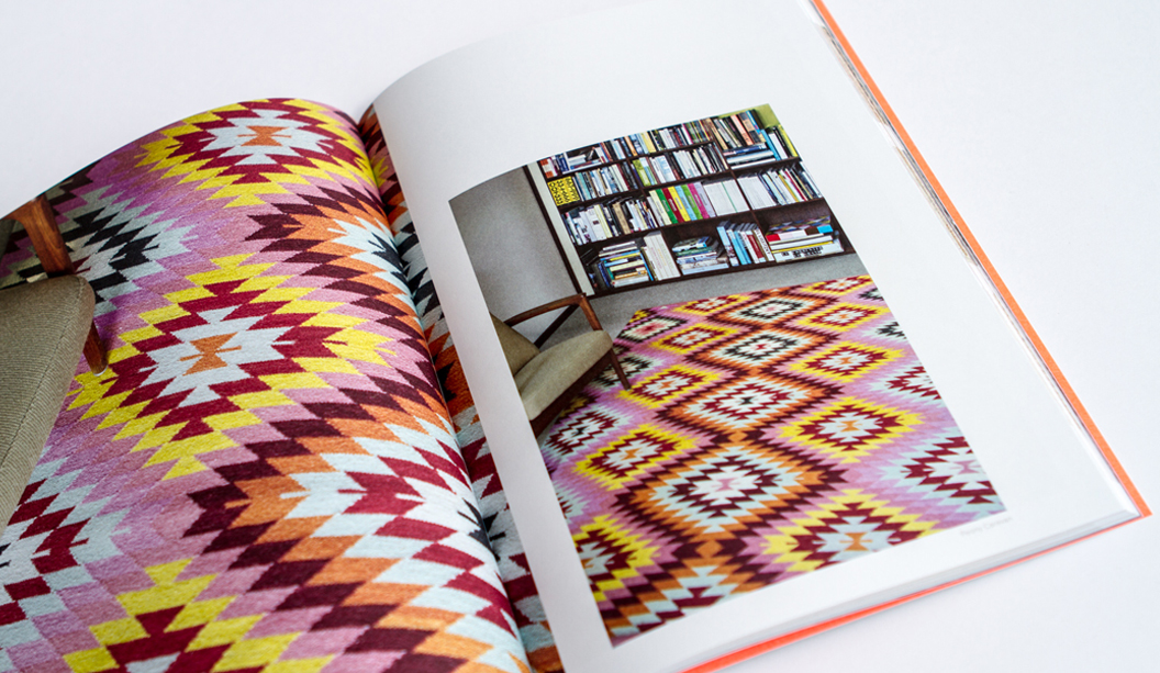
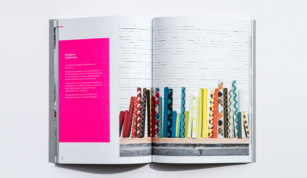
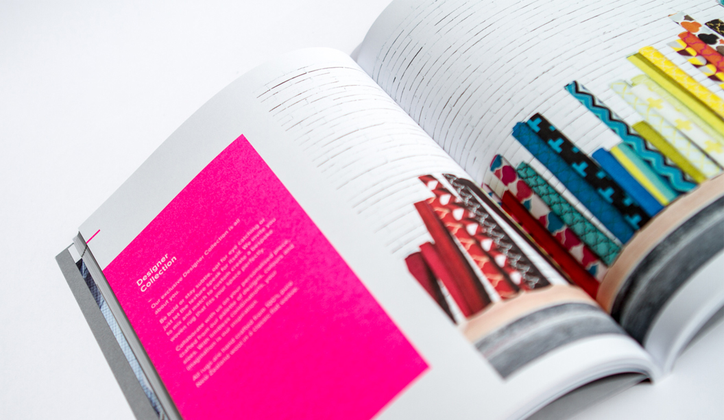
Armadillo&Co is dynamic duo Jodie Fried and Sally Pottharst, who share a love of honest and earthy rugs. This year, it was time to showcase their beautifully crafted pieces in a series of print catalogues.
Founded over five years ago, every piece embraces fair trade practices, is crafted from sustainable natural fibres including pure wool, hemp and PET recycled fibres, and all purchases benefit local schools in their weavers’ villages in India. We can’t help but gush at what a truly remarkable business this is, not to mention their beautiful rug collection. Armadillo&Co explains: “For us, it’s about combining aesthetics with ethics. Our artisans are our extended family – we treat them with love and respect that their weaving traditions have been generously passed down through generations.”
Armadillo&Co collaborated with designer Mike McMullen from Arms Studio in LA, to create the three gorgeous catalogues: ‘Collection’, ‘Bespoke’ and ‘Indoor Outdoor’ showcasing their 2015 range. Each piece is printed CMYK with a different PMS on Knight Vellum 280gsm for the cover and Sun Offset 120gsm for the text. The soft, uncoated surface of the paper pairs nicely with the stunning photography and earthy textures of the rugs.
There are just too many fabulous designs to choose from and we could spend hours pouring over their catalogues. Alas, it’s your turn! Visit http://armadillo-co.com/ we know you’ll love them as much as we do.
Check out how this letterpress poster for RÖMERTURM Feinstpapier was made. It took 5 steps to create this piece of art. We love those pop-out coaster bits. Very crafty.
Format: 30 x 40 cm. Printing specs: offset printing in 4c + 3c letterpress, 1c hot foil, punches and application of 5 paper specimen. Design: ersteliga büro für gestaltung www.ersteliga.de Production: Letterjazz Print Sudio www.letterjazz.com
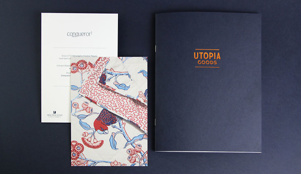
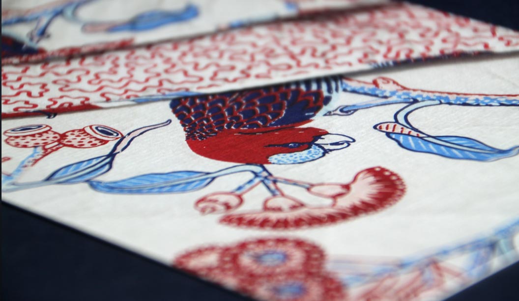
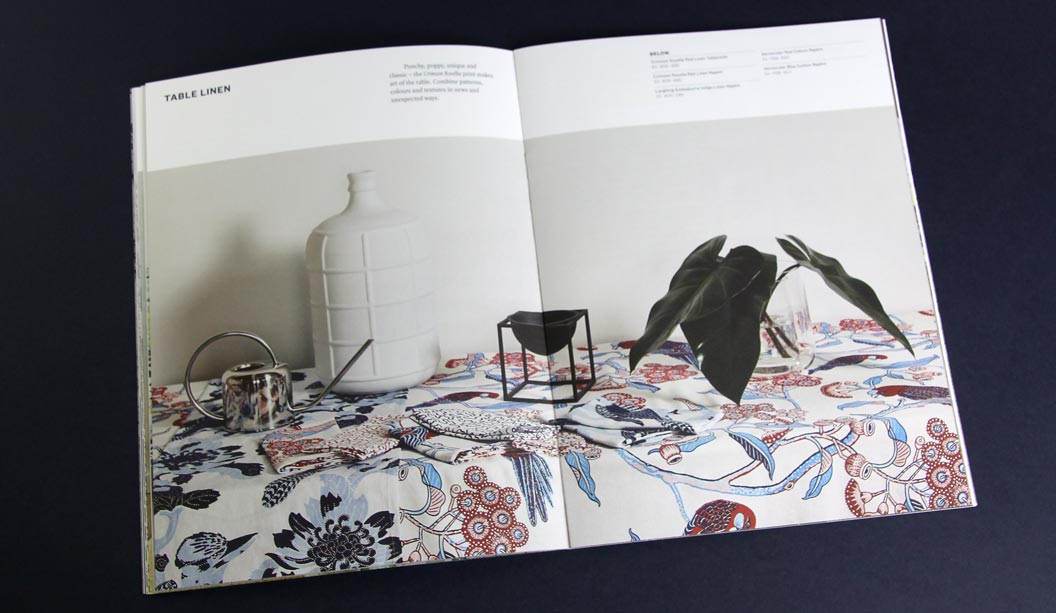
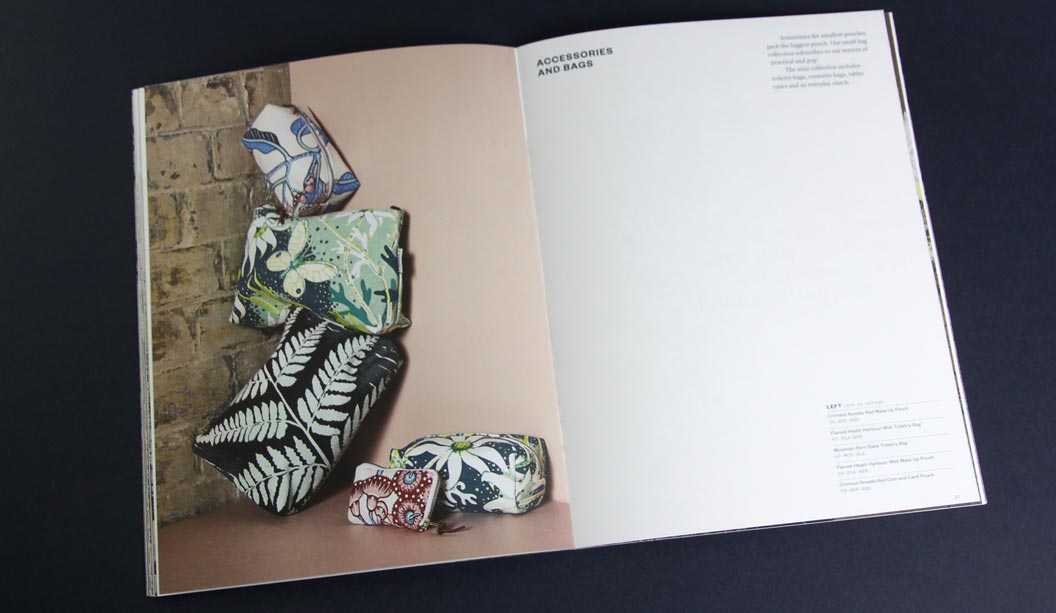
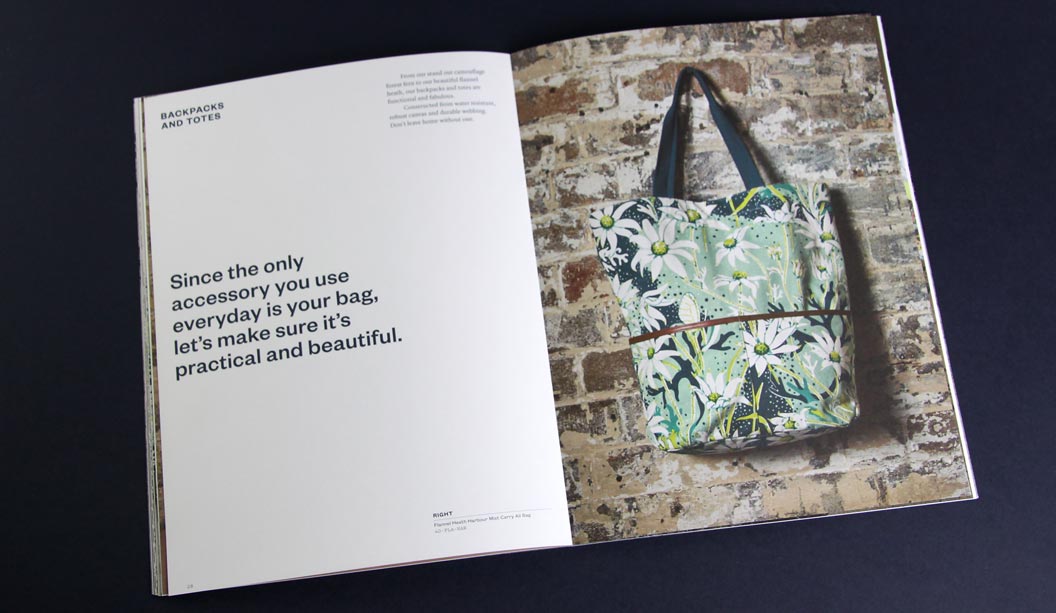
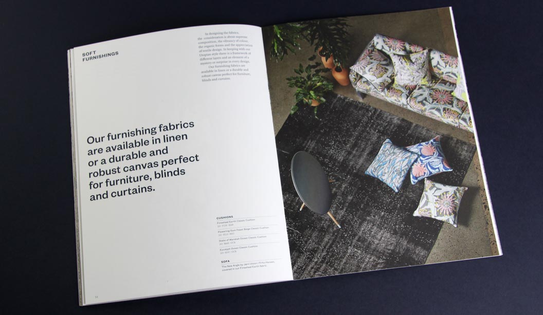
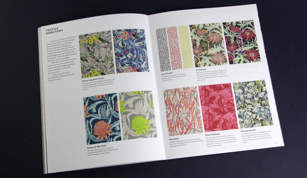
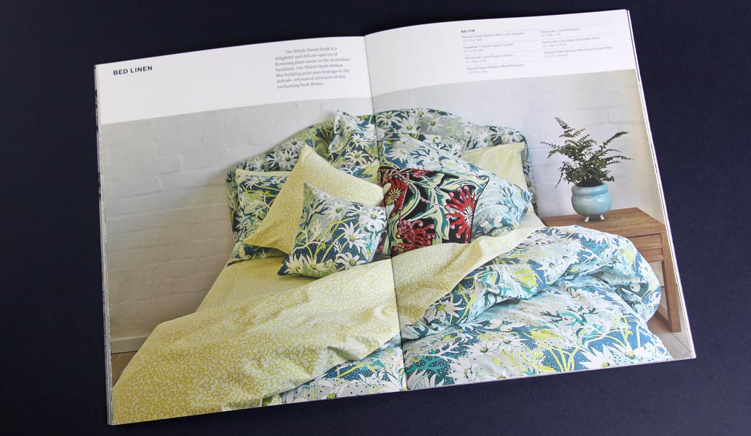
By day Bruce Slorach and Sophie Tatlow run the highly regarded Deuce Design. By night these two crafty cats dream up beautiful modern Australian homewares. Utopia Goods is a range of soft furnishings that centre around Bruce’s illustrative work. It features hand drawn native flora and fauna and is, in their words: “Part maximalist and part sumptuous fabric feast.” We love the colour, the chaos and the maximalist nature of it all. The perfect contrast to all that Danish minimalism of recent times.
For their printed catalogue, Duece were looking for a paper that would reproduce the beautiful bold colours of the collection and still offer the handler a natural finish. We chose Conqueror Wove Diamond White 120gsm, paired back with a Keaykolour Original Navy Blue cover in 250gsm. The Wove paper is soft to touch, not smooth but certainly not rough. The perfect softer style sheet for a brand such as Utopia Goods. Kudos to Special T Print in Sydney, a superb print job.
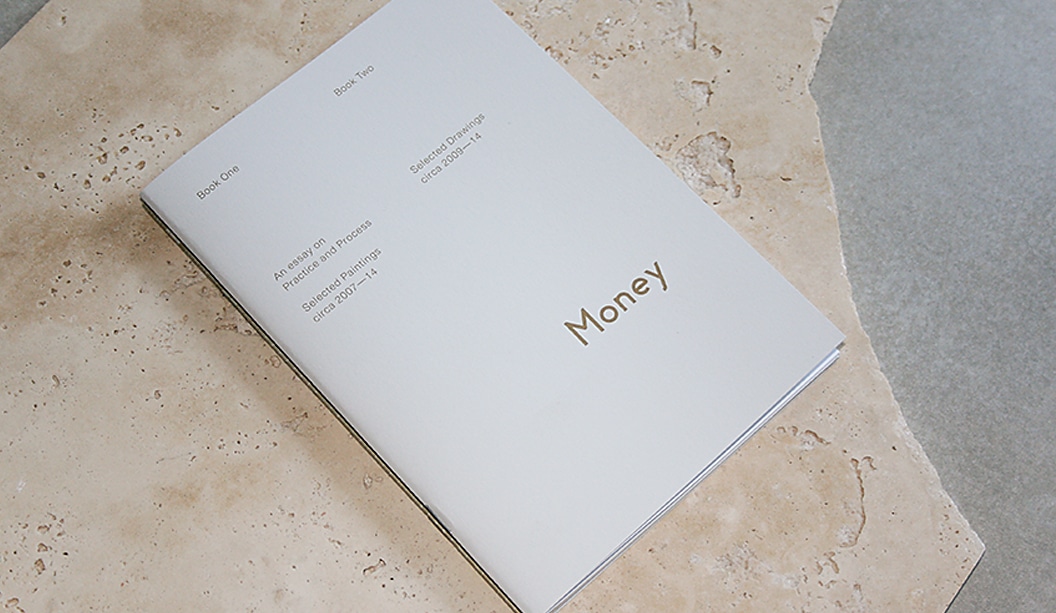
Title:James Money Monograph
Agency:Studio Constantine (VIC)Client:James Money, Artist
Stocks: Kaskad Sparrow Grey,Grange Offset, HannoArt Satin
Printing specs: Offset printed, Pantone 871 and duotonePrinted by:Adams Print (VIC)
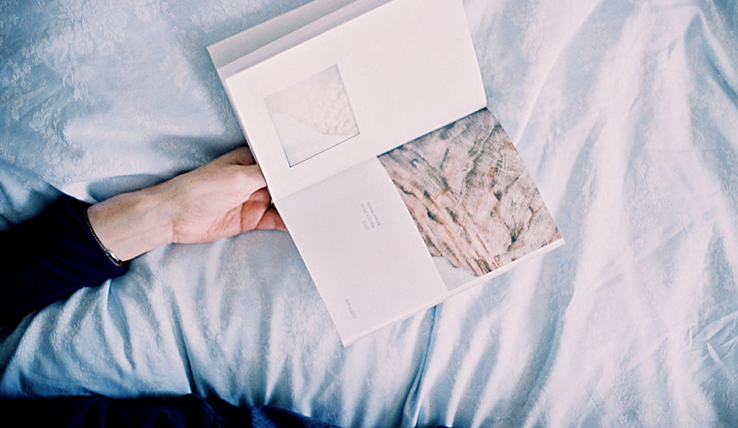
So many songs and puns we’d like to share about ‘money’ right now but alas, it’s not the point of this post. We refer here to James Money, an accomplished Australian artist and Archibald finalist. To launch into the Hong Kong art market during Art Basel/HK 2014, he collaborated with Studio Constantine to create a limited edition monograph of his work. The outcome is this simple and elegant A5 piece printed on Kaskad Sparrow Grey, Grange Offset and HannoArt Satin.Money (we just have to keep using his surname, it’s so great!) is an award winning artist. He works in both portraiture and landscape, exploring themes of isolation. His work appears in private collections around Australia and New York. Studio Constantine worked on all the stages – planning, documenting, editing and production. As David Constantine explains, they were keen to: “Use a format that led readers through the work and articulated the different genres. The layout and typography was deliberately restrained, although quietly assertive in scale.”
So we now have this little A5 beauty to feast our eyes on. A double-spined, concertina fold cover printed with Pantone 871 on the Kaskad with two different text paper stocks – a coated sheet for the painted work (HannoArt Satin) and an uncoated sheet (Grange Offset) with a custom duotone for James’ pen and ink drawings. Dee-lightful.
Documentary images by SC & Flore Diamant.
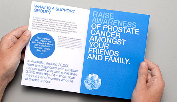
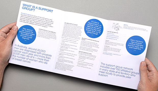
Thursday Design have a knack for teaming up with great illustrators. This time it was Lew Keilar who did a super job of illustrating real people from the prostate cancer community for a series of three A5 brochures. Using PMS colours like the foundation’s blue, PMS 3005 and PMS 144, PMS 305, PMS 583 plus a black, Thursday Design have done a great job of making this collateral a real stand-out. The campaign launches nationally this month so keep a look out for it.
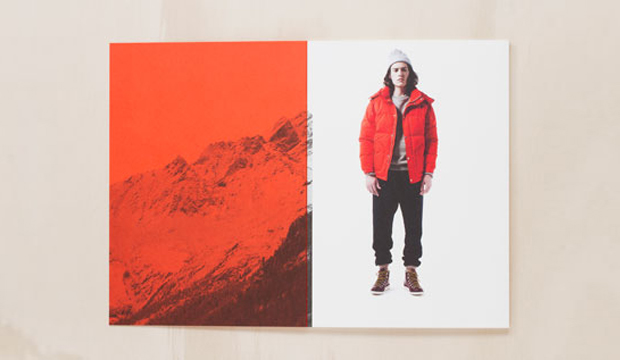
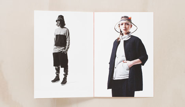
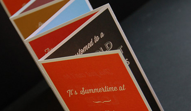
Adam and Amy Coombes share a common passion – they both love fashion and each other! In 2011, this driven and creative couple started Kloke, a Melbourne based clothing label that produces technical garments and tailored detail. Recently, Three60 produced printed piece showcasing Kloke’s Autumn/Winter collection, calling it ‘Dissimulate’.
The A5, 32pp book references the spirit of the brand as a functional and detailed piece. Printed on Strathmore Super Smooth, 352gsm the book is pad bound (also known as cheesecloth). This is where the glue is dyed and the colour is visible on the spine. It also means it can be opened flat for spreads or taken apart and used as individual cards. Printed CMYK plus PMS 172U, we think the PMS has come up a treat, really punchy and rich. Makes buying something even more enticing. Not that we need an excuse.
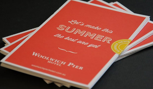
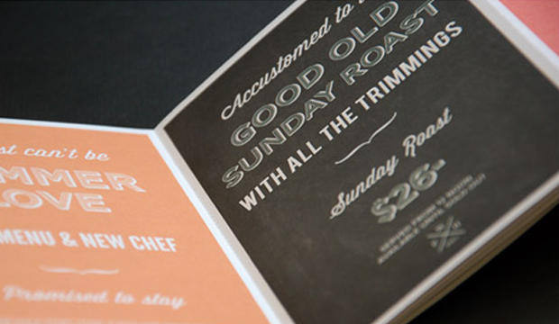
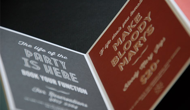
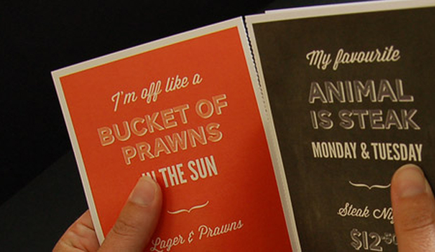
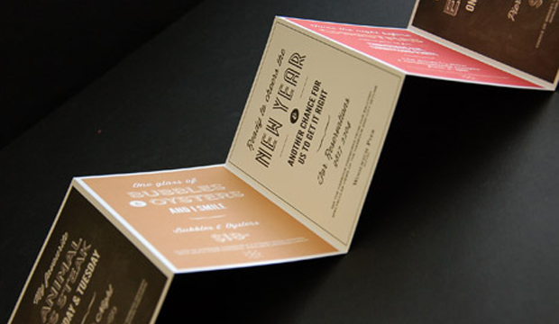
Here’s a direct mail piece that must have had thousands of people in the Lower North Shore and Ryde areas wanting a beer and hearty pub meal! Printed on Knight – Vellum 200gsm, the piece is a 7pp concertina fold with perf, created for one of Sydney’s most iconic pubs, the Woolwich Pier Hotel. The studio behind it is Matter Design (who also designed the hotel’s website and promotional posters).
Matter Design was asked to develop a new style to attract an audience over the Christmas and New Year period. The brief was to take a typographical approach and still have that traditional English feel but with a modern twist. Mission accomplished! You may recognise some of the free Conqueror typefaces that were used – Carved and Inline. Other fonts include Wisdom Script and League Gothic.
The Knight range is known for its tactility and elegant nature, factors that Matter Design took into account. They wanted people to pick up the piece and interact with it so Knight – Vellum was a good choice for them. The client provided creative freedom in all respects which made for a very happy design studio. It’s clear in the outcome – such a fun colour palette and lovely typography, quite different to regular pub branding.
Given the large print run (14,000), the job was offset printed by Lindsay Yates Group. Alyce Biggs from Matter Design explains: “The colours were practically spot on with the Pantone breakdowns on the 7 spot Heidelberg Speedmaster. The printer has great attention to detail and a great technical system so our CMYK was as close to the Pantone as it could be.”
We hope Matter Design keep producing such beautiful printed pieces. We like them a lot.
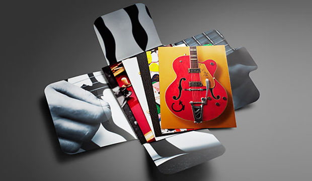
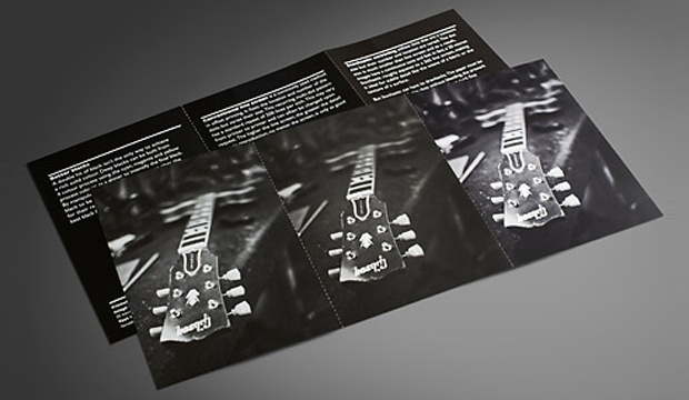
“The time I burned my guitar it was like a sacrifice. You sacrifice the things you love. I love my guitar,” Jimi Hendrix. Ok, so does that mean we need to burn paper to prove we love it? We figured a bonfire in the back of the warehouse would most likely breach an OH&S rule. A paper promotion seemed a much safer option!
In our latest HannoArt promo, we pay homage to the worlds of music and paper. We added an educational twist by including tips about grain direction, colour, printing with blacks, stochastic/conventional line screen and also ink limits. Not to forget the awesome colour and visuals. We really wanted to showcase how well HannoArt handles solid colour and sharp detail. We pondered, we collaborated (with David Lancashire Design in Melbourne), we held production meetings (with Southern Colour in Melbourne) and fleshed out ideas over and over to come up with a promotion that uses achievable print techniques and includes technical information.
This post is going to provide you with some tips and insights into a few of the cards we printed. If you’re not keen on reading any of this, thanks for being here or call your rep and ask them for an in person demonstration. Soak up their technical knowledge!
The spot matt etch, which appears on the front cover is probably the only technique that isn’t offered by a majority of printers. We firstly printed the cover with the fluoro pink, then had it laminated. The spot matt etch was done in a second pass. It’s a matt varnish technique has been applied to the black leather grain area only, leaving the glossy laminate to shine on the plectrums and the ‘IS’.
We purposefully designed some of the cards to be a comparator. The 4pp ’56 Gretsch Atkins card, is one of these. The left image is printed 4 colour process with all over gloss varnish. For the right image, we added a Pantone 877 Silver and spot OP matt and spot OP gloss varnish. We then perforated the card so our customers had the option to take one with them to a meeting and potentially leave one with their client. Now, there’s nothing wrong with the 4 colour image – it looks really good actually. But you can tell the difference with the contrasting card. The silver brightens up the bridge of the guitar, and the varnishes make the guitar pop off the page.
We used Pantone 2935 C for one card because it’s the HannoArt blue. This is such a tricky colour to print with and can be really challenging. The result shows how there is no mottling on the paper which is a really good result. No extra pressure was used for this card but we did use a stochastic screen to produce crisp, clean edges in the small logos and tiny type. Gloss varnish was used to seal in the colour better.
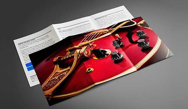
We’ve got an unofficial favourite – the 6pp red guitar. We tricked this one up on purpose. It was good for us to see what difference the Pantone Rubine Red C bump plate could make with this type of image. The body of the guitar just looks so much brighter and richer with it. And the Pantone Silver underlay boosts up the hardware. On the back, there are tips on colour, so we replicated a small square of the Pantone Blue with a CMYK blue to show the difference. It’s pretty obvious, the difference, and handy to know the compromise you’ll make if budget doesn’t allow for a PMS.
The final card in the pack shows three images – a 4 colour b&w stochastic, monotone stochastic and monotone conventional. On the reverse we have printed three blacks. The 4 colour b&w printed stochastic is a stand-out in this set, a much warmer black. On the reverse, we’ve show just how different stock looks with a varnish, we printed each card with a strip of satin sealer, gloss varnish and then no varnish. We perforated this card as well so you can compare the blacks next to each other.
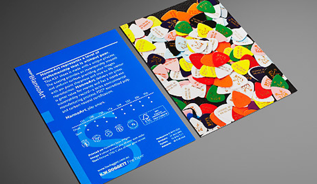
You may recognise the images we’ve used are from the 2010 promotion Sappi released called ‘Dave’s Guitar Shop’. In Wisconsin USA, Dave’s famed guitar shop houses a rare collection of guitars by legends like Gibson, Fender and Gretsch and other music legends. This place is apparently a mecca for guitar lovers from all over. As an extra bonus, we have a Dave’s Guitar Shop plectrum in the promos! Just like the iconic instruments at Dave’s, HannoArt bears the hallmarks of quality and craftsmanship.
Printing specs:
Folder (outside): Satin 250gsm, 4 colour + Pantone 806 C (plectrums). Spot matt etch. All over gloss laminate.
Folder (inside): 4 colour black and white image, matt laminate.
Card 1: 2pp, Satin 350gsm.
Text: 4 colour process plus all-over satin sealer.
Image (close-up of the Dave’s 25th anniversary guitar) : 4 colour process + all over gloss varnish.
Card 2: 2pp, Satin 350gsm.
Text: 4 colour process plus all over gloss machine varnish, Pantone 2935 C.
Image (branded plectrums from the front cover): 4 colour process. All-over satin sealer.
Card 3: ’56 Gretsch Atkins. 4pp, Gloss 300gsm.
Left image: 4 colour process. All-over gloss varnish. Perforation at 6 TPI (teeth per inch).
Right image: 4 colour process. Spot Pantone Silver (first pass). (Second pass) Spot OP gloss varnish over the guitar and spot OP matt varnish over background to create a contrast. Black plus all over gloss varnish.
Tip: Ink limits.
Card 4: Three Fender Telecasters from the 50s. Gloss 170gsm.
Image: 4 colour process. All-over gloss aqueous varnish. Scored and folded.
Text: Black plus 2 hits Pantone Silver 877 C. All-over gloss aqueous varnish.
Tip: Grain direction.
Card 5: 60s Gibson ES 355. Gloss 250gsm.
Image: Pantone Silver (separation). First pass. 4 colour process. Second pass. Pantone Rubine Red C (separation). Bump plate in second pass. Spot OP gloss varnish on timber areas.
Text: Black plus all-over gloss varnish. Left card has two squares: PMS 2935 (same as the blue on card 2) – CMYK (which shows the nearest match you can get using a CMYK breakdown).
Tip: CMYK and spot colour.
Card 6: Satin 250gsm. 6pp.
Image (left): Black monotone printed stochastic. FM screen, 20 microns. Satin sealer.
Image (middle): Black monotone printed conventional. AM screen, 200 lines per inch. Satin sealer.
Image (right):4 colour black and white, printed stochastic. FM screen, 20 microns. Satin sealer.
Text (left. Tip – Better blacks: 4 colour black. K100 with underprint of C40, M20, Y20.
Text (middle). Tip – Conventional line screen: Dense black.
Text (right). Tip – Stochastic screening: Standard process black.
Varnishes Each text card has three varnishes applied to it in columns. First column is gloss varnish, then satin sealer then no varnish.
 Footy Tips