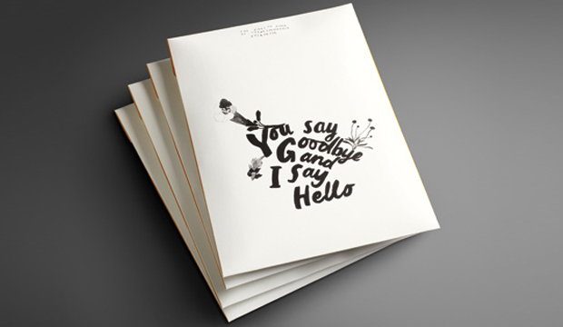
Buffalo Kraft illustrative poster

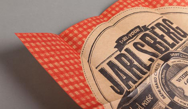
Title: Wheel ´O cheese
Agency: Seesaw Design (Melbourne)
Client: K.W.Doggett Fine Paper
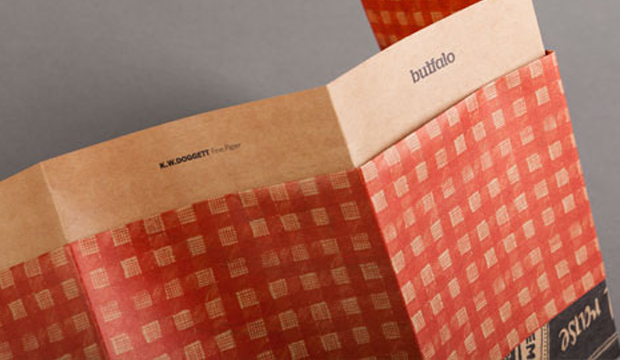
Stocks: Buffalo Kraft
Printed by: Bambra Press (Melbourne), 2 colour process – PMS 485 C and Black 6 C

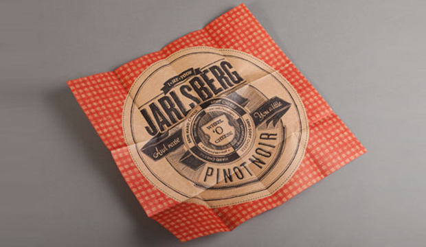
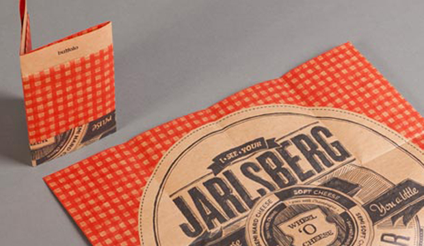
´I see your Jarlsberg and raise you a little Pinot Noir´. Wine and cheese. Is it the perfect match? We think so! This illustrative poster is printed on Buffalo Kraft, the newest addition to the Buffalo range and complements our recent Buffalo Board promotion showcasing delicious recipe cards.

Buffalo Kraft is a natural looking brown Kraft paper and versatile packaging grade with FDA approval for direct food contact. For Seesaw Design in Melbourne, cheese and wine was the perfect match, so with this tasty inspiration in mind, they set out to create an illustrative piece that was loosely informative, matching specific wines with cheese.  After enjoying the Buffalo Board promotion so much, Seesaw were excited to create a second piece for the Buffalo range. From the onset because this paper FDA approved, it was obvious that this piece had to relate to the world of fast moving consumer goods (FMCG) or hospitality, but it also needed to go that extra step. With gorgeous vintage and modern cheese label designs in mind, their inspiration came from the tongue-in-cheek style of info-graphics and the intricate details contained within them.

Buffalo Kraft_5

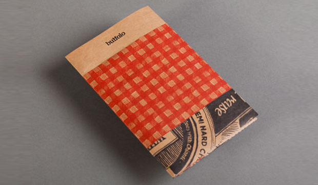
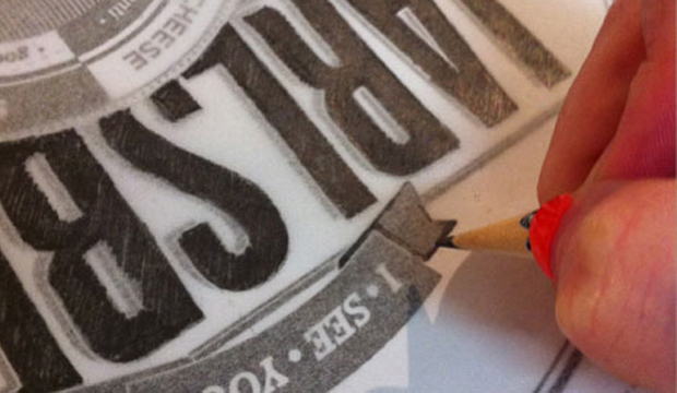
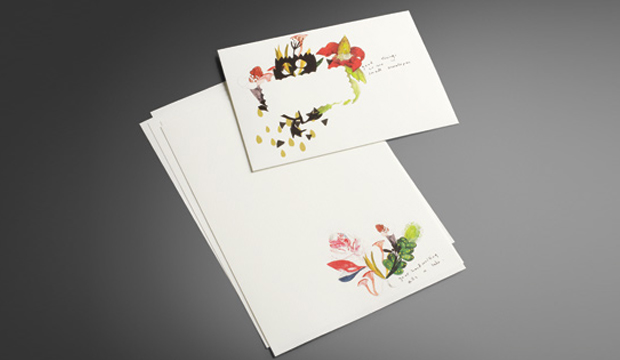
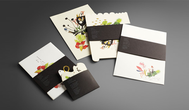
Jess Pigot from Seesaw says: “The brief came to us with the potential for foiling, embossing or any number of finishes. We found that the stock has so much character and personality, that it really doesn’t need a lot of finishes to make it look fantastic. I guess the lesson was a simple one… keep it simple!” The result is a small A6 parcel on Buffalo Kraft 80gsm, with a tablecloth graphic (suddenly our thoughts turned to a sunny Sunday afternoon picnic) wrapping around the middle like a belly band. Containing a series of unique and unusual folds, the parcel gradually reveals the artwork step by step, opening to a 450mm square poster. Kudos to Seesaw for this clever illusion. The final touch was physically drawing the entire piece, which enhances the raw, organic and handmade look and feel of the stock.

When we asked Jess what the studio liked about Buffalo Kraft, she was all smiles: “The stock was fantastic to work with. The print result was crisp and clean and the stock handled the colours really well. Strengthening the colours at press check stage can achieve great richness and a lovely rich black that is a great contrast to the colour of the stock. The warm colour allows for a completely different aesthetic to any artwork.”

Buffalo Kraft is an unbleached, natural brown Kraft paper. Featuring high tensile strength it’s perfect for sacks or bags containing foodstuffs, animal feed even ready-mix building materials. Buffalo Kraft is versatile and even comes in a range of envelopes. Lightweight with good opacity, it’s perfect for wrapping bread, chocolates or even the odd piece of Jarlsberg cheese. Yum!

Your K.W.Doggett Fine Paper specialist will be out to see you soon with a copy of this promo. Otherwise, please call our samples departments. If you have any specific packaging related questions, please call our dedicated packaging business development manager John Alipan on 0434 692 446 or email him jalipan@kwdoggett.com.au.

Buffalo Kraft_1

Buffalo Kraft_2

Buffalo Kraft_3

Buffalo Kraft_4

Bird Design business cards

Title: Bird Design business cards
Agency: Bird Design (VIC
Stocks: Conqueror Laid
Printed by: Taylor’d Press (VIC), Edging – OrtBindery (VIC).

In the previous story, we talked about Bird Design’s stationery suite project for Owen & Peach, and now we’re going to talk about the designers themselves. Meet Bird, a Melbourne based graphic design studio that develops engaging design experiences across architectural and environmental signage/graphics, branding and print mediums. Their studio business cards are an expression of the studio’s character – a less is more approach which is greatly influenced by Director Luke Carson’s design philosophy.

Bird-2

There is an underlying grid system which supports the constructive design so Bird wanted to choose a stock that complemented this approach. They decided on a natural, exposed paper that has texture, something you can feel. Conqueror Laid Brilliant White ticked all the boxes for them. Bird ended up choosing the beefiest option, going with the bulky 400gsm which they say made the painted edges slightly more visible. This, combined with the textured feel of the paper, added a softness to the constructive design.

The cards are printed 1 colour both sides with edge colouring to match the PMS 1788. A tip if you ever chose to do something similar – paint small stacks to avoid any colour bleeding. So, there you have it, a pretty sweet and simple business card that screams ‘less is more’.

Photographs provided by Albert Comper.

Bird-3

Bird-4

You say goodbye, I say hello

Title: You say goodbye, I say hello
Agency: Ortolan
Client: K.W.Doggett Fine Paper
Stocks: Keaykolour Original / Rives Design / Rives Tradition
Printed by: Bambra Press

I am covetable, colourful and exciting. You want to use me, but I often get forgotten. What am I? Introducing our latest promotion for Rives – a modern day stationery set, complete with communication etiquette tips! The Rives promotion reminds us that in this day and age, we often forget the art of old fashioned communication. What? There is no hash tag involved? Impossible!

You say goodbye_4

‘You say goodbye, I say hello’, is a promotion that showcases the versatility of Rives, a stock often used for letterheads, business cards and invitations. This provided the foundation for the creative development. We were fortunate enough to collaborate with two self-confessed Rives lovers – Kat Macleod and Narelle Brewer from Ortolan.

Kat and Narelle played further with the idea of tradition, took inspiration from the classic art form of botanical illustration, and included a twist. The result is a contemporary illustrative approach, featuring water colours of classic botanic specimens combined with made-up mutant flora. The word mutant conjures up a frightening image, but these illustrations are anything but that – they’re beautiful.

The stocks used for the 2011 Rives promotion include Rives Design and Tradition. It consists of post cards (die cut with the most gorgeous illustration and embellished with a hint of gold foil – see pics above), note paper, envelopes and gift cards (that even come with their own yellow string ready to attach to a gift!) and a paper chart.

The promo is printed four colour process, the belly bands with two spot colours (one hit of silver and one hit of white), and everything is perfectly packed into a main envelope (printed outside one colour (black) and inside one colour (yellow PMS 109). Printed on the belly bands are cheeky etiquette tips like: ‘If you want to be invited back, think ink! An email is not a thank you note’; and, ‘Your hand writing tells a tale, make it your best’.

Fusing the strength of tradition with the energy of the present, Rives is a naturally elegant collection ideal for even the most contemporary communications. Available in Design – a discreet, fine mesh texture; Tradition – a refined felt-like finish; and, Design Digital – an indigo compatible sheet. Rives is exclusive to K.W.Doggett Fine Paper and proudly made FSC certified by Arjowiggins Creative Papers (France).

You say goodbye_1

You say goodbye_2

You say goodbye_3

You say goodbye_5


Strength and Beauty is Knight

Title: Strength and Beauty
Agency: Three60 (VIC)
Client: K.W.Doggett Fine Paper
Stocks: Knight – Smooth / Knight – Textures / Knight – Vellum / Knight Smooth – Cream
Printed by: Bambra Press (VIC)

This was a truly special project for us, a collaboration of creativity, inspiration and fashion, where everyone involved was fully immersed in the process. The large format book ‘Strength and Beauty’, and three complementary A5 postcards, feature a stunning series of photographs that are a modern interpretation of medieval heroes and heroines. The book and cards showcase Knight, a unique collection of high quality uncoated papers.  With a delicate and even surface, Knight is finished to ensure beautiful printed results for communications that require elegance, strength and beauty.

Beauty-is-Knight_6

We had the privilege of working with some really talented people including (but not limited to!), Three60 who provided the design and creative direction, talented photographer Justin Cooper, Visual Thing & Mr Woolf in charge of post-production, and some of Australia’s top stylists and fashion houses namely Jolyon Mason, who provided the expert styling, and fashion labels like Romance was Born,Toni Maticevski, Skin and Threads, Zambesi, Diesel and Manning Cartell among others.

The book really is a tactile and visual experience, capturing the outstanding print quality, high resolution imagery and versatility of the range which boasts a comprehensive choice of weights and finishes and is even made from environmentally sustainable pulp. The images reveal how beautifully the Knight range prints 4 colour process, handles rich solids and sharp detail with ease, and how it adds distinct warmth and beauty to enhance skin tones.

Handy hint: Re the 4 colour process set-up, we used the ISO uncoated colour profile and 2 colour process made up of Process black and Warm Grey 6. We opened up the mid-tones to allow for gain and images were over sharpened to allow for ink swell on the press.

For your very own copy of the Knight book, please contact our samples department or call your specifications representative.

Beauty-is-Knight_1

Beauty-is-Knight_2

Beauty-is-Knight_3

Beauty-is-Knight_4

Beauty-is-Knight_5