Paul Robertson’s business cards

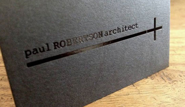
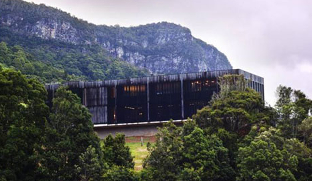
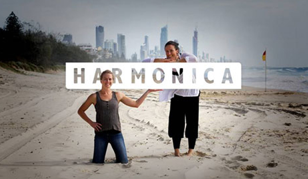
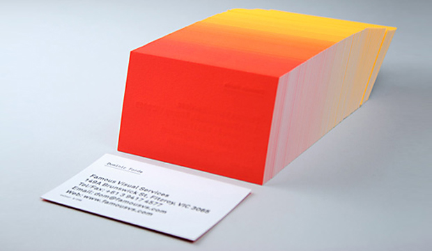
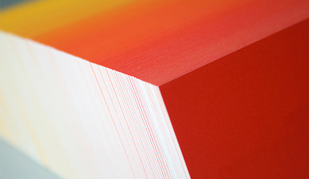
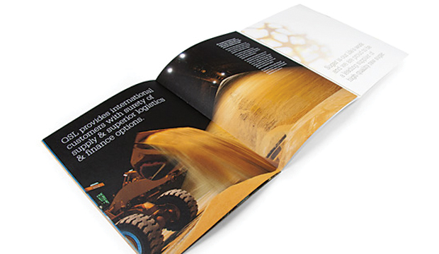
Title: Paul Robertson’s business cards Agency: Harmonica (QLD) Client: Paul Robertson Stocks: Keaykolour Original Printed by: Gold Coast Foil Printers (QLD) Paul Robertson is an award winning architect from the Gold Coast. He’s also a creative, laid-back surfer (who lives on a boat) and is very modest about the beautiful structures he creates. Thanks to a local studio named Harmonica, made-up of long term friends Rachel Smith and Kate Moloney, some very classy business cards have been created using Keaykolour Jet Black. The cards appealed to Paul’s understated style and arrived just in time as he was jetting off on a whirlwind trip to Spain. Adios Amigo!

Paul_4

In designing Paul’s business cards, Harmonica had to walk a fine line between corporate, casual and creative without appearing too flash or in their words ‘without all the bedazzle’. To Rachel and Kate, using Keaykolour was an obvious choice having worked with the stock before. Kate tells us: “We knew the standard of finish we wanted to achieve and instantly knew that Jet Black would fit the bill for our black card dreams and desires.” Gold Coast Foil Printers in Queensland helped them out with foil selections which the Harmonica team said was invaluable. They’re big supporters of using on shore services (just quietly, so are we!) even if it means the price is higher. Harmonica’s advice: “Support local suppliers and talk to them if you don’t understand anything. Old school service is the way forward.” It also meant they could get the job done yesterday. The black gloss foil combined with the heavy 400gsm stock created the perfect balance of contrast and discretion. The result is a sophisticated and simple design and we’re guessing the Spanish like them too. Olé! We have to say, studios like Harmonica are yet another example of the amazing creative coming out of the Sunshine State. Kate commented on the fact there are heaps of rad designers, illustrators, photographers and web gurus right in their backyard. We definitely agree. Projects designed by Queensland agencies are coming across our desk in a steady stream and we’re continuously impressed with what we see. You can also check Harmonica out on their Facebook page.

Paul_5

Paul_3

Famous Visual Services business cards

Title: Famous Visual Services business cards
Agency: Self-promotion
Stocks: Concept Vellum
Printed by: Taylor’d Press (VIC)

We love a bit of colour around here. We have even been known to say certain colourful designs remind us of 80s icy poles. These business cards are definitely a reminder of 80s Summer time goodness. These knockout cards were produced by Dom Forde from Famous Visual Services. For Dom, new business cards present the opportunity to experiment with ideas and materials. And experiment he did!

Visual_1

Concept Vellum Radiance was chosen for its ability to handle fluoro ink well. Dom wanted to enhance the vibrancy of the colours and he also knew, on advice from James Taylor at Taylor’d Press, that the stock handles letter press well. Especially the heavy grammage – 352gsm, which can take a robust indentation from the machine. The outcome is a vibrant set of cards with luxurious tactile qualities.

The patience of James Taylor was really important in the process. As Dom explains: “Our idea was to print a slightly different colour shade across the back of each card in the print run. First we printed a solid fluoro yellow on all 250 cards, then we then ran the cards back through the press adding dollops of fluoro red to the press as the cards were running.” The result is a 250 step gradation from yellow to red across the print run. The name details were letterpress printed in black. Now that’s a nifty business card print job if ever we saw one. And yes, he did say 250 step gradation. Amazing!

Visual_2

Visual_3

Paper hearts by Le Cordon Bleu

Stocks: Curious Metallics

Oh the joy when a piece of paper art crosses our path. This gorgeous and colourful creation was sent out by Le Cordon Bleu Australia as part of a Valentine’s Day email. If you’re not familiar, Le Cordon Bleu offers training in cuisine, pastry, management and gastronomy. The email sent out on 14 Feb, titled: ‘Cooking for love, for the love of cooking’, offered a dessert recipe – chocolate flavoured puff pastry crisps with fromage blanc and orange cream, cherry and banyuls wine sauce. Need we say more?

Darren Taljaard from Le Cordon Bleu wanted to create something handmade, novel and unique ie nothing kitsch, overly used and definitely no stock images! He used the Curious Metallic range (Violette, Red Lacquer and White Gold) in 120gsm to create this little beauty. As he mentioned to us: “The rich colours and luxurious metallic effect worked perfectly to convey the feelings of the heart! They evoke wealth and suggest that the message is a valued gift. The deep purple of the Violette created a lush backdrop for the very rich and intense Red Lacquer. The White Gold, because of the golden metallic component, stood out beautifully on the white background and complemented the two intensely coloured papers used in the rest of the heart.” And in case you didn’t notice, the thin strips are conceptually linked to the blue ribbon in the company’s logo.

Darren was happy with the Curious Metallics range, he mentioned: “The paper is of a high quality and it’s smooth so was easy to work with. It has a certain ‘memory’ when curled and so was easy to ‘draw’ with.” And for any budding paper art enthusiasts out there, it’s best to use a lighter GSM in order to bend and curl the strands smoothly. Darren says that in the end, each strip needed to look like a fusion of calligraphy and paper.

The heart received loads of positive feedback. It seems that hand made, traditional illustration techniques are still very much appreciated. It could be the recognition of the effort that goes into designing something hand made, the delicate nature of the process, the precision, using real materials – all of it strikes a chord with people in a very postmodern age.

Working with paper has been highly satisfying for Darren. It has opened a new direction in paper illustration for him and he’s certain to follow up with more increasingly elaborate designs. We’ve had a chat in the office and the only thing that could make this heart better is if it was edible. Preferably something chocolatey like the recipe. Yes, it’s unanimous, that would make our day!

Cordon-2 Cordon-1

Owen & Peach stationery

Title: Owen & Peach stationery suite
Agency: Bird Design (Melbourne)
Client: Owen & Peach
Stocks: Knight – Smooth
Printed by: Taylor’d Press (Melbourne)

Newly formed graphic design studio – Bird Design in Melbourne, created a bold, confident new look for Owen & Peach (chartered accountants) and TVA Partners after they merged in late 2011. Corporate stationery is often pretty uniform – you’ve got your corporate colours and a brandmark. And then, when a company throws in a blind emboss or two, you get a corporate stationery suite with a dash of something special. We love a little embellishment – of the print variety that is!

Peach-4

And who can overlook a strong brandmark? Something that is as memorable as it is simple. Bird Design created an upward blue tick/arrow for the Owen & Peach branding to emphasise growth and positive movement. Combined with the use of bright blue and black, it gives the stationery a much more contemporary feel. Knight Smooth White was chosen as the stock for the entire suite to complement this direction. The suite includes notepads (105gsm), letterhead (105gsm), with comps (105gsm) and business cards (350gsm) printed 2 colour with an embossed brandmark on the business cards, letterhead and with comps.

Bird Design shared some of their thoughts about the print finish on the Knight Smooth White: “The stock held the ink/colour beautifully. A nice flat coverage with the natural fibre of the paper was still visible. An initial concern was how the fine blue lines on the business card would look on the press but the colour held very well and the contrast of the black, blue and the whiteness of the stock is very punchy. The stock held the emboss well too.” We think the business card is particularly impressive with the discreet yet stylish pattern. Who said blue and black should never be seen. We love it!

The Bird Design recipe for success included a thorough understanding of the brief and also the history of both companies which they started to unravel out in the initial meeting. This helped drive and direct choices later in the process including the selection of paper which needed to be bold and contemporary and include suitable stock weights throughout the range. What can be better than a happy client at the end of the day? Bird Design delivered a suite that was on brief and successfully delivered the intention to create a confident and bold stationery suite.

Photographs provided by Albert Comper.

Peach-1

Peach-3

Peach-5

Queensland Sugar Limited corporate brochure

Title: QSL Corporate Brochure
Agency: Lloyd Grey Design
Client: Queensland Sugar Limited
Stocks: Cambric Linen
Printed by: Inprint Limited (Brisbane)

They say success is sweet. So most days at Queensland Sugar Limited (QSL) must be pretty good then! QSL is an Australian marketing and logistics company based in Brisbane, responsible for the marketing of the majority of bulk raw sugar exports produced in Queensland. Lloyd Grey Design have been working with QSL since 2009 to redesign their identity, build brand equity and the QSL brand experience. Last year, QSL approached them to come up with a high quality corporate brochure to further position them as the leading raw sugar marketer in Asia.

Sugar-4

Ok, so sometimes we read ‘corporate brochure’ and think bo-ring. But not this time. Lloyd Grey Design went down the unconventional route with this one. The brochure needed to appeal to international customers and trade houses and showcase QSL’s expertise and innovation. The brochure has 24 pages and the eight page cover has two internal sections (each containing eight pages), which were collated and saddle stitched into the gatefold cover. They combined a memorable design with feature photography, key messages and relevant diagrams and there you have it, a corporate brochure minus the boring factor. Not surprising then that the brochure created quite the impression during face-to-face meetings.

The brochure was printed on Cambric Linen Arctic 271gsm/118gsm in 4 colour process plus PMS 7497u, featuring a white pearlised foil on the front cover. Here’s a neat story about why Lloyd Grey Design chose the stock. “We thought it was well suited to QSL as it shares strong symbolism with what forms the basis of QSL’s business – sugar cane. Like the cane, Cambric Linen is fibrous and has a natural, textured feel, without overwhelming the design. We felt the pearl foil contrasted with the paper texture for a beautiful finish.” Like we always say, there is a paper to match every occasion!

Sugar-2


Sugar-1  Sugar-5

Making an Impact!

Title: Making an Impact!
Agency: Thursday Design
Client: K.W. Doggett Fine Paper
Stocks: Impact
Printed by: Southern Colour – NSW

A bold promotional campaign showcasing our new environmental champion, Impact 100% recycled.

The creative team of Thursday Design in Sydney were chosen to bring this bold paper to life. The brief was to create a robust personality and not become another clichéd environmental paper promotion. The ‘Impact’ promotion needed to stand alone but still be taken as a serious contender, in the growing environmental paper market.

Making-an-Impact_5

The solution
The concept for the campaign was conceived after exploring words and phases which linked ‘Impact’ (and the papers environmental attributes) to the sport of boxing, for example, fighting for what you believe in / challenges faced / raw / standing for something / guard / light-weight through to heavy-weight / protect / undisputed champion.

A photographer, Lee Valentine – was commissioned to document a dedicated young boxer preparing for his next professional fight. Hundreds of images were captured from the torturous training program in Western Sydney. Stunning images were taken of the boxers sparring in temperatures regularly climbing over 40°c in the gym.

The shoot climaxed after five weeks of training, when the young fighter in his sixth professional fight -successfully knocked out his opponent in under three rounds. The result provided the campaign with a visually striking conclusion.

The result
A 32 page photographic essay was offset printed, using five colours on four weights of Impact, including a large silver foiled 120gsm dust-jacket. The oversized proportion (240mm x 340mm) of the brochure enables the images to have maximum visual impact on the page, demonstrating the stocks superb ink holding qualities.

The over-riding aim of the project was to promote the use of sustainable paper options and to show that recycled and carbon neutral papers can still deliver exceptional print results.

Impact is made from 100% post consumer waste and is a carbon neutral product to K.W.Doggett Fine Paper warehouses nationally.

To receive your copy of the Impact paper sampler, please contact your nearest Sample Department.

Making-an-Impact_1

Making-an-Impact_2

Making-an-Impact_3

Making-an-Impact_4

Making-an-Impact_7