The Mohawk Maker Quarterly gives us the feels

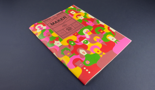
This is issue #8 of the Mohawk Maker Quarterly, designed by Hybrid Design and brought to you by one of our eminent mill partners – Mohawk. This issue is particularly special because it combines the Strathmore range and also Curious Collection which is from the Arjowiggins mill (Mohawk are now the North American suppliers of the Curious Collection range which makes us rather happy because we’re the Australian ones!). Maker is always a gift to the senses, a showcase of high quality printed matter in what is an increasingly digital era. It’s a real print treasure and celebration of creative, hands-on makers of this world.

Mohawk stands by the fact that embracing the medium is just as important as the message in creating an experience and building an emotional connection and with this issue, themed ‘Feel’, this premise is taken to a whole new level. This quote from the publication says it all: “Customers don’t necessarily remember what you do for them as much as they remember how you made them feel.”

We love the eight distinctive papers combined with a killer print job (offset printed using conventional and UV inks). They’ve boldly and cleverly combined half sheets, textured papers with photography, metallic papers with artworks and a deckled edge. The print medium, in our eyes at least, creates ‘feeling’ like not many other mediums can. Colour, texture, visuals. Print has the power to create a lasting memory and give anyone who loves design, print and paper all the feels.

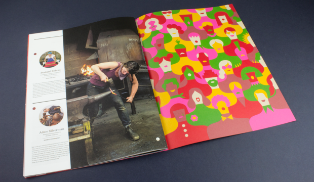
Cover – What’s firstly most striking is Olimpia Zagnoli’s beautifully bold pattern illustration that blends so seamlessly with the Strathmore Wove Riveria Rose (one of four Strathmore Heritage Collection colours introduced in 2015). We don’t sell it but can look to order it for you, just keep in mind there would be a minimum order amount. Read this blog post by Parse and Parcel for an excellent read and print production tip when printing on dark coloured papers. Mohawk hit the sheet with opaque white ink, twice, then used UV inks which dry instantly and don’t soak into the sheet so are much more punchy.

Maker-1

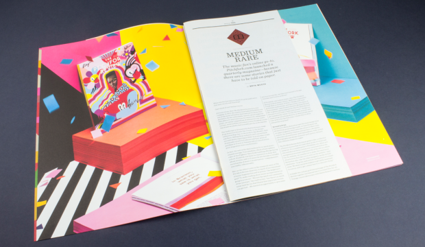
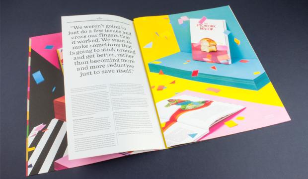
Medium Rare – Music fans online go-to is pitchfork.com and they’ve just release a quarterly magazine – because there are some stories that just have to be told on paper. An online presence going offline. The travesty! Flies in the face of convention it does. The Pitchfork Review showcases the striking beauty of Curious Collection Metallics – Ice Gold, against vibrant images printed on Strathmore Premium Wove and Smooth – Platinum White. This is a fun spread. The half page looks rad.

Maker-pics-3

Maker-pics-4

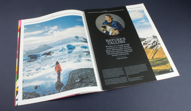
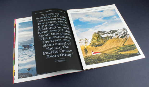
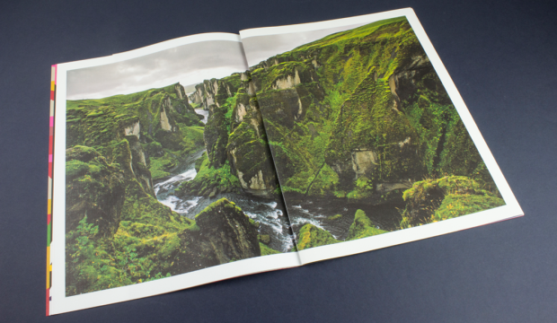
Nature’s Calling – We stand by the choice to use uncoated papers for photography, as long as you prepare the files the right way and work with a printer that is willing to push it with you. A great example of how to make this combo work is the section on Kennett Mohrman which looks amazing on uncoated Strathmore Pastelle that has a felt finish. The mossy covered terrain appears as a double page spread printed partly on Strathmore Cambric that has a linen finish and the Strathmore Pastelle. Same photo across two different papers, one Platinum White the other Bright White. And geez it looks a-ma-zing! The photo is a beauty. So much depth and richness. The half sheet on Skin Curious Collection – Black printed with white ink even comes with augmented reality components.

Maker-pics-6

Maker-pics-7

Maker-pics8

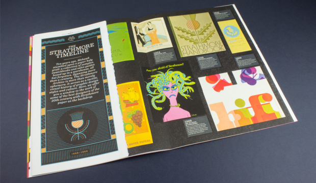
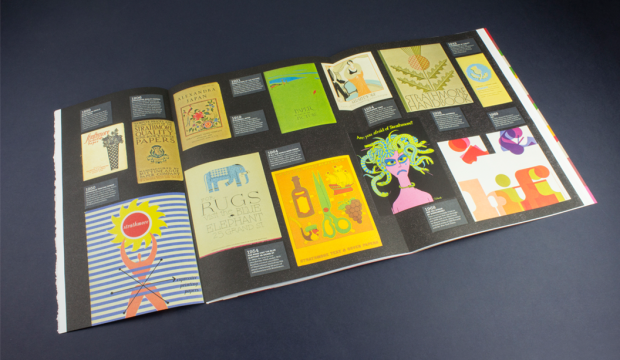
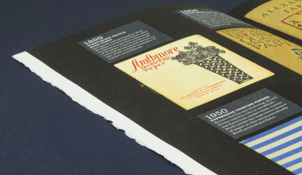
Strathmore Archive – We absolutely love this double page spread called The Strathmore Archive. The team at Mohawk found all these swatches and print samples, boxed-up in their warehouse. Literally over 100 years of print design in America, discovered in some dusty boxes! The deckled edge. Swooooon.


Maker-pics-9

Maker-pics-10

Maker-pics-14

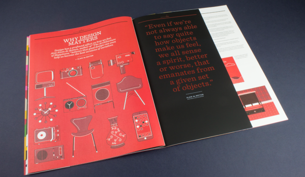
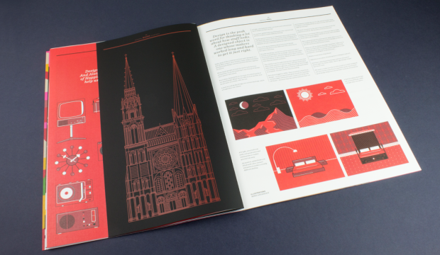
Why Design Matters Another half sheet and mixed paper goodness combo that gives us the design feels. Strathmore Premium Cambric (a linen finish) with Skin Curious Collection – Black and a half sheet thrown in for good measure. A perfect backdrop for Alain de Botton’s article on how objects make us feel – how good design can assist us with becoming even better versions of ourselves. As one blog mentions, the mid century illustrations look awesome printed on the linen sheet, as does the cathedral printed with red ink on the black. Clever.

See more pics and another write-up here, via the Mohawk blog Felt & Wire.


Maker-pics-11

Maker-Pics-15

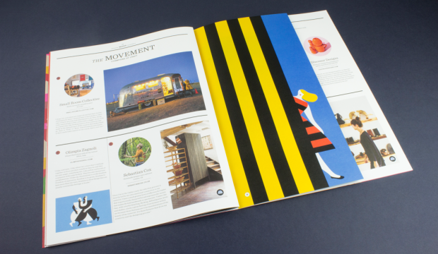
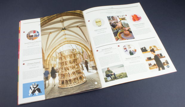
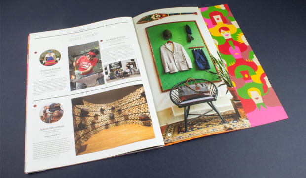
The Movement – This is what the Maker does really well – covers some really talented champions of craft – small manufacturers, artisans, printers, designers and artists from around the world still using their skills in this so called age of the digital revolution. Our very own Australian brandDinosaur Designs even get a mention in this one! Other makers include Shelter Social Club, Penland School, Brothers & Craft, Sebastian Cox, Object and Totem and Adam Silverman. Plus there’s some more augmented reality to enjoy.

It is impossible to tell from this picture but the smart cookies at Hybrid and Mohawk have paired the photograph of this wooden sculpture with Curious Metallics – Ice Gold which literally has a gold shimmer finish. We’ve said it before and we’ll say it again. Clever.

And if this wasn’t enough for your senses, see more pics and another write-up here, via the Mohawk blog Felt & Wire.

Maker-Pics-16

Maker-Pics-17

Maker-pics-12

Maker-pics-13

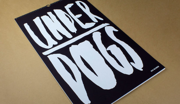
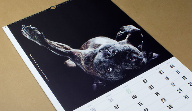
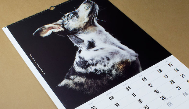
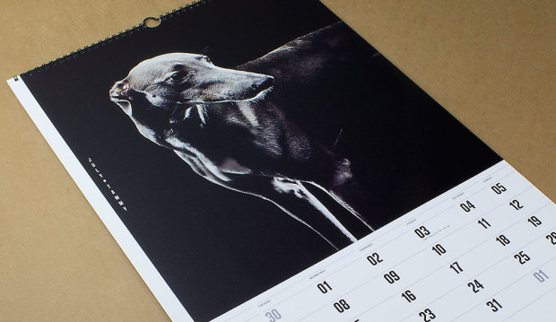
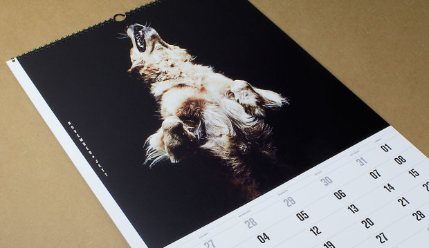
Our 2015 calendar ‘Underdogs’ is a homage to rescue dogs

Title: Underdogs.
Design: Marta Roca from Four&Sons plus Caroline Beard and Anthony Stephens (RMIT grads).
Photography: James Geer and assistant Tom Blachford.
Pre-production: Visual Thing (VIC).
Copywriting: Samantha Guthrie.
Stocks: Cover is Rives Tradition Poison Black 250gsm and text is Strathmore Premium Super Smooth Ultimate White 176gsm.
Printing specs: UV offset printed by Immij (VIC). Cover screen printed by STS Creative Printers (VIC). Binder: Marvel Book Binding (VIC).
Finished size: 350 x 590 mm.

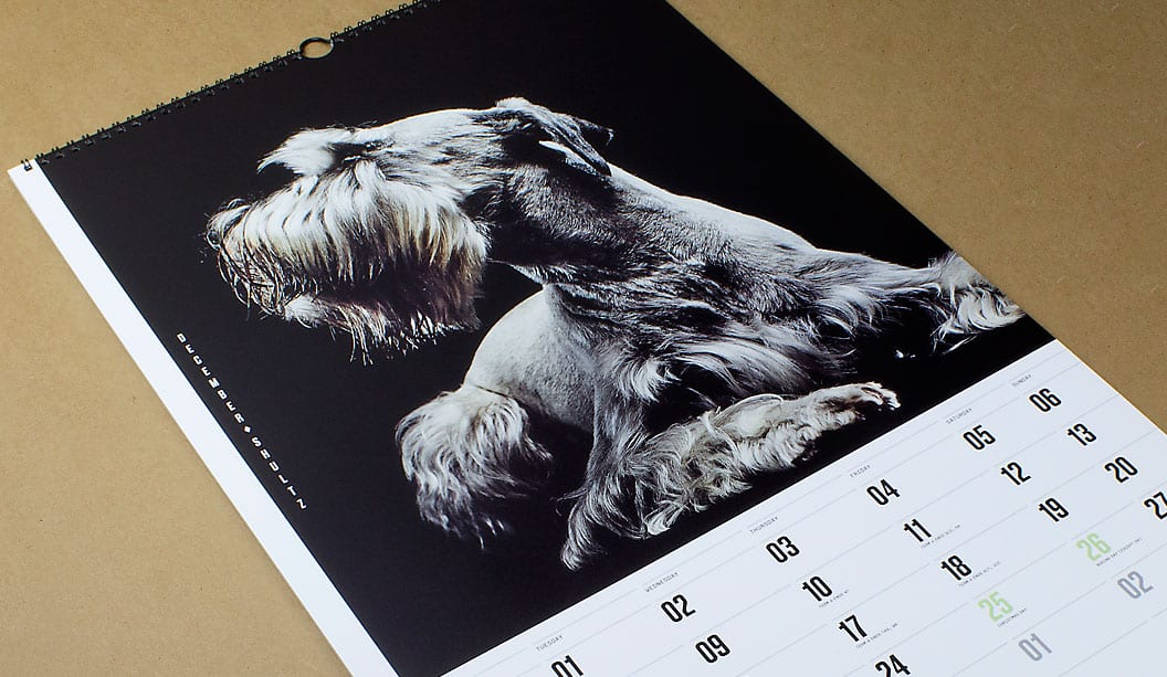
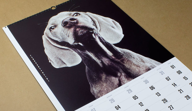
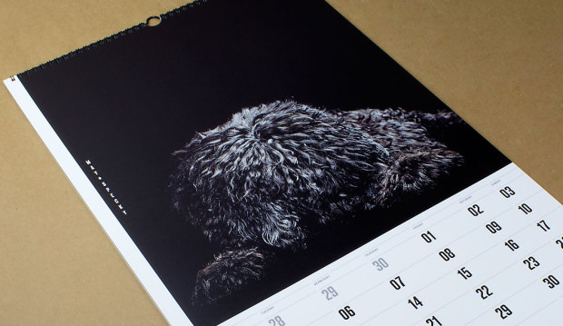
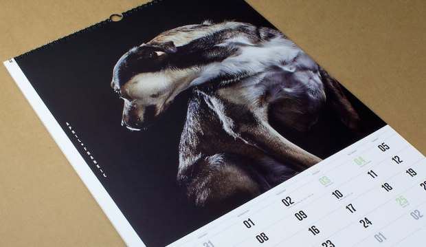
Next year marks our 40th year in the paper biz, so we called in the big guns to create our 2015 calendar which is given to key customers as a gift and a thank you. We assembled a team of poochie lovers that set-out on a collaboration that took nine months to complete. The result is a set of doggie portraits, fashion inspired images of 12 underdogs. The misfits and true Aussie battlers from the wrong side of the tracks.

14

The team of poochie aficondos was made-up of Marta Roca, Creative Director from online and print magazine Four&Sons along with some students which we found via a shout-out on desktop. The wonderful Caroline Beard and Anthony Stephens, two recently graduated RMIT students from VIC made the cut. They recently wrote to us saying how much they loved the experience, had loads of fun. That the project intensified their love of print and beautiful paper even more and they thanked us for the friendship and guidance provided. We think you guys rock! Ok, enough gushing.

When Catherine Doggett contacted Four&Sons to be a part of the calendar project, Marta says she: “Felt a sense of serendipity. From the KWD team, to the graduates Anthony and Caroline and James Geer, everyone got in sync with the underdog concept straight away. We all wanted to pay tribute to the unsung heroes and to give something back for all of those years of constant inspiration.”

To find the poochie models, we ran a doggy talent search among our VIC clients and customers. The criteria specifically asked for dogs that have been adopted or rescued. Each person submitted a photo and a bio of their dog. We received over 200 entries. A great response and so many great dogs! Marta, Anthony and Caroline chose the final 12 to appear in the calendar.

One camera shoot, one day and a lot of pooches coming and going from the studio in Melbourne’s leafy suburb of Elsternwick. We took the dogs for walks, helped them make friends and let them roam around in the hope we’d capture their true spirit which James did so brilliantly. We gave them lots of attention. It was a big love-in of our furry friends. “Maybe it was the treats, maybe we were just plain lucky. Or all of the above. Whatever the reason, magic just happened! We couldn’t have asked for better models,” said Marta to us recently. And internationally renowned photographer James Geer captured that magic.To say thanks for their hard work, we donated money to Pet Rescue Australia.

That’s it friends, we’re done for another year. We often joke that maybe, just maybe, one day, we will make the calendar about cats instead. Possibly even change our name to Cattett Paper. But we’re pretty keen on the dogs for now, so not just yet. Enjoy the 12 months of canine inspiration! Until next time…

Printing tips…
Using the UV offset press (on an uncoated paper profile) means instant drying times and a slight sheen to the ink is created. The darker images were printed using a 225 line screen which gave us a richer black and even ink lay down. The lighter images were printed with a 175 line screen as there was more contrast between the lighter and darker areas. The cover is screen printed with two hits of white to give a bold ink lift.

The paper for the text pages is Strathmore Premium Super Smooth. Being a premium paper, it is ideal for high end photography with even ink lay down. Nice solids and sharp reproduction. It makes the images look great. The Ultimate White is slightly ivory in colour and does add a small amount of yellow to an image (you can compensate for this on press or when setting up artwork).

1

4

3

12

5

6

10

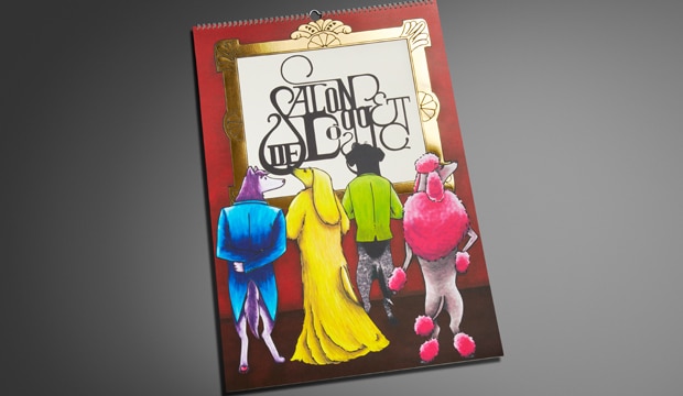
The 2013 calendar ‘Salon de Doggett’ is unveiled!

Title: 2013 calendar – Salon de Doggett
Agency: University of Technology Sydney (UTS), Bachelor of Design (Visual Communication) students
Client: K.W.Doggett Fine Paper
Stocks: Envirocare 100% Recycled / HannoArt – Satin / Knight – Textures / Knight – Vellum
Printed by: Offset Alpine Printing (NSW). Embellishments: Gold Craft Embossing (NSW)

The calendar pays homage to art movements and famous artists with canine adaptations. Imagine the Mona Lisa from the Renaissance period looking much furrier than usual! Or Picasso’s abstract Weeping Woman as a pouting pooch. These classics sit alongside dogified originals from the Graffiti Art, Bahaus and Art Deco movements, just to name a few. We’ve been producing the calendar for 26 years, as a gift for our customers. We are still, after all this time, blown away by the creativity and professionalism the students show.

Printed stochastically with 4 colour process and UV inks, the cover is printed on Knight Vellum  200gsm and features a striking gold foil. HannoArt Satin 200gsm, Envirocare 100% Recycled, Knight Linen 280gsm and Knight Vellum 200gsm are all mixed within the 12 months, with a few surprise embellishments too.

A special thank you to Amy Commons, Creative Director of Sai Designs and Tutor at UTS, as well all the students for their hard work and effort in producing an amazing calendar. The students we had the pleasure of working with (in no particular order) are: Carina Lee, Eleanor Cliffe, Jamie Lo, Nikki Lo, Ash Myburgh, Susanne Peng, Lucy Turnbull, Vanson Han, Thiwanka Somaratna, Lucinda Dryden and Yewon Chung.

Your fine paper specialist will be around shortly to drop in your 2013 calendar – where you can see these 12 beautiful (slightly familiar) loveable pooches for yourself.

Cover – Nikki Lo.
January (Futurism) – Jamie Lo.
February (Renaissance) – Susanne Peng.
March (German Expressionism) – Lucy Turnbull.
April (Graffiti Art) – Vanson Han.
May (Bahaus) – Thiwanka Somaratna.
June (Cubism) – Jamie Lo.
July (Art Deco) – Lucinda Dryden.
August (Post Impressionism) – Vanson Han.
September (Ukiyo-E) – Vanson Han.
October (Day of the Dead) – Carina Lee.
November (Surrealism) – Yewon Chung.
December (Pop Art) – Ash Myburgh.
Typography and layout – Eleanor Cliffe
Project management team – Carina Lee, Eleanor Cliffe, Jamie Lo.