White ink goes with PS Creative

Title: PS Creative white ink printed pieces
Agency: PS Creative
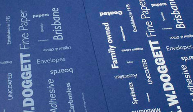
Stocks: Skin Curious Collection and Buffalo Board
Printing specs: Digitally printed with white ink
Printed by: PS Creative QLD

PS Creative specialises in white ink digital printing. Located in lovely Wynnum in Queensland, the boutique creative agency does lots of business cards, menus and wedding/event stationery. Their latest two jobs – a café menu and self-promotional card showcases their craft.

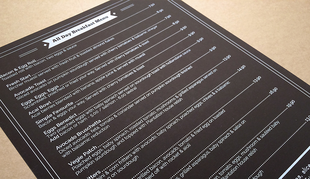
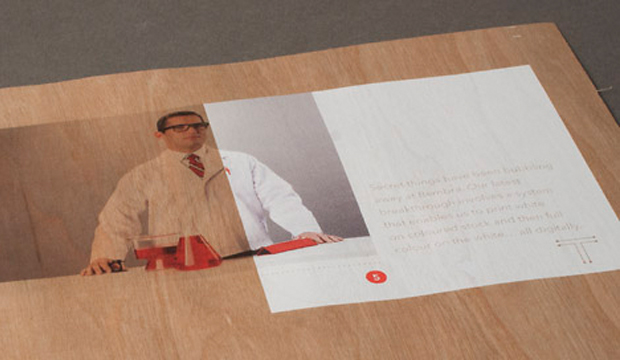
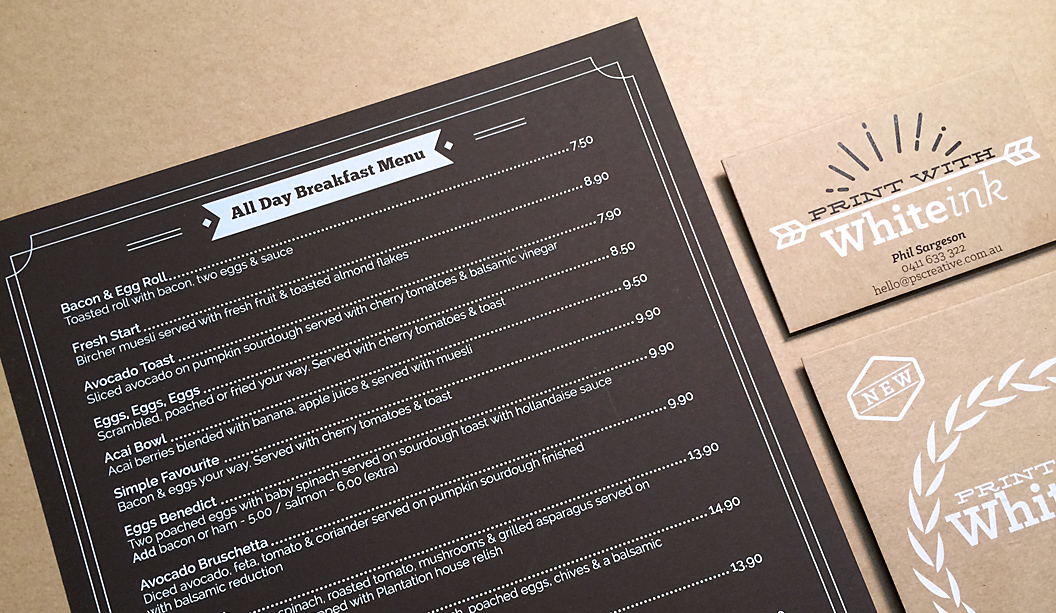
The menu, printed on Skin Curious Collection Mocha 270gsm was a job they got to work on after PS Creative approached the café to redesign their menu, showing them examples of what white ink can do. Daily wear and tear, some maple syrup and a car tyre (yup, one literally blew onto the road and a car ran over it)! later, these menus are still holding up. As Phil Sargeson from PS Creative explains: “The owners of the cafe wanted something completely different and long lasting, that’s when I contacted Corinne (our paper rep) to see if the Skin range would suit. The café have had really great comments on them.”

White-Ink_4

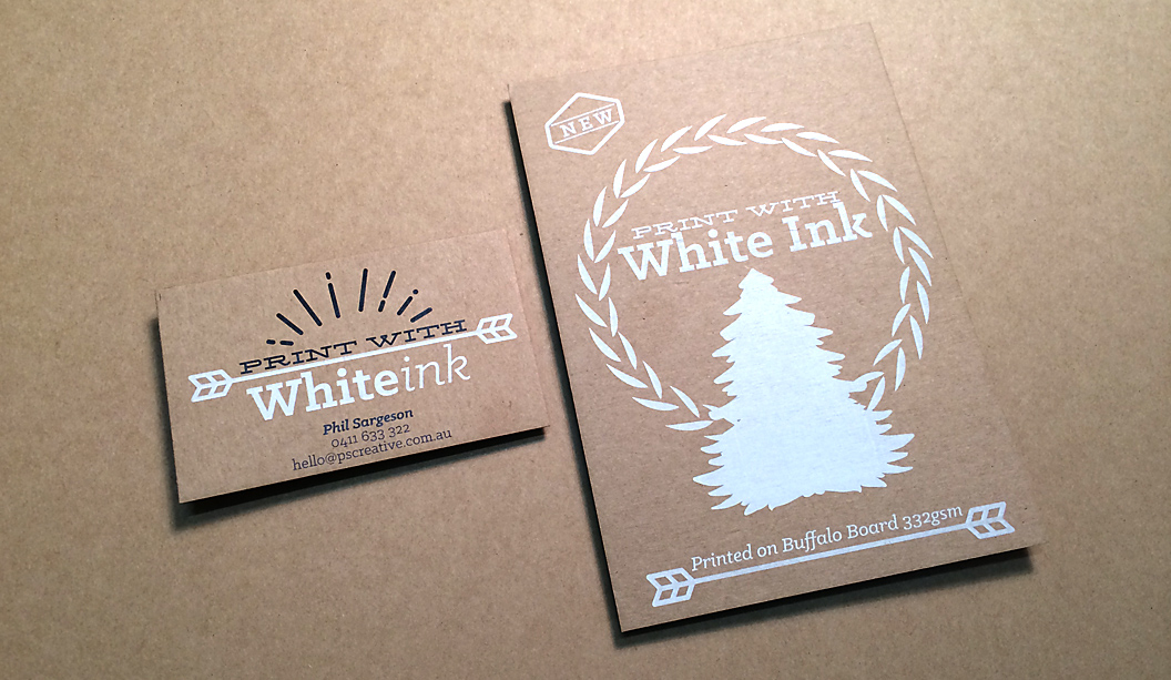
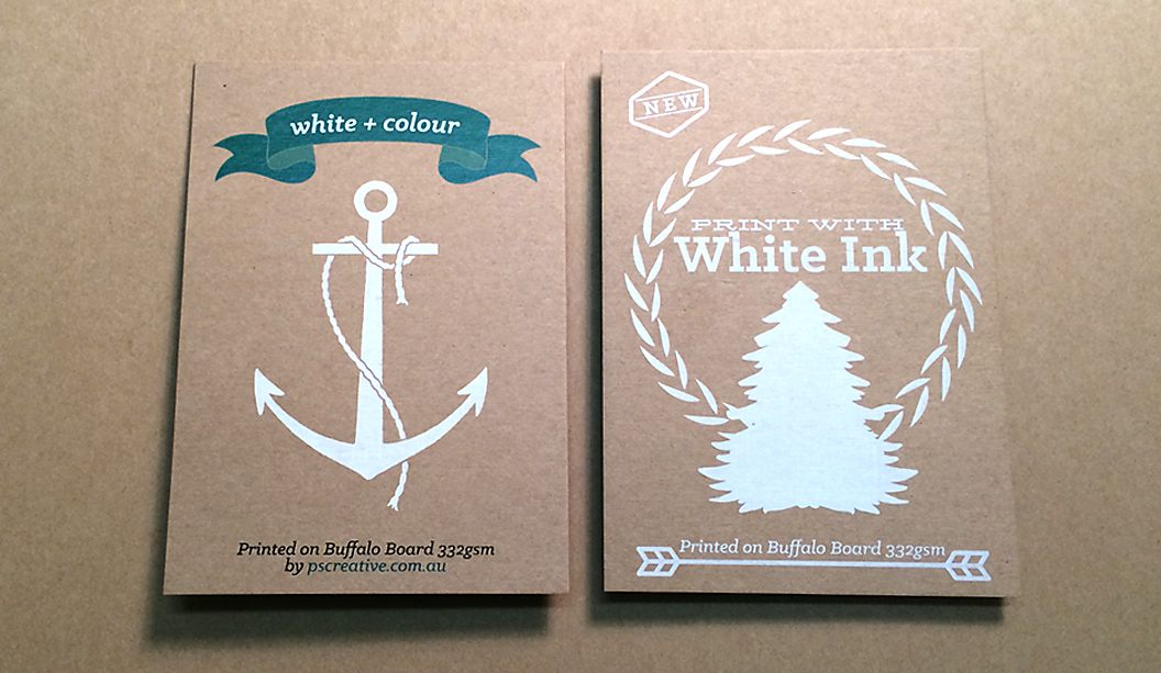
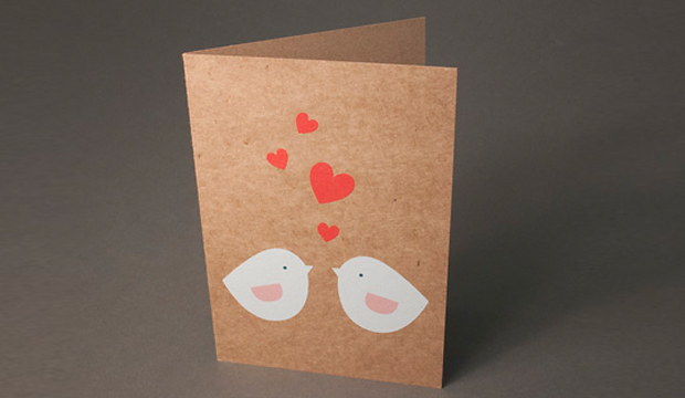
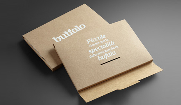
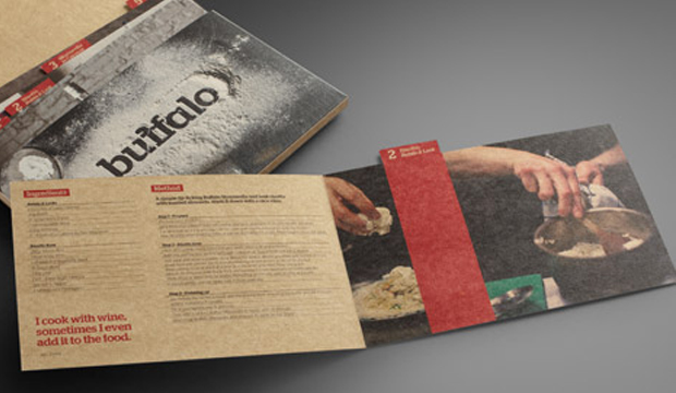
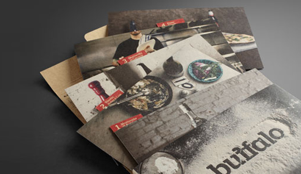
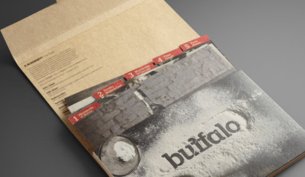
This set of images relates to their A6 self-promotional card. It’s printed full CYMK with white ink on Buffalo Board 332gsm, chosen for its natural/recycled look. Phil said to us: “I love the way the ink fuses with the board which gives the print a rustic vintage look – great for wedding invitation sets, but not just limited to that. We are now printing our own business cards on this stock and also a small handful of others to our clients.” Bring on the white ink we say! Have a read of an article we wrote on the process a couple of years ago for some hints and tips.

And if you happen to be a graphic designer, letterpress studio, agency or invitation designer, then PS Creative can offer you trade pricing. Get in contact with them by calling 0411 6333 22 or hello@pscreative.com.au

White-Ink_1

White-Ink_3

HP ElectroInk white – viva la (technology) revolution!

A couple of months back we had a burst of inspiration after seeing some digital projects featuring white ink. We decided the only thing that could scratch our itch was some experimenting, so we trotted off to Bambra Press in Melbourne and spoke to Carbon8 in Sydney. As a result, here’s 12 short tips and observations on working with the white ink.

Electro_3

The fairly new ElectroInk white process, is currently only available for Indigo presses. It allows you to print opaque white ink on coloured or darker papers, providing a result that was traditionally only achieved through screen printing, matt pigment foiling, or through many passes on an offset press. And as the ink is opaque, it means you can print 4 colours straight over the top without it soaking back into the sheet.

  1. How many hits? When requesting print samples of your work, ask your printer whether they think one, three or five hits of white ink is better. Generally, Bambra feel that between three and five hits is enough for a foundation. Seven is the most they’ve ever needed to do, dependant on the stock and the nature of the job (each extra hit will add to the cost).
  2. The best result. Around three to four hits of white looked really good when we tested it. The first hit wasn’t strong enough – it made the type and images look washed out. The more we pushed the hits of white, the greater the result, but it often resulted in ink picking. Mis-registration also started to creep into the mix (the paper will inevitably move around the machine a little).
  3. Picking. The slight picking occurs because there’s too much wet ink. The Indigo uses a lot of pressure so with fine layers, each layer can pull the ink away slightly, increasing the chance of picking. Bambra note that thicker boards may have a tendency to do this (FYI a 300gsm sheet may mic up differently from one to another – gsm is a measure of weight not thickness so be aware of this when choosing paper).
  4. Type. The type held up really well. Even the 7pt type only started to pick slightly when we did seven continuous hits of white ink (see pic 4 above).
  5. Coloured paper. In days gone by, digital printing pretty much meant coloured ink/toner on white or light coloured papers. HP ElectroInk has increased the capabilities of digital printing, allowing you to print on almost any coloured paper. This is perfect for short run jobs that need to make an impact, like invitations. You can use the white ink as a base on which to apply 4 colour over the top (the colour won’t soak back), or use the white on its own, or apply white over the top of 4 colour, depending on the desired result.
  6. Substrates.  Indigo presses work best with papers that are treated with a coating that provides maximum tac to the ElectroInk. There are many HP certified papers with this coating, but not so many coloured options. In our trials, we found that non HP certified papers can work too. Keaykolour Tangerine 300gsm, Royal Blue 250gsm, Jet Black 250gsm and Guardsmen Red 300gsm all provided great results without any additional coating. Bambra have even printed balsa wood (see pic.5 above) without it being coated. Amazing! If you are planning to use a standard sheet, best discuss a mini trial with your Indigo printer first. Some printers also offer the option to coat a standard sheet in house. We have seen some great results with this extra coating on unusual stocks like Boxboard and Chill Board. Carbon8 pre-coat stock and have so far used everything from Kaskad, Curious to Buffalo Board through their machines.
  7. Drying. A job printed with white ink needs to dry and the more hits of ink, the more time it needs but it’s not like offset printing. ElectroInk should dry in a matter of hours not days, retaining the benefits of a fast turnaround for digital print.
  8. Short grain. Paper was cut short grain (450×320) because the press feeds on the short edge and we used stock over 200gsm. Cut the sheet long grain when using stock that is 200gsm and under.
  9. Roller marks. We noticed a roller mark on one side of the sheet when we did our print trials. It might be best to set-up your artwork accordingly, or at least ask your printer what to do.
  10. Choose a good printer. Partnering with the right printer (who has the capabilities to print with white) is essential. The machine can’t operate itself! So find someone willing to push the boundaries with you. It’s also best to work with them in the beginning to set your files up properly. As Carbon8 mention: “Sometimes (as a printer) you have to stop yourself from saying ‘it’s good enough’. You need to take more time. A good printer knows how to make the white, white.” That’s the kind of standard you want to hear.
  11. Designer hot tip! A great tip from Carbon8: Remember, when setting up your files, the white ink layer needs to go down first with all the other colours on top of it. Any objects that you want to print/appear above the white, need to be set up to ‘overprint’. You can check in Acrobat if you have prepared it correctly by going to ‘output preview’ and turning off the CMYK separations. If you do not see the full white separation but instead a reversed out image of the CMYK plates, then it is being ‘knocked-out’ and will not sit below at 100% as it should.
  12. Costs. This will vary according to the number of hits because there is a per click/hit charge (a ball park figure, printing may cost around 75c-$1+ per sheet). White ink is a tricky process so there is a set-up cost too, a bit like doing a traditional embellishment. But the benefit of digital print is although it is expensive per unit you can keep the units as low as you need and therefore keep costs affordable.

So there you have it paper lovers. If you do any work with white ink in the future, please share your tips with us on our Facebook page or via Twitter (@KWDoggett) using the hashtag #whiteink – we’d love to hear about your experiences and see pictures of you work.

A big thanks to Brett and the team at Bambra Press for their hospitality! We conducted the trials on their HP Indigo 7600. And thank you to Ken from Carbon8 for your advice and time!  Carbon8 run white ink on their HP Indigo 5500 and 3050 presses.

Electro_2

Electro_4

Electro_5

Buffalo board packaging promotion – it’s good enough to eat

TitleBuffalo Board recipe cards
Agency: Seesaw Design (Melbourne) – concept, design and photography
Client: K.W.Doggett Fine Paper
Stocks: Buffalo Board
Printed by: Bambra Press (Melbourne), foiling by Avon (Melbourne).

As the buffalo roam the Serengeti, they dream about eating ‘Mozzarella in Carozza’. Of course we’re not being serious but wouldn’t it be a sight to see! Seriously though, did you know the Italians have been making buffalo mozzarella (bufala as they call it), since the 12th century? So what on Earth does buffalo mozzarella have to do with Buffalo Board? Well, Buffalo Board has many applications, one of which is food packaging. We collaborated with Seesaw Design in Melbourne who suggested we focus on this angle considering the stock is FDA approved for direct food contact. The concept of incorporating a food by-product led them to buffalo mozzarella (provided by La Latteria), a common ingredient on pizzas and salads.  It then seemed a perfect fit to work with Ladro, a popular pizza restaurant in Melbourne. And there you have it folks, the beginning of a delicious paper promotion.

Buffalo Board_4

The promotion consists of an A5 folder made from 332 gsm/610ums Buffalo Board, printed with a matt white foil. Five recipe cards featuring buffalo mozzarella (ie mozzarella di bufala; risotto – bufala and leek; mozzarella in carozza; pizza dough; pizza bianco) are contained within the folder, and printed on 283gsm/508ums stock. The folder and outside of the cards are printed 4 colour process with double hit of opaque white highlights printed wet on dry. The inside of the card is printed 4 colour process.

The recipe cards are such little treasures and are so tasty they’re good enough to serve to your mama. Ladro provided a great location for the photo shoot. The photographs showcase the stock’s raw look, a bonus for people that want to convey a distinctive, clean and natural design. The rustic dishes were captured in a beautiful and elegant way, and it looked like the team had fun doing it! Here’s a video with some behind-the-scenes footage of the shoot. The food styling is thanks to Vicki Valsamis who has done such a stellar job of making the dishes look downright dreamy and scrumptious. It’s like we can hear them calling out: ‘Eat me, eat me’.

Seesaw set out to create something special with this promotion rather than a novelty piece. As Anita Ryley from Seesaw explains: “We wanted to produce a finished product that is designer orientated while showcasing the stock. We wanted the promotion to be interactive, engaging and original. Using images of stock buffalo seemed a little obvious. It needed to be a solution that was beautiful, clever, professional and a little left of centre. We wanted to create a stock sample that wasn’t just another pretty design piece. As a studio, we love the samples we can engage with. The ones that have a dual purpose.”

Buffalo Board is a low density, high yield product. It’s an uncoated, moisture-resistant folding carton board that is cost effective, has a verifiably low bacteria content compared to many other paperboard products and outstanding strength and durability. Buffalo Board is also available in 386gsm/711ums and is also used for health, beauty, fashion and beverage applications. It’s made from natural kraft fibres that are responsibly sourced and fully recyclable and it even has a low carbon footprint (measured exit mill gate).

Your K.W.Doggett Fine Paper specialist will be out to see you soon with a copy of this promo. Otherwise, please call our samples departments. If you have any specific packaging related questions, please call our dedicated packaging business development manager John Alipan on 0434 692 446 or email him jalipan@kwdoggett.com.au

Buffalo Board_1

Buffalo Board_2

Buffalo Board_3